Category Focus/categories/productivity
Productivity AI Tools
Discover and compare the best productivity AI tools and software. Browse 859+ curated tools with reviews and rankings.
Projects tracked
859
Sort mode
RECENT
Page
9
Discover and compare the best productivity AI tools and software. Browse 859+ curated tools with reviews and rankings.
Projects tracked
859
Sort mode
RECENT
Page
9
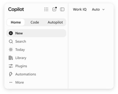
Microsoft Copilot is AI built for work. According to Microsoft, Copilot connects with your work content and the apps you already use, bringing together the latest AI models to help you create finished work, not just answers. It is designed for people who work inside Microsoft's productivity ecosystem: individuals who want to simplify everyday work, businesses that want their teams to move from ideas to impact, and enterprises that need secure AI grounded in their own organization. Copilot is available across desktop, mobile, and web, and it can be used with voice, keyboard, or pen, so the same assistant follows the user from one device to the next. The starting point for Copilot is a simple observation about how knowledge work actually happens. Most AI tools respond with an answer and stop there, while real work continues across documents, spreadsheets, presentations, email, meetings, and chat. Microsoft positions Copilot as a response to that gap: instead of an isolated chatbot, Copilot lives in the apps where work already happens — Word, Excel, PowerPoint, Outlook, and Teams — and it is grounded in work content rather than in generic information. That grounding is delivered through Work IQ, which ties Copilot to your company, your team's roles, and the context behind your projects. The stated goal is finished work, not just answers, which is why the product is framed as AI built for work rather than a general-purpose assistant. Feature group one is AI integrated into the apps you already use and grounded in your work. Copilot is integrated into Word, Excel, PowerPoint, Outlook, and Teams, where your work already happens, so users do not have to leave the tools they rely on to get help. Work IQ grounds Copilot in your company, your team's roles, and the context behind your projects, which means responses can reflect the reality of a specific organization rather than a generic model's best guess. Microsoft describes this as "AI that knows your work." Because the assistant already sits inside the productivity apps, the distance between asking for something and applying it to a real document, message, or meeting is much shorter. Feature group two is leading AI models brought together in one place, with automatic model selection. Copilot brings together leading AI models with Work IQ so users can benefit from the distinct strengths of each in a single experience — there is no need to switch between separate tools to reach a different model. A capability Microsoft calls "Auto advantage" handles the choice for you: Auto weighs accuracy, speed, and cost for each request, helping determine the right model and effort for the task at hand. The stated intent is to let people focus on the work, not the model. Microsoft also says that, looking ahead, Copilot will help orchestrate work across Chat, Cowork, and Code. Feature group three covers the surfaces where Copilot does the work. Home is the starting point in Copilot, bringing Chat and Cowork together in one place so users can review recent activity, discover suggested actions, pick up where they left off, or start something new. Chat is used for answers grounded in your work, while Cowork is designed for complex, multi-step work handed off across your apps, data, and workflows. Copilot Code requires no coding experience: you describe the dashboard, tracker, or app you want and Copilot builds it with the power of code. Copilot Autopilot is described as an always-on personal agent with its own identity, memory, and access to tools; it is cloud-hosted and keeps work moving in the background, using Microsoft 365 and Work IQ to take action within the guardrails you and your organization set. Home view and Copilot Code are noted as available in Microsoft Frontier, while Autopilot is described as available in Private Preview. Feature group four is building your own agents and working across devices. With Agent Builder in Copilot, users can turn their expertise into personalized, work-grounded agents in minutes using natural language; when they are ready to scale, those agents can be extended and managed with Copilot Studio. This is presented as "Build your agents. Work your way." In parallel, Microsoft emphasizes one Copilot across your devices: the same assistant is available on desktop, mobile, and web, and it can be driven with voice, keyboard, or pen. Together these capabilities are presented as a way to customize AI to specific work rather than accept a one-size-fits-all assistant. How the whole system fits together is described through grounding and orchestration. Work IQ supplies the context — company, team roles, and project background — and the leading AI models supply the reasoning. Auto sits between the request and the model, weighing accuracy, speed, and cost to determine the right model and effort for the task at hand. Autopilot adds an always-on layer with its own identity, memory, and access to tools, operating in the background within organizational guardrails. Microsoft states that Copilot will also help orchestrate work across Chat, Cowork, and Code, tying the conversational, multi-step, and code-building modes into one flow rather than three separate tools. The benefits Microsoft highlights are practical. Because Copilot is grounded in your work and lives in the apps you already use, users can move from ideas to impact inside the tools where they already operate. Chat returns answers grounded in work rather than generic responses, and Cowork takes on multi-step tasks across apps, data, and workflows so those tasks do not have to be assembled by hand. Copilot Code lets people without coding experience produce dashboards, trackers, and apps, which turns an idea into a working artifact. Autopilot keeps work moving even when a person is not actively asking, and the shared experience across desktop, mobile, and web means work can continue wherever the user happens to be. Security and privacy are presented as foundational rather than optional. Copilot is designed to be secure and private and is built on the trusted Microsoft 365 foundation that organizations already use. Enterprise-grade controls protect data, people, and business, and the design keeps work and personal accounts separate — a detail that matters for people who use the same devices and accounts for both. For enterprises and businesses, this means Copilot can be grounded in internal content and context while still operating inside existing security and compliance expectations. Concrete use cases named in the material include catching up on email and calendar work in Outlook, reviewing meeting notes and suggested actions in the Copilot app, and starting something new or picking up where you left off from a single starting point. Cowork is aimed at handling complex, multi-step work across apps, data, and workflows, while Copilot Code is aimed at building a dashboard, a tracker, or an app from a plain-language description. Agent Builder supports creating work-grounded agents from individual expertise, and Copilot Studio is used to extend and manage those agents when they need to scale across an organization. Copilot offers solutions for three audiences. Copilot for Individuals is positioned to simplify everyday work in the apps you use, from creating to managing email and calendar. Copilot for Business is positioned to help a business work smarter with AI built into the apps the team uses every day, so everyone can move from ideas to impact. Copilot for Enterprise is positioned to empower an organization with secure AI grounded in the business and built into the apps teams use daily. Pricing shown on the site starts at $9.99 per month for individuals; $23.50 per user per month, paid yearly, for business; and $30.00 per user per month, paid yearly, for enterprise. The business tier includes Copilot with Work IQ, productivity apps, identity management, security, and cloud storage; the enterprise tier adds Copilot Studio and enterprise-grade security. Taken together, Microsoft Copilot is positioned as an AI assistant for work rather than a general-purpose chatbot: it is integrated into Word, Excel, PowerPoint, Outlook, and Teams, grounded in organizational context through Work IQ, able to draw on leading AI models with automatic selection, and extended by agents, Autopilot, and Copilot Code. The consistent promise across the material is that Copilot helps you create finished work, not just answers.
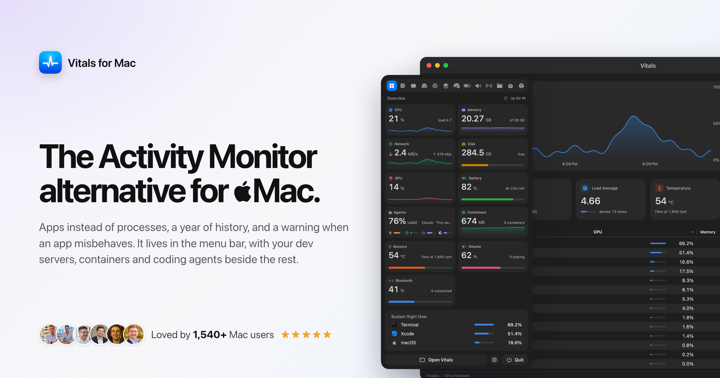
Vitals is an Activity Monitor alternative for Mac that changes how system monitoring is presented: instead of listing roughly 1,000 individual processes, it groups every process under the app that launched it. A working Mac therefore shows about 60 apps instead of 1,000 processes, each with one figure for memory, CPU, energy, disk and network. It is made for Mac users who want a clear, app-level answer to the question 'what is using my memory?'. Vitals keeps 30 days of history, alerts you when an app misbehaves, points out forgotten dev servers, and reports temperatures, fans and battery. Every readout can sit in your menu bar, arranged your way, and it is sold as a one-time purchase. macOS Activity Monitor lists every process on the system. On a working Mac that is about a thousand rows, a hundred of them called Google Chrome Helper, and to work out which application is actually responsible for your memory or CPU use you have to add the helpers up yourself. Vitals frames the difference simply: Activity Monitor is good at showing what is happening this second, while Vitals also tells you which app is responsible, what happened while you were not looking, and when something needs your attention. It adds every helper to the app that launched it, so each app gets one row and one figure. The result is that 'what is using my memory?' has a one-line answer rather than a long list of similarly named processes. The first feature group is app-level monitoring across every major metric. Vitals tracks CPU, memory, GPU, disk, network, energy and battery, and it presents each of those metrics per app rather than per process. In the app there are tabs for Overview, CPU, Memory, Disk, Network, GPU, Battery, Sound, Bluetooth and Projects. A Memory by App view, for example, shows Google Chrome at 21.23 GB, VS Code at 8.17 GB, Terminal at 3.86 GB and Safari at 2.69 GB, with the remainder grouped under Other. The same per-app breakdown exists for CPU, disk writes, downloads, GPU use and power draw, so a heavy video call, a runaway browser tab or a rendering job can be traced back to the application that owns it instead of to a helper process. The second group is history and alerting. Vitals keeps 30 days of history for every metric, per app, selectable as the last 12 hours, 24 hours, 7 days or 30 days, together with which apps used the most. The data is stored in one small file on your Mac. On top of that, Vitals sends alerts when an app misbehaves: a notification when an app hogs the CPU, keeps growing in memory, or hammers the disk or network. The website illustrates this with a Slack alert noting memory up 1.4 GB in an hour, now 3.3 GB, and a Chrome alert showing 70% CPU on average for ten minutes. Activity Monitor offers live graphs and 12 hours for energy but no alerts, so this is where Vitals adds ongoing awareness rather than a single snapshot. The third group is the menu bar experience. Every readout can be its own menu bar item, covering CPU, memory, GPU, network, disk, temperature or battery, shown as a value, a graph or both, with or without its icon. Holding the Command key lets you drag the items into any order, and the icon turns into a warning sign when your Mac is under strain. Clicking an item opens a dropdown containing every metric on one screen, the busiest apps right now, and a tab for each metric with the apps behind the figure. You can arrange its tiles or switch to a list with one line per metric, and clicking an app opens a window focused on it. Activity Monitor itself has no menu bar presence; at most its Dock icon can show CPU use, which is what Vitals is intended to replace. The fourth group covers dev servers and open ports. Vitals groups processes by the project folder they run in and shows the ports they have open. It points out a dev server that has done nothing for three days and offers to stop it, and it asks before it stops anything. The website shows an example list with servers on ports 4322, 8000, 4321, 3000 and 5173, labelled with their runtime (node or python) and how long they have been idle or up, with buttons to stop them. A confirmation message reports that storefront-web stopped, freeing 458 MB and port 4322. Activity Monitor has no equivalent, so leaked node processes and forgotten ports have to be hunted down by hand without it. Beyond those four groups, Vitals includes eight smaller features. Alerts for misbehaving apps, described above, sit alongside per-app volume control so you can turn a meeting up and music down, with nothing recorded. There are temperatures, fans and batteries: CPU and GPU temperature, fan speed, and the battery level in your AirPods, mouse and keyboard (the site shows AirPods Pro left at 42%, right at 58%, case at 80%, plus a Magic Trackpad and Magic Keyboard). You can quit an app or a single process from any list, with Vitals always asking first, and the confirmation warns that quitting Google Chrome will close 96 processes. You can export a 1200 by 630 share card of your memory, top apps and CPU, or copy the whole dashboard, in light or dark. Arrange everything lets you choose the tabs and show, hide and reorder sections, including the dropdown tiles and menu bar items, with a reset. Units you choose covers Celsius or Fahrenheit, bytes or bits, and CPU per core or per Mac. A distinctive part of the product is its privacy posture. An activity monitor sees every app you run and every project you work on, and Vitals keeps all of it on your machine. There is no account: you buy a license key and there is nothing to sign in to. There is no analytics, so Vitals does not report what you run, when, or for how long. The only two network requests are one that checks for updates and one that checks your license. History storage is one small file on your Mac. For developers working on private codebases and for anyone who objects to telemetry in a system tool, that architecture is the point rather than a footnote. The overall approach is a grouping layer on top of the process data macOS already exposes. Vitals adds each helper process to the app that launched it, so fifty or a hundred child processes collapse into one row, one figure and one history line. That same grouping is reused across tabs: per-app memory, per-app CPU, per-app disk writes, per-app network, per-app GPU and per-app power all derive from the same app identity. Grouping by project folder extends the idea to running servers, which is why idle dev servers and their ports can be surfaced and stopped. Because the app is native to the machine, the figures come from your own Mac; the interactive demo on the website uses simulated figures precisely because a web page cannot read your Mac and should not. The outcome for users is a faster answer to ordinary questions: which app is actually using the memory, what happened overnight, and whether something is heading in the wrong direction. Reviews quoted on the site describe the experience in similar terms: users say they find themselves glancing at the menu bar instead of worrying, that Activity Monitor is horrible when juggling dev projects and local AI, that having CPU, memory, GPU and projects in one place is a game changer, and that Vitals is a fast, well-designed upgrade that finally answers questions they had been searching for an app to solve. Paying once and owning the license, with every update included for life, is framed as part of the value. Concrete workflows described on the site include identifying which browser or app is responsible for memory pressure, as in the reviewer who discovered Dia was using most of their memory; watching what happened while you were away using the 12-hour, 24-hour, 7-day and 30-day history views; cleaning up leaked node processes and idle dev servers holding ports 3000, 4321, 4322, 8000 and 5173; receiving alerts when an app hogs CPU, grows in memory or hammers disk and network; checking CPU and GPU temperature, fan speed and accessory battery levels; controlling volume per app during a call; and exporting or copying a dashboard image for a post or a support thread. Vitals is aimed at Mac users who want more than Activity Monitor, particularly developers and AI builders running local projects and servers, and people who currently use menu bar monitors such as MenuMeters, iStat Menus or Stats, or who are arriving from Windows Task Manager. It is a Mac app sold at vitalsmac.com, with a waitlist open for Windows. Pricing is one-time: $9 during the launch, rising in steps to $29 as licenses sell, with no subscription. The site notes 1,000 licenses sold at $5 and 96 of 100 left at $9, one key per paid Mac that can be moved at any time, a 14-day refund, and every feature and update for life. Vitals reframes Mac system monitoring around apps rather than processes. By folding every helper into the app that launched it, keeping 30 days of per-app history, alerting when an app misbehaves, surfacing forgotten dev servers and putting configurable readouts in the menu bar, it aims to answer what is using your Mac in one line. Add local-only data, no account and no analytics, and a single one-time price, and the promise is a simpler, private, faster way to understand what your Mac is doing.
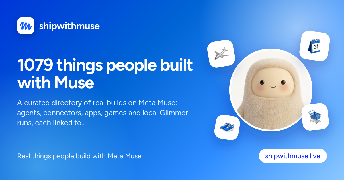
ShipWithMuse is a curated directory of what people are building with Meta Muse. The site describes itself as "a catalog of what people build with Muse," and its Product Hunt tagline is "Discover what people are building with Muse." Rather than publishing its own tutorials or demos, it collects real builds from around the web — agents, connectors, apps, games, skills, resources and local Glimmer runs — and presents them in one searchable catalog. Every entry is linked back to its original public source, whether that is an X post, a Reddit thread, a GitHub repository, a YouTube video, a blog resource or a website. It is built for developers, builders and curious observers who want to see the concrete things people have made with Muse rather than read abstract descriptions of the platform. The problem ShipWithMuse addresses is dispersion. Builds made with Meta Muse appear in many different places: developers post screenshots and results on X, hobbyists share custom connectors on the r/MuseAgent subreddit, engineers publish repositories on GitHub, video creators walk through results on YouTube, and writers publish guides and benchmark analyses on their own blogs. Following all of those channels individually is impractical, and much of the work is easy to miss. ShipWithMuse aggregates that material into a single catalog of more than 1,000 builds — the homepage header reads "1079 usecases built now with Muse" — so that anyone evaluating the platform can see what is actually being shipped in practice rather than relying on marketing claims. Because the entries link to their sources, the directory doubles as an index of evidence: benchmarks, demos, repositories and how-to guides that can be checked firsthand. Browsing is organised around build type and page. The catalog lists all 1,079 builds, then offers type filters with their own counts: X posts (462), Reddit posts (124), GitHub (143), Videos (61), Sites (33), Skills (110), Resources (137) and Guides (9). A separate "Star picks" toggle lets visitors show only the curated highlights. Results are paginated — the full catalog spans 27 pages — and each item is presented as a card carrying the creator's handle and avatar, a category label, a like count where one exists, and a direct link out to the original post, repository, video or site. Newly submitted builds are surfaced at the top of the homepage, alongside a prompt inviting visitors to submit their own work. Entries span a wide range of categories, which is itself a picture of what Muse is being used for. Coding & dev tools covers items such as the Browserbase plugin for Muse Code, a guide to Muse Code CLI commands, and the Muse Code Uninstaller utility. Connectors & MCP includes a Linear connector built by Muse in under a minute, the muse-fileapi local file connector, and a developer's guide to building Muse connectors. Games & 3D features five self-playing games written one-shot with Muse Glimmer, a Three.js browser driving demo and a Mini Golf game ported to VR. Benchmarks & research collects tests such as 105 planted bugs pitting Muse Spark 1.3 against frontier models, Spark 1.3's first place on Website Arena, and a privacy teardown of the Muse apps. Other categories reflect the personal-agent side of Muse. Errands & personal agent gathers stories such as a $1,750 unclaimed property find, a $603-a-year car insurance saving, an Alaska flight claim filed from email receipts, and a portfolio-aware Muse feed. Business & commerce covers items like a Squarespace-to-Shopify migration and Shopify Catalog checkout inside Muse. Local & open models collects work on Muse Glimmer, including a free fine-tuning notebook that reports training it faster with less VRAM, and Apps & websites includes builds such as a Tinder-style interface for unfollowing people on Instagram. There is also an Agents & automation category, where projects like TerMuse — a tool that shows a Muse agent's live terminal and an interactive browser side by side — are listed. The site's approach is deliberately indirect: it does not host the builds, run them, or re-publish their instructions. Instead it curates and links. Each listing is a pointer — the description summarises what the build does in a sentence or two, credits the creator by name and handle, and provides an outbound link to the original X post, Reddit thread, GitHub repository, YouTube video, blog resource or website. Visitors can therefore start from the catalog and end up at the primary source, whether that is a repository they can clone, a video they can watch, or a post they can read in full. Submissions are accepted through a dedicated submission page, and the homepage explicitly features newly submitted builds so recently published work gets visibility alongside the wider archive. For anyone assessing Muse, the benefit is a shortcut to evidence. Instead of reading feature lists, visitors can see what has been built, what it cost, what the results looked like, and who did it — for example, a benchmark that measured Muse Spark 1.3 against frontier models on planted bugs, or a report that Muse Glimmer delivered five runnable games at roughly one-fifth of Muse Spark's cost. For builders, the directory is a source of inspiration and prior art: seeing that someone connected Linear in under a minute, taught Muse a custom connector, or drove the Unity CLI to port a game to VR makes it clearer what a next project could look like. And because every card links out, the catalog also acts as a discovery layer for the creators themselves, sending traffic and credit back to their posts, repositories and channels. Concrete uses of ShipWithMuse follow from that structure. A developer new to Muse Code can browse the Coding & dev tools and Connectors & MCP categories to find setup guides, CLI walkthroughs and working connector examples before writing their own. Someone evaluating model performance can go straight to Benchmarks & research and read the collected tests and analyses in one place. A builder looking for project ideas can scan Games & 3D or Apps & websites for examples of what Muse produces in a single file or a short session. Teams curious about the personal-agent capabilities can read the Errands & personal agent entries — flight claims, insurance comparisons, unclaimed property searches — to understand what such workflows look like in practice. And creators can submit their own builds for listing in the catalog. ShipWithMuse is maintained by @mohithkumar808, credited on the site as the curator. It is a web-based catalog. The site also sells sponsorship placements: a sponsored slot the same size as a post, shown every 12 builds on every catalog page, priced at $100 per week, and the site's sponsor strip includes ChatForm and Tgmlabs. The directory draws on a range of build types — X posts, Reddit posts, GitHub repositories, videos, sites, skills, resources and guides — and its Product Hunt listing classifies it under Productivity, Developer Tools and Artificial Intelligence. The through-line is simple: ShipWithMuse turns scattered Muse activity into a single, link-backed catalog. By indexing more than a thousand real builds, letting visitors filter by type and highlight star picks, and pointing every entry at its original public source, it gives developers and observers a practical way to discover what Muse can do — and, if they have built something themselves, a place to submit it.
Robin is an email product built around a single promise: an inbox on easy mode, so you can focus on everything else. Instead of leaving you to file, label and triage messages by hand, Robin gives you an email inbox that organises itself. Receipts, bookings and notes are sorted as they arrive, with no folders to babysit. You can use Robin as your signup address, so that login codes reach you while the sales pitch stays behind in the inbox, and you can let invitations flow straight into your Robin calendar where plans get sorted. Robin is also designed to serve agents: an email address for your agent is provided through Robin MCP, and the wider intent stated by the product is that agents should work in the background with the inbox for us, so the inbox is smarter by default. Most people treat an inbox as a container they must continually maintain. Mail arrives in one undifferentiated stream, and the work of deciding what matters — which message is a receipt, which is a booking confirmation, which is a login code, which is a note worth keeping — falls on the person reading it. Robin's founding observation is that this arrangement is backwards. The inbox should be smarter by default, and agents should work in the background with the inbox for us. The stated point of the product is liberating the user from email a bit: reducing the amount of email administration a person has to perform, while still making sure the messages that matter, such as login codes and invitations, actually get through and get used. Robin's first capability is automatic sorting. Receipts, bookings and notes are sorted as they arrive, and the website is explicit that there are no folders to babysit — you are not asked to build rules or maintain a filing structure, because the sorting happens on arrival. The categories named in the content are receipts, bookings and notes, and the Product Hunt description adds that purchases and subscriptions get classified. Because sorting happens as mail lands rather than whenever you get round to it, the inbox you open is already in a workable state; you are reading an organised set of messages rather than performing the organising yourself. Robin also works as the address you hand out when you sign up for things. Using your Robin address for signups means codes get through — sign-in codes and other verification messages reach you instead of being lost in the noise — and the sales pitch stays in the inbox rather than following you around. The site illustrates this with a sign-in code alongside a 20% off code, showing the kind of mail Robin is built to handle. The Product Hunt description adds that Robin gathers all your newsletters like a magazine, an arrangement that keeps recurring reading in one place rather than mixed into the rest of your mail. Invitations and scheduling are handled next. Invites land in your Robin calendar, so an invitation does not have to be manually translated into a plan. Robin also provides a booking page that you can share, letting other people pick a time. The combination means that the two halves of making plans — receiving the invitation and agreeing on when to meet — are covered: invitations arrive in the calendar automatically, and when someone needs to find a slot they use your booking page rather than trading messages about availability. The site's example shows a calendar view and a confirmed plan such as coffee at 10:30. Robin MCP gives your agent an inbox to receive mail, read messages and prepare replies. The content shows this as functions such as list_messages() returning three emails and save_reply_preview(...) saving a draft, so the agent reads the inbox and prepares a reply rather than sending one unsupervised. The website is explicit about the control model: you keep the keys. Access to MCP is currently an invitation-only beta, and the site links to a guide for agents explaining how to use it. MCP access is listed as a Premium feature, described as access by invitation. Getting started with Robin follows a described path. You get your Robin address by confirming your email, and then you forward your first email to Robin. The signup flow asks for your email and offers to continue with email, then asks you to verify your email and choose a plan, with no charge until checkout. From there, Robin can be used either as the address you sign up with or as a destination you forward your mail to; the Product Hunt description frames this as using Robin for signups or forwarding your mail. Usage is metered in emails received and emails sent. Sends count per recipient, while Robin's own verification messages, code forwards and briefings to you are excluded from counting. The website sets out clearly how limits behave. Rejected spam, duplicate deliveries and rereading mail do not count as incoming emails. When you reach your limit, new receiving or sending pauses until the next month, and Robin states there are no surprise charges; top-ups are not available yet. One account shares its allowance across all inboxes, and limits reset monthly in UTC. This matters because the value of an organised inbox depends on it being dependable: the metering described is arranged so that routine activity such as spam rejection and re-reading your own mail does not consume your allowance. The outcome Robin aims at is an inbox that requires less of you. Sorting on arrival means less filing. Using a Robin address for signups means verification codes still reach you while promotional mail is kept to one side. Invitations landing in the calendar mean plans are made with less back-and-forth. An agent with an inbox and MCP tools can read mail and prepare replies in the background, with you holding the keys. Taken together, these are the elements of the promise: mail, codes and plans handled for you, so you can focus on everything else. Robin is offered in three plans. Starter costs $5 per month and includes one inbox with a Robin address, mail sorted, login codes delivered, and calendar and bookings; it includes 600 emails received and 100 emails sent each month. Premium costs $10 per month and includes three inboxes, the ability to choose your address name, and MCP access by invitation; it includes 6,000 emails received and 900 emails sent each month. Startup is priced by conversation — Let's talk — for more inboxes, room for more mail and an inbox for every job, sized around you. The Startup request form asks for estimated inboxes, received per month and sent per month, and optionally what you will use Robin for. Robin's value proposition is straightforward: mail, codes and plans for you, through an inbox on easy mode and an email address for your agent. Sorting, a signup address, a calendar with a booking page and MCP access for agents are the pieces, and together they aim at liberating you from email a bit so you can focus on everything else.
Peas & Pans is meal planning software for nutrition coaches, dietitians and personal trainers who build plans for clients. It is designed so that a coach imports recipes, arranges them into a client's week against that client's calorie and macro targets, and then sends the finished plan out under the coach's own brand. The client receives a private page and a PDF in the coach's colours, with the coach's logo and business name, and Peas & Pans never appears on it. The product runs in a browser, is sold on a single plan at USD 29 per month with unlimited clients, and begins with a 7 day free trial that does not require a card. The problem the product addresses is stated plainly in its own words: you became a coach to help people eat better, not to retype recipes, add up macros in a spreadsheet and fix a PDF at 11 pm. The work behind a single client plan fragments across files — a macros spreadsheet with hand-written totals, a document named "Meal plan v3 FINAL (2).docx" last edited at 23:04, a screenshot of a recipe saved from Instagram, a message at 21:47 asking for the plan to be sent again because the PDF cannot be found, and a follow-up question about whether Thursday is fine without dairy. Peas & Pans takes that administrative part away so the coach keeps the part that needs them: deciding what each client should eat. Recipe import is the front of the workflow. A coach pastes a link, snaps a photo of a cookbook page, uploads a PDF, or types the recipe in as text. The product fetches the page, reads the recipe and matches it, so a link to something like a lemon chicken traybake arrives with its nutrition already worked out. Every ingredient is matched to USDA FoodData Central, which means the numbers are ones a coach can stand behind, and any line the system is not certain about is flagged for the coach to check and resolve themselves. An imported recipe shows its serving count, time, calories, protein, carbs and fat, along with how many lines are waiting for review — for example, two lines to check on one import, and every line matched on another. The product ships with a starter library of 450 recipes covering breakfasts, lunches, dinners and snacks, every one of them with ingredients matched to USDA data and already checked. Coaches can put them into a plan exactly as they are, or save a copy and make it their own. The library can be browsed by meal, by diet, and by what to leave out, and each recipe shows calories, protein, carbs and fat per serving, a method, and a macro ring. Behind the recipes sits a foods database of nearly 14,000 foods from USDA FoodData Central, each with its household measures. A coach can look a food up, check it per 100 g, per portion or by their own amount, view macros, fibre, sodium and more, and add it straight to a plan or use it inside a recipe. Building the week is the middle of the workflow. Recipes are dragged into each day, or every empty slot in the week can be filled in one press, and calories and macros add up as the coach goes, measured against the targets set for that particular client. Days show a running total against the target — for instance 1,567 of 1,850 kcal, 283 kcal under, with protein, carbs and fat tracked the same way. A meal can be swapped for one that matches its calories and protein in the same slot, a single day can be copied, and a whole plan can be copied and handed to the next client. Grocery lists are built from the week, grouped by aisle, and can be ticked off on the client's phone. Sharing is the final step, and it is where the branding matters. Each client gets a private page and a print-ready PDF in one click, carrying the coach's logo, colour and business name. There is no app to install and no login for the client — the private link simply opens in any browser. Six templates control the look of both the page and the PDF: Clean, which is airy with fine lines; Warm, with soft tinted cards; Editorial, with cookbook serif titles and days as chapters; Slate, with a dark header panel and strong rules; Notebook, with day cards on a cream sheet and dotted rules; and Statement, with a big title, a heavy rule in the brand colour, and large numbers. The coach's colours are applied within whichever layout they choose. The overall approach follows a simple three-step product tour — Import, Build, Share. Import brings a recipe in from a link, photo, PDF or text and resolves its nutrition against USDA FoodData Central, flagging anything uncertain. Build arranges those recipes into a client's week with live day totals against that client's targets. Share publishes the week as a branded page and PDF. Around those three steps sit the details that keep a practice running: an invite link that lets a client answer a few questions and land in the coach's client list ready for a plan, and calories and macros suggested from those intake answers, over which the coach always has the last word. A number of smaller conveniences are included as well. One search box finds any client, plan, recipe or food, and can be opened from any screen with ⌘K or Ctrl K. Help is available from every screen, either to read an answer or to send a question. A new account comes with a sample client and a week already in the coach's brand, so the coach can see what a client sees before building anything real. Data ownership is explicit: settings export every client, recipe and plan, plus the plan PDFs, at any time, and that export remains available if a subscription ends. The outcome for the coach is time returned and work they can stand behind. Plans that were assembled from spreadsheets and retyped recipes become a drag-and-drop week whose totals update automatically, and the PDF that used to be rebuilt late at night is replaced by a one-click export already in the coach's branding. Because every ingredient is matched to USDA data and anything uncertain is flagged, the nutrition a coach sends out is checked rather than estimated. Because clients get a private link with no login, there is no app for them to install or account for them to forget. And because the pages and PDFs carry the coach's logo, colour and name only, the software disappears behind the practice. Typical use looks like a coach importing a batch of recipes from links and cookbook photos, checking the flagged lines, then dragging meals into a named client's week — for example, a plan for a client on 1,850 kcal and 152 g protein a day, running 14 to 20 September, with each day measured against those targets. Another scenario is swapping Thursday's dinner for a dairy-free option after a client asks, using swaps that fit the same calories and protein in the same slot. A third is reusing a proven week: copying a day to fill a week, or copying a whole plan to hand to the next client. A fourth is sending the finished plan as a private page and a print-ready PDF, with a grocery list grouped by aisle that the client ticks off on their phone. Peas & Pans is aimed at nutrition coaches, dietitians and personal trainers who plan for clients, and it is priced as a single plan: USD 29 per month with unlimited clients, every feature included, and no per-client fees. It starts with 7 days free and no card required. When the trial ends, the account becomes read-only until the coach subscribes, and nothing is deleted. On cancellation the subscription runs to the end of the paid period, after which the account is read-only and everything can still be exported. Refunds are offered within 14 days of a charge. The value proposition is straightforward: Peas & Pans handles the retyping, the macro arithmetic and the late-night PDF, and leaves the coach the decision of what each client should eat. It does that with USDA-matched nutrition, a checked recipe library, a week builder that keeps the numbers current, and branded client pages and PDFs that carry the coach's name rather than the software's.
FixMyFX is a free, no-sign-up calculator built for founders who sell or spend in foreign currencies. Its purpose is straightforward: show you what FX fees are costing your business and what you could do about it. You enter your annual revenue, the share of it in foreign currency, your annual expenses, and the share paid in a foreign currency. The tool then estimates roughly what FX fees cost you per year and gives you a plain-English plan to minimise those costs by receiving and spending in the same currency — for example, using a multi-currency account from Wise or Airwallex alongside a local bank. The calculation runs entirely in your browser: none of your numbers are collected, sent to a server, or tracked. The problem FixMyFX addresses is stated directly on the site: most founders get charged FX fees twice, on income and on expenses. The share text used by the tool puts it plainly — most founders lose 2–5% of revenue to hidden FX fees. On the income side, Stripe auto-conversion is described as charging 1% (US) or 2% (UK/EU/Rest) on inbound foreign revenue. On the spending side, a bank FX markup of around 3% is described as a typical bank spread on foreign spending and subscriptions. The calculator labels this combined situation the "lazy tax" — the cost of a standard single-currency setup in which you use your local bank for everything. These costs are easy to miss individually but compound over a 12-month period, quietly taking money that could otherwise stay in the business. The tool is also explicit about who does not need it: if your company, clients, and suppliers are all in the same country, you probably don't need it. FixMyFX starts by asking where your company is registered, offering the United Kingdom (GBP), United States (USD), Eurozone (EUR), Australia (AUD), Canada (CAD), the Nordics (DKK/NOK/SEK), New Zealand (NZD), Singapore (SGD), and Other (USD). That choice sets the home currency for the calculation. It then asks how you manage currency, with two options: Single Currency, described as using your local bank for everything (the standard setup), and Multi Currency, described as holding funds in multi-currency accounts (an FX-optimised setup). From there you enter your annual revenue per year together with the percentage in foreign currency, and your annual expenses per year together with the percentage paid in foreign currency — with SaaS tools, ads, and hosting paid in USD given as examples. You then execute the calculation, or update it when you change an input. The results screen places two setups side by side. Under "Current setup (lazy tax)", the tool models Stripe auto-convert plus bank FX and shows estimated annual fees. Its own explanation of the calculation is twofold: Stripe auto-conversion of 1% (US) or 2% (UK/EU/Rest) on inbound foreign revenue, and a bank FX markup of roughly 3% as a typical bank spread on foreign spending and subscriptions. Under "FixMyFX setup (zero leak)", it models a multi-currency account and shows estimated annual fees. That calculation is explained in three parts: direct payout at a 0% fee, meaning you receive foreign currencies into matching multi-currency bank accounts; direct spend at a 0% fee, meaning you pay foreign bills directly from matching currency balances; and a net profit transfer at roughly 0.4% fee, meaning interbank rate conversion only when moving balances home. The gap between the two estimates becomes the potential annual savings, calculated over a 12-month period. When there are savings to capture, FixMyFX explains how to achieve them in four numbered steps. First, open a multi-currency account (e.g. Wise Business, Airwallex) matching the currencies your customers pay in (EUR/GBP/USD). Second, connect these local bank accounts to Stripe so payouts land directly without Stripe's 1–2% auto-conversion markup. Third, pay foreign expenses such as SaaS, ads, and overseas contractors directly from those currency balances with zero FX spread. Fourth, convert only what is left back to your home currency at transparent ~0.4% interbank rates. The tool also translates the estimated saving into equivalencies, listing MacBooks Pro, months of Claude Max 20x, months of Claude Max 5x, months of Claude Pro, and fancy coffees. You can share the result on Twitter/X or LinkedIn, optionally including your savings amount. If your inputs already describe an optimised setup, the tool switches to a "You are winning!" state instead. That state states you are already using an optimised setup, that most founders lose money per year on this volume but you keep it, that this is because you don't auto-convert revenue (saving 1–2%), and that paying expenses directly from your foreign currency balances stops the FX leak completely; the annual fees shown in that case assume you pay a ~0.4% conversion fee only on the net profit you bring home. The distinctive methodology behind FixMyFX is that typically FX tools compare transfer rates, whereas this tool looks at your whole flow — income and spending. Rather than optimising a single transfer, it models the money coming in and the money going out, then compares a standard single-currency setup against a multi-currency, FX-optimised setup. The entire calculation runs in your browser, and the site states that none of your numbers are collected, sent to a server, or tracked. That means you can get an estimate without creating an account, without a sign-up, and without any of your figures leaving your device — a design choice that also makes it practical to test several scenarios quickly and privately. For users, the outcome is visibility plus a concrete path to saving. Instead of guessing whether FX fees matter at their volume, a founder sees an estimated annual fee figure for their current setup, an estimated annual fee figure for an FX-optimised setup, and the difference, described as money going back into the business every year. The four-step plan turns that estimate into action by naming the specific moves: opening a multi-currency account, connecting it to Stripe for direct payouts, paying foreign expenses from matching currency balances, and converting only the remainder at transparent interbank rates. The equivalencies — MacBooks Pro or months of Claude subscriptions — reframe an abstract percentage as things the business could otherwise buy, and the built-in sharing options let a founder circulate the result, optionally with the savings amount included. Concrete scenarios where FixMyFX fits are the ones its inputs describe. A founder whose customers pay in EUR, GBP, or USD while the company is registered elsewhere can enter annual revenue and the share received in foreign currency to see what Stripe auto-conversion costs them. A business paying SaaS tools, ads, and hosting in USD can enter those expenses and the percentage paid in foreign currency to see what a typical bank FX spread adds on top. Someone deciding whether to move from a single-currency setup to a multi-currency one can switch the currency-management choice between Single Currency and Multi Currency and compare the two fee estimates. A founder who already holds funds in multi-currency accounts can run their numbers to confirm they are in the "You are winning!" state. And anyone who wants to know the size of the prize before doing the work can use the savings figure and the equivalencies to justify the change. The product is aimed squarely at founders who sell or spend in foreign currencies, and the site notes that if your company, clients, and suppliers are all in the same country, you probably don't need it. It is free — no sign-up, no account required — and it runs in the browser on the web. Named in the content are the accounts and services it references: Wise Business and Airwallex multi-currency accounts, Stripe and its payout and auto-conversion behaviour, and local banks. It also lets you support the builder with a voluntary, non-refundable gratuity in USD, GBP, or EUR at $5, $15, $25, or a custom amount. FixMyFX was built by Tania Bell, described as a product manager who can code and an ex-finance manager, and it carries a disclaimer that it provides estimates based on standard publicly available fee structures, does not constitute financial advice, and that you should always check your own bank's PDS. In short, FixMyFX is a free, browser-only calculator that shows founders what FX fees are costing them across their whole flow, compares their current setup against a multi-currency one, and then hands them a plain-English four-step plan for keeping more of their revenue in the business.
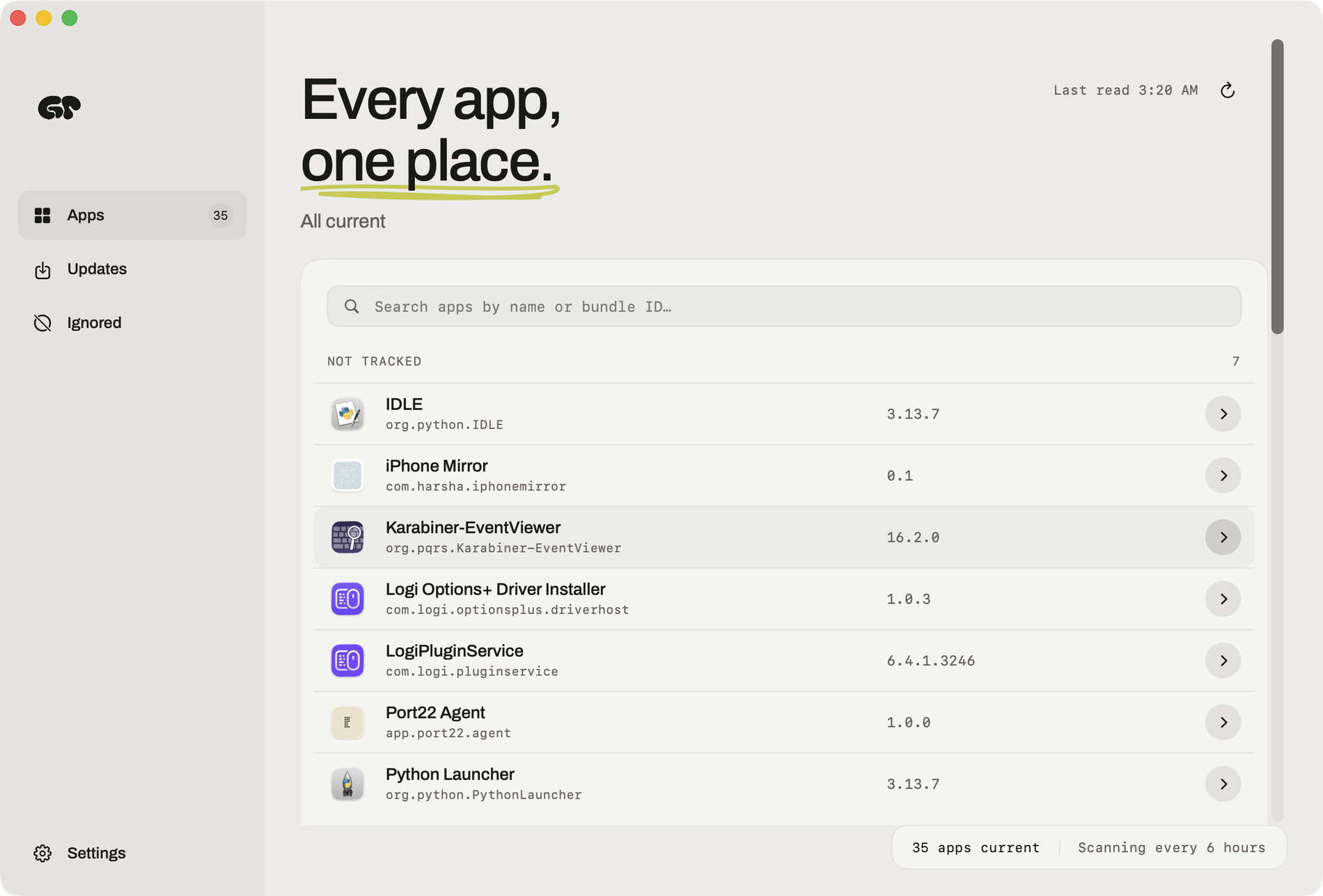
Greypaint is a Mac app updater built for macOS that finds and installs updates for the apps already on your Mac. It checks Sparkle, Homebrew, GitHub, and the App Store, and answers in one list. Instead of chasing each app's own update mechanism separately, Greypaint presents a single, searchable inventory of installed Mac apps with their versions and update status, so you can see what is behind at a glance and update it in one click. The problem it targets is simple: on a modern Mac, updates arrive through many different channels, and it is easy to miss one. Indie apps publish Sparkle appcasts, tools and desktop apps arrive through Homebrew, some apps ship straight from a GitHub repository, and the Mac App Store handles the rest. Each of those speaks in its own way, and many only mention a new version when you happen to open the app. Greypaint's opening line captures the intent exactly — "You didn't notice. Greypaint did." It checks for Mac app updates with the window closed, so nothing quietly falls out of date while you are working. Greypaint reads the updater each app already has. Sparkle appcasts, described as the feed most indie Mac apps already publish, are checked so the current version sits next to the available one — an appcast moving from 1.13.7 to 1.14.0, for example. Homebrew casks are covered too, so whatever you installed with brew can be updated without a terminal, with versions such as 3.0.14 moving to 3.0.15. GitHub releases are checked for the apps that ship straight from a repository, where tags move from v26.2 to v26.6. For the Mac App Store, updates are counted in Greypaint's list and then opened where macOS insists, pairing App Store tracking with everything else in one place. Autopilot and scheduling decide how far Greypaint goes on its own. Autopilot offers three explicit choices: "Nothing without me," "Security fixes only," and "Everything quietly." With security fixes selected, security fixes install quietly while everything else waits for you, or nothing does. Checks can run on your schedule — hourly, every six hours, daily — or never, unless you ask. Because Greypaint checks for updates while its window is closed, the work happens quietly in the background on whatever cadence you choose, and you can change that cadence whenever you like. It tells you before it touches anything: what changed, what could break, and what it won't do. Big jumps are flagged, so a new major version — 5.4 to 6.0, say — is marked and never installs on its own. You can skip one version, setting a release aside while the next one shows up as usual. If an update is missing, Greypaint says why: when a release needs a newer Mac or a newer macOS, such as one requiring macOS 28, you hear about it rather than wondering why nothing appeared. Old apps are called out as well, including apps still on Rosetta and apps their developer stopped making, shown as discontinued. Rollback is the safety net behind every install. If you didn't like the new version, Greypaint puts the previous one back — the undo button in its tagline, turning a move to 6.0 back into 5.4. Beyond graphical apps, it covers your command-line tools too: Homebrew formulae and npm packages are listed and are never updated without you. The interface keeps your hands on the keyboard, and every shortcut can be changed in Settings — switch appearance (⌘D), check for updates (⌘U), update selected apps (⇧⌘U), and find an app (⌘F). The sidebar separates Apps, Updates, and Ignored, alongside a searchable, filtered inventory of installed Mac apps with versions and update status. The approach behind Greypaint is to reuse what each app already provides rather than replacing it. It reads the updater each app already has — Sparkle, Homebrew, GitHub, and the App Store — and checks every update before it lands. Nothing is invented or routed through a proprietary channel; Greypaint interprets the appcasts, casks, release tags, and receipts that developers already publish. That is why a cask shows one version becoming the next, a GitHub tag moves forward, and the Mac App Store receipt is counted in the same list as the rest, and why the update decision stays in one place rather than scattered across separate tools. The outcome for users is a Mac that stays current without constant attention. You see every app that needs attention, make one decision, and update in one click. Security fixes can be absorbed automatically while riskier changes wait for you. You are told in advance what counts as a big jump, what needs newer hardware or a newer macOS, and what has been abandoned by its developer. Old apps on Rosetta and discontinued apps are surfaced rather than discovered at the worst moment. And when an update does cause trouble, rollback removes the fear from clicking update in the first place. Concrete scenarios follow from those pieces. Someone running a Mac full of indie apps that publish Sparkle appcasts can see every available release in one pass instead of opening each app. A developer whose tools ship from GitHub, or who installed software with brew, gets casks, release tags, Homebrew formulae, and npm packages in the same window and never has them updated without consent. Anyone who wants the Mac App Store counted alongside the rest gets App Store updates listed with everything else. And when a new version goes wrong, rollback restores the previous one. The heading "Find out what's behind, once" sums up the audit-style workflow: one searchable, filtered inventory answering what is out of date. Greypaint can be downloaded for free and tried for 14 days. After that it is $6.49 for a lifetime license, one payment with updates included and no subscription. It requires macOS 26.2 or later, and the download is a macOS disk image. Purchases are activated with the email from checkout and the license key you receive; Greypaint also emails those activation details, which are shown on a purchase-complete screen with a copy button. Taken together, Greypaint replaces a scattered set of updaters with one quiet Mac app updater: Sparkle, Homebrew, GitHub releases, and the App Store in a single list, checks that run with the window closed, autopilot you can tune, flags for big jumps and missing updates, and a rollback when something goes wrong — all for a one-time $6.49 lifetime license.
GameRoll is a single app built to bring a gamer's entire gaming life into one place. It tracks your library across 219 platforms, spanning PC, PlayStation, Xbox, Nintendo, mobile and classic retro systems, so every title you own or want sits in one unified collection instead of being scattered across storefronts and consoles. Alongside backlog tracking, GameRoll handles your wishlist, favorites and custom collections, your ratings and reviews, a real-time community feed, and the question every player eventually faces: what should I play next? It is made for players who own games across multiple systems and want their backlog, their opinions and their gaming friends gathered into one home. The problem GameRoll addresses is the slow collapse of the personal game backlog. Most players keep their list in their head or in a spreadsheet they stopped updating in 2022, which means games get forgotten, bought twice, or never finished at all. Wishlists usually live inside individual storefronts, so a release you have been waiting for can arrive without you noticing, and a price drop on a wishlisted game is easy to miss entirely. Gaming conversation is scattered too: a short clip on TikTok or Instagram might show a game you cannot name, and there is no easy way to turn that moment into a library entry. GameRoll takes a different approach. Every game you add, start, complete or drop gets logged automatically, so your record stays current without manual spreadsheet upkeep. At the centre of GameRoll is Your Roll, a backlog system built on four unambiguous states: pending, playing, completed or dropped. Every game you touch is placed into one of those four states, and the status is always in view, so there is no confusion about what you are actually working through and no ambiguity about whether a game has been finished or quietly abandoned. If you cannot decide what is next, you can spin your Roll and it picks a pending game for you. Around that foundation sit wishlists, favorites and collections: you can save games for later, mark the ones you love, and organize everything into your own custom collections. Together, these features turn a flat list into a structured library that reflects the way you actually play rather than the way a spreadsheet expects you to. GameRoll also watches your wishlist so you do not have to. You get notified the moment a game you are waiting for comes out, and again when one of your wishlisted games drops in price. The deal alerts are part of GameRoll UNLIMITED, powered by IsThereAnyDeal. Because that watching is not limited to a single store or console, the wishlist works across the same breadth as the library itself. GameRoll tracks games across 219 platforms, covering PC, PlayStation, Xbox, Nintendo, mobile and more, with your whole library and no borders between platforms. For players who own hardware from several generations, that means one backlog and one wishlist instead of a handful of separate lists that never quite stay in sync. A distinctive part of the product is sharing from anywhere. If you see a game in a video, you do not have to pause the clip to read the title or hunt through a search box. Instead, you share the post to GameRoll and it works out which game it is about. Sharing happens straight from your feed on TikTok, Instagram, YouTube, Facebook and X, without leaving the app you are already in. GameRoll reads the post and identifies the game for you, so you never have to type a name you are not sure how to spell, and a single tap sends it into your Roll or your wishlist so you can get back to scrolling. The community layer sits on top of the tracking. GameRoll's feed is not a list but the real activity of the people you follow: what they are playing, what they just finished, and what review they just wrote, updating in real time with no refreshing needed, so you can see who is playing right now and jump straight into a chat. Every game has its own thread where players debate theories, ask for help, or talk about the ending with people who have played it too. Reviews that actually matter are rated and shared, letting you see what your people think before you start a game. Discovery is folded into the same feed through trending picks, top rated titles, most wishlisted games, the latest reviews and upcoming releases, plus gaming news. As you play, you unlock medals and watch your stats build up by status and platform, right on your profile. What ties all of this together is a deliberately simple model. A game exists in one of four states, and everything else in the app is arranged around that single record: the wishlist keeps future games, collections organize them, the Roll surfaces them, the feed gives them a social context, and reviews capture what you thought. Adding a game is meant to be low effort, whether you select it in the app or share a social post and let GameRoll identify it, and moving a game forward is a matter of changing its state. The spin mechanic removes the paralysis from choosing what to play, and the real-time feed removes the effort of hunting for what your friends are into. Rather than bolting separate tools together, GameRoll treats the backlog as the centre of gaming life and builds tracking, alerts, discovery and conversation around it. The benefits are largely about removing friction and keeping a record. Your backlog no longer depends on you remembering to update a spreadsheet, because games are logged automatically as you add, start, complete or drop them. You stop missing the games you actually wanted, since wishlist alerts fire at release and at price drops. You stop losing track of a game you saw in a clip, because sharing the post is enough for GameRoll to name it and file it. Your library stops being divided by platform, because it spans 219 of them. And your opinions stop disappearing, because ratings and reviews sit alongside your stats and medals on your profile, giving you a visible history of what you played and what you thought about it. Concrete scenarios show how the app fits together. You are scrolling TikTok and see a clip from a game you do not recognise, so you share the post to GameRoll, it identifies the title, and one tap puts it in your wishlist. You have games spread across a PlayStation, a Switch, a PC and a retro handheld, and you log them all into one library where each one carries a clear status. It is Friday night and you cannot choose, so you spin your Roll and it picks a pending game. You are waiting on a release or hoping for a discount, and your wishlist alerts tell you when it arrives or when the price falls. You finish a game and want to talk about the ending, so you open its thread, read your friends' reviews and post your own. Over time you watch your medals and stats build up on your profile. GameRoll is aimed at people who play a lot of games, often across several platforms and generations of hardware, and who want their library organised without spreadsheet upkeep. It reaches users through mobile apps and the web, with the Product Hunt listing categorised under Android, iOS and Games. Its deal alerts are powered by IsThereAnyDeal, and sharing works from TikTok, Instagram, YouTube, Facebook and X, while game imagery in the app is served from IGDB and user content from Firebase. Deal alerts are packaged as part of GameRoll UNLIMITED, the app's named tier, alongside the core tracking, wishlist, community and review features. In short, GameRoll replaces the abandoned spreadsheet, the scattered storefront wishlists and the forgotten game names with one home for everything you play. It tracks your backlog across 219 platforms, turns four simple states into a clear picture of your progress, watches your wishlist for releases and price drops, identifies games from a shared post, and surrounds it all with a community that is actually playing. It is, as the tagline puts it, one app for your gaming life.
Lofi Cities is a free web app that pairs animated pixel-art city nights with endless lofi music generated live in your browser. It is made for anyone who wants a calm, continuous background for studying, working or winding down, and it asks for nothing beyond a browser: there is nothing to install, no account needed, and no pop-ups. You pick a city, press play, and let it run. Every scene is a 480×270 pixel-art animation that loops seamlessly every four minutes, with its own weather, landmarks and city sounds, while new lofi tracks are composed on the fly. It works on computers, phones and tablets. Lofi music has become a familiar companion for focus, study and sleep, but most ways of listening depend on an app, an account or a fixed playlist that eventually ends. Lofi Cities takes a different route. Rather than streaming a catalogue of recordings, it composes music while you listen, so the stream never runs out. Rather than showing a single looping video, it renders each city as a pixel-art animation drawn with its own weather, landmarks and ambient sounds. The result is a background that behaves more like a place than a playlist, one that can be left running for hours while you work, read or fall asleep. There are 16 cities to choose from: Paris, Tokyo, New York, London, Rio de Janeiro, Istanbul, Hong Kong, Sydney, San Francisco, Hamburg, Amsterdam, Dubai, Madrid, Rome, Prague and Munich. Each one is a distinct scene — rain on a painter's attic window under the zinc roofs of Paris with the Eiffel Tower sparkling far off; neon rain by Tokyo Tower; snow over the Brooklyn Bridge; fog and drizzle on the Thames; a Copacabana summer night; a rooftop tea garden on the Bosphorus; Victoria Harbour after dark; a jacaranda night on Sydney harbour; fog pouring through the Golden Gate; harbour lights on the Elbe; canal bridge lights in Amsterdam; a fountain night at the Burj; a summer night on Gran Vía; a warm night by the Colosseum; lamps on Charles Bridge; and a Christmas market in the snow in Munich. The city picker shows each city's local time and how many people are in it right now, and new cities are added over time. Every track is composed on the spot with the Web Audio API: a chord progression, a drum groove, a bass line and often a melody, finished with tape wobble and vinyl crackle. Chords, drums, bass and melody are all synthesized in real time, with no samples or recordings, which is why the music never runs out and every track is new. Track titles are inspired by the city on screen, so the music and the scene stay connected as you listen. The Vibe panel shapes what is playing. Style offers nine options: jazzhop, the default, built on a Rhodes, jazzy chords and a swung boom-bap beat at 68 to 88 BPM; piano, a sleepy felt piano with soft drums; ambient, slow warm pads with barely a beat, made for sleep and deep focus; bossa, nylon guitar over a bossa nova groove; synth, 80s city-pop synths; house, lofi deep house on a soft four-on-the-floor kick; guitar, a clean electric guitar fingerpicked over a lazy beat; sad, slow minor chords and a lonely muted trumpet; and medieval, a lute and a recorder over hand drums. Energy moves the mood from chill (slower and darker) to upbeat (faster and brighter), and Band plays the full band, no drums, or the chords only. A new style starts with the next track. A separate ambience layer mixes each city's own sounds under the music. The city sounds mixer goes further, offering a slider for every sound of the city — turn the rain up, the traffic off or the bells down — and that setting carries over to every city that has the same sound. The Weather chip brings rain, snow, autumn leaves or a clear night to any city, and the city sounds and track titles follow it: rain brings the sound of rain in, while snow arrives with a hush of wind. Music and city sounds each have their own volume slider, and the Up next list shows the coming tracks so you can pick one to play right away. Focus and sleep timers are built in. The focus timer runs 25 minutes of focus and 5 of break, or 50 and 10, on repeat, with a soft chime at each break and a bell to call you back; the sleep timer fades the music and city sounds out after 15 to 90 minutes and then pauses. The Tour chip moves on to the next city every 5, 10, 15 or 30 minutes, or follows the night, showing whichever city is closest to 1 am local time and moving west from Sydney to San Francisco as the hours pass, with cities on the same clock taking turns. Together adds a social layer: pick a heart, note, star or moon and tap the scene to float it up from that spot on everyone's screen there, or release a paper lantern that rises over the city for about a minute in the same place for everyone. The Chat button opens short messages from the last hour under a random two-word name such as "sleepy fox", with emoji available from a smiley button or by typing a colon and a name like :coffee:. The whole thing runs in your browser. Because the cities and the music are generated locally, Lofi Cities works offline after your first online visit, every city included. There is no sign-in and no cookies: settings such as the last city, volumes and vibe, plus anonymous random ids for statistics and the live count, are kept in your browser's local storage. Anonymous usage statistics, such as which cities are viewed, are collected without cookies, and browsers that send Do Not Track are left out of them. For chat, a random id in local storage makes your tabs count as one person, the server forgets it about 25 hours after your last visit, and other people only ever see your two-word name. For studying and working, the app gets out of the way: fullscreen hides everything else, H hides the interface, the controls fade out on their own when you stop moving the mouse, and P opens a picture-in-picture mini player that keeps the scene floating over your other apps on computers in browsers that support it. Streamers can add a browser source at 1920×1080 pointing to a city page with ?obs, which keeps the interface hidden and starts the music on its own, with the option to control audio via OBS. The save button or the S key exports the current frame as a 1080p PNG, and the city videos can also be bought on Gumroad as a 16-city collection of four-minute 1920×1080 MP4 loops at 60 fps without audio, for personal use and video or livestream backgrounds. Every city also has a billboard for rent where a business can be drawn in pixel art. In practice, Lofi Cities fits around a working day and around sleep. It can sit in a browser tab as a background for studying, coding, writing or reading, run in fullscreen with the interface hidden so only the city and the music remain, or float in a mini player over other applications. The focus timer turns it into a Pomodoro companion with chimes at each break. In the evening it becomes a wind-down: the ambient style, the sleep timer and the fader that pauses the music after 15 to 90 minutes. Streamers use it as a browser source behind their overlay, listeners save frames as 1080p wallpapers or loop the city videos, and people who like a bit of company can release lanterns, send a reaction or chat with whoever else is in the same city. Lofi Cities turns a browser tab into a place: sixteen animated pixel-art cities, each with its own weather and sounds, and lofi music composed live so it never runs out. It is free, needs no account, works on phone and desktop, and is built to be left running quietly in the background — a simple way to get a calm, endless lofi atmosphere for work, study or sleep.
NiroHelp is an AI-native help desk built for WordPress. It bundles a knowledge base, a support ticket system, an AI chatbot, and an AI auto-responder into a single plugin that lives inside the WordPress admin, so docs, tickets, and AI all sit in the same menu. It is designed for teams that answer the same customer questions over and over — WordPress plugin, theme, and WooCommerce businesses, small support teams, and agencies managing multiple sites. The core purpose is straightforward: let your own help articles answer repeat tickets, and only pull in a human when the AI is not confident enough to reply. The help desk itself — knowledge base, ticketing, and dashboard — is free on WordPress.org, while paid plans switch on the AI features and email piping. Support teams often end up paying for several separate tools to cover one job: a documentation plugin, a ticketing plugin, and a chat or help-desk subscription. NiroHelp's founder, Nazmul Ahsan, says the team built it because they were tired of paying for five plugins to do what should be one job. The result is a single plugin where the knowledge base customers read is the same knowledge base the AI reads before it replies, and where docs, tickets, and AI live in one admin menu with nothing extra to install or learn. Because documentation usually already exists in WordPress product businesses and the questions already repeat, NiroHelp goes after the repetitive pre-sales and licensing questions that fill support queues. Customers get faster answers, and the team spends less time on questions the docs already cover. The knowledge base module lets you publish help articles your customers can search and browse. Articles are written with a familiar editor that supports titles, images, and formatting, and they are grouped into topics so visitors find things fast. Customers can mark an article helpful or not helpful, giving you a direct signal about which documentation needs work — the dashboard later surfaces those votes alongside the tickets that referenced the article. Article pages are clean and readable, with a table of contents and readable code snippets, and they stay fast to load even with hundreds of articles. Crucially, the AI reads these articles before it ever replies to anyone, so the quality of your docs directly shapes how much support the AI can handle on its own. Ticketing covers the conversations the AI cannot answer. Every ticket moves through clear stages — open, in progress, waiting, resolved, and more, eight stages in total on the free plan — and status updates itself whenever your team or the customer replies. New tickets are handed to an available agent automatically, so no single person gets overloaded. Manager, Agent, and Customer roles define who can access what, custom fields can be added without any code, and everyone gets an email the moment something changes. Tickets can also be embedded on any page, which means the same system can collect requests from a contact page, a checkout screen, or anywhere else on your site. The AI layer has two halves. The live chatbot is a chat bubble that already knows your product: you add a single line of vanilla JavaScript to any website, WordPress or not, and visitors get answers pulled straight from your help docs. You pick the agent name, avatar, and color so the widget matches your brand, choose which pages it appears on and when — it can go quiet outside business hours — and preview the exact widget in your dashboard before it goes live. It also remembers the conversation, so customers can move between pages without repeating themselves for as long as the tab lasts. The AI auto-responder applies the same documentation-grounded AI to incoming tickets. If your docs clear the confidence threshold you set, it replies on its own; if they do not, it stays quiet and leaves the ticket for your team. Answers post after a delay you choose — five minutes by default — so a customer who is still typing is not interrupted. Email piping turns the support inbox your customers already write to into your ticket queue. NiroHelp connects to any mailbox over IMAP or POP3 — including Gmail, Microsoft 365, and cPanel — and every email arrives as a tracked ticket while every reply threads back into the same conversation, so customers never have to learn a new tool. Multiple shared inboxes can each be routed to their own agents. Quoted history is stripped, attachments are carried over, and auto-replies are ignored. The AI auto-responder answers piped tickets too, which means even requests that arrive as ordinary email can be resolved from your docs before a person opens them. The dashboard gives a 360-degree view of your support for the last 30 days. At a glance you can see which tickets are waiting on your team, how many are overdue, your median first reply time, what percentage of conversations the AI deflected, and which threads have turned unhappy or been flagged. A needs-attention list sorts tickets by risk, and a separate panel highlights customers whose sentiment is turning negative. Then there is the copilot: a chat box you can ask questions such as which customers are most at risk this month, or what you should fix in the docs first, and it answers from your open tickets, replies, and doc votes. The workflow of the auto-responder is deliberately simple. A customer writes in, either as a new ticket or a reply, just like normal. The AI checks your docs for an article that actually answers the question. If it is confident, the answer posts after the delay you set. If it is not sure, it stays quiet and the ticket waits for a person — no guessing. Everything is contained in a single plugin: the free core handles docs, tickets, and the dashboard, while paid plans add the chatbot, the auto-responder, the copilot, and email piping. Each module can be enabled or disabled independently from Settings, and disabling one never touches the other's data because docs are posts, tickets are posts, and replies are comments. NiroHelp places privacy and ownership at the center of its design. The knowledge base, tickets, and replies live in your own WordPress database as ordinary posts and comments, not in a proprietary table and not on NiroHelp's servers. Docs, tickets, emails, and migration contact no external service at all, so the help desk keeps working with the internet unplugged; only the AI features talk outward, and when the auto-responder is on, that includes the ticket it is answering. There is no OpenAI or Anthropic key field anywhere in the plugin — the AI is included in your plan as an allowance of replies, and when it is used up the AI pauses until it resets rather than generating a per-token bill. Uninstalling deletes nothing of yours; it clears only the plugin's own bookkeeping. Migration is built in as well. A Migrate action copies articles, topics, and tickets — replies included — from seven other plugins: BetterDocs, weDocs, Echo Knowledge Base, BasePress, Awesome Support, SupportCandy, and JS Help Desk. Your old plugin keeps its data until you choose to clean it up, and every imported item is marked, so re-running the migration creates no duplicates; each source has its own guide describing exactly what comes across. NiroHelp also positions itself against a stitched-together stack. In its own cost comparison for a three-agent team, running Intercom, Zendesk, HubSpot, or Help Scout alongside a separate docs plugin comes to between $1,499 and $3,309 per year, while NiroHelp Starter is listed at $79.99 per year with unlimited agents. Pricing is based on how many sites you run, not how many people are on your team, and unlimited agents are included on every plan. The free plan, available on WordPress.org with no time limit, covers the knowledge base with search, ticketing with eight stages, automatic ticket assignment, the support dashboard, imports from seven plugins, and unlimited agents and tickets. Starter is $9.99 per month or $79.99 per year for one site and adds email piping, the AI chatbot trained on your docs, the AI auto-responder for tickets, and 1,000 AI credits per month. Growth is $29.99 per month or $239.99 per year for five sites with 6,000 AI credits per month and priority email support. Agency is $49.99 per month or $399.99 per year for ten client sites with 15,000 AI credits per month and voice call support. The product is aimed at WordPress product companies, small support teams of two to ten people, and agencies running multi-site setups. It is translation-ready, with a .pot template shipping with the plugin, and clients can log in without a WordPress account using a one-time verification code, a magic link, or a standard password. NiroHelp's primary value proposition is that the documentation you already wrote can do more of the support work. By keeping the knowledge base, tickets, chatbot, and auto-responder in one WordPress plugin — and by grounding every AI reply in your own articles — it lets a smaller team handle more customers at lower cost, while leaving the hard questions to people.