Category Focus/categories/productivity
Productivity AI Tools
Discover and compare the best productivity AI tools and software. Browse 859+ curated tools with reviews and rankings.
Projects tracked
859
Sort mode
RECENT
Page
1
Discover and compare the best productivity AI tools and software. Browse 859+ curated tools with reviews and rankings.
Projects tracked
859
Sort mode
RECENT
Page
1
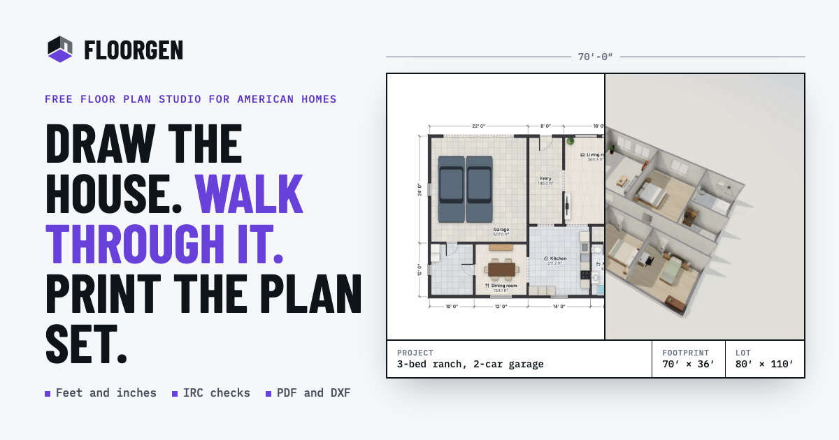
FloorGen is a free floor plan maker that runs in the browser and combines 2D drafting, 3D walkthroughs, video export and code checking in one place. You can describe the space you have in mind and let FloorGen AI draw an editable plan, or draw the plan yourself wall by wall. It is built for homeowners and renters, interior designers and architects, real estate professionals and builders, and people who want an AI assistant to edit their drawings. Every wall, door and sofa in a plan is editable, and every plan is already a 3D model, so you can orbit it, open it as a dollhouse, or walk through it at eye level before anything is built. The problem it addresses is the gap between wanting to change a space and being able to show anyone what that change looks like. Measuring a room, testing where the sofa fits, planning a kitchen or a backyard ADU usually means sketching on paper, guessing at scale, or learning heavyweight drafting software with a licence and an install. FloorGen lets you measure a room, draw it to the inch or the millimetre, and try the sofa in three places before you lift it. There is nothing to install and no account required to draw: plans save in your browser until you choose to sign in. Plans can start from scratch or from existing work. Walls snap and rooms close as you draw, or you can import a photo or PDF of a plan, set the scale by clicking two points a known distance apart, and accept or skip the walls FloorGen suggests. That tracing workflow is semi-automatic, so you check each wall and draw over the image where it misses one. Ready-made plans include houses, ADUs and rooms, such as a 3-bed ranch of about 2,000 ft², a 4-bed two-story of about 2,240 ft², an 800 ft² backyard ADU, a garage-to-studio ADU, an L-shaped kitchen, a 5 × 8 full bath and a 12 × 12 bedroom, each drawn to scale, furnished, and openable in the editor without an account. Furnishing and finishes are handled on the same drawing. About 3,000 models in 14 categories cover kitchens and bathroom fixtures through to cars, workbenches and garage shelving, and each face of a wall can take its own paint while floors take marble, ceramic or wood. Because every plan is already a 3D model, you can orbit it, view it as a dollhouse or walk through at eye level, then record an MP4 walkthrough in 16:9, 9:16 or 1:1 up to 1440p with captions. A view-only HTML file lets anyone open the result without installing anything. Drawings and exports are produced at scale. Plans, elevations and sections sit on sheets from Letter and A4 up to ARCH D and A1, with your client, address and revision in the title block. PDF plan sets include a title block, schedules and a 3D view; PNG images go up to 4,500 px; SVG gives layered vector output; DXF (R12) carries a layer per object type for AutoCAD and other CAD tools and also imports walls, doors and windows as editable objects; glTF exports a 3D model; and MP4 or WebM delivers the walkthrough video. FloorGen states clearly that there is no DWG or IFC export and no photoreal rendering. Code checking runs as you edit. You pick a profile, including IRC (US), NBC (Canada), OBC (Ontario), the UK Approved Documents, DIN (Germany), CDMX (Mexico City) or a generic set, and each issue names the room, the rule and what it needs, with a numbered marker on the plan that you can mark as handled. The checks cover habitable room size and width (IRC: at least 70 ft² and 7′ across), stairs including risers, treads, width, headroom, handrails and guards with IRC limits of 7¾″ risers, 10″ treads and 6′-8″ headroom, net and gross area per room and floor in ft² or m², and schedules for doors, windows, finishes and furniture with unit rates for a budget. FloorGen describes itself as a design aid, not a permit approval, and advises confirming with your building department. AI is available in two forms with the same tools and the same undo. Sign in and press Ctrl+I on any plan to use the built-in FloorGen AI, typing what you want or dropping in a photo of a sketch; every change appears as a step with its own Undo. Alternatively, connect the assistant you already use, including Claude, ChatGPT, Cursor, Claude Code, Claude Desktop, claude.ai, VS Code with Copilot, Windsurf, Codex CLI, Gemini CLI or Cline, over MCP. The MCP server exposes 150 tools, 15 resources and 12 prompts that read and change the real drawing rather than a picture of it, so areas and checks stay correct. Keys are scoped to read, edit or full access per project with an expiry, while dry runs, a restorable trash and a checkpoint before big changes add safety, and deleted projects can be restored for 30 days. Everything works on one drawing, which is the core of the approach: change a wall and the areas, the 3D model, the code checks and the printed sheets follow. The workflow runs from drawing or tracing, to furnishing and checking, to walking the plan in 3D, to exporting or printing a plan set. Metric and imperial units are both supported, with feet and inches to 1/16″ or metric to 1 mm, and areas shown in ft², m² or sq yd. For homeowners and renters that means trying a layout before moving anything, planning a kitchen, bathroom or backyard ADU, and handing a contractor a drawing to scale instead of a sketch. For interior designers and architects it means furnishing from the model library, giving walls individual finishes, presenting in 3D or on video, and producing elevations, sections and print sets. For real estate and builders it means tracing plans from a photo or PDF, getting room areas and a budget for paint, flooring, tile, doors and windows, and sending a view-only HTML file or a walkthrough video. Concrete workflows described on the site include tracing a plan from a photo or PDF and setting the scale with two points, furnishing a bedroom or kitchen and reviewing numbered issues room by room, walking a four-bed two-story template in 3D, and printing an 800 ft² ADU plan. The AI workflow is equally concrete: ask an assistant to widen the kitchen by 2 ft, add a window over the sink, then check the rooms against the IRC, and watch each change land as an undoable step. There is also a direction for education, for teaching how plans work. Target users are listed explicitly: homeowners and renters, interior designers and architects, real estate and builders, AI users, and education. It runs in the browser on phones, tablets and desktops with nothing to install, though a bigger screen is easier for detailed drafting. Pricing is $0: the editor in metric or imperial, furnished 3D with walk-through and video, code checks and schedules, PDF, PNG, DXF and glTF exports, and the AI assistant connection are all free, with no trial, no card and no watermark. Signing in, also free, is what unlocks exports and adds cloud sync and the AI chat in the editor. FloorGen's value proposition is straightforward: a free, browser-based way to draw or describe a floor plan, see it furnished in 3D, check it against building code guidance and export a scaled drawing set, all without installing software, paying for a licence, or creating an account just to start.
Kooler is a free cocktail recipe app for people who like making drinks at home. You tell it what is in your bar — the bottles and ingredients you already have — and it shows you the drinks you can make right now, drawn from a library of more than 100 curated recipes covering classics, modern cocktails and Brazilian drinks. Every recipe is presented with clear measurements, a step-by-step method and a consistent photo. Kooler runs on the web and on iOS, and it is free to use: no ads and no paywall. The problem Kooler addresses is the gap between a shelf of bottles and a drink in your hand. People who mix drinks at home typically own a set of spirits, liqueurs and mixers, but it is not obvious which combinations of them actually add up to a good cocktail. The product states the premise directly: classic and Brazilian cocktail recipes with measurements and step-by-step method — tell us what's in your bar and see what you can make. Inverting the usual way of browsing recipes, from what do I feel like drinking to what can I make with what I already have, is what turns a recipe collection into something you can use on the spot instead of a list of drinks that require a shopping trip. My Bar is the heart of the app. You add the bottles and ingredients you have, and Kooler then shows you every drink you can make right now. This removes guesswork from the moment you decide to mix something: instead of reading through recipes and discovering halfway down the ingredient list that you are missing a component, you start from what is physically available to you. Because the bar inventory is the starting point, the drinks surfaced are ones you can actually pour without leaving the house, which is exactly the promise in the app's tagline: find cocktails you can make with what's in your bar. Behind My Bar sits a curated recipe library of more than 100 drinks, organised so that there is something for every level of effort and taste. The Classics selection includes well-known standards such as the Old Fashioned, Dry Martini, Negroni, Espresso Martini, Cosmopolitan, Margarita, Manhattan, Mojito, Aperol Spritz and Daiquiri. A dedicated Brazilian section covers drinks such as Caipirinha, Rabo de Galo, Macunaíma, Caju Amigo, Caipiroska, Batida de Coco, Passion Fruit Batida, Quentão, Clericot, Bombeirinho, Leite de Onça and Rabo de Galo Paulista, alongside Brazilian Frozen Limeade and Sakerinha. Further collections include Just in for recently added drinks, To impress for more involved serves such as the Penicillin, Mai Tai, French 75, Sidecar, Boulevardier, Pisco Sour, Clover Club, Alexander, Aviation and Brandy Crusta, Sours such as the Whiskey Sour, Tom Collins, Virgin Mojito, Amaretto Sour, Gimlet, Tommy's Margarita, Fitzgerald and Gin Fizz, and Built in the glass for simple drinks mixed directly in the serving glass, such as Gin and Tonic, Mimosa, Dark 'n' Stormy, Shirley Temple, Fernet and Coke, Passion Fruit Tonic, Rusty Nail, Black Russian, Garibaldi and Campari Soda. An A–Z index lists the full catalogue alphabetically, from Adonis and Algonquin through to White Russian and Zombie, so a specific drink can be found quickly by name. Each recipe is built around clarity. Kooler gives clear measurements for every ingredient and a step-by-step method that walks through how the drink is made, rather than leaving the reader to interpret a loose ingredient list. Recipes are accompanied by consistent photos, so the drink you are aiming for looks the same across the catalogue and you can see what the finished serve should resemble. These three elements — measurements, method and photography — are the reason the app describes itself as a source of classic and Brazilian cocktail recipes with measurements and step-by-step method. The library is also organised as browsable collections rather than one flat list. Collections such as Classics, Brazilian, Just in, To impress, Sours and Built in the glass group drinks by theme and by how they are made, which makes it easier to move from a general intention — something simple, something sour, something to serve to guests — to a specific recipe. The Just in collection highlights recent additions, and a From the community section surfaces drinks submitted by users, including entries such as Honey Deuce, Carajillo and Espresso Tonic with Orange and Spices. On the home page these collections sit alongside a For you feed, and each collection links through to a see all page for the complete list. Beyond recipes, Kooler adds a social layer through check-ins. You can rate a drink you had at a bar and share it, which extends the app beyond your own kitchen and lets you record what you thought of a cocktail you tried out. Signing in — with Apple or Google — creates an account that lets you save your favourite drinks, interact with the community and submit your own best recipes. That account layer is what turns a recipe reference into something personal, where the drinks you like and the drinks you have created accumulate over time. Kooler's overall approach is bar-first and curated. Instead of an open-ended database of every cocktail imaginable, it presents a defined set of over 100 curated recipes and pairs it with an inventory you control. The two halves work together: the inventory answers the question of what is possible tonight, and the curated library answers the question of what is worth making. Collections then give a second route into the same catalogue, by style, by occasion or by method, so the app can be used either by typing in what you own or by browsing by mood. The practical result is a recipe app that does not get in the way. There are no ads and there is no paywall, so the entire recipe library and the My Bar matching are available without interruption or subscription. It is available on the web at kooler.me and as an app on the App Store for iOS, meaning the same account and collection can be reached from a laptop in the kitchen or a phone at the bar. The site is also offered with a Portuguese (Brazil) locale alongside English, reflecting the Brazilian cocktails that are a distinct part of the catalogue. Use cases follow directly from how the app is built. Someone with a partly stocked home bar opens My Bar, enters their bottles and ingredients, and sees a list of drinks they can make immediately. Someone curious about Brazilian drinking culture browses the Brazilian collection and works through Caipirinha, Rabo de Galo or Macunaíma. Someone hosting looks at To impress for a more involved serve such as a Mai Tai or Clover Club, or at Built in the glass when they want something quick like a Gin and Tonic or Mimosa. Someone at a bar uses check-ins to rate a drink and share it. Someone with their own variation submits it to the community, and someone who simply wants to remember what they liked saves favourites to their account. Kooler is aimed at people who like making drinks at home — from those who keep a basic set of bottles and want to know what those bottles can produce, to drinkers interested in classic cocktails and in Brazilian recipes in particular. Access is through the web at kooler.me or the iOS app, with an optional free account created via Apple or Google sign-in that unlocks favourites, community interaction and recipe submission. There is no paid tier described: the product is free, with no ads and no paywall. The takeaway is that Kooler solves a narrow, everyday question well: what can I make with what I have? By connecting a My Bar inventory to more than 100 curated classic, modern and Brazilian recipes, each with clear measurements, a step-by-step method and consistent photos, it removes the shopping-list problem from home bartending and lets you pour something good tonight.
Foley is a voice-first to-do list that turns spoken thoughts into structured tasks. Instead of typing a task, choosing a project, setting a date and adding a reminder, you say a sentence — or several things at once — and Foley works out the tasks, the dates and the project before anything lands. It is built for people who keep their work and their life in one place and want the admin of task management to disappear. The app is available on Mac, Windows, the web, iPhone, Android, Apple Watch and Wear OS watches, and the same list follows you across those surfaces. Its promise is simple: out of your head, into your day. Most task apps ask you to do the filing yourself. You have to think of the task, open the app, type it, decide where it belongs, pick a date, and set a reminder — often at the exact moment your hands are full or your attention is elsewhere. That friction is why lists go stale and why thoughts get lost between one meeting and the next. Foley approaches the problem from the other direction. The thought is the input, not the chore. You say what needs doing the way you would say it to a colleague, and the app handles the structure. When two tasks could fit what you said, or when it needs to know where before it goes looking, Foley asks a question rather than making a guess, so you stay in charge of the result. Capture is where everything begins. A desktop shortcut brings Foley to you without pulling you out of what you are doing, and on iPhone, Android and the watches the capture sheet or capture mark listens while you talk. You can say one thing or several — “Add two tasks: buy milk, and call the electrician” — and Foley works out the separate tasks, the dates and the project before anything lands. You review what it understood before the tasks are saved. On the wrist, Foley shows what it is doing: while the microphone is open the wordmark pulses and the clock counts up, so waiting never looks like something is broken, and you stop when you are done. Nothing asks you to confirm. Once tasks exist, Foley gives them a place. Folders keep related projects together and projects hold the work and its context, so work, life and everything in between can live in one system with clear boundaries — “Create a folder called Clients and move work into it.” For the parts of life that are not projects, Lists provide a simple checklist: shopping, packing, the little things to remember. You can add an item to the shopping list and tick things off. Task context goes further than a title. You can connect related work, keep notes and attachments with the task, and see the dependencies that explain what comes next, such as an invoice that is blocked by a board deck. Seeing what is holding things up is part of knowing what to do next. Foley is also a planner. The Daily desk brings tasks from across your projects together in one clear place, where you can open a task, change a detail, or check it off when it is done. Your day shows the shape of the day in a calendar, so when plans change you can move a task or change its time and keep the rest of the day in view — “Change Sam's pull request review to 4 PM.” You can ask Foley to help plan your day around the tasks already there, follow the plan back to the work, and adjust it as you go. On mobile, the Plan tab answers questions like “What should I work on first?” from what is actually on your list. Clarification is a deliberate feature: when two tasks could fit what you said, Foley asks which one you mean. The approach that ties all of this together is voice plus verification. Capture is conversational, and the result is confirmed rather than assumed: after a capture the app shows what it saved, with the project and the time already set, and then it says so out loud — one sentence, by the same rules on every device — while the words stay on the screen whether or not the voice plays. When the voice does not play, the watch says why, in one dim line. History keeps your original words beside what Foley changed, so you can review the result and undo a capture when you need to. And because the phone, the desk and the browser share one list once you are signed in, a change made in one place is a change made everywhere. On the wrist, a short answer is read back before it goes anywhere, because that is where recognition is least reliable. The outcome Foley aims for is a lighter head and a clearer day. Tasks do not need to be remembered, because capture is only a sentence away on whatever device is nearest. Tasks do not need to be re-typed, because the project and the date arrive with them. Plans do not need to be rebuilt from scratch, because Foley plans around the tasks already on the list and you can adjust from there. And because the app asks rather than guesses, the list stays trustworthy — you are not silently filing tasks into the wrong project or accepting a wrong date. The Timeline groups what is late, what is due today and what the week holds across every project, so the day is one glance instead of a search. Concrete scenarios run through the whole product. In the middle of work, you press a shortcut and say “Add two tasks: buy milk, and call the electrician,” review the two tasks Foley produced, and carry on. Walking out of a meeting, you capture on your phone and Foley files it with the project and time already set. When something changes, you say “Change Sam's pull request review to 4 PM” and the day rearranges. When you are not sure where to start, you ask “What should I work on first?” and Foley answers from your list — for example, renewing an overdue parking permit before posting a parcel due at 12:30. On the wrist, a question like “Which area, and how many people?” can be answered with a tap on one of the suggested chips or by voice. And for a household errand, “Add bread to the shopping list” is enough. Foley is aimed at anyone who keeps a personal and professional task list and wants to keep it without doing the filing — knowledge workers at a desk, people who capture thoughts on the move, and anyone who wants their tasks on a watch as well as a screen. It runs on Mac and Windows desktop apps, in the browser at my.foleyapp.com, on iPhone and Android, and on Apple Watch (watchOS 10 or later) and Wear OS watches (Wear OS 3 or later). Setup lets you connect your tools, choose your capture shortcut, and decide which projects AI may use as context — and you can pick Foley-managed AI or bring your own key. Desktop task management is free, with no sign-in needed to get started and a personal AI key for AI features; your AI provider charges for personal-key usage. Foley Pro is $8 per month (currently $4 for the first month), with hosted AI without a personal key and your account across devices on monthly or annual billing. Website pricing may differ from store prices; signing in is required for hosted AI, sync and sharing. Foley's value proposition is that the thought is the work. By starting with voice — on a desktop shortcut, a phone, a browser tab or a watch — and finishing with a task that already has its project, date and reminder attached, it removes the administrative step that makes most task lists fail. It asks when it is unsure instead of guessing, it keeps your original words so changes can be undone, and it keeps one list in sync across Mac, Windows, web, iPhone, Android and the watches. The result is exactly what the product promises: out of your head, into your day.
FocusWrite is a calm, local-first writing app built around the act of writing itself. According to the product's own description, it combines deep focus modes, ambient sounds, optional cloud sync, and PDF export in a single editor. The application presents a minimal writing surface centered on a single draft, shown in the interface as "Untitled 1," with a live word count and reading-time estimate displayed beneath it. A saved indicator confirms that work is stored, and a sidebar can be opened or closed depending on how much space the writer wants to give the page. FocusWrite is positioned as "your words, your space, no distractions," making it clear that the product is intended for anyone who wants to write without the clutter and interference of a heavier productivity suite. Most writing tools have grown into complex workspaces. They bundle collaboration, project management, formatting panels, comment threads, and notification streams into the same window where a person is supposed to concentrate. The result is a surface that constantly competes for attention. FocusWrite addresses that problem directly by naming itself around focus. Its stated purpose is a calm writing environment, and its feature set is deliberately limited to the things that support sustained attention rather than breaking it: a distraction-free editor, adjustable focus depth, ambient sound, and quiet local storage. The phrase "local-first" in its description signals a stance on where writing lives - on the writer's own device by default, with cloud sync offered as an option rather than a requirement. For people who write for a living or write to think, that framing matters, because it treats the draft as private, immediate, and always available rather than something that depends on a server round trip before it feels real. Focus modes are the centerpiece of the product. The interface exposes three settings - Off, Standard, and Deep - which let the writer choose how much of the environment remains visible while working. At one end, the Off setting leaves the app in its normal state, with the surrounding interface available. The Standard and Deep settings progressively narrow the experience toward the text alone, which is useful when the goal is a long stretch of uninterrupted drafting rather than quick editing or review. Because the modes are presented as a simple three-position control inside the editor, switching depth does not require navigating preferences or reloading the document; the writer can move from a more open workspace into a quieter one and back again within the same session. That matters for real writing rhythms, where attention demands change from minute to minute: a person might want the full picture while planning a section and then drop into Deep focus once the words start to flow. Ambient sounds are included as part of the same calm environment. Rather than requiring a separate app or browser tab, background audio sits alongside the writing surface, so a writer can settle into a steady soundscape without leaving the document. The local-first design complements this: drafts are kept on the device, and the app indicates the state of cloud connectivity directly in the interface with a "Cloud offline" status, making it explicit when work is being held locally rather than synced. Cloud sync itself is described as optional, meaning writers can use FocusWrite entirely offline and enable syncing only if they want their work available elsewhere. In practice, that combination - sound for atmosphere, local storage for reliability, and an optional cloud layer - means the editor keeps working the same way whether or not a network is present, which is the core promise of a local-first application. The writing surface itself stays deliberately plain. FocusWrite displays a document title, a live word count, and a reading-time estimate that appears beneath the text, shown in the interface in formats like "0 words | 1 min read." Those two numbers give a writer an immediate sense of scope - useful when drafting to a target length or judging whether a piece is long enough to be worth trimming. A saved indicator reassures the writer that changes have been committed. A find function, bound to the familiar Command-F shortcut, allows quick searching within the document without leaving the editor. An open sidebar can be toggled on or off. Export is available from the toolbar, and PDF export is named specifically in the product description, giving writers a way to turn a draft into a fixed, shareable document. A brief "Finishing setup" state appears when the app is preparing to run for the first time. FocusWrite's approach is cumulative rather than clever. It does not try to reinvent the text editor; it removes things. The product's identity is built from three decisions that reinforce one another: keep everything local so writing is instant and private, make concentration adjustable through Off, Standard, and Deep focus modes rather than a single all-or-nothing fullscreen toggle, and add only the light atmospheric touches - ambient sound - that help a writer stay in place. Optional cloud sync means the app never forces a trade-off between the reliability of local storage and the convenience of access from another machine; the writer decides. The result is a tool whose methodology is essentially restraint: a calm surface, a few well-chosen controls, and no mechanism by which the software can demand attention away from the sentence being written. The benefits described for users follow directly from those design choices. Writing in FocusWrite is calm by default: the interface is quiet, the focus setting can be deepened when concentration wavers, and ambient sound supplies background texture without a separate player. Because the app is local-first, drafts remain available and responsive without depending on a connection, and the explicit cloud status removes the ambiguity that usually surrounds offline editing - a writer can see whether work is synced or held locally. Word count and reading time give immediate feedback on progress and length. PDF export provides a finished artifact for sharing or archiving. Taken together, these outcomes point to the same goal the product states outright: your words, your space, no distractions. A few workflows follow naturally from what the app provides. A writer drafting a long piece can open a document, switch to Deep focus, and work through a session with ambient sound running and nothing else on screen, checking the live word count as a progress gauge. Someone who needs to work without a connection - on a train, in a place with poor signal, or simply offline by preference - can keep writing locally, with "Cloud offline" shown in the interface, and sync later if cloud sync is enabled. A writer finishing a draft can use Command-F to search the document for a term or a passage that needs revision, and then use Export to produce a PDF for sending to an editor or reader. A shorter session works the same way at the Standard focus level, with the sidebar open while writing. FocusWrite is listed on Product Hunt as a Web App, and its topics there are Web App, Productivity, and Writing. Product Hunt metadata shows it has received 115 votes and 14 comments at the time of listing. The application runs in the browser at focuswrite.app and does not require installation, which fits its local-first model: a writer opens a page and starts typing. Pricing and plan details are not stated in the available content, and no specific integrations or technology stack are named beyond the optional cloud sync layer that supports storing work across devices. FocusWrite's primary value proposition is straightforward: a calm, local-first writing environment where focus can be dialled up or down, where the draft lives on your own device unless you choose to sync it, and where the only outputs that matter are your words and, when you are ready, a PDF. It is a writing app that treats attention as the scarce resource and builds everything else around protecting it.
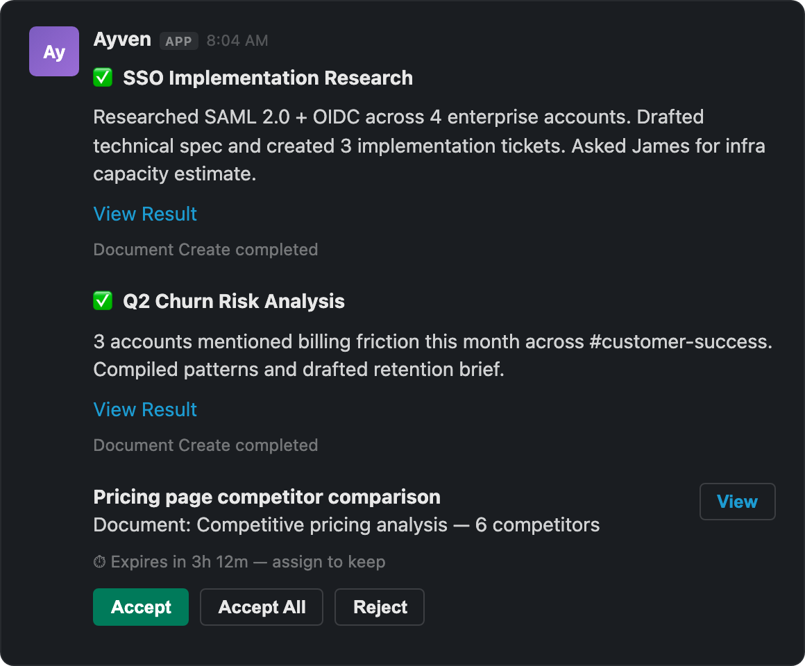
Ayven describes itself as the AI super coordinator that carries and drives your team's agenda. It works on Slack and Microsoft Teams: she reads what is due, asks the one person who can move it, hands off what she cannot do herself, and follows every piece through to Done, with a ticket changing only on its owner's yes. In practice that means Ayven observes the work, cuts it into pieces the team can take one at a time, puts an owner and a date on each, and files them in Jira or YouTrack. From there she runs, tracks and talks about the work for weeks — asking whoever knows, waiting, chasing silence and moving work when someone is away. Your team answers in Slack and the board moves. Ayven is aimed at the people who own outcomes for a team: the leads, executives and founders whose initiatives stall because no single person is explicitly holding the next step. Every open question in new territory has no obvious owner, and the ones nobody owns are the ones that stall. That is the problem Ayven is built around. A ticket that gates a launch passes its due date and quietly sits there. A question asked at six dies in the thread until tomorrow, and nobody counts the day it cost. Three days with no next step is a stall. When you are finding out, what was true on Monday is wrong by Wednesday, and someone has to ask around. Worse, the few people who can push into the unknown are the ceiling, and every new initiative waits on them. Teams that staff this kind of work hire a chief of staff at a $160,000 median base, which is the coordination burden Ayven is designed to carry instead. Ayven's first job is driving and delegating the work itself. She observes what is happening, cuts it into pieces your team can take one at a time, puts an owner and a due date on each, and files them into the board your team already uses, such as Jira, YouTrack or Asana. What she cannot do herself becomes a ticket with an owner and a due date, filed after you approve it, and she follows it until the board says Done. When work runs late, she keeps it moving: past its due date she asks the assignee on the ticket, then hands the work to a teammate who can carry it once you say yes. She also moves work when someone is away. Throughout, she tells whoever raised the work as it moves, so the person who reported a problem hears about it the moment the ticket changes. Ayven also asks the person who actually holds each answer. She sends the question to whoever can answer it — one person by direct message, or the channel when anyone can. Before she asks, she reads the relevant ticket or document, so she is checking rather than guessing. She takes 'no reply yet' as an answer, asks another person when one goes quiet, and tells the asker who answered. One example on the site shows her checking billing and finding that the annual discount is applied at invoice time rather than at checkout, so the demo bug is in checkout, not pricing — she found the answer in the code and asked no one. Another shows her checking competitor prices before putting a pricing decision to a person, because the call gates the pricing page. A third capability is that Ayven reads the tools you already run rather than asking you to move into a new one. She reads Slack threads before writing, reads the live Google Drive doc, and re-reads Notion pages before she acts. She reads a ticket's state and due date in Asana, watches a Jira ticket through to Done, reads the due date off a YouTrack ticket, and reads a GitHub issue's state and owner. She reads the live SharePoint file and can browse any Microsoft Teams channel on demand. She asks through Slack and Microsoft Teams, checks the ticket or the doc before she asks, and files or reassigns on the board only after you approve the exact change. Ayven is built to work over time and in the background, over months. A promised Thursday is a deadline she keeps, no ask is left waiting forever, and she follows up in step with the deadline. On the site she works to a morning clock at 08:00, tracks expiry windows, and comments on a ticket the day it passes its date. For a goal such as a launch by a given date, she reads the due date off the ticket, notes a blocker, and acts — commenting on the ticket the morning after it passes, emailing you if the launch projects past its date, and recomputing after every step. The stated outcome is that she warns you about a slip while you can still do something about it, rather than after the fact. The centre of Ayven's approach is that her messages and comments go out on their own, but a change to a ticket waits for your yes. She files work she cannot do as a ticket once you approve it, reassigns only on your yes, and is watched to Done without ever marking a ticket Done herself. Missions hold multi-week work: you give the outcome, she messages the people each step waits on, comments on tickets past their date, and files or changes a ticket after you approve the exact change. A reply on the ticket or a move on the board updates the mission automatically, so the record stays true without anyone re-explaining it. The benefits follow directly from that model. Because Ayven carries the asking, the following-up and the coordination between people, those things happen on their own instead of waiting on a human to remember them. Planning stops being the barrier, and the team ships its agenda faster. More gets done with the same team, because the few people who can push into the unknown are no longer the bottleneck for every unrelated step. Responsibility stays clear — every piece has an owner and a date — and you are told when a ticket you care about moves, and when something you own slips, with enough time left to act. Concrete scenarios appear throughout the site. An account executive reports that two prospects hit the checkout bug in demos; Ayven files it as a ticket to an engineer, due Thursday, watches it until the board shows Done, and tells the account executive as it moves. A senior executive asks for a summer team trip to be organised; Ayven asks four people one question each — dates, venue, headcount and budget — in direct messages. A finance, product and sales update becomes one assembled draft on Google Drive, filed on the requester's yes, with each team asked for its own numbers by a Thursday noon deadline. Late work is chased on the ticket, then handed to a teammate once approved, and a launch-gating ticket past its due date triggers a comment on the ticket the same day. Ayven runs on Slack and Microsoft Teams and integrates with Google Drive, Notion, SharePoint, Asana, Jira, YouTrack and GitHub, so it reads the tools a team already runs rather than replacing them. Its stated audience is teams that would otherwise staff this coordination work by hiring a chief of staff, whose median base is $160,000. Pricing starts with a free plan at $0 that includes 500 credits a month, every integration included, and no card required; a 15-minute demo can also be booked. There is no mention of a separate paid tier on the site, though the credit-based free plan implies usage is metered. Taken together, Ayven is a coordinator rather than a dashboard: it takes the outcome you give it, asks the one person who can move each step, files and tracks tickets to Done, and keeps every change behind your approval. Its value proposition is that the asking, the chasing and the coordination stop depending on a human remembering them — the board moves, the record stays true, and you hear about a slip while you can still do something about it.
OpenScreen is a free, open-source screen recorder and video editor for Windows, macOS and Linux that takes a raw screen capture and turns it into a finished demo. Its stated purpose is that a raw capture goes in and a finished demo comes out, in the category Screen Studio defined. It is aimed at anyone who records their screen — a founder demonstrating a product, a developer walking through a tool, a support person showing a workflow — and wants the recording to look finished without learning a separate editing suite. Both halves of the job live in one application: the recorder captures the screen, and the editor places zooms, restyles the cursor, dresses the frame, and cuts the video, including cuts described in writing and handled by an AI agent over MCP. Screen recordings usually look unfinished on the first take. The cursor is small, the frame is a bare rectangle of desktop, and the moment that matters — a button being clicked — scrolls past at normal speed. The usual fix is to re-shoot, or to move the file into an editing program and rebuild the framing by hand. OpenScreen's approach is to make the recording look good before you touch anything: a finished frame with wallpaper, padding, shadow, rounded corners and a little motion blur is applied by default, and zooms are planned from where you clicked. It is MIT licensed, with no watermark and no account, and it continues the original OpenScreen project, which its creator archived after v1.5.0. Recording is done with the operating system, not around it. You pick a window or a display, and OpenScreen uses the capture path the system itself provides: macOS goes through ScreenCaptureKit, Windows through Windows Graphics Capture, and Linux through PipeWire and the ScreenCast portal. System audio is captured without an extra driver, and Windows uses Media Foundation for webcam capture. The important technical detail is that the pointer is recorded as data rather than burned into the pixels, which is the only reason the cursor can be restyled later instead of being committed at record time. On macOS, cursor shape and clicks become available once Accessibility is granted. The editor is built around a small number of things you will actually do. For style, you can swap the background to an image, a colour or a gradient behind your recording with no re-shoot, set the background animation to none, Drift, Aurora or Waves, and apply background blur. For effects, padding, motion blur, shadow and roundness each composite live, so you frame it your way. For the cursor, size, smoothing, motion blur and click bounce are all adjustable, because every move should read on screen. Five cursor packs ship with the app — Studio Ink, Prism Glow, Pop Coral, Pixel Candy and Star Sprout — and each can be drawn as a 3D object with a shadow. Zoom placement is the headline editing behaviour. Zooms from your clicks means each take is zoomed where you clicked, by a fixed rule, with no AI and no network call, and it can be turned off in Record mode. On top of that sits a 3D camera: each zoom can stay flat, turn the screen left or right, or orbit it while following the zoom's focus, and depth of field softens the far side to add depth. Around the screen you can place a frame — a window, laptop, phone or screen, in light or dark — over an animated background. On the timeline, zooms, speed ramps, trims and comments each land as a pill, so one click places every zoom and the edit stays visible rather than hidden in menus. The transcript is a second editing surface. You edit video like text: delete a word or a silence and the cut lands on the timeline, and nothing is destructive, so the original material stays intact. Captions lean on the same idea. Transcription runs on your machine because whisper.cpp ships with the app; the model downloads once on first use, and after that it works with the network off across 100 languages. The audio never leaves the laptop, and what comes back is editable text — set the typeface, the size, the colour and the position, then burn it into the render. Webcam work is handled with layouts and segmentation. There are four layouts: picture in picture, dual frame, vertical stack, or no webcam at all. Full Camera gives a stretch of the timeline to the camera, so it grows to full screen and then eases back. Blur, cut out or replace is driven by a segmentation model that separates you from the room on your own computer, and nothing is uploaded. The same take can be framed for any aspect ratio — 16:9, 9:16, 1:1, 4:3, 4:5, 16:10 or 10:16. Blur regions, smooth or mosaic, as a rectangle, an oval or a freehand shape, can be drawn over an email, a key or a password before the clip is shared. Then there is the agent. You describe the edit and the agent makes it. The wizard places zooms by watching where your cursor went; the agent goes further by reading the actual transcript and the actual timeline, so it answers with timecodes you can go and check, telling you which spans it will cut and how much that saves. Every edit it makes is an ordinary undoable one, it needs a provider key you supply, and it is off by default — nothing runs until you connect one. Export writes the file on your machine, which is where the local-first promise is easiest to see. Output is MP4 from 720p up to source resolution, at 24, 30 or 60 frames per second, in H.264, or a GIF. The encode runs on your machine and counts frames while it does, so you can see progress rather than wait behind a queue. There is no account, no watermark, and the file is on disk when the bar fills. The outcome for users is a demo that looks deliberate without a second tool. Nothing is uploaded: recording, transcription and rendering all happen on your machine, and your video never leaves it. Text leaves only when you ask — the chat panel and caption translation each use a key you supply, and transcription downloads its 264 MB Whisper model once, on first run. Every feature ships free for personal and commercial use, with no paywalls, no premium tier and no usage caps. Because transcript cuts and agent edits are non-destructive, you can experiment without risking the take. The concrete workflows are the ones the product was built around. You record a product demo and let the zooms fall where you clicked, as in the walkthrough showing a soil sensor being paired in the Fern garden app: no app store, no account, the probe talks to the laptop, and the whole thing took forty seconds — with the dead air still to be trimmed. You trim that dead air by deleting words and silences in the transcript instead of scrubbing a timeline. You cut a vertical or square version of the same take for a social post without recording again. You mask a key, an email or a password with a blur region before sharing a support clip. You let the agent read the transcript and propose which spans to cut, with timecodes you can verify. And you burn subtitles in whatever language the audience needs. OpenScreen runs on Windows, macOS and Linux from one source tree with native capture on each. Distribution is broad for a free tool: a Microsoft Store listing, a .dmg, a .exe, a .deb, a .rpm, a .pacman, an AppImage and a Nix flake, with a signed and notarized macOS build — the Windows .exe is not code-signed, so SmartScreen warns before it runs. The interface is available in 15 languages: English, Arabic, Czech, German, Spanish, French, Italian, Japanese, Korean, Russian, Turkish, Vietnamese, Brazilian Portuguese, Simplified Chinese and Traditional Chinese. The tech stack leans on the platform: ScreenCaptureKit, Windows Graphics Capture, PipeWire, Media Foundation and whisper.cpp for local transcription, with H.264 encoding on the way out. The takeaway is straightforward. OpenScreen is a free, open-source screen recorder and video editor that makes the first take look finished, keeps the whole pipeline on your machine, and leaves the tedious part of editing — placing zooms, trimming dead air, cutting spans — to rules, transcripts and, if you want it, an AI agent you connect with your own key. No watermark, no account, MIT licensed, and every edit reversible.
kōdlo is an AI-native sales workspace for high-ticket B2B teams. It finds prospects that fit your ICP, tells you how to warm each one up, and writes the message, the offer, and the deck from your own documents. Instead of stopping at a list, the workspace carries a deal through the full cycle: ICP interview, lead sourcing, list enrichment, deep research, cited brief, personalized outreach, pipeline update, campaign content, and closed deal. Your team tracks clients, contacts, and tasks in the same place, so nothing gets lost between steps. An agent sits on every page, and a shared memory layer means the research, outreach, and CRM capabilities never start from zero context. The product positions itself as the AI workspace for sales, built around one source of truth. Most sales tooling solves one slice of the cycle. As the site itself puts it, other sales tools hand you a list and stop. The gap is everything that comes after: understanding whether a prospect genuinely fits, finding the public signals that show how to approach them, writing outreach that sounds like you, and keeping the pipeline current while you do it. When each of those steps lives in a different tool, context fragments — the reasoning behind a lead, the sources behind a claim, and the history of a relationship all get scattered. kōdlo addresses this by holding your ICP, your contacts, your campaigns, and every brief the agent has written in one place, so prospects arrive with their signals and sources attached and stay that way. kōdlo's outbound loop starts with the ICP Builder, an interview-style setup where the agent builds your ideal customer profile with you. From there the Lead Discovery agent hunts for leads that match it, and each lead is backed by real signals rather than a guess. Those signals are drawn from public record sources the site lists explicitly: press releases, patent filings, job postings, trademark registries, conference programs, public funding rounds, open repositories, public LinkedIn pages, podcast transcripts, tender notices, Companies House, and SEC EDGAR. Every signal is cited to its source, so you can check for yourself that the fit is real. A list enrichment step sits between sourcing and research, filling out the records that discovery produces before the agent goes deeper on them. Deep research turns every account into a cited brief. The agent plans the question, runs the searches, cross-checks what it finds, and cites every source — on screen, step by step, while it happens. That visible trace (ask, plan, search, cross-check, cite) is what lets you see exactly where the agent went wrong when it is wrong. Research draws only on public sources, and every record carries the links it came from. The site notes that the record is live and re-indexed hourly, and that the lawful basis for processing is legitimate interest, documented. The result is a brief you can verify rather than a summary you have to trust, which matters a great deal when the account in question is a high-ticket deal where a wrong assumption is expensive. Outreach goes out personalized over LinkedIn or email and is drafted in your tone of voice. What makes it specific is the Knowledge Hub: you upload product catalogues and other documents, the hub parses them with OCR, and the agent turns them into personalized messages, offers, deep searches, and decks. The Knowledge Hub holds up to 1,000 pages on the Starter edition and up to 10,000 pages on Pro. On the closing side, pitch decks and proposals generate from your own template, so a deal that advances or closes turns into campaign content that keeps the account warm. Documents and attachments that arrive through the inbound lane are parsed and made queryable in the same workspace. The workspace pairs tools and agents on one shared context. On the tool side sit the capabilities your team works with every day: outreach, web intelligence, the Knowledge Hub, and CRM operations. On the agent side sit deep research, lead discovery, content and slide-deck generation, and scheduled automation jobs. Everything sits on a single memory layer made up of short-term memory, long-term session-wise memory, and user profiling memory, so no capability and no agent ever starts from zero context. The CRM and contact management keep the pipeline current, holding companies as an entity layer, people in each role, and the industry they move in. A ticket system handles inquiries, replies are grounded in Knowledge Hub citations and the memory of past threads, and Telegram and Google Chat connections deliver follow-ups and digests. Pro adds long-term session memory and agent learning. The stated outcome is continuity: each step feeds the next because they all run on the same data. Open a contact six weeks later, ask "what's next?", and the agent answers from the record it built — grounded in their public profile, their company news, and your own history with them. On the data side, the promise is that you pay for signal rather than seats: no per-contact charges and no data add-ons. Your data stays in your workspace, under GDPR, CCPA, and global privacy standards, with sourcing the site describes as GDPR-clean. Two workflows are described in detail on the site. In the outbound loop, you define the play with an ICP block, the Lead Discovery agent discovers leads, deep research qualifies prospects with cited briefs, and personalized LinkedIn and email outreach goes out in your tone of voice; the flow ends in a close-and-retain stage with pitch decks, proposals, and scheduled check-ins, and wins and losses feed back to refine the ICP. In the inbound lane, incoming inquiries become contacts and tickets with attachments parsed and queryable, every reply is grounded in Knowledge Hub citations and past threads, follow-ups and digests reach you in Telegram and Google Chat, and pitch decks and proposals generate from your own template. Closing and retaining run in the same workspace as the hunt. kōdlo is aimed at high-ticket B2B sales work: solo reps ready to work a real pipeline, small teams sharing one workspace, and organizations whose needs do not fit a standard plan. Pricing runs across three editions. A free tier offers a seven-day trial with one seat, the agent-native workspace, ICP Builder and Prospect Finder, integrated web and deep research, CRM and contact management, Knowledge Hub with OCR, cited deep research briefs, Telegram and Google Chat connection, and the ticket system. Starter is $49 per month plus VAT (about $43 per month on quarterly billing, a 15% saving) for one seat and Knowledge Hub OCR up to 1,000 pages. Pro is $199 per month plus VAT (about $169 per month quarterly) for up to three seats, workspace collaboration features, 4x month limits, long-term session memory, agent learning, and OCR up to 10,000 pages. An Enterprise edition adds custom AI agents built around your workflow, custom integrations, SSO and advanced security, SLA, DPA and procurement support, dedicated onboarding, and an optional bring-your-own-API-key option. Claude Desktop, ChatGPT Work, or your code agent can connect with kōdlo MCP to scale and orchestrate contexts. kōdlo's core proposition is an end-to-end sales workspace with unified context: one record that finds the prospect and answers the inquiry that arrives without one, one memory that every tool and agent shares, and one place where the ICP, the briefs, the outreach, and the pipeline live together. For high-ticket B2B teams, that means the research behind a lead is cited and checkable, the outreach is written from your own documents and in your voice, and nothing gets lost between the steps of the cycle.
HireKey is a recruiter-informed AI job-search co-pilot designed to help people apply strategically and interview with confidence. It brings the entire job search into a single workspace: assessing how well a candidate fits a role, tailoring a resume to a specific job description, preparing answers out loud with an interactive AI voice coach, drafting cover letters, researching companies, and tracking every application and next step. HireKey is built for professionals applying to competitive roles, including engineers, product managers, designers, data professionals, marketers, sales professionals, and operators. Its stated purpose is to help job seekers see their next move more clearly — to understand their fit, apply with purpose, practice the conversation, and keep moving forward instead of sending applications and hearing nothing back. Much of the frustration HireKey addresses is captured in its own framing: sending applications, hearing nothing, and not knowing where to focus. The platform is informed by the other side of the hiring process, drawing on ten years of tech recruiting experience at Microsoft, Amazon, and Stripe. HireKey explicitly warns that a high ATS score may not lead to interviews and that a score or recommendation cannot predict an employer's decision, so the product takes a different angle. Instead of promising a prediction, it aims to explain which gaps need clearer communication and which need actual experience. That distinction shapes every feature — from role-fit analysis to resume tailoring — and gives candidates a clearer reason to apply, improve, or move on. Role-fit analysis compares a resume with a specific job description. It separates the experience a candidate can genuinely support from the wording of the resume itself, showing where the evidence is strong, what needs a clearer explanation, and where there may be a genuine gap. HireKey assesses role fit and resume impact separately and explains the evidence behind each assessment, so users can understand their strengths and gaps and decide where to focus their effort. A companion free tool, the recruiter resume review, checks a resume on its own for positioning, evidence, scan visibility, and seniority signals; it requires no account, and the free checker processes the resume on the user's device. The distinction matters: the free checker looks at the resume alone, while role-fit analysis in HireKey compares documented experience with a specific job description. Resume tailoring turns vague bullets into a clearer account of what a candidate actually did, bringing the experience that matters for the role to the front. Users review original and tailored wording side by side, so they can see what changed and why each revision clarifies their contribution and impact. HireKey keeps the candidate in control: the final say over every change stays with the user, and tailoring is intended to make real experience clearer and more relevant rather than to invent qualifications, results, or responsibilities. It should not turn a contributing role into ownership the candidate did not have, and every revision is meant to be reviewed before use. Cover letters follow the same principle — a draft grounded in the user's background and the specific job, connected to the opportunity and given the user's own voice before it is sent. Interview preparation centers on an interactive AI voice coach. Candidates work through their answers in a live audio conversation on their own schedule, choosing questions for a recruiter screen or a hiring-manager conversation, or adding their own. The coach asks follow-up questions based on the answers given, so practice feels like a real conversation rather than a script; it also provides feedback during practice and a debrief on what to improve. For those who prefer preparing on paper, HireKey can save role-specific questions and answer guidance as a PDF. Company research briefs build context before an interview, turning what the candidate learns into more specific questions and a clearer reason for their interest. Together these features aim to give job seekers a clearer story for their application and better context for the next conversation. The job application tracker keeps every opportunity in one place, from the first application to the final interview. Users can see their whole pipeline in either a table or a Kanban view, with stages covering Not Applied, Applied, Phone Screen, Interview, Offer, Rejected, and Withdrawn, and keep stages, deadlines, notes, and follow-ups together rather than scattered across spreadsheets. Each opportunity stays connected to the preparation that supports it. Overall, HireKey describes a simple loop: find your fit, apply, practice, and keep moving. Role-fit analysis informs the decision to apply, resume tailoring and cover letters shape the application, the AI voice coach and company research briefs prepare the conversation, and the tracker keeps the whole search moving forward with a visible next step. The benefits HireKey claims are visibility and confidence at each stage of the search. Candidates know their fit before they apply rather than guessing; they can tailor a resume to the role so their contribution and impact are easier to see; they can practice out loud and receive real-time interview feedback before the interview counts; and they can track every application and next step without another spreadsheet. Because assessments are explained with evidence, users can separate a genuine experience gap from a communication gap and decide where to spend their effort — apply, improve, or move on. The result the site describes is a search with a clearer plan: understanding fit, applying with purpose, practicing the conversation, and keeping momentum instead of sending applications into silence. Concrete scenarios map closely to that four-step workflow. A candidate finds a job posting they are excited about and runs role-fit analysis to compare their resume against the job description, seeing where the evidence is thin. If the role is worth pursuing, they use resume tailoring to review original and tailored bullets side by side and confirm what each rewrite clarifies, then draft a cover letter connected to that opportunity. Before a recruiter screen, they practice out loud with the AI voice coach in recruiter-screen mode, receive feedback and a debrief, and save role-specific questions and answer guidance as a PDF. Company research briefs prepare them to ask more specific questions. Throughout, the tracker shows which applications sit at the Not Applied, Applied, Phone Screen, Interview, Offer, Rejected, or Withdrawn stage, and what follow-up comes next. HireKey is built for professionals applying to competitive roles, including engineers, product managers, designers, data professionals, marketers, sales professionals, and operators. It is available on the web, and users can start with a free plan. Free costs $0 per month and includes 5 resume tailoring sessions, 5 interview practice sessions, 2 live voice coaching sessions, 5 cover letters, 5 company research briefs, and unlimited job application tracking in the dashboard. Premium costs $39 per month for candidates actively applying, interviewing, and preparing for competitive opportunities, and includes 50 resume tailoring sessions, 50 interview practice sessions, 10 live voice coaching sessions, unlimited cover letters, unlimited company research briefs, unlimited job application tracking, plus Pipeline Intelligence and Application Insights. Premium can be selected after sign-in and onboarding under Settings > Billing, and additional credits are available: 5 voice sessions for $9.99 and 15 resume tailors for $9.99. The free checker and the full app have different data workflows; the free checker processes the resume on the device, while the app uses the information provided to deliver its features. For job seekers tired of sending applications and hearing nothing, HireKey's value proposition is a clearer plan informed by a recruiter's perspective: understand your fit, apply with purpose, practice the conversation out loud, and keep moving forward. It does not promise to predict an employer's decision; it aims to make the experience a candidate already has easier to see, explain, and prove — and to keep every opportunity connected to the preparation behind it.
Baby Desk is a macOS app that turns your Mac into a full-screen playground for a baby or toddler while your work stays exactly where you left it. The product's own summary is blunt about its priorities: the point isn't the fun, it's the wall. With one Accessibility permission, Baby Desk intercepts input at the system level — before macOS or any other app can see it — so every keypress, click and scroll lands on the play screen instead of on your documents, windows or applications. It is built for parents and caregivers who work on a Mac at home and need a few safe minutes, not a separate device to hand over. A small child's hand on an open keyboard is unpredictable in the most expensive way. The website lists the shortcuts that routinely threaten an afternoon of work: ⌘Q quits the front app, ⌘W closes a window, ⌘Tab switches applications, ⌘Space opens Spotlight, ⇧⌘3 takes a screenshot, and ⌥⌘⎋ can trigger force quit. Media and volume keys, plus every click and scroll, are just as easy to trip. Baby Desk exists to make those inputs harmless: dangerous shortcuts are swallowed whole rather than merely covered up, which is why the product leads with safety rather than entertainment. Input interception happens at the system level. Baby Desk asks for a single Accessibility permission, and that permission is what lets it swallow keystrokes before macOS acts on them. Because interception happens ahead of the operating system and any other app, protection is not limited to one window or one application — it applies across the whole machine while the play screen is on. Multi-display setups are fully covered as well, so an external monitor becomes part of the playground instead of a gap in the wall. The permission is used only while the play screen is active, and a friendly onboarding walks users through granting it. On screen, Baby Desk offers three ways to be completely mesmerized. The first is Starlight Keyboard: every key pops a giant letter or emoji accompanied by its own xylophone note. Those notes are tuned to a pentatonic scale, so even chaotic mashing sounds lovely rather than jarring, and fast mashing earns fireworks as a reward. The second is Sparkle Drawing, where the mouse paints a glowing rainbow trail that lingers on screen. These are real drawings that stay long enough to be admired and then gently fade away, turning random pointer movement into something that looks intentional. The third mode is Balloon Pop. Balloons drift up the screen and any key or click pops them in a burst of confetti. The supply is endless, so the game never runs out and the giggles keep going for as long as the session lasts. Together, the three modes share one underlying idea: the keyboard and mouse still feel responsive and rewarding, but everything they produce stays inside the playground. Nothing typed here can reach a document, a draft or a chat window, and nothing drawn here can alter a file. Getting out of the playground is deliberately harder than getting in. A parent gate requires the secret exit shortcut ⌘⌥⇧L, or alternatively holding any screen corner for three seconds. From there, an optional second factor — Touch ID or a PIN — makes sure a lucky mash can never unlock the Mac by accident. A play timer can be set to 1, 3 or 5 minutes, after which a calm "that's all for today" screen ends the session. A volume cap and dim mode keep the stimulation gentle, and system volume itself is never touched. Baby Desk is honest by design about what it cannot do. No software can intercept the hardware power button, a forced shutdown, or some system trackpad gestures, and rather than pretending otherwise the app shows the exact protection level in force: Full protection when Accessibility has been granted, or a clearly-labeled partial mode without it. There are no surprises in either state, and the app still works in partial mode if the permission is refused. This transparency is presented as a feature in its own right — the product would rather show you what it covers than overstate its guarantees. The overall approach explains why Baby Desk is not on the Mac App Store. The App Store requires sandboxing, and a sandboxed app cannot intercept system-level input, which is the entire point of the product. It therefore ships directly, signed with a verified Apple Developer ID and notarized by Apple, the same way pro tools like keyboard remappers are distributed. The result is a single-purpose utility with a narrow, well-defined job: hold a system-wide wall for a bounded amount of time, then hand the Mac back untouched. Requirements are macOS 13 Ventura or later on Apple Silicon or Intel, with the interface available in English, Korean and Japanese, following your system language. The benefit is measured in ordinary parental currency: minutes. When playtime ends, your desktop comes back exactly as you left it — same windows, same focus, same volume. Input never reached other apps in the first place, so there is no cleanup, no lost draft, no relaunched application and no reopened tabs. The site frames the trade plainly: trade five minutes of chaos for five minutes of wonder. For a working parent, that means the Mac can be shared with a curious toddler without becoming a liability, and a 1, 3 or 5 minute timer gives the session a natural, calm ending. Typical scenarios follow directly from that design. A parent working from home can set the play timer and let a baby mash the keyboard while an important document stays open and untouched. Someone with a multi-display desk can extend the playground across an external monitor, so a child reaching toward the second screen finds the same protected surface. A one-minute session suits a quick distraction, while five minutes covers finishing an email or a call. In every case the wall is the product: the Mac remains a Mac underneath. Baby Desk is aimed at parents and caregivers who work on a Mac and need their machine to survive tiny hands, including users running multi-display setups and those who choose to run in clearly-labeled partial mode instead of granting Accessibility. The interface follows your system language and is available in English, Korean and Japanese. Pricing is a one-time purchase described as yours forever: $1.99 during the launch offer and $4.99 regularly, bought directly from the developer rather than through the App Store. A demo is available on the website to try before buying. Baby Desk's primary value proposition is narrow and clear: it is a wall, not a toy. By intercepting input at the system level with a single Accessibility permission, it swallows ⌘Q, ⌘W, ⌘Tab, Spotlight, screenshots, force quit, media keys and every click and scroll before macOS or any other app can react. Stars, xylophone notes, rainbow trails and confetti balloons keep little hands busy on every display, while a parent gate, optional Touch ID or PIN, a play timer, volume cap and dim mode keep the session controlled. When playtime ends, your work is exactly where you left it.
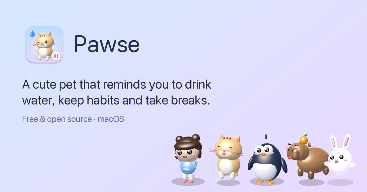
Pawse is a free, open-source macOS menu bar app that reminds you to drink water, keep your habits and take breaks. Instead of firing off a notification, Pawse sends a small 3D pet walking onto your screen to ask you a simple question: "Did you drink water?" or "Did you stretch?" You answer yes or not yet, and the pet reacts — bouncing with joy when you say yes, and drooping, sniffling and floating back a little later when you say not yet. Everything lives quietly in your menu bar until it's time to care, and the app covers water tracking, habit reminders on any interval and screen-time breaks in one place. Most reminder apps rely on notifications, and notifications get swiped away. Banners get muted. Reminders get ignored. Pawse's answer to that problem is character: as the site puts it, it is really hard to say no to someone small and hopeful who walked all the way across your screen just to ask if you're okay. That framing shapes everything about the app — a reminder that has a face, a mood and a voice is harder to dismiss than a grey banner. Instead of adding another alert to silence, Pawse turns hydration, stretching, eye rest and screen-time breaks into small moments you answer directly from your screen. The water tracker is built around a daily goal and a glass size you set yourself. Your pet visits you on your schedule and only during your active hours, and it stops once you hit your goal. A one-click log makes answering trivial: the "Yes!" button records the glass, the counter advances (for example 2/8, then 6/8 glasses today), and the pet reacts. Pawse tracks streaks and shows a month calendar so you can see consistency at a glance. The progress view shows a partially filled glass alongside your streak — the site's example shows a 75% full glass and an 11 day streak, and the sample day-in-the-life ends with 8/8 glasses and a streak that grows to 12 days. Habits can be anything on any interval. Stretch every 30 minutes. Walk every 45. Rest your eyes every 20. You create a habit with an emoji and a goal, and your pet asks about it — and the habit list shown on the site includes drinking water, stretching, resting your eyes, taking a break, fixing posture, going for a walk, breathing and taking a pawse. Each habit has its own interval and its own pet reminder, so a 30-minute stretch habit and a 45-minute walk habit can run side by side. Habit tracking includes streaks and a monthly calendar, and the habit detail view shows the streak and the calendar together, so you can see which habits you are keeping and which ones are slipping. Screen time is measured from active use and it pauses automatically when you step away. After 30 minutes of continuous screen time — adjustable, since the default break rhythm is 30 minutes but can be changed to anything — Pawse shows a calm full-screen break with tips such as the 20-20-20 rule for resting your eyes. Stepping away for 3 minutes counts as a break automatically, so a genuine pause is recognised without you having to log it. The screen-time section includes an hourly chart, auto-pause, a daily limit and 20-20-20 tips. Summaries show figures such as 4h 28m of screen time today and 4 breaks taken, and the screen time area also offers hourly and weekly charts, so you can see when your heaviest screen use happens and whether your breaks are keeping pace with it. Hard block is the optional serious mode. For the habits you're serious about, the pet covers the whole screen and it only unlocks when you say yes — for water, for any habit, or for breaks. Breaks in hard block cannot be snoozed or ended early, which is the point: no snooze, no excuses. It can be enabled per habit, and locked breaks are part of the same mechanism. Because that could be frustrating if something urgent comes up, Pawse builds in an emergency exit: hold Esc for 5 seconds and the screen unlocks, described in the app as the only way out, with a "Done!" confirmation for the habit you completed. Pawse ships with five hand-built 3D pets, each with its own walk, voice and personality, and each with moods you can tap. Momo is the chatty chibi, who has a real voice, offers you a water bottle and takes a big sip when you do. Mochi the Cat has a tail that swishes, ears that twitch and a meow you won't want to ignore. Pip the Penguin waddles in and flaps both flippers when you drink. Yuzu the Capybara is calm, chill, and carries an orange on its head, squeaking softly. Boo is a gentle ghost bunny that floats in with ears streaming. If you want something else entirely, you can drop any .usdz 3D model into Pawse and use it as your pet. Pawse is a menu bar app with one window for your whole day: a Today dashboard, a Habits view and a Screen time view. The Today view gathers water, screen time and habits together so you can see the day at a glance, and the app is designed to live quietly in the menu bar until it is time to care. Privacy matters here: Pawse makes no network requests and has no analytics or accounts, so your history stays on your Mac. The site puts it bluntly: 0 network requests, your data never leaves your Mac. For screen time, Pawse reads only how many seconds ago you last pressed a key or moved the mouse — never what you type or which apps you use. A day with Pawse, as described on the site, starts at 9:00 when Momo walks in with a bottle before your first meeting and asks "Good morning, water?" At 10:30 your 30-minute stretch habit fires and Mochi waits for an answer: "Did you stretch?" At 12:00, after 30 minutes of screen time, break time arrives as a calm countdown with your eyes off the screen. At 15:00, if you answer "Not yet?", Boo droops, sniffles, and floats back a little later rather than nagging. At 18:00 the goal is reached — 8/8 glasses, 4 stretches — and your streak grows to 12 days. That rhythm makes Pawse useful for anyone who spends long stretches at a Mac and forgets to drink water, sits too long without stretching, or needs a nudge to rest their eyes, and it can be turned up with hard block for the habits you're serious about. Pawse runs on macOS 13 Ventura, macOS 14 Sonoma, macOS 15 Sequoia and newer, on both Apple silicon (M1, M2, M3, M4) and Intel Macs, as a universal download of about 5MB. On first launch, if macOS can't verify the developer, you right-click Pawse in Applications, choose Open, and confirm Open. Pawse is completely free, with no ads, subscriptions, in-app purchases or accounts, and it is open source under the MIT licence. The site states the price as $0 forever, and there are no paid tiers or plans to compare — the only cost mentioned anywhere is nothing. The takeaway is simple: Pawse takes the three things people most often neglect at a desk — drinking water, keeping small healthy habits and taking breaks from the screen — and hands them to a small, hopeful 3D pet that walks across your screen and asks. Because it is a Mac menu bar app with no network requests, no accounts and no price, it adds care without adding another subscription or another notification to swipe away. Free forever, open source, and living quietly in your menu bar until it's time to care.