Category Focus/categories/design
Design AI Tools
Discover and compare the best design AI tools and software. Browse 177+ curated tools with reviews and rankings.
Projects tracked
177
Sort mode
RECENT
Page
2
Discover and compare the best design AI tools and software. Browse 177+ curated tools with reviews and rankings.
Projects tracked
177
Sort mode
RECENT
Page
2
Circle Panel is an AI-native user research platform that lets teams plan, recruit, interview, analyze and share user research in one place. Its stated purpose is to turn raw research sessions into decision-ready insight, and it is explicitly built for everyone who talks to users: product managers, designers, researchers and market research teams. The platform runs in Arabic and English, and it presents itself as end to end, covering the whole path from defining a study to publishing what was learned. Rather than separating scheduling, recording, transcription and synthesis into different products, Circle Panel keeps the entire workflow inside a single workspace so that no stage of a study needs a subscription of its own. The problem Circle Panel sets out to solve is fragmentation across the research workflow. As the site describes it, teams routinely pay for a separate tool at every step: booking links for scheduling sessions, call recorders for capturing them, transcription apps for turning speech into text, and note documents for synthesis. Each of those stages traditionally carries its own subscription, and every hand-off between them costs time and context. Circle Panel folds booking links, call recorders, transcription apps and note docs into one flow, drawing a comparison with tools such as Notion, calendar apps, Calendly, Miro, Zoom, Otter and forms. The benefit it promises is that teams spend less time switching between tools and more time doing research, with no stage of a study requiring its own subscription. The first two steps of the five-step workflow cover designing a study and reaching participants. Instead of building a plan by hand, you describe in plain language what you want to learn, and Circle Panel's AI pulls proven frameworks from a knowledge base spanning 100 industries before drafting your goals, your discussion guide and your screener questions. The site states that a study can be set up in around 30 seconds, with the study plan, discussion guide and participant screener ready to launch or refine. Recruitment then works in two ways. You can share a branded booking link with your own users, or use the built-in participant panel. People book their own slots and are screened automatically against your criteria, which removes spreadsheets and back-and-forth. Screener questions filter people automatically, and incentives are handled inside the platform. Step three is running the interviews themselves. Every session is conducted with a structured, AI-generated guide, and live transcription captures every word in Arabic and English. The bilingual support extends to code-switching within a single session, meaning a participant can move between both languages and the transcript keeps up. Transcription, AI summaries and insight generation all run in Arabic and English. Live transcription is framed as a way to stay present in the conversation instead of splitting attention between listening and note-taking, and the platform includes a conference room so sessions can run at scale. Step four turns sessions into findings. AI groups patterns across sessions, pulls out the strongest quotes and ranks findings by frequency, which the site describes as turning hours of analysis into minutes. This analysis layer is the AI debrief, themes and insight ranking capability. Step five is about accumulation: every study is saved to a searchable repository, and past findings, personas and reports resurface automatically when you plan your next study. Instead of research being archived and forgotten at the end of a project, each new study starts with the context of what the team already learned, so a research repository becomes a working asset rather than a storage folder. Circle Panel's overall approach is described as five steps from question to insight, with AI handling the setup, screening and synthesis so that the researcher stays focused on the conversation. The company describes itself as AI-native and says it applies enterprise-grade controls at every step. On data handling, sessions are encrypted in transit and at rest. Enterprise plans add SSO/SAML, audit logs, a 99.9% uptime SLA and Arabic data residency in the MENA region. Pricing is tiered and published on the site: Starter, Pro and Business plans, a 14-day free trial on all paid plans with no credit card required, and 20% savings on annual billing. A custom Enterprise tier is also referenced. The outcomes the platform claims are tied to each role. Product managers get actionable findings the moment a session ends, ready to shape the next sprint rather than the one after it. Designers can put a prototype in front of real users this week and watch exactly where they hesitate. Researchers get screening, scheduling and transcription in one place so their time goes to analysis. Market research teams can reach verified segments across MENA in Arabic or English without having to build a panel first. More broadly, consolidating the workflow means fewer tools to juggle, less manual analysis, and research findings that persist and resurface instead of being lost between projects. Concrete use cases follow from those roles. A product team running continuous discovery at scale can keep multiple studies live at once, with the Pro plan allowing unlimited studies and 25 sessions per month. A solo researcher running regular studies can work within the Starter plan's two active studies and ten sessions per month. Design teams use the platform to test prototypes with real participants and observe hesitation points. Market researchers use the built-in participant panel to reach verified segments across MENA in Arabic or English without building a panel first. The platform also lists the industries it works with: healthcare, fintech, e-commerce and travel research, noting that it adapts to how a given industry runs user research. Circle Panel is aimed at four broad groups: product managers, designers, researchers and market research teams, plus the wider set of people who talk to users. Pricing starts at $29 per month for solo researchers on the Starter plan, $49 per month for product teams on Pro, and $119 per month for organizations that need the full research operations platform on Business. Starter includes 20 AI credits per month, two active studies, ten sessions per month, three seats, the AI study builder, a recruitment link and conference room, and full public share links. Pro adds 50 AI credits per month, unlimited studies, 25 sessions per month, ten seats, plus AI debrief, themes and insight ranking. Business includes 100 AI credits per month, unlimited seats, everything in Pro and priority support. Circle Panel's value proposition is a single, AI-native workspace for the whole user research cycle: plan, recruit, interview, analyze and share. It removes the need to stitch together booking links, call recorders, transcription apps and note documents, supports Arabic and English throughout, including code-switching within a single session, and keeps every study in a searchable repository that feeds future research. With plans starting at $29 per month and a 14-day free trial, it targets everyone from solo researchers to teams running continuous discovery, with enterprise-grade controls and MENA data residency available at the top tier.
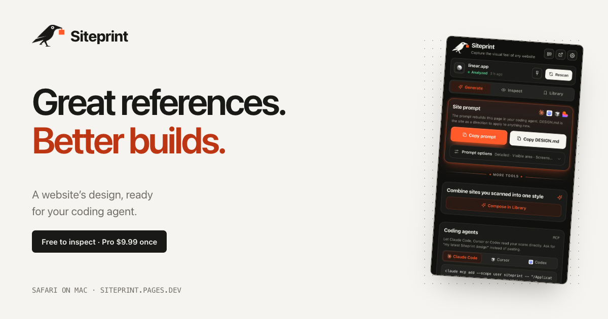
Siteprint is a Safari extension for Mac that measures the design of any website and turns what it finds into one exact prompt for a coding agent. Open a page in Safari, click the crow in the toolbar, and Siteprint reads the page's colors together with their roles, its type scale, spacing, corners and layout. From that measurement it produces a single prompt that can be pasted into Claude Code, Codex, Cursor, Lovable or any other AI tool, which then builds a new page from those values. It is made for designers, developers and founders who find a design they love and want their AI to work from measured values rather than guesswork. The extension runs on your Mac, with no account, no tracking and no uploads. The problem Siteprint addresses is that design inspiration is trapped in the browser. You find a site whose colors, type and spacing feel right, but the usual way to pass that look to an AI coding agent is to describe it in words. Words do not carry hex codes, font sizes or spacing scales, so the agent improvises: colors that are close but not the same, type at the wrong scale, layout that drifts away from the reference. Siteprint replaces that guesswork with measurement taken directly from the page. Instead of describing a design in vague terms, you hand your agent the values the page actually uses. Siteprint frames this as real values, not vibes, and that framing is the core of the product's purpose. The free Inspect view is where the measurement becomes visible. It shows the palette of the page with each color's role, the font families and the typography in use, and a blueprint of every section on the page. Alongside that, Siteprint includes an eyedropper and a grid overlay so you can check individual colors, spacing and alignment directly in Safari. Inspect, token export and the Library are available without paying, which means you can measure any site and study its design system before deciding whether you need the rest of the workflow. Generate is the Pro step that turns a scan into something your coding agent can use. It copies one prompt containing the exact values Siteprint measured, and it can also copy a DESIGN.md file. Themes are part of Pro as well. The published example DESIGN.md shows what the output looks like: a design direction section with canvas, surface, text and muted colors as hex values, a type section listing a display size at a specific weight and a body size at a specific weight, and a shape section listing corner radii. That file is the same kind of artefact you would normally assemble by hand from a browser inspector, and Siteprint produces it from a single click on the page. Compose is the second Pro capability and it is the one that goes beyond copying a single reference. Compose mixes two saved sites into a new style, so a palette from one design can be combined with the typography and layout of another. The product's own illustration of this is mixing Stripe's colors with Linear's type and layout. Because both sites have already been scanned and stored in your Library, the values are exact on both sides of the mix rather than approximated. This gives you a way to build a hybrid design direction that no single reference site could provide, while still keeping every value grounded in a real, measured page. For teams that work with coding agents, Pro also lets your AI read your scans directly. In the extension you open Generate, then Coding agents, and follow the setup for Claude Code, Cursor or Codex. On Macs that have Apple Intelligence, Siteprint additionally reviews each scan and answers your questions about the design, for example how to match a particular site's look. Apple Intelligence is optional: Siteprint states that everything works without it, and it is simply an extra layer of review and question answering on machines that support it. Siteprint itself does not build the site; it measures the design, and your coding agent builds from the prompt. The overall workflow is deliberately short. Siteprint describes it as three clicks: open any site, click the crow, and paste into your AI. Getting set up takes about a minute: get the extension from the Mac App Store, turn it on in Safari Settings, and click the crow on any site. Everything happens locally on your Mac, which is why the product can promise no account, no tracking and no uploads. There is nothing to sign up for and nothing leaving your machine, which matters when the pages you are measuring are client work, unreleased designs or internal tools. The benefit for users is that a design reference stops being an inspiration image and becomes a set of exact values an agent can act on. You no longer eyeball a hex code, guess a type scale or describe spacing in words, and you no longer accept output that is merely close to the reference. Because the prompt is generated from measurement, the design direction you hand to Claude Code, Codex, Cursor, Lovable or any other AI is consistent and repeatable. And because the pricing model is buy once rather than a subscription, the tool is a one-time purchase that keeps working. Concrete scenarios follow directly from the workflow. You might see a site whose palette you like and scan it to get the exact colors with their roles, then ask your agent to build a completely different product page using that palette. You might scan Linear and ask your coding agent to build a pricing page in that design direction, using the copied prompt or the DESIGN.md file. You might use Compose to mix Stripe's colors with Linear's typography and layout for a hybrid style. You might export tokens to carry a measured design into your own system, or open the blueprint in Inspect to study how a page structures its sections, spacing and corners before writing anything. On a Mac with Apple Intelligence you can also ask the design questions and get answers grounded in the scan. Siteprint is a Safari extension for Mac and requires macOS 14 or later. It is not available for Chrome or iPhone yet. It is aimed at designers, developers and founders, and specifically at anyone who uses an AI coding agent such as Claude Code, Codex, Cursor or Lovable, or any other AI that can take a prompt. The free tier covers colors, type and layout measurement, the eyedropper and grid overlay, token export and your Library. Pro costs $9.99 as a one-time purchase and adds one exact prompt, DESIGN.md and themes, mixing two sites with Compose, and agent access so your AI can read your scans. Support and the setup guide are available through the site, and feedback goes to the product's support email address. The takeaway is that Siteprint turns a design you admire into precise, measured instructions your AI can build from. By measuring colors with their roles, type scale, spacing, corners and layout inside Safari and packaging them into one exact prompt, it removes the guesswork that normally sits between a reference site and a new build. Free to inspect, $9.99 once for the full prompt workflow, no account and no uploads: Siteprint gives your coding agent real values instead of vibes.
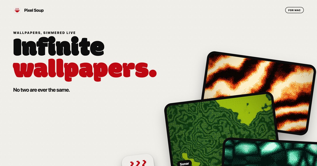
Pixel Soup is a Mac app that generates dithered wallpapers on your own GPU. Each wallpaper is made from a shape, a palette, a dither style and a seed, and it can sit still as your desktop picture or keep drifting gently behind your icons at a speed you choose. The app is for Mac users who want a desktop that looks distinctive without hunting for images elsewhere: Pixel Soup makes the wallpaper for you, in the style of dithering, and no two results are ever the same. A small handle sits on the edge of your screen, and clicking it opens the editor, so there is no Dock icon and no window in the way. You pick a shape, a palette and a dither, press Apply, and it becomes your desktop. The thinking behind Pixel Soup is abundance plus ownership. Because every wallpaper is a shape, a palette, a dither and a seed, there are over a hundred thousand combinations before you touch a single dial, and every one of them keeps moving. Instead of a fixed library of static images that everyone else also has, the app can serve a fresh wallpaper every hour or every day if you like being surprised, and if you preferred the last one, Previous brings it back. Ownership is part of the pitch too: the app is a one-time purchase rather than a subscription, it requires no account, it makes no analytics calls, and nothing about you leaves your Mac. The core of the app is its shape set. Pixel Soup ships with twelve shape tiles in the editor, among them Flow, Mesh, Plasma, Ripple, Aurora, Cells, Topo, Whorl, Sonar, Mosh and Weave, with a page on the site showing them all. A shape provides the underlying structure that the generator animates and dithers, so the same palette and the same dither choice will look entirely different depending on which shape is selected. Because a wallpaper is defined by shape, palette, dither and seed together, the number of possible results exceeds a hundred thousand before you adjust any sliders. If you cannot decide, a one-button shuffle produces a random new wallpaper, and you can keep shuffling until something stops you, then keep that one. The Fresh Bowl option serves a new wallpaper every hour or every day, for people who like being surprised. Dithering is the visual signature of Pixel Soup, and the app provides ten dither styles: Smooth, Poster, Bayer 4, Bayer 8, Noise, Halftone, Lines, Diamond, ASCII and Benday dots. The site links to a reference page showing what each one looks like, which matters because dither styles change the character of an image dramatically, from clean gradients to hard-edged dot patterns reminiscent of print. Beyond picking a style, you set the pixel size the dither is applied at and how many colours the image is allowed to use. Those two dials control how coarse or how refined the result looks, so the same shape can read as a subtle gradient or as a chunky retro pattern. The dither layer is what turns a generated gradient into something that looks like it was printed rather than rendered. Colour is handled through palettes. Pixel Soup includes twelve palettes, and you can build your own from up to five colours. If you would rather pull a palette out of something you already like, you can point the app at a photo and it will extract a palette for you. Photos also work as source material in their own right: drop in an image and Pixel Soup dithers that instead of a generated shape, applying the same dither styles, pixel size and colour controls to your own picture. The site dedicates a page to turning a photo into a dithered wallpaper, so this is a first-class workflow rather than an afterthought. Combined with palette extraction, it means you can produce a dithered version of a photograph that matches a colour scheme you have already chosen, or use colours from that photograph on generated shapes elsewhere. Every wallpaper can be still or moving. Freeze any single frame as your desktop picture, or let it keep drifting behind your icons at a speed you choose. When you want to take a result elsewhere, you can export it as a PNG for this display, at 6K, at iPhone size, or as a 2048 square, and exported PNGs are yours to use anywhere, including commercially. Multi-display setups are supported: every display gets the wallpaper at its own resolution, and plugging a display in or out sorts itself out. Answers on the site address battery life directly: an animated wallpaper is drawn by the GPU at a low frame rate, pauses when windows cover the desktop, and slows down again in Low Power Mode, while a still wallpaper costs nothing once it is set. Pixel Soup runs entirely on your Mac. It is sandboxed, requires no account, includes no analytics, and nothing about you leaves your machine. The editor lives behind a small handle on the edge of your screen, so the app stays out of the way with no Dock icon and no window competing with your work. The workflow is deliberately short: pick a shape, a palette and a dither, press Apply, and the wallpaper is your desktop. Generation happens live on the GPU rather than being downloaded, which is how the app can offer so many variations from a single install. The download is a notarized DMG that updates itself, and the full app is free to try for three days with no account and no card. What you get out of Pixel Soup is a desktop that never looks like anyone else's, produced on your own machine in seconds. Because the app generates rather than downloads, there is no library to browse and no account to create; you shuffle until something stops you and apply it. Stills carry no ongoing cost, so freezing a frame is an option that costs nothing once it is set, and the animated mode is built to be polite about power by lowering its frame rate and pausing when the desktop is covered. Exporting PNGs means a result you like is not trapped inside the app and can be used anywhere, including commercially. And the purchase model is a single payment with updates included, not a subscription. Concrete use cases come straight out of the app's own workflows. If you want a new look without deciding anything, hit the shuffle button for a random wallpaper, or turn on Fresh Bowl and let a new one arrive every hour or every day, using Previous to go back if you liked the last one better. If you have a photograph you love, drop it into Pixel Soup and dither it, optionally pulling a palette from it first so a generated shape elsewhere on your desktop matches. If you work across several monitors, each display receives the wallpaper at its own resolution and plugging a display in or out sorts itself out. If you make things, export a 6K, iPhone or 2048 square PNG and use it in other places. And if you simply want a moving desktop, choose a speed and let it drift. Pixel Soup is for Mac users running macOS 14 Sonoma or later, on either Apple silicon or Intel; the app is a universal, notarized build. Pricing is a one-time payment: $4.99 during launch week, then $9.99, and the licence is good for up to 3 of your Macs. The download from the site is the full app, free for three days with no account and no card; if you want to keep it after that, you buy a licence, sold through Dodo Payments, who handle your receipt and any tax. A Mac App Store version is coming soon and will be the same app at the same price, without the trial. Refunds are available within 14 days, no questions asked. Taken together, Pixel Soup is a small Mac utility with a narrow and clearly stated promise: your Mac makes its own dithered wallpapers, still or gently moving, and no two are ever the same. It does that on your own GPU, keeps everything on your machine, stays out of the way behind a handle on the edge of the screen, and asks for a single payment rather than a subscription. The free three-day trial means you can find out whether your desktop looks better dithered before you decide.
TinyFolder is a native app launcher for the Mac Dock that turns Dock clutter into one beautiful click. It lets you group the apps you actually use together into custom folders that live right inside your Dock, designed to feel native, and it opens them instantly. Instead of a row of separate icons, you get one folder tile; a single click pops the folder open above the tile, and you launch whatever is inside. It is built for Mac users who want their most-used apps within reach without giving up a large slice of the Dock, and it is free to start on the Mac App Store. The problem TinyFolder addresses is simple: the Mac Dock has no app folders, and since macOS Tahoe there is no Launchpad either. As the product's designer and developer, Sergey Filkov, explains, "I built TinyFolder because my Dock was always split between two bad options: too many icons, or apps hidden somewhere else." The product's own comparison table makes the distinction explicit. A standard macOS folder can open files, but it does not live beside your apps, it is not designed for app launching, it has no adaptive popup layouts, no custom folder styles and no global keyboard shortcuts. TinyFolder is purpose-built for launching apps, which is why it exists as a separate tool rather than a Dock setting. At its core, TinyFolder puts a folder of apps right in your Dock. The folder's icon is built from the apps inside it, so the tile itself reflects what you have grouped together rather than relying on a generic folder graphic. Because the folder lives beside your apps, it behaves like any other Dock item: one click opens it, and the popup appears directly above the tile where you expect it. You can add as many apps as you want, spread across pages to stay organized, so a single folder can hold an entire workflow without becoming a wall of icons. The free Starter plan includes one folder with up to four apps, while Lifetime Pro removes the limits on folders and apps. Layouts are one of the areas where TinyFolder goes well beyond a plain folder. You can present the contents as icons, as a list, or as big tiles, and set columns and pages to control how much fits on screen at once. The popup sizes itself to fit its contents, so it stays responsive, balanced and never cramped regardless of how many apps a page holds. This adaptive layout system means a folder of four apps and a folder of forty apps both open in a shape that suits them, which matters when the whole point is to launch something quickly and get out of the way. Icons, list and big tiles are all first-class options rather than afterthoughts. Every folder is built in a live editor called the Design Studio. The workflow described on the site is straightforward: pick a style, tweak the glass, drop in icons, and watch it update in real time; when it looks right, pin it. You can create surfaces using glass, color, depth and texture, and tune every last detail including background, shape, icons, type and effects while the folder updates live. The feature list includes Liquid Glass, grid control, custom backgrounds, the ability to rename apps and hide titles, plus deep customization and a live preview. To get started quickly there are 64 built-in curated presets and 4 icon packs, and a Shuffle option lets you explore over a billion unique style combinations in one click. TinyFolder is built to feel native and to stay out of the way. It is Apple notarized, signed and verified for macOS, code-signed with a Developer ID, and distributed both on the Mac App Store, where it is reviewed by Apple, and as a direct download. It is private by default: it runs locally on your Mac, no personal data leaves your device, it works offline and there is nothing to sign into. It is native for Mac and available in 12 languages. Speed is part of the design, with a shortcut opening a folder in less than half a second, described on the site as under 0.4s. Global keyboard shortcuts let you open folders from anywhere, and any folder can be given its own shortcut. The benefits follow from that design. Instead of hunting through a row of icons, you open a curated folder in a fraction of a second and launch what you need. Dock space is reclaimed: the apps you are not running sit in one folder instead of occupying their own tiles. Your setup stays personal, because you design each folder's look rather than accepting a system default, and it stays private, because everything happens locally on your Mac. One-time Pro pricing means you are not buying a subscription to keep customizing your own Dock, and offline operation means the app keeps working with no account, no sign-in and no connectivity required. The site presents three concrete scenarios: Design, Development and Routine, each illustrated with example app groupings such as design tools, development apps, and everyday apps like Calendar, Mail, Notes, Reminders, Keynote, Pages, Linear and Learn Spanish. A designer might gather their whole creative stack into one styled tile; a developer might keep project and reference apps in a single folder pinned beside active apps; and anyone with a daily routine can put Calendar, Mail and Reminders together so the morning workflow is one click away. Because any folder can be assigned a global shortcut and opened from anywhere, TinyFolder also suits people who want to trigger an app group without reaching for the Dock at all, and the Starter plan's single four-app folder is enough to test the idea with the apps you use most. TinyFolder is free to start and upgrades once. The Starter plan costs $0 and includes one folder with up to four apps, Liquid Glass styling and the ability to pin directly to the Dock, free forever and with no account required. Lifetime Pro is priced at $21 once, marked down from $32, and covers 2 Macs, such as a desktop and a laptop, activated with your email and key and no account needed; it adds unlimited folders and apps, the full Design Studio, 64 presets and 4 icon packs, global keyboard shortcuts and all future updates. A 7-day, no-questions money-back guarantee applies. Two builds are offered: the Mac App Store version 2.0.4 for macOS 13.1 and later on Apple Silicon, limited to one folder in the Dock by App Store rules, and the direct download version 1.1.8 for macOS 13 and later on Apple Silicon and Intel, with any number of folders in the Dock. Support is available by email at support@tinyfolder.app. In short, TinyFolder is a focused, native Mac utility that fills a gap the operating system leaves open. It gives you app folders in the Dock, lets you design exactly how they look with glass, color, texture and layouts, opens them in under half a second from a click or a global shortcut, and keeps everything local and private. For Mac users who want their most-used apps grouped, styled and instantly reachable, TinyFolder turns clutter into one beautiful click.
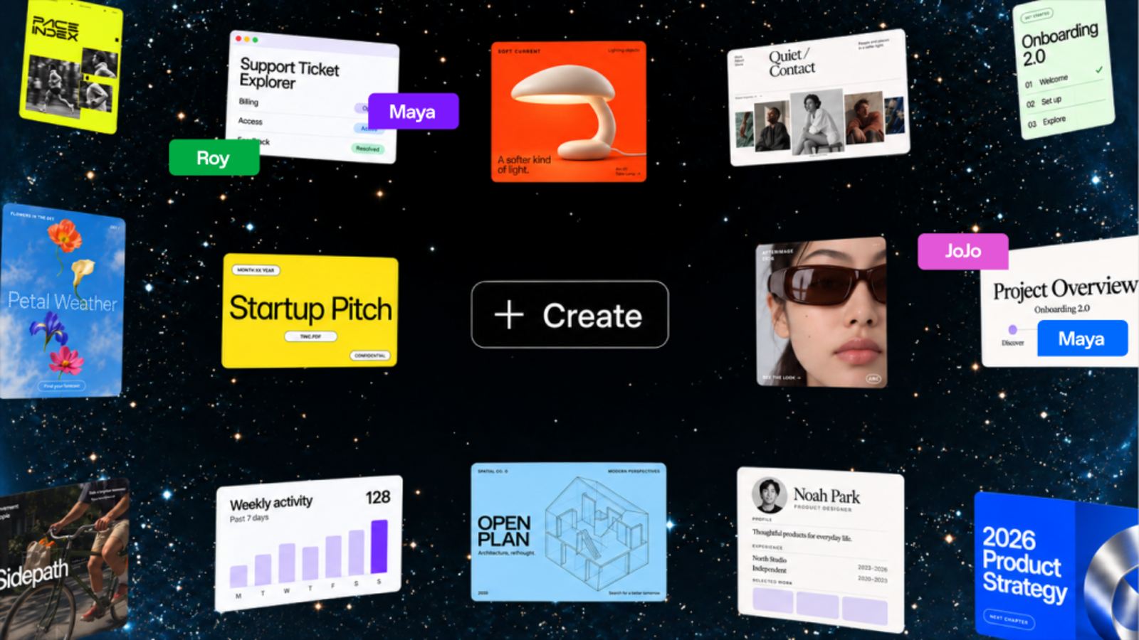
ChatGPT Space is a shared workspace where people and AI work together on living documents. According to OpenAI, Space helps you create living documents with ChatGPT and the people you work with, keeping work in one shared space where you can tag in ChatGPT, Codex, or your dot to help and build on shared context together. It is described as the home for the pages and files you create, upload, and share in ChatGPT, including spreadsheets and presentations, and it replaces the former Library. Its stated purpose is to let people create, collaborate, and build together with AI, turning conversations, files, and ideas into plans, documents, prototypes, slides, and more while keeping everyone aligned in one place. Teams often deal with context scattered across tools, documents that go stale, and the friction of turning discussions into deliverables. Space addresses this by making the document itself a shared, connected place rather than a static file. The product description notes that you can add links, files, and ideas to build a living source of context, then work with ChatGPT to turn them into plans, docs, apps, and more. Pages can stay updated from your connected tools, so the stated goal is that you can focus on the work, not updating the doc. Space also serves as the home for the pages and files created, uploaded, and shared in ChatGPT, including spreadsheets and presentations, while collaborative slides and spreadsheets are noted as coming soon. Powerful, self-updating pages are a core capability. A page is described as an editable document where you can work with ChatGPT and other people. You can bring together text, images, charts, and interactive tools, then ask ChatGPT to help you revise and build on the work. Pages are built for work you do with agents—write, visualize, research, and code—and they can stay updated from your connected tools. To keep a page current, you can ask ChatGPT to update the page whenever you need a change. For recurring updates, you set up an automation with instructions for what to update, which sources to use, and how often to run; you then return to the page to review the changes. Working together with AI is explicit in Space. Teammates can edit pages in real time, leave feedback in comments, and tag ChatGPT or their dot to make changes or take on next steps—all in the same page. People with edit access can work on the same page at the same time, and each person works with their own ChatGPT to ask questions or make changes to the shared page. When refining work, you can ask ChatGPT or your dot to organize the work with checklists, images, charts, and tables, and keep improving it together right on the page. You can also @mention ChatGPT or your dot in a comment to help make changes. Sharing a page does not give collaborators access to your private chats or personal memory, although anything you or ChatGPT write on the page is visible to people with access, including personal details drawn from memory. A home for shared knowledge: Space lets you bring your team's files, pages, slides, spreadsheets, and more into one shared place, and ChatGPT and your dot can use that context to help your team build on what's already done. Shared context for your team and agents means you can bring your team's goals, plans, and designs into one shared space and ask ChatGPT or your dot to keep dashboards updated, turn a teammate's design into engineering tasks, or flag blockers. New work your team creates builds on that shared context. You can also bring in files and context from other tools by adding files or asking ChatGPT to use connected tools such as Google Drive and Slack. Files uploaded into a page follow that page's permissions; linking to a separate file does not grant access to it, and its own permissions still apply, while any content copied or summarized onto the page is visible to collaborators. Overall, Space works around pages that stay connected to context and to the people and agents working on them. You can start with a conversation or a template—asking ChatGPT to turn an existing conversation into a page or slides, or starting from templates such as Welcome to Space, a daily to-do list, or a project dashboard. Each page can hold text, images, charts, tables, and interactive tools. You give your page instructions: tell ChatGPT what to update on your page, which sources to use, and when to check, then come back to review what changed and decide what comes next. You find and organize your work in Space by browsing or searching for your pages, spreadsheets, slides, and files, saving favorites for quick access, or returning to a team space to pick up where you and your teammates left off. To create a team space, you give your space a name and add individual team members or your entire team, then tell ChatGPT about your projects and priorities. Benefits described include keeping project context, files, and shared pages together so teams stay aligned in one place, and spending more time doing the work rather than making the list. The self-updating to-do list pulls to-dos from Slack, email, and your calendar into a page, and ChatGPT or your dot can keep items, due dates, and next steps current as priorities shift. Because pages stay updated from connected tools and from shared context, teams can build on what's already done rather than starting over. Real-time editing, comments, and the ability to tag AI in the same page are presented as ways to move work forward without leaving the document. Concrete scenarios described include visualizing prototypes, research, data, or key decisions right on a page, editing together with your team, and tagging ChatGPT, Codex, or your dot to work through changes; an example shown is an onboarding prototype displayed on a shared page with teammate cursors and a sidebar. Another scenario is collaborating on slides: turning a conversation into slides using your team's template, editing with teammates, adding feedback, and asking ChatGPT to revise the slides so everyone works on the same deck. Teams can also ask ChatGPT or their dot to keep dashboards updated, turn a teammate's design into engineering tasks, or flag blockers. The self-updating to-do list is a further scenario: pulling to-dos from Slack, email, and calendar and keeping items, due dates, and next steps current. With the Meetings plugin, you can create private, personalized notes with suggested follow-ups, review the notes, then ask ChatGPT to research a follow-up, draft a message, or update a plan, bring the work into a page, and choose what to share with your team. Space is available for ChatGPT Pro, Business, and Enterprise users. Create and edit pages on web and desktop; on mobile you can find, read, and share pages, while creating and editing pages is not supported at launch, and mobile editing and collaboration are coming soon. Collaborative slides and spreadsheets are coming soon as well. Workspace availability and sharing are subject to admin settings. On a workspace plan, use Share to invite people or teams in your ChatGPT workspace; for pages you can give view or edit access and change or remove that access later. On an eligible personal plan, invite people by email from a page's Share menu and choose view or edit access, or share by link where that option is available. If teams are enabled in your workspace, you can select a team when sharing a page or presentation and reuse that group when sharing other work. Dots work natively across files in Space, and wherever you work with your dot—in ChatGPT, Slack, or Microsoft Teams—you can also ask it to keep the page up to date as plans change, with texting coming soon. OpenAI does not train on ChatGPT Business or Enterprise data by default; for individual accounts, your training and memory settings apply. ChatGPT Space is, in OpenAI's own framing, a place where people and AI work together: a shared space for creating, planning, and collaborating, with pages that hold text, images, charts, and interactive tools and that can stay updated from connected tools. Its primary value proposition is keeping project context, files, shared pages, and teammates in one place while letting ChatGPT, Codex, and dots help build on that shared context—so work keeps moving instead of stalling in scattered documents.
Smooth Recorder is a native Mac screen recorder built for making demos and tutorials. Its promise is that you record once and the video is edited by the time you hit stop: it zooms in where you click, smooths your cursor and camera movement, adds captions on your Mac, and places the recording on a nice background. Screenshots get the same treatment, opening into an editor with wallpaper, padding, corners, shadow, arrows, text, numbers, blur and 3D tilt. The app is for Mac users who want polished screen recordings and captures without doing much editing afterwards. It is a one-time purchase with no subscription and no account, so the workflow stays self-contained. The problem it solves is the distance between a raw screen recording and something you are happy to share. A plain capture usually needs zoom-ins on the clicks that matter, a cursor that glides instead of jumping, captions for people watching without sound, and a background that makes the frame look deliberate rather than accidental. Doing all of that by hand in a video editor takes time and a second tool, and the recording has to be captured again if the framing is wrong. A reviewer quoted on the site, Stanislav Tyshchenko, founder of Opencals, summed up the search for a fix: "I remember having a hard time looking for a tool like this, one that lets me record demos in one go without having to do much editing." Smooth Recorder takes the position that the polish should be produced during the recording rather than afterwards. The site also positions the app against the recorders people weigh it against. Its comparison table covers Screen Studio, CleanShot X and Loom, checked on their own websites in September 2026. In that table Smooth Recorder is the native Mac app that is pay once with no subscription, with auto-zoom on your clicks, a smooth cursor, captions made on your Mac, cutting by editing the transcript, and screenshots with an editor. Screen Studio is shown as an Electron app; Loom's captions are cloud-based and its transcript cutting sits on a $24/mo plan; CleanShot X is listed with yearly updates. These are the seller's own readings of competitor sites. The core recording features are the zooms that follow your clicks, the smooth cursor and camera, and the captions. Version 1.1 added 3D angles. Because the zoom is driven by where you click rather than by manual keyframes, the emphasis lands on the buttons, fields and menus you actually used, and the camera work is already cut together when you stop. Captions light up each word as it is spoken, which keeps a viewer's eye on the part of the interface being described even when they are watching with the sound off. The recording is placed on a nice background as part of the same flow. Editing is done by editing the words. The recording is transcribed on your Mac and the transcript sits alongside the video: delete a word or a sentence from the transcript and it is gone from the video too. The interface reports what was removed — the product tour shows "Cut 3 filler words" with an Undo control — so repeated takes and verbal tics such as "um", "uh" and "er" can be trimmed out without touching a timeline. That turns the transcript into a practical editing surface rather than just a subtitle file, which matters for anyone recording a walkthrough in one take. One shortcut — the tour shows ⌥1 — opens the capture overlay. You pick the area, then choose what to make from it. There are five options: Screenshot (an area, a window or the full screen, ↩), Record (with camera, mic and system audio, R), GIF (a looping clip that goes straight to your clipboard, G), Scroll (one tall screenshot of a whole page, S) and Text (copy the words inside any area, T). Putting all five behind a single overlay means the same starting gesture covers a quick still, a looping clip for chat, a full-page capture, or lifting text off the screen. Screenshots get everything the editor does, a key or a click away. "Make it yours" covers wallpaper, padding, corners and shadow, with 76 wallpapers, 40 of them new. "Make your point" covers arrows, text, numbers and blur, one key each, and edits stay editable. "Tilt it in 3D" offers nine presets that turn the screenshot, with fine-tuning available if you want it. Because the edits remain editable rather than baked in, a screenshot can be reworked instead of re-taken. Smart Redact handles what comes before sharing. It finds the things you would rather not show and blurs them in one click: emails, phone numbers, card numbers, API keys and faces. The tour shows it reporting its matches, such as "Smart Redact 2 found" or "5 found" on a billing screen, before the screenshot goes anywhere. All of it runs on your Mac — captions, text recognition and redaction are processed locally, and recordings do not leave the machine. Rakesh Potnuru, founder of WithUPI, singled the feature out: "I love the auto detection and blurring of sensitive details feature." Smooth Recorder is a native macOS app built in SwiftUI and AppKit — not a Chrome extension, not a website in a window. It runs on macOS 15 Sequoia and later, and on macOS 26 it uses newer system features when they are available. The Library lives in the notch and holds every screenshot and recording, with search and the recording timer. Version 1.1 added menu bar and Dock support: the menu bar icon opens your Library, and the Dock menu offers Capture and Recent. Shortcuts and Siri can take a screenshot, capture text, or start and stop a recording, and the app follows your Mac's appearance or your choice of Light, Dark or Auto. Exports cover the places recordings actually go: MP4 for anywhere, MOV for Keynote and Final Cut at 30 or 60 fps, and GIF for docs, chat and READMEs at up to 24 fps. Pricing is deliberately simple. During early access the app costs $9 once against a launch price of $69 — $60 off for the first 100 buyers, with 90 left when the page was captured. There is no subscription and no account. The single payment includes recording with auto-zoom, smooth cursor and captions; transcript editing and filler-word removal; screenshots, GIFs, scrolling capture and text; the screenshot editor with Smart Redact and Motion; 3D zoom angles and 76 wallpapers; MP4 and MOV export at up to 60 fps plus GIF; and every update during early access. Taken together, Smooth Recorder collapses recording, polishing and screenshot work into a single flow on the Mac. You set up the area once, capture in the format you need, and stop — the zooms, cursor, captions and background are already in place, and the transcript gives you a way to trim without a timeline. For founders, developers and anyone producing demos, tutorials or documentation on a Mac, the value proposition is the one in the headline: record it once, and the polish is done when you stop.
Autonomyware is an AI-native platform that turns a described idea into an engineered physical product. You start with a prompt, a sketch, or an existing product, and autonomous AI handles the engineering process end to end — moving from product definition through architecture, risk, CAD, BOMs, code, verification, and manufacturing preparation. The company frames the promise simply as going from text to physical products. The product is presented as one AI-native workspace that keeps every decision and engineering artifact connected from idea to implementation, so work does not scatter across disconnected tools. Its stated position is that if you can describe it, you can build it, with Autonomyware doing the engineering for you, and its tagline describes the goal as engineering anything you can imagine. The problem Autonomyware addresses is set out in its own research framing: a product is not a collection of shapes, it is a network of relationships. AI-generated geometry that merely looks right can fail to assemble, and there is a meaningful difference between a render you cannot use and a model you can inspect, verify and build. The platform also points to the engineering data companies already hold — scattered CAD, drawings and specs — as something worth interpreting rather than discarding. By taking an idea through product definition, architecture, risk, CAD, bills of materials and manufacturing preparation inside a single workspace, Autonomyware aims to close the gap between a concept and something that can actually be made. The central surface is the Forge. You open a forge, interact with the model and explore the surfaces, while a live forging narration shows exactly how the geometry was built. In the example shown on the site, a user asks for a desk sculpture of the Product Hunt kitty-cat award: the kitty in a stylized spaceship, with concentric circles and laurels around it, and a flat bottom so it prints clean. The narration reads the intent, classifies the work as SCULPT in a sculpting lane with one continuous organic body, no decoration and no assembly costing, and then creates a reference image to seed the sculpt. The platform describes the author as driving the tools with sight tags per department, with no templates and no recipes. Narration entries cover multi-view inference to complete unseen geometry, a first-pass seed acquired from four views through multi-view fusion, and Trellis native delivery remeshed to 285,000 triangles, winding-oriented with specks removed, before the whole product is assembled and reported as watertight, verified and using real materials. Everything the platform forges is described as real geometry — watertight and export-ready. Forged products appear in a library with their mode and status attached: a City bike and an EV solar charger listed as Assembly, forged, watertight, STEP and STL; a Camera drone listed as Assembly, forged, verified, STEP and STL; and a Panda sculpture listed as Sculpt, forged, coloured, watertight and STL. The site lists STEP, STL and 3MF under the heading "Made to be made", describing real 3D that is ready to print at home or send to a factory. A companion pillar, "Grounded in reality", states that an engineering mind checks the product stands up, that parts fit, and that it can be made. The model workspace also offers Material, Mesh and X-ray views alongside Render and Export controls. Agent Orchestration is where the model side of the platform is mapped. A provider list ships with "standard providers with sane defaults, ready to fly" — OpenAI, Anthropic and Google listed as defaults, plus a Local / self-hosted option. Users can add their own connection by choosing a provider family, specifying a model, a custom base URL and an API key, which the site describes as BYOK with no lock-in. Role mapping then assigns a model to each role: the main agent, the pre-read for the planner, the reviewer and verifier, image analysis, and the CAM advisor. A single model can take over all roles, or models can be mapped per role. The accompanying audit view, described as "one brain", runs every role on one shared context and keeps a full trace of every decision, cost and token for review. The overall method is presented as a five-step path in one place to create, improve and make something real. Step 01, Start with anything: describe an idea, share a sketch, or bring an existing product — plain words are enough. Step 02, Shape it together: Autonomyware asks useful questions, helps you explore options and keeps the work moving. Step 03, Watch it come alive: see the product take shape and understand how it works, explore it, then ask for changes. Step 04, Get everything you need: receive the right files, parts and guidance for the product. Step 05, Make it real: print it, manufacture it, build it or keep improving it. Refinement is conversational — the site invites users to comment on a forge with a described change, so iteration happens by chatting about the model rather than manipulating geometry directly. The stated benefits follow from that workflow. Under "Talk, don't click", you say what you want in plain words and then shape it by chatting, which lowers the barrier for people who do not drive CAD tools directly. Under "Grounded in reality", an engineering mind checks the design stands, fits and can be built, addressing the risk that a good-looking result cannot be made. Under "Made to be made", you receive real 3D that is ready to print at home or send to a factory, along with files and guidance that are described as clear and ready to use. Because the platform keeps decisions and engineering artifacts connected in one workspace, the thread from the first idea to the finished, downloadable model stays intact instead of being rebuilt by hand at each stage. Concrete scenarios shown in the content include a desk sculpture of the Product Hunt kitty-cat award, built as a single continuous sculpted body with a flat printable bottom, housed in a stylized spaceship with concentric circles and laurels. Assembly-oriented examples include a City bike, an EV solar charger and a Camera drone, all forged and watertight, with the drone also marked verified, and all offered as STEP and STL files. A Panda sculpture shows the sculpt lane producing a coloured, watertight model delivered as STL. The site also frames the end of the journey as printing or manufacturing: making the product real at home or sending it to a factory, according to the "Made to be made" messaging. Autonomyware is presented for anyone who can describe an idea, as well as for engineers who want to look deeper: the site says the surface is simple on purpose while real systems engineering sits underneath, and links to a research hub written in the open. Stated integrations include model providers OpenAI, Anthropic and Google as defaults, a Local / self-hosted option, and bring-your-own-key connections with a custom base URL, with no lock-in. Output formats named in the content are STEP, STL and 3MF. A forthcoming capability, labelled coming soon, is Evolve Outside Products: reading existing engineering data, learning from what already works, and evolving designs beyond a single product. No pricing or plan details are stated in the provided content. The takeaway is straightforward: Autonomyware positions itself as the place where an idea becomes a physical product without the user doing the engineering. You bring the idea in plain words, an autonomous AI system moves it through definition, architecture, CAD, verification and manufacturing preparation, and you end up with watertight, export-ready geometry plus the parts and guidance to make it real.
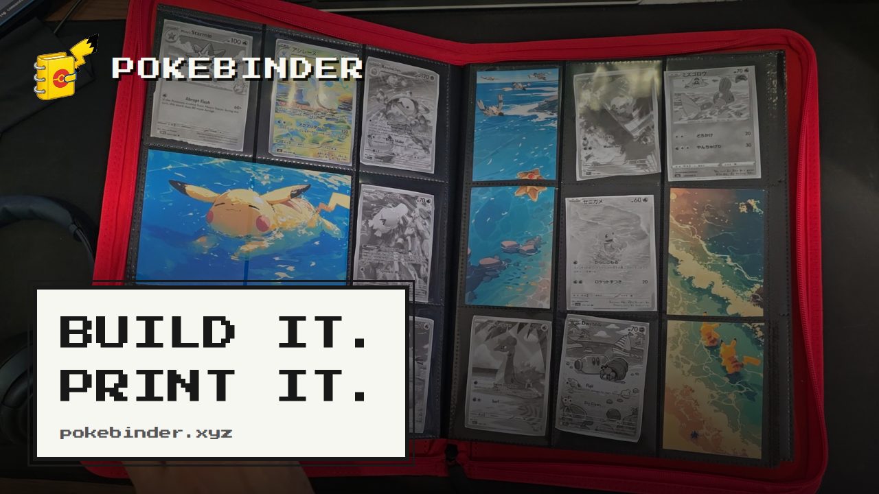
Pokébinder is a free tool for Pokémon TCG collectors that turns the job of filling a cardboard binder into a plan you can see and print. Collectors search any card in English or Japanese, drag or tap those cards into the nine pockets of a 3×3 binder page, and let their own artwork run across those pockets instead of sitting in a single slot. Its main purpose is to let someone design and preview a binder page before spending money on it, and then print true-size placeholders for only the cards they do not own yet, so each empty pocket has something in it and each gap doubles as a reminder of exactly what is missing and where it belongs. No account is needed and the binder stays in the browser. Binder collecting has an awkward middle state. A collector starts a page, owns some of the cards and not others, and the unfilled pockets sit empty for weeks or months while the missing cards are hunted down. There is no easy way to see how a finished spread will read, so money can get spent on cards for a layout that turns out not to work. The Michi method — a way of building binder pages where one piece of artwork carries across several pockets so a spread reads as a single image instead of nine separate cards — normally involves printing backing art, cutting it to size and sitting cards on top of it, which is a lot of measuring and reprinting. Pokébinder addresses that by doing the layout work on screen first and producing accurate printouts afterwards, doing the same thing as the manual Michi method but without the guesswork. The tool also states plainly what its printouts are not: a placeholder holds an empty pocket until the real card turns up, and is not for play and not for sale. Card search is the starting point. Pokébinder indexes over 20,000 English cards that can be searched by name, set or artist, and over 21,000 Japanese cards that can be searched by name or set — including the printings collectors actually chase. That means a collector can track down a specific card whether they know the artist but not the set, or the set but not the exact printing. Cards are placed by dragging or tapping them into the 3×3 grid of pockets. An amber cart marks a card that is in the binder but not owned yet, which is the state that causes it to print. Hovering a card reveals the binder's own controls for adjusting what sits in the pocket. One page can be assembled in five ways, and the page always keeps the same nine pockets — what changes is how much of the page the artwork carries. An image can fill a single pocket. It can stretch across a row, covering three pockets, or run down a column across two. Several images can each hold one pocket. Or, in the extended binder art layout, one image fills all nine pockets and the cards sit on top of it in whichever pockets the collector chooses, so the art carries on around them. That last arrangement is the Michi page. Because the image is shared across pockets, taking a card out reveals the slice of art underneath it, so the picture still reads correctly. The image can be zoomed and nudged until the framing is right, and it prints one slice per pocket on the same cut guides as the cards. Printing is designed around the physical binder rather than the screen. Any card marked as not owned yet prints at true card size, 6.3 × 8.8 cm, at 300 dpi, with a dashed cut line on every card, nine to an A4 or US Letter sheet. Spanned artwork prints alongside it, aligned so the slices land in the right pockets. The print preview shows the page as it will come out — for example page three with nine cards and guidance to cut on the dashes. Once printed, the collector cuts on the dashes and adds the placeholders to the physical binder. When a real card finally turns up, the printed one slides out and the real one slides in, and nothing else on the page moves. Binder view lets a collector flip through the result: the binder opens as a two-page spread with a real page curl on desktop and turns one page per swipe on a phone, so the same pages and the same art behave like the thing on the shelf. The tool is free, with no account, no ads and no watermark, and the binder stays in the collector's own browser. The distinctive approach is that the binder exists digitally first and physically second. Rather than buying cards to find out whether a spread works, a collector builds the page, marks what is missing, and prints only the gaps. The placeholder is the card: a printed piece at exact card size holds the pocket until the real card turns up. The Michi method — popularised by @peeplop and written up at The Michi Method on woahpoke.com — is supported directly, with art able to run across up to three pockets horizontally or vertically, or to fill the whole page behind the cards, and with zoom and reposition controls that remove the trial and error of sizing printed backing art by hand. Benefits follow from that order of operations. Empty pockets stop being empty, because every missing card has a placeholder sitting in its place. Those gaps double as a shopping list: the collector always knows what is missing and exactly where it goes. Purchases become easier to sanity-check, because the spread can be seen before money is spent, and a change of mind happens on paper instead of at the counter. Nothing has to be reorganised when a card finally arrives, since sliding out a placeholder and sliding in a real card leaves the rest of the page untouched. And because the tool is free, requires no account, carries no watermark and keeps the binder in the browser, there is no commitment involved in trying a layout. Concrete workflows include planning a spread from scratch: search a card, drop it in a pocket, and see what the page wants to be. Another is completing a set — mark everything that is not owned yet, print the placeholders, and use the printed page as a guide to what to buy. The Michi page suits collectors who want a single piece of artwork to carry an entire nine-pocket spread with their cards sitting on top of it, and printing the slices keeps the alignment exact. A collector who has just bought a missing card can check where it goes and swap the placeholder out. Japanese cards can be searched by name or set for collectors building Japanese-language pages, and English cards can be searched by artist for collectors following a particular illustrator. Pokébinder is aimed at Pokémon TCG collectors who build physical binders, from someone assembling a single page to collectors chasing specific printings by artist or set. It is a browser tool, usable on desktop and on a phone, where pages are turned with a swipe. It is free, with no account, no ads and no watermark, and the binder data stays in the collector's browser. The site notes that it is an independent fan project made by one collector and is not produced, endorsed or supported by Nintendo, Creatures Inc., GAME FREAK, The Pokémon Company or Wizards of the Coast, and that card images are served from their original sources and remain the property of their rights holders. Taken together, Pokébinder is a free planning layer for Pokémon TCG binders: search real cards, arrange them into 3×3 pages, run your own art across the pockets, and print true-size placeholders for whatever is missing so that every pocket is accounted for. It moves the guesswork of binder design onto the screen and leaves the collector with something they can cut out, add to the page, and swap for the real card when it turns up.
Paste is a clipboard manager for Mac, iPhone, and iPad that remembers everything you copy and keeps it organized, searchable, and in sync across your devices. Anything you copied, on any of those devices, is back in seconds. It is made for people who constantly move snippets, links, images, files, colors, and templates between apps — developers, designers, writers, and teams — and who need that material to be instantly retrievable instead of disappearing the moment something new is copied. Paste describes itself as more than a clipboard: it also suggests what you will most likely paste next based on what you are working on, and it can connect your clipboard history to the AI tools you already use. The default clipboard on any operating system is a single slot. It holds exactly one thing, and the moment you copy something else, the previous item is gone with no way to get it back. That is fine until the moment it isn't: a paragraph you forgot to paste back, a link you copied ten minutes ago, a color value, an address, or a code snippet that took time to assemble. This single-slot behavior forces people to juggle apps, retype text, re-copy the same things over and over, and lose work they had already done. Paste exists to remove that friction. It treats the clipboard not as a temporary holding area but as a persistent, searchable memory of everything you have copied, so the cost of copying something new is no longer the loss of everything you copied before. The first thing Paste changes is the assumption that copied content is disposable. Everything you copy is saved, with no limit, and it stays there — an hour ago or a year ago, it is still in your history. Because an unlimited history is only useful if you can navigate it, Paste also lets you search your whole clipboard history and find what you need in seconds. Instead of scrolling back through dozens of entries, you type what you remember about the item and jump straight to it. Reviewers have noted that the visual nature of the app makes it quick to identify the item you want to paste, and that Paste can be the clipboard star around which your devices orbit. For the things you reach for constantly, Paste lets you pin the snippets, links, colors, and templates you use all the time, so reusable material sits close at hand rather than buried in history. Pinning turns frequently pasted material into a stable shelf: a signature block, a set of brand colors, a boilerplate reply, a template paragraph, an icon, or a link you send repeatedly. Paste is also built to follow you: your clipboard history syncs across Mac, iPhone, and iPad, so an item copied on one device is available on the others. Teams can go further and share pinboards to keep their team in sync, giving a group a common set of snippets and references instead of scattering them across individual inboxes and documents. In Paste, Intelligent Clipboard adds a predictive layer. Paste suggests which of your copied items you will most likely paste next, based on what you are working on. The feature is powered by Apple Intelligence and runs privately on your Mac, so the suggestion is generated locally rather than in the cloud. A separate capability takes the clipboard into AI: Paste connects your clipboard history to Claude, Codex, Cursor, and other AI tools so they can use what you have already copied as context. The connection runs on your Mac, and you choose what to share, which means your history becomes an input to your AI workflows without leaving your control. Paste's overall approach is local-first and permission-based. Your clipboard stays on your device and in your private iCloud; according to Paste, it never touches the company's servers. You can set rules so Paste ignores passwords and other sensitive apps, which keeps credentials out of your history while everything else continues to be captured. The Intelligent Clipboard suggestions are generated by Apple Intelligence on the Mac, and the connection to AI tools also runs on the Mac with you deciding what is shared. Taken together, the design is a clipboard that is expansive in what it remembers and conservative in where that memory travels — the opposite of the usual trade-off between convenience and privacy, and the reason the app describes itself as private by design. The outcome Paste promises is simple: nothing you copy is lost, and nothing you have copied is hard to find. Instead of remembering to paste something before it is overwritten, you can copy freely and retrieve later. Instead of retyping a paragraph, you search for it. Instead of losing an important item because you copied something else, you have both. Developers keep code snippets saved and organized, designers keep colors, icons, and links a keystroke away, writers never lose a paragraph they forgot to paste back, and teams stay aligned through shared pinboards. Users describe Paste as core to their everyday workflows, with some saying it makes them crazy efficient and provides them with superpowers in daily computer use, while others treat it as a must-have Mac app they use dozens if not hundreds of times a day. Concrete workflows show up throughout Paste's own examples. A developer copies one snippet and then the next without losing the first, because everything stays saved and organized. A designer keeps colors, icons, and links a keystroke away while working. A writer drafts a long document and never loses a paragraph that was copied but not yet pasted back. In a messaging or email scenario, someone writing 'Here's the cabin:' finds the copied cabin link already surfaced at the front of the row, because Paste predicted it as the next item to paste. In an AI workflow, a user can ask a tool to find the notes they copied earlier that day in Paste and draft a team update for a launch using them. Teams share pinboards so everyone pulls from the same set of snippets and stays in sync. Paste is aimed at Mac, iPhone, and iPad users, and explicitly at developers, designers, writers, and teams. Its integrations extend to AI tools including Claude, Codex, and Cursor, and its predictive feature relies on Apple Intelligence running on the Mac. Sync is handled through the user's private iCloud, and the app's privacy controls let you exclude passwords and sensitive apps from capture. Paste has been on the App Store for ten years and holds a 4.5 rating from more than 16,000 ratings. Pricing is presented through plans and a purchase option, and the site offers a free seven-day trial of the one app for Mac, iPhone, and iPad, alongside 'Try for free' and 'See plans' links and a direct 'Buy now' option. Paste's value proposition is that the clipboard should remember everything and you should never have to worry about what is on it. By saving every item with no limit, making the whole history searchable, letting you pin what you reuse, syncing across Mac, iPhone, and iPad, and keeping the whole system private on your device and in your private iCloud, it turns a single-slot utility into a durable, searchable memory. Intelligent Clipboard adds prediction on top of that memory, powered by Apple Intelligence on the Mac, and the AI connections let that memory feed the tools you already work in. The result is a clipboard manager that is both broader and more careful than the system default.
Stash is a macOS utility that keeps your apps and system controls hidden at the edges and corners of your screen until you reach for them. Stash lives in your menu bar: you set up your apps and controls once, then reach for them at the edges and corners of your screen. On the Mac it delivers Edge Sliders, Corner Dials, a Hidden Dock, an App Launcher and App Profiles. On the iPhone, the Stash Deck companion app turns your phone into a tactile remote for your Mac, with quick controls, app launching, configurable widgets and Creative Pro controls for creative applications. Stash is for Mac users who want their apps and controls within reach without cluttering the screen. The problem Stash addresses is one most Mac users recognise: the controls and apps you rely on most are rarely exactly where you need them when you need them. System controls such as volume, brightness, keyboard backlight and audio output normally require a trip to the menu bar, and the apps you use constantly have to compete for space in the Dock. Stash's approach is to keep those apps and controls within reach without cluttering your screen — they stay out of sight until you reach for them, then appear at the edges and corners. The company describes the result as hidden controls that feel like they have always belonged there: beautiful, native-feeling and ridiculously satisfying to use. It is not that the Mac lacks controls, but that those controls and apps are spread across the menu bar and the Dock, competing for the same limited space. Edge Sliders and Corner Dials are the two control surfaces that put system settings around the perimeter of your display. Edge Sliders let you assign the left or right edge of the screen to volume, brightness or appearance, so a reach to the side of the display adjusts the setting you use most. Corner Dials put volume, brightness, keyboard backlight and audio output in the corners of your screen, giving you a set of dials rather than a menu to hunt through. Together they turn the frame of your display into a control layer for the settings you adjust most often. They follow the same principle as the rest of Stash: the controls are not displayed permanently, only when your pointer reaches the relevant edge or corner. The Hidden Dock and App Launcher handle access to your applications. The Hidden Dock works alongside your existing Dock — it does not replace it — and slides out when you move to the edge of the Dock, holding the apps you want nearby but not always visible. An expanding App Launcher covers the rest of your applications, so your favourites sit within reach while everything else stays one step away. Stash can be recalibrated from the menu bar if your Dock changes. Because these apps are not permanently on screen, your workspace stays clear while your most-used tools remain immediately available. App Profiles make Stash adapt to what you are doing. Stash automatically changes your apps and controls depending on what you are using, so the set of controls and applications on hand reflects the current task rather than a single static configuration. That means the same utility can present a different, appropriate arrangement as you move between activities, without you rebuilding your setup each time. Because the switching happens automatically based on what you are using, there is no need to rebuild your layout by hand when you move between activities. Edges, corners, apps and the accent colour can all be changed at any time from Settings, so profiles and layout stay under your control. Stash Deck extends the same idea to your iPhone. It is the iPhone companion to Stash for Mac and it follows what you are doing: you can control your Mac from the phone, throw an app from your phone to open it on your screen, and keep widgets such as Spotify, Timer, Claude Code and Codex on hand. Creative Pro is part of Stash Deck. When you are in a creative app, the Deck becomes contextual tools, precise sliders and colour controls for Photoshop, Illustrator, After Effects, Premiere Pro and Blender. Stash Deck is free to download and works with Stash for Mac. Stash's overall approach is a menu bar app that you configure once and then use through your edges and corners. Rather than adding more windows, panels or icons to your screen, Stash stays out of sight until you reach for it — the interface appears at the side or corner of the display exactly when your pointer arrives there. If your Dock changes, you can recalibrate Stash from the menu bar, and the Settings panel lets you revisit which apps and controls are assigned where. Everything ships as one package: Hidden Dock, App Launcher, Edge Sliders, Corner Dials, App Profiles and Stash Deck with Creative Pro, with no tiers or add-ons. The benefits follow from that design. Your screen stays uncluttered because the controls are hidden until used, yet volume, brightness, keyboard backlight, audio output and appearance are always a gesture away rather than buried in menus. Favourite apps stay within reach through the Hidden Dock while the App Launcher keeps the rest accessible, and App Profiles mean the right apps and controls are available for whatever you are working in. Stash Deck adds the convenience of working from your phone, and Creative Pro gives creative professionals precise controls tailored to the applications they already use. Because everything is included in a single purchase with no tiers or add-ons, users do not have to decide which parts of the experience they need. Use cases include adjusting system settings mid-task — changing volume, brightness or appearance by reaching for the edge or corner of the display without leaving what you are doing. Another is keeping a working set of apps close through the Hidden Dock and App Launcher while the main Dock stays tidy. Creative Pro supports photographers, designers, editors and 3D artists working in Photoshop, Illustrator, After Effects, Premiere Pro or Blender, who can use the iPhone deck for contextual tools, precise sliders and colour controls. App Profiles suit users who move between different kinds of work and want the interface to follow. Stash Deck also serves anyone who wants their iPhone to act as a remote for their Mac, launching apps and hosting widgets such as Spotify, Timer, Claude Code and Codex. Stash is aimed at Mac users who want faster access to apps and system controls without cluttering their screen, and at creative professionals who want tactile, precise controls alongside their creative applications. It requires macOS Tahoe; older macOS versions are not supported. Pricing is simple: Stash is free for 24 hours, after which you can pay $3.99 per month, cancellable anytime, or $19.99 once for a lifetime licence at the launch price. Both options include everything and work on up to 3 Macs. If you cancel the monthly plan, Stash keeps working until the end of the period you have paid for and then locks until you renew or buy Lifetime. Existing owners get the update, including Creative Pro, on the same number of Macs as before. In short, Stash turns the edges and corners of your Mac into a hidden control layer, keeps your apps within reach without cluttering the screen, and extends the whole experience to your iPhone through Stash Deck and Creative Pro — one app, everything included.