Category Focus/categories/productivity
Productivity AI Tools
Discover and compare the best productivity AI tools and software. Browse 859+ curated tools with reviews and rankings.
Projects tracked
859
Sort mode
RECENT
Page
8
Discover and compare the best productivity AI tools and software. Browse 859+ curated tools with reviews and rankings.
Projects tracked
859
Sort mode
RECENT
Page
8
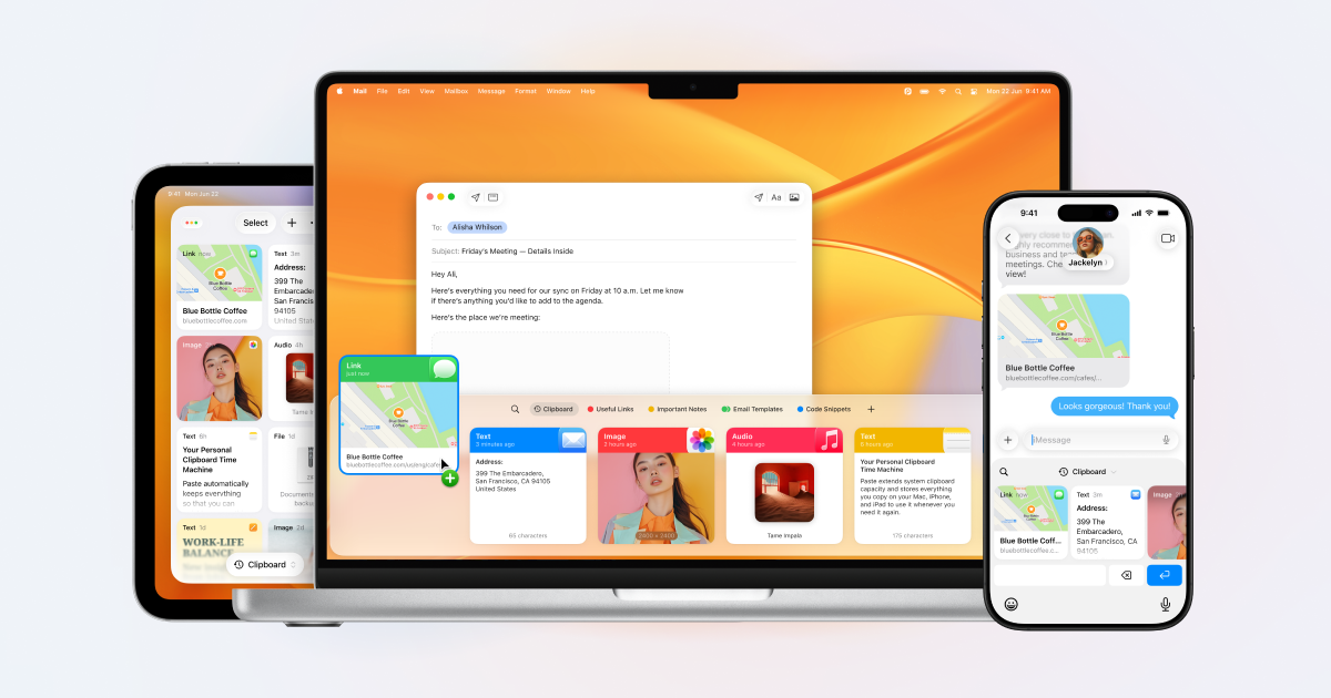
Paste is a clipboard manager for Mac, iPhone, and iPad that remembers everything you copy and keeps it organized, searchable, and in sync across your devices. Anything you copied, on any of those devices, is back in seconds. It is made for people who constantly move snippets, links, images, files, colors, and templates between apps — developers, designers, writers, and teams — and who need that material to be instantly retrievable instead of disappearing the moment something new is copied. Paste describes itself as more than a clipboard: it also suggests what you will most likely paste next based on what you are working on, and it can connect your clipboard history to the AI tools you already use. The default clipboard on any operating system is a single slot. It holds exactly one thing, and the moment you copy something else, the previous item is gone with no way to get it back. That is fine until the moment it isn't: a paragraph you forgot to paste back, a link you copied ten minutes ago, a color value, an address, or a code snippet that took time to assemble. This single-slot behavior forces people to juggle apps, retype text, re-copy the same things over and over, and lose work they had already done. Paste exists to remove that friction. It treats the clipboard not as a temporary holding area but as a persistent, searchable memory of everything you have copied, so the cost of copying something new is no longer the loss of everything you copied before. The first thing Paste changes is the assumption that copied content is disposable. Everything you copy is saved, with no limit, and it stays there — an hour ago or a year ago, it is still in your history. Because an unlimited history is only useful if you can navigate it, Paste also lets you search your whole clipboard history and find what you need in seconds. Instead of scrolling back through dozens of entries, you type what you remember about the item and jump straight to it. Reviewers have noted that the visual nature of the app makes it quick to identify the item you want to paste, and that Paste can be the clipboard star around which your devices orbit. For the things you reach for constantly, Paste lets you pin the snippets, links, colors, and templates you use all the time, so reusable material sits close at hand rather than buried in history. Pinning turns frequently pasted material into a stable shelf: a signature block, a set of brand colors, a boilerplate reply, a template paragraph, an icon, or a link you send repeatedly. Paste is also built to follow you: your clipboard history syncs across Mac, iPhone, and iPad, so an item copied on one device is available on the others. Teams can go further and share pinboards to keep their team in sync, giving a group a common set of snippets and references instead of scattering them across individual inboxes and documents. In Paste, Intelligent Clipboard adds a predictive layer. Paste suggests which of your copied items you will most likely paste next, based on what you are working on. The feature is powered by Apple Intelligence and runs privately on your Mac, so the suggestion is generated locally rather than in the cloud. A separate capability takes the clipboard into AI: Paste connects your clipboard history to Claude, Codex, Cursor, and other AI tools so they can use what you have already copied as context. The connection runs on your Mac, and you choose what to share, which means your history becomes an input to your AI workflows without leaving your control. Paste's overall approach is local-first and permission-based. Your clipboard stays on your device and in your private iCloud; according to Paste, it never touches the company's servers. You can set rules so Paste ignores passwords and other sensitive apps, which keeps credentials out of your history while everything else continues to be captured. The Intelligent Clipboard suggestions are generated by Apple Intelligence on the Mac, and the connection to AI tools also runs on the Mac with you deciding what is shared. Taken together, the design is a clipboard that is expansive in what it remembers and conservative in where that memory travels — the opposite of the usual trade-off between convenience and privacy, and the reason the app describes itself as private by design. The outcome Paste promises is simple: nothing you copy is lost, and nothing you have copied is hard to find. Instead of remembering to paste something before it is overwritten, you can copy freely and retrieve later. Instead of retyping a paragraph, you search for it. Instead of losing an important item because you copied something else, you have both. Developers keep code snippets saved and organized, designers keep colors, icons, and links a keystroke away, writers never lose a paragraph they forgot to paste back, and teams stay aligned through shared pinboards. Users describe Paste as core to their everyday workflows, with some saying it makes them crazy efficient and provides them with superpowers in daily computer use, while others treat it as a must-have Mac app they use dozens if not hundreds of times a day. Concrete workflows show up throughout Paste's own examples. A developer copies one snippet and then the next without losing the first, because everything stays saved and organized. A designer keeps colors, icons, and links a keystroke away while working. A writer drafts a long document and never loses a paragraph that was copied but not yet pasted back. In a messaging or email scenario, someone writing 'Here's the cabin:' finds the copied cabin link already surfaced at the front of the row, because Paste predicted it as the next item to paste. In an AI workflow, a user can ask a tool to find the notes they copied earlier that day in Paste and draft a team update for a launch using them. Teams share pinboards so everyone pulls from the same set of snippets and stays in sync. Paste is aimed at Mac, iPhone, and iPad users, and explicitly at developers, designers, writers, and teams. Its integrations extend to AI tools including Claude, Codex, and Cursor, and its predictive feature relies on Apple Intelligence running on the Mac. Sync is handled through the user's private iCloud, and the app's privacy controls let you exclude passwords and sensitive apps from capture. Paste has been on the App Store for ten years and holds a 4.5 rating from more than 16,000 ratings. Pricing is presented through plans and a purchase option, and the site offers a free seven-day trial of the one app for Mac, iPhone, and iPad, alongside 'Try for free' and 'See plans' links and a direct 'Buy now' option. Paste's value proposition is that the clipboard should remember everything and you should never have to worry about what is on it. By saving every item with no limit, making the whole history searchable, letting you pin what you reuse, syncing across Mac, iPhone, and iPad, and keeping the whole system private on your device and in your private iCloud, it turns a single-slot utility into a durable, searchable memory. Intelligent Clipboard adds prediction on top of that memory, powered by Apple Intelligence on the Mac, and the AI connections let that memory feed the tools you already work in. The result is a clipboard manager that is both broader and more careful than the system default.
LUCI is a desktop memory layer for your computer. It remembers your whole day — meetings, code, email, and everything in between — and makes that memory available to the AI agents you already run, including Claude Code, Cursor, Codex, and Gemini. Instead of re-explaining what you were doing every time you ask an agent for help, you get one memory across everything you touch. LUCI is free, runs on Mac and Windows, and is built for anyone whose day does not fit in a chat window: developers, founders, researchers, consultants, designers, and support and operations teams. Everything it remembers is processed and stored on your own machine. The problem LUCI exists to solve is context loss. AI agents are powerful inside a single session, but they start each new conversation without any idea of what you were looking at five minutes ago, what was decided on a call this morning, or which file you were reading last week. The usual workaround is to copy, paste, and explain — dropping error traces and design specs into an editor, or reconstructing decisions from scattered calls and threads. Connector-based tools only deepen the problem: they require OAuth, API keys, and per-app configuration, and they still miss internal tools and private documents. Context windows reset between sessions, so the knowledge you build up evaporates. LUCI's answer is to remember on your behalf, locally, and then hand that memory to whichever agent you ask. LUCI's first capability group is capture and chronology. LUCI reads directly from your screen and your calls, which means there are no OAuth flows, no API keys, and nothing to configure: every app you open is already supported, including internal tools and private documents that connectors cannot reach. Chrome, Gmail, Slack, Notion, Linear, Figma, Zoom, Google Meet, Microsoft Teams, YouTube, Discord, and coding agents such as Codex, Cline, Amp, and opencode all fall inside the same record. Because capture is continuous, chronology emerges naturally: your day is laid out end to end, so you can walk back to any moment instead of trying to remember it. Day reports show the shape of that day — active capture hours, sample counts, and the time blocks where work actually happened — alongside the meetings, people, projects, organizations, and rules attached to it. Visual memory is the second piece. LUCI reads and understands what is on your screen on your device, and keeps it findable afterwards. You do not have to have bookmarked a page or saved a file: if you saw it, LUCI can bring it back. Search and insights sit on top of that record. You can ask in plain English across both screen content and meetings — describing something the way you would to a colleague — and answer questions not only about what you saw but about where the day actually went. That combination turns scattered fragments of a working day into something queryable. The third group covers meetings and written output. Voice and transcripts capture every word — yours and theirs — in meetings and calls, with on-device transcription, attached to the day it happened. That means you never take manual notes, and the record of a call sits alongside the screens you were looking at while it happened. From there, distillation takes over: your agent turns the raw day into a short written record and files it in your Life folder. Daily summaries are produced with Microsoft Foundry Local. The Life folder is plain files in a folder rather than a proprietary silo — a record that outlives any single app, including LUCI itself. The fourth group is the local model and privacy layer. Local models — Phi, Qwen, Llama, and DeepSeek — power the understanding of your day; you pick one, switch whenever you like, and your memory stays exactly where it is. Zero-leak redaction runs before anything is saved: cards, keys, and passwords are blacked out so secrets never enter the record. Everything LUCI remembers lives on your machine encrypted at rest, with no cloud copy, and retention is yours to set — keep a week, keep a year, and deleting a day removes it entirely. Agent Bridge ties this to the agents: LUCI connects itself to Claude Code, Cursor, Codex, Gemini, Copilot, Windsurf, Zed, opencode, Amp, Cline, Kilo Code, Warp, VS Code, and Grok, with nothing to set up and no per-agent configuration to keep in sync. Overall, LUCI works by moving memory out of the session and into your machine. Rather than building a connector for every tool, it reads from the screen and the microphone, so coverage is universal by construction. On-device understanding converts that raw material into something structured: days, transcripts, and distilled reports. Then Agent Bridge exposes it to your agents, which query LUCI instead of asking you to re-explain. Add a new agent tomorrow and your memory is already there. The result is a single, persistent, private record that any assistant can draw on. The benefits show up in the small frictions that disappear. A staff engineer stops copy-pasting error traces and Figma specs into Cursor, because the agent queries LUCI for what was on screen five minutes ago and gets straight to work. A head of product no longer spends Friday afternoons reconstructing decisions from scattered calls and threads, because the week is distilled into the project log in seconds. A founder ends each evening with an honest summary of where the time actually went. A principal AI engineer can recall why a specific architecture pattern was chosen three weeks ago, even though context windows reset between sessions. A solutions director gets every client call captured and organized without manual notes, so a proposal draft can pull the exact constraints the client mentioned. And for security teams, redaction plus local indexing makes sign-off frictionless — LUCI is GDPR compliant and SOC 2 Type 2 certified. The use cases LUCI highlights are the things you would ask on day one. Ask about your screen: whatever is in front of you becomes answerable, so you can resolve 'this' and 'that' across sessions and jump straight to the right source. Catch up on a call: every word, yours and theirs, is captured without you taking notes. Recap your week: your agent distills the day into plain files in your Life folder, giving an honest picture of where the week went. Search what you saw: describe a reference you scrolled past on Tuesday and find it again on Friday — a page you forgot to bookmark, a decision from a call, a half-remembered document still findable weeks later. LUCI is built for developers, founders, researchers, consultants, designers, and support and operations teams — anyone who would rather not copy, paste, and explain what they were doing every time they ask an agent for help. It runs on Mac and Windows, and it is free and fully local. Supported agents include Claude Code, Cursor, Codex, Gemini, Copilot, Windsurf, Zed, opencode, Amp, Cline, Kilo Code, Warp, VS Code, and Grok, with any agent you install next expected to connect through the same bridge. Data lives encrypted on your disk, on-device understanding keeps processing local, and your Life folder is plain files you control. LUCI's core promise is simple: your whole day on the computer, remembered on your machine, and handed to whichever agent you ask. It removes the work of carrying context between sessions while keeping the memory yours — local, redacted, encrypted, and portable as plain files.
Arc is a free AI assistant app that runs on the screen you are already looking at. On Android it appears as a floating sidebar over every app, and on Mac it is a panel you open with Control+Space over any window. Rather than asking you to describe your situation, Arc reads the current screen and acts on it: it can summarize, read aloud, rewrite, chat about, and extract information from whatever is in front of you. It is built for people who want AI help inside the apps they already use, without leaving what they are doing or explaining their context from scratch. The starting point for Arc is a simple observation: chatbots make you bring the screen to them. To get help with a document, message, or article inside a traditional chatbot, you typically select the text, copy it, open the AI app, paste it, explain what you want, and then copy the answer back — five steps across two apps, with the context lost along the way. Arc is positioned as already being on the screen instead. It is designed so that the same task becomes a single step: summon Arc over whatever you are doing, pick an action, and use the result in place. That difference matters most in the apps where work actually happens — email, chat, documents, and browsers — where switching away breaks focus and forces you to re-establish context. The AI Summary and Reader feature turns articles, PDFs, long emails, and threads into numbered key points, with an auto-detected title and source shown alongside the result. Because Arc is reading the screen rather than receiving pasted text, it already knows what the points are about, and you can ask follow-up questions about the same page without re-explaining the context. The summary panel itself offers Listen, Copy, and Save actions, so a summary can be read aloud, copied out, or kept for later. Arc can also explain or translate content in more than ten languages, which makes the same feature useful for understanding material written in a language you do not read fluently. AI Writer works inside the text box you are already using. It can rewrite text in any tone, fix grammar, draft a reply, or turn notes into a post, and then insert the result directly back into the focused field — Gmail, WhatsApp, Slack, or anything else with a text field — so nothing has to be copied or pasted. Alongside writing, AI Read provides natural text-to-speech with automatic language detection. You can have any screen read aloud, one tap from any app, whether you are listening to articles, documents, and messages while commuting, cooking, or resting your eyes. The feature is described as built with accessibility in mind, and it runs from the floating sidebar rather than from a separate reader application. Smart Extract pulls structured details out of a screen in a single pass: dates, contacts, links, phone numbers, addresses, meeting times, and tracking codes. There is nothing to select or highlight first, and each extracted item can be copied with a single tap. Chat with any screen lets you ask questions about the document in front of you with its context already loaded, so you can get clarifications or explore a topic further without pasting anything. Results and summaries can be saved to a library, with optional Google Drive backup, and saved items follow you across platforms. Related actions include an AI Note Taker for call transcripts, summaries, and action items, and an AI Reply Generator that produces context-aware replies for chats and email in your tone. Custom Actions let you write a prompt once and save it as a one-tap action that can be run on any screen. Any action can be bound to a global hotkey, so a frequently used prompt becomes as quick to trigger as a keyboard shortcut. Beyond your own prompts, Arc ships with access to a community library of more than 500 ready-made actions built and shared by other users for work, study, writing, and research. You can filter that library by category and language, add an action to your sidebar with a tap, and share your own actions back with the community. The same library is described as free to install. Arc also turns reading into remembering. The Flashcards feature generates a flashcard deck from whatever is on your screen — a page, lecture notes, or a paper — and lets you review it inside Arc using a question-and-answer review mode. Decks are saved to your library and follow you across devices, so study material created on one screen can be reviewed on another. Combined with AI Summary and AI Note Taker, this gives students a workflow where the same screen content that was summarized or transcribed can then be converted into review material. Using Arc is designed to take about three seconds from question to answer. On Mac you press Control+Space; on Android you tap the floating Arc bubble; either way the assistant opens over whatever you are doing. You then pick an action — summarize, read aloud, write, chat, extract, or one of your own custom actions — or simply type a prompt into the actions and prompt field. The result can be inserted into the field you were typing in, listened to, copied, or saved to your library. Pressing Esc returns you to work, and because Arc is summoned rather than running in the background, nothing happens until you ask. Arc is available on Android and Mac. The Android app is a floating sidebar over every app with every Arc feature, distributed through Google Play, and the Mac app is a Control+Space panel over any window that is notarized by Apple and requires macOS 14.0 or later on Apple Silicon or Intel. A Windows version with Ctrl+Space is in beta, and an iPhone version is in development. The free plan costs $0 forever on every platform and includes 7 requests per week on basic features, no ads, and no trial countdown, and you can use it as a guest without an account. A Premium plan for power users is unlimited and priced in your local currency inside the app; it covers unlimited AI summaries, unlimited text-to-speech, AI chat about any screen, workflow automation and custom actions, and one subscription covers every platform. Google Play shows a 4.6-star rating. Privacy is treated as a core part of the design, because an assistant that sees your screen has to earn trust. Arc is on-demand by design: there is no background monitoring and no keylogging, and it reads the screen when you run an action and not otherwise. Screenshots require explicit permission and are only taken when you initiate an action that needs them. Arc automatically disables itself in nearly 400 sensitive apps, including banking, crypto, and password-manager apps, and you can add your own exclusions. Screen content is processed to produce the answer and then discarded rather than stored on Arc's servers, and saved items stay on your device unless you turn on Google Drive backup. Arc works on top of the apps you already use and any other app that shows text. The site lists Chrome, Safari, Gmail, WhatsApp, Slack, Notion, Mail, Preview, Obsidian, Reddit, and LinkedIn among the applications it works over, and the FAQ states that Arc works with virtually any app, subject to the sensitive-app exclusions. Because it operates at the screen level instead of through per-app integrations, there is nothing to connect or configure before using it in a new application, and the same actions are available wherever text appears. Arc suits anyone who reads, writes, or studies on a screen: people handling long email threads and documents, students turning lecture notes into flashcards, users who want text read aloud, and anyone who wants to automate repetitive steps across apps through reusable actions. Its promise is straightforward — an AI assistant that already knows what is on your screen, so the work of summarizing, rewriting, listening, extracting, and automating happens where you already are, on Android and Mac, free to start.
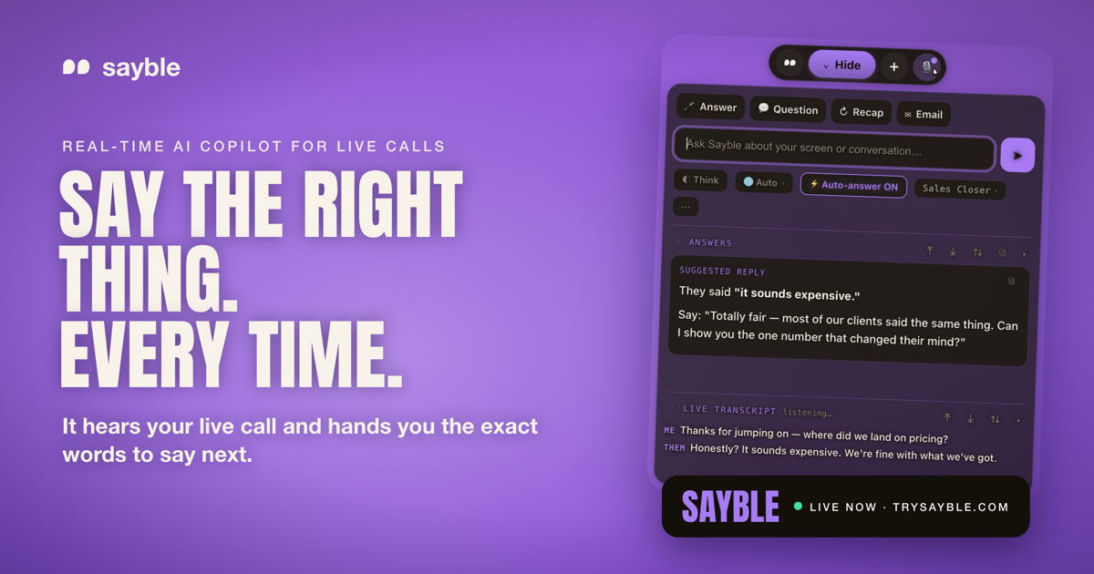
Sayble is a real-time AI copilot for conversations that matter — sales calls, client meetings, negotiations and everyday professional calls. It listens to your live call, hears what the other person just said, and hands you the exact words to say next, plus a backup line, in about half a second. When the call ends, it writes a structured recap and a ready-to-send follow-up email. Sayble runs on Mac and Windows, hears and answers in 10 languages, and is built for professionals who close, pitch and advise — people whose income depends on the next conversation going well. Its stated purpose is simple: perform better when the conversation matters, with sharper objection handling, faster thinking and confidence under pressure. High-stakes conversations move faster than most people can think. A prospect says "honestly, your price is way higher than the other quote I got," and the answer you give in the next few seconds often decides the deal. Under pressure, people reach for the wrong words, defend the price instead of reframing it, forget what was promised, and let follow-ups slip. Sayble is built for that exact moment. Instead of turning the conversation into a wall of text you would never read mid-sentence, it gives you one clean line you can actually say out loud — and then it turns the whole call into a written record you can act on afterwards. The core of Sayble is real-time assistance. It listens to the other person's latest point and returns the single best thing to say next — one line, not a wall of text. The site states the timing as 0.8 seconds from words spoken to answer on your screen, or roughly half a second. Each suggestion also comes with a backup line, so if the first approach does not land you have another ready. The website shows this in practice: when the other side says "Honestly, it sounds expensive. We're fine with what we have," Sayble suggests "Totally fair — most of our clients said that too. Can I show you the number that changed their mind?" and offers a backup line: "What would it need to save you monthly to be worth a look?" The second you hang up, Sayble writes the recap. The recap is pulled from the real transcript and captures what was decided, the objection that actually stuck, and what you owe them — the site's example reads "Decided: Pilot on 3 sites, 60 days," "Objection that stuck: Onboarding ate a month of our time last vendor," and "You owe them: Pricing sheet + the 3-day onboarding plan, by Friday." The follow-up email is drafted from what was actually agreed, so it is written before you have closed the laptop. You review it, send it, and move on. Call recording, recaps and drafted follow-ups are all included in the plan. The Home screen keeps your calls in one place. Today's calls are pulled from Google Calendar with one-click join, every recorded call is ready to replay, and each one carries an auto-written recap plus a follow-up email. A live transcription engine transcribes both sides of the conversation as it is said and separates who said what, so nothing is lost or misremembered. Sayble auto-detects the language of the conversation and answers in kind across 10 languages. It works on the calls you already take — Google Meet, Zoom, Microsoft Teams, Slack huddles, phone calls and anything on screen. Your modes, prompts and reference files follow your account across every device, and six skins with day and night canvases let you change the whole app's look without restarting. Sayble's approach is deliberately narrow. Rather than narrating the meeting in real time or filling the screen with analysis, it focuses on the next sentence — one line, in quotes, ready to speak. It is also built to stay off screen share: Sayble is designed to stay hidden from screen sharing and recording software, and that protection is included in your plan rather than sold as an expensive add-on. Everything it produces is grounded in the transcript of the actual call, which is why the live suggestions, the recap, the follow-up email and the answers you can interrogate later all come from what was really said. The site also carries an explicit AI notice: Sayble uses AI to analyze the conversation and generate real-time suggestions, AI output can be incomplete or inaccurate, and the user stays in control and always uses their own judgment. The conversation intelligence layer turns your calls into data. Sayble remembers every call, meeting and pitch, then lets you interrogate them in plain language — described as a private analyst that has sat in on all of your conversations and forgets nothing. You can scope the question to the last 5 days, the last 30 days, 100 calls or this quarter, then ask things like "What objection cost me the most deals this month?" The site illustrates the answer: "'It's too expensive' showed up in 61% of the calls you lost. In the 3 you won after it, you reframed to monthly savings within 20 seconds. In the ones you lost, you defended the price instead." Ask who to follow up with first and it reportedly flags the contacts who asked for pricing and never got a recap email, and offers the drafts. You can also ask what changed the mind of everyone who bought, and get back the exact lines that worked. The benefits compound across a book of business. Live, you get sharper objection handling, faster thinking and confidence under pressure. After the call, you never lose the thread of a back-to-back day, because live talking points during the call are followed by a structured recap and a drafted email afterwards. Over time, Sayble surfaces the objection you fumble most, the moment calls go quiet and the promise you keep forgetting — pulled from your own transcripts rather than a guess. Because it can read whole ranges of calls and answer with the lines that worked, you can scale what your best calls do and make your average conversation perform like your best one. Sayble is used across a range of high-stakes calls. Closers and SDRs use it to kill objections while the prospect is still talking — "too expensive," "let me think about it," "we already have a vendor" — and get a clean, human answer in quotes, ready to speak. Founders bring it into partnerships, negotiations and raises, where it keeps a record of what was actually said and keeps them sharp when the room gets expensive. Customer success and support teams use it to stay warm, on-message and quick under pressure. Recruiters use it to ask the sharp follow-up and summarise what matters accurately every time. Anyone working back-to-back days uses it to hold the thread from a live call through to a structured recap. The named audiences are sales closers, SDRs, account executives, founders, mortgage pros, insurance, real estate, customer success, call centers, recruiters, consultants, coaches and financial advisors. The app runs on macOS (Apple Silicon, .dmg) and Windows 10 and 11 (.exe), with the newest build listed as 1.2.30. Mobile for iOS and Android is listed as coming soon with a waitlist, and App Store, Google Play, Mac App Store and Microsoft Store availability is described as coming soon. It works alongside Google Meet, Zoom, Microsoft Teams, Slack huddles and phone calls, and uses Google Calendar for today's meetings on the Home screen. Pricing begins with a free download and a 3-minute live session with no card required. Sayble Pro is $24.99/month at the founder rate for the first 12 months, then $39.99/month, and includes unlimited real-time live-call copilot, screen-share hiding, objection handling and closing lines, follow-ups, recaps and email drafts, call recording and multilingual support on Mac and Windows. Sayble Teams is custom-priced per seat for sales floors and client-facing teams, with team onboarding, priority support and volume pricing for call centers. For professionals whose income depends on the next conversation going well, Sayble positions itself as a quiet edge: one line to say next in the moment, a recap and follow-up the moment the call ends, and a searchable record of every conversation you have ever had.
Mochi is a downloadable desktop pet for macOS — a little pink blob who lives on your screen, floats around while you work, reacts to what you are doing, and naps now and then. It is made for Mac users who want a small, cozy companion sitting alongside their everyday work, and it doubles as a gentle housekeeper: if you let it, Mochi keeps your Desktop tidy by carrying loose files into folders like Screenshots, Documents and Media. If you would rather it only hangs around, you can tell it to simply keep you company. The problem Mochi addresses is the Desktop that slowly turns into a dumping ground. Loose screenshots, stray documents and media files pile up while you are busy, and tidying them is a chore nobody wants to do in the middle of a work session. Mochi reframes that chore as something a companion does on your behalf. It files items away one by one rather than in a bulk sweep, it never deletes or overwrites anything, and every move it makes can be undone from the menu bar through the "Where Did My Files Go?" entry. Desk Patrol is Mochi's filing mode. When enabled, Mochi flies to loose files on your Desktop and files them away, one by one, moving them into folders such as Screenshots, Documents and Media. The approach is deliberately conservative: Mochi never deletes or overwrites anything, so nothing can be lost through an unexpected move. Every relocation can be undone from the menu bar using "Where Did My Files Go?", which means you can review what happened and reverse it if you disagree with the outcome. If you do not want any automatic filing at all, you can switch the behaviour off entirely and choose "Just keep me company", leaving Mochi as a purely decorative presence on your screen. Mochi's second role is companionship, expressed through hundreds of reactions to what is happening on your Mac. It reacts to the apps you use, to how long you have been working, and to late nights, so the pet's behaviour shifts with the shape of your day. It floats around while you work and naps now and then. Interaction is direct and mouse-driven: you can drag Mochi anywhere on screen, click it to pet it, and double-click it to give it a treat. These small gestures turn an idle presence into something you can actually play with between tasks. For users who want more personality, Mochi offers optional AI comments, powered by your own Claude, ChatGPT or Gemini key. Because the key is your own, the feature is opt-in and only active when you choose to supply one. Mochi Pro adds a tiny life sim on top of the pet: you grow a strawberry tree, build a nest, lay and hatch an egg, and raise a little family. Strawberries are scarce, so you need to keep watering — or, as the developer puts it, things get dramatic. Pro can be tried free for 30 minutes and is available on Gumroad from $5. Mochi lives in your menu bar at the top of the screen, which is where the main controls sit, including "Where Did My Files Go?" and the option to leave Mochi as company only. Installation is straightforward: download the .dmg, drag Mochi into Applications, and open it. The first time, macOS will say it can't verify Mochi because it is a free indie app without a paid Apple certificate yet; you click Done, then go to System Settings → Privacy & Security and click Open Anyway. This is only done once, and the full steps are included in a "How to open Mochi.txt" file inside the download. Mochi requires macOS 13 (Ventura) or later, and runs on Apple Silicon or Intel. The downloads are version 1.0.3, available as a 3.4 MB disk image or a 3.1 MB zip. Mochi runs entirely on your Mac, with no account and no tracking. The benefits are practical as well as decorative. Your Desktop stays organised without you spending time sorting screenshots, documents and media by hand, and because every move is reversible from the menu bar, adopting the feature carries little risk. At the same time, the pet itself gives long work sessions a bit of warmth — reactions that notice how long you have been at the machine, naps, playful interactions, and optional AI comments. Because everything runs locally with no account and no tracking, using Mochi does not add another login or another service watching your behaviour. Typical use looks like this: you leave Mochi running during a work session and let Desk Patrol gradually clear the loose files that accumulate on your Desktop, checking "Where Did My Files Go?" whenever you want to see or undo what was moved. If you are on the machine late, Mochi's reactions to late nights and to the apps you are using become part of the ambience. Users who want a companion rather than a housekeeper switch to "Just keep me company" and simply drag, pet and feed Mochi between tasks. And anyone curious about the little life sim can start Pro for the free 30-minute trial, grow the strawberry tree and work towards hatching an egg. Mochi suits Mac owners who enjoy cozy, casual desktop companions and who would also like small productivity nudges — the itch.io listing categorises it as a Simulation with tags including casual, companion, cozy, cute, desktop pet, idle, productivity, relaxing, tamagotchi and virtual pet. It is an English-language, mouse-driven experience, and the listing notes an average session of days or more, reflecting that Mochi is meant to stay running in the background rather than be opened for a single sitting. The app is released by the developer nickmorefun and carries an AI disclosure for assisted code, graphics and text. Pricing is a free download with an optional paid Pro tier from $5 on Gumroad. Overall, Mochi combines a cute Mac desktop pet with a cautious, fully reversible file-tidying helper. It keeps your Desktop in order, adds personality and small reactions to your working day, and stays entirely on your Mac with no account or tracking — free to download, with a Pro life sim for anyone who wants more.
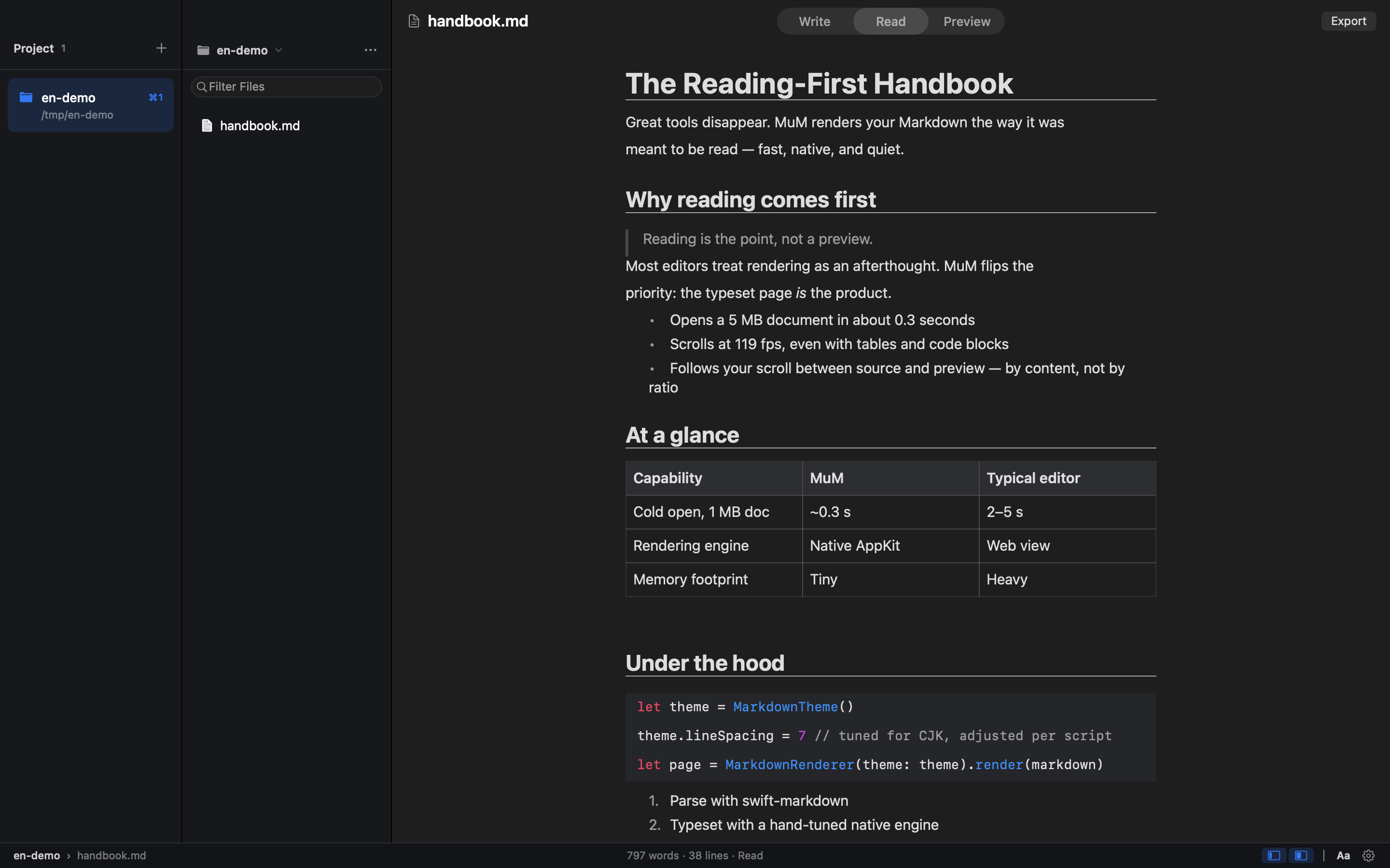
MuM is a reading-first Markdown engine for macOS, described by its makers as a native macOS reader with no web engine inside — everything is built with AppKit. Its og:description sums the product up as hand-built AppKit typesetting for humans and CLI rendering for agents. Instead of being a writing app with a preview pane, MuM is designed for people who already have Markdown scattered across many folders and who simply want to read one section. It opens several projects at once, each remembering where you stopped, and provides cross-project search plus typesetting tuned for CJK as well as Latin text. It is open source under the MIT license, and it also ships a command-line side that renders Markdown for agents. The product's own framing states that your Markdown lives in a dozen folders, and that most of the time you do not want to write — you just want to read one section. Yet, according to MuM, every other Markdown tool is a writing app with a preview pane. That mismatch means readers are pushed into interfaces built around editing, with preview workflows and rendering stacks that add friction to what should be a simple act of reading. MuM addresses this gap by inverting the model: reading comes first, and authoring is not the point. It also targets the practical annoyance of juggling many separate documentation folders by treating each project as an answer to the question of where you are, so context is never lost when you move between documents or repositories. MuM's core human-facing capability is multi-project reading. You can keep several projects open at the same time and switch between them with ⌘1 through ⌘9, and each project remembers where you stopped, so returning to a document resumes at the exact place you left off. The app is explicitly built for reading rather than authoring: ⌘F performs find within a document, ⌘⇧O opens an outline, and reading history is navigated with ⌘[ and ⌘]. Because each project preserves its own position, MuM's projects serve as landmarks that answer where you are, which matters when documentation is spread across many repositories and folders rather than living in one tidy workspace. Finding content is handled by two dedicated shortcuts. ⌘P fuzzy-finds files by name, which is the fast path when you know roughly what a file is called but not which folder holds it. ⌘⇧F goes further, searching names and contents across every project and streaming results as they are found, so you are not limited to the project currently on screen. Together these two modes cover the two most common retrieval patterns — reaching for a known file and hunting for an unknown phrase — without leaving the reader or opening a separate search interface. MuM's typesetting is tuned for CJK as well as Latin text. Line height, punctuation compression, and mixed-script spacing are measured rather than guessed, which is what allows documents that mix Chinese, Japanese, or Korean characters with Latin script to read cleanly instead of looking mechanically assembled. The rendering path is deliberately broad: MuM reads code with syntax highlighting, renders CSV and TSV as tables, and displays RTF, images, PDF, and srt/vtt subtitles. Office files get a page that points you to the default application. Markdown can also carry limited HTML — small, mark, and super/subscript tags render semantically while the tags themselves stay out of sight. Export is built in as well: ⌘⇧E turns the current document into a tall PNG or a paged PDF, and page-break hints written in the document become real page breaks in the output. Day to day, MuM keeps the interface quiet. Double-clicking a lone file opens single-file mode: both sidebars fold away and you simply read, and the folder is not turned into a project, so your project list stays clean. File management lives in the file tree's menu and right-click menus, where ⌘N creates a new file and you can also create folders, rename items, or move them to Trash. One click opens a shell right at a deeply nested folder, auto-detecting Ghostty first, then iTerm, then Terminal.app. Updates are one-click too: a banner's Download update button downloads the DMG in-app, mounts it, and lets you drag MuM into Applications. The app is quiet in a broader sense as well — no accounts, no telemetry, no plugin store — on the principle that a tool shouldn't be louder than its content. Structurally, MuM is the opposite of a writing app with a preview pane. The entire typesetting engine is hand-built and native, and the app contains zero web engines, so rendering happens directly rather than through an embedded browser. That same hand-built engine powers a windowless path for agents: a CLI renders Markdown straight to PNG or PDF with the same CJK spacing, code highlighting, and reading themes used inside the app. Commands such as mum render README.md --png cover.png and mum outline README.md --json let automated consumers get images or structured outlines, and outline, search, and check emit stable JSON with classified exit codes (0, 1, 2, 3, and 4), so agents never have to parse prose. This dual-surface approach — the same engine serving both a macOS window and the command line — is the product's central methodology. The benefits follow from those design choices. Because MuM contains zero web engines, it starts cold to a window in about 0.3 seconds, ships as a 1.7 MB installer, and scrolls a 5 MB document at over 100 fps — figures the product itself publishes. Because projects remember reading positions and history is navigable with ⌘[ and ⌘], you spend less time reorienting and more time reading. Because search spans every project rather than one folder at a time, you are not forced to remember which repository contains a given phrase. And because there are no accounts, no telemetry, and no plugin store, nothing is running in the background or asking for attention beyond the document itself. Concrete scenarios include keeping several documentation projects open at once and hopping between them with ⌘1 through ⌘9 while each holds its place; double-clicking a single Markdown file to read it in single-file mode without polluting your project list; pressing ⌘⇧F to find a phrase whose location you have forgotten across all your projects; exporting a document to a tall PNG for sharing or a paged PDF for printing, with document page-break hints becoming real breaks; reading a deeply nested folder and jumping straight into a shell there through Open in Terminal; and, on the agent side, running the CLI to render README.md to a PNG cover or to emit an outline as JSON so scripts and agents can consume structure rather than prose. MuM is aimed at macOS users who read a lot of Markdown — its topics are Open Source, Developer Tools, and GitHub — and at agents that need rendered or structured output. The app is native, built with AppKit and containing no web engine, and it is open source under the MIT license, so no purchase is required. Integrations mentioned are practical rather than plugin-based: terminal emulators are auto-detected in the order Ghostty, then iTerm, then Terminal.app, and the CLI exposes mum render README.md --png cover.png and mum outline README.md --json, with outline, search, and check emitting stable JSON and classified exit codes (0/1/2/3/4) so that agents never parse prose. MuM's value proposition is simple and self-declared: it is a reading-first Markdown engine. By building everything in AppKit, skipping web engines, remembering where you stopped across several projects, searching every project's file names and contents, tuning typesetting for CJK and Latin alike, exporting to PNG and PDF, and exposing the same engine to agents through a quiet CLI, MuM treats Markdown as something to be read — fast, native, quiet, and open source.
Lattice is a web-based text transformation tool that reshapes your writing so it sounds like you wrote it. You paste in a draft, choose an input and output language, and Lattice returns a rewritten version that carries the same meaning in a more natural, less predictable expression. Its stated purpose is simple: make any text sound like the person who wrote it. Rather than replacing your ideas, it works on the wording, swapping phrasing that reads as stiff or generated for language people actually use. Lattice is presented as being built for academic writing, and its interface also lists emails and communication, content creation, reports and documentation, multilingual expression and everyday writing among the areas it addresses. Most drafts, as Lattice describes it, lean on the same handful of phrases. Stock openers such as hoping a message finds someone well, and filler transitions about circling back, appear again and again, along with a rhythm that is too even to read as spontaneous. The site points to em dashes and stock phrases as tells that make a message read as AI-written. The problem matters because those tells get in the way of the message itself: a reader notices the padding before they notice the request. Lattice's answer is to find those repeated, predictable phrases and rewrite them in plain language, so your message lands the way you meant it. In the before-and-after example published on the site, an email laden with stock phrasing and four em dashes becomes roughly half the length while making exactly the same request. The site's central idea is a different path to the same idea. Every language, as Lattice puts it, says things its own way. Lattice passes your text through a few languages, so what comes back keeps your meaning but loses the stiff, predictable phrasing. The site diagrams this as a journey: an English draft, then a hop into Spanish, a second hop into German, a third hop into Japanese, and then back to English. The interface shows the sentence about today's fast-paced world and the importance of leveraging effective communication strategies as the original in English, marked as stage one of five in the visualised path. Each hop is a stage in the transformation, and the wording that returns is not the wording that went in. The result is meant to be a fresh expression of the same idea rather than a simple synonym swap. Lattice's first stated promise is that it drops the tells. Stock openers, filler transitions and that too-even rhythm get replaced with wording people actually use. This is the part of the rewrite a reader feels immediately: the salutation stops sounding like a template, the transitions stop announcing themselves, and the sentences stop marching in step. Because the tool targets the specific patterns that make text read as generated, the output is meant to pass as ordinary writing rather than as a lightly edited machine draft. In the published example, the original opens with a formal greeting and a run of padded clauses, while the rewritten version opens with a name and a direct follow-up request, closing with a short question about being free for fifteen minutes this week. Lattice is equally explicit about what it does not touch. Names, numbers, technical terms and the point you were making all come through untouched. That constraint is what makes the rewriting useful rather than risky: you are not re-checking facts, figures or terminology after each pass, because the transformation is aimed at expression rather than content. The third promise is that the result reads like you. Sentences vary in length and flow naturally, so the output sounds written rather than generated. Together, the three claims describe a narrow, deliberate kind of editing: change how the text sounds, leave what the text says alone. Using Lattice follows a short, visible workflow. You paste your draft into the input area, which is labelled with the input language and a counter showing a maximum of 1,000 characters, so the tool operates on short passages such as an email, a paragraph or a set of sentences rather than a whole document. You then choose the output language, shown as English in the interface, and press Transform. The page reports that the transformation runs in 4 hops by default, and an Advanced options panel sits beneath that setting. A Clear action empties the input, and the transformed text appears in a dedicated output panel with a Copy button, so the result can move straight into the document or message you were writing. The site also presents before-and-after comparisons so you can see the original and the Lattice version side by side before using it. The stated outcome is a message that lands as intended. Shorter, plainer text does the same work with less to read, as the roughly halved length of the published example suggests. Dropping stock openers and filler transitions removes the cues that make a reader suspect the text was generated. Preserving names, numbers and technical terms means the rewrite does not create rework. And because sentences vary in length and flow naturally, the result sounds like a person rather than a template. For anyone writing in a professional or academic setting, those outcomes combine into a simpler promise: you can start from the draft you already have and end with something you would be comfortable having written yourself. The interface lists the kinds of writing Lattice is aimed at. Academic writing is called out as a focus: good research writing, the site notes, is precise rather than padded, so Lattice smooths out clunky sentences and repetitive transitions while leaving terminology, citations and argument exactly where you put them. Emails and communication is the second area, illustrated by the before-and-after follow-up email about a project timeline and a request for fifteen minutes this week. Content creation is listed as a third area, and reports and documentation as a fourth. Multilingual expression is a fifth, which follows naturally from a tool whose method is to pass text through several languages. Everyday writing is the sixth. Across all of them the pattern is the same: a draft with predictable phrasing goes in, and a plainer version of the same message comes back. Lattice presents itself most explicitly as a tool built for academic writing, and the example it publishes is a workplace email, so the audiences the content speaks to are academics and researchers on one side and professionals writing messages, content, reports and documentation on the other. The site does not describe integrations, a technology stack or a plan structure. What it does show is a single web interface with input and output language selectors, a hop count and an advanced options panel, which points to a browser-based tool rather than something you install. Everything about the product in the available content runs through that one page and one transform action. Lattice's value proposition is narrow and clear. It does not write for you or generate new ideas; it takes text you have already written and reshapes it through multiple language paths until the same meaning arrives in a fresher, more natural expression. The tells go, the names, numbers and terms stay, and what the reader sees is a message that sounds like the person who sent it.
Ryu Journal is a calm, private journaling app for iPhone and iPad, available on the App Store. Ryu means 'flow' in Japanese, and that single idea shapes the entire product: it is a quiet place to put a thought down and let it go. There are no accounts, no social feed and no pressure — just you and the page. The app is made for busy minds that want a low-friction way to write something down and then return to their day rather than managing another complicated tool. You open Ryu Journal, write what is on your mind, and close it again. A Home Screen widget keeps a gentle zen quote in view as a small, steady reminder of the same idea: let it flow, let it go. Ryu Journal is built around the belief that a journal should help you release a thought rather than trap you in a system. The app deliberately leaves out the things that usually make journaling feel heavy: there is no sign-in or account creation, so the app never knows who you are; there is no social feed to post into or compare yourself against; and there is no pressure of any kind built into the experience. Privacy is treated as a default rather than a setting. Ryu Journal collects no data, runs no analytics, telemetry or crash-reporting SDKs, and uses no third-party services, ads or trackers. For anyone who has wanted to write things down but did not want their private reflections sitting on someone else's server, that combination is the core promise of the product. The heart of Ryu Journal is a clean, distraction-free editor. Adding an entry is intentionally minimal: tap the plus, write, and save. Tapping any existing entry opens it again so you can keep writing inside the same post instead of starting over. Because there is nothing to configure, the act of writing stays as short as the thought itself. Saved entries gather into a simple timeline, so a week of short notes collects softly into one place instead of scattering across notebooks, notes apps and fragments of memory. The result is a record that builds quietly in the background of your day — you are not asked to maintain it, organise it or design it, only to write and let go. Pulling the journal down reveals Trends, a compact view of what your writing is showing over time. Trends includes your streak, a word cloud and your mood, all derived from the entries you have written. The streak shows how consistently you have been writing; the word cloud surfaces the keywords and themes that keep coming up in your words; and the mood signal reflects how your entries are reading. All of this is stored locally on your device alongside the entries themselves. Trends also uses the phone's motion sensors for one small, purely visual purpose: to tilt its colours gently as you move the device. Nothing from those sensors is ever stored. A Home Screen widget keeps a gentle zen quote where you will see it, drawn from a collection that includes Zen proverbs and words from Lao Tzu, Thich Nhat Hanh, Ram Dass, Eckhart Tolle and Glen Hansard. The widget reads only a small snapshot of your latest entry and its quotes from local storage that is shared between the app and the widget and nowhere else. If you want an extra layer of protection, you can turn on app lock; the passcode is kept in your device's keychain and never leaves it. You stay in control of what is kept: press and hold any entry to delete it on its own, or pull the journal down to reveal Trends, tap Options and then Delete all posts to remove everything at once. Deleting the app removes all of its data from your device. Ryu Journal works entirely on your device, and that single design decision explains most of how the product behaves. Everything you write — entries plus the keywords, themes and mood signals derived from them — is stored locally. The app makes no network requests carrying your content and works fully offline, so it behaves the same on a plane, in a tunnel or in airplane mode. Because there is no account system, there is nothing to log into and nothing for anyone else to look up. If you use iCloud device backups, your device may include the app's local data in your encrypted backup, but that backup is governed by Apple's privacy policy rather than Ryu's, and the developer has no access to it. The practical benefit is a journal you can trust with things you would not type into a feed. Your words belong to you and stay with you, which lowers the hesitation that usually comes before writing something honest. The absence of accounts, trackers and analytics means there is no audience, no profiling and no data trail; the absence of a social feed means there is no performance. The calm, minimal editor and the pull-down Trends view give the app a rhythm that matches its name: write, glance at what has accumulated, and move on. For busy minds, the outcome described is simple — a place to put a thought down, and the relief of letting it go. Ryu Journal fits small, frequent moments rather than long ritualistic sessions. One common pattern is the quick capture: something is bothering you or an idea arrives, you tap the plus, write a few lines, save, and get back to your day. Another is the continuing entry — you tap a post from earlier and keep writing in the same thread as a thought develops. Reviewing the week is a third: the timeline gathers your entries so you can scroll back through what you have written. When you want a wider view, you pull the journal down to check your streak, word cloud and mood in Trends. Others keep the Home Screen widget in view for a zen quote during the day, and anyone can delete a single entry or all posts whenever they choose. Ryu Journal is aimed at iPhone and iPad users, and it is available on the App Store. It suits people with busy minds who want somewhere private to write, particularly those who are put off by apps that require accounts or invite sharing. The product's stated approach is privacy-first and offline-first: no data collection, no accounts, no analytics, no telemetry, no crash-reporting SDKs, no third-party services, no ads and no trackers. Questions can be directed to the developer on Threads at @jayrunquist. The privacy policy, last updated September 8, 2026, states that Ryu Journal collects no data and that your journal never leaves your device. Ryu Journal is, in its own words, a quiet place to put a thought down and let it go. Everything it does follows from that: a clean editor that takes seconds to use, a timeline that gathers the week softly, Trends that quietly reflect your streak, words and mood, a widget that keeps a zen quote in sight, and a privacy model in which nothing leaves your device unless you back it up yourself. For busy minds that want to write without an audience, a sign-in or a data trail, that is the whole value — write it down, let it flow, let it go.
Stash is a macOS utility that keeps your apps and system controls hidden at the edges and corners of your screen until you reach for them. Stash lives in your menu bar: you set up your apps and controls once, then reach for them at the edges and corners of your screen. On the Mac it delivers Edge Sliders, Corner Dials, a Hidden Dock, an App Launcher and App Profiles. On the iPhone, the Stash Deck companion app turns your phone into a tactile remote for your Mac, with quick controls, app launching, configurable widgets and Creative Pro controls for creative applications. Stash is for Mac users who want their apps and controls within reach without cluttering the screen. The problem Stash addresses is one most Mac users recognise: the controls and apps you rely on most are rarely exactly where you need them when you need them. System controls such as volume, brightness, keyboard backlight and audio output normally require a trip to the menu bar, and the apps you use constantly have to compete for space in the Dock. Stash's approach is to keep those apps and controls within reach without cluttering your screen — they stay out of sight until you reach for them, then appear at the edges and corners. The company describes the result as hidden controls that feel like they have always belonged there: beautiful, native-feeling and ridiculously satisfying to use. It is not that the Mac lacks controls, but that those controls and apps are spread across the menu bar and the Dock, competing for the same limited space. Edge Sliders and Corner Dials are the two control surfaces that put system settings around the perimeter of your display. Edge Sliders let you assign the left or right edge of the screen to volume, brightness or appearance, so a reach to the side of the display adjusts the setting you use most. Corner Dials put volume, brightness, keyboard backlight and audio output in the corners of your screen, giving you a set of dials rather than a menu to hunt through. Together they turn the frame of your display into a control layer for the settings you adjust most often. They follow the same principle as the rest of Stash: the controls are not displayed permanently, only when your pointer reaches the relevant edge or corner. The Hidden Dock and App Launcher handle access to your applications. The Hidden Dock works alongside your existing Dock — it does not replace it — and slides out when you move to the edge of the Dock, holding the apps you want nearby but not always visible. An expanding App Launcher covers the rest of your applications, so your favourites sit within reach while everything else stays one step away. Stash can be recalibrated from the menu bar if your Dock changes. Because these apps are not permanently on screen, your workspace stays clear while your most-used tools remain immediately available. App Profiles make Stash adapt to what you are doing. Stash automatically changes your apps and controls depending on what you are using, so the set of controls and applications on hand reflects the current task rather than a single static configuration. That means the same utility can present a different, appropriate arrangement as you move between activities, without you rebuilding your setup each time. Because the switching happens automatically based on what you are using, there is no need to rebuild your layout by hand when you move between activities. Edges, corners, apps and the accent colour can all be changed at any time from Settings, so profiles and layout stay under your control. Stash Deck extends the same idea to your iPhone. It is the iPhone companion to Stash for Mac and it follows what you are doing: you can control your Mac from the phone, throw an app from your phone to open it on your screen, and keep widgets such as Spotify, Timer, Claude Code and Codex on hand. Creative Pro is part of Stash Deck. When you are in a creative app, the Deck becomes contextual tools, precise sliders and colour controls for Photoshop, Illustrator, After Effects, Premiere Pro and Blender. Stash Deck is free to download and works with Stash for Mac. Stash's overall approach is a menu bar app that you configure once and then use through your edges and corners. Rather than adding more windows, panels or icons to your screen, Stash stays out of sight until you reach for it — the interface appears at the side or corner of the display exactly when your pointer arrives there. If your Dock changes, you can recalibrate Stash from the menu bar, and the Settings panel lets you revisit which apps and controls are assigned where. Everything ships as one package: Hidden Dock, App Launcher, Edge Sliders, Corner Dials, App Profiles and Stash Deck with Creative Pro, with no tiers or add-ons. The benefits follow from that design. Your screen stays uncluttered because the controls are hidden until used, yet volume, brightness, keyboard backlight, audio output and appearance are always a gesture away rather than buried in menus. Favourite apps stay within reach through the Hidden Dock while the App Launcher keeps the rest accessible, and App Profiles mean the right apps and controls are available for whatever you are working in. Stash Deck adds the convenience of working from your phone, and Creative Pro gives creative professionals precise controls tailored to the applications they already use. Because everything is included in a single purchase with no tiers or add-ons, users do not have to decide which parts of the experience they need. Use cases include adjusting system settings mid-task — changing volume, brightness or appearance by reaching for the edge or corner of the display without leaving what you are doing. Another is keeping a working set of apps close through the Hidden Dock and App Launcher while the main Dock stays tidy. Creative Pro supports photographers, designers, editors and 3D artists working in Photoshop, Illustrator, After Effects, Premiere Pro or Blender, who can use the iPhone deck for contextual tools, precise sliders and colour controls. App Profiles suit users who move between different kinds of work and want the interface to follow. Stash Deck also serves anyone who wants their iPhone to act as a remote for their Mac, launching apps and hosting widgets such as Spotify, Timer, Claude Code and Codex. Stash is aimed at Mac users who want faster access to apps and system controls without cluttering their screen, and at creative professionals who want tactile, precise controls alongside their creative applications. It requires macOS Tahoe; older macOS versions are not supported. Pricing is simple: Stash is free for 24 hours, after which you can pay $3.99 per month, cancellable anytime, or $19.99 once for a lifetime licence at the launch price. Both options include everything and work on up to 3 Macs. If you cancel the monthly plan, Stash keeps working until the end of the period you have paid for and then locks until you renew or buy Lifetime. Existing owners get the update, including Creative Pro, on the same number of Macs as before. In short, Stash turns the edges and corners of your Mac into a hidden control layer, keeps your apps within reach without cluttering the screen, and extends the whole experience to your iPhone through Stash Deck and Creative Pro — one app, everything included.
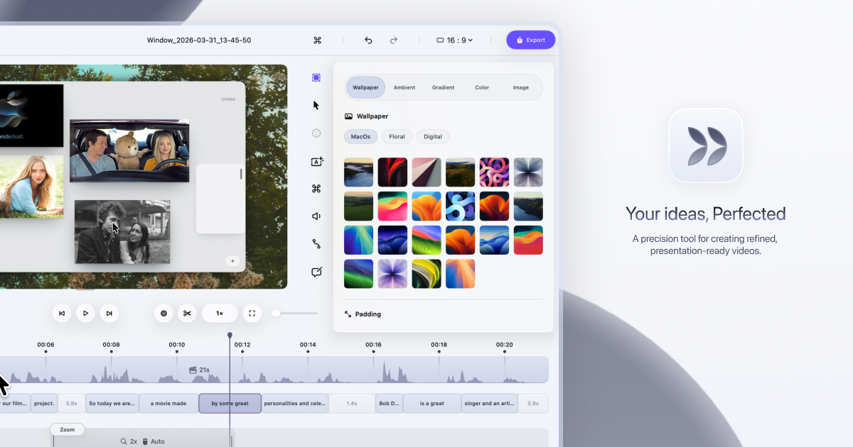
Dina is a screen recorder built exclusively for macOS that turns raw screen captures into polished, presentation-ready videos. It records your screen, audio, camera, cursor, and keystrokes in one take, then refines the result — with motion, zoom, and clarity handled for you — so every recording feels ready to present. The tool is made for people who need to explain something on screen clearly and beautifully, from product demos and tutorials to courses and social media videos. Dina's stated goal is to make every video worth watching, so what your audience sees is as clear as what you imagined. Screen recordings are the fastest way to show rather than tell, but the result rarely matches what the creator pictured. Key interactions get lost when the viewer cannot tell where to look, and motion can feel less intentional than intended. Dina's approach is to handle the refinement automatically: it records your screen and refines it automatically, and according to the product, demos and tutorials made with it feel clearer, more engaging, and effortless to watch because automatic zoom keeps the audience focused on what matters. Dina also positions itself as an alternative to tools such as Screen Studio, Loom, and Tella, standing apart by adding cinematic zoom, smooth animations, and AI-powered features to recordings so they feel polished without manual editing. Capture everything that matters, all in one take. Dina records screen, audio, camera, cursor, and keystrokes together, and you can capture your screen, a window, or a selected area with camera, mic, and system audio in high quality from the same recording panel. Scheduled Recording lets you set a time and let Dina handle the rest, so a recording can start without you being there, while Pause Recording lets you pause and resume whenever you need to so you can record at your own pace. Because capture happens in one place in one take, there is no need to assemble separate tracks afterwards. Automatic zoom is at the heart of the experience. Dina automatically zooms into key interactions, helping your audience stay focused without distraction, and you can switch to precise manual zoom control when you want to highlight something specific. Smooth, intentional zoom animations guide the audience through every important detail. A new dimension of depth comes from subtle 3D camera movement added to your recording, so scenes feel more cinematic and alive. You set the perspective with presets that range from a gentle angle to a dynamic top-down shot, then fine-tune camera position, distance, roll, and depth blur so each move feels exactly right. Cursor movement is gently refined so motion feels steady and intentional, and cursor size, variant, and highlight effects can be customized to match your brand. Keyframes provide smooth, natural transitions that highlight important moments and guide the viewer's attention. Complete layouts bring titles, slides, images, and video together into cohesive scenes that feel balanced, intentional, and ready to present. Mask Layout hides sensitive information with flexible, multi-region masking exactly where you need it. Slide Layout adds slides directly into your recording and gives you control over their color, timing, and animation so they feel like part of the video rather than an overlay. Text Layout adds text with solid or gradient fills and refined animations timed to appear and exit naturally as the recording progresses. Annotations guide attention exactly where it matters: arrows, highlights, shapes, and callouts are added directly into the video. Callouts provide contextual notes with customizable text, colors, and timing, Highlights draw the viewer's eye to key moments, and Shapes & Arrows frame, point, and guide with precision. Background and spacing can be adjusted to frame content clearly and consistently. Dina is built for presence, recording your webcam, microphone, and captions together so your message comes through naturally without extra setup. The webcam can be adjusted for size, shape, roundness, and position to place your camera exactly where it belongs in the frame. Voiceovers can be recorded directly in the timeline, so narration can be added, edited, and refined without breaking your flow. Editable captions generate transcripts automatically and let you fine-tune words, timing, and phrasing so captions read clearly and accurately. AI transcript editing turns speech into edits: your recording appears as text, so you can edit your video by editing the transcript while AI removes fillers and silence automatically. AI voiceovers turn text into natural-sounding narration instantly, generating voiceovers from text using efficient on-device models. Dina puts control at your fingertips so you can customize shortcuts and edit your video with speed and precision without slowing down. Visual keyboard overlays show every key as it is pressed so your audience can follow along, and the shortcut display itself can be customized to match your brand and improve clarity. Output is studio-quality and ready instantly, with 4K output, multiple formats, and fast rendering. Native resolution exports preserve the original resolution without quality loss, which is useful for high-quality demos and tutorials. Shareable video links let anyone watch, review, and collaborate on a recording without needing an account, and Layer Export lets you export videos in layers to preserve quality and flexibility for professional editing workflows. Dina also handles iPhone recordings. Beautiful iOS Recordings capture your iPhone in original resolution and enhance it with smooth motion and refined presentation, designed to make every recording look polished. A range of iPhone variants and device mockups let you present your recordings inside device mockups. Easy iOS device recording works by connecting your iPhone with a USB cable or by choosing the iPhone mirroring window, and then starting the recording. Under the hood, Dina is designed exclusively for macOS, using modern Apple technologies to deliver native performance. The interface is crafted with SwiftUI for fluid animations, precise interactions, and a clean macOS-native experience. Metal taps directly into the GPU to power smooth motion, real-time visual effects, and high-quality video processing. On-device Core ML models run intelligent features, from transcript generation to voice synthesis, with full privacy and zero cloud latency. Dina runs natively on Macs powered by Apple Silicon and requires macOS Sequoia or later; there is no Windows version, and the app is built exclusively for macOS to take full advantage of Apple Silicon and Metal. Privacy is a core part of the product. All recordings are saved locally on your Mac, Dina works completely offline, and it does not require any account or cloud connection, so your data stays on your device, private and secure. The AI features, including transcript generation and voice synthesis, run on-device via Core ML, so nothing needs to leave the machine. The practical outcome is a fast, private workflow where polished videos are produced without manual editing, without subscriptions, and without depending on an internet connection. Typical uses include product demo videos that show a feature in action, video tutorials and courses that walk through a process step by step, and social media video content intended for quick sharing. Mask Layout is useful when a recording contains sensitive information that should not be shown, and Scheduled Recording helps capture sessions that happen at a fixed time without the creator being present. Layer Export serves professional editing workflows where further work happens in another editor, while shareable links support review and collaboration, since anyone can watch, review, and collaborate on a video without an account. Dina is trusted by professionals at companies including FloraAI, Sketch, Windsurf, and Typeform. It is distributed as a Mac licence: a native macOS app sold as a one-time purchase rather than a subscription. The licence costs $58 per device and includes lifetime updates, with an option to choose one device or three devices. Buyers get a lifetime license, free updates forever, files saved locally, full offline operation, and all features unlocked. Dina also maintains a Slack community for new features and tips, and an X/Twitter account for release updates. In short, Dina is a native macOS screen recorder that makes recordings look intentional without manual editing. It captures screen, audio, camera, cursor, and keystrokes in one take, then applies automatic zoom, 3D camera motion, smooth cursor movement, layouts, annotations, captions, and transcript-based AI editing to produce studio-quality video. For Mac users who need demos, tutorials, courses, or social videos that look polished and stay private, Dina combines speed, cinematic presentation, and one-time pricing in a single offline app.