Category Focus/categories/productivity
Productivity AI Tools
Discover and compare the best productivity AI tools and software. Browse 864+ curated tools with reviews and rankings.
Projects tracked
864
Sort mode
RECENT
Page
16
Discover and compare the best productivity AI tools and software. Browse 864+ curated tools with reviews and rankings.
Projects tracked
864
Sort mode
RECENT
Page
16
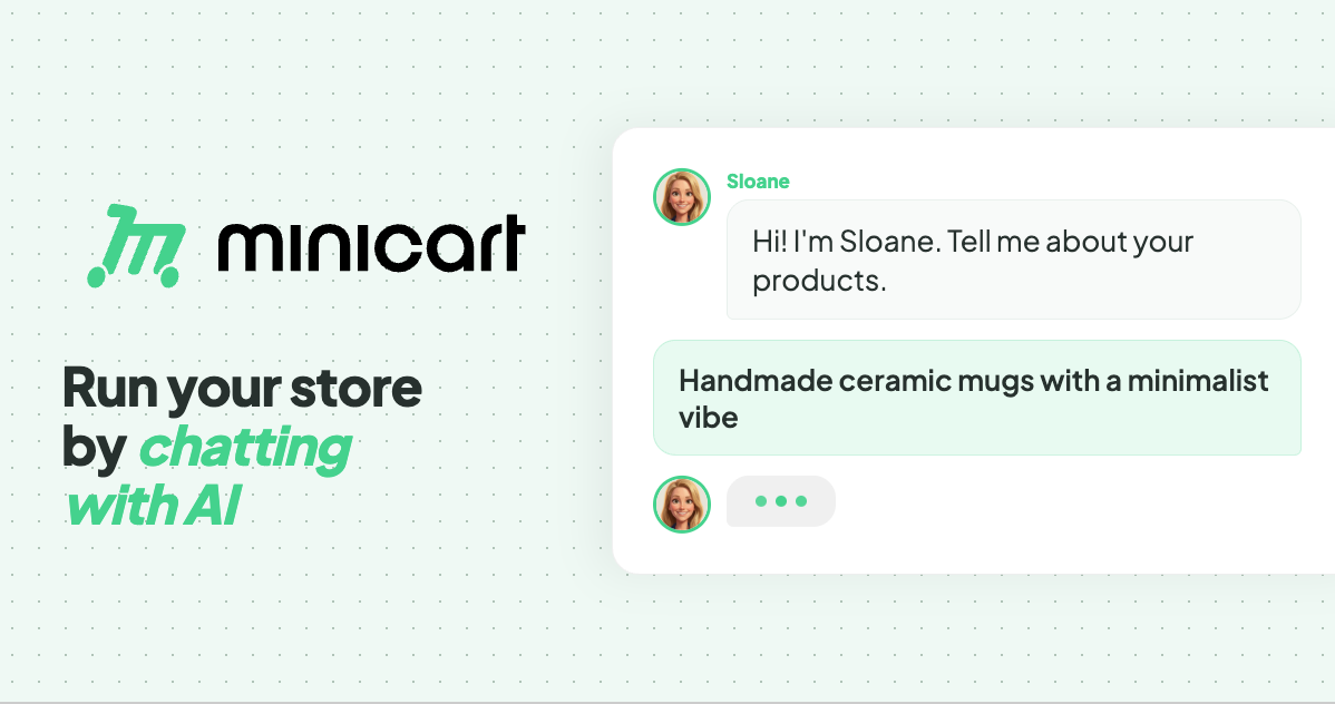
Minicart is a platform for launching and running an online store by chatting with AI. According to the website, you snap a photo of what you make and Minicart builds you a real website that you own, then gives you AI teammates to run it for you. The site positions Minicart for the people who make and sell things — it names makers, creators and resellers — rather than for developers or ecommerce specialists. Its stated purpose is to let someone launch and run a store without learning ecommerce software: no code, no design work, nothing to configure. The promise is deliberately plain: if you can take a photo and send a text, you can run a Minicart store. The site frames Minicart against selling inside someone else's platform. In its own words, a store should not be "a booth in someone else's marketplace." Marketplaces charge listing fees and keep the customer relationship buried in a feed, and building on existing store software can mean monthly fees and a stack of apps. The problem Minicart addresses is twofold. First, getting a real store live is usually slow and technical. Second, once a store is live, the everyday work — listings, marketing, shipping, customer replies, sales tax — turns into a second job. Minicart's answer is to give you a storefront of your own plus AI teammates that handle that busywork around the clock. Getting started is built around photos and imports. Minicart states that a single photo is enough to get started: you take a photo of what you make, answer a few quick questions, and Minicart builds the rest, turning the photo into a polished product listing and a full website automatically. The site advertises going from photo to live store in under ten minutes, with no design work to do. For sellers who are already trading elsewhere, Minicart offers one-click import. You paste your Etsy shop link and Minicart pulls in every listing — titles, prices, photos and variations — then rebuilds them on a site that is yours, while your Etsy shop keeps running. The same one-click approach works for Shopify, bringing products, images and collections across, and for eBay, importing titles, prices, photos and variations onto a site you own. Minicart describes these as read-only connections, so your existing store is never touched or paused. After launch, three named AI teammates take over the daily work. Sloane is the storefront teammate: she builds the site, takes payments, tracks sales and keeps listings current. Milo is the marketing teammate: Milo drafts lifestyle photos, social posts and discount codes that bring people in, and the site shows Milo drafting Instagram posts for new products. Logan is the logistics teammate: Logan ships orders, tracks inventory, handles refunds and drafts customer replies, with the site showing Logan preparing a shipping label and writing a reply to a customer question. The site describes these teammates as working 24/7 — its example timeline runs from turning photos into products in the morning through processing payments and sending a payout in the evening. Everything is driven through chat. The site says that if you can text, you can run a store: you manage inventory, draft social posts and talk to customers through a simple chat interface. Commands are given in plain language, and the site gives the example of creating a 20% summer promo code for all bracelets, which the assistant confirms with the code SUMMER20. The same chat interface powers a bulk editor for updating everything at once. Saying "increase price of all red necklaces by $5" makes the team line up the affected items and show a confirmation list before anything changes. Minicart makes clear that you review the list, uncheck anything you want to skip, and confirm — nothing changes until you say so. The same review-and-confirm pattern applies to inventory updates such as new stock numbers for bracelets and necklaces. The overall method is a three-step loop: snap a photo, let Minicart build your store, then go live and sell. Step one is taking a photo of what you make and answering a few quick questions. Step two is Minicart turning that photo into a polished product listing and a full website automatically. Step three is launching the site, sharing the link anywhere and taking orders in minutes. From there, the teammates keep running the operation under a single stated rule: you are always in control, and nothing goes out without your say-so. The stated outcomes for users are concrete and tied to ownership. You get your own website that lives on your own domain under your brand, rather than inside a marketplace feed, and you can bring your own domain or grab a new one, with your store carrying your name, colors and style from day one. There are no listing fees, so you can list as much as you want, and Minicart says it only charges a small card fee when you actually make a sale. Because the store is yours, you keep your customers: their emails are yours to build repeat business and a brand you can grow for years. The site also highlights speed — launch in minutes rather than weeks, and live in ten minutes — along with dropping monthly fees and the app stack associated with other platforms. The use cases shown on the site are drawn from real stores. Minicart says it helps you sell resin art, and its how-it-works example builds a store from a photo of a candle. It lists storefronts selling trading cards and sports memorabilia, sneakers, boutique gifts, handmade accessories and faith-inspired apparel, plus a diecast model car store. Imports are pitched at sellers who already trade on Etsy, Shopify or eBay and want a store they own while keeping their existing shop open. The bulk editor scenario — repricing a set of red necklaces or adding new butterfly bracelets and ruby necklaces — shows a typical day of small catalog updates handled by chatting. Minicart is aimed at makers, creators and resellers who have no interest in coding, designing or configuring ecommerce software; the FAQ states that if you can take a photo and send a text, you can run a Minicart store. Integrations explicitly mentioned are one-click imports from Etsy, Shopify and eBay, custom domains, and social posting such as Instagram. On pricing, Minicart says there is a generous free plan with no monthly fees to start selling, and that paid plans lower the card rates; no credit card is required to start. Every visitor can connect their own domain and brand, and the FAQ confirms the store runs on a Minicart domain such as yourstore.minicart.com or a custom domain you own, with the customer list yours to keep. In short, Minicart's value proposition is ownership without overhead. It pairs a real store on your own domain and your own customer list with AI teammates who handle listings, marketing, shipping, refunds, customer replies and sales tax through plain conversation — so makers and resellers can launch in minutes, list without listing fees, stay in control of every change, and spend their time making instead of managing store software.
LucentraCode is an AI coding CLI built for developers who want powerful models without constantly worrying about usage limits or expensive subscriptions. It runs directly from the terminal, letting developers choose from models such as GPT-6 Astra, GPT-5.6 Sol, Claude, Gemini, Grok, Kimi and more, and apply them to real development work — debugging, building features, refactoring, testing, and working across larger codebases. The product frames itself with a simple promise: "code without the clock," a runtime designed to keep developers in flow state instead of making them pause for quota windows to reset. The problem LucentraCode targets is the stop-start rhythm of many AI coding subscriptions. Quota windows expire, sessions are interrupted mid-execution, and the most capable models are frequently locked behind $100–$200 per month tiers. The site positions the product directly against that model. It states its aim as building for flow state with "no 5-hour resets," and highlights that work should not be interrupted by session quota timers or mid-execution lockouts. For developers who work in long, uninterrupted stretches, that reset cycle is more than an inconvenience: it fragments concentration, breaks context, and pushes people toward either paying for a higher tier or switching tools midway through a task. LucentraCode's answer is to remove the countdown clocks from the equation and replace them with a single, predictable allowance. The first pillar of the product is its approach to session limits. LucentraCode advertises a session quota timer that is uncapped, with no 5-hour limit, and zero interruptions caused by mid-execution lockouts. The intended outcome is a continuous flow state that remains guaranteed active throughout long working sessions, so developers are not forced to stop and wait for a quota window to reset. The site presents this as an always-on capability rather than a best-effort behaviour, contrasting it with the countdown clocks that characterise many competing coding assistants. In practice that means a developer can start a refactor, a debugging session, or a feature build and carry it through to completion without watching a timer or breaking their working context to check remaining quota. Long sessions become a normal way to work rather than something to ration. Second, LucentraCode brings frontier models within reach on a much lower tier. The site states that premium models such as GPT-6 Astra are available without jumping straight to a $100–$200 tier, and it contrasts that competitor requirement with its own $20 per month plan that includes all models. The model line-up shown on the site includes GPT-6 Astra, Claude 3.7 Sonnet, Opus 5, GLM 5.3, and Fable 5.1. To make a single monthly allowance stretch further, the product uses Smart Auto, which picks the right model for the job: cheaper models handle search, tests, and routine work, while stronger models handle implementation, architecture, and review. That division of labour is the mechanism behind the allowance efficiency the site claims — 3x–5x more code shipped from the same pool of usage. Third, usage is organised around one simple monthly pool. LucentraCode eliminates rolling timers and windows entirely — the site counts them as zero, describing them as eliminated — and instead uses a single unified balance presented as an account meter. The stated benefit is usage freedom: developers spend their allowance when they actually need it, inside a single monthly allowance that the site says involves zero artificial lockouts. Rather than juggling multiple reset timers and separate meters for different models or workloads, the developer has one balance to monitor, which makes both planning and day-to-day work simpler. The design philosophy is that the meter should reflect real work done, not an artificial schedule imposed by the provider. Getting started follows a short, terminal-native workflow. LucentraCode is installed globally with a single command, `npm install -g lucentracode`, and is then launched by running `lucentracode`. It requires Node.js v20 or later. The runtime is available on Linux, Windows, and macOS, so the same command-line workflow carries across the major desktop operating systems. Once launched, the terminal is where model selection, routing, and real development work take place — the product is built to be used inside the environment where many developers already spend their day, rather than through a separate IDE plugin or web application. There is no separate application to keep open or context to switch into; the CLI is the product. The benefits LucentraCode promises are practical rather than abstract. Uninterrupted sessions support deeper focus and preserve context across long tasks. A single monthly pool removes the arithmetic of multiple reset windows and separate balances. Smart Auto routing means the most expensive reasoning is reserved for the work that genuinely needs it, so routine tasks never consume premium capacity unnecessarily. Access to frontier models at a $20 entry point lowers the cost of working with the strongest available models, and the site summarises the combined effect as shipping 3x–5x more code within the same allowance. For teams, that translates into fewer decisions forced by quota mechanics and more decisions driven by the task at hand. LucentraCode is described as a tool for real development work, and the listed scenarios span the full development loop. They include debugging, building features, refactoring, testing, and working across larger codebases. The Smart Auto routing maps naturally onto that spread of work: search, tests, and routine tasks are handled by fast, efficient models, while implementation, architecture, and review are handled by frontier reasoning models. A developer working in a large codebase can therefore use the runtime for exploratory search and routine test generation, escalate to stronger models when implementing a substantial feature or reviewing an architectural decision, and keep the entire workflow inside a single terminal session. Because there is no 5-hour reset in play, a long debugging investigation or a multi-hour feature build does not have to be paused and resumed around a quota window. LucentraCode is aimed at developers and serious builders — people who want frontier models for everyday coding work without premium-tier pricing. Pricing is organised into named runtimes. The Operator plan costs $20 per month and offers more than 5X the usage of the ordinary plan, with models including everything available in Ordinary, plus claude-opus-5, claude-opus-4.8, and gpt-6-astra. The Obsessed plan costs $40 per month, gives 2.5X more usage than the Operator plan, and includes everything in Operator plus claude-fable-5.1 and claude-fable-5. The Ordinary entry tier is available in India only, and international pricing is displayed in USD and INR. Full plan details are available through the LucentraCode dashboard. The site notes that the pricing shown is a preview and that availability and billing details will be announced at launch. Taken together, LucentraCode's proposition is straightforward: keep the terminal workflow developers already use, give them a broad set of frontier models through a single monthly allowance, and remove the countdown clocks that interrupt long sessions. Smart Auto routing makes that allowance go further by matching model strength to task difficulty, and a $20 entry point brings premium models within reach of individual developers rather than only teams that can justify a $100–$200 monthly tier. For developers who judge a coding assistant by how little it interrupts them, that combination — one pool, many models, and no reset timer — is the core value proposition.
One More Thing is a micro-learning platform built to replace doomscrolling with something worth knowing. Instead of endlessly scrolling through content you will forget, you choose a subject you actually want to learn and work through it one card at a time. Every topic becomes a bite-sized learning deck you can swipe through in minutes, spanning areas such as psychology, history, science, money, culture, languages, and weird facts. The product describes itself simply as a place to learn anything, one card at a time, and it positions itself as a way to turn any subject into cards you swipe in minutes, not hours. The problem One More Thing addresses is stated directly on its website: your curiosity is the last real currency, and it should not be traded for noise. Endless feeds are designed to hold attention without leaving anything behind, and time spent scrolling typically produces nothing that sticks. One More Thing reframes that same swipe gesture as a step toward a sharper mind rather than a step deeper into the algorithm. The pitch is that every swipe becomes progress, and that reclaiming your feed for learning is a way to reignite the wonder you had as a kid. The goal is a daily dose of "huh, I didn't know that" instead of content you will forget. At the heart of the product is the deck. A deck is a set of bite-sized cards on a single subject, designed to be completed in one to three minutes. Each card carries one idea, with no fluff and no binge, so a session stays short and finishable. In the product's own demonstration, a card titled "Table Basics" states that the periodic table has 118 confirmed elements, and a "Tell me more" action lets you go deeper when you want the reasoning behind the fact. Navigation is gesture-based: you swipe a card up to flip to the next one. The stated outcome of this format is mastery in minutes — one to three minute decks on any subject, with one idea per card. Retention is handled by pairing the cards with quick quizzes. The website states that bite-sized cards plus quick quizzes add up to 50× better retention than cramming. In the demonstration flow, after swiping through cards you tap to reveal the why, then quiz yourself, and the session is finished in minutes. The claim is not that the app teaches more in a single sitting, but that the short, repeated format with immediate self-testing makes what you read actually stick. That combination — small cards, an explanation on demand, and a quick check — is the mechanism the product points to when it says learning here actually sticks. One More Thing is also a creation tool, not only a consumption tool. Its "Create, don't just consume" principle is implemented through AI: you type a topic and the AI builds you a deck on anything you can imagine, in seconds. That means the catalogue is not limited to whatever was pre-built — any subject you are curious about can become a swipeable deck. The site frames this as the difference between browsing someone else's library and making the learning yours. Combined with the "any subject you can imagine" claim on the landing page, AI deck generation is what lets the product cover the full range of curiosity rather than a fixed curriculum. Progress is made visible through gamification. The Product Hunt description notes that users earn XP, build streaks, unlock badges, and discover something new every day. In the interface, a deck such as "Elements: Sorted!" displays an XP total of 240 XP, giving an immediate, tangible signal of what a completed session was worth. Streaks turn the habit into something you do not want to break, and badges mark milestones along the way. "Keep curiosity alive" is described as a daily dose of discovery, which is why the product frames itself as a habit to build rather than a course to finish. There is, as the tagline says, always one more thing. Users who would rather start from a curated list can browse decks instead of generating their own. The site shows a topic row including Alkali Metals, Noble Gases, Halogens, Transition Metals, Table Basics, and Alkaline Earth Metals, plus a "Browse all" entry point. Named decks visible on the landing page include Elements: Sorted!, Fashion Unraveled: Style Secrets, Area 51: Secrets & Skies, Guinness Records Gone Wild, Master of Puppets: Metallica Unleashed, Master Manga Art & Technique, Laws Gone Wild, California's Best Kept Secrets, and Sweep of the Blade Deep Dive. The range is deliberately broad — science, fashion, mysteries, music, art, law, travel, and martial arts — reflecting the "any subject" positioning of the product. The product also lets you make it yours. Three looks are offered — Elegant Light, Royal Blue, and Dark Brown — and you can switch between them anytime, right from your profile. It is a small feature, but it supports the idea that the app is a personal space for your own curiosity rather than a single fixed interface, and it lets users match the reading surface to their preference for a daily swipe session. Putting it together, the workflow is deliberately short. You pick a subject, either from the browse list or by typing one for the AI to turn into a deck. You swipe through cards, one idea at a time, tapping when you want the deeper "why" behind a fact. You quiz yourself to check that it stuck. You finish in one to three minutes, and you earn XP while a streak and badges keep track of the habit. Repeat daily, and the product's promise is knowledge that accumulates rather than content that disappears — the same downward swipe you already know, pointed at something you would actually like to know. The benefits the site claims follow directly from that loop. The first is retention: 50× better retention than cramming, achieved through bite-sized cards and quick quizzes. The second is time well spent, with sessions of one to three minutes instead of hours. The third is a sharper mind, because every swipe is described as a step toward one rather than a step into the algorithm. The fourth is sustained curiosity — the daily "huh, I didn't know that" moment that reignites childhood wonder. The fifth is depth as an advantage: the product's framing is that you walk into every room with one more idea than yesterday and become the one who knows one more thing. Concretely, One More Thing fits the moments where scrolling usually happens. A commute, a queue, a few minutes before bed — the one to three minute session length is designed for exactly those gaps, so a deck can be finished instead of abandoned. Curated decks support browsing by interest: someone curious about chemistry can work through Elements: Sorted! and its related topics, while someone drawn to oddities can pick Guinness Records Gone Wild, Area 51: Secrets & Skies, or Laws Gone Wild. Music and culture fans can use Master of Puppets: Metallica Unleashed or Fashion Unraveled: Style Secrets, and art learners can take Master Manga Art & Technique. When nothing in the library matches a sudden question, typing the topic and letting AI generate a deck turns that flash of curiosity into something to swipe through immediately. One More Thing is aimed at anyone whose curiosity is currently being spent on an infinite feed: people who want to learn but do not want to commit to a course, a lecture, or a long article. The topics listed — psychology, history, science, money, culture, languages, and weird facts — suggest a general audience of casual learners rather than specialists. It is free to start, with no credit card required, and the site states that signing in takes ten seconds. Pricing beyond that is not described on the page. One More Thing is a micro-learning platform with a single clear proposition: turn doomscrolling into something worth knowing. Bite-sized decks, one idea per card, quick quizzes, XP, streaks and badges turn a few spare minutes into a daily learning habit — and AI deck creation means the subject can be anything you are curious about. Scroll less, know more: there is always one more thing.
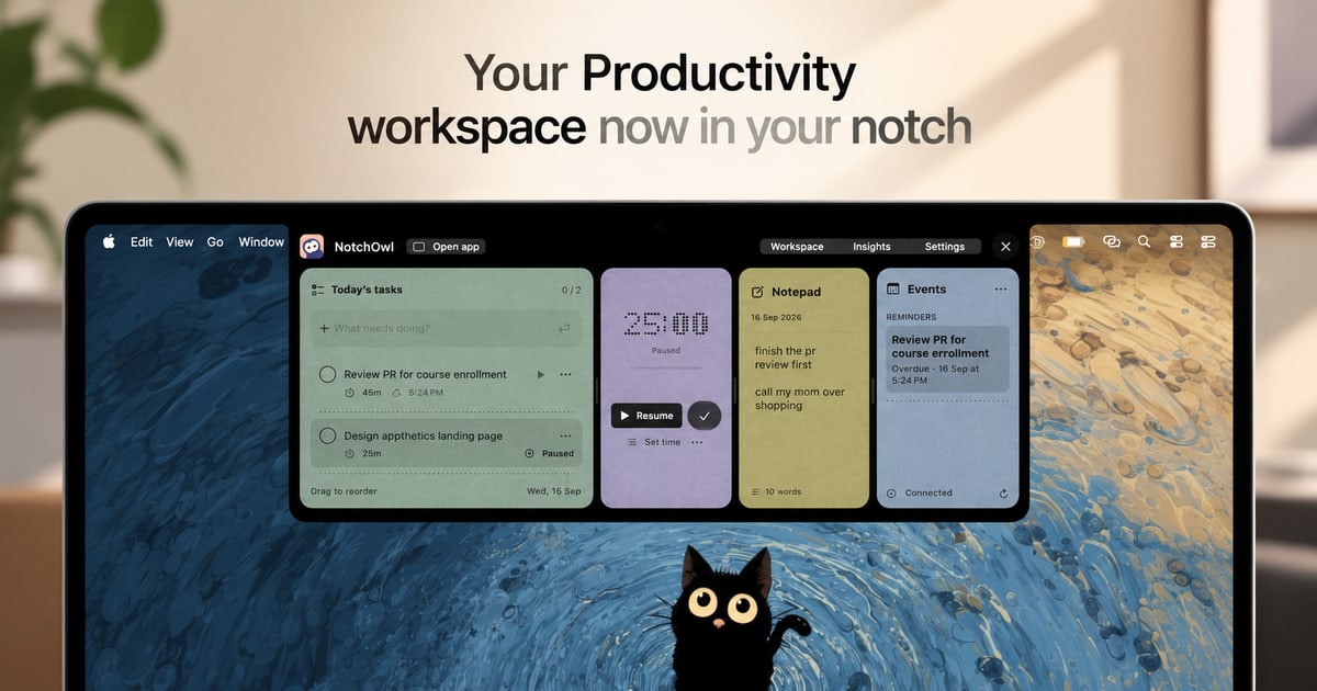
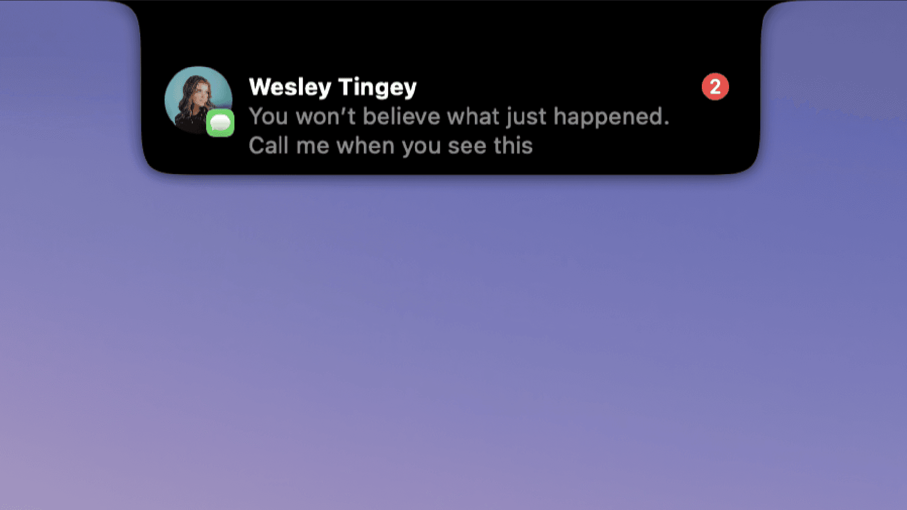
NotchOwl is a Mac productivity workspace that turns the notch at the top of your screen into a place to work. It brings together tasks, a focus timer, quick notes, calendar events, and productivity insights so that everything you need to stay on track sits one hover away. Instead of moving between windows and separate apps, you open NotchOwl in the notch, add a task, start a focus session, jot down a note, or check today's upcoming events, then close it and get back to work. It is built for Mac users who want their next task and their captured ideas to stay close to whatever they are doing, and its tagline captures the idea simply: keep your day a notch closer. Most productivity tools live in their own window or browser tab, which means using them requires leaving the thing you are actually working on. NotchOwl is built around the opposite idea: less switching, more doing. The product's website frames the benefit directly, describing a workspace where everything you need to stay on track is available without switching windows. The problem it addresses is twofold. First, tasks and timers are easy to lose sight of when they sit in another app, so the work you planned gets interrupted by the mechanics of managing it. Second, a busy week can be hard to remember, making it difficult to see what you actually finished and where your attention went. By keeping the workspace in the notch and its timer visible while you work, NotchOwl keeps your intentions in view rather than filed away. The focus timer is the core of the task workflow. You pick a task and give it a time limit, or you let a stopwatch run when you do not need a deadline. The timer stays visible in the notch while you work, so you can see the remaining time without opening anything. You can pause, resume, or add five minutes when you need a little longer, which makes the timer flexible enough for work that does not end exactly on schedule. Two details matter for accuracy: timers pause when your Mac sleeps, and Insights counts only active focus time. The result is a timer that reflects the time you actually spent focusing rather than wall-clock time that includes every interruption. The daily notepad is where thoughts get captured before they disappear. You can jot down an idea, a link, or something to follow up on, and the notepad saves as you type. When a line becomes something to do, you place the cursor on that line and press Command–Return to turn it into a task. That single shortcut closes the gap between capturing a thought and acting on it, so notes do not pile up as an unprocessed list. Because the notepad lives in the same workspace as your tasks and timer, the moment you write something actionable you can convert it without leaving the notch. Insights is the reflection layer. A busy week can be hard to remember, so Insights brings together completed tasks, active focus time, and daily activity in one place. That lets you see what you finished and where your attention went, turning a scattered set of sessions into a readable record of the work you put in. Because active focus time is counted separately, timers pause when your Mac sleeps, so the picture Insights shows is about deliberate work rather than time spent with the app open. Calendar events are available in the same notch workspace, and connecting Calendar is optional. The notch workspace shows today's upcoming events from the calendars you already have added to Apple Calendar on your Mac. NotchOwl is explicit about how this works: macOS calls the permission Full Access, but NotchOwl only reads events and never creates, edits, or deletes them. That means you can check what is coming up next without opening a calendar app, while your calendar data stays under the control of Apple Calendar on your Mac. Getting into the workspace is deliberately quick. You hover over your Mac's notch or press Option–N to open NotchOwl, then add a task, start a focus session, jot down a note, or check today's upcoming events. When you are ready to work, you close it, and your running timer stays visible in the notch. You do not need a Mac with a notch to use it: on displays without a notch, NotchOwl opens at the top center of the screen, below the menu bar, and you can also open a full dashboard. Your tasks, notes, and timers work locally and your planner data stays on your Mac, and you can export your planner data as a JSON backup. The stated outcomes are practical. Keeping the workspace one hover away means less switching and more doing, because checking your next task no longer means leaving the app you are working in. Because the timer stays visible in the notch, your commitment to a task stays in front of you, and the ability to pause, resume, or add five minutes keeps that commitment realistic. The notepad means ideas and follow-ups are captured as they happen rather than lost. Insights answers the question of what you actually got done, and the calendar view keeps the next appointment in view. Together these pieces support the product's closing invitation: make room for what matters. Several concrete workflows follow from the features described. During a focused piece of work, you can pick a task and give it a time limit, or run a stopwatch if the work has no clear deadline, and watch the countdown in the notch until you pause, resume, or add five minutes. Mid-task, you can hover the notch and jot an idea or a link into the daily notepad without switching windows, saving it as you type. If a line you wrote is something to do, Command–Return turns it into a task immediately. Before a meeting, you can open the workspace and check today's upcoming events from Apple Calendar. At the end of a busy week, you can open Insights to review completed tasks, active focus time, and daily activity. And if you need a broader view, you can open the full dashboard. NotchOwl also keeps working when you are offline: after license activation, tasks, notes, and timers work locally, and an internet connection is needed only for activation, deactivation, and update checks. NotchOwl is for Mac users. The current download requires macOS 14 or later and is built for Apple silicon Macs, and a notch is not required since the workspace also opens at the top center of the screen on displays without one, with a full dashboard option as well. It is a paid product sold as a one-time purchase rather than a subscription: the lifetime license is $4.9 USD and covers all NotchOwl features, lifetime updates, and activation on up to 3 Macs, with a 14-day money-back guarantee. The installer is free to download, but a paid license is required to use the app; after checkout the license key arrives in the Dodo Payments email and is entered in the Mac app. There is no recurring payment, and you can move the license to another Mac by choosing Deactivate this Mac in the License section of Settings, after which you can use the key on the new Mac, subject to the 3-Mac limit and an internet connection for deactivation. NotchOwl's value proposition is narrow and clear: instead of another window to manage, it puts tasks, a focus timer, quick notes, calendar events, and insights in the Mac's notch, one hover or Option–N away. For Mac users who want their next task and captured ideas to stay close, without switching windows, it offers a small, local, one-time-purchase workspace for the work in front of them.
BiBimba is a Mac clipboard manager that keeps clipboard history, screenshots, and the text inside copied images in one searchable place. It is aimed at Mac users who copy and screenshot constantly and then need to find something again later without remembering where it came from. Instead of relying on memory, you type a few words, choose the item you need, and paste it straight back into the app you were using. Beyond history, BiBimba reads text inside screenshots with OCR and, on compatible Macs, runs on-device AI that can translate, summarize, or rewrite selected text. The entire experience is designed to be driven from the keyboard. The problem BiBimba addresses is simple and familiar to anyone who works on a Mac all day. The system clipboard only holds the last thing you copied, so everything before that is gone the moment you copy something new. Screenshots add a second layer of friction: an image can contain a receipt total, an error message, or a table of values, yet that text is locked inside a picture and cannot be searched or reused. The result is a lot of hunting — scrolling through folders, opening old screenshots, or copying the same information twice. BiBimba's answer, as its tagline puts it, is clipboard history that can read your screenshots, so copied text and screenshots become searchable together rather than living in separate silos. Search is the core of the product. With ⌃⇧C you open your history, then type a few words to search Mac clipboard history, screenshots, text inside images, and snippets all at once. You move through the results with ⌃N and ⌃P, choose an item, and paste it back into the app you were using. Because OCR results are indexed alongside ordinary copied text, the interface can even label matching items by type — the site shows an example query such as "invoice" returning a result group marked "@ocr · 6 items." For quick reuse without opening the full window, ⌃⇧V lets you pick an item and paste it directly, and the paste menu offers a plain paste with ↩ alongside text actions with ⌃K. The design goal is stated plainly on the site: you do not need to remember where something was saved; you search, choose, and use it. OCR is what separates BiBimba from a conventional clipboard history tool. BiBimba automatically reads the text in screenshots and copied images with OCR, so a screenshot stops being a dead-end image and becomes searchable, copyable text. You can copy the specific text you need rather than retyping it, and if BiBimba detects a table in an image, it can turn that detected table into Markdown, JSON, or HTML. The site illustrates this with a receipt screenshot reading "Receipt total ¥12,400" — the kind of detail that is easy to capture in a screenshot and painful to recover later. Dedicated shortcuts support the workflow: ⌃⇧S takes a screenshot and ⌃⇧O runs screen OCR, and the history view explicitly points out that you can search text inside screenshots and copy the part you need. Once text is in front of you, BiBimba can act on it. Selected text can be translated, summarized, or rewritten, and the site lists the built-in actions with their keyboard shortcuts: Translate (⌃T), Summarize (⌃S), Business email (⌃M), Bullet list (⌃L), and Format a table (⌃R). There is also a Saved actions entry on ⌃K, so the instructions you use often can be run from the keyboard rather than retyped. These operations run from the keyboard, which means you never have to leave the app you are working in or break your flow to open another tool. The site notes that summaries, rewrites, and some other features require a supported setup with Apple Intelligence enabled, so the AI actions depend on the capabilities of the Mac you are using. Snippets give you a small library of reusable text — the site shows a saved snippet reading "Thanks for reaching out." — which you can reach with ⌃⇧B and find through the same search you use for clipboard and screenshot content. Privacy is handled by keeping everything local. Clipboard and screenshot history is stored on your Mac, not in the cloud. You choose how many items to keep and for how long, older items are removed automatically, and you can delete anything you no longer need at any time. The site also states there are no ads and no clipboard or feature-usage analytics, so what you copy and screenshot stays on your machine. BiBimba's overall approach is keyboard-first and local-first. Everything is reached through a small set of shortcuts rather than menus or browser tabs: ⌃⇧C to open history, ⌃⇧V to pick and paste, ⌃⇧B for snippets, ⌃⇧S for a screenshot, ⌃⇧O for screen OCR, and ⌃K for text actions. Copying, screenshots, and OCR output all feed the same searchable history, and the AI text actions run on-device on compatible Macs instead of sending your content to a remote service. When an action produces a result — a translation, a summary, a rewrite, or a table converted to Markdown, JSON, or HTML — you paste the result straight back into the app you were using. The workflow loops cleanly: capture, search, transform, paste. The benefit is time and recall. Because clipboard history and screenshot text are searchable together, something you copied an hour or a week ago is still findable by typing a few words, which removes the need to remember where it was saved or to copy it again. Extracting text from an image saves retyping and makes screenshots of receipts, error messages, and tables usable as data rather than as pictures. Converting a detected table into Markdown, JSON, or HTML means an image can flow straight into documentation or code. Running translate, summarize, and rewrite actions from the keyboard keeps you inside your current app, and keeping history on your Mac with automatic cleanup and no usage analytics keeps the whole thing low-maintenance and private. Concrete scenarios follow directly from how the product is described. A shopper screenshots a receipt and later searches for the total instead of scrolling through photos. A developer captures an error message in a screenshot, finds it again with OCR search, and copies just the part needed. A support or sales person keeps snippets like "Thanks for reaching out." ready for quick replies. Someone preparing documentation finds a table in a screenshot, extracts it, and outputs Markdown, JSON, or HTML. A user reading something in another language selects the text, runs Translate with ⌃T, and pastes the result where they need it. And anyone drafting correspondence can select text and run Business email (⌃M), Bullet list (⌃L), or Format a table (⌃R) without leaving the app they are working in. BiBimba runs on Apple silicon Macs with macOS 26 or later; summaries, rewrites, and some other features require a supported setup with Apple Intelligence enabled, and the site notes it cannot run on non-Apple-silicon devices. The interface is available in ten languages: Japanese, English, Simplified and Traditional Chinese, Korean, Spanish, French, German, Portuguese, and Arabic. Pricing is a one-time US$9 purchase covering 3 active Macs, with all 1.x updates included; buying again with the same email adds 3 more Macs. A 7-day free trial is available inside the app via ⌃T, with no email, card, or automatic billing required. Installation is a DMG download from the site, moving BiBimba to the Applications folder, with distribution through Apple notarization. Refunds can be requested through Link Support from the purchase receipt; requests made within 60 days of purchase are responded to based on the circumstances, without affecting local consumer rights. The takeaway is that BiBimba turns the clipboard from a one-slot memory into a searchable, local archive that also understands the text hidden inside images. For anyone who copies and screenshots constantly on a Mac, it offers a keyboard-driven way to find anything again, extract text with OCR, and translate, summarize, or rewrite it with on-device AI before pasting the result straight back into the work at hand.
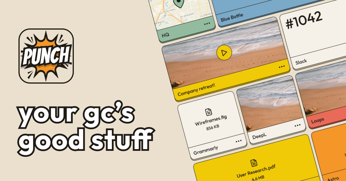
Punch is an app built around a simple idea: it is where your group chat keeps its stuff. Instead of treating notes as a private, single-user document, Punch gives you a shared space where the things you and your people actually need — the Airbnb address, the door code, the rendezvous spot, an important note, a link, a photo, a video, or even that meme you cannot stop laughing at — live in one place. The app is described on its site as a place where you can save anything, summarized in three words: notes, quick, shared. It is aimed at friends, family, and crews who coordinate in group chats and keep losing the details they need. Its purpose is to make that information easy to save once and easy to find again, whether you are planning a trip, coordinating a meetup, or simply collecting ideas you want to keep. Group chats are wonderful at generating conversation and terrible at keeping information retrievable. The classic example on Punch's Product Hunt page is a vacation with friends: you need to know the Airbnb address, the door code, and the rendezvous spot, and instead of scrolling through one hundred or more messages to find them, you save that information on Punch and share it with your friends and family. The site frames the same frustration with two questions people keep asking in chats: 'Where are we meeting again?' and 'Where's that link you sent a few days ago?' Punch's product page explains why existing options fall short. The Notes app on your phone can fill up quickly, can start to look clunky after a while, does not let you share individual pieces from a note, and suffers from incompatibility between operating systems. Cloud storage services like Drive and Dropbox have the storage and shareability aspect, but they are more geared toward storage than toward the quick, conversational sharing a group chat actually needs. The first thing Punch does is let you save anything. The examples given on the site span the mundane and the fun: the Airbnb address, important notes, gift ideas for your mom, and even that meme you cannot stop laughing at. A screenshot of the app referenced on the site shows a Punch space containing notes, links, photos, and videos, which indicates that a saved item is not limited to plain text — the things you keep can carry the visual context of the moment. Because the emphasis is on speed, saving is meant to be quick: the tagline on the site summarizes the product as 'Notes. Quick. Shared.' The value of that flexibility is that you do not have to decide in advance what counts as worth keeping. A door code, a link to a reservation, a photo of a meeting spot, and a joke you want to remember all go into the same shared space, and they can all be found again without scrolling back through the conversation. Sharing is the second half of the product. Punch is described as letting you save your brilliant ideas and share them with your crew in a snap, and the site positions it as where your group chat keeps its stuff — which means the people in the chat can see the same saved information. Because the content you save is stored as individual notes rather than as one monolithic document, the sharing model avoids one of the specific complaints Punch raises about the phone's built-in Notes app: that you cannot share individual pieces from a note. Instead, a single saved item — one address, one link, one photo — can be the unit you put in front of your friends and family. The description also frames Punch as a creative vault, ready to unleash inspiration whenever you need it, which suggests the shared space doubles as a place to keep ideas rather than only logistics. Punch is available as a mobile app. The site links directly to the App Store, where it appears under the name 'Punch: Visual Shared Spaces,' and to Google Play under the package com.remedy.punch, so it runs on both iOS and Android — which addresses the cross-operating-system incompatibility Punch calls out as a weakness of the built-in Notes app. The product is published by Remedy Apps LLC. On Product Hunt, Punch is listed under the topics Android, iOS, Productivity, and iMessage Apps, indicating that the product is positioned as a productivity tool spread across both major mobile platforms and that an iMessage app is part of how it reaches users. Being mobile-first matters for the audience: the information Punch holds is the information you need while you are out in the world — at the rental, at the meeting point, at the store looking for a gift. The overall approach is to move important information out of the river of chat messages and into a shared space. Rather than searching, scrolling, and asking people to repeat themselves, you save the thing when you see it, and it stays in a place your group can return to. The site describes the result as a visual shared space: notes, links, photos, and videos sit together, which makes it easier to recognize what you are looking for at a glance. The naming choices in the product's metadata reinforce the same idea — Punch is tagged around notes, ideas, a creative vault, sharing ideas, collaboration, and note taking. In practice, Punch functions as a lightweight shared clipboard for a group: whatever the chat produces that is worth keeping gets punched into the vault, and the vault is what the group consults afterward. The benefit a user gets is the end of repetitive questions. The site lists the things you will no longer have to say in the group chat: 'Where are we meeting again?' and 'Where's that link you sent a few days ago?' Those two questions are the symptom Punch is designed to remove. Instead of scrolling through one hundred or more messages, you look in Punch. Because notes are quick and shared, the effort of saving is small and the payoff is that everybody in the group has the same answer. Because you can save anything, the tool covers the full range of what a group needs — logistics like addresses and door codes, references like links, and lighter material like memes and gift ideas. And because the saved material is visual, you get recognition instead of recall: you can spot the photo of the meeting spot rather than remember which message it was buried in. The most concrete use case given is a vacation with friends: you need the Airbnb address, the door code, and the rendezvous spot, and you save all of that on Punch and share it with your friends and family. The same pattern applies to any group trip or family holiday where details are agreed in chat and then need to be found again later. Another use case is link keeping: the site asks where the link someone sent a few days ago went, and Punch answers by giving links a permanent home in a shared space. Gift ideas are a third: saving ideas for your mom is the example given, turning a passing chat message into something you can come back to when it is time to buy. Sharing memes is a fourth: the meme you cannot stop laughing at is explicitly listed among the things you can save and share. More broadly, any group coordinating a meetup, a plan, or a collection of ideas is a candidate. Punch is aimed at people who coordinate through group chats: friends planning and taking trips together, families sharing logistics, and crews keeping track of links, ideas, and running jokes. It is a mobile product for iOS and Android, downloadable from the App Store and Google Play, and listed on Product Hunt under Android, iOS, Productivity, and iMessage Apps. The app is published by Remedy Apps LLC. Beyond the availability of the app itself, the provided information does not state pricing or subscription plans, so no pricing detail is claimed here. Punch's proposition is narrow and clear: it is where your group chat keeps its stuff. Save anything — an address, a door code, a note, a link, a photo, a video, a meme, a gift idea — and share it with your crew in a snap, so nobody has to scroll through a hundred messages or ask where the meeting is again. Notes. Quick. Shared.
Mise is a meal planner from Robot Recipes that focuses on cooking a whole meal on a single timeline rather than one dish at a time. You pick a recipe to start with, build out the rest of the menu around it, and say when you want to eat. Mise then back-schedules every dish from that minute so the entire meal lands on the table hot at once. It is designed for home cooks assembling multi-dish meals — breakfasts, dinners and holiday spreads alike — and it runs in the browser, free of charge, with no login, no app and no ads in the way. Recipes are written to help you cook one dish. But meals have multiple dishes, and that is where timing gets hard. Each dish has its own cooking duration, its own oven or stovetop demands, and its own hands-on steps that need your attention at a specific moment. When you try to manage several of those at once — from separate recipe pages, tabs or a handwritten list — it is easy for two hands-on steps to collide, for the oven to be busy when the next dish is due, or for one dish to finish long before the rest. Mise is built for that orchestration problem: instead of simply collecting recipes, it works out the running order for the whole meal so the dishes come together at the same time. At the centre of Mise is a back-scheduled timeline. Once you set the time you want to eat, every dish in the plan is scheduled backwards from that minute. The plan distinguishes between hands-on work and hands-free time — oven, simmering and resting — so you can see at a glance when you actually need to be at the stove and when a dish is quietly taking care of itself. Mise also nudges dishes earlier where necessary so that two hands-on steps never collide, keeping your attention on one task at a time instead of forcing you to choose between two dishes that are both demanding you right now. Choosing the menu is only half of the work, so Mise also produces a merged shopping list. The list is combined across every dish in the plan and scaled to the number of servings you have set, so quantities reflect the meal as a whole rather than each recipe in isolation. You can tap items to check them off as you shop. Alongside the list, Mise shows the tools a meal depends on — what the timing relies on — so you know before you start whether the plan assumes an oven, a particular pan or another piece of equipment. When cooking starts, Mise switches into a live cooking mode. Instead of showing the whole plan at once, cooking mode displays only what you need to do right now, with an up-next view of what follows. It keeps the screen awake where the browser allows it and beeps when a step comes due, so you can leave a device open on the counter and get on with the work rather than watching a clock. Cooking mode needs no connection once the page has loaded. The plan can also be printed or saved as a PDF, and a copy link lets anyone with the link open the same plan — it is not listed anywhere. Robot Recipes describes the Mise workflow in four steps. First, you start from one recipe: search any recipe on Robot Recipes and that dish anchors the meal. Second, the robots fill in the menu: they suggest dishes that go with your anchor recipe and read each recipe's steps to work out how long each one takes and which parts need your hands. Third, you say when you want to eat: every dish is scheduled backwards from that minute, and dishes are nudged earlier so two hands-on steps never collide. Fourth, you cook from the timeline: cooking mode shows only what to do right now, keeps the screen awake and beeps when a step is due. That combination — a menu the robots assemble, read and reorder around your chosen eating time — is the core of Mise's approach. The benefit is a meal that arrives together rather than a sequence of dishes that half-finish at different times. Because the timeline is back-scheduled from the minute you want to eat, you are working towards a single deadline instead of improvising around several. The hands-on and hands-free split makes the plan realistic about your attention, and the collision-avoiding nudges mean you are rarely asked to be in two places at once. A merged, scaled shopping list removes the arithmetic of buying for multiple recipes, and a single running order replaces the mental juggling that normally comes with a multi-dish meal. Typical uses follow the way people actually cook multiple dishes. A weeknight dinner built around one main recipe, with a side or sauce added from the robots' suggestions, is the everyday case. Holiday cooking, such as Thanksgiving, is the high-stakes version: several dishes competing for one oven and one pair of hands, all of which need to land on the table at the same time. Breakfast or brunch is another, with the goal stated plainly on the page — getting breakfast on the table all at once. The plan also scales: set the number of servings and every dish and the shopping list scale with it, which matters when cooking for a household or a crowd. Mise is aimed at home cooks who are putting together meals with more than one dish and want the timing handled for them. It runs in the browser, so there is no app to install, and the robot recipe library behind it spans courses — main course, snack, appetizer, dessert, breakfast, side dish, lunch, dinner, soup, beverage, condiment, salad, vegetarian, seafood, brunch, sauce, bread, vegan, dip, charcuterie, sandwich and gluten-free — as well as cuisines from Indian and Vietnamese to Italian, Mexican, Japanese, Korean, French and many more. Mise itself is free, requires no login, and shows no ads in the way. Robot Recipes notes a disclaimer: meal plans and their timing are not created by humans, and cooking times vary with your oven, your cookware and your ingredients, so meat should always be checked to a safe temperature. For anyone who has ever stood in a kitchen with three dishes at different stages, Mise replaces the guesswork with a single schedule. One start time, one running order, one merged shopping list and a cooking mode that only ever tells you the next thing to do — built so a whole meal finishes hot at the same moment. It is free, needs no login, and holds the promise in its tagline: getting all your dishes ready at once.
Lull is a personalized meditation app that writes a guided meditation based on what you tell it. Instead of browsing a library of pre-recorded sessions, you speak your mind for a minute or so about what is actually going on, and Lull creates the rest. You then hear the meditation read in one of 11 voices, with Oura recovery able to shape the tone and Apple Watch heart-rate tracking recording how your body settled. The app is built for people who want a meditation made for this moment rather than a generic recording, and it is distributed as an iOS app through the App Store. Most meditation products work like a feed. You open the app, scroll through options, and try to find something that roughly matches your state. Lull's site frames the alternative directly with the line 'Instead of an endless feed, scroll inward.' The problem it addresses is fit. A session recorded months ago for a general audience cannot know that you are carrying the weight of a specific day, that you are wired late at night, or that you need to let go of something particular. Lull starts from your own words — 'Tell it how you feel. It creates the rest' — so the practice begins with your moment rather than with a catalogue. The site also sums it up as 'Your moment. Your way. Your peace,' and promises no searching and no scrolling. The primary capability is spoken input turned into a written meditation. The landing page instructs simply: 'Speak your mind.' You talk through what is going on — the example shown is a person saying they need to let go of today's stress and find some peace — and Lull writes a meditation for that moment. The site states that it takes roughly two minutes from thought to session, and that the result is 100% personalized guidance. With Premium, every session is generated fresh, described as created just now for you, and the number of unique meditations is represented as unlimited. Even the sample listed on the site reflects this: 'The Weight of the Ground' is described as a meditation for settling at the end of the day, and the app notes that with Premium every session is written fresh for you. Lull includes mood tracking built around the question 'How are you feeling today?' The app presents a calendar view so you can log how you feel and watch the pattern build across days and weeks. Three statements describe the experience: every session adapts to your mood, your moment, and your rhythm; the more you practice, the more it understands what you need; and you can watch yourself evolve over days, weeks, and months. This matters because a meditation that fits you today is partly a function of what you have been feeling lately, and the calendar gives that history a visible shape instead of leaving it as a vague impression. Mood tracking turns a one-off session into something closer to an ongoing practice. The audio experience is described in specific terms. Lull promises crystal-clear audio that draws you deeper into stillness, and spatial audio that wraps around you like a warm blanket — 'depth you can feel.' Playback is seamless from start to finish, with no jarring volume changes, just smooth and continuous stillness. You can layer your perfect atmosphere by mixing ambient sounds such as rain or waves with your meditation. You can also share what helps by sending a meditation to someone who needs it, since the app notes that stillness is contagious. Finally, you choose the voice: Lull offers 11 voices described as warm, gentle, and grounding, so you can find a guide that feels right for you. Lull's methodology is what separates it from playback-based meditation apps: Lull does not play recordings. You talk for a minute about what is actually going on, and it writes a meditation for that moment. Two health integrations shape that session. Oura recovery can shape the tone, and Apple Watch records your heart rate during the meditation. Afterwards Lull shows 'one honest number' — how far your heart settled below your own resting baseline — or it shows nothing at all. The app deliberately avoids gamification: there are no streaks and no scores, and the site states plainly that there is nothing here to keep alive and that you should come when you need to. One plan, a real 7-day trial, and cancellation two taps away in Apple's own settings reinforce the same low-pressure philosophy. The site frames meditation as more than stillness: it describes clarity, focus, and resilience as what regular practice unlocks. Three outcomes are named. New pathways: your brain rewires itself with every session, old patterns soften, and new possibilities emerge. Sharper focus: scatter fades, clarity rises, and you find the concentration that has been there all along. Quiet strength: life will push, you will bend rather than break, and you build the inner steadiness that carries you. The app's own description adds that Lull helps reduce stress, improve sleep, and find your ease. The Apple Watch settle measurement gives these benefits a personal reference point — your own resting baseline — rather than a shared score to chase. Concrete scenarios appear throughout the content. The featured meditation 'The Weight of the Ground' is written for settling at the end of the day, which maps to unwinding after work or before sleep. The example spoken prompt on the landing page describes needing to let go of today's stress and find some peace, a scenario for coping with accumulated daily pressure. The mood calendar supports a daily check-in habit: logging how you feel and then receiving a session adapted to that mood. Sharing a meditation supports sending support to a friend or family member who needs it. And Quick Sessions, which stay free and unlimited, cover the moments when you want something short without a subscription. Lull is built for iOS and distributed through the App Store, with Android listed as coming soon. Its stated health integrations are Apple Watch, which records heart rate and shows the settle after a session, and Oura, whose recovery data shapes the tone. Pricing is deliberately simple: one plan, described as 'the price is the price,' with a real 7-day trial, and cancellation available two taps away in Apple's own settings. The free tier is positioned as a practice rather than a preview — Quick Sessions stay free and unlimited for as long as you want them. A path for people already subscribed on the web is also referenced. Lull's core proposition is meditation that listens. By turning a minute of honest speech into a freshly written, spatially mixed session — optionally shaped by Oura recovery and measured by Apple Watch — it replaces the endless feed with something made for this moment, delivered in a voice you choose. No streaks, no scores, one honest number, and unlimited free Quick Sessions make the practice feel sustainable rather than gamified, which is exactly the point the product is making.
Lumiko is a free Chrome screen recorder and browser-based video editor that turns ordinary screen captures into polished, cinematic recordings. It is built for anyone who needs to show a screen — creators, developers, marketers, designers, founders, educators, and freelancers producing demos or client work — and its core promise is simple: you record your screen, and Lumiko edits the footage while you work. The extension captures your screen together with system audio and microphone voiceover, tracks where your cursor moves and clicks, and then automatically builds smooth zoom and pan moves over those moments, so the finished video guides the viewer's attention without any manual keyframing. A built-in editor in the browser lets you trim, split, and reorder clips, add a webcam bubble, apply backgrounds and click effects, and export up to 4K, all without creating an account or uploading anything to a queue. Traditional screen recording workflows are slow and fiddly. Recording is the easy part; making the result watchable is not. Editors normally have to scrub through the timeline, place keyframes by hand to zoom into the parts that matter, mask out anything sensitive, and then wait for a render before the file is ready to share. Cloud-based recorders add another layer of friction: clips go to a server, upload queues build up, accounts are required, and privacy becomes a question. Lumiko addresses this by treating the cursor and the clicks as the editing signal. Because the recording itself carries the information about where attention was, Lumiko can automate the zoom and pan work that would otherwise be done by hand, and it can do all of the processing locally in the browser rather than in the cloud. Auto Zoom & Pan is the headline feature. Lumiko analyzes your cursor and your clicks as you record, then creates smooth, cinematic zoom and pan moves that follow them automatically — no manual keyframes and no timeline gymnastics. The result is a recording that stays on the part of the screen that matters, guiding viewer focus the way a human editor would. Paired with this are click effects: ripple, orb, or pressure animations triggered on every mouse click, which make interactions visible and obvious to someone watching the video. Together these two capabilities mean a plain screen capture reads as a directed piece of footage rather than a flat, unedited dump of a desktop, which is especially valuable for demo videos where the viewer needs to understand exactly what was clicked and in what order. Smart Blur handles privacy. Drawing a box hides sensitive information such as API keys, emails, passwords, and revenue dashboards, with the stated purpose of obscuring that data instantly and automatically. For developers recording a terminal, a dashboard, or a settings screen, this removes the risk of leaking credentials or customer data in a published video. The Webcam Overlay adds a personal element: a draggable, resizable circular face-cam frame with a premium drop-shadow that stays perfectly synced with your screen recording. Because it can be moved and resized, it can be placed wherever it does not cover the part of the screen being demonstrated, giving the recording a presenter presence without requiring a separate camera setup or external compositing software. The Instant Editor is a browser-based timeline that runs with zero render queue. You can split clips, delete mistakes, and drag to reorder segments, then export in 4K, 1080p, or 720p in one click. Basic trimming with the timeline scissors removes dead space immediately. Beautiful Backgrounds lets you frame the recording with a preset gradient, a solid color, a transparent backdrop, a high-resolution Unsplash image, or your own uploaded brand assets, including a company logo. Multiple Aspect Ratios means the same video can be exported in 16:9 for YouTube, 9:16 for Shorts and TikTok, or 1:1 for LinkedIn, using intelligent auto-framing so the composition holds up in each format. Rendering is hardware-accelerated and local, so exports happen on your machine rather than through a cloud render farm. Overall, Lumiko is a Chrome extension built on Manifest V3 that works as a single integrated tool: record, edit, and export without leaving the browser. During recording it captures the screen and, on the free tier, system audio and microphone voiceover together. Because it tracks the cursor and clicks, it can generate the zoom and pan choreography as part of the recording rather than after it, which is what removes the keyframing step entirely. Editing then happens in the browser-based timeline, and export is performed with hardware-accelerated local rendering. Lumiko requests only four permissions — activeTab, storage, desktopCapture, and scripting — and states that there is no tracking, that recording and export processing happen locally in your browser, and that recordings are never uploaded, viewed, or retained. The practical benefits follow from that design. Creators get cinematic-looking recordings without learning an editor or placing a single keyframe. Because there is no render queue and no upload step, the gap between finishing a recording and sharing it shrinks considerably. Privacy is protected by default: sensitive data is hidden with Smart Blur before it ever leaves the machine, and no account is required to start. The pricing model is equally direct — free forever for unlimited recording, auto-zoom, Smart Blur, custom backgrounds, and exports up to 1440p, with a one-time Pro upgrade for watermark-free 4K exports and a lifetime license covering up to three device activations. There are no subscriptions and no surprise recurring charges, so the cost of producing professional demo videos stays predictable. Concrete workflows include recording product demos and feature walkthroughs where the viewer needs to follow a specific sequence of clicks; producing software tutorials and technical walkthroughs; and capturing bug reports or step-by-step reproductions for teammates. Marketers and founders can repurpose a single recording across channels by exporting it in the correct aspect ratio for YouTube, Shorts, TikTok, or LinkedIn. Freelancers and agencies record client-facing work with custom brand backgrounds, their own logo, no watermark, and a webcam overlay to add a personal introduction. Anyone recording a terminal, admin panel, analytics dashboard, or configuration screen can use Smart Blur to hide API keys, emails, passwords, and revenue figures before publishing. Educators and course creators can record lessons with system audio and voiceover, trim the dead space, and export in HD for a learning platform. Lumiko is aimed at makers — the site signs off with "built for makers" — which in practice covers developers, designers, product teams, marketers, founders, freelancers, agencies, educators, and course creators who publish screen recordings regularly. It runs as a Chrome extension and can be launched from the Chrome Web Store or the browser editor page, so the ecosystem it integrates with is the Chrome browser itself. Backgrounds can draw on preset gradients, solid colors, transparent options, or high-resolution images from Unsplash, and custom uploads for brand assets. Pricing is straightforward: a Free tier at $0 forever with unlimited recording, auto-zoom engine, click effects, timeline editing, Smart Blur, webcam overlay, and exports up to 1440p; and a Pro tier listed at $29 lifetime, discounted to a $9 one-time payment, adding 4K Ultra-HD exports, removal of the "Made with Lumiko" watermark, and a lifetime license with up to three device activations. Lumiko's value proposition is contained in a single idea: the recording edits itself. By turning cursor movement and clicks into automatic zoom and pan, adding Smart Blur, a webcam overlay, backgrounds, aspect-ratio exports, and a local timeline editor, it compresses what used to be a multi-step editing project into a record-and-export workflow that runs entirely in Chrome — free to start, and $9 once to unlock 4K, watermark-free output.
DynamicLake 2.0 is a Mac application that brings a Dynamic Island style experience to the Mac desktop. Its website describes it simply as "Dynamic Island for Mac", and its Product Hunt listing calls it "Dynamic Island for Mac with 3rd Live Activities and more". The product's own description lists plugins, notifications, drag and drop, a converter, calls, AirDrop and a timer among the things it offers. The site states that it is "Inspired by Apple Dynamic Island" and that it follows a "Liquid Glass Design - Inspired by Apple Liquid glass". It is intended for Mac users who want a compact, interactive presence on their screen that surfaces notifications and small everyday utilities in one place, rather than scattering them across separate apps and windows. The concept behind DynamicLake comes from Apple's Dynamic Island, the interactive element Apple introduced on iPhone that turns a small area at the top of the display into a live, changing surface for activities and alerts. DynamicLake translates that idea to the Mac. On Product Hunt the product is filed under the topics Mac, Menu Bar Apps and Apple, which places it in the family of small Mac utilities that live persistently on the desktop or in the menu bar area so they are always within reach. The appeal of such tools is that they reduce the friction of switching contexts: instead of hunting through windows or opening a separate application, users can glance at a single spot and interact with what is happening right there. Live Activities and notifications are central to the product. The Product Hunt tagline highlights "3rd Live Activities", indicating that third-party Live Activities are part of what DynamicLake displays, and the official description lists notifications as one of its main capabilities. The website's FAQ devotes specific questions to this area, including "How does Dynamic Lake Pro handle my notifications?" and "Will there be new features added to DynamicLake Pro?", which shows that notification handling is treated as a core part of the Pro experience. For a Mac user, having notifications presented in a single, consistent, island-style surface means the most relevant updates stay visible and actionable without covering the work in progress. Beyond notifications, DynamicLake bundles a set of small everyday tools. The product description names plugins, drag and drop, a converter and a timer. A converter and a timer are the kind of utilities that are frequently needed for a few seconds at a time and then abandoned, so placing them inside an always-accessible island removes the need to open a dedicated app or a web page for each one. Drag and drop suggests that items can be moved onto the island directly as part of the workflow, and plugins indicate that the surface can be extended with additional pieces of functionality. The tagline's "and more" leaves room for further tools within the same interface. Communication and file transfer features also appear in the description: calls and AirDrop. Calls listed alongside the other capabilities implies that call information or call handling is surfaced through the same Dynamic Island interface, keeping it visible while the user continues working. AirDrop being included points to dragging files onto the island to send them, or receiving them, through Apple's own transfer mechanism. The FAQ also references "DynaMusix" in the question "Does DynaMusix support all music apps?", which indicates a music-related component associated with the product. Visually, the site states the design is a Liquid Glass design inspired by Apple Liquid Glass, giving the interface a translucent, modern look that sits alongside macOS. Overall, DynamicLake works as a persistent, interactive layer on the Mac that is modelled on Apple's Dynamic Island. Rather than being a single-purpose utility, it acts as a container: Live Activities, notifications, a converter, a timer, calls, AirDrop and plugins all flow through the same island-shaped surface, and the Liquid Glass styling keeps it visually integrated with the system. The website's FAQ shows that the team thinks about the practical details of running the app day to day, covering which macOS versions are supported, whether it works on non-notch MacBooks, whether it supports external displays, and whether it is compatible with the BetterDisplay app. There are also questions about updating the app to the latest version and what to do when a bug is encountered. The benefits follow from that design. Placing frequently needed information and mini-tools in one persistent spot reduces app switching and keeps the user's attention on the task at hand. Notifications and Live Activities remain glanceable instead of interrupting with full-screen or modal interruptions. Small jobs such as converting a value or starting a timer no longer require leaving the current window. Communication cues for calls and file transfers arrive in the same place. Because it is inspired by Apple's own Dynamic Island and Liquid Glass design language, the experience feels familiar to anyone who uses an iPhone, while remaining a native-feeling part of the Mac desktop. Concrete situations the product is suited to include monitoring ongoing Live Activities while working in other applications, keeping notifications under control in a single island surface, running a quick conversion without opening another tool, timing a short task, managing calls so that call information stays visible during work, and sending or receiving files through AirDrop from the same interface. The FAQ also raises external displays and non-notch MacBooks, which correspond to the common setups where users would want the island to remain usable: a MacBook with an external monitor, or a Mac model that does not have a notch at the top of its built-in display. The music-app question tied to DynaMusix points to another scenario, listening to music while working. On requirements and practicalities, the FAQ covers which macOS versions are supported and whether DynamicLake works on non-notch MacBooks, so compatibility with a range of Mac hardware is part of the pitch. It also asks about external display support and BetterDisplay compatibility. The app appears to be a paid product with a Pro tier: the FAQ asks whether DynamicLake can be tried before purchasing, whether payment can be made with PayPal, and how DynamicLake Pro can be activated on multiple devices. New features are also signalled, with the site asking whether more will be added to DynamicLake Pro. Language support is another documented question. On the technical side, the site notes that the software uses code of FFmpeg licensed under LGPLv3.0. The site carries a 2025 copyright for Aviorrok, and the FAQ also clarifies that AppleLake or Dynamiclake.net are not the same as DynamicLake. In summary, DynamicLake 2.0 takes the Dynamic Island idea that Apple popularised on iPhone and carries it to the Mac, combining third-party Live Activities, notifications, plugins, drag and drop, a converter, calls, AirDrop and a timer into one Liquid Glass-styled surface. For Mac users who want their alerts, activities and small utilities in a single always-available place, it offers a focused, Apple-inspired way to keep that information close at hand.