Category Focus/categories/education
Education AI Tools
Discover and compare the best education AI tools and software. Browse 101+ curated tools with reviews and rankings.
Projects tracked
101
Sort mode
RECENT
Page
1
Discover and compare the best education AI tools and software. Browse 101+ curated tools with reviews and rankings.
Projects tracked
101
Sort mode
RECENT
Page
1
diff-tour is a command line tool that turns a git diff into a tour you step through with the → and ← keys. Point it at a branch in any git repository and the AI coding CLI you already use writes a guided walkthrough of the change, covering what the change is for, which files to read next — including files that did not change — what a senior engineer would ask about it, what must be fixed versus what is only a nit, and where an experienced reviewer would stop and say "wait". It is built for engineers who want to keep understanding code as AI writes more of it, and it runs on your own AI coding CLI, read-only and open source. The tool starts from a question its maker kept hearing from people who teach software engineering: now that AI writes the code, what should engineers learn? People rarely write code by hand anymore, AI often reviews it too, and software moves so fast that reading every line is hard. diff-tour's answer is that understanding code matters as much as ever, and that understanding code means learning how a senior engineer thinks. That thinking is what lets an engineer give AI the right instructions, notice what really matters in a problem, design well, and keep a project moving in the right direction. Rather than teaching those habits in the abstract, diff-tour teaches them on real changes in a real repository. The core of the product is the tour itself. Each step is navigated with the → and ← keys, so a reviewer moves through the change one question at a time instead of scrolling through a wall of diff. Every step opens with what the change is for, then points to where to look next — and that includes files that did not change, which, as reviewers on the launch noted, is often where the real risk is hiding. Because the experience is a sequence rather than a summary, you work through the change in the order a careful reviewer would, rather than skimming until something looks off. diff-tour frames each step around the questions a senior engineer asks about a change: What if this runs twice? Can it be rolled back? Would the tests fail if the code broke? Those questions are asked explicitly rather than left implicit, so a reviewer has a checklist grounded in the actual diff. The tour also separates what must be fixed from what is only a nit, and calls out what looks risky but is actually fine, so attention goes to the parts that deserve it. Beyond correctness, the tour asks design questions too: does this belong here, and does it make the next change easier or harder? A distinctive part of the format is that the moments where a senior engineer would stop and say "wait" are asked as questions, so you guess first and then see the answer. Committing to an answer before seeing it is what makes the lesson stick, and it turns the diff from something you passively read into something you actively reason about. The tour also stops at risky schema changes, flagging them as deserving extra care, though the maker notes that it does not yet walk you through what is stored and how it connects — an acknowledged gap that is open for improvement through the project's issue tracker. Several design choices are about trust. diff-tour is read-only: the AI gets a copy of the files git tracks plus read-only tools, and that restriction is enforced by command-line flags rather than only by the prompt. The code on screen is read from git at the right commit and is never copied from the AI's reply, so what you see is the actual change. There is no server and no telemetry, it is MIT licensed, and it saves nothing between runs — which also means it does not track your guesses over time. It runs on your own Claude Code, Codex, Gemini, OpenCode or Copilot plan. Getting started takes one line: install with the one-line script in the README, then run `tour` in any git repository. The first run asks for a language and an AI CLI, with recommended choices already selected — pressing Enter three times starts the tour being written. There is no separate account, dashboard, or approval workflow to learn. The product is explicit that it is not for approving a change; it is for learning how a senior engineer reads one, and because it is open source you can see how those perspectives are written in internal/generate/lessons. The outcome diff-tour aims at is a reader who can look at a change and know where to look, what to ask, and what to ignore. Instead of skimming a large diff produced by an agent and waiting for something to look off, an engineer works through the runs-twice, can-it-roll-back and would-the-tests-fail questions up front. Because the questions come before the code, and because the reader guesses first, the habits of a senior reviewer get practiced rather than merely explained. Over time that is what supports giving AI better instructions, spotting what matters in a problem, and keeping a project pointed in the right direction. Typical use cases follow from that. When an agent hands back a large diff, diff-tour gives you a structured way to read it instead of skimming. When a tour reaches a risky schema change, it stops and asks for extra care, which is useful for the data-model-sensitive reviews reviewers on the launch said they still watch closely. When you are learning, the tour is practice on a real change rather than a toy example, and the design questions it raises — does this belong here, will the next change be easier or harder — give you a vocabulary for architectural discussion. The maker also agrees that reviewing AI-written changes is not only an engineer's job anymore, so the same walkthrough can be used by managers who need to follow what a change actually does. diff-tour is aimed at software engineers, at people who teach software engineering, and at anyone who needs to read AI-written changes rather than only write them. It does not ship its own model: it plugs into the AI coding CLI you already use, including Claude Code, Gemini CLI and OpenAI Codex CLI, and the launch also lists OpenCode and Copilot plans. It is a command line tool distributed under the MIT license, free to use, with installation through a one-line script and no server component. Everything it shows is read from git at the correct commit, and nothing is stored between runs. The takeaway is simple: as writing code gets cheaper, reading it well still matters, and diff-tour teaches that reading on the real changes in front of you. It turns a git diff into a short, navigable tour built around a senior engineer's questions, keeps the experience read-only and local, and asks you to guess the answer before you see it — so the habit of understanding a change is practiced, not just described.
TONKO is a pocket money app for the whole family. A parent sets the allowance, the jobs and the family rules; a child earns money by doing jobs, then decides how to split every euro between three jars — Spend, Save and Grow — and saves toward goals with a picture and a finish line. It is built for families with children aged 6 to 14, with content that adjusts by age band (6–8, 9–11, 12–14), and its purpose is to teach money skills through a child's own pocket money, week after week, rather than through lectures or worksheets. One app serves the whole family: everyone downloads the same TONKO, and what it shows depends on whose phone it is and whose turn it is. The idea behind the product is that money isn't just a number on a screen. It's small decisions, every day, around the kitchen table — and TONKO turns those decisions into habits that last a lifetime. Its own framing is that money is a skill learned by doing, not by lecture: the lessons come from a child's own euros, from waiting for a goal to fill up, and from choosing where each euro goes every single week. TONKO also removes the parts parents worry about. There are no ads, nothing is sold, and there is no bank card and no real investing — TONKO is a family ledger for pocket money you already give, in real currency, but it does not hold or move money. You pay out the way you always do; TONKO makes it visible and meaningful. Earning is the first lesson. Work has a value, agreed in advance, so a job done well turns into pocket money — but only once a parent says well done. Jobs pay out only after a parent approves them, nothing moves on its own, and approval takes one tap from the parent's phone. Parents can invite a second parent with a link, and both can set jobs, approve them and see progress. The app's example moments show how this plays out: a child tidies his room and the job waits for Mum, it is marked done, Mum says well done, and the money lands in his pocket. On the parent side, a dashboard shows the next allowance and the jobs waiting for approval — for example, “Tidied his room, Leo, €2.00” and “Watered the plants, Mia, €1.50.” Every euro gets a job. New pocket money waits until the child decides where it goes, choosing between three jars: Spend, for now — small treats chosen on purpose; Save, for later — a goal with a picture and a finish line; and Grow, for much later — a family bonus that rewards waiting. Making that choice is the lesson, and it happens every week. Goals make saving concrete: a “My first bike” goal showing €67.50 of €120 (56%) fills up week by week, and a goal streak shows progress such as four weeks of saving. Wishes complete the picture: a wish becomes a goal to save for rather than something to drop in a basket, because the gap between wanting and having is where judgement grows. The Money Time Machine is a playful tool kids find inside TONKO, and the same tool appears on the website as the Money Lab. Move the sliders — for example €5.00 every week for 1 year — and see what a little every week could become: the illustration shows €273 from €260 put in plus a €13 family bonus, and lists example targets like headphones at €45, a bike at €120 and a school trip at €300, with a bike reached in about six months. The bonus is a family reward the parent sets (10% a year in the example), not a market return — no markets, no investing, no trading. The one-euro story on the site walks the same path: a euro is earned, then given a job, then added to week after week, and a euro a week for five years is €260 put in, about €337 with a 10% yearly family bonus. Alongside these tools, children learn money skills in short lessons inside the app. Getting started is designed to be quick — “ready before dinner.” First you set up your family: download TONKO, add your children with a nickname and an avatar, and choose their pocket money and jobs. Second, you connect their phone with a one-time code, or simply hand them your own phone; it is the same app, with their own space. Third, they earn, share out and grow: they mark jobs done, you say well done, and they decide where every euro goes, with goals to aim for. The first time a child opens TONKO, Tonko the mascot shows them around — a tickle, five practice coins and a dream to save for, with no lectures — while parents get their own short tour explaining why TONKO works the way it does, plus a “First steps” card that gets the family ready in five minutes. The outcomes are framed as five things a child walks away with: that money is earned, because work has a value agreed in advance and a job done well becomes pocket money once a parent says well done; that every euro needs a job, because choosing between spending now, saving for a goal and growing for later happens every week; that saving has a point, because a goal with a picture and a finish line is easier to reach than a vague “someday”; that waiting pays, because a little every week becomes something real over months and years and kids see it before they believe it; and that wanting isn't buying, because a wish becomes a goal to save for rather than an impulse. Together these turn everyday money moments into visible progress a child can watch accumulate. Typical use cases follow the family routine. A parent sets a weekly allowance, shown in the app as allowance arriving on Saturday, and the child splits it across the three jars. Jobs around the house become earning opportunities — tidying a room for €2.00, watering the plants for €1.50 — each waiting for a one-tap parental approval before it pays out. A child saving for a bike watches the goal reach 56% and eventually “Goal reached!” after months of small transfers. A family using a shared phone can hand the device to a child, whose space stays open until the parent takes it back with a fingerprint, face or the family PIN. A second parent joins by link and approves jobs too. And because TONKO tracks pocket money the family already gives, parents keep paying out exactly as they always have. Safety is built around parents. Jobs pay out only after a parent says well done, and nothing moves on its own. On a child's phone, grown-up settings open only with an OK from a parent's phone or the family PIN, then close again. Wrong PIN guesses slow things down, and every sign-in is kept encrypted on the phone. Kids see no ads and nothing is sold — the website itself carries no analytics. Children stay private: they use a nickname and an avatar, with no email, password or photo needed, and a child only sees their jars, jobs, goals, the Money Lab and their own progress — never family settings or other children's details. TONKO is free on Android with one child, with an iPhone version planned for later, and it speaks English and Croatian, following the phone's language with a setting to change it at any time. In short, TONKO's value proposition is simple: one app for the whole family where kids learn how money works by earning it, sharing it out and saving for something they really want, with a parent approving every step. Little habits, a lifetime ahead.
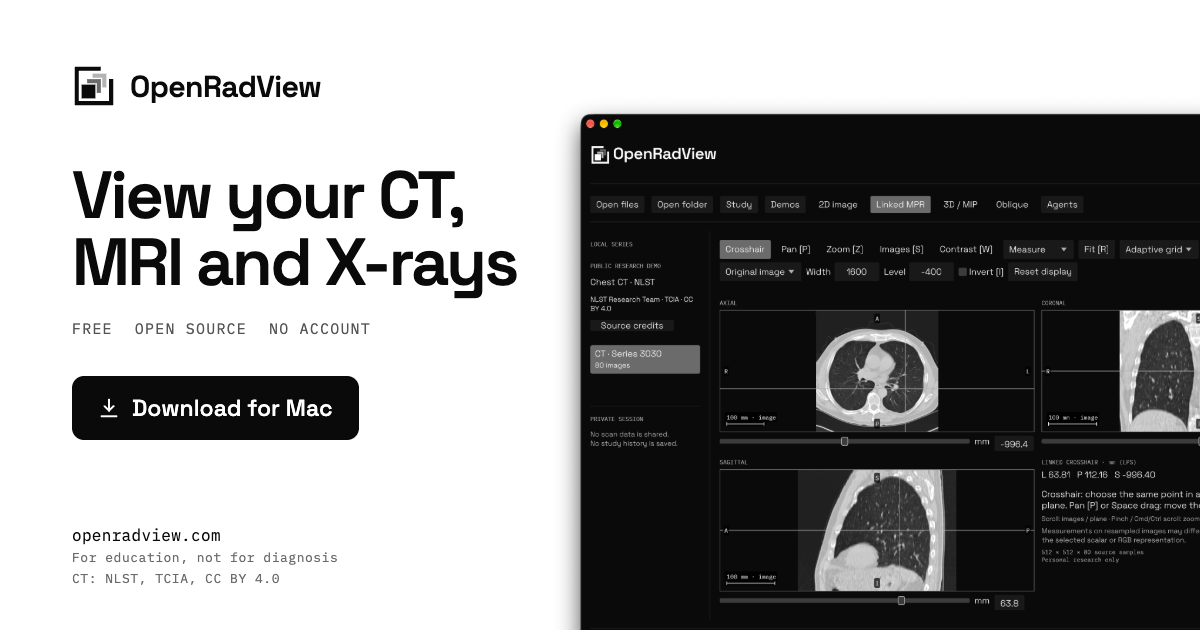
OpenRadView is a free, open-source desktop viewer for opening and exploring your own medical images on your computer. It is designed for CT, MRI and X-ray files, and it opens DICOM, NIfTI-1/2 and ZIP archives locally. The site describes it as a personal research project for education, not a clinically validated diagnostic tool. It is built for Apple Silicon and also runs on Linux, with Mac, Windows and Linux builds available from GitHub. No account is required, and the app does not upload scans or save study history. The product addresses a practical privacy problem: scan CDs and ZIP files often contain DICOM images that are awkward to inspect without sending them to a third-party service. OpenRadView keeps imports local, reads archives without extraction, and processes images on the computer. The site states there is no telemetry, analytics, account or scan upload, and no study history is saved. This matters for people who want to look at scans they own without creating an account or handing files to a cloud viewer. The app displays images without interpreting them; the site repeatedly says it is not for diagnosis and that a qualified clinician should interpret scans. File support is broad within the limits stated on the site. OpenRadView opens grayscale DICOM datasets including native, JPEG, RLE, JPEG-LS, JPEG 2000 and deflated data, plus 8/16-bit RGB/YBR and palette DICOM and native packed 8-bit YBR422. It reads NIfTI-1/2 as .nii, .nii.gz or paired .hdr/.img files, including gzip. Time points and vector/tensor components can appear as separate volumes, and complex data can be viewed as magnitude, phase, real or imaginary. Embedded RGB ICC profiles are converted to sRGB. Files, folders and ZIP archives including ZIP64 are supported, with up to 32 million samples per frame. The site lists unsupported formats such as RGB/RGBA or extended-precision NIfTI, legacy Analyze and alpha/enhanced DICOM palettes. For 2D images, the viewer provides window and level controls for grayscale contrast, with presets or manual window/level adjustment, plus pan, zoom and invert for supported color images. A reset restores the initial display. The site also mentions image information, scalar and RGB histograms, and pointer pixel values, so users can inspect display settings and pixel data. Series can be filtered by modality, series number or time/component label, and source images can play at a chosen speed; slow decoding reduces speed instead of skipping images. Users can export a local PNG and view settings for the completed pane without app overlays or labels, although identifying text may remain in the pixels. Linked MPR is a central viewing mode. It builds axial, coronal and sagittal planes from scalar or color volumes with consistent geometry, and one crosshair selects the same point in all three views. Users can move a plane with the Images control or arrow keys, which helps show how slices relate across planes. Oblique planes let users tilt a plane through a supported scalar or color volume and then step along it. The site notes that MPR, oblique and 3D views need consistent geometry, and that missing or invalid NIfTI geometry stays unlabeled in the 2D source grid. Values on resampled planes can differ from source images. 3D and maximum intensity projection views are labeled experimental. Scalar data has Source range and CT presets, while color data has brightness-based opacity and independent RGB maxima. Users can drag to orbit a projection of the same scan. Measurements include distance and angle where physical geometry is known, and rectangle statistics report scalar values or separate RGB channel codes. The site cautions that RGB maxima can combine colors from different depths, RGB codes are not physical tissue measurements, and volume views have a 512 MiB budget plus GPU limits. The decoded cache is bounded at 128 MiB, with codec and GPU allocations using additional memory. OpenRadView has no AI of its own and gives no opinion. Its optional agent feature is an MCP connection, so an agent the user already uses, on their own subscription or a local model, can see a view the user allows. MCP support is required. The workflow is explicit: a local MCP-capable client requests access, the app shows the series, tools and risks, and the user allows one series or reviewed views. Access can be revoked, changed to another series, or ended by quitting, but copies already sent cannot be recalled. Replies come from the agent, not OpenRadView, and the site says they are experimental AI commentary that can be wrong. Privacy controls are described in detail. All processing happens on the user's computer, with no telemetry, analytics, account or scan upload, and no study history saved. Automatic GitHub update checks are enabled by default and can be turned off on first launch or in Privacy → Updates. Checks send no scan data, but GitHub sees the IP address, app version and requested platform/architecture. Agent access only happens when the user approves a named session and its series or views and tools. A connected agent may send that data to its provider, and logs, retention and training depend on that provider's terms and settings. The stated benefits are educational and practical. The app is good for looking at scans you own on your own computer, seeing how contrast settings change an image, and understanding how slices form planes and a volume. Three public example scans ship with the app so users can try every view before opening their own files. It is explicitly not for diagnosis, screening, treatment or emergencies, not a replacement for a doctor or second opinion, and not for deciding whether to seek care. If urgent help is needed, the site says to contact local emergency services. Concrete use cases follow from those features. Someone with a scan CD or ZIP can open the files or folder locally and inspect the series without extraction. A user can load the bundled chest CT demo and move a linked crosshair through axial, coronal and sagittal views. On the chest X-ray demo, a user can drag to change window and level and then reset the display. A learner can tilt an oblique plane or orbit an experimental 3D/MIP projection. A user with an MCP-capable client can allow one reviewed series for their own AI agent, then revoke access. A user can export a PNG of the completed pane for their own records. The target user is someone who has their own CT, MRI or X-ray files and wants a local, account-free way to view them, plus learners who want to understand planes, volumes and contrast settings. The site stresses education and personal research rather than clinical use. Integrations are limited to optional local MCP clients such as Claude, Codex, Cursor and Grok on a subscription, or local models through LM Studio and Ollama paired with an MCP-capable client. Any client that supports local MCP servers works. Pricing is free and open source under GPL-3.0-or-later, with no account and optional update checks. OpenRadView's primary value is a free, local, open-source way to open and explore personal medical images without uploading them or creating an account. It combines DICOM and NIfTI support, linked MPR, 2D window/level, experimental 3D/MIP and measurements, with an optional MCP bridge to a user's own agent. It is explicitly educational, not diagnostic, and should be paired with a qualified clinician for interpretation.
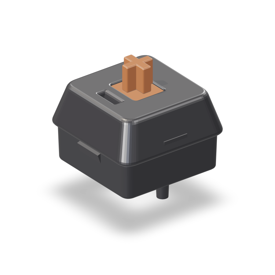
Switch Lab is a browser-based tool for pressing, hearing and comparing mechanical keyboard switches before you buy them. Instead of a spec sheet or a video, you get a 3D keyboard you can interact with: lift the keycaps, look at the switch underneath, swap it for another model and press it to hear the real recorded sound. The library covers 100 popular switches, from MX Red, MX Brown and MX Blue to Oil King and silent switches. Switch Lab is built for anyone shopping for a mechanical keyboard or a set of switches who wants to know how a switch will sound and feel on their own desk before spending money on it. Buying mechanical keyboard switches is a guessing game. Specs and YouTube videos don't tell you how a switch will sound and feel on your own desk — that framing comes straight from the product itself, and it captures the problem precisely. A switch listing might state its type, its weight and its actuation point, but those numbers do not translate into the sound a key makes when you bottom it out, or the way the spring pushes back under your finger. Videos recorded on someone else's keyboard, desk and microphone only get you part of the way. Switch Lab closes that gap by letting you press a switch, hear its recorded sound and compare it with others in the same session, so the decision rests on what you actually experience rather than on a specification sheet. Switch Lab starts by explaining what is actually inside a keyboard. Under every keycap your finger touches hides a switch, and the switch decides most of how a key feels and sounds, so changing only the switches makes the same keyboard feel completely different. The site breaks a keyboard into four layers: the keycap — the cap you touch, which pops off and swaps out; the switch — one per key and the star that sets feel and sound; the plate — which holds the switches firmly in place; and the case — the body around it all, which adds a little resonance. Each of the 87 keys sits on an identical switch, and pulling one out reveals the stem you press, the housing around it and the spring inside — the thumbnail-sized part that decides sound and feel. The central interaction is swapping switches and pressing them yourself. Tap a switch card and its stem really travels down while the recorded sound plays; hold the big switch and it stays pressed all the way down. Each card reports travel against a 4.0 mm scale with an orange mark at the 2.0 mm actuation point, along with loudness and force figures such as 55g for Oil King, 45g for MX Red, 55g for MX Brown, 60g for MX Blue and 50g for Milky Yellow. Cards carry a one-line feel summary — Oil King 'glides down smoothly and bottoms out with a deep thock', MX Red is smooth with no bump, MX Brown has a light bump, MX Blue clicks every press, and Milky Yellow is a soft, tidy clack — plus a type label such as linear, tactile or clicky. Switch Lab deliberately avoids jargon. Instead of words like 'tactile' or 'actuation force', it tells you how loud a switch is, how heavy it feels and where it works best, showing four things on one screen for every switch: how it feels in one line, who it suits (first mechanical, office, heavy typing and similar), where it is cheapest, and a link to hear more. The price block lists per-switch prices from each store, cheapest first — in the site's example, $0.39 per switch from Store A at 90 pieces, $0.45 from Store B at 70 pieces and $0.52 from Store C at 35 pieces. The 'hear more' link jumps straight to real sound tests on YouTube, searching for something like 'Oil King sound test'. Once you have found a switch you like, you plug it in and type on it yourself. Drop the switch you pulled out into the empty slot and the keycaps tap back on like a wave; from there, pressing keys on screen or typing on your own keyboard makes the 3D keyboard press along. Practice mode lets you type with the sound you picked, as if you had used the switch for a few days before buying. Sessions range from English and Korean typing to Python and JavaScript coding, and if you finish without a typo your name goes on the leaderboard. The switch library holds 100 popular switches, from MX Red, Brown and Blue to Oil King and silent switches, and you can filter by type, weight and sound to narrow the list to candidates that fit your taste. Beyond practice, Switch Lab includes mini games — typing marathon, drum stems and metro typing — that turn time with a switch into something more playful than a spec sheet. The 3D keyboard scrolls down the page in numbered sections, moving from a general look at keyboard layers to a single switch close-up, then to pressing, comparing, plugging in and practicing, so the whole evaluation follows the same order you would follow in real life: understand, listen, compare, then try. Colour is a separate, purely visual layer. You can pick keycap and case colours from five themes — Industrial, Ink Orange, Retro Beige, Lilac Mint and Cream Sage — while the sound stays exactly the same. This matters because the same switch can look completely different depending on the keycaps and case around it, and buyers often choose a keyboard at least partly on appearance. Letting you change the look while holding the sound constant keeps the comparison honest: when you switch from one theme to another, you know that any change in impression comes from the visuals, not from the audio. The core approach pairs a 3D keyboard model with recordings of real switches rather than synthesised or approximated sounds. The stem animation is tied to the playback of the recording and to the travel scale, so pressing and listening happen together instead of in two separate steps. The same model is reused across features: the switch you pull out in the close-up is the switch you drop into the keyboard, the switch you type on in practice, and the switch whose card you compare in the picks list. Everything runs in the browser — no install, no sign-up — and it works on phone and desktop, so you can pull it up while shopping online or standing in front of a display. The benefit is confidence before you spend. Instead of ordering a set of switches based on a written description and hoping, you hear a recorded sound, watch the stem travel, read a plain-language feel line, see who the switch is recommended for and check what it costs per switch across stores. Comparing several switches back to back in the same session is far easier than opening a dozen tabs of reviews and videos. Practice sessions let you live with the pick for a few minutes, and the leaderboard gives you a small reason to keep typing, which means more time hearing the switch you are considering. Typical use cases follow the site's own flow. Someone buying their first mechanical keyboard can start with switches labelled 'first mech' and work up from there. An office worker can filter toward quiet options like Oil King, described as not loud and fine at the office. A heavy typist can look at weight and force figures. A shopper comparing stores can check the per-switch prices from Store A, B and C before ordering 70 or 90 pieces. A developer can run a Python or JavaScript session to hear the switch under coding-speed typing. And anyone who wants a quick break can open a mini game such as typing marathon, drum stems or metro typing. Switch Lab is aimed at people shopping for mechanical keyboard switches and keyboards — first-time buyers who do not know what 'tactile' or 'actuation force' means, office workers who need something quiet, heavy typists, and anyone who cares about sound as much as specs. It requires no install and no sign-up, and works on both phone and desktop. The site also notes that 100 popular switches are available to press, spanning MX Red, Brown and Blue, Oil King and silent switches, and that each switch card includes per-switch prices from multiple stores so you can see where it is cheapest. Switch Lab's proposition is simple: press it, hear it, then buy it. By combining a 3D keyboard, real recorded switch sounds, plain-language descriptions, per-switch price comparisons, a plug-in typing mode, practice sessions and mini games in one browser page, it turns switch shopping from a guessing game into something you can actually try. For anyone who has ever wondered how a switch would sound on their own desk, that is the whole point.
Tomo for ChatGPT is a plugin that turns any topic into a playable course inside a ChatGPT conversation. Ask ChatGPT for a Tomo course on anything you are curious about, or convert the chat you are already having into one, and a game card drops into the conversation with quick questions, instant feedback, hearts and stars. It is aimed at curious learners who want to practice what they are reading or discussing rather than just read it. It works on the web, in the desktop app and in the ChatGPT app on iPhone and Android, courses are ready to play in about a minute, and you can start without a sign-up. ChatGPT can already ask you a few questions when you prompt it, but a handful of questions is not a course: there are no levels, no scoring and nothing that brings you back the next day. Tomo for ChatGPT addresses that gap by building a real course with levels, grading every answer, keeping score and bringing learners back with a streak, in the chat and in the app. The premise behind the product is that talking a topic through is not the same as remembering it, so Tomo offers a way to practice what you just talked through so it actually sticks. Each level takes only a few minutes and ends with a takeaway, so the big idea stays with you after the questions are over. Course creation is the entry point. Once Tomo is added to ChatGPT, you simply say what you are curious about. Prompts such as "Make me a Tomo course on black holes" work for any topic you can name, and the course is ready to play in about a minute. A second route is to say "turn this chat into a Tomo course," which converts the conversation you are already in into practice material, so a discussion you just had becomes something you can drill instead of something you only read. A third route is discovery: you can ask Tomo to find a course about a subject, such as latte art, and play courses other curious people have already made. Together these three paths cover learning something new, reinforcing something you just covered, and picking up a course someone else built. Inside the conversation, each level is a few minutes of questions presented on a card. Tap an answer and you see right away whether you nailed it, along with a one-line explanation of why. That immediate grading loop means you are not waiting until the end of a quiz to find out what you misunderstood; the correction arrives with the question. Finishing a level also gives you its big idea as a takeaway, so each short session leaves a single memorable point rather than a scattered set of facts. The card format keeps everything inside the chat, so the learner never has to switch to another window or tab to play. The game loop mirrors the Tomo app: hearts, combos and stars. You keep your hearts, build a combo as you answer, and finish a level with up to three stars, plus XP. You also choose who teaches you, picking from personas such as your bestie, a professor, a storyteller, a pirate, or an explanation pitched like you are five. A deliberate design choice is that there are no spoilers: ChatGPT never sees the answers, because Tomo sends each level's answers only to the game card, never to ChatGPT, so the model cannot give a level away. That separation is what keeps the game honest while it lives inside a conversational assistant. Getting started takes three steps. First, open Tomo's page in ChatGPT and tap Install. Second, connect or skip: ChatGPT opens Tomo's sign-in, and you can sign in to keep your streak or tap Continue without an account to play as a guest. Third, ask for a course by naming any topic or saying "turn this chat into a Tomo course." Playing courses is free, and a new learner gets enough sparks to build a course; building more courses uses sparks from your Tomo account. Nothing is sold inside ChatGPT. A free Tomo account keeps your streak, unlocks every level of a course and carries your progress into the Tomo app on iPhone and Android, so you can play a level on the bus and pick it back up in ChatGPT. The benefits follow from that loop. Instead of passively reading an answer, you test yourself on it immediately and get a correction in the same breath, which is why the product frames itself as practice so the material actually sticks. Levels are short enough to fit into a few minutes, so learning a topic does not require blocking out a study session. Stars, combos, hearts, XP and streaks add the reasons to come back that a plain Q&A exchange lacks. And because progress travels between ChatGPT and the Tomo mobile app, a single habit spans both surfaces rather than resetting each time you switch devices. Concrete use cases appear throughout the product's own examples. You can ask for a Tomo course on the history of coffee and work through questions such as which specific region the coffee plant first thrived in, with Ethiopia marked correct and a short explanation. You can ask for a course on black holes when a topic catches your interest. You can turn a chat you just had into a course so the conversation turns into retained knowledge. You can ask Tomo to find a course about latte art and play something another learner already built. And because it runs in the ChatGPT app on iPhone and Android as well as on the web and desktop, you can play a level on the bus and continue later. Tomo for ChatGPT is for anyone already using ChatGPT who wants to turn curiosity into practice: casual learners, students reinforcing a discussion, and people who prefer a game loop to a wall of text. It requires no account to try, since guest play is supported, and a free Tomo account adds streak keeping, full level access and continuity with the Tomo app. Availability covers ChatGPT on the web, the desktop app and the ChatGPT app on iPhone and Android. Tomo itself is rated 4.7 on the App Store and Google Play, and the plugin is free to start, with additional course building using sparks from a Tomo account. In short, Tomo for ChatGPT takes the conversational reach of ChatGPT and wraps a real game around it: any topic becomes a leveled course with instant grading, hearts, combos, stars, streaks and a takeaway, all without leaving the chat. It is a small, focused addition to a conversation you are already having, and that is exactly its value.
MyLens is an AI workspace for delivering one-on-one presentations at scale. Rather than building a deck once and repeating the same walkthrough for every person, you upload your raw sources — documents, notes, recordings and more — say what matters, and invite your audience list. MyLens AI then gives every individual a live, private presentation generated from your material, answers their questions using those same sources, and reports back to you on how each session went. The product is built for anyone who explains the same thing to many people: sales teams, customer success, people and HR, founders, educators and trainers, and leaders. Its promise is simple: let every person feel presented to, one on one. The problem MyLens addresses is stated plainly on its own site: you can't present 1-1 to everyone. The best way to share something important is one-on-one — tailored slides, a live walkthrough and answers to each person's specific questions — but that takes hours per person, and it is impossible to scale by hand. MyLens does the math for you: presenting to 24 people at 30 minutes each is 12 hours of your time. With MyLens, the same audience is covered by about 20 minutes of setup, once, after which every person gets their own private personal presentation. The company frames this as going from one person to a thousand, with each person still receiving a private, personalized session rather than a broadcast. Setup starts with what you already have; no deck is needed. You drop in docs, notes and recordings — the site lists PDF, long text, Word, slides, YouTube, website, Markdown, audio, image, spreadsheet, Google Drive and ChatGPT output as accepted source types — and MyLens AI turns them into a clear, visual presentation. Alongside sources there is a Knowledge layer where you define the goal and tone, the audience overview, and what the AI should never say. In the product's own example, a pricing memo becomes a presentation built for each person, and an onboarding goal (get new hires productive in their first 30 days) with an audience of new engineers and their managers shapes how the material is framed. The presentation itself is delivered live and one-to-one. Everyone opens a private link and enters the six-digit code from their invite, and MyLens presents to them whenever they are ready — each visual is explained, and the session runs as a conversation rather than a recording. During the session people can stop and ask anything in their own words, right on the slide. MyLens answers from your sources and, when words are not enough, creates a new visual or a new layer in real time. The site's example shows an audience member asking what a contributor actually gets access to, followed by a drill-down infographic on code repositories — contributor or developer access, version control and peer pull requests, provisioned by the engineering lead — generated for that specific question. Because the AI is presenting on your behalf, MyLens puts explicit controls around what it may do during a live session. You choose whether the AI can create a new slide, drill down into more detail, and cite sources, so the boundaries of each session are set before anyone joins. On the audience side, you invite people into private sessions and track them through clear statuses — invited, opened, presented, asking a question, and follow up — so you can see at a glance who is presenting right now and who needs attention afterwards. The overall workflow is laid out as six steps: add your sources, teach your AI, let the AI create your presentation, choose what the AI may do, invite your audience, and go live. That sequence is the product's core methodology — set it up once and the AI presenter handles the rest, running every session in parallel rather than one after another. The site illustrates the scale visually: a single presenter on one side, and on the other an AI presenter running 1,000 people and 1,000 sessions at the same time, with individuals shown as presented, presenting now, asking a question, opened, or invited. Afterwards you see how each session went. You can review every audience session individually — time spent, questions asked and who needs a follow-up — for each person, with a per-person row showing name, role, status, session date, duration and session code, plus aggregate numbers such as invited, opened, presented and total time. That reporting closes the loop on a one-to-many presentation: instead of guessing whether the message landed, you can see who is doing well, who is stuck, and what to do next for every individual on the list. Trust is a stated design principle. MyLens says the AI only says what you would say: every answer comes from the files you added, and if the answer isn't there it says so and flags it for you. Every session is private — one person, one code, one conversation — so audience members do not sit in on each other's presentations. On data, the site states that what you bring stays yours: content is never used to train AI models, files are private by default and only your workspace can open them, data is encrypted, and you can delete it whenever you want. The site names six groups it is built for, each with a concrete scenario. Sales teams give every prospect a personal walkthrough of the offer. Customer success explains renewals and updates to each account, one by one. People and HR welcome every new hire with the same careful onboarding. Founders send each investor a private update they can question. Educators and trainers run lessons that answer back at each learner's own pace. Leaders explain a big change to every person, privately. In each case the same body of source material is reused, but the session adapts to the individual on the other side of the link. MyLens works with the AI you already use. You can do research in ChatGPT, Claude, Cursor or your own agents and send it to MyLens over MCP, where it becomes a presentation each person gets one on one. The listed connections are ChatGPT, Claude, Cursor, your own agents and MCP servers, so material produced elsewhere can be turned into private live sessions without rebuilding it by hand. In short, MyLens replaces the unscalable one-on-one walkthrough with an AI presenter that runs a private, personalized live session for every person on your list, grounded strictly in your sources, controllable down to what the AI is allowed to do, and measurable afterwards through per-person session reporting. Your first presentation is ready in minutes, and the value proposition stays the same whether you are presenting to a few people or to a thousand: let every person feel presented to.
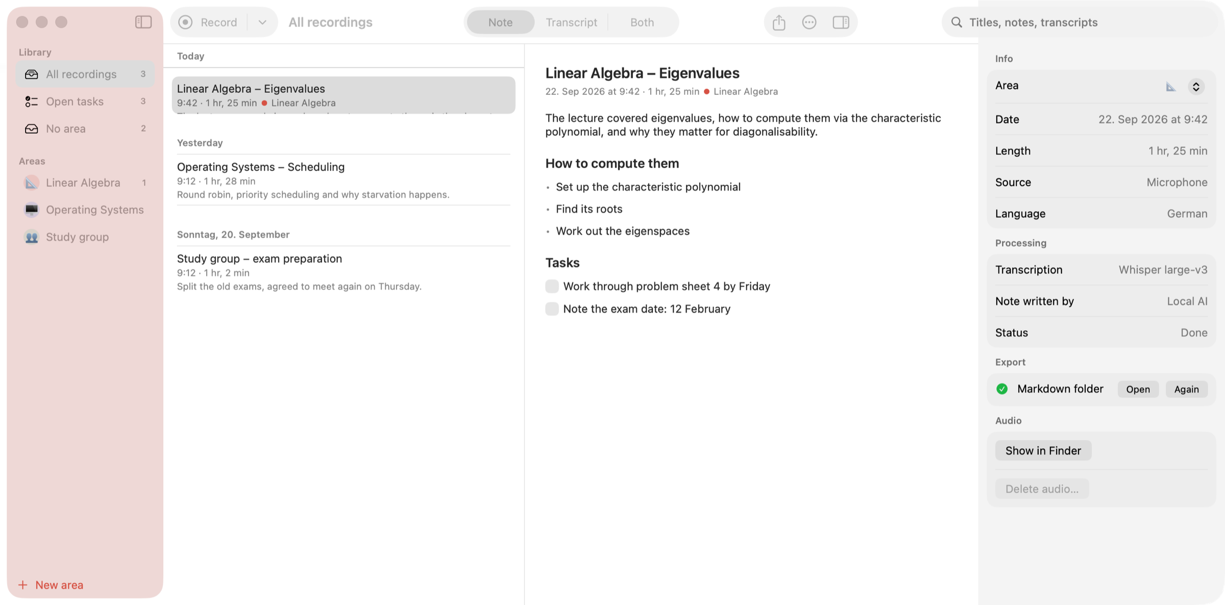
Earnote is a note-taking app for Mac, iPhone and iPad that records lectures, meetings and calls, transcribes them with Whisper and turns the recording into a structured written note. Instead of leaving you with a wall of transcript, it produces a short summary, the topics that actually came up, decisions and tasks you can tick off, plus flashcards and a printable PDF study sheet. It is built for students sitting in lectures, for people who need a record of meetings and calls, and for anyone who wants to talk through an idea and keep the result as a written note. The app is free and open source under the MIT licence, with no account, no ads and no subscription. The problem Earnote addresses is the gap between what is said in a room and what a person manages to write down. A lecturer who speaks quickly, a meeting where several people talk at once, or a call that ends with a list of follow-ups all produce information that is easy to lose. A plain recording solves only half of it: the audio exists, but finding the relevant minute later means scrubbing through an hour of sound. A plain transcript produces text that still has to be read and reorganised by hand, and the details that matter — decisions, tasks, exam hints — disappear into the paragraphs. Earnote's stated ambition is to write what you would have written yourself if you had been fast enough: a short summary, the topics that actually came up, decisions and tasks, all while the recording stays on your own devices. Recording starts with ⇧⌘R or a single click in the menu bar, and Earnote captures the microphone and system audio together, so everyone on a Zoom, Teams or Meet call ends up in the transcript as well as the people in the room. A global shortcut, ⌃⌥⌘R, starts and stops a recording from any app without hunting for a window first. On iPhone and iPad the app records the whole lecture even with the screen off and the phone locked, and offers a Live Activity on the Lock Screen, Control Center and Action button controls, and widgets. It pauses for phone calls, notices when Zoom, Teams or Meet is running, asks whether it should take notes and can stop when the call ends. If a calendar event is running, the recording is named after the event — "Linear Algebra" instead of "Uni, 21 Sep" — and you choose which calendars count. Transcription runs with Whisper, and on the Mac the speech recognition happens locally on the machine. On a Mac with enough power you see the transcript live while you are still in the room, and because Earnote transcribes while it records, most of the work is already done by the time you press stop. On an M1 MacBook Air a 60-minute lecture is transcribed in about five to six minutes, roughly 12× real time, and the note then takes a few minutes more while you watch it being written. Low Power Mode makes everything about three times slower, and Earnote tells you when that happens. Recordings can be transcribed in many languages and you choose the language of the notes separately; the interface follows your Mac and is available in English or German. The note is written by a language model, downloaded once and run on your device, and it contains a summary and the topics that actually came up rather than a reformatted transcript. Decisions are pulled out, and follow-ups become tasks with checkboxes you can tick off. You can edit any part of the note by hand, or summarise again with your own instruction while the AI version stays one click away. Six local AI models are available and Earnote preselects the one that fits your Mac. Per-area instructions give every subject or client its own style for the AI, so the notes for a maths lecture and for a client call do not read the same way. Study material comes out of the same note. Flashcards — question and answer cards written straight from the lecture — can be edited inside the note and exported to Anki so you can quiz yourself. The note can be printed or saved as a clean PDF study sheet with headings, bullet points and tasks rendered as boxes, which makes revision possible away from the screen. For a whole subject there is an overview across every lecture at once, showing the topics, how they build on each other and any exam hints that were mentioned along the way. Listening back is built into the transcript. Every timestamp is a button: click the time and you hear exactly that moment, so when the lecturer went too fast you can jump straight to the sentence instead of hunting. The paragraph that is playing stays highlighted while you read along, and ⌘3 puts the note and the transcript side by side with the transcript scrolling along with the audio. Search inside recordings finds a term across all transcripts, steps through the matches with ⌘G and lets you hear the spot. Names and terms that Whisper gets wrong can be corrected once in a dictionary: the correction applies to the title, the note and the transcript, and the dictionary is handed to Whisper and to the AI so the next recording gets it right, per area or for everything. Privacy is treated as a default rather than a setting. Transcription runs locally with Whisper and the notes are written by a language model that Earnote downloads once and then runs on your device — no account, no API key, works offline. Recordings, transcripts and notes live in your home folder and are never synced. The app sends no analytics and no crash reports, and there is no server that belongs to Earnote. Cloud AI is possible only if you ask for it: you can pick Claude, OpenAI, Gemini or your own server, and the app says clearly when text would leave the machine. Housekeeping follows the same principle — you can see what the recordings take up and drop the audio of old ones while notes and transcripts stay, and Earnote filters the sentences Whisper invents during silence instead of writing them down. Notes are filed where you already work: Notion, Obsidian, Logseq, Apple Notes, Bear, Craft or a plain Markdown folder. Open tasks go to Apple Reminders, Things or Todoist, with one list per subject, and every subject or client can be set up as an area with its own colour, AI instructions and export targets. The app keeps itself up to date by telling you when a new version is there, showing what changed and installing it after you agree. On iPhone, a recording can be written up on the device itself, by your Mac through your own iCloud — with the audio deleted afterwards — or with your own free Google key, where only the text is sent and never the audio; notes then sync with your Mac. The Mac app requires macOS 15 or newer on Apple Silicon with about 8 GB of memory, and the first run downloads the speech model (~1.6 GB) and the local AI (~2.3 GB) once. It is a 26 MB download, signed and notarised by Apple, and it is not in the Mac App Store because the sandbox there would get in the way of recording system audio and filing notes into other apps. iPhone and iPad versions require iOS 26 / iPadOS 26 and are available on the App Store; on iPhone 15 Pro and later even the note is written on-device. There is no Windows version, because Earnote builds on Apple's CoreML and MLX frameworks. Everything on the Mac is free; on iPhone and iPad an optional one-time Earnote Pro purchase adds speaker detection, ask your notes and translation, with no subscription. Typical use is a student recording a linear algebra lecture, getting a summary and tasks, quizzing themselves with flashcards and revising from a PDF study sheet before the exam. It is a meeting where Zoom, Teams or Meet audio is captured alongside the room, the recording is named after the calendar event, follow-ups land in a task manager and the note is exported to Notion or Obsidian. It is an explanation recorded out loud that comes back as a structured note, or a phone on the desk recording a full lecture with the screen off and the notes waiting afterwards. It is also semester-scale work: one overview across every lecture of a subject, with search across all transcripts when a term needs to be found again. Earnote's value proposition is narrow and concrete: press record, keep talking, and end up with a note you would have written yourself — summary, topics, decisions, tasks, flashcards and a PDF — while the audio and the transcript never leave your devices unless you explicitly send them somewhere.
Memory Chess is a free chess memory game and chess memory trainer that runs in a browser on desktop and mobile. It is designed for anyone who wants to practise holding a chess position in their head, from beginners who do not know openings to chess masters. In each round, you study a position for a few seconds, the board goes blank, and you rebuild the position from memory. The round ends with an accuracy reading from 0 to 100% and a map showing every square you got right or wrong. The site says it has hosted 48,697 games played, offers a 1–60s study window, uses 2–32 pieces per round, and is available in 24 languages. The product’s premise is that most chess practice trains decisions, while very little of it checks whether you can actually hold the board in your head. The site says this skill sits under calculation, blindfold play and spotting tactics, and is usually left to chance. It describes a common failure: players lose track of pieces mid-calculation, so that three moves deep a bishop on the long diagonal quietly disappears from the picture in their head. The board in front of them was right; the one in their mind was not. Memory Chess frames board recall as a trainable, testable skill: hold a position briefly, rebuild it, check the result, and repeat with more pieces and less time. The site explicitly says it makes no claims about your brain; it gives you a reading you can track. The core round is deliberately simple. You choose how many pieces you want and how long you want to study the board; the site supports 2–32 pieces and a 1–60s study window. When the position disappears, the board clears and you place the pieces back on the squares you remember. You submit your answer to see your accuracy and time. The site notes that placing more pieces than the position had lowers your accuracy, so you should only place what you remember. Each round is a short memory test with an accuracy reading from 0 to 100% and a map of every square you got right or wrong. Rounds take under a minute, so you can run many. A calibration reading is offered as a starting point. The Medium round uses 6 pieces, two kings among them, and 10 seconds of exposure; then the board clears and you rebuild it. You get a readout card with your accuracy and recall by piece type, and the readout card shows correct squares, rebuild time, wrong pieces, exposure, and recall by piece type after your first run. A suggested difficulty appears after the reading. The calibration works with mouse, touch and keyboard. The site describes the flow: press start, study the position until the meter empties, pick a piece from the palette, tap a square, tap a placed piece to remove it, and submit. Difficulty is organised into four presets and one custom rig. Easy uses 2 pieces and 10 seconds and is described as just kings, perfect for starting out. Medium uses 6 pieces and 10 seconds, described as a few pieces with comfortable time to memorize. Hard uses 12 pieces and 8 seconds, described as more pieces with less time to memorize. Grandmaster uses 20 pieces and 5 seconds and is described as being for chess masters with photographic memory. The CustomRig lets you set your own variables to isolate one weakness, with 2–32 pieces and 1–60s exposure. The site advises moving up a tier when your readings hold steady, not after one lucky round. The site also walks through a round under the microscope using the final position of Kasparov’s Immortal, after 44.Qa7. Phase 1 is Study: eleven pieces, ten seconds, and the advice to take in the whole board, not square by square. Phase 2 is Anchors: start with the kings, fix two points first, and place everything else relative to them. Phase 3 is Chunk: group pieces by what they do to each other, such as the kings fighting over d2, two pawn staircases, and the queen and rook each aiming at an unguarded h-pawn. Phase 4 is Encode: turn each group into a sentence, naming it by its job: Stand-off, Stairs, and Long shots. Phase 5 is Blank: the board clears with no pieces and no hints, and you rebuild from the sentences, not from a picture. Phase 6 is Rebuild: rebuild group by group, placing each group with its sentence before starting the next. Phase 7 is Score: re-check each relation on the rebuilt board, then score; the example shows 10 of 11 squares is 91%. The site says the overlays show one way to memorise it, not a recording of anyone’s attention. It also references de Groot’s experiments, Chase and Simon (1973), and Gobet and Simon (1996) in explaining anchors and chunking. The dashboard, called the lab record, is built around the idea that one reading is a snapshot while ten readings are a measurement. Every round you play is kept on the device, and the panels fill in from your own rounds. Before your first round, panels show sample values, not real players; after it, a panel that cannot read your record yet says what it still needs. The figures include memory span, pieces held, accuracy over time, recall pace, today’s board, days in a row, a forgetting curve, a lab notebook, a miss map, recall by piece type, insights, programs, a goal, personal bests, and a leaderboard. Some figures unlock only after enough rounds or sightings, such as memory span at two rounds at 80%+ with 3+ pieces, pieces held at five rounds over two days, and recall by piece type at twenty sightings of a non-king piece. The daily board is one board a day, the same for everyone. A new position opens every day at midnight UTC; everyone gets the same board and study time, and you get one try. The streak counts any finished round, game or practice, for its day, and one missed day in any seven is forgiven. For forgetting, boards you score under 80% on come back for review 1, 3, 7 and 14 days after you first see them, and the curve plots how much you recall at each gap. Programs include Baseline week, a 7-day plan with one Medium round a day, logging the reading, and comparing day 7 against day 1; Edge-file drill, a 14-day plan with a custom rig of 8 pieces and 15 seconds, reviewing the miss map every 3 days and pairing with the board vision guide; and Step-down ladder, an open-ended plan that has you hold 90% for three rounds in a row, then cut study time by 2 seconds, and when study time bottoms out, add pieces. The leaderboard compares readings worldwide or in your country. Each difficulty is ranked by correct pieces, then fewer wrong pieces, then faster memorize time, then faster solve time, and every row shows the player’s country. You submit a score from the result screen, then check where it stands. A goal lets you pick a piece count and an accuracy; the bar fills from your best round at that count or more since you set the goal. Personal bests are kept per setting because 6 pieces and 20 pieces are different tests, and practice readings on the page stay apart from games. Memory Chess is free, with no account and no server. Your lab record is kept on this device; you can download a copy to move it to another browser or to keep it safe, and the site lists import and Back up across devices (coming soon). Adding a name to the leaderboard is optional. The site is available in 24 languages, and Product Hunt notes that version 2.0 includes a redesign in 24 languages, a daily board everyone plays once, a skill rating that moves both ways, a dashboard of memory span and progress, and shareable round replays. Product Hunt also points players to a Telegram group at t.me/TheMemoryChess to swap scores. A reference library, called the Learning Center, pairs short guides with drills so each reading points to something you can practise. The listed guides cover board vision (seeing the whole board at once instead of one corner at a time), visualization (holding a moving position in your head as pieces shift), calculation (looking further ahead without losing track of the board), memory (chunking and pattern techniques that raise your readings), and blindfold chess training (a four-stage plan from board recall to full blindfold games). There is also a browse chess guides entry and a guide on how to stop blundering. The FAQ says beginners can play because you do not need to know chess openings or calculate moves; start with fewer pieces and more study time, then make the game harder when ready. For memorizing, it suggests starting with anchors such as kings, queens, corners, and edge squares, then looking for groups, lines, diagonals, and empty spaces instead of trying to remember every piece on its own. To make the game harder, add more pieces, shorten study time, or hide board coordinates, changing one setting at a time.
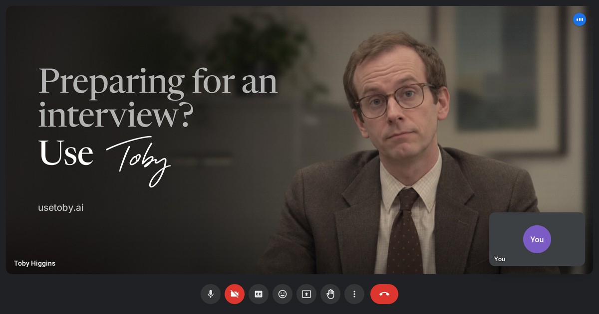
Toby is an AI mock interviewer built to help people prepare for real job interviews. You paste a job description, and Toby builds the questions a real panel would ask — from the warm-up to the curveball — then interviews you on a Google Meet, Microsoft Teams or Zoom-style video call. Toby Higgins, the AI hiring manager, asks the questions, listens, and tells you exactly what to fix. It is aimed at candidates who have an interview coming up, whether that is a recruiter screen, a hiring manager conversation, a case round or a values interview, and its purpose is to let you practise the hard questions before they count so that the real interview feels familiar. Interview preparation usually means reading a generic list of questions, rehearsing alone, or memorising answers that collapse under pressure. Toby's stated approach is different: it is not a generic list of questions. Toby researches the company, maps every round and plays the interviewer, then shows you exactly what to fix. The product frames itself as "the interview before the interview." The idea is that useful practice should resemble the interview you have actually got, happen on the kind of call you will actually take, and produce feedback that tells you precisely what to change rather than vague encouragement. The site explicitly contrasts this with generic question lists, positioning company-specific research and round-by-round mapping as the core of the preparation. The first thing Toby does is build your prep brief so that you know the company cold. Tell it the role and it produces a picture of what the company does, how it makes money, what has happened lately and how the team works. The brief presents stage, size, HQ and business model at a glance. The worked example on the site is a Senior Product Manager, Payments role at Fernleaf: spend management for UK and EU small businesses, covering company cards, bill pay and expenses in one account, at Series B with £45m raised, roughly 200 staff, headquartered in London. The brief also lists recent news and culture signals, dated — for example, a new CFO hired in August 2026 from a listed payments company, and a June 2026 launch of bill pay in Ireland and the Netherlands. Finally, it suggests talking points worth raising in the room: asking how SEPA failure rates compare with Faster Payments, noting that interchange is most of their revenue so authorisation rate is a revenue metric, and referencing their memo culture by offering a short written plan for your first 90 days. The point of this section is that you arrive already knowing the business model, the recent context and the signals that show you have done the work. Toby then maps the interview process so you can see every round coming. It sets out each round, how long it runs and what it tests, and then lists the questions most likely to come up in each one. In the example this is a 30-minute recruiter screen, a 45-minute hiring manager interview, a 60-minute product case and a 45-minute values round, with six questions listed per round. Each question is tagged by competency and difficulty and marked when real candidates have reported it. So "What made you apply to Fernleaf, and why this payments role in particular?" is tagged customer focus, motivation, easy and reported, while "This role leads a squad of six engineers without line management. How have you led teams in that set-up?" is tagged cross-functional leadership, leadership, medium and reported. There is also a browsable library of company interview guides linked from the site. This gives you a structured view of what each stage is assessing rather than one undifferentiated bank of questions. The practice itself is designed to feel like the day. You pick the round — recruiter screen, hiring manager, case or values — and how long you have got: 10, 20 or 30 minutes, whatever you've got. You then choose a mode. Real mode runs it straight through, uninterrupted, like the day itself, with the full debrief at the end. Coach mode gives you a note or two after each answer and a chance to try again; coach notes only appear once you have finished talking, so you are not interrupted mid-answer. The call runs in a Google Meet, Teams or Zoom-style format so the real thing feels familiar, and you can have your camera on or off. Toby will wait while you think, and as the site puts it, he is very patient. Overall, Toby works as a three-step loop: tell Toby the role, take the call, get the debrief. Everything is anchored to the job description you pasted, which is what makes the questions and the feedback specific to the role rather than generic. Toby Higgins plays the interviewer throughout, and the model is built around reproducing the conditions of the real interview — the round type, the length, the video-call format — and then converting that performance into structured notes. The outcome is a debrief that tells you exactly what to fix. Toby gives you a score against the role's rubric — the example shows 60 out of 100 with the verdict "Solid examples, light on measurable impact" — and then breaks down every answer: what worked, what to fix, and a stronger version built only from what you said. Each competency is scored 1–5 with the quote behind it, for instance customer focus at 3/5 because the answer was a real example but had no numbers to size the impact. It also measures delivery: talk time at 35%, pace at 136 wpm against an ideal of 130–160, and one filler word, "actually", used once. Because the stronger version is built only from what you said, you are not handed a generic script — you get your own answer rebuilt, with brackets to fill in with your real details, such as adding the result as a number: from what, to what, over what time. The full transcript, question by question, is included as well. The overall promise is simple: walk in having done it already. In practical terms, the use cases follow the rounds Toby maps. A candidate with a recruiter screen coming up can run a short 10-minute coach-mode session to warm up on motivation and background questions. Someone facing a hiring manager round can run a longer session in Real mode to get the uninterrupted feel of the day, then read the debrief. A candidate with a 60-minute product case or a values round can pick that specific round and rehearse against the questions most likely to come up in it. Before applying or interviewing, you can use the prep brief to learn the company's business model, recent news and talking points. And after a bad answer, you can review the transcript and the stronger version, fill in the brackets with your real numbers, and try again. Toby is aimed at job candidates preparing for interviews, from those practising a recruiter screen through to people preparing for case and values rounds at specific companies. It runs on the web. On price, Toby is free to start: your first 5 minutes on a call are free, which is enough to warm up and see how the feedback works, and you save a card to see your debrief — it isn't charged. The free tier includes a full prep brief for your role, likely questions for every round, Real or Coach mode, and a debrief on what you answered. After that it is £0.50 a minute; you buy minutes in packs from £5, they are only used on a call, and they last 6 months. There is no subscription. As an illustration, a 10-minute mock interview is £10.00, and both modes, prep briefs and debriefs are included, and you can stop whenever you like. Toby's core value proposition is that it turns interview preparation into a realistic rehearsal against the specific role and company you are targeting, then converts that rehearsal into concrete, measurable fixes — pacing, filler words, talk time, structure and stronger versions of your own answers. Rather than hoping the real interview goes well, you walk in having already done it.
ngram is an AI video generator that creates perfect AI videos for every team, covering onboarding, training, demos and explainers from a prompt or a screen recording. Its Product Hunt listing describes ngram 2.0 as a tool for creating explainers, screencasts, and AI avatar videos by turning ideas, documents, and recordings into narrated videos. The site presents it for sales teams, marketing teams, support teams, HR teams, product teams, founders, explainers and every team in between. The core promise is that you describe the video you want in plain words, ngram plans and builds it, and the finished video stays editable so you can then make it perfect. The problem ngram addresses is the gap between having something worth explaining and having a video that actually explains it. The site draws the contrast directly: Loom is useful for quick screen recordings but does not help with structure or polish, while Descript requires editing skills. ngram instead starts from your intent — who the video is for and what it should achieve — and builds a complete video with structure, visuals, and polish. The customer stories suggest why that matters. The Owelet team says, “I can finally show people what Owelet does instead of just describing it.” The Wolvio Solutions team reports that “what used to take weeks can now be done in a day” and cites 80% less production time, while the Quillr team went from producing 3 to 7 reels a week. A G2 reviewer notes ngram makes it easier to create and refine instructional content. ngram can begin from whatever material a team already has. The most direct starting point is a prompt: you describe your video idea, audience, and tone, and that description is treated as the whole brief. The site's own example brief asks for a 30-second launch film for Inkpolish, specifying the opening moment, the ranking drop, the fix, and a request to use the brand kit. Projects can also start from a screen recording or an uploaded video, which ngram analyzes to identify key moments and build clear product walkthroughs. Other inputs named on the site include documents and PDFs, screenshots, photos and references, your README, and even your website — for example, one prompt asks ngram to turn a website into a 30-second explainer for facility managers. The homepage is explicit that assets are optional: you can start with just a description, and ngram will write the script, plan the storyboard, and generate visuals to match. Before anything renders, ngram plans the story. After you describe the video, ngram outlines every scene and waits for your approval — the site's example plan lists five scenes with individual durations covering the publish moment, the ranking drop, the score and fix, the prompt, and the publish decision. Once approved, you watch it build: narration, soundtrack, visuals and animation come together while you watch, and the site describes ngram recording the narration, composing the soundtrack, generating visuals, building the animation and checking the result. The site also states that ngram plans the story structure before generating anything and uses your brand kit for consistency, a deliberate approach designed so videos look intentionally produced rather than obviously automated. Every video stays editable, which is where the “then make it perfect” half of the promise lives. You can edit any scene by chatting: you point at the frame you want changed and say what you want, and ngram makes a new version. In the site's example, a change pinned to scene two — “Get to this drop sooner. The intro runs long.” — caused ngram to shorten scene one from 4s to 2s so the drop lands sooner, producing version two. Iteration works in plain language after the video is done too, with requests like “make the intro shorter” or “swap the second scene for a screen recording.” You can also take the controls yourself: captions, music and scene edits are a click away, and captions can be set to styles such as Pop Light from the Edit video menu. Deeper control is available through the timeline editor, which offers frame-level precision, plus the ability to swap scenes, edit text, change styles and regenerate sections. ngram supports narrated, animated and avatar-led videos. You can create animated explainers or add an AI avatar presenter, and the site lists AI presenters and custom voices, cinematic AI footage, and the ability to swap the voice or the language. Captions are added automatically and can be matched to your brand colors. A brand kit is set up once, and every video then uses your identity — colors, fonts, logo, intro/outro sequences — for consistent branding across your entire team. Output is flexible: finished videos export as MP4, and short ones can also be downloaded as a GIF. You can create in 16:9 (landscape), 9:16 (vertical), or 1:1 (square) when the selected models support it, and you can download the finished video or share a link to it, or embed it. The overall method is a seven-step flow the site lays out in order: describe it, approve the plan, watch it build, preview the video, point at a change, take the controls, and download. The preview stage plays the finished video beside its storyboard, scene by scene, so you can see how each beat maps to the plan. This structure is what the site presents as the core difference from other tools — ngram starts from your intent and builds a complete video with structure, visuals, and polish, rather than handing you a raw recording or expecting editing expertise. It also means the video is planned before it is generated, so story decisions come before rendering, and revisions afterward are targeted rather than wholesale. The stated outcomes for users are speed, clarity and iteration without starting over. Teams report moving from weeks to a day, 80% less production time, and higher output like 3 to 7 reels a week. The site frames the benefit as being able to show rather than describe — “I can finally show people what Owelet does instead of just describing it.” Because you review the script and storyboard before anything renders and can iterate anytime afterwards, changes do not require rebuilding the video. ngram also reports a G2 rating of 4.6 out of 5 from 62 reviews, and offers a free start with no credit card. Use cases map onto teams. For sales and revenue, ngram pitches sending the demo and skipping the call, with pitch explainers built from screenshots. For marketing, it generates industry explainers from screenshots, promo videos with an AI presenter from a PDF or doc, and product launch films from photos and references. For customer success and support, it makes customer onboarding videos from screenshots and customer education from a PDF or doc. For HR, People and L&D, it produces compliance training and messages with an AI presenter from photos and references — including non-English training, such as a safety video in Vietnamese about hand hygiene compliance in hospitals. For product and engineering, it creates stakeholder demos from screen recordings and developer launch teasers from your README. For founders and leadership, it builds board update videos from reports and all-hands announcements from a prompt. For explainers and education, it turns a website into an explainer or builds technical explainers from photos and references. ngram is aimed at teams rather than individual editors. The homepage explicitly names sales, marketing, support, HR, product, founder, and explainer/education audiences, and the example library spans brands such as Slack, Headspace, Revolut, Robinhood and Cernel, alongside companies listed as customers including HubSpot, Deel, Zapier, ITV, Veeva, DP World, Genpact and SafetyCulture. Pricing is described as “Free to start · No credit card.” The marketing site is built on Next.js. The site is also clear that the product is not limited to marketing videos: teams use ngram for product demos, customer onboarding, internal updates, training videos, sales enablement, changelogs and investor pitches — any message that lands better as video. In short, ngram's value proposition is that anyone on a team can describe the video they need — or bring a prompt, a screen recording, a document, or a website — approve a plan, and end up with a narrated, branded, polished video they can refine by chatting or by hand. It removes the structure and production burden while keeping the finished video fully editable.