Category Focus/categories/productivity
Productivity AI Tools
Discover and compare the best productivity AI tools and software. Browse 864+ curated tools with reviews and rankings.
Projects tracked
864
Sort mode
RECENT
Page
15
Discover and compare the best productivity AI tools and software. Browse 864+ curated tools with reviews and rankings.
Projects tracked
864
Sort mode
RECENT
Page
15
Sai is a robosecretary built by Simular AI: an AI agent that commands an autonomous computer fleet and puts it to work on your behalf. According to Simular, Sai gets real work done across apps, websites, and desktop tools. Instead of asking you to sit in front of a screen and repeat the same steps, Sai runs a fleet of autonomous computers that take routine work off your plate. The pitch is deliberately plain — Sai introduces itself as your robosecretary, invites you to sign in, and asks you to start delegating. The product is aimed at anyone whose day is filled with screen work that must be done but does not need to be done by them. The problem Sai addresses is the sheer volume of routine screen work that software leaves behind. Most automation depends on an application exposing an API — a defined programmatic interface that a script or integration can call. A great deal of the software people rely on every day does not offer one. Legacy desktop applications, internal portals, and anything sitting behind a login are commonly off limits to conventional automation tools, not because the work is difficult but because there is no clean programmatic door to walk through. The result is that the most repetitive, least rewarding work stays manual, and people spend hours reading screens, clicking buttons, and typing into forms that never change. What makes Sai distinctive is the way its computers do the work. Each computer in the fleet navigates software the way you do: it reads the screen, clicks the button, and types in the form. That is the core mechanic, and it is stated in the product description in exactly those terms. Rather than operating behind the scenes at a code level, Sai operates at the interface level, through the same visible surface a person uses. The practical consequence is that anything a person can do on a screen, Sai's computers approach the same way — by looking at what is there and acting on it. The description emphasises that Sai is trained to interact with the computer interface, which is what allows the fleet to move through software the way a person does. Because Sai works through the computer interface, it can automate software even when that software has no API. This is stated as a defining capability: Sai automates software even when they lack APIs. It is a meaningful expansion of what can be delegated. The tools that lack APIs are usually the ones buried deepest in day-to-day operations — the ones nobody is going to rebuild — and they are precisely the ones Sai is designed to handle. Rather than requiring an integration to be built, or an application to expose endpoints, Sai simply uses the software the way a person would, reading the screen, clicking the button, and typing in the form. That removes the API requirement as a precondition for automation. Simular names the categories of software Sai is built to take on: legacy desktop apps, internal portals, and anything behind a login. Those three categories are where routine screen work most often accumulates and where automation most often fails to reach. Sai is described as handling them by interacting with the computer interface rather than by integrating with the application. Sai also supports Windows, macOS, and Linux, so the fleet is not restricted to a single operating system, and the product reports a score of 73% on OSWorld, a benchmark for computer-use tasks. That figure is a concrete, stated measure of how capable Sai's autonomous computers are at working through real software. The overall workflow is simple by design. You sign in to Sai and start delegating. From there, an AI agent commands the autonomous computer fleet, and the individual computers carry out the work on apps, websites, and desktop tools. Each computer reads the screen, clicks the button, and types in the form — the same sequence a person would perform, executed without a person at the keyboard. Because the interaction happens at the interface level, the same fundamental approach applies across very different kinds of software, from a modern web app to a legacy desktop program to an internal portal that only exists inside a company. Sai's stated approach is therefore not to build a separate integration for each tool, but to use the computer the way a human does. The benefit Sai puts forward is time and attention returned. Sai runs a computer fleet to take routine work off your plate, so the endless screen work no longer has to be done by you. Because the fleet is autonomous, those tasks keep moving without someone driving every click. Because Sai can operate where APIs do not exist, the benefit reaches into the parts of a workflow that previously had no automation at all — the legacy desktop app, the internal portal, the system behind a login. And because the same interface-level approach carries across apps, websites, and desktop tools, delegation is not restricted to a narrow slice of the work. Concrete scenarios follow from the stated capabilities. Anything behind a login is a candidate: work that lives inside an authenticated system, where you have to sign in and then repeat the same steps. Internal portals are another: the company systems that exist only on the inside and rarely expose an API. Legacy desktop apps are a third: software that predates modern integration patterns and would never be rebuilt for automation's sake. Software that has no API at all is the fourth, and it is the broadest — Sai automates it by reading the screen, clicking the button, and typing in the form. Routine, endless screen work is the fifth: the repeated reading, clicking, and typing that fills a day. And the sixth is the general case the product describes, getting real work done across apps, websites, and desktop tools. In each case, the workflow is the same: you delegate, and Sai's fleet works through the software as a person would. Sai is presented for people who have routine work on a computer that they would rather hand off. The framing — "your first robosecretary", "take routine work off your plate", "start delegating" — speaks to anyone with a backlog of repetitive screen tasks and no good way to automate them, especially where the software involved is legacy, internal, or locked behind a login. On platforms, Sai supports Windows, macOS, and Linux, and the product itself is accessed by signing in on the web at sai.simular.ai, with Google sign-in offered. The agreement is covered by Simular's terms of service and privacy policy. No pricing or plan details are stated in the material reviewed here, so cost information cannot be confirmed from the content. Sai's value proposition rests on three stated things: an autonomous fleet of computers rather than a single script, a method that mirrors how a person uses a computer — read the screen, click the button, type in the form — and the ability to automate software even when it has no API. Together those make the robosecretary idea practical for the software that actually sits in front of people every day: legacy desktop apps, internal portals, and anything behind a login. You sign in, you delegate, and the fleet does the routine screen work.
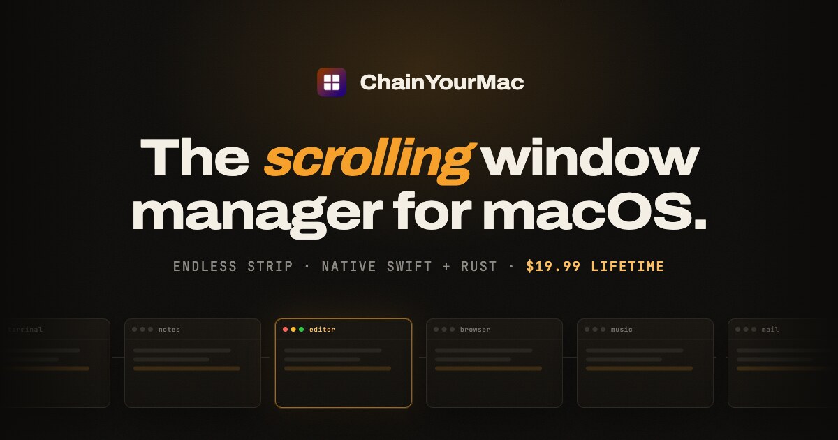
ChainYourMac is a native scrolling window manager for macOS. Rather than squeezing every window into a fixed grid, it places each window as a column on a horizontal strip that runs past the edges of your display. You move around that strip with three- or four-finger trackpad swipes or with keyboard shortcuts, and every window keeps the width you gave it. It is built for Mac users who want the automatic layout management of a tiling window manager without their workspace reflowing every time another app opens. It ships as a real Mac app — SwiftUI on top, a Rust window engine underneath — and requires macOS 13 Ventura or later on Apple silicon. Grid tiling managers such as yabai, Amethyst and AeroSpace divide the screen again every time an app opens, so everything keeps getting smaller. With three windows open each one takes roughly a third of the screen, and the next launch narrows them all once more. Window snappers such as Rectangle and Magnet sit at the opposite end: you invoke them window by window, and they do not maintain a layout at all. ChainYourMac maintains a layout without the grid. The strip gets longer instead of the windows getting thinner: with three windows open, a grid gives each one about a third of the screen while the strip still gives each one half. New windows open beside the one you are using, nothing overlaps, and nothing gets lost behind another window, because every window has its own place on the strip. The strip follows your focus. Move focus from the keyboard or swipe the trackpad and the strip scrolls just far enough to bring the window into view, on a spring animation that starts the moment you press the key. The animation is a vsync-locked spring, so movement around the strip feels immediate. Layout is persistent as well: column order, widths and stacks come back after a restart, and every display and every Space keeps a strip of its own, so work and chat never get shuffled together. Session restore and launch at login are part of version 2.0, which means the app can start with your Mac and begin tiling automatically. Stacks let you put several windows in one column. You can pull a window into the column on its left or right, push it back out, reorder windows inside the stack, and make any window taller or shorter; heights can also be equalized with a single shortcut. When each window in a stack deserves the full height, one shortcut flips the column into a tabbed column and back again. Widths are handled with presets: cycle a window through the widths you choose, such as 25, 33, 50, 66 and 75 percent, or nudge it wider and narrower. Full width and centre are one key each. Gaps between windows and at the screen edges are configurable down to zero, and windows size themselves around the Dock so nothing ends up underneath it. Version 2.0 adds a strip minimap that appears while you navigate, shows where you are, and fades out again. An optional focus border can sit around the focused window and everything else can be dimmed; both features are off until you enable them. Centre modes let you keep the focused column centred never, only when the strip overflows, or always. You can drag a window onto another column and the strip rearranges around it. Per-app window rules let you float apps that should not tile or give an app a fixed slot on the strip, and native macOS fullscreen is left alone — put a window into fullscreen and ChainYourMac stays out of its way. Every shortcut is rebindable, one action can carry several bindings, and the recorder understands non-US layouts including AZERTY, QWERTZ and Dvorak. Settings apply instantly: change a gap, a width or a key and you see it on screen straight away, with no Save button and no restart. Multi-monitor support is built around one strip per display. Every display has its own independent strip with its own focus and scroll position, windows never spill onto the screen next door, and one shortcut sends the focused window to the next display. macOS Spaces work the same way, with each Space keeping a separate strip layout. The trackpad swipe is the signature interaction: swipe with three or four fingers and the strip moves with them one to one, then settles on the nearest column. Under the hood, ChainYourMac is a real Mac app rather than a script collection. The window engine is written in Rust and runs as a small background process that sits idle until a window changes or you press a shortcut; shortcuts are handled by the engine directly, so moving around the strip feels immediate. The interface is native SwiftUI: a menu bar item and a settings window where every option has a control. There is no Electron, no web view and no config file to learn. The app needs one permission, Accessibility, because that is how macOS lets any window manager move and resize other apps' windows; Rectangle, Magnet and others require the same one. Everything happens locally on your Mac — the app does not read your screen contents or send data anywhere, and there is no account and no telemetry in the app. A self-healing engine restarts the engine process if it ever stops and keeps an engine log showing what happened, while new versions arrive through Sparkle, the standard Mac updater. The outcome is a workspace that stays calm as you work. Because each window holds its width, opening another app never triggers a reflow, and you never have to hunt for a window that has been pushed behind another one. Navigation becomes a single gesture or keystroke in the direction you want to go, and because the position of every window is predictable, you build muscle memory for where things live. Column order, widths and stacks survive restarts, and displays and Spaces keep their own strips, so restarting your Mac does not mean rebuilding your workspace. Concrete workflows include a development session with a code editor, a terminal, a log window and documentation all open at once: stack the terminal and logs into one column, tab them, and keep the editor at full or half width without ever resizing the rest. Multi-monitor desks benefit from one strip per display, with a keystroke to throw a window to the other screen. People who liked PaperWM on GNOME or niri on Wayland get the same scrolling model with Mac manners, and anyone with an app that should not tile — a floating palette or a small utility window — can float it. Automating the strip is possible too: a chainyourmac:// URL scheme, Raycast script commands and a command-line tool let other tools drive the window manager. Requirements and pricing round out the picture. ChainYourMac needs macOS 13 Ventura or later and runs on Apple silicon (M1 or newer); Intel Macs are not supported. It is notarized by Apple and signed with a Developer ID, with no kernel extensions, no system modifications and no need to disable SIP. It is a one-time purchase rather than a subscription: the standard 1-Mac lifetime license is $19.99, with the first 20 launch licenses at half price, $9.99. Multi-Mac licenses are also available — 3 Macs for $24.99 launch price ($49.99 regular), 5 Macs for $39.99 ($79.99) and 20 Macs for $149.99 ($299.99) for teams — each giving one key with the corresponding number of activations, free updates forever, and the ability to move an activation to a different Mac after deactivating it. Checkout is handled by Gumroad, and the download and license key arrive by email. ChainYourMac takes the scrolling window model that Linux users know from PaperWM and niri and delivers it as a polished native Mac app: windows on an endless strip, trackpad swipes that follow your fingers, stacks and tabbed columns, per-app rules, multi-monitor strips and a SwiftUI interface over a Rust engine. It keeps the automation of tiling without the grid, so new windows never shrink the ones you are already using.
Soar90™ is a personal, self-guided 30-60-90 day onboarding plan for anyone starting a new job or stepping into a newly promoted role. It gives new hires a phase-by-phase roadmap of what to focus on each day, a simple Win Log for capturing accomplishments and praise while they are fresh, and a Review-Ready Report generated from that real progress. You choose a career track tailored to your role, set up your plan in under two minutes, and follow one clear task a day from pre-start through day 90. Soar90 works as a complete standalone plan or alongside whatever onboarding your employer already has in place. New hires and newly promoted professionals usually receive systems training, a laptop, and a first-week schedule. What they rarely receive is a plan for their own success: a clear answer to what to focus on this week, and a record of the impact they build along the way. Soar90 began with a pattern its founder kept seeing as a recruiter and HR professional: talented people start strong, work hard, and then show up to their first review with nothing to show for it. Not because they lacked impact, but because nobody ever taught them to keep the receipts. The first 90 days are too important to leave to chance, and starting a new job brings pressure to prove yourself, the overwhelm of everything new, and the worry of whether you are doing enough. Soar90 exists to turn that lesson into a simple daily habit: a task a day, a win logged in seconds, and a report ready when you need it. The core of Soar90 is a structured 30-60-90 day roadmap built around phase-specific tasks, mantras, and reflection prompts that guide you from learning the ropes to leading the charge. The journey is divided into four phases. Pre-Start helps you prepare before day one with pre-onboarding tasks that set you up to show up confident and prepared. Days 1-30, Learn, Listen & Orient, focuses on mapping the culture, building relationships, and understanding expectations, listening more than you talk. Days 31-60, Contribute & Connect, is about owning your first project, setting boundaries, and deepening relationships with your core collaborators. Days 61-90, Lead & Grow, asks you to deliver your quick win, build a roadmap, and proactively request your 90-day review. The app keeps that roadmap actionable by surfacing one clear task a day. The dashboard shows Today's Focus, your current day and phase, how many tasks are left in the phase, and overall phase progress. Milestone tracking and celebrations let you check off tasks, hit milestones, and receive visual celebrations that keep your momentum alive. Plan setup is tuned to your role and start date and takes under two minutes: you select a career track tailored to your specific role and enter your start date, and Soar90 places you in the right phase. If you have already started your new job, you can enter your actual start date and go back to complete tasks from earlier phases. The Win Log is where you capture accomplishments, recognition, praise, and shout-outs in seconds while they are fresh, so your record builds itself. Shout-Outs specifically capture the praise and recognition you receive along the way, including details such as who gave it, their role, the context, and whether it was public praise, written feedback, or a direct message. When your next review arrives, you have a complete record of the impact others see in you instead of scrambling to remember what you did months ago. The design is deliberate: log your impact, not internal secrets. The Review-Ready Report is generated from the tasks you completed and the wins you logged. One tap turns your real progress into a first-person summary you can share with your manager, and it can be printed or saved as a PDF. The report includes an executive summary of your onboarding journey, key accomplishments organized by phase, standout highlights and wins, documented wins from your Win Log, personal reflections and learnings, and forward-looking goals for your next quarter. AI is optional throughout: you can let it draft the report, or write it yourself in your own words. Support features keep you on track between tasks. Weekly Check-Ins and Guidance give you a 60-second pulse check with tailored scripts and boundary templates when you need support. Daily email reminders send personalized nudges with phase tips and motivational quotes. Beyond day 90, your Win Log and Review-Ready Report remain available forever, and you can keep logging wins, generating reports, and using the roadmap for promotions, role changes, and annual reviews. Soar90's approach is deliberately personal and standalone. Rather than explaining a specific company's systems and processes, it helps you organize your personal progress and preserve proof of your impact. It was created by a recruiter together with practicing HR and talent-acquisition managers, and it is designed to be used as your complete 90-day plan or alongside whatever your employer has in place. The methodology is a daily habit loop: follow the roadmap, log your wins as they happen, and generate a report from that real progress when you need it. Your plan, wins, and reflections are private to you, and your manager or employer cannot see your notes. The outcome Soar90 promises is that after 90 days you know exactly what you did, you can name the difference it made, and your Review-Ready Report says it in your own words. Rather than wondering whether you are on track, you have clear priorities, gentle reminders, and a way to capture every win so you never have to wonder if you are on track. Users describe feeling focused, confident, and organized from day one, and one hiring manager reported being impressed enough to gift the app to new hires. The product also points to external research: only 12% of employees strongly agree their company does a great job of onboarding them according to Gallup, while strong onboarding improves new-hire retention by 82% and productivity by over 70% according to Brandon Hall Group. Soar90 fits anyone starting fresh: a new job at a new company, an internal promotion, a role change, or a return from a career break. Because the plan adapts to your situation with tailored tasks for each scenario, the same app supports a first-time new hire and a newly promoted professional. It is also positioned as a gift from a recruiter or employer, and a hiring manager who tried it said they will gift it to new hires from now on. Users bring the Review-Ready Report to a performance review, use the Win Log to prepare for annual reviews, and keep the roadmap going for promotions and role changes well beyond the first 90 days. Soar90 is built for anyone starting a new role, and it is developed by recruiters, HR, and leadership professionals. It is available on the web, iPhone, iPad, and Android, and one purchase covers every device, with your plan, win log, and reports following you across them. On the web it is a one-time $9 purchase with lifetime access and a 7-day money-back guarantee, with checkout on the Soar90 site. On iPhone and iPad you purchase in the App Store app using your Apple account, and on Android in the Google Play store using your Google account; in-app pricing is set by Apple and Google and may differ from the web price. There is no subscription, no recurring charges, and no cancellation needed. A free demo is available with no signup and no credit card required, letting you preview the dashboard, browse sample tasks across all three phases, and experience a milestone celebration. Ultimately, Soar90 reinforces one simple promise: start with a 90-day plan, always know what to do next, and show up to your review with receipts. It combines a structured 30-60-90 day roadmap, a fast Win Log, and a first-person Review-Ready Report into a single personal platform that costs $9 once and lasts a lifetime. You got the job, and Soar90 is designed to help you make your first 90 days count while the record of your impact builds itself.
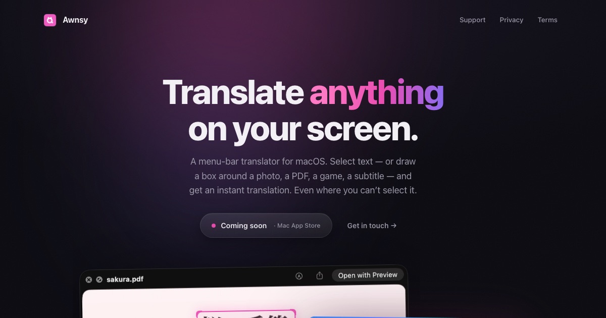
Awnsy is a small menu bar translator for macOS that turns one keystroke into an instant translation. You select text in any app, press ⌘C twice, and the translation streams in live right over the window you are working in. For text you cannot select — words inside images, videos, or apps that will not let you highlight anything — you drag a box around the area and Awnsy reads the screen itself. Its stated goal is to be everything a translator should do on a Mac, with the translation model living inside the app and running on your machine, so what you translate stays with you. Why a dedicated Mac translator? The everyday friction of reading something in another language is rarely the translation itself — it is everything around it. Copying text out of one app, pasting it into a browser, waiting for a cloud round trip, and then matching the result back to what you were reading all break the flow. Worse, much of the foreign text Mac users meet is not selectable at all: it is baked into a screenshot, a scanned PDF, a video frame, or an interface that simply refuses to be highlighted. Awnsy is built around the idea that translation should happen where the text already is, with no account to create, no API key to manage, and no telemetry. The product is positioned as a small app with serious reach: everything a translator should do on a Mac, plus a couple of things that require reading the screen rather than the clipboard. One keystroke, any language. Double-pressing ⌘C is the entire interface — or you can assign your own hotkey instead. As soon as it is triggered, the translation streams in live rather than appearing only after the whole request is finished, and the result is shown over the window you are already looking at, so you never lose your place. Inside that window you can switch the target language or change which translation model is answering, without opening preferences, signing in, or restarting anything. Awnsy describes this as "one keystroke, any language" — the point being that translation should feel like a reflex on the Mac rather than a separate task you have to go and perform somewhere else. Reads the screen itself. Plenty of the text you want to translate cannot be selected: words inside images, frames of a video, scanned PDFs, or applications that do not allow text selection. For those cases Awnsy uses on-device text recognition — you drag a box around whatever is on screen, and the app pulls the words out of the picture before translating them. Because recognition happens on the device, the content being read is not sent anywhere for that step, which keeps the same privacy posture as the built-in translation model and means the feature keeps working even when the machine is offline. Private by default, and your models if you want them. The built-in translation model runs entirely on your Mac — offline, with no account, no API key, and no telemetry — so what you translate stays on your machine. If you would rather have cloud quality, you can bring your own OpenAI or Anthropic key instead; that key is stored in your Keychain rather than sitting in plain text somewhere in the app's files. The model switcher lives in the same translation window, so choosing between the on-device model and your own cloud provider is a toggle rather than a setup project. Native and featherlight is not just a slogan here: Awnsy is written in pure Swift rather than Electron, lives in the menu bar, and never clutters your Dock. That architecture is what makes the rest of the product possible — a lightweight, always-available companion that can be summoned with a keystroke from inside whatever you happen to be doing, rather than a heavyweight application you launch and manage. The overall approach is a single, narrow surface: trigger with your hotkey, get a streamed translation over the current window, switch language or model inline if you need to, and dismiss it. There is no dashboard, no project setup, and no dedicated translation screen to learn. The outcome is translation that costs almost nothing in attention. You do not leave the app you are reading, you do not copy and paste into a browser, and you do not need an account or a key to get started — the built-in model is there the first time you double-press ⌘C. Because that model runs on your Mac and works offline, results are available in situations where a cloud service would not be: no connection, a locked-down environment, or content you would simply rather not send to a third party. And because text recognition covers material you cannot select, the same gesture handles a paragraph, a screenshot, a scanned document page, or a line of on-screen text inside a video. Concretely, Awnsy fits the moments where foreign text appears in the middle of other work. Reading a foreign-language article, help thread, or documentation page in a browser or a document, you select the passage and double-press ⌘C, and the translation appears over the page. Reviewing a scanned PDF, you draw a box around a paragraph because there is no selectable text to copy. Watching a video whose on-screen text you cannot copy, you box the frame and read it in your language. Looking at a screenshot, a chart, or a third-party app whose text resists selection, the same box gesture works. And on a plane, on a locked-down network, or simply offline, the built-in model keeps working. Awnsy is built for Mac users — the Product Hunt listing files it under Mac, Productivity, and Artificial Intelligence — and particularly for people who encounter several languages during the day and would rather not context-switch to handle them. It runs on macOS and is distributed through the Mac App Store, where it is free to download; the paid Awnsy Pro tier unlocks unlimited screen translation. The app is written in pure Swift and integrates optionally with OpenAI and Anthropic as bring-your-own-key providers, keeping that key in the Keychain. No account is required for the on-device mode. The takeaway: Awnsy compresses Mac translation into a single gesture. Select text, double-press ⌘C, read the result where you are — or draw a box when the text is trapped in an image, a video, or an app that will not let you select it. Offline and private by default, cloud quality optional with your own key, and native enough to stay out of the way in the menu bar.
Scrapboard Cloud 4 is an iOS and iPadOS app that recreates the classic concept of a digital bulletin board, bringing the cozy feel of a family refrigerator door right onto your iPhone and iPad. It is part of the Scrapboard series, which the maker describes as having a 12-year heritage behind it, and it is designed to work hand-in-hand with its macOS counterpart, Scrapboard 4. The app lets you create and manage multi-page virtual boards on your mobile devices, pin all kinds of content to them, and keep those boards in sync with the boards you keep on your Mac. Its purpose is simple: give you a creative, personal place to pin things up and keep them visible, wherever you are. Background: The maker explains that the Scrapboard series has always been about bringing that cozy, creative, chaotic energy of pinning things to a family refrigerator door straight onto your screen. Following up on the release of Scrapboard 4 for Mac, the team introduced Scrapboard Cloud 4 as its mobile companion for iOS and iPadOS. The problem it addresses is one of reach and continuity: a bulletin board traditionally lives on one screen, and staying away from that screen means staying away from your boards. By making the concept pocket-sized and adding cloud sync, Scrapboard Cloud 4 keeps your pinned content available no matter which Apple device you happen to be holding. Sync is the heart of the Cloud edition. With version 4, mobile and desktop sync together seamlessly via iCloud and CloudKit, so the same boards appear across your iPads, iPhones, and Macs using your iCloud account. The app supports multi-page virtual boards and project management, and it lets you push and fetch changes instantly rather than waiting for a manual export or import. You also get instant push notifications whenever edits are synced over from your Mac or another device, which means you can see the moment a board changes somewhere else in your Apple ecosystem. That combination of instant push/fetch and notifications turns a set of separate screens into one shared workspace. Scrapboard Cloud 4 is packed with six versatile layer types right in your pocket, and the first three cover the everyday content you would pin to a real board. The Text layer supports full typography, including font families, text sizes, and custom colors, so labels, headings, and notes can be styled to match the mood of a board. The Picture layer pulls images straight from your photo library or device storage, letting you pin photos and artwork without leaving the app. The SF Symbol layer places clean, native scalable Apple icons onto a board, which is handy for visual markers, categories, and simple decoration that stays sharp at any size. The remaining three layer types add live, functional content to your boards. The Appointment layer renders real-time countdowns with flexible reminder intervals, making it possible to pin an upcoming event to a board and watch the time tick down. The Web layer embeds live web content via a URL, so a board can show an actual page rather than a static screenshot. The Map layer handles precise GPS locations and landmark search lookups, letting you pin exact places and find them by name. Together, these six layer types mean a Scrapboard can hold text, images, icons, timers, live web pages, and locations on the same multi-page canvas. How it works overall: Scrapboard Cloud 4 is built to feel completely native, fast, and delightful to use, in the maker's words. You create multi-page virtual boards on your iPhone or iPad, add the layer types you need, and manage your boards and projects in one place. Because the app is designed to work hand-in-hand with Scrapboard 4 for Mac and shares boards through your iCloud account using CloudKit, the workflow is cross-device by default: edit on one Apple device, push the change, and fetch it on another. The product's unique approach is that it treats the old physical bulletin board as a software concept — pinning, arranging, and glancing — and then extends it beyond a single screen through cloud sync. Benefits: the obvious outcome is that your boards are no longer tied to one device or one desk. Whether you are away from your desk or sketching out ideas on your iPad on the couch, Scrapboard Cloud 4 lets you create boards and manage projects wherever you are. Instant push notifications mean you are never left guessing whether a change made on your Mac or another device has arrived. Because the six layer types cover text, imagery, icons, countdowns, web content, and maps, one app can serve as a pinboard, a countdown display, a live web reference, and a location list at the same time. And the app is free on the App Store, so trying it costs nothing. Use cases: the most literal one is the digital family refrigerator door — pinning pictures, notes, and reminders the way you would stick them to the fridge, but on your iPhone or iPad. Another is sketching out ideas on an iPad on the couch and then syncing them back to the Mac. Project management is a stated use: creating multi-page virtual boards, managing projects, and pushing or fetching changes instantly. The Appointment layer supports countdown scenarios with reminder intervals for upcoming events. The Web layer supports boards that show live embedded web content pulled from a URL. The Map layer supports saving precise GPS locations and performing landmark search lookups. Push notifications cover the case where a board is edited from your Mac or another device and you want to know right away. Target users, platforms, and pricing: Scrapboard Cloud 4 targets people in the Apple ecosystem, specifically iPhone and iPad users, including existing users of the macOS counterpart Scrapboard 4 who want the same boards on the go. The app runs on iOS and iPadOS and is listed as Free on the App Store, where you can download it and test cross-device sync with your Mac. Sync relies on your iCloud account and CloudKit. The maker is Señor Tomato, and a support site is available for feature requests and questions. Summary: Scrapboard Cloud 4 takes a familiar, cozy idea — the family refrigerator door — and makes it pocket-sized, multi-page, and cloud-synced. With six layer types, instant iCloud and CloudKit sync, and push notifications, it keeps your pinned boards and projects consistent across your iPad, iPhone, and Mac.
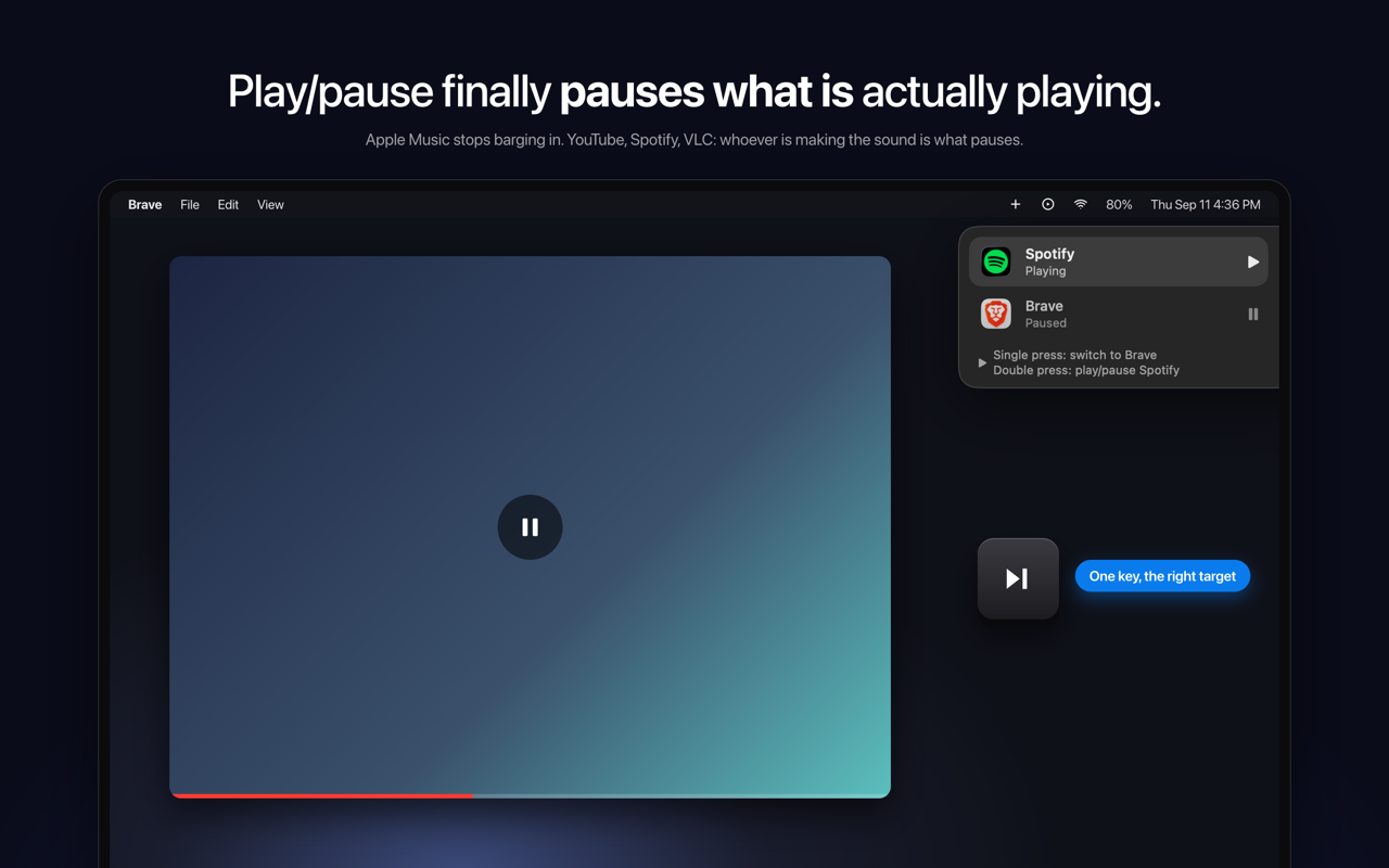
SmartPause is a free, open-source macOS menu bar app that sends the play/pause media key to the app that is actually making sound on your Mac, rather than to whatever the system remembers as "Now Playing." It is built for Mac users who listen to audio from more than one place at once — someone watching a YouTube video in Brave while Spotify sits paused, for example — and who simply want the play/pause key to do the obvious thing. The app lives in the menu bar, requires no account, and its stated purpose is direct: press play, and the right thing pauses. macOS routes media keys to its own idea of "Now Playing," a piece of state that is often stale and sometimes points at nothing at all. The practical result is a familiar annoyance: you are watching a YouTube video, you press play/pause, the video keeps going, and Apple Music opens by itself. The key press is delivered to the remembered app instead of the audible one. SmartPause exists to close that gap so the media key behaves the way users intuitively expect, controlling the audio they are actually hearing in that moment rather than a remembered guess. On every press, SmartPause asks Core Audio which process is outputting sound right now, and then sends the command to that app. Because the decision is made at the moment of the key press and is based on real audio output rather than remembered state, Apple Music stays closed when it is not the app making noise. Nothing has to be pre-configured per app for this core behavior to work. If nothing is playing at all, the press falls back to the last thing you paused and resumes it, so the key remains useful instead of doing nothing. When two apps are playing at the same time, one key still handles it. A single press switches between them: the currently playing app pauses, the other one starts, and it moves to the top. A double press plays or pauses the selected app. A widget at the top right of the screen shows what just happened and what the next press will do, so the current state is visible rather than guessed at. SmartPause is deliberately small. It asks for one permission — Accessibility — which it needs in order to hear the media keys, and it does not request the microphone or screen recording. Audio detection uses Core Audio's public process list and runs only when you press a key, so the app costs nothing when idle. Apps that have no adapter get the key handed back to the system untouched, so the media key is never dead. The app is open source under the MIT license, written in Swift, with no analytics and no accounts, so users can read every line. Out of the box, SmartPause works with Spotify, Apple Music, VLC, Chrome, Brave and Safari, which covers the mix of browser and native playback that causes most media key confusion in the first place. The app is available in English and Turkish. Installation is a one-minute job. You can install it with a single Homebrew command — brew install --cask yasinozmeen/smartpause/smartpause — or download the zip from the GitHub releases page. The app requires macOS 14.2 or newer and runs on both Apple Silicon and Intel Macs. On first launch it asks for the Accessibility permission, and that is the whole setup. The benefit is the removal of a small but daily annoyance. Instead of the media key triggering a surprise launch of Apple Music or doing nothing at all, it acts on the audio you can hear. Because unsupported apps get the key handed back to the system, the key never becomes dead just because SmartPause does not recognize the app. Because detection only runs on a key press, there is no idle cost. And because there is no analytics and no account, using the app does not add tracking to a routine keyboard shortcut. Concretely, the workflows are the ones that break today. You are watching YouTube in Brave and press the key; the video pauses and Apple Music stays closed. A browser and Spotify are both playing; a single press switches between them and the widget shows what happened. Nothing is playing; the press resumes the last thing you paused. The app making sound has no adapter; the key is handed back to the system untouched. SmartPause is aimed at Mac users who listen across browsers and native players, and at users who prefer small, private, open-source utilities that need no account. It is free and staying free; the developer accepts coffee donations that go toward the Apple Developer ID so the app can be notarized. The app is menu bar only, with no windows to manage. In short, SmartPause fixes a specific, repeatable macOS annoyance by aiming the play/pause key at the process that is genuinely producing sound right now — free, open source, and small enough to forget about until the moment you press the key.
Epismo OS is a collaboration OS for people and AI agents. It keeps the purpose and constraints of real work, so the next person or AI can continue without starting over. Epismo is built for people who work with AI tools such as Claude, ChatGPT, and Cursor and who want to move between those tools — or hand work to a teammate — without a re-brief. The product's central promise is "Switch AI. Keep the work." Work is kept in a Case that holds the result, the decisions behind it, reviews, and the next step, so work in progress survives a change of model, tool, or person. The problem Epismo addresses is continuity. When a piece of work is done inside a single chat with a single AI tool, everything that made it meaningful — why it was started, what the constraints were, which decisions were made, which claims were still assumptions — is locked inside that conversation. Moving to another AI tool, coming back the next day, or passing the work to a teammate usually means starting over: re-explaining the brief, redoing the research, and rebuilding context that already existed. Epismo keeps the purpose and constraints of real work so the next person or AI can continue without starting over, in the tools you already use. Everything begins with saving. Epismo keeps the purpose, the constraints, and the current decisions of a piece of work, along with the result, the decisions behind it, reviews, and the next step. Once that is saved, continuing becomes the default rather than restarting. You do not need a new chat — you hand the work in progress to the next person or AI. You can hand the same work to Claude, ChatGPT, or Cursor without redoing the research. You can open the same work the next morning and find that what it is for is still there. Or a teammate can open it and see what happened, and where to pick up. The example shown in the product is an "Acme renewal" Case marked In progress: a research step in Claude Code left the evidence and open questions, and an account executive continuing in ChatGPT picks up from there with no restart. Auto review is Epismo's quality layer. Instead of manually re-checking a saved result, you leave the work with Epismo, which reads it and writes what still needs checking. Those notes become the starting point for the next turn in Cursor, Claude, or ChatGPT, so your AI fixes what Epismo flagged. In the example, the review states that usage isn't sourced and that the churn claim is still an assumption; the following Cursor turn adds the usage and the filing. Crucially, auto review gives a saved result a fresh review, flags issues, and leaves the original unchanged — so you get a second pass without overwriting the work you already have. When the same kind of work comes up again, Epismo turns what worked into a playbook. A playbook captures what counts as evidence and what a person should check, so the next piece of work starts from there. The recommended playbook shown in the product, "Enterprise renewal review", is built from four named steps: scope the renewal risk, pull filings, tickets, and usage into one set, separate verified facts from assumptions, and hand the call to the account owner. Each step can name the Skill, MCP, CLI, Plugin, or Approval it should use — for example a "Renewal risk rubric" Skill, MCP connectors for filings and earnings calls and for CRM plus ticket history, a "Claim-to-source audit" Plugin, an "Exec brief builder" CLI, and an Approval step. This means the pattern of work becomes reusable and explicit, rather than something each person has to remember. Epismo's methodology is deliberately work-first: work first, the pattern later. You do not start by writing a pattern. The flow is four steps. Save: keep purpose, constraints, and current decisions. Handoff: the next person or AI picks up from there. Discover: see what worked, and keep that as a pattern. Improve: lessons from real work feed the next run. Only after real work has been saved, handed off, and reviewed does Epismo surface the reusable pattern, which reduces the risk of designing an abstract process that does not match how the work actually gets done. The outcome for users is continuity. Work is no longer trapped in a single conversation with a single tool: switching from one AI to another, returning the next day, or involving a teammate all happen without a re-brief. Because Epismo keeps the purpose and constraints, the next person or AI continues rather than restarts. Because auto review reads saved results and writes what still needs checking, quality checks become part of the workflow instead of a separate manual pass, and the original result stays unchanged. Because patterns become playbooks, teams stop starting from zero on repeatable work and can carry lessons from real work into the next run. The product is shown around an enterprise renewal review, a scenario where evidence, assumptions, and human sign-off all matter: research is gathered with Claude Code, the renewal brief is drafted in Cursor, Epismo flags unsourced usage and an unverified churn claim, and the account owner receives the call through an Approval step. More broadly, Epismo signals the many kinds of work it is meant to hold through its categories, including deck, email, operations, approval, campaign, customers, meeting, coding, report, content, launch, hiring, bug, support, experiment, research, legal, and accounting. Any of these can be saved as a Case, continued by another AI or teammate, reviewed automatically, and — where it repeats — turned into a playbook whose steps name the Skills, MCP, CLI, Plugin, or Approval to use. Epismo is for teams and individuals who already work with AI assistants and want that work to survive a change of tool, day, or person. The product states that it works with the AI you already use, and names Claude, ChatGPT, Cursor, and Claude Code in its examples; playbook steps can reference Skills, MCP connectors, CLI tools, Plugins, and Approvals. Epismo is offered as a web product with a free start — the site prompts you to "Start free" with no credit card required — and a separate "Talk to sales" path for buyers who want to speak with the team. Epismo OS is the collaboration OS for people and AI agents: it keeps the purpose, constraints, and decisions of real work in a Case, hands that work forward to the next AI or teammate, reviews saved results without changing them, and turns what worked into reusable playbooks. The primary value proposition is continuity — switch AI, keep the work, and don't start from zero next time.
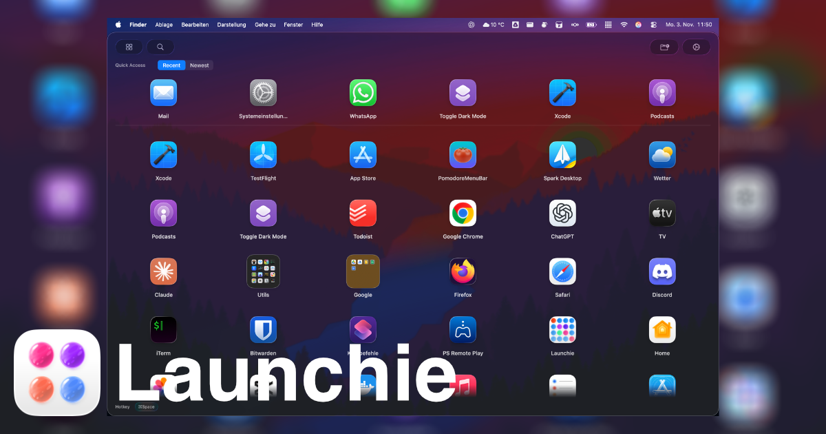
Launchie is a macOS application that brings a fullscreen, visual app launcher back to Macs running macOS 26 Tahoe and macOS 27 Golden Gate. It displays installed applications as a grid of icons that the user arranges themselves, with drag-and-drop ordering that sticks, unlimited folders, separate Spaces for different groups of apps, and instant search. Launchie is a replacement for people who browse their apps by eye instead of typing a name into a keyboard launcher, and it is positioned as the visual launcher macOS 26 removed: your app grid, your folders, your layout. It is available on the Mac App Store and can also be installed through Homebrew. Launchie is free to use, with a Pro tier offered as a one-time purchase. The product exists because Apple removed Launchpad in macOS 26 and kept it out of macOS 27. As the site puts it, macOS 26 broke the classic Launchpad. According to the feature comparison on the site, macOS 26's Launchpad offered no icon rearranging, so apps were stuck in alphabetical order; no custom folders, so users could not organize their workflow; a fixed grid layout that fits nobody; no customization at all; no backup options, so a setup was lost on new devices; and no smart features beyond a basic grid. Launchie is presented as the recommended alternative, offering drag-and-drop reordering, custom folders, flexible layouts, full customization of hotkeys, themes and icons, backup and restore, and Smart Lists. User reviews on the site echo the same story: reviewers describe losing a curated launcher when upgrading to Tahoe, and then finding that Launchie did everything the old Launcher did, and more, with one calling it the perfect un-Sherlock'ing of Launchpad. Launchie's core is the grid. Every app appears in a fullscreen grid that the user arranges themselves, and because drag-and-drop ordering sticks, the layout stays where it is put rather than snapping back to an alphabetical list. Spaces extend this by splitting the launcher into separate sections, each holding its own apps and folders, so a large library stops being one long wall of icons; users can keep work apps in one Space and everything else in another. The site notes that the old Launchpad never had Spaces. Screenshots on the site show the app grid, Spaces, search, organizing apps, quick access and appearance settings, alongside a live demo video of Launchie 1.6.1 running on macOS 27 and macOS 26. Folders and search handle organization and retrieval. Users can make as many folders as they like and drop apps into them to group what belongs together, and search finds and launches any app in seconds. Apps that are never opened can be hidden to keep the launcher clean. A backup and restore feature saves the whole Launchie setup so that a new Mac starts where the last one left off. Launchie is also designed to be opened and closed quickly. It can be opened with Command-K or with a custom keyboard shortcut chosen by the user, and it can also be launched through Hot Corner activation. Pressing Esc instantly returns the user to what they were doing, and clicking outside the launcher closes it as well. A quick access section uses Smart Lists to surface recently used, most used or newest apps at the top. Customization is a major part of the app: the look can be adjusted to the user's needs, and there is a choice between a modern Liquid Glass UI or a traditional sheet look. All of this is framed as everything that was loved about the classic Launchpad, plus modern enhancements. The overall approach is deliberately visual and spatial rather than keyboard-first. Launchie opens as a fullscreen overlay on the Mac desktop, showing the app grid, folders and Spaces, and then closes again with Esc or a click outside so the user returns to whatever they were doing. Because ordering, folders, Spaces, hidden apps and the rest of the configuration are part of the setup, the launcher becomes a curated, persistent layout rather than a flat list of every installed application. The site contrasts this with keyboard productivity tools such as Raycast, noting that keyboard productivity and visual app launching solve different Mac workflow problems. For users, the benefit is getting a familiar visual browsing workflow back after upgrading to macOS 26 or macOS 27, and then getting more than the original offered: drag-and-drop reordering, custom folders, flexible layouts, hotkeys, themes and icons, backup and restore, and Smart Lists. Reviewers quoted on the site describe it as fast, elegantly designed, thoroughly customizable and actively developed, with one noting that they have hundreds of apps installed and that quickly finding and opening the ones they need is no trivial task, a problem Launchie's search and Smart Lists address. Another reviewer says the app includes so many more features than Launchpad ever did that they no longer miss it. The app holds a 4.6 out of 5 rating from 141 ratings on the Mac App Store. Launchie's use cases follow directly from its features. Someone who upgrades to macOS 26 Tahoe, discovers the launcher is gone, and wants a familiar fullscreen grid back can install Launchie and arrange apps the way they had them before. A user with hundreds of installed apps can rely on search and Smart Lists to find and open what they need quickly. A person who wants to keep work and personal apps apart can place them in separate Spaces, each with its own apps and folders. Someone who has carefully curated a layout can back it up and restore it on a new Mac so the setup carries over. Users who browse by eye rather than typing an app name get a grid organized around how they remember their apps. The site also provides guide pages aimed at people searching for a missing Launchpad on macOS Tahoe, the best macOS Launchpad replacement, or a Launchpad replacement for macOS 27 Golden Gate. Launchie is aimed at Mac users on macOS 26 Tahoe and macOS 27 Golden Gate, particularly those who valued Launchpad's visual browsing, folders and spatial memory. It requires macOS 26 Tahoe and is distributed through the Mac App Store and via Homebrew with the command brew install --cask launchie, with other installation options listed on the site. Pricing is free to use, with Pro available as a one-time purchase. The site reports its Mac App Store rating and press coverage from iDownloadBlog, Mac & i 6/2025 and MacGadget, and it also hosts comparison pages against LaunchOS, AppGrid and Raycast, along with guides, blog posts and a newsletter for release notes and launchpad replacement guides. Launchie's primary value proposition is simple: it restores the visual, customizable app launcher that macOS 26 removed, and it does so with drag-and-drop ordering, folders, Spaces, search, hidden apps, Smart Lists, backup and restore, and appearance options that go beyond the original Launchpad, in a package that is free to use with a one-time Pro purchase.
Termphin is an SSH client that keeps the shell alive on the server so that sessions survive locked screens, lost signals, and network switches. It is a mobile terminal built for developers, system administrators, and anyone who manages remote machines from a phone, and it combines a fast terminal with an integrated SFTP browser and editor, a snippet runner, an SSH key manager, port forwarding, ProxyJump bastion chains, and a biometric lock. The stated purpose is simple and repeated throughout the site: never lose an SSH session again. Your shell stays alive on the server through locked screens and network drops, and when you come back you are put on the same screen you left. Termphin is available on Google Play, is free to use, and comes with no ads and no in-app purchases. The site also positions it explicitly as built for productivity and built for AI coding agents such as Claude Code and OpenCode. The problem Termphin targets is specific and well documented. A blog post on the site asks why your SSH session dies when you lock the screen, and answers with the mechanics of mobile app suspension: mobile SSH connections drop when an app is suspended, and the post covers what the client does to stay scheduled and how a remote helper keeps long-running shells alive. On a phone, locking the screen, losing a signal, or switching from Wi-Fi to mobile data has traditionally terminated the connection, and with it any job that was running. That matters most for work that takes minutes rather than seconds - deploy scripts, database migrations, builds, or AI coding agent tasks - where a dropped session can mean losing both the process and the context of what it was doing. Termphin's answer is to move the shell off the app and onto the server. Persistent sessions are the core of the product. Termphin maintains the connection while the app is backgrounded or the phone is locked, and it relies on the Termphin Agent: a tiny, open-source helper that holds the remote shell open and reattaches instantly when you return. Because the shell runs on the server rather than inside the app, your jobs keep running even if you lock your phone or lose signal. The FAQ explains that if the connection drops or you switch networks, the small open-source Rust agent on the server keeps the remote shell running and reattaches you seamlessly upon reconnect. For basic sessions no helper is required at all, since shell detection is automatic, which means the agent is an enhancement for persistence rather than a prerequisite for connecting. Terminal rendering gets its own emphasis. Termphin draws the TUI directly with Flutter rather than inside a web view, which the site says keeps htop, vim, and other terminal user interfaces rendering without broken box characters. The pixel-perfect TUI section adds that spinners, progress bars, and diff views render cleanly without mangled characters - a practical difference when you are reading a diff or watching a progress bar on a small screen. Appearance is configurable as well, with 14 color schemes and controls for font size, line height, and padding, all previewed live in the terminal before you commit to a setting. The toolbox covers the day-to-day tasks around a remote shell. SSH tunnels let you open local and remote port forwards per session, or save them with a profile so they come back with the connection. Integrated SFTP puts a full file browser a tab away from the terminal: you can browse remote files, edit them with syntax highlighting, preview images remotely, and resume file transfers that were interrupted. A one-tap SFTP upload flow lets you upload files from your phone and then paste their remote server path straight into your prompt, which removes the usual guesswork about where an upload landed. Machines, snippets, and key management round out the toolset. In the machines list you save the host, user, and credentials once, then tag, search, and connect in one tap; the site lists fast search and tags, ProxyJump bastion chains, and multi-tab concurrent sessions as the organizing features. Snippets let you save recurring commands once and trigger them instantly across your infrastructure, with a search-and-run palette, execution history that records exit codes, and a customizable action dock. Security is handled by a device-bound key vault: keys and profiles are sealed with AES-256-GCM behind your phone's PIN or fingerprint, you can generate ed25519 and RSA keys, biometric PIN and fingerprint lock gate access, and host key pinning happens on connect. The unique approach is the split between client and server. Instead of holding the shell inside a mobile app that the operating system can suspend, Termphin keeps the shell running remotely and treats the app as a window onto it, reattaching when you return. Termphin says it maintains the connection while backgrounded or locked, and connections go directly to your server with host key verification rather than through an intermediary. Data protection stays local: keys and profiles are sealed in an AES-256-GCM vault on the phone, gated by PIN or biometrics, and only opt-in anonymous crash analytics are ever sent. Two of the pieces are open source on GitHub - the terminal renderer, terminal_view, and the server helper, termphin-agent - so the persistence mechanism can be inspected rather than taken on trust. The benefits follow from that architecture. Long jobs keep running when the phone is locked or the signal drops, and you reattach anytime rather than restarting. Terminal output stays legible because the TUI is drawn natively, so htop, vim, spinners, progress bars, and diffs do not degrade into mangled characters. Credentials and keys stay on the device in an encrypted vault rather than being typed repeatedly, and profiles, tags, and search turn a list of servers into something you can navigate in a tap. Snippets cut repeated typing down to a single action, and because the session survives network changes, switching between Wi-Fi and mobile data stops being a destructive event. Concrete scenarios are described on the site. The AI coding agents section gives the clearest one: start a ten-minute Claude Code or OpenCode task and pocket your phone, because the agent runs on your server and the session never aborts. The FAQ confirms that Claude Code, Codex, and OpenCode run seamlessly, that tasks keep executing when the screen locks, and that TUI diffs and progress bars render cleanly. Other workflows in the content include reaching a server behind a bastion by pointing a profile at a jump host, running interactive keyboard prompts for 2FA authenticator codes (TOTP) and PAM passwords, browsing and editing a remote file over SFTP without leaving the app, and triggering saved recurring commands across infrastructure from a search-and-run palette. Termphin is aimed at people who work on remote servers from a phone: developers, administrators, and anyone running long-lived processes or AI coding agents over SSH. It works with any server reachable over standard SSH - Linux, macOS, BSD, or Windows - with automatic shell detection, and it interoperates with bastion setups through ProxyJump-style jump hosts and with 2FA through TOTP and PAM prompts. The stack described on the site includes Flutter for the terminal rendering, a Rust server agent, and AES-256-GCM for the local vault. Pricing is straightforward: Termphin is free to use with no ads and no in-app purchases, distributed through Google Play. In short, Termphin's value proposition is that the shell lives on the server while you live on your phone. By keeping sessions alive through locked screens, lost signals, and network switches, rendering terminal interfaces properly, and bundling SFTP, tunnels, snippets, key management, and bastion support into one free Android app, it turns mobile SSH from a fragile short-lived connection into something that behaves like a persistent workstation.
Harbor is a private notes app and Evernote alternative that its website describes as a second brain you finally own, and own for life. It is designed to capture notes, documents, scans, photos, audio recordings, handwriting and web clips in one place, keep them searchable, and keep them for good. Harbor positions itself as a personal rather than an enterprise product: your data is never sold, mined or shared, and the promise is that your brain stays yours. It runs as native apps on Mac, Windows, iPhone, iPad, Android and the web, plus a CLI, and it opens with a free plan that requires no credit card. The product exists because of a specific frustration. As Harbor puts it, Evernote promised to be your second brain, then broke the promise: prices doubled, the free plan was gutted, the app got slow, and your data got harder to leave with. That story is familiar to many long-term note-takers, and it explains why people hesitate before committing years of notes, scans, photos and recordings to a single service. Harbor's answer is to pick up the original idea — one private place for everything, forever — and to commit to it in writing, with explicit promises about pricing, export and data ownership rather than vague reassurances. Capture is the first half of that promise. The app is built to save anything, in any form: notes, scans, photos, audio and handwriting, plus web clips gathered through the Web Clipper. The website shows this in a domestic scene — a couple sorting their mail and scanning documents together at a sunlit table — with the scanned document then saved in Harbor. The value of capturing in many formats is that you stop deciding in advance what is worth keeping. A receipt, a handwritten page or a voice recording can all go into the same second brain, and the decision about whether it matters can be made later, at the moment you actually need it. Finding is the second half, and it is where Harbor leans most heavily on technology. Harbor reads the words inside your photos, scanned PDFs and even your handwriting, so a short two-word search can surface the exact page you need. The site illustrates this with a search for 'receipt' that returns a Monroe County business tax receipt stored as a PDF, with the matched text — 'FLORIDA LOCAL BUSINESS TAX RECEIPT — issued pursuant to Ch. 205' — shown in context, alongside a scanned 2023 F-250 brake job invoice, from which Harbor has read details such as the 24-month warranty and the next service due. Recordings are handled in the same spirit: your audio becomes searchable transcripts. For anyone who scans paperwork or records spoken notes, this turns an archive of files into something closer to a memory that can actually be queried. Privacy is the third pillar. Harbor lets you turn on zero-knowledge encryption for any note or notebook, so that only you hold the key. The point of applying it selectively is that you can lock down the genuinely sensitive material while keeping everything else fully searchable and AI-ready; the site's example is an encrypted notebook that stays locked until you unlock it. Underpinning this, the security section lists zero-knowledge encryption and privacy by principle, with a commitment that your data is never sold, plus sign-in options that include passkeys, Apple, Google and full device control. Harbor is available everywhere you are. Its apps are described as genuinely native — fast and light, not a web page in a wrapper — and everything works with no signal and syncs the moment you are back online. The listed platforms are Mac, Windows, iPhone, iPad, Android and the web, and the same notes sync across all of them. The Web Clipper extends that reach into the browser: available for Chrome, Edge, Firefox and Safari, it can clip a simplified article, a full page, a bookmark or a screenshot, let you mark it up, and then drop it straight into the right notebook without ever leaving the page. That matters because the moment you leave a page to file a clip is usually the moment the clip is lost. Rather than building a weaker assistant into the product, Harbor opens the door to the AI you already pay for. You can connect ChatGPT or Claude, as well as tools such as Cursor, through an API, CLI and MCP, so your assistant can search, add and organize your notes in Harbor. The site's framing is direct: you already pay for ChatGPT or Claude, so instead of paying Harbor for a weaker one baked in, you connect the one you have. Access works with your keys and your data, and can be revoked at any time. The rest of the feature set covers the everyday mechanics of keeping a notebook. Notes and notebooks are deliberately simple, with no Markdown and no clever-tag gymnastics; tasks and reminders sit right next to your notes with due dates, recurrence and priority; templates provide ready-made note structures you build once and reuse; version history saves every change with one-click restore so an edit is never lost; and public links let you share any note read-only, with no account needed to view it. Import and export are treated as core features rather than afterthoughts: one-step import brings an Evernote library in, and full export takes everything out, anytime, in the open. Harbor's distinctive approach is less about any single feature than about the commitments wrapped around them. You are never held hostage: if you stop paying, your account goes read-only and you can still export everything, and delete it. A real API, MCP and one-click export mean you can leave whenever you want, on the explicit logic that Harbor wants you to stay because it is great, not because you are stuck. The pricing itself is framed as a promise: no price increase for three years, then capped at 10% a year. The product is cross-platform, starts free, and is priced as one simple plan. For users, the outcome is a library that behaves the way a second brain should. Everything you save syncs the moment you save it, on every device you own, so the same notes are available on a desktop, on a phone or in the browser, online or offline. Scans, receipts, photos and recordings stop being dead files and become searchable material. Sensitive items can be encrypted while the rest of the library stays usable and available to your own AI tools. And the commercial terms — locked pricing, read-only rather than deleted data, and full export on every plan — mean the cost of committing years of notes to Harbor is bounded in a way the site argues the previous generation of note apps was not. Concrete scenarios from the site include searching a short term such as 'receipt' to pull up a scanned business tax receipt or a vehicle service invoice and immediately see the matched line; scanning household mail and documents as they arrive and filing the results in Harbor; clipping an article from a news site, annotating it and saving it into the right notebook without leaving the browser; turning audio recordings into searchable transcripts so a spoken note can later be found by its words; and importing an entire Evernote library — notebooks, tags, checklists, attachments and clips — in one step when switching over. Shared read-only links cover the case where someone else needs to read a note without creating an account. Harbor is aimed at individuals rather than enterprises: people who keep personal notes, scans and recordings, people who care about privacy and ownership, and in particular people currently considering leaving Evernote — the site offers a dedicated switching path and a one-step importer for notebooks, tags, checklists, attachments and clips. Its integrations are the AI tools you already use, reached through API, CLI and MCP, and its browser extension works in Chrome, Edge, Firefox and Safari. Pricing is deliberately simple: a free plan to start with no credit card, and one paid plan, Harbor Unlimited, at $8.25 per month when billed yearly at $99, or monthly, with annual saving 17%. The paid plan includes unlimited notes, notebooks and devices, OCR search, all apps and the Web Clipper, optional zero-knowledge encryption, API, CLI and MCP access, and import and export at any time. In short, Harbor takes the familiar promise of a second brain and attaches guarantees to it: capture in any format, find anything with OCR and transcripts, encrypt what is sensitive, work natively on every device and offline, connect your own AI, and keep the ability to take everything with you. The claim is not that it does more than the alternatives, but that it can be trusted to keep doing it — with the price, the export and the ownership terms written down rather than merely implied.