Category Focus/categories/productivity
Productivity AI Tools
Discover and compare the best productivity AI tools and software. Browse 859+ curated tools with reviews and rankings.
Projects tracked
859
Sort mode
RECENT
Page
11
Discover and compare the best productivity AI tools and software. Browse 859+ curated tools with reviews and rankings.
Projects tracked
859
Sort mode
RECENT
Page
11
Psst is a real-time shared to-do app for two people or twenty. It gives you one shared list where someone adds milk, someone else grabs it, and everyone sees it happen live. Lists can be about anything — groceries, a move, or a Q3 launch — and adding an item is as simple as typing or talking, because Psst sorts out the dates and reminders for you. The app runs on iOS and Android, works offline, and starts on a free plan that needs no card. Psst is designed both for households and small groups who share everyday errands, and for teams that want to assign items, chat next to the tasks, and feel the small joy of a finished list. Most shared planning breaks down in the same way: the shopping run lives in someone's head, the move lives in a group text, and the launch plan lives in a tool nobody opened. Psst's premise is that a list should keep up with the people on it rather than the other way around. Instead of collecting emails, chasing accounts, or standing up a workspace before you can start, Psst lets anyone join a list from a single link in seconds, on either an iPhone or an Android phone. On top of the shared list itself, Psst also tackles a quieter problem: remembering what things cost, so you can see whether a price has actually changed since last time. How it works is deliberately three steps. First, make a list — add items by typing or talking, and Psst sorts out dates and reminders from what you say. Second, send one link: there are no emails to collect and no accounts to chase, so anyone with the link can join the list in seconds on iOS or Android. Third, check things off together, with everyone seeing progress live. Quick-add is built to understand plain language: type 'milk tomorrow 6pm' and Psst returns a structured item — Milk, Tomorrow, 18:00, with a reminder affordance — rather than a raw block of text. Real time is the core of the experience: the whole list is live. A shared activity feed shows what changed and when — for example, that Yara checked off 'Reserve the cabin', that Marc added three items to Groceries twelve seconds ago, or that Tess joined a Q3 Launch list a minute ago. Because everyone sees the same state at the same moment, the classic 'did you already get it?' text becomes unnecessary. Assigning items is part of the same flow, along with roles, comments and an activity feed that keeps the record of who did what. List chat keeps decisions next to the tasks they affect. Instead of splitting a conversation into a separate messaging thread, you can ask 'who's on dessert?' inside the list, see someone answer 'on it - assigned myself', and end up with the item 'Bring dessert · assigned to Yara'. The Today view then filters all of that noise down to one place: every item due today, pulled from every list you're on, laid out across morning, afternoon and anytime. A calendar view is available as the lists grow. Psst is built to be yours anywhere. It works in airplane mode and syncs when you land, merging changes so nobody's edits are lost. There are five themes and four accents for personalizing the app, home-screen widgets let you glance at today and your lists without opening the app, and recent work has added Arabic and right-to-left polish across every screen. Your lists sync through your account, you can export them at any time, and deleting a list actually deletes it. The broader approach behind Psst is restraint about the things it claims to know. Psst is a shared shopping list whose useful part is that it remembers what you paid. Photograph a receipt and the lines come back structured, each one showing a crop of the row it came from, along with what that item cost last time and where. The careful part is comparison: two prices in different units are never compared with each other, and comparison is done on unit price rather than the line total, so buying 2kg instead of 1kg is not treated as a price rise. Most of the work, in the product's own words, went into not saying something when it isn't sure. The benefits follow from that: less coordination overhead, fewer missed items, and a single place where a household or a team can see what is done and what is left. Sharing is optional rather than required, so the same app works as a personal to-do list for people who only occasionally share a list. And because reminders, recurring items, a calendar view and collaboration roles arrive without standing up a workspace first, Psst can replace a dedicated task app without the setup cost — you can start with one list and scale to the whole team. Concrete uses described for Psst include the grocery run, where one person adds milk and another checks it off as they pass the aisle; a household move, where items, reminders and assignments live on one list; and a Q3 launch, where a team joins by link, assigns items, and chats next to the tasks. The Today view is designed for the morning, afternoon and anytime sweep of everything due across all your lists. Integrations extend the same workflow: Google Calendar and Outlook sync due dates both ways, Slack turns messages into tasks and nudges you on what's due, and Zapier connects Psst to thousands of other apps. Psst is aimed at both households and teams. The Free plan covers shared lists with live sync, roles, comments and an activity feed, list chat, the Today view, natural-language quick-add, and iOS, Android and offline use. Pro is $35.99 per year (about $2.99 a month, or $4.99 month to month) and adds unlimited lists, reminders and nudges, recurring items, a calendar view, themes and accent colors, and advanced collaboration roles. Family is $49.99 a year for up to six members, each keeping their own lists under one bill. Team is $79 per user per year and adds an admin console, member roles, SSO and SCIM provisioning, joining by company domain with approval, central billing and invoicing, and priority support. Every new account gets 7 days of Pro free with no card. A founding offer lets the first 150 people claim Individual Pro for life at $99 one-time or Household Family for life at $149 one-time. In short, Psst treats a shared list as a living thing: real-time, chattable, assignable, and available offline, joined by a single link rather than an account dance. Add the Today view, calendar, reminders and recurring items, plus a shopping-list memory for what things cost, and you get one place that keeps up with your people — whether that is two people splitting groceries or twenty people shipping a launch.
Kleanly is a small macOS utility for MacBook owners who want to clean their machine without shutting it down. It lives in the notch of your MacBook, and with a single tap it disables your keyboard and trackpad so you can wipe everything down safely. To start a cleaning session you hover the Kleanly control beside your MacBook notch and press play; to finish, you simply double-tap the trackpad to exit. Kleanly is built for anyone who wants a spotless keyboard and display — from people who clean their keyboard regularly to parents who hand their Mac to a child. The problem Kleanly addresses is one almost every MacBook owner has run into: you want to clean your keyboard, but you cannot easily do it while the Mac is running. Turning the machine off just to wipe the keys is inconvenient, and leaving it on means your screen ends up a mess as stray keystrokes and trackpad gestures fire while you clean. Worse, those accidental inputs can send random messages or trigger shortcuts you did not intend. Kleanly removes that dilemma entirely. Instead of powering down, you temporarily disable input with one tap, clean freely, and then exit with a double-tap when you are done. The result is a clean Mac without interruptions. The core of Kleanly is its input lock. With just a tap, Kleanly lets you disable your keyboard and trackpad. The control sits beside your MacBook notch, and pressing play on it starts the cleaning session. While the lock is active, taps, slaps and swipes on the keyboard or trackpad do nothing, which is what gives users what the product calls peace of mind: no more worrying about sending random messages or triggering shortcuts while cleaning, so you can focus on making your Mac spotless. The session ends when you double-tap your trackpad, returning normal input instantly. Because the interaction is limited to a single tap to start and a double-tap to stop, there is nothing to configure mid-clean and no risk of leaving the lock on by mistake. Kleanly also handles the display. It can display a full-screen black overlay on your screen, revealing all the dirt, fingerprints and smudges so you can see exactly what needs wiping — a black surface makes marks far more visible than whatever wallpaper or app window you were looking at. A newer capability, Keep Watching While You Clean, means your screen stays on, so a video keeps playing while you wipe down the keys. You turn on the black overlay only when it is time to clean the display, so you can clean the keyboard while continuing to watch something and then switch to the overlay for the screen itself. Together these two behaviours cover both surfaces of a MacBook: the keys you type on and the glass you look at. Several features serve specific situations. Toddler-Proof mode is designed for parents: you let the little ones watch a cartoon, and taps, slaps and swipes on the keyboard or trackpad do nothing until you double-tap to exit. No Notch? No Problem covers Macs and displays that do not have a notch — there Kleanly sits as a small tab in the menu bar instead of beside the notch. The interface itself is minimalistic and intuitive: a minimal design that stays out of your way, with no extra windows and no unnecessary clicks. For minimalists who dislike seeing extra controls, Hide the Notch Control lets you tuck the notch control out of sight between cleanings. The creator's update notes also mention in-app updates and the ability to move your license to a new Mac yourself. Overall, Kleanly works by putting a single control where MacBook users already look — the notch — and turning cleaning into a two-gesture workflow. You hover the Kleanly control beside the notch and press play to enter a locked cleaning state. In that state the keyboard and trackpad are disabled, so nothing you touch registers, while the screen can keep playing content or switch to a full-screen black overlay for display cleaning. When you are finished, a double-tap on the trackpad exits and input is restored. On machines without a notch, the same control appears as a small menu bar tab. There is no separate window to manage and no complicated setup described beyond installing the app. The benefits follow directly from that design. You get peace of mind, because you no longer worry about sending random messages or triggering shortcuts while you clean. You can keep watching while you clean, so cleaning the keyboard no longer interrupts a video. You can get a genuinely clean display, because the black overlay exposes dirt, fingerprints and smudges that would otherwise be easy to miss. Parents get a toddler-proof Mac that survives cartoon time. Users who care about the look of their software get a minimalistic interface that stays out of the way and can be hidden between cleanings. And everyone avoids the main alternative — shutting the Mac down just to wipe the keys. Concrete scenarios come straight from the product's descriptions. In the first, you are watching a video on your MacBook and want to clean the keyboard: you press play on the Kleanly control beside the notch, wipe the keys while the video keeps playing, then double-tap the trackpad to exit. In the second, it is time to clean the screen: you turn on the full-screen black overlay, which exposes all the dirt, fingerprints and smudges, wipe the display, and exit. In the third, a toddler is watching a cartoon: taps, slaps and swipes do nothing until you double-tap to exit. A fourth scenario is a Mac or display without a notch, where you use the small menu bar tab instead. Throughout, the point is cleaning without turning the machine off. Kleanly is aimed at MacBook owners generally, and especially at people who clean their keyboard and display regularly, parents who share a Mac with young children, and users who prefer minimal, well-designed software. Requirements are stated on the product page: macOS 12 (Monterey) or greater, and Macs with Intel chips are supported. Kleanly is sold as a paid one-time purchase at $14.99, with a license-key lookup for people who have already bought it. The product listing shows 58 sales and a 5-star rating from the reviews displayed, and the creator's rating is 4.9 from 12 verified reviews across other products. Buyers have described it as easy, practical and useful, and as surprisingly well designed. In short, Kleanly turns an awkward chore into a tap. By living in the notch and locking your keyboard and trackpad on demand, it lets you clean your MacBook — keys and display — without shutting it down, while videos keep playing and toddlers stay safely unproductive. It is a small, focused macOS utility whose value is exactly its narrowness: one tap to start cleaning, a double-tap to stop.
GoodSocials is an AI social media manager built specifically for LinkedIn. It writes posts that draw only on deep research or on your own data, and it publishes five times a week — but only after you approve each post. Onboarding is deliberately fast: you sign in with LinkedIn, paste your website, and according to the site your board is full in 90 seconds with seven posts. The product is made for the person whose name is on the profile, and the site names four groups it is built for: founders, consultants, operators and agencies. The example board shown belongs to TimeTuna.com, a scheduling service, and its stated goal is inbound leads — a useful clue to what the product is ultimately for: a steady, credible professional presence that brings in demand. The problem it addresses is framed bluntly on the site: a social media manager costs $3,000 a month. A comparison table spells out the trade-offs. A $3,000 manager posts in most weeks; GoodSocials posts every weekday. A $3,000 manager delivers first drafts after a week of onboarding; GoodSocials delivers them in 90 seconds. When you are on holiday the manager stops, while GoodSocials posts what you queued. And the price is $100 a month instead of $3,000. The site also frames the starting point many users are in: three posts in your last three months. That gap — between intending to post regularly and actually doing it — is what the product is built to close. A second, equally explicit concern is quality. GoodSocials positions itself against "AI slop" and lists the writing habits it refuses to produce: cringe openings like "Nobody talks about this, but scheduling is broken", posts built around "I spent 10 years in SaaS", and the "it's not X, it's Y" construction. Every post is one of three kinds, according to the site: market research, deep dives, and your numbers. This is the core editorial model. Market research posts come from looking at the wider landscape — one example card reports that of 12 scheduling tools compared that month, nine put round-robin scheduling behind a paid tier and two moved it there in the previous quarter. Deep dives go into a source or an idea in more depth — one example draws on 1,200 support threads from new TimeTuna users to identify the most frequent week-one question, and another weighs a famous jam study from Iyengar and Lepper (2000) against a meta-analysis of 50 experiments by Scheibehenne et al. (2010) to explain why TimeTuna shows three slots. Your numbers posts come from your own tools, such as the finding that TimeTuna reschedules fell from 18% in May to 7% in August, one change in between being that the invite now shows the guest's timezone first, based on 9,412 meetings. The site states plainly that the content is research, deep dives and your numbers, nothing else. To produce those posts, GoodSocials connects to the tools you already use. The example board lists five read-only connections: PostHog, Stripe, GitHub, Plausible and Notion. Because the connections are read-only, the product can quote your data without being able to change anything in those systems, and because they are your own tools, the resulting posts contain figures only you could publish. The output lands on a board — a kanban-style view where posts are drafted and moved through approval. You approve the posts you want, and the pipeline moves them on. Cards are scheduled to specific times, such as Tuesday at 09:00 or Wednesday at 09:00, so the cadence is planned rather than improvised. The board is shown populated with seven posts within 90 seconds of signing in with LinkedIn and pasting your website. Corrections stick: the site promises that if you correct it once, every post after follows. The mechanism is explicit. When you leave a note on a card, that note rewrites the card and becomes a rule in your voice. In the example, a reviewer's note — "Open on the number, not a question" — becomes a voice rule, joining other rules such as "Reports, does not sell". From then on, every next post follows those rules. The rules accumulate week by week: the site shows one rule in week one, two rules by week four, and five rules by week 12, every one of them originating from a note of yours. For Pro users, those rules are described as three brand principles that learn from every revision. The practical effect is that the system moves toward your voice instead of you rewriting the same feedback into every prompt. The overall flow is presented as five steps: it reads your tools, it writes the post, it draws the image, you approve, and it publishes — with "Publishes Tue 09:00" shown against the example card. Image generation is part of the pipeline rather than a separate tool, and the Pro plan includes up to 200 generated images a month. Approval sits between generation and publishing, which is what keeps a human in the loop on every piece of content that goes out under your name. The site also flags what is coming: integrations with Codex, Claude Code and a Grok bot are listed as coming soon, suggesting the generation and review loop will extend to more of the tools people already work in. Cadence is treated as the point of the product. Under the heading "Show up every weekday. The rest follows.", the site contrasts three posts in your last three months with 20 posts next month once the system is running. The claim attached to that cadence is that profile views, followers and inbound leads follow a steady month — that is, the results are framed as a consequence of showing up consistently rather than of any single viral post. For agencies, the same idea is applied across clients, with one board per client. And for the times you are away, queued posts keep publishing, which is exactly the failure mode the site attributes to a human manager who stops when you are on holiday. The site answers "who is it for" with four groups, each illustrated by an example post. Founders get posts built from business data, such as a Stripe-derived observation that 31% of August signups chose annual, up from 19% in July, with two candidate causes and neither confirmed. Consultants get posts from client work, such as the finding that across 38 client engagements most retainers end in month four and one meeting shows up in 29 of the exits. Operators get engineering-flavoured posts, such as failed deploys per release falling about 62% after one CI rule across a small sample of 11 releases. Agencies manage each client's own profile from one board per client, up to 10 clients. In every case the content is tied to the person whose profile it appears on. Pricing is published in three tiers, each starting with a seven-day free trial. Pro costs $100 a month for one LinkedIn profile and includes three brand principles that learn from every revision and up to 200 generated images a month. Agency costs $1,000 a month for up to 10 profiles, with one board per client; each client authorises their own profile so the agency never holds a password, and GoodSocials emails the agency before a client's access runs out. Consultancy costs $2,000 a month and is hands-on: Pasha, the founder, sets up your themes, principles and sources with you and has a call with you every week. There is no setup fee, and you can change plan or cancel from the pricing page or in settings. Signing in uses LinkedIn, and the board is delivered in the browser. The takeaway is a narrow, opinionated promise. GoodSocials is not a general-purpose content generator or a multi-network scheduler; it is an AI social media manager for one network, LinkedIn, that writes only from research and from your own tool data, puts every draft in front of you on a board before it publishes, learns your corrections as lasting voice rules, and keeps posting five times a week for $100 a month against a $3,000-a-month human alternative. If your presence on LinkedIn matters to how you win work and you cannot keep a cadence yourself, that is the trade it offers.
Paragraph Notes is a privacy-focused Markdown notes app for Mac. It provides Mac users with a simple, distraction-free plain text editor for writing notes with Markdown formatting. The app is designed around privacy: it collects no data and never connects to the internet, so the writing a person creates stays on their own Mac. Notes are stored locally in an open, portable format. Paragraph Notes can be used free for up to 20 notes, and a one-time Pro purchase unlocks unlimited notes. The app addresses a common concern around note-taking: what happens to the things you write. Paragraph Notes makes a clear, simple promise — it collects no data and never connects to the internet. For anyone who keeps personal thoughts, drafts, or working notes on a computer, that promise matters, because it means the contents of those notes are never transmitted anywhere and no information about the user is gathered. Instead of relying on a remote service, Paragraph Notes works as a local writing tool on the Mac, and the notes it produces are stored locally in an open, portable format. That combination — no data collection, no internet connection, and portable local files — is the core of what the product offers. The core of Paragraph Notes is its editor. It is a plain text editor, which means notes are written as plain text rather than in a rich formatting layer. Markdown formatting is supported, giving writers a lightweight way to structure their notes with Markdown syntax while keeping the underlying content as plain text. Because the editor is deliberately simple, writing stays the focus; there is no complicated toolbar or layout to manage. For people who already write in Markdown, the format is familiar and portable, and for people who simply want to write notes without fuss, the plain text approach keeps the experience straightforward. The interface is described as a distraction-free writing environment. The idea is a space dedicated to the act of writing, with the app's structure kept out of the way. Distraction-free writing environments are useful when the goal is to think and type rather than to manage settings, panels, or formatting controls. Paragraph Notes pairs this minimal interface with its plain text Markdown editor, so the user opens the app and writes. The emphasis throughout the product description is on simplicity: a simple, distraction-free plain text editor is how the app is presented, and that simplicity is intentional rather than a limitation. Privacy is the defining trait of Paragraph Notes. The product states plainly that it collects no data and never connects to the internet. In practice, that means the app does not send notes, usage information, or other data anywhere, because it does not connect to the internet at all. There is no cloud component involved in using the app. For users who want their notes to remain entirely under their own control, this local-only design is the central reason to choose Paragraph Notes over apps that depend on a network. The privacy promise applies across the app, not just to specific features. Notes in Paragraph Notes are stored locally in an open, portable format. Local storage means the notes live on the user's Mac rather than on a remote server. An open, portable format means the notes are not locked into a proprietary database: they are kept in a form that can be read and moved. This matters because note collections tend to grow and to outlive individual apps; writing that is stored in an open format can be preserved, carried between machines, or opened with other tools. Portability also reinforces the privacy story, since the notes exist as files the user holds rather than as records in someone else's system. Paragraph Notes works as a straightforward, self-contained Mac writing app. The user writes in the plain text editor, using Markdown formatting where it is helpful, inside a distraction-free interface. The app keeps that writing locally, in an open and portable format, and it never connects to the internet and never collects data. Pricing is equally simple: the app can be used free for up to 20 notes, and upgrading to Pro — through a one-time in-app purchase — removes the note limit. There is no subscription model described; the Pro upgrade is a single purchase. The overall approach is minimal by design: one editor, local files, an offline app, and a single upgrade path. The benefits follow directly from those design choices. Users get a writing environment that is free of online dependencies, so their notes are not exposed to network transmission or data collection. They get an interface that keeps attention on the writing itself rather than on managing the app. They get notes stored in an open, portable format, so their writing remains accessible and not tied to a closed system. And they get a clear, low-commitment pricing path: try the app with up to 20 notes for free, and if the app fits, make a one-time purchase for unlimited notes instead of paying an ongoing subscription. Paragraph Notes is a Mac app, distributed through the Mac App Store listing linked from the product's website. It is intended for Mac users who write notes and who care about privacy — people who want a plain text, Markdown-friendly editor and would rather their notes stay on their own machine. Pricing is split into two parts: the free version supports up to 20 notes, and the Pro upgrade, priced at $19.99 as a one-time in-app purchase, provides unlimited notes. The free tier makes it possible to try the editor and the privacy-first workflow before committing, while the one-time Pro purchase suits users who do not want a recurring subscription. A user guide is available on the product's website for getting started. Concrete use cases for Paragraph Notes are shaped by its local-only, plain text design. It suits writing private notes on a Mac — text that the user would prefer not to send over the internet. It suits writing in Markdown, since Markdown formatting is supported directly in the editor, which appeals to people who keep structured plain text notes. It suits distraction-free writing sessions, where a simple editor and a minimal interface help maintain focus. It also suits anyone who wants their notes stored in an open, portable format rather than in a closed app, so the writing can be kept and moved on their own terms. Users who begin with the free tier of up to 20 notes can move to Pro for unlimited notes as their collection grows. Paragraph Notes is a private, local-first Markdown notes app for Mac. It combines a simple, distraction-free plain text editor with a strict privacy stance: no data collection and no internet connection, ever. Notes are stored locally in an open, portable format, and the app can be used free for up to 20 notes, with unlimited notes available through a one-time Pro purchase for $19.99. For Mac users who want to write without an internet connection and know exactly where their notes live, Paragraph Notes offers a focused, minimal tool built around those priorities.
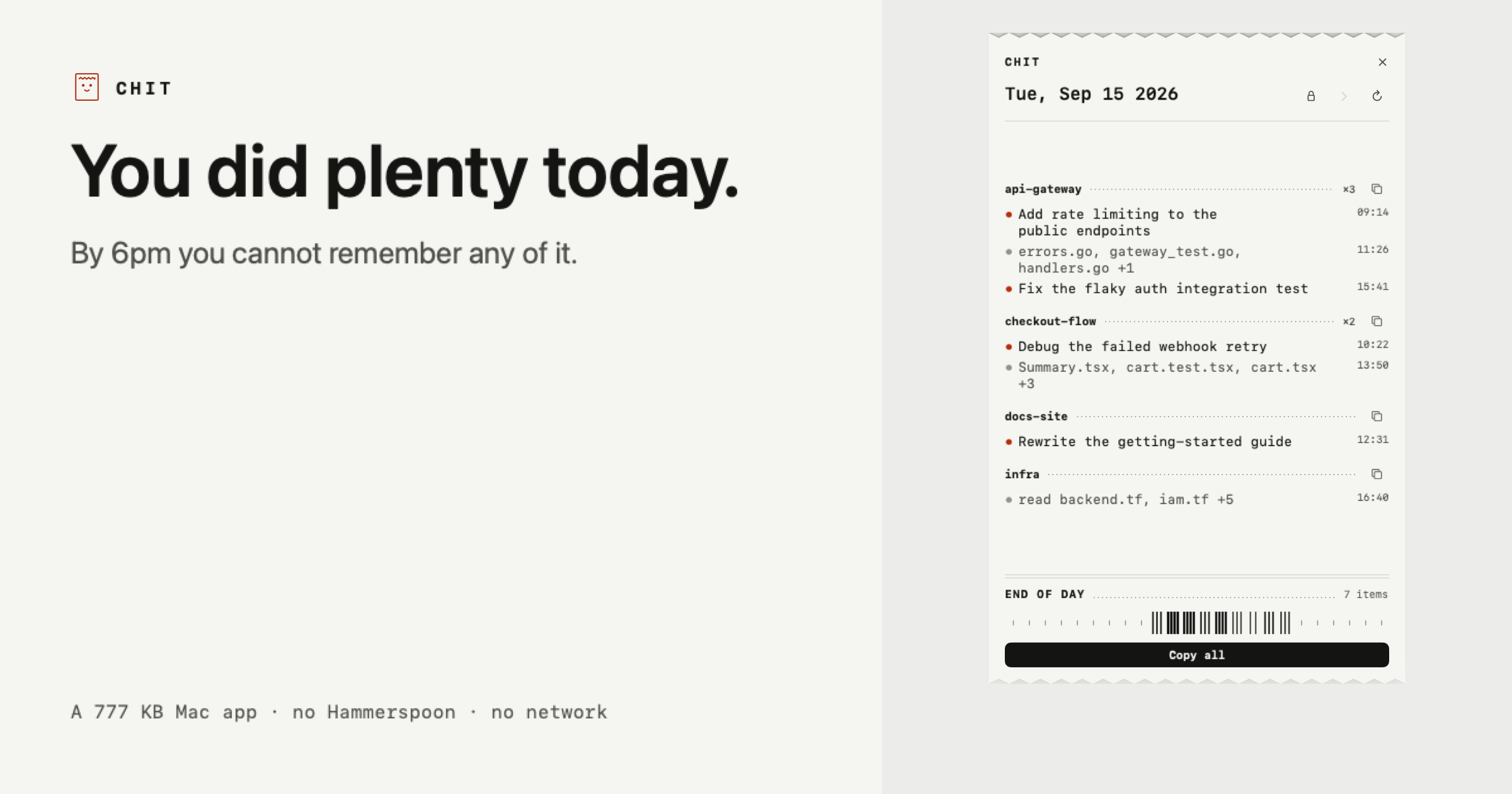
Chit is a small Mac application that reads the Claude Code transcripts already sitting on your own disk and prints your day back as a receipt — a compact, plain-text summary of what you actually did, grouped by project and ready to paste. It was made for developers and other Claude Code users who finish a working day with plenty of activity behind them but no reliable memory of it. The receipt is the app: Chit prints itself once a day, and how long that receipt is depends on how much you did. Nothing needs to be installed first — you double click the app and today is already on screen. You did plenty today. The problem is that by 6pm you cannot remember any of it. The day's work is spread across many sessions, several repositories, and a transcript history that reads like chat logs rather than like work. Chit exists to convert that raw history into something that reads as a day of engineering: which projects you touched, what was done in each, and which files changed. That matters most at the moments when you have to account for your time — a standup in the morning, a timesheet at the end of the week, or a review of a day you have already forgotten. Rather than asking you to reconstruct the day from memory, Chit reads what Claude Code already wrote to disk. The core of the receipt is its grouping. Every session is bucketed under its repository, busiest first, so the day reads as work rather than as a pile of chat logs. Agent worktrees fold back into their parent project instead of appearing as separate, unrecognisable entries — a detail that keeps parallel agent work from fragmenting your summary into strangers. Under each project the receipt lists the tasks that were worked on and the files that changed, with an explicit sample showing entries such as a rate-limiting task followed by a list of touched files. Because the ordering is by activity, the busiest project naturally appears first. Chit's output is built to be pasted, not read twice. One click copies the whole day; another copies a single project on its own. Both are already phrased the way a task sheet or a standup wants them, so there is no reformatting step between the receipt and the place you need it. For destinations that render Markdown, there is a Markdown version as well. The sample receipt shown on the site demonstrates the shape of it: a date header, followed by project names such as api-gateway, checkout-flow and docs-site, each with its bulleted tasks and touched files underneath. The receipt is not limited to today. You can step back through the week when you need to account for a day you have already forgotten, and a full scan of a 2.7 GB transcript folder takes about a second. That speed is what makes browsing backwards practical rather than a chore. Chit is also a CLI, which means the same material can be produced without the window at all: chit --today, --date=, --from= --to= and --markdown are the documented flags. The CLI output can be piped straight into whatever eats your timesheets, so a summary can flow into an existing tool instead of being copied by hand. Privacy is the part of the design Chit spends the most words on, and the approach is unusually simple. Chit opens the files Claude Code already writes to ~/.claude/projects on your own disk. Nothing leaves the machine, and there is no network code in the binary at all — the site counts it as zero network calls, ever. The lines in a receipt come from the titles Claude Code generates for sessions, or, where Claude Code has not named a session, from the names of the files you touched; Chit names the line after those files. Your prompts never appear. What you typed is used only to decide whether a session counted as work, and is never stored or shown. Two more protections follow from that. Lines contain file names, not paths — a line says audit.js, never a path that reveals your client directories, because a path would say who you are and who you work for. And whole projects can be hidden, keeping client, NDA or job-hunt work off the receipt entirely; hiding removes that project's lines, though the site is honest that it cannot hide a sentence you typed about that work inside a different project, and is not sold as if it could. Chit is read only: it never writes to ~/.claude, so nothing it does can affect a session. The app itself is 777 KB, requires zero things to install first, and takes a single double click. One practical caveat is stated plainly on the site: Chit is not notarised yet, so a browser download gets flagged once. The terminal one-liner installs with no warning at all, and the SHA-256 is published next to it. The benefit of all of this is a daily artefact you did not have to write. Instead of reconstructing yesterday from memory, you get the day back in a form that already matches how standups, task sheets and timesheets want to receive it, produced from data that was already on your disk, without an account and without anything leaving your machine. The scenarios Chit is described against are specific. The first is the standup: you open the receipt in the morning, copy the day, and paste it into a task sheet or standup thread already phrased for the occasion. The second is timesheets — the CLI's date flags let you produce a ranged summary and pipe it into whatever system eats your timesheets. The third is accounting for a day you have already forgotten, stepping back through the week until you find it. The fourth is keeping sensitive work quiet: hiding whole projects keeps client, NDA or job-hunt work off the receipt. And because a busy day produces a longer receipt than a quiet morning, the output scales with what you actually did. Chit is aimed at people who use Claude Code heavily enough that their own history has become unreadable: developers running multiple sessions and repositories, and anyone who has to report what they did. Pricing is split in two. The free tier is free forever, not a trial, and covers the half used every morning: today's receipt in full, copying the day or any project, plain text and Markdown, hiding projects, and the CLI. Chit Pro is $12 once, not a subscription, and adds every past day, week and month statements, a dashboard, and a key tied to your Mac that works offline forever. The app is distributed as a zip you drag to Applications, or via a curl one-liner, and it is a Mac app at 777 KB with no account required. Taken together, Chit is a deliberately small, local tool with a narrow job: read the Claude Code transcripts already on your disk, print the day back as a receipt grouped by project, and make it paste-ready. It asks for no account, makes no network calls, never shows your prompts, and keeps file names rather than paths. For developers who need to account for their time, that is the whole value: a printed receipt of your day, produced from your own machine.
Hemory is an always-on listening product that captures what you live through and turns it into a private, searchable memory — then wires that memory into your AI agents. The name comes from Hear + Memory, and the product is explicitly not meeting transcription: it listens on the phone or Apple Watch you already own and keeps every conversation as memory. Your day is automatically split into moments with speaker labels, and each moment settles into a private, searchable memory that you can connect to Claude, Codex, Cursor, or any agent over MCP. The goal stated on the site is that your AI finally has real context to revisit what you heard and build on it, with everything grounded in what actually happened — ready to answer questions or generate any document you need. Most people now work with AI agents that are powerful but cut off from the details of their actual day. The moments where commitments are made, scope is decided, or ideas are floated happen in conversation — on a walk, at lunch, in a review — and none of that becomes source material for the tools that are supposed to help you afterwards. Hemory addresses that gap by keeping the listening always on (or on exactly when you choose) and preserving what was said as searchable memory, rather than treating each session as an isolated recording you will never reopen. Instead, you get memory an agent can query, so the context behind a promise, a decision, or a plan survives past the moment it was spoken. Listening is controlled in two ways. Manual mode keeps Hemory on only when you need it, so the privacy boundary stays yours. Schedule mode lets you define windows such as weekdays 9:00–18:00, and Hemory is nudged right on time — the site describes this as what always-on feels like, and shows a running listening counter with the active schedule beside it. Quota is counted with VAD, or voice-activity detection: always-on listening sounds expensive, but VAD only counts the moments when someone is actually speaking, while silence, gaps, and background noise never touch your quota. That is why the company says you can leave Hemory listening all day — keeping your bill low is presented as Hemory's job. Once listening is running, Hemory organizes the day for you. It auto-splits your day into moments with speaker labels and shows them on a timeline with titles, times, durations, and the people involved — for example an "App 2.0 release review — scope, search latency and ship date" meeting from 10:30 to 12:00 with David and Mike, a lunch with Mike, a voice note on the walk back, and a "Product UI review · Memory palace" with Jenny and Mike. Those moments settle into a private, searchable memory. You then query it through your agent: the site shows the question "what did Daniel promise me in last Tuesday's sync?" answered by a hemory search_memory (MCP) call that returns "Daniel" · 3 sessions together with the specific commitment — Daniel committed to the final launch budget by Thursday, with his team owning the App Store screenshots. Connecting an agent takes two steps. First you start listening in Hemory; then you connect Hemory to your agent via MCP. The site lists support for Claude Code, Codex, Gemini, Cursor, VS Code, OpenClaw, Hermes, and other standard MCP clients, and shows the connection happening in seconds with terminal commands such as "codex mcp add hemory" and "claude mcp add hemory" followed by a connected confirmation and the available tool, search_memory. Once connected, you chat with your agent about the memories Hemory has heard, and the agent can revisit real, past context instead of relying only on what you paste in during a session. Privacy is positioned as a default, not a setting. Hemory states zero audio retention: your audio is never stored in the cloud, it is processed as a stream, and it is destroyed the moment processing ends. Raw audio is stored only on the listening device and is never synced across devices, so recordings stay where they were captured. A self-host option is listed as coming soon, for people who want to optionally run Hemory entirely on their own infrastructure. Combined with manual mode and scheduled listening windows, these choices are meant to keep the privacy boundary in the user's hands while still making the resulting memory available to the agents they already use. Overall, Hemory's approach is to make real life the source material. Two steps — start listening, connect your agent over MCP — sit in front of everything else, and the resulting memory is grounded in what actually happened. Rather than forcing you to write notes, record meetings, or reconstruct context later, Hemory hears it, splits it into labeled moments, stores it privately on the listening device, and exposes it to agents through a single search tool. From that foundation, answering questions or generating documents becomes one prompt away. With Hemory as source material, the site lists concrete outputs, each described as one prompt away. A monthly work report deck can be generated from the work heard over the past month and delivered as a web page with progress, key takeaways, and next month's plan, ready to present at a management meeting. A nightly journal can be produced at 22:00, writing down the interesting things from your day as a brief note — one entry every night. A smart ring PRD draft can be assembled from recent customer interviews plus internal brainstorm sessions, distilled into a complete PRD. In the agent example shown, a follow-up draft is written to follow-up.md and reported as 12 lines, ready to send, based on what was heard. Pricing starts with a Free Trial at $0 one-time with 10 hours of listening, no renewal. Starter is $10 per month with 20 hours per month, described as the budget pick for just the conversations that matter. Pro is $20 per month with 60 hours per month, aimed at professional use and enough for everyday work, and is marked most popular. Max is $50 per month with unlimited listening under a 24-hour-per-day cap and fair use, for all-day listening and building your memory palace. All plans count quota with VAD. Hemory is available for iOS through the App Store and for Android, with macOS, Windows, Linux, Web, and self-host listed as coming soon. Hemory's value proposition is straightforward: keep listening, and let every real conversation become memory your agents can search and generate from. By combining always-on or scheduled listening, automatic moment splitting with speaker labels, private-by-default audio handling, and MCP connections to the agents people already use, it aims to give AI the one thing it usually lacks — grounded context from your actual day.
Kaiku is an agent-native task tracker and wiki built for teams whose work is increasingly done by AI agents. In Kaiku, agents work in the tracker and the wiki the way the rest of the team does. You can hand an agent an issue, or call it in a comment, connect your own agents over MCP, and see every run on the issue it worked on. The product's core rule is simple: an agent proposes, a person approves. Tools written against the API most companies already run connect too, so the software you already use does not have to be replaced to bring agents into the way your team plans and records work. The problem Kaiku addresses is that agentic work has arrived inside ordinary team workflows, but the tools those teams use were not built for it. Agents are usually bolted on as plugins, and their connection to existing trackers and wikis runs through a bridge that lags a version behind the API it imitates. Kaiku puts the compatibility on the wire instead: the MCP servers your agents already use for the incumbent tracker and its wiki work against Kaiku as they are. The second problem is cost visibility. When automation files issues, answers questions and edits pages, the bill arrives after the fact. Kaiku records every agent run against the issue it worked on — tokens by kind, machine time, who asked — so you find out what the automation actually cost while you can still do something about it. Agents are the point of Kaiku, not a plugin. The product speaks MCP two ways. First, through the MCP servers your agents already have configured for the tracker and the wiki your company runs today; those work unchanged because the compatibility lives on the wire rather than in a bridge that lags a version behind. Second, Kaiku ships an MCP server of its own. Both are HTTP with a bearer token: a workspace, an address, and four lines of config. Your workspace answers on its own address and issues its own tokens from Settings, and a read-only token cannot reach the MCP endpoint at all. The built-in server exposes issues and their children, comments and the threads they hang in, wiki pages, attachments by path, project fields, and questions put to one person and waiting on an answer. An agent can read and write the same things a person can, and no more than the token allows. Calling an agent in Kaiku works like calling a colleague. You call it in a comment, by name, in the thread where the question already is. It reads the issue, answers in the same thread, and says what it read to get there. It never decides: a proposal is recorded as a question addressed to you, with no default answer, so the issue keeps who chose and what they chose — and silence chooses nothing. An agent is a role of your workspace, not an account, with no password, no token and no access of its own. It runs as the person who called it, with the permissions that person has at that moment, and it is clamped to the issue's project — a question about one project never ships the other nine to a model. Its tools are reads only, and the comment it answers with is written by Kaiku, not by the model. Every answer carries the issues and pages its tools actually returned, so the reasoning can be checked against its sources, and every call is a row: who called which role, on which issue, what came of it and what it cost. The wiki beside the tasks speaks the same protocol. Every project carries exactly one space, keyed like the project. You write Markdown, while the wire carries the storage format the incumbent corporate wiki uses, so tools built for it read Kaiku without being told. Pages go out as Word documents, and the words inside an attached diagram are searchable, so a drawing stops being a dead end. Issues, comments and wiki pages are also translated automatically, on demand, with a language picker that searches by what each language calls itself. Because the wiki is governed by the same access rules and the same MCP server as the tracker, agents can read and write it under exactly the same permissions a person has. Some teams keep clients rather than a backlog, and Kaiku covers that with a mini-CRM. Turn on the client book in a project and it reads as one: a row per client, the columns your business actually runs on, and the work for each client right under its row. Nothing leaves the tracker to get there — the board, search and your agents keep seeing the same issues. A client is an issue of its own type, so it comes with comments, files, history and watchers, and the same API and MCP as everything else. Projects write down the columns they need, of six kinds: a list with colours, a country, a number, a date, a person, a line of text. A value that does not fit its column is refused on the spot, never quietly dropped. The name, the owner and every custom column change right in the table, using the same write the card makes, so history, notifications and agents all see it. The whole book exports as one .xlsx with your columns in your order, where a number stays a number and a date stays a date. Beyond agents, the wiki and the client book, Kaiku ships the ordinary things a tracker owes you and a few it usually does not. There are Kanban and scrum boards, dragging between columns, and sprints that start and close; a board bigger than a page says so rather than quietly showing you a prefix. Custom fields are not only for clients: any project can define them, search by them, colour its board cards by a list's value, and mark a card with the field that matters. Several GitLab repositories can attach to a project, because a tracker project rarely lives in one, and a repository that did not answer says so instead of pretending there is nothing there. Numbers stay honest because stock and flow are kept apart — what is open now never quietly takes the date range that created-per-day takes — and archived issues are still counted, because a shelf is not a delete. Archiving clears a board without losing anything, by hand or on a rule the project sets, counted from when the task became done rather than when it was made. You can sign in without a password using passkeys or Google sign-in, or a password if you prefer, and you cannot remove your last way in. Notifications cover mentions, watchers and reactions on comments, with a digest that respects what you asked for; every timestamp keeps its exact value behind the friendly one. The data stays yours. One request gives you the whole project as a zip: structured JSON, readable Markdown and every attachment. It keeps working after a subscription lapses, on the principle that a service which locks your data behind a payment is a service nobody should pick. If your workspace does stop paying, it becomes read-only: nothing is deleted, everything is still readable, export keeps working, and that state is kept for 12 months with a warning well before anything is removed. Bringing existing work in is a first-class path too. A company admin imports a project from the cloud version of a popular task manager, and issues keep their keys while their comments, files, custom fields, parents and links come with them. A check runs first and names what will not move — change history, sprints, logged time — before anything is written. The unique approach running through all of this is that agents are treated as members of the team rather than as an external integration. They are roles in your workspace, called by name in the place the conversation already lives, constrained by the permissions of the person who called them, and answered with citations to what they read. Everything they do is a recorded run attached to an issue, with tokens by kind, machine time and who asked. Because the tracker and the wiki both answer on the wire formats the incumbent tools use, the MCP servers people already run keep working, and nothing has to be installed or forked to make that true. Concrete use cases come straight from the product. A repertory theatre runs a season as project work: a dozen productions share one board, each opening night has thirty pieces of work in front of it, and the calendar shows when each of them ran and what each is waiting on — drawing a bar only between days that were actually recorded, never from a start somebody guessed. A company admin migrates a project from the cloud version of a popular task manager and keeps issue keys, comments, files, custom fields, parents and links. A team that keeps clients turns on the client book and manages each client's work under its row without leaving the tracker. A developer calls an agent by name in a comment on an issue, gets an answer in the same thread with the sources it read, and approves or rejects the proposal it made. And finance can watch a week of automation costs on the issues where the runs happened. Kaiku is aimed at teams whose work is increasingly done by AI agents and who already run a tracker and a corporate wiki, as well as people who use agents such as Claude Code and Cursor and want a tracker they can point those tools at. Integrations centre on MCP over HTTP with a bearer token, the REST API of the tracker most companies already run, the equivalent wiki format, and GitLab repositories. Workspaces live on their own subdomain, yourcompany.kaiku.tech, so project keys and issue keys never collide across companies. Pricing starts with a 30-day trial: up to 2 people, 1 project, 1 GB of attachments, every feature, no card and no wallet to start. Personal is $19.99 per month for one seat, up to 100 projects, 20,000 issues and wiki pages and 10 GB of attachments. Team is $7 per person per month with AI included or your own key, $5.25 per person per month when paid for a year, plus $20 per month per extra 20,000 issues and pages and $10 per month per extra 100 GB of attachments, per workspace. A Team plan with your own AI key is $6 per person per month and runs agents, the assistant and translation on your company's own Anthropic or DeepSeek key. AI Pro on Team adds $12.99 per seat per month. Payment is in USDT or USDC today, with Visa and Mastercard card payments coming soon, and self-hosting is available by request. Kaiku's primary value is that it lets agents join the team without leaving the systems the team already uses: an agent-native tracker and wiki that speak the API and MCP the incumbent tools speak, record what every run cost on the issue it worked on, and never let a model decide on its own. Start with a month — two people, one project, everything switched on — and take your data with you if it does not fit.
Kapshot is a screen recorder for macOS that turns ordinary screen captures into polished, presentation-ready videos. It is built for people who need to share their screen — content creators making tutorials, developers walking through features, educators recording lessons, and product teams preparing launch demos — but who do not want to spend time in a video editor afterwards. Instead of recording the screen and then opening a separate editing app to add zooms, fix the cursor, and frame every interaction, Kapshot performs that polish automatically while you record. The result, in the product's own words, is a recording that "looks edited without a timeline," exported as a clean MP4 for fast loading and sharing. Recording a screen is easy; making the result look intentional is not. A raw capture usually arrives full of jittery cursor movement, missed clicks, and a flat full-screen frame that buries whatever detail mattered. The conventional fix is a second app: import the capture into a video editor, keyframe zooms by hand, try to mask cursor jitter, add a background, and render. That process is slow and repetitive, and it is the reason a customer quoted on the Kapshot site says "$19 lifetime is cheap for what editing zooms and cursor framing manually costs in hours." Kapshot's answer is to treat polish as something that happens during the recording itself, not after it — the zooms, the cursor and the framing are generated automatically as you record, so there is no timeline to work through before you can send the file. The first thing Kapshot changes is your pointer. It replaces your real cursor with a clean, smooth one that glides instead of jittering, driven by spring physics rather than raw mouse input. Size is adjustable from 16 to 200 pixels, so a cursor can be small and unobtrusive or large and readable in a compressed video. Click animations can be toggled on, and ripples can be added that show exactly where you clicked — useful when a viewer is watching an interaction and needs to see which control was pressed. The controls shown in the product interface include cursor size, ripple effects, and spring physics, all configurable. Auto-zoom handles emphasis. When you click something, Kapshot zooms in on that area so viewers do not miss it, then eases back out. Zoom can run from 1x to 4x. Instead of a hard cut every time you click, rapid clicks in the same spot are clustered into one smooth zoom rather than a series of jarring jumps, and the movement uses cinematic easing — the settings shown are a zoom level such as 2.5x, cinematic easing, and a duration of around 400ms. The result is a recording that directs attention the way a hand-edited screencast would, but without anyone placing keyframes. Styled backgrounds make the recording look like a product demo rather than a raw screen grab. The captured screen floats on a customizable canvas where you can choose a styled background preset or supply your own image. Padding, rounded corners and drop shadows are applied to the floating frame. Customizing these elements normally means rebuilding the composition inside a design or editing tool; here they are part of the recording setup, so the framing is already in place by the time you reach the export step. Kapshot ships with a built-in editor, so no extra apps are required. You can trim and cut footage, scrub the timeline, adjust the zoom segments that were placed automatically, and preview in real time — what you see in the editor is exactly what you get in the file. Export is a single action: the finished recording is written as an H.264 MP4 optimized for fast loading and sharing, with no render queues. The stated encoding details are CRF 18 for quality, the yuv420p pixel format, 60 fps smooth motion, and fast start so the file plays while it loads. Recording itself is captured at 60 FPS through ScreenCaptureKit, which keeps fast scrolls and animations fluid. The workflow is four steps. First, launch: a compact capture bar appears and you choose Display or Window, then toggle the camera. Second, record: a minimal floating dock controls the recording, and the dock itself is never captured, so it stays out of the way while you present. Third, edit: the editor opens with your recording already on a styled canvas and auto-zoom segments already placed. Fourth, export: click Export MP4 and the H.264 file is produced, ready to share. An optional camera overlay can be included during recording if you want a presenter view alongside the screen. The outcome Kapshot aims at is a video that looks like you meant it. Zooms land on the right places, the cursor is calm and readable, and the frame has a deliberate presentation treatment, all without a manual editing pass. Because everything runs locally on your Mac — recording, editing and exporting — nothing is uploaded and no data is sent to any server. Setup required is listed as none, and the product sits alongside tools like Lumiko and OBS with its own combination of automatic zoom, cursor smoothing, click ripples, styled backgrounds and a built-in editor. Kapshot is described as made for people who share their screen. Content creators use it for tutorial and demo videos that look professional. Developers use it for feature walkthroughs and bug reproductions, where zooming into a click and smoothing the cursor makes a reproduction easier to follow. Educators use it for screencasts in courses and lessons. Product teams use it for polished demos at launches and presentations. In all of these cases the same pattern applies: record the screen as normal, let the zooms, cursor and background treatment happen automatically, then trim and export a single MP4 file that can be shared directly. Kapshot is a native macOS app for macOS 14 or later and runs on both Apple silicon and Intel Macs; Windows and Linux are listed as planned. It records at 60 FPS via ScreenCaptureKit and supports MP4, WebM, MOV, MKV and AVI files. Pricing is a one-time purchase: the launch price is $19 against a regular price of $49, with $49 applying afterwards. A licence includes all pro features unlocked, lifetime updates, and a 14-day money-back guarantee — if the app does not fit how you work, you can email within 14 days of purchase for a refund. There is no subscription, and existing buyers download Kapshot from the site. Kapshot's proposition is narrow and clear: record your screen normally, and get back a polished video. Auto-zoom, cursor smoothing, styled backgrounds, a built-in editor and one-click export are combined in a single macOS app, so the hours that would otherwise go into keyframing zooms and fixing cursor movement are removed from the process. For anyone who shares their screen regularly — creators, developers, educators and product teams — that is a smaller workflow with a better-looking result.
Squints is a free Chrome extension that puts design tools on top of any live web page, built for design engineers. It bundles a set of utilities that let you look closely at a page that is actually running in the browser: measure spacing, drag out guides, overlay a column grid, pick colours in any format, see the font that actually rendered, and slow down or scrub any animation. Rather than working inside a static design file, Squints operates on the real, live page, so the things you examine are the things users see. The extension is free, requires no account, and does no tracking. You add it to Chrome and the tools are available over the pages you visit, without a separate design canvas or an export step in between. The product exists because design is moving into code. Decisions that used to be settled in a design file, such as spacing, type, colour and motion, now get made in the browser, where the tools for looking closely never followed. A designer or design engineer reviewing a built page can see the result, but measuring the gap between two elements, checking which font actually rendered, or slowing down an animation to inspect it is awkward without the right tooling. Squints closes that gap by bringing Figma's measuring tools and more to any live web page. The result is that the same kind of close inspection that happens in a design canvas can happen on the production page itself. Two of the core capabilities are inspection and measurement. With Squints you can inspect anything on the page and read its box, along with the gap to the next one. That means selecting an element and seeing its boundaries and the distance between it and a neighbouring element, rather than estimating by eye. Alongside inspection, Squints provides rulers and guides that you drag out just like in Figma, and they snap. Snapping matters because it turns a rough drag into an exact alignment reference; you pull a guide to the edge of an element and it locks onto the right position, giving you a reliable line to measure against. Together these tools make spacing decisions visible and precise on a live page. Squints also lays a column grid over the real page, and the grid is remembered per site. That means once you set up the column structure for a given site, Squints keeps it for that site, so repeat visits do not require setting the grid up again. Overlaying a grid on the live page lets you judge whether content lines up with the intended columns as it actually renders. On top of that, Squints lets you draw on the page, using arrows, boxes and notes, where it matters. This turns the extension into a lightweight annotation layer, so you can mark up a specific spot on a rendering with a pointer, an outline or a written note instead of describing its location in words. Colour and type are handled directly on the live page as well. Squints lets you pick any colour, showing it in every format, plus the token behind it. Picking a colour from a rendered page means you capture the value that is actually being displayed, and getting the token behind it connects that value back to the design system it came from. For type, Squints identifies any font, the one that really rendered, with metrics. This matters because what a page specifies and what a browser renders are not always the same thing; a fallback may be in use without being obvious. Squints reports the font that actually rendered and includes its metrics, so typography can be checked against what users truly see. Motion and capture round out the toolset. Squints slows motion down, running every animation at a tenth of its speed. Animations often move too quickly to judge by eye, so slowing them to a tenth of their speed makes it possible to watch a transition play out and see what it does. Squints can also scrub any animation, as the product description notes, alongside slowing it down. The extension can also capture the result: a screenshot or a recording, with or without the marks you have made. Capturing a screenshot with marks included produces an annotated visual you can share, while capturing without marks gives a clean view of the page. A recording captures motion over time. These outputs make it easy to document what you found and pass it along. Overall, Squints works by layering design tooling on top of live web pages rather than inside a separate design file. It is delivered as a Chrome extension, so it runs in the browser next to the page you are examining. The tools are applied to the real rendered output, which is the same output users encounter. It is free, needs no account, and does no tracking. That combination keeps the workflow lightweight: there is nothing to sign up for and nothing being collected, so the extension can be used as a quick inspection layer whenever a page needs a closer look. The tools echo Figma's measuring approach, but they are pointed at the live web. The benefit for users is that close inspection becomes possible wherever the work actually lives. Instead of estimating spacing, you read the box and the gap. Instead of guessing at a colour, you pick it in every format and see the token behind it. Instead of wondering which font rendered, you identify it with metrics. Instead of trying to catch a fast animation by eye, you slow it down to a tenth of its speed. Guides that snap give exact alignment references, an overlaid column grid is remembered per site, and annotations plus screenshots or recordings let you document findings. The result is a tighter loop between looking at a live page and making a decision about it. Use cases follow from those capabilities. A design engineer reviewing a built page can measure the spacing between elements and check it against the intended values with rulers and guides that snap. Someone auditing a site's typography can identify the font that actually rendered and inspect its metrics. A designer checking colour can pick any colour on the page, see it in every format, and find the token behind it. When a layout needs verification against a grid, a column grid can be overlaid on the real page and remembered for that site. Animations can be slowed to a tenth of their speed to inspect motion, and the whole result can be captured as a screenshot or a recording, with or without marks, to share. Squints is described as a free Chrome extension for design engineers. It is intended for people who work where design meets code and who need to examine live pages closely. The extension is free, requires no account, and does no tracking, so there is no pricing tier, signup, or data collection to consider. Because it installs in Chrome and operates over web pages, it fits into an existing browser workflow rather than adding a separate application. The Product Hunt listing categorises it under design tools, productivity and developer tools, which matches the mix of design inspection and engineering-facing utility that the extension provides. In short, Squints brings design tools to the live web. It puts inspection, rulers and snapping guides, a remembered column grid, drawing and annotation, colour picking with tokens, font identification with metrics, slowed-down motion, and screenshot or recording capture on top of any live page. For design engineers, that means the close looking that once happened only in a design file can now happen in the browser, free and without an account.
Wand is a voice-first tool designed for builders who think faster than they type. It allows users to speak naturally, shaping their thinking into work, authorizing a build, and reviewing the result in one quiet, generative environment. The product aims to turn spoken thoughts into software, eliminating the need to stop and translate ideas into written prompts. By doing so, Wand introduces what it calls the post-keyboard era, where the keyboard is no longer the bottleneck in software creation. The problem Wand addresses is the friction caused by traditional input methods. The keyboard is becoming the bottleneck for builders who have ideas flowing faster than they can type. Translating thoughts into prompts or code requires stopping the creative process, which slows down innovation. Wand solves this by letting users think out loud instead of typing, allowing them to ramble, react, and even change their mind mid-sentence while the system keeps up. This matters because it removes the translation step between idea and implementation, making software creation more fluid and immediate. A core capability of Wand is its ability to capture natural speech. Users can speak freely, without needing to structure their thoughts into precise prompts. The system is designed to keep up with rambling, reactions, and mid-sentence changes of mind. This means builders can think out loud, exploring ideas verbally without worrying about formulating the perfect written instruction. The feature is useful because it mirrors the way people naturally think—non-linearly and dynamically—rather than forcing them into a rigid typing format. Another key feature is the transformation of spoken thoughts into work. Wand shapes your thinking into work, turning your thoughts into software. This is done within a generative environment, implying that the system uses generative technology to create software artifacts from voice input. The process is described as shaping thinking into work, suggesting a refinement from raw ideas to structured output. This is useful because it allows builders to go from concept to tangible software without the intermediate step of manually writing code or detailed specifications. Wand also includes an authorization step and a review process. After speaking, users authorize a build, which suggests a checkpoint where the user approves the generated output before it is finalized. Then they review it in the same quiet environment. This feature gives users control over the generative process, ensuring that the software produced aligns with their intent. The quiet environment implies a focused, distraction-free workspace where the entire cycle—speak, shape, authorize, review—happens seamlessly. This is useful for maintaining quality and intentionality in the software creation process. Overall, Wand works by integrating voice input with generative software creation in a single environment. Its unique approach is voice-first: instead of typing prompts, users speak naturally. The system is designed to handle the messy, nonlinear nature of human thought, capturing ideas as they evolve. It then converts those ideas into software, allowing the user to authorize and review the result. This methodology aims to make software building as fast as thought itself, ushering in the post-keyboard era. The benefits for users include the ability to build software at the speed of thought. By removing the keyboard bottleneck, builders can iterate faster, capture fleeting ideas, and maintain creative flow. They can ramble and react without losing momentum, and change their mind mid-sentence knowing the system will adapt. The quiet, generative environment provides a focused space for creation, reducing distractions. Ultimately, Wand enables a more natural and efficient way to turn ideas into software. Use cases for Wand include any scenario where a builder wants to quickly prototype or develop software ideas. For example, a developer might speak a feature concept aloud, refine it mid-sentence, authorize the build, and review the generated code—all without typing. Product thinkers could brainstorm aloud, capturing and shaping ideas into functional software. It is particularly suited for builders who think faster than they type and want to maintain a high velocity of ideation and implementation, moving from spoken thought to authorized build and review in a single quiet session. The target users for Wand are builders—specifically those who create software and find the keyboard a bottleneck. This includes developers, engineers, and product creators who want to move from thought to software more directly. No specific integrations, tech stack, or pricing details are mentioned in the available content. The product is accessed via a web environment, as indicated by its website and the "Get started" call to action. In summary, Wand is a voice-first generative environment that lets builders speak naturally to shape their thinking into software. By eliminating the need to type prompts, it removes the keyboard bottleneck and enables software creation at the speed of thought. With features like natural speech capture, mid-sentence changes, build authorization, and review, Wand provides a fluid, quiet space for turning ideas into work. It represents a step into the post-keyboard era, where thinking out loud is the new way to build.