Category Focus/categories/data-analysis
Data Analysis AI Tools
Discover and compare the best data analysis AI tools and software. Browse 43+ curated tools with reviews and rankings.
Projects tracked
43
Sort mode
RECENT
Page
1
Discover and compare the best data analysis AI tools and software. Browse 43+ curated tools with reviews and rankings.
Projects tracked
43
Sort mode
RECENT
Page
1
sizeless is an AI-powered documentation platform for civil engineering that turns a smartphone video of an open trench into the deliverables utilities and contractors are legally required to produce: a 3D model, CAD/BIM plans, and the quantities they bill from. It is built for network operators and construction teams working on civil engineering, district heating, and house connections who need precise 3D twins of open trenches and house connections delivered directly for GIS and CAD. The platform pairs a guided iPhone Pro capture app called SiteScan with processing that generates high-resolution 3D reconstructions, industry-standard as-built plans, and GIS-ready digital twins, so that a single scan produces every output a team already works with. The problem sizeless addresses is the gap between how fast underground infrastructure is built and how slowly it is documented. Producing compliant as-built documentation has traditionally taken months and required a surveyor, which means trenches must either stay open or be revisited, crews wait for separate surveying appointments, and the final record is assembled from manual sketches that end up in disconnected data silos. Because documentation lags behind construction, billing and cash flow slow down, and construction errors can go unnoticed until they are buried under backfill. sizeless moves documentation into the moment of excavation: the existing project team films the open trench themselves, and the required outputs are generated from that single capture, in hours rather than months. The workflow begins with trench capture. Using a standardized capture process on an iPhone Pro directly at the excavation, the existing project team records the open trench. No special hardware is required and no extra appointments have to be scheduled, which means documentation starts while the trench is still open rather than in a later, separate surveying visit. Because capture is carried out by the people already on site, the process does not depend on specialists being available, and technicians can document house connections independently via smartphone. The same guided approach is used by the SiteScan iPhone app to capture properties, trenches, and technical rooms in minutes. From that captured video, algorithms developed at ETH Zurich generate a high-resolution 3D point cloud of the open trench that is centimeter-accurate. The point cloud is the objective basis for earthwork volumes, dimensions, and audit trails, giving teams a measurable 3D reconstruction of the scanned space instead of a hand-drawn approximation. The reconstruction is interactive, so users can rotate and zoom through it to inspect the captured geometry. This continuous 3D evidence also covers third-party utilities and house entries, and it works without GPS in basement areas, which keeps documentation complete in places where positioning signals are unavailable. The capture then converts into a 2D CAD as-built plan in DWG/DXF, the industry-standard format for revision documentation. In these plans, couplings and pipes are quickly identified and measurement extraction is simplified, so the as-built record can be handed to the processes and tools that already consume CAD drawings. Alongside the 2D plan, sizeless produces a 3D model and digital twin of the pipe route including house entries, with seamless integration into GIS systems for future-proof planning and maintenance. Together these outputs mean one capture yields a 3D point cloud, 2D CAD, and BIM/GIS deliverables ready to drop into existing tools. sizeless describes its approach as a four-step AI-powered workflow. Step one is trench capture at the excavation by the existing project team. Step two is the generation of a centimeter-accurate 3D point cloud using algorithms developed at ETH Zurich. Step three is the production of 2D CAD as-built plans in DWG/DXF for revision documentation. Step four is the 3D model and GIS output that represents the pipe route as a digital twin, including house entries. The differentiating idea is that no surveyor and no special hardware are needed: the documentation is filmed by the crew themselves and turned into compliant deliverables from a single scan, which is why sizeless can produce documentation in hours where the traditional route takes months. The benefits follow directly from that workflow. Trenches can be backfilled immediately after the video, with no waiting for separate surveying appointments, and complete documentation is available weeks earlier, which enables faster billing and cash flow. Documentation is described as quality-assured and audit-proof, because the continuous 3D evidence eliminates manual sketches and data silos and allows construction errors to be identified before backfilling. Process autonomy is another stated outcome: technicians document house connections independently with a smartphone, and existing internal or external teams can handle a higher project volume through more efficient workflows, without specialists. The headline references include 72-hour documentation, DWG/DXF outputs, instant backfill, iPhone Pro capture, GIS-ready data, and higher throughput. Concrete use cases include documenting open trenches for civil engineering and district heating projects, capturing house connections and house entries, documenting third-party utilities encountered in the trench, and scanning properties and technical rooms with the SiteScan iPhone app. Because the outputs include as-built plans and quantities, the documentation also feeds revision documentation and the measurement quantities that contractors bill from. For network operators, the resulting digital twin of the pipe route integrates into GIS systems to support future planning and maintenance of underground infrastructure. The primary audience is network operators, utilities, and contractors active in civil engineering, district heating, and house connections, along with the existing field teams and technicians who carry out the work on site. Documentation is available through the web platform at sizeless.co, where users can book a demo, request an in-person demo, or see the workflow in action, and through SiteScan, the sizeless iPhone app available on the App Store. sizeless was founded by engineers from ETH Zurich and UC Berkeley and is backed by Y Combinator, ETH Zurich, UC Berkeley, Cambridge, and MIT. In summary, sizeless replaces months of surveying and manual sketching with an AI-powered, video-first documentation workflow for underground infrastructure. A single smartphone scan of an open trench becomes a centimeter-accurate 3D point cloud, DWG/DXF as-built plans, and a GIS-ready digital twin of the pipe route, giving utilities and contractors audit-proof documentation, faster backfill, faster billing, and greater process autonomy without special hardware or specialist surveyors.
Drive is an iOS app that turns the phone already in your car into a vehicle telemetry rig. It captures g-force, braking, cornering, and the full trace of a drive, and it flags license plate reader (LPR) cameras as you approach them. The app is built for driving enthusiasts who want telemetry data on their next weekend drive without installing specialized hardware, wiring looms, or dongles. Drive requires no laptop and no sign up — you open the app and drive. It positions itself as a simple route to driving fun with real driving data attached. The product grew out of a gap its maker experienced firsthand. The maker spent a few years as a design lead on autonomous driving interfaces for Android Auto — the work of making a car drive itself well — and then spent weekends in a 27-year-old car doing precisely the opposite, badly, for fun. Drive is what came out of that gap. The problem it addresses is that dedicated vehicle telemetry setups are expensive and complicated: the category Drive is up against costs between $800 and $3,000 and involves installing a wiring loom. Meanwhile, the phone already sitting in the car has contained an accelerometer, a gyroscope, and GPS for a decade. Drive's premise is that this gap between costly telemetry hardware and the sensors already in your pocket is most of the product. The core of Drive is its telemetry capture. The app measures g-force, braking, and cornering, and records the full trace of a drive. Rather than relying on external sensors, it draws on the phone's existing hardware to log how the car behaves through acceleration, deceleration, and turns. This gives drivers a record of the dynamics of a session — the kind of data that enthusiast drivers and track-day participants traditionally gather with dedicated data loggers. For anyone who wants to see how a particular corner was taken or how hard a braking zone was, the trace provides that feedback. Because the trace is captured from the phone, there is no wiring loom, no dongle, and no laptop involved anywhere in the process. Drive also flags license plate reader cameras as you approach them. This feature began as a personal itch: the maker noticed Flock cameras appearing everywhere and wanted an alert when a drive came up on them. In the app, LPR camera locations surface as you come up on them, so drivers know about the cameras before passing rather than discovering them after the fact. For people who care about privacy, this turns an otherwise invisible part of the roadside into something the driver is consciously aware of. A user in the launch discussion asked where the camera locations come from — whether something like DeFlock's OpenStreetMap layer or a dataset of the app's own — but the available content does not state the underlying data source. A defining characteristic of Drive is everything it does not require. There is no wiring loom to install, no dongle to pair, no laptop needed to run it, and no sign up before you can start driving. Those omissions are deliberate rather than incidental: the product's value comes largely from removing the setup that usually stands between a driver and telemetry data. The phone already in the car, with its accelerometer, gyroscope, and GPS, supplies the measurements instead of dedicated hardware. This makes Drive dramatically simpler to begin using than hardware-based telemetry rigs, which cost far more and demand installation. The maker summarizes the whole proposition as no wiring loom, no dongle, no laptop, no sign up — just driving fun. Drive's overall approach is to replace dedicated telemetry hardware with software running on a device the driver already owns. The phone's onboard accelerometer and gyroscope sense motion and orientation, while GPS provides positional context for the drive. From those inputs, the app produces g-force, braking, and cornering readings and assembles them into a full trace of the session. Alongside the driving data, the app uses location to flag license plate reader cameras as they are approached. The result is a telemetry experience with essentially no hardware footprint: nothing to wire in, nothing to plug in, and nothing to carry beyond the phone. The maker frames this substitution — an expensive rig versus the sensors already in your pocket — as the essence of the product, and as the thing that made the app worth building. For drivers, the benefit is access to telemetry that would otherwise demand a costly, hardware-heavy setup. Instead of spending $800 to $3,000 and installing a wiring loom, a driver can use the phone already in the car. There is nothing to wire up, nothing to plug in, and no account required before driving, so the time between deciding to go for a drive and capturing data is effectively zero. The LPR alert adds a distinct privacy benefit: drivers concerned about license plate reader cameras get a heads-up as they approach those locations. Together these benefits point to a single outcome the maker names directly — driving fun, made measurable, without the usual friction. Drive is designed around the weekend drive. The maker's own scenario — spending weekends in a 27-year-old car, driving for fun — is the canonical use case: a driver takes the car out, launches the app, and captures the g-force, braking, and cornering trace of the run. Because there is no setup cost in time or hardware, the app also suits spontaneous drives rather than only planned track sessions. Privacy-conscious drivers can use the LPR flagging to stay aware of license plate reader cameras along familiar or unfamiliar routes, a use that arose from the maker noticing Flock cameras everywhere. Experienced users of dedicated data loggers are invited to try Drive and compare. Drive is an iOS app, available on the App Store, and it has been tagged with iOS, Cars, and Privacy on Product Hunt under a Maps and GPS category. It targets driving enthusiasts — people who take weekend drives, drivers of older cars, and users who have experience with real data loggers such as AiM, VBOX, or Racelogic. The maker has explicitly asked that audience what they would miss most when moving from dedicated data loggers to a phone, and said that is the list the product is being built from. Drive is free to start. No specific third-party integrations, additional hardware, or broader tech stack components are described in the available content. Drive's core value proposition is straightforward: it makes the phone you already carry into a vehicle telemetry rig, capturing g-force, braking, and cornering traces without a wiring loom, dongle, or laptop, while also flagging license plate reader cameras as you approach them. Free to start and requiring no sign up, it lowers the barrier to measuring your driving to essentially nothing. It is, in the maker's own words, just driving fun.
AI Observability by OpenObserve is an AI and LLM monitoring product that traces every agent, tool call, and model request, scores quality on live traffic, and attributes cost to the token. It runs in the same platform that handles the rest of a team's production stack, is OpenTelemetry-native, can be deployed anywhere, and is priced per GB instead of per span. Its stated purpose is to show what agents are really doing: every agent session is traced across models, tools, services, datastores, and user sessions so teams can see exactly where time, money, and quality went. It is aimed at the people who operate agentic applications in production — developers, platform and SRE teams — and it also extends to evaluation and AI SRE workflows. The problem it addresses is that agentic applications are expensive and opaque. As OpenObserve frames it: your agent cost $40 and took 34 seconds — but why? A single request fans out into hundreds of spans, and most LLM tools are a silo bolted onto a real observability stack, metered per span and locked to one cloud. That metering model punishes exactly the workloads agentic apps create. Meanwhile, debugging a bad answer often means grepping logs to reconstruct what an agent did. OpenObserve positions itself as one platform for AI and everything under it: LLM traces land next to logs, metrics, traces, and RUM, so when an agent is slow you can see the pod, database, or vector store behind it — no second tool, no swivel-chair. Tracing and mapping work by treating every agent request as a distributed trace. OpenObserve maps each agent to the models, tools, services, and datastores it calls, with request counts and error health on every edge, so a runaway loop or failing tool is obvious at a glance. The Agent Graph renders the full call tree across sub-agents, tools, and models; border colors flag healthy, degraded, and critical paths by error rate; and filters by environment, agent, and version let teams compare releases. Session debugging opens any session and replays the whole conversation — every turn, every tool call, the model behind it, and where cost and latency actually went. Session ribbons break down cost, duration, and tokens per turn; tool, cost, and latency hotspots surface the expensive, slow steps instantly; and one hop takes you from a turn to its full distributed trace. Evaluations run continuously on production traffic. Online eval jobs score live spans, traces, or full sessions the moment they arrive, using LLM-as-judge with your own provider or a remote HTTP scorer. Built-in scorers cover relevance, hallucination, toxicity, bias, and more. You define a score config with a healthy threshold, choose a sampling rate — on a sample or on everything — and score at span, trace, or session scope. Score configs are versioned, and results roll up into a live Quality dashboard that flags what needs attention, replacing the one-off notebook approach to measuring model quality. The evaluation loop closes by turning production traces into test sets. Real traces can be routed into review queues where humans score them alongside the automatic evaluators, with reviewer scores layered over system scores. A single click distills a reviewed trace into a dataset that future versions can be tested against, and Discovery surfaces the failures worth reviewing in the first place. Agent Behavior catches loops and groups failures by kind. Together these steps connect what happens in production to the eval data used to validate the next release. Architecturally, AI and LLM traffic is a first-class layer in one unified stack: it is just another source flowing through the same correlation engine as the frontend, APIs, databases, and infrastructure. Traces, metrics, logs, LLM observability, evals, and AI SRE live in one platform and are queried together with SQL and PromQL. Instrumentation is standard: OpenObserve ingests OpenTelemetry gen_ai spans and OpenInference conventions, so instrumentation you already have keeps working and can be routed to OpenObserve, another backend, or both. The engine is a Rust engine on columnar Parquet storage and bills per GB. Deployments can be managed cloud, self-hosted single binary, bring-your-own-cloud, or bring-your-own-bucket, with federated search across regions and clouds while keeping egress controlled. The outcomes stated in the content are predictability and correlation. Because pricing is per GB ingested and queried rather than per LLM span, per unit, or per seat, agentic applications that fan out into hundreds of spans per request stay predictable instead of spiking the bill, and users are unlimited. Because LLM traces sit beside the rest of the stack, a slow agent can be traced to the pod, database, or vector store behind it without switching tools. Because evaluations run on live traffic against a healthy threshold, quality is watched continuously on a dashboard instead of measured once. Sampling eval jobs and redacting sensitive fields with VRL pipelines before storage help control cost and data exposure. Concrete scenarios include detecting a runaway agent loop: the Agent Graph shows a failing tool or loop at a glance. Replaying a bad answer: a session view shows every turn, every tool call, the model behind it, and where cost and latency went. Comparing releases: filters by environment, agent, and version expose regressions. Measuring quality in production: online evals score live traffic with LLM-as-judge or a remote scorer. Following a failure end to end: from the LLM call through the backend and database, alongside the logs, traces, and metrics from the rest of the production stack. And building eval datasets: routing real traces to annotation queues and distilling reviewed traces into datasets for testing future versions. Target users are teams running agents and LLMs in production — developers, platform and SRE teams, and organizations that need AI observability alongside their existing stack. Integrations are broad and OpenTelemetry-based: OpenAI (Python and JS/TS), OpenAI Assistants, Anthropic (Python and JS/TS), LangChain, Google Gemini, Amazon Bedrock, Mistral, Ollama, DeepSeek, Cohere, Groq, Hugging Face, vLLM, Together AI, Fireworks AI, and xAI Grok, with the FAQ citing coverage of LangChain, CrewAI, LlamaIndex, OpenAI, Anthropic, LiteLLM, and 80+ more frameworks, providers, and gateways. Deployment spans managed cloud in four regions (US East, US West, Europe, India), self-hosted as a single binary, bring-your-own-cloud, and bring-your-own-bucket. Management as code is supported via a Terraform / OpenTofu provider, with enterprise controls including RBAC and SSO. Plans listed include self-hosted Enterprise free up to 50GB, a 14-day cloud free trial, and Enterprise Premium with enterprise-grade support, SSO, and SLAs for large-scale, multi-region deployments. In summary, AI Observability by OpenObserve answers the question of how an agent run accumulated its cost, latency, and quality. It traces every agent, tool call, and model request with OpenTelemetry, evaluates live traffic, and correlates cost per token with the rest of production — one platform, deployable on your terms, priced per GB.
Nugget is a LinkedIn warm outreach tool built for Founders and Solopreneurs who hate cold outreach. It mines the LinkedIn data export you already own into a set of actionable reports that show you exactly who in your network to talk to, what to say to them, and where your next opportunity is hiding. Instead of scraping profiles or buying lead lists, Nugget works from your own LinkedIn archive and turns it into a clear picture of who is warm and what to do next. The problem Nugget addresses is one the site states plainly: your LinkedIn network is full of connections who could refer you, hire you, or open a door, but LinkedIn does not show you who they are, how warm they are, or what to say. The usual outcomes are throwing spaghetti hoping something sticks, or doing nothing and wondering why the pipeline is dry. Cold outreach, meanwhile, feels too salesy to even try. Either way, as the product puts it, you are leaving money behind — and the data needed to avoid that is already sitting in your own export, unused. Nugget ships with three free reports that require no payment and no credit card. The Open Door looks at the real people just outside your network: every pending invite in your account, who is already waiting on a yes from you, and who you reached out to but never got a reply from. The Line-Up takes every connection in your network and sorts it by role — Founders, C-Suite, VPs and more — so you can actually find the person you are looking for instead of scrolling through hundreds of names. The Field Report surveys the land: who is actually in your network, how many of those connections match your ICP, and your top ten untapped connections. Together, these three reports answer the basic question of who is in your network and how much of it is relevant to who you are trying to reach. Five additional reports are unlocked with purchased credits, and the site describes each as existing to fix one specific thing that is costing you opportunities. The Warm List produces a single ranked list of who is actually worth your time right now, scored by real fit and relationship gap rather than by who messaged you last. The Hidden Nuggets Report surfaces the people who are already in your corner but whom you are not leveraging, ranked by likely value and best ask type — the advocates who are ready to refer you or vouch for you. The Inbound Report asks whether your profile is ready to convert: if a perfect prospect landed on your profile right now, would they stay or bounce? The Outbound Report looks in the other direction and shows what your LinkedIn activity broadcasts to potential clients when you are not paying attention. The seventh report, The Gold Nugget, is the one the site calls the treasure map rather than just another report: a full Business Development Action Plan containing your complete pipeline, prioritized targets, the warm relationships already in your corner, missed conversations, and outreach sequences ready to send. Where the other reports tell you who is worth your time and why, the Gold Nugget tells you what to actually do about it, bringing the Warm List, Hidden Nuggets, Inbound and Outbound findings together with the action plan. Running The Gold Nugget also produces Nugget's signature metric, the BizDev Readiness Score. It is a score out of 100 that shows exactly where you stand and what to do to raise it, and it is built from five strengths: Network (who is in your network and how ICP-aligned they are), Profile (how ready your profile is to convert a visitor into a client), Content (what your content says when you are not in the room), Relationship (the warmth and depth of your active relationships), and Advocate (how many advocates are ready to go to bat for you). Because the score is broken into these five areas, it points at the specific dimension to work on rather than giving one vague number. There is no scraping and no LinkedIn login involved. Nugget works from the data export LinkedIn already lets you download, in three steps. First, on LinkedIn, go to Me → Settings & Privacy → Data Privacy → Request a copy of your data, select Complete rather than Basic, and click Request archive. Second, two emails arrive: a Basic export within minutes and a Complete export within 24 hours that includes your messages and activity. You can drop the Basic file in right away and start with The Line-Up and The Field Report while you wait; dropping the Complete file in unlocks The Warm List, Hidden Nuggets, Inbound and Outbound. Third, drag and drop each zip file into Nugget — there is no need to unzip, because Nugget opens them automatically and merges everything in as it arrives. You can also upload individual files if you prefer. The stated benefit is that you stop guessing. Instead of choosing who to contact based on who messaged you last, you get a ranked, criteria-based answer to who is warm and why, plus a view of the relationships and advocates you already have but are not using. The Inbound and Outbound reports turn your profile and your activity into feedback you can act on, and the Gold Nugget converts all of it into prioritized targets and outreach sequences ready to send. In the product's own framing, every insight, every name and every next step is unique to you: this is your data, your people, and your pipeline. Concretely, Nugget is used when a founder has hundreds of LinkedIn connections and no idea which of them are Founders, decision-makers or just noise — The Line-Up and The Field Report answer that. It is used to clean up loose ends: pending invites and outreach that never got a reply are gathered in The Open Door so you can decide what to do with them. It is used when you are choosing who to reach out to first and want a ranked list rather than a guess based on who messaged you last. It is used before a push to check whether your profile would convert an inbound visitor and what your recent LinkedIn activity signals to prospects. Finally, it is used to turn all of that into a full business development action plan with warm paths, missed conversations and outreach sequences. Nugget starts free and moves to credit-based paid plans. The free tier costs $0 with no credit card required and includes The Open Door, The Line-Up and The Field Report. Explorer is $79 for one report credit — one full run of the four-report bundle covering Warm List, Hidden Nuggets, Inbound and Outbound, with the Gold Nugget not included. Connector is $207 for three report credits at $69 each, adding the Gold Nugget on every run. Closer is $295 for five report credits at $59 each, giving five full runs of the five-report bundle with the Gold Nugget included on every run, which the site frames as plenty of room to rerun as your network changes. The site notes that founder pricing is available to lock in before October 9. Credits expire 18 months from purchase, there is no subscription and no auto-renewal, and each report generates once per run — you are advised to save yours as a PDF, since nothing is stored after you close the tab. The product itself is aimed at Founders, Solopreneurs and Owners. Nugget was created by founder Anna Ludwinowski, who describes 33 years of business experience as a Business Strategist and says she has lived every bizdev challenge personally: the cold leads, the missed opportunities, and the warm network sitting right there, completely untouched. She describes seeing smart, capable Founders leave money behind not because they don't know how to sell, but because they don't know how to use the data they already have. Nugget is positioned as an unfair advantage on LinkedIn: no fluff, no jargon, just a clear picture of what is in your network and exactly what to do with it. The takeaway is simple and matches the tagline: your next client is already in your LinkedIn network, and Nugget's job is to show you where. By mining your own LinkedIn export into seven reports, a readiness score and a full business development action plan, it replaces cold outreach and guesswork with a ranked, personalized answer to who to contact, what to say, and where the opportunity is hiding — starting free and scaling with credits when you are ready to unlock the Gold.
AlphaGenome Atlas is a database introduced by Google DeepMind that predicts the effects of every possible single nucleotide variant in the human genome. It was created by using the AlphaGenome AI model to pre-calculate the regulatory impact of all nine billion single-letter genetic changes, producing a massive, one-petabyte dataset. The Atlas is intended for researchers, clinical researchers, and biologists, who can explore it through an intuitive website portal that requires zero coding skills, with API and Antigravity access available for deeper research. Its stated purpose is to provide grounded genomic insights that will accelerate the pace of biological discovery. The human genome is made of about three billion base pairs of DNA, but much of it remains a mystery. Scientists understand the roughly two percent of the genome that codes for proteins relatively well, yet they have only limited knowledge of the remaining ninety-eight percent. Google DeepMind's AlphaGenome model had already shown how single changes in these non-coding DNA regions can disrupt molecular processes such as protein production, but the bigger picture across the genome remained unclear. At the same time, identifying rare, non-coding variants linked to complex traits is difficult because of statistical noise in the data. AlphaGenome Atlas was created to address this gap by turning an enormous space of possible mutations into a searchable, precomputed resource that researchers can rapidly query instead of evaluating variants one at a time. A central feature of the Atlas is the AlphaGenome Variant Impact (AVI) score. This single, easy-to-use score combines predictions for both coding and non-coding regions of the genome, giving researchers one measure to work with instead of a large collection of separate outputs. Because the score condenses coding and non-coding predictions into a single number, it allows researchers to quickly prioritize the most promising avenues for research without sifting through thousands of data points. The AVI score is described as the mechanism that helps scientists rapidly navigate the vast information held in the Atlas, making it possible to rank variants by predicted impact and focus attention where it is most likely to matter. In practice, this scoring approach is what turns a one-petabyte dataset into something a research team can act on. The Atlas covers every possible single nucleotide variant in the human genome. Google DeepMind used the AlphaGenome AI model to pre-calculate the regulatory impact of all nine billion single-letter genetic changes, resulting in a one-petabyte dataset. Crucially, these predictions span both coding and non-coding regions, rather than focusing only on the small fraction of the genome that codes for proteins. This matters because the non-coding portion of the genome is where much of the remaining biological mystery lies, and where single-letter changes can disrupt molecular processes like protein production. By precomputing predictions across the full set of possible variants, the Atlas removes the need for researchers to run predictions on demand for each variant they want to investigate, and instead gives them a comprehensive catalogue of how genetic mutations affect molecular biology. Access to the Atlas is designed to be broad. It is available through an intuitive website portal that requires zero coding skills, which the announcement frames as democratizing access for clinical researchers and biologists worldwide. For researchers who need to work at greater depth, the Atlas also offers API access, along with access through Antigravity. AlphaGenome Atlas is free to explore through the visual web interface. This combination of a no-code portal and programmatic access means the same underlying predictions can serve a biologist inspecting a single variant in a browser and a research group building variant-prioritization workflows into its own pipelines. The Atlas works by precomputation rather than on-demand prediction. Rather than running the AlphaGenome model each time a researcher wants to understand a variant, Google DeepMind used the model to pre-calculate the regulatory impact of every possible single-letter genetic change in the human genome — all nine billion of them — and stored the results as a one-petabyte dataset. The Atlas then helps scientists rapidly query this vast information, and it introduces the AVI score as a way to summarize the underlying predictions into a single usable ranking. This approach shifts the heavy computational work to a one-time, genome-wide precomputation and turns the result into something that can be explored interactively or accessed programmatically, which is what makes rapid navigation of the full variant space feasible. The stated benefit of AlphaGenome Atlas is that it provides grounded genomic insights that will accelerate the pace of biological discovery. By combining coding and non-coding predictions into a single AVI score, it lets researchers prioritize the most promising avenues for research without sifting through thousands of data points, saving effort that would otherwise be spent on manual triage. The no-code web portal broadens who can use these predictions, democratizing access for clinical researchers and biologists worldwide rather than limiting it to those who can write code or run models themselves. The announcement also describes the Atlas as acting as a powerful augmentation partner for the scientific community, accelerating research — a claim illustrated by the rare disease and complex trait examples it cites. Overall, the Atlas is positioned as a resource that makes a previously unclear genome-wide picture accessible and actionable. AlphaGenome Atlas is already being applied in real research settings. At the Broad Institute, Laura Covill and her team used the AVI score to prioritize variants for unsolved rare disease research; the tool highlighted a critical variant in the DNM1 gene, predicting that it created an incorrect splice site, which provided crucial supporting evidence that helped successfully solve the case. In a second example, Dr. Gareth Hawkes applied AlphaGenome Atlas to data from more than 54,000 UK Biobank participants to study complex traits. By grouping variants based on predicted molecular effects, he uncovered 22% more non-coding genetic associations, and by focusing on the top 1% of impactful variants he identified 19 genetic regions linked to body mass index (BMI), directing the next stage of targeted research. These examples show the Atlas being used both to prioritize individual candidate variants in rare disease and to group and rank variants across large population cohorts. AlphaGenome Atlas is aimed at the scientific community — researchers, clinical researchers, and biologists — including teams working on rare genomic variation and on complex traits. It is described as available today through an intuitive website portal that requires zero coding skills, with API and Antigravity access for deeper research, and it is free to explore. The Atlas is presented as part of Google DeepMind's ongoing commitment to accelerate genomic discovery and science, for everyone, and it builds on the earlier AlphaGenome model. For those who want more detail, the announcement points readers to the Google DeepMind blog. AlphaGenome Atlas is Google DeepMind's high-resolution, precomputed map of how single-letter changes in human DNA affect molecular biology. By calculating predictions for all nine billion possible single nucleotide variants and condensing them into the AlphaGenome Variant Impact score, it gives researchers a practical way to explore both coding and non-coding regions of the genome and prioritize the variants most worth pursuing. Free, accessible through a no-code portal, and supported by API and Antigravity access, it aims to serve as an augmentation partner for the scientific community and to accelerate the pace of biological discovery.

Wingbits AI is a platform that enables users to create AI agents for real-time monitoring of airspace activity and receive alerts when specific events occur. It is powered by an independent global network of over 5,600 antennas across 120 countries, processing terabytes of ADS-B data daily to provide insights into aircraft movements, including military, private, and government jets. Key features include the ability to ask questions in plain English about current flights, such as "where is Air Force One right now?" or "Which private jets visited Davos last weekend?". Users can create monitoring agents that send alerts to platforms like Slack, email, Telegram, or Teams when criteria are met. The platform also offers scheduled reports and analysis on topics like competitor routes and can compare GPS jamming events across different regions. The system is built on a proprietary data infrastructure that ingests and cleans approximately 3TB of raw ADS-B data daily with under 1-second latency. It deduplicates and processes transponder messages before agents query the clean data. The platform identifies common query patterns and pre-aggregates relevant data to enable efficient querying over longer time windows. Benefits include extracting geopolitical or operational insights from aviation data without requiring a data science team. Use cases include tracking military aircraft, monitoring private jet movements for competitive analysis or news reporting, detecting GPS jamming spikes, and receiving alerts about specific aircraft like those of traveling friends or family members. The platform helps users get fewer, higher-confidence alerts by using alert history to determine if something has meaningfully changed. The product is designed for reporters, prediction markets, competitive analysts, route planners, and aviation enthusiasts. It integrates with communication tools like Slack, Teams, Telegram, and email for alert delivery. The underlying technology includes a global antenna network for data collection and real-time stream processing to handle high-frequency event streams with low latency.
ChatGPT for Excel builds full spreadsheets from plain language and analyzes data across tabs and formulas. It updates workbooks in real time with explanations for each change.
Parsewise is a decision platform that assesses complex risk at scale across underwriting, claims, and portfolio diligence workflows. It automates extraction, validation, and standardization to turn data packages into insights.

Anterpise provides AI companies with verified human skill proofs and behavioral data to train smarter AI agents. The platform offers ethically sourced datasets capturing real human decision-making patterns across diverse skill categories.
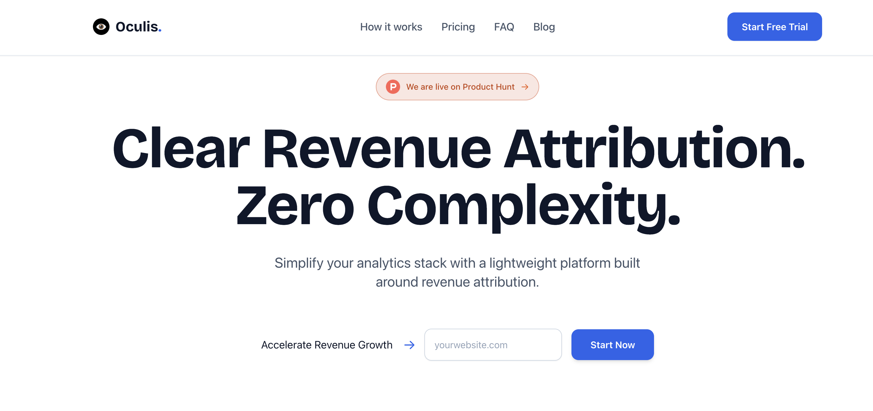
Oculis Analytics helps you track every visitor back to the dollars they generate with revenue attribution across marketing channels. Setup takes under 2 minutes with a lightweight platform built around revenue-focused analytics.