Category Focus/categories/productivity
Productivity AI Tools
Discover and compare the best productivity AI tools and software. Browse 859+ curated tools with reviews and rankings.
Projects tracked
859
Sort mode
RECENT
Page
10
Discover and compare the best productivity AI tools and software. Browse 859+ curated tools with reviews and rankings.
Projects tracked
859
Sort mode
RECENT
Page
10
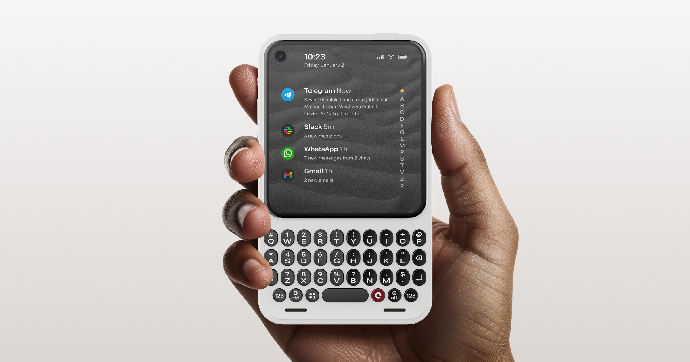
Clicks Communicator is a new kind of mobile communicator — a compact Android 17 phone built around a physical keyboard and a home screen dedicated to conversations. It is designed for taking action and communicating in a noisy world, offering deeper context, versatile input and greater control in a compact design. The device can serve as a primary phone or as a companion to a flagship iPhone, Galaxy or Pixel, and it is positioned as a pocketable messenger and the ultimate communication companion for people who want to get things done rather than scroll. The problem Clicks Communicator addresses is stated plainly: modern phones are built for doomscrolling rather than doing. Its 4.03-inch touch display is deliberately sized and described as designed for doing, not doomscrolling, and the overall proposition is a phone purpose-built for communicating in a noisy world. Instead of a large glass slab optimized for endless feeds, Communicator pairs a touchscreen with a tactile keyboard, a message hub and a customizable notification light, so messages, typing and quick replies stay close at hand. For anyone whose attention feels fragmented by notifications and feeds, the device aims to keep communication central and distraction at the margins. Input is the core of the product, and Clicks Communicator offers several distinct ways to type and capture thoughts. The physical keyboard is described as a premium typing experience with ergonomically designed keys that offer perfectly satisfying tactile feedback, so longer typing tasks can be tackled confidently. A touch-sensitive keypad lets you scroll through your inbox, messages or web pages without ever leaving the keyboard, meaning navigation and text entry happen in the same place under your thumb. Voice input is available at the push of a button: holding the side key turns voice into text, starts a voice recording, or transcribes a meeting. A fingerprint sensor lets you unlock by resting your thumb on the spacebar and jump right into the Message hub, the Clicks Key launches custom shortcuts, and brushed aluminum side keys are accompanied by a physical kill switch. Beyond typing, Communicator is built around keeping you aware of what matters and ignoring what does not. The Message hub launcher brings messages from your favorite apps together on the home screen, and keyboard shortcuts let you quickly triage and take action on them. A customizable Signal LED provides a notification signal that can be set to alert you when specific people or apps are trying to get your attention — the site shows examples such as Mom, Telegram, the Boss and WhatsApp — so you can tell at a glance whether an incoming notification deserves your time. Together, the message hub and the Signal LED turn the home screen into a control center for conversations rather than a launchpad for apps. The hardware design is intended to make all of this comfortable and practical to use. You can move seamlessly between the touch-sensitive keyboard and the touchscreen, and the fastback design is described as striking the perfect balance. The device includes an all-in-one camera and flash and a 3.5mm headphone jack so you can work wired-in. Clicks Communicator also supports swappable back covers so owners can match their mood or suit their style, with colors including Smoke, Dune, Clover and Onyx, and every device ships with a default Charging Cover matched to the color of the phone — for example Smoke pairs with Dune, Clover pairs with Clover, and Onyx pairs with Onyx. Keyboard layouts are made to speak your language, with English (QWERTY), French (AZERTY), German (QWERTZ), Korean and Arabic options selected when you configure your Communicator order closer to shipping. Communicator runs Android 17, which is what makes its unusual form factor practical: the site states plainly that because it runs Android, you can get all the apps. The device is a fully standalone smartphone with all the apps, 5G connectivity and Wi-Fi, sold unlocked with support for a broad range of 5G, 4G LTE, 3G and 2G bands via nano SIM and eSIM. It supports dual SIM, with a physical nano SIM slot found beneath the back cover and an eSIM, both of which can be active at the same time. Voice over internet calling services such as WhatsApp, Telegram and Facebook carry over from a primary phone, while traditional cellular calls require a second SIM or phone number. The approach, then, is not to abandon the smartphone ecosystem but to reshape the front door to it: the same apps and networks, but a different set of interface priorities built around typing, messages and deliberate attention. The benefits follow from that design. Typing tasks become more confident thanks to tactile, ergonomically designed keys. Quick replies stay within reach because you never have to leave the keyboard to scroll through an inbox or a web page. Notifications become more useful because the Signal LED can be customized per person or per app and surfaces the signals that deserve a response. Unlocking is simple because resting your thumb on the spacebar drops you straight into the Message hub. Because the phone runs Android 17 with the app ecosystem intact, owners keep the apps and services they already depend on, backed by connectivity across 5G, 4G LTE, 3G and 2G. Clicks also commits to a minimum of four years of Android version updates and five years of security updates, with support up to at least Android 20, and offers Clicks Care, an expanded warranty covering accidental damage plus a quicker replacement process so you are never left without a Communicator for long. Concrete scenarios where Communicator fits include using it as a primary phone: the company confirms it is a fully standalone smartphone running Android 17 with all the apps, 5G connectivity and Wi-Fi, and expects many people to make it their main device. A second scenario is the companion phone — it is described as the ultimate complement to an iPhone, Galaxy or Pixel, letting owners carry it alongside a flagship, with internet-based calling carrying over from the primary phone. Other described workflows include scrolling through an inbox from the touch-sensitive keypad without leaving the keyboard, holding the side key to transcribe a meeting or record a voice note, triaging messages from multiple apps in the Message hub using keyboard shortcuts, and launching custom shortcuts with the Clicks Key. It is pitched as a pocketable messenger perfectly sized for people on the go. Pricing and availability are detailed on the site. Clicks Communicator is available for pre-order at $499 USD, reduced from $649 USD, with the offer ending 30 September. Reservations must be configured and completed by September 30, order changes and accessory additions are accepted until October 31, shipping address changes until November 30, and orders are on track to begin shipping in December, subject to certification approvals, configuration availability and regional distribution. Shipping covers North America, much of Europe, Asia, parts of Africa, the Middle East, Oceania and Paraguay, and for full reservations shipping, duties and taxes are already covered. The hardware includes a 4,350 mAh lithium-ion battery, a 4.03-inch AMOLED display at 1080 x 1200, Bluetooth, NFC and Wi-Fi (802.11 a/b/g/n/ac/ax), a 50MP rear camera with autofocus and optical image stabilization, a 24MP front camera, Qi2 wireless charging that is MagSafe-compatible plus USB-C, 12GB of RAM, 256GB of onboard storage expandable via MicroSD card up to 2TB, Android Strongbox-ready secure storage, and a MediaTek Dimensity 8300 (MT8883) 4-nanometer 5G SoC. It measures 130.5mm × 78.63mm × 12mm and weighs 170g. A one-year limited manufacturer warranty applies from delivery, and dbrand's MNML case and Prism screen protector are offered as accessories. Clicks Communicator is a deliberately different phone. It keeps Android 17, 5G and the full app ecosystem, but re-centers the experience on a physical keyboard, a message hub and a customizable Signal LED so that communicating — and acting on what arrives — is the point of picking up the device. For people who want a primary phone or a companion device built for doing rather than doomscrolling, it offers a compact, tactile and focused alternative.
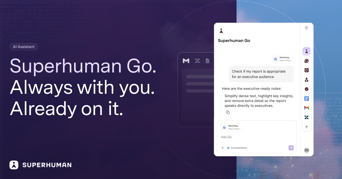
Superhuman Go is an AI assistant and agent platform that works everywhere you work and can offer help proactively across more than 1 million apps and websites. Instead of waiting for a prompt, Go automatically looks for opportunities to help you say something better or do something faster. It annotates in real time everywhere you write, pointing out where you could be clearer or more convincing, or when you are just wrong. It is built for people who communicate for a living — professionals working inside email, Slack, docs, and the browser — and for teams and schools that need trusted security and controls around AI. The problem Go sets out to solve is the friction of general-purpose AI chatbots. ChatGPT, Claude, Cowork, and Gemini are powerful general-purpose chatbots: you open a separate window, describe what you need, and copy the result back into your work. That workflow means switching tabs, re-explaining context, and pasting answers back and forth, with prompt engineering required to get anything useful. Go is built for the opposite experience. It lives inside the apps where you already write and work, so help arrives in the flow of what you are doing. Because Go works in context, it already understands the email you are replying to, the document you are drafting, or the message you are about to send — no prompt engineering required. Rather than waiting for you to ask, Go surfaces the right suggestion at the right moment, the way Grammarly's underlines always have. Go's most visible capability is suggestions as you type. Everywhere you write, Go annotates in real time, pointing out where you could be clearer or more convincing — or when you are just wrong. In your text, Go gives you the knowledge you need as you type: a grammatical rule, a company-approved stat, or a forgotten tidbit from last week's meeting. The assistant also works on your cursor: simply highlight text in any app and it will cue a list of actions from your favorite agents. A context-aware side chat is always at your side, ready to chat about whatever you are reading, writing, or wondering. Underpinning the writing help is Grammarly's 17 years of writing intelligence, which Superhuman maintains and brings inline wherever you are already working. Go manages your email the way you wish you could. It sorts your incoming mail and pre-drafts replies in your voice and with your context, so you can respond in record time. The Email Assistant agent does the same work in more depth, sorting your inbox and drafting replies informed by your voice, calendar, and connected apps; it is powered by Superhuman Mail. Go is also a meeting co-host: you can ask it to handle the prep and follow-through, crowdsourcing the agenda before a team sync or auto-assigning tasks when the meeting ends. Because Go connects to your data sources, you can give it more complex tasks, such as building out a team project tracker and keeping it up to date. Agents are your team of AI collaborators in Go, built for the common tasks that fill up your workday, like summarizing long threads, drafting reports, or finding information across tools. Go comes with a powerful set of default agents and lets you build custom ones tailored to you and your team's needs without coding or engineering experience. The default roster includes a customizable Grammarly agent — tell it which underlines you find useful and it adjusts the feedback going forward — alongside the Email Assistant, the Knowledge Checker, which searches your data sources for evidence to back up your claims and prevent you from making the wrong one, and the Daily Brief, which starts every day with a custom report based on your apps, such as deals about to close in Salesforce, Jira tickets from last night, and tasks and meetings that need your attention. Custom Agents let you design agents for your workflows and routines, configuring them to show up as you type, on a schedule, or after an event, like when a meeting ends or someone sends you an email. Anyone on the Pro, Business, or Enterprise plans can build them through a simple chat conversation or the visual agent builder, share agents directly with teammates, or publish them to a company agent directory. For deeper integrations, the Superhuman Agents SDK lets developers build agents that plug into an organization's unique tools, systems, and workflows. And if you would rather not build, the Agent Store is a growing library of ready-made agents from Superhuman and its partners, with agents for schoolwork, sales teams, accountants, and more. AI is only as good as the context you give it, so Go connects to the apps you use most through pre-built or custom MCP connectors — meaning everything Go says and does will be grounded in your knowledge. Go is also designed to work how you work, changing shape to meet you where you are: it can show up as an underline in a doc, a side panel in your browser, or a scheduled automation. It works in your text, in a context-aware side chat, on your cursor, and in Slack, where you can message Go like a teammate or at-mention it in a group channel for a quick answer or task. The Go app is your home base for tackling complex tasks and managing all your Go agents — a full screen where you can chat, make agents, create docs, and complete tasks. That combination is what makes Go different from other AI assistants. Unlike assistants that require you to go to them and ask for help, Go provides proactive help and suggestions right where you are working, not in a separate window. It surfaces suggestions inline as you write, with edits, context, and next steps appearing automatically with no prompting required. It understands what is on your screen, so you never have to copy-paste or describe what you are working on. It connects to your most important apps so suggestions are grounded in your real work context, and it manages a team of AI agents — including Grammarly's embedded writing intelligence — to help when and where it is useful. Finally, it grows with you over time: you can add new agents as they are released or create your own, so Go keeps getting more useful without you having to switch tools. Nothing happens without your approval — Go suggests, and you decide. The benefits show up in the daily work Go takes off your plate. It can draft documents inside your existing tools with inline suggestions, coordinate meetings end to end from scheduling to follow-up, manage tasks across tools like email, Asana, and Jira, and surface past decisions or context on demand. All of this happens inside the apps you already use, without copy-pasting or tab switching, which reduces your daily admin tasks. Because Go works within the tools and platforms you have already invested in, it increases their ROI rather than replacing them. And if you do want to migrate from another AI assistant, it is simple: ask your existing tool to summarize what it knows about you, paste that into Go, and pick up right where you left off. Concrete scenarios illustrate where Go fits. While replying to a customer email, Go sorts the message, drafts a reply in your voice using your calendar and connected apps, and flags phrasing that could be clearer. Before a team sync, you ask Go to crowdsource the agenda; when the meeting ends, it auto-assigns the follow-up tasks. Each morning, the Daily Brief delivers a custom report drawn from your apps — deals about to close in Salesforce, Jira tickets from last night, and the tasks and meetings that need your attention. While drafting a report, the Knowledge Checker searches your data sources for evidence to back up your claims. In Slack, you at-mention Go in a group channel for a quick answer or task. And for a team project tracker, Go builds it out and keeps it up to date from your connected data sources. Go is aimed at professionals who need real results rather than just a chatbot, and at teams and schools that need security and controls. It does not require switching tools or platforms; Go works within the tools you already use and have invested in. It is available via the Superhuman desktop app for Windows and Mac, through browser extensions for Chrome and Edge, on mobile for iOS and Android, and in your browser with nothing to install. Superhuman Go is free to start by signing up for a Superhuman account and is available in all Superhuman plans; visit the pricing page to compare plans for individuals or teams. On trust, Superhuman maintains Grammarly's 17-year track record of safe, responsible AI, trusted by over 40 million people, and you control whether your content is used to train Go's AI models — for Enterprise users, AI training is off by default. Superhuman Go's core promise is proactive, in-context assistance. Instead of another destination you have to visit with a prompt, it works where you do — annotating your text, drafting your replies, prepping your meetings, and running a team of agents you can extend over time. Free to start, included in every Superhuman plan, and grounded in your connected knowledge, Go is built to make the communication and work you are already doing faster, clearer, and more on-brand.
KiwiDesk is a tiling window manager for macOS that puts your open windows in order for you instead of leaving that job to you. Open a window and it slots neatly into place beside the others — tidy, edge to edge, with no gaps you did not ask for. It is built for people who work on a Mac all day and want their screen to stay calm and organized without manual dragging, resizing, or setup rituals. Every window finds its place in one of seven layouts, apps can be opened with a shortcut, and mouse users get a Space Bar they can drag windows onto. It is free to use, and its source is public on GitHub. The problem KiwiDesk addresses is familiar to anyone who works on a Mac: window management is manual. Without a tool like this, you drag a window to one side, pull its edge until it fits, then do the same for the next one — and when you open one more, you start over. As the creator puts it, tiling managers were always a nerd's toy, and the goal here was to make them intuitive for everyone so that it should just work. The stated ambition is a window manager that works with you, rather than one you have to tell how to work. KiwiDesk exists to remove that repeated tidying, so that every window is visible and nothing stays buried while you focus on actual work. At the core of KiwiDesk is automatic tiling. Instead of you positioning each window by hand, each window slides into a tidy spot automatically, so every window stays visible and nothing gets buried. Windows size themselves to fit, which means no dragging window edges. There are seven layouts to choose from, and a scrolling layout is shown in action in the product video. Automatic arrangement also continues as you move around: a window you move somewhere else arranges itself when it gets there, so there is no rebuilding your layout by hand. If you do want to change the arrangement, a tap of a key nudges the layout; otherwise it simply stays neat while you work. Keyboard control is central to how KiwiDesk behaves. You can give an app its own key, and its window comes to you — including a window you had minimized. That makes switching contexts a single keystroke rather than a hunt through a crowded desktop. The same idea runs through the basic workflow: you work as you always do, opening apps, browsing and writing, and the windows arrange themselves around you. When you want a different arrangement, a tap of a key nudges the layout; when you do not, KiwiDesk stays out of the way. The product describes this as staying in the flow. Mouse users are treated as first-class, which is unusual for a tiling window manager. KiwiDesk provides Space Bar and App Bar overlays that let you navigate visually without memorizing hotkeys. The Space Bar is something you can drag windows onto, so a mouse-driven user can place and move windows directly instead of relying on keyboard commands. The App Bar gives a visual way to reach applications. Together these overlays mean the product is not only for people who are comfortable with shortcuts — it also works for anyone who prefers to point and drag. KiwiDesk works alongside your native macOS Desktops. Each Desktop keeps its own windows, and each can bring its own setup: you bind a profile to each macOS Desktop and it loads the moment you swipe there, with its own spaces, layouts, colors and shortcuts. That makes it possible to have, for example, one arrangement for focused writing and a different one for development, each restoring itself automatically when you swipe over. KiwiDesk also offers a sticky or pinned window that follows you everywhere — the product's own example being your music or your notes, always there. A pinned window that follows you, and one profile per macOS Desktop, are both demonstrated in the product video. The app is designed to feel native to macOS. Settings live in a native Settings app, and no config file is needed — everything is set through the interface rather than by editing text. It is built for macOS with SwiftUI settings, smooth spring animations, and zero config files required. That combination matters because it lowers the barrier for people who are not command-line or dotfile users: you install it, open the settings, and configure layouts, shortcuts and profiles visually. The result is described as a tool that feels like it shipped with the operating system rather than something bolted on. The stated workflow is deliberately short: three steps to a calmer screen. First, open your windows — work like you always do, opening apps, browsing and writing, with nothing new to learn. Second, they arrange themselves: each window slides into a tidy spot automatically, so every window is visible and nothing is buried. Third, stay in the flow: a tap of a key nudges the layout when you want it, and otherwise it stays neat while you focus. There are no setup rituals and no manuals; the product's claim is simply that it starts helping. The benefits follow from that. You stop dragging window edges because windows size themselves to fit. You stop rebuilding layouts by hand, because a window you move somewhere else arranges itself when it arrives. You reach any app's window with a single key, even if it was minimized. Your macOS Desktops keep their own windows and can each bring their own profile. Sticky windows keep important things such as music or notes visible everywhere. And because it feels native, with SwiftUI settings, smooth spring animations and no config files, it fits into an existing Mac workflow instead of asking you to adopt a new one. Concrete scenarios described in the content include tidying five messy windows in one step, using the scrolling layout, dragging a window onto the Space Bar, pinning a window that follows you, and running one profile per macOS Desktop. In day-to-day terms that covers a desk in a hurry: opening a batch of apps and having them immediately tile edge to edge; arranging a scrolling strip of windows for material you are referencing; pulling a window across to the Space Bar with the mouse; keeping a music player or notes window always visible through a sticky window; and letting each macOS Desktop load its own layout, spaces, colors and shortcuts the moment you swipe to it. KiwiDesk is aimed at Mac users who want calmer, tidier screens — from people new to tiling window managers, for whom the product is recommended as a starting point, to experienced users who want something flexible enough to replace more opinionated window managers. It runs on desktop macOS only, requires macOS 14 or later on Apple silicon, and is signed and notarized. You can download it directly, or install it with Homebrew — the same signed build either way — and it keeps itself up to date from there. It is free to use, the source is public on GitHub, and there is an option to support development on Ko-fi. KiwiDesk's core promise is simple: tiling that feels like it shipped with macOS. It takes the repetitive work of arranging, resizing and rebuilding window layouts on a Mac and turns it into something automatic and calm, while keeping keyboard control, first-class mouse overlays, per-Desktop profiles and sticky windows for the people who want them. Everything is configured in a native Settings app with no config files, it is free and open source, and it is designed to just work.
Cuey is a Chrome extension that lets you compare any AI answer against 30+ models without leaving the AI tool you already use. It sends your prompt to ChatGPT, Claude, Gemini, Grok, DeepSeek and other leading models, then displays their responses side by side in a clean sidebar so you can see what they agree on, what they disagree on, and what your original model missed. It is built for anyone who relies on AI for everyday work and wants a second opinion before acting on a single model's confident-sounding answer. It is free to install, and no account is required to start. AI models deliver wrong answers in exactly the same confident tone as correct ones, which makes it hard to tell when you should trust a response and when you should look closer. Different models also have different strengths: one may reason through a problem better, another may write stronger ad copy, and another may have real-time internet access. Because each tool lives in its own tab, checking a second or third model normally means copy-pasting the same prompt, repeating your context, and juggling multiple subscriptions. Cuey removes that friction by putting the comparison directly where the question was asked, so a second opinion is available at the moment you need it rather than after a manual round trip between browser tabs. The core capability is multi-model comparison. Cuey works directly inside your AI tool, so there is no separate app to learn and no new interface to adopt. You send one prompt to multiple models at once, and Cuey runs it across your selected models before laying the responses out side by side in its sidebar. The free plan includes full side-by-side model comparison and works inside all seven major AI model providers covered by the extension, while cross-checking answers against more than 30 models is available with a daily free limit. Seeing the responses next to each other makes it possible to judge differences in reasoning, tone, and completeness at a glance instead of relying on memory of what another tab produced earlier. Cuey does more than display answers in parallel; it highlights the relationships between them. It shows where models agree, where they diverge, and why the difference matters, plus what your original model missed. Agreement is a signal that you can move forward with more confidence, while disagreement is a signal that the question deserves a closer look before you act. This is the mechanism that turns a wall of competing text into a usable judgment: instead of reading three or four answers and guessing which one to trust, you see the points of consensus and the points of conflict isolated in the sidebar. Memory portability is the second pillar of the product. Cuey lets your context follow you when you move between models, so you never start from zero again. You can import your chat history and memories from ChatGPT, Claude, and Gemini, then carry that context, along with your preferences and history, across supported models. Switching to a different model no longer means re-explaining your project, your tone requirements, or the background of the conversation, because the history you have already built up in one tool stops being trapped there and becomes portable. Cuey is not a replacement for the AI you already pay for. It runs alongside the assistant you use and supplies a second opinion from other models, so people who already have ChatGPT Plus can keep their existing subscription and still see how other models respond. There is nothing to configure: no API keys are required and no account is required to start, and side-by-side comparison, cross-checking, and multi-language support are free, with a daily free limit on the 30+ model cross-check. Cuey accesses the page content needed to provide model comparison and context features, and the developer states that your data is not sold to third parties and is not used for purposes unrelated to the extension's core functionality. The practical outcome is fewer bad decisions made on the back of a single confident-sounding answer. Because the comparison happens in place, there is no copy-pasting, no tab-switching, and no guessing, and users do not need to take on extra subscriptions to hear from more than one model. The extension also saves the time that would otherwise go into re-establishing context each time you try a new model, and it gives you a repeatable check before you commit to an answer in writing, analysis, or research. When the models agree, you can move on with more confidence; when they do not, you know to investigate further. Concrete workflows in the content include checking an AI-generated answer before acting on it, which is the scenario the extension is built around: catching a confident-sounding wrong answer before it burns you. Writers can compare how different models handle the same brief, such as ad copy, where models are described as having different strengths. Questions that depend on current information benefit from including models with real-time internet access in the comparison alongside models without it. People who move between AI tools can carry their imported history and preferences so each new model starts with context rather than a blank slate. And because comparison, cross-checking, and multi-language support are free, the workflow can be tried without a subscription commitment. Cuey is delivered as a Chrome extension published by Llama Valley Inc and distributed through the Chrome Web Store, where the listing shows version 0.1.20.9, an install size of 8.9MiB, and support for 8 languages: Deutsch, English, español, français, italiano, português (Brasil), 中文(中国), and 日本語. The listing notes that the extension offers in-app purchases and places it under Productivity / Tools within the Extensions category. The free tier covers side-by-side comparison, cross-checking with a daily free limit, and multi-language support, all with no account required, while the publisher's stated mission is to make AI easier to use and more useful for everyday work. Cuey's value proposition is straightforward: the AI answer you already have is only one opinion, and a confident tone is not evidence of correctness. By comparing that answer against 30+ models inside the tool where the question was asked, surfacing where models agree and disagree, and carrying your context between models, Cuey makes a second opinion a normal step rather than a chore. It is free to install, requires no account to start, and adds no extra subscription if you already pay for an AI assistant.
Bump is an AI collections engine for accounts receivable, built to work every overdue invoice through to paid. It is designed as an automated AR collections team that chases payments across email and WhatsApp, reads the replies that come back, tracks promises to pay and payment plans, and escalates on its own, so the cash comes in without the user sending another "just following up" email. The product is built for freelancers, agencies and small businesses in the United States, Europe and India, and positions itself as a way to add a collections function without hiring a collections team. Its central promise is that getting paid runs itself: once set up, Bump handles the chasing, follow-up and escalation that would otherwise sit on an owner's to-do list. Bump exists because late payment is a persistent cash-flow problem for small businesses. According to the product's own framing, one in four invoices to small businesses is paid late — cash the business has already earned but that is stuck. Beyond the money itself, chasing invoices consumes time: Bump states that the average owner burns more than 14 hours a month writing and re-sending payment reminders. The worst part, in Bump's words, is that chasing feels rude when the client is someone you want to keep, so most people simply wait rather than follow up. That combination — real money delayed, hours spent on repetitive reminders, and the emotional awkwardness of pursuing a client relationship — is the gap Bump is designed to close. Instead of relying on willpower and uncomfortable emails, Bump turns invoice follow-up into a repeatable workflow that runs on autopilot within guardrails the user defines. Getting started with Bump begins with connecting invoices. Users can enter invoices manually, import them from a CSV file, or sync them from Stripe, QuickBooks and Xero. Once the invoices are in, Bump tracks what is owed and prioritises which accounts to chase first, so the most important balances get attention before less pressing ones. This step matters because collections only works if the system knows what is outstanding and in what order it should act; Bump centralises that picture instead of leaving the user to remember who owes what. Because the import options include both CSV and direct syncs with accounting and payment platforms, the setup can fit businesses that already run billing through Stripe, QuickBooks or Xero, as well as those that keep invoices in a simpler form. Bump then works every account, channelling outreach through email and WhatsApp. Email is used for polished, on-brand reminders that include a clear pay link, giving the business a professional, traceable record of the request. WhatsApp is used as the channel that gets read in minutes, which Bump describes as essential in India and growing fast in Europe. The product picks the channel that gets a response and keeps the tone human on both. In a sample WhatsApp nudge shown in the content, Bump drafts a message that opens warmly, notes the invoice number and amount, states when the invoice was due and includes a payment link; the sample reply shows the client paying immediately, with the invoice marked paid and nudges stopped automatically. That example illustrates the intended dynamic: a friendly, specific reminder delivered where the client actually replies, followed by automatic de-escalation the moment payment happens. A large part of Bump's work happens after the first message is sent. Bump reads replies, tracks promises to pay and records payment plans so that nobody slips through the cracks. Rather than firing off identical reminders, it escalates progressively — moving from friendly to firm, and from email to WhatsApp — in the user's voice. Tracking a promise to pay means the system knows when a client has said they will pay by a given date and can follow up if that commitment is broken; tracking payment plans means instalment arrangements are remembered rather than forgotten. Escalation provides a structured way to increase pressure without the user drafting each step themselves, and doing it in the user's voice keeps correspondence consistent with how the business normally talks to clients. On autopilot, Bump sends within the guardrails users set, follows up on broken promises, brings only the exceptions to their attention, and stops the second an invoice is paid. That hands-off behaviour is the core of the "set it once, Bump handles the rest" promise: routine chasing happens without intervention, and the user is pulled in only when something genuinely needs a human decision. Control remains with the user at every stage. They can approve the first message to any client before it sends, or flip on full autopilot instead. Bump respects quiet hours, never double-texts, and stops instantly the moment an invoice is paid or a client replies. Together these controls mean the automation does not create a risk of pestering clients: timing and frequency are bounded, and any sign of resolution ends the sequence. Bump is built for three markets out of the box and adapts currency, timing and tone to each. For the United States, it handles USD formatting, includes TCPA and CAN-SPAM opt-out built in, and uses a firm-but-friendly tone. For Europe, it supports multi-currency amounts in euros and pounds, takes a GDPR-first approach to data handling, and leans toward a more formal register. For India, it formats amounts in rupees, times nudges to IST, leads with WhatsApp-first outreach and uses a warm, relationship-led tone. Bump nudges in the client's local business hours, formats money the way the client expects, and respects the rules that matter in each market — details that matter for businesses invoicing clients across borders, where the wrong tone, currency format or send time can undermine an otherwise reasonable reminder. The stated outcomes for users follow directly from those capabilities. Businesses get paid faster because every overdue invoice keeps being worked rather than waiting on the owner's motivation. Owners reclaim hours previously spent writing and re-sending reminders — time Bump quantifies as more than 14 hours a month for the average owner. Cash flow improves as money that has already been earned stops sitting unpaid, and the awkwardness of chasing clients is absorbed by an automated system that escalates politely rather than personally. Bump also reduces the risk of accounts being forgotten: promises to pay and payment plans are tracked, broken promises trigger follow-up, and the sequence only ends when the invoice is actually paid. In short, the product turns collections from an uncomfortable manual chore into a background process. Concrete scenarios described in the content include a freelancer who has finished work and is owed on an overdue invoice; an agency managing several client balances at once, where Bump's prioritisation of who to chase first is useful; and a small business syncing invoices from Stripe, QuickBooks or Xero so the collection process attaches to billing it already does. A typical workflow looks like this: invoices are entered, imported or synced; Bump tracks and prioritises what is owed; it sends an on-brand email or a friendly WhatsApp nudge containing the invoice details and a pay link; the client replies and pays through the link; the invoice is marked paid and nudges stop automatically. When a client says they will pay later, Bump records the promise and follows up if it is broken. For businesses selling into the US, Europe and India, the same flow adapts to local currency formatting, timing and tone, and to WhatsApp-first outreach where that is the norm. Bump is explicitly built for freelancers, agencies and small businesses in the United States, Europe and India. The integrations named in the content are Stripe, QuickBooks and Xero, alongside manual entry and CSV import for invoices. Outreach runs over email and WhatsApp. Pricing is straightforward: Bump is free for up to three clients, and no credit card is required to create a free account. That free tier lets a small operator start using automated collections immediately, while the reference to adding "a collections team, without hiring one" frames the product as a substitute for the cost and overhead of dedicated collections staff. Taken together, Bump is an AI collections engine that takes over the repetitive, awkward work of accounts receivable: connecting invoices, chasing them across email and WhatsApp, reading replies, tracking promises and payment plans, escalating within user-defined guardrails and stopping automatically when payment lands. Its value proposition is simple and clearly stated — getting paid runs itself, so freelancers, agencies and small businesses in the US, Europe and India collect what they have earned without sending another follow-up email.
Big Weather is a weather app built specifically for the macOS menu bar. A glance at the menu bar gives you the temperature, and when you click it, the days ahead show up as one curve, so you can see when the rain comes in and when it clears without reading a table. It is designed for people who look up at the menu bar more often than they open a separate weather app. The app is free on the Mac App Store and requires macOS 15.2 or later. Its central idea is to make the forecast glanceable and visual, turning hourly weather data into an interactive wave that lives right where you already work. Whether you need a quick temperature check or a closer look at the next ten days, Big Weather keeps the weather in the menu bar and out of your way. The problem Big Weather addresses is simple: most weather apps make you open them, then read through rows and columns of numbers to figure out what is happening. That is fine when you are planning in advance, but it is clumsy when you just want to know whether rain is coming before your next meeting, or whether it will clear by the time you leave the house. By placing the forecast directly in the menu bar and rendering the days ahead as a single curve, Big Weather lets you understand the shape of the weather at a glance. You do not have to interpret a table; you can scrub along a line and see temperature and rain hour by hour. This makes the app useful for people who check the weather many times a day and want an answer in seconds rather than a full report. The core visual feature is the interactive hourly wave. You run your cursor along the curve and it tells you the temperature and the rain at that hour. The free version includes two days of this hourly view, and Premium extends it to ten days, still hour by hour. The free version also provides temperature and conditions in the menu bar, your location or any city in the world, 48 hours of temperature and rain hour by hour, a 3-day forecast, UV for today and tomorrow, and wind, pressure and humidity. Premium adds ten days of forecast, hour by hour, along with more frequent updates. The app also offers multi-day UV, 10-day trends, and a minimalist design option for people who just want the basics. You can choose light or dark mode, chart or plain text, °C, °F or both, and set a keyboard shortcut to open it. New in version 5.0 is AI insights, a Premium feature that turns the forecast into a sentence. The menu bar tells you what today holds, for example "Heavy rain from 4PM," and the panel sums up the week. From Thursday onward, the panel also covers next week. These insights are written by Apple Intelligence on your Mac, so your location never goes to an AI service. This requires macOS 27 and a Mac with Apple Intelligence; other Macs get the regular summary instead. The result is a forecast you can read in plain language, useful when you want a quick narrative rather than numbers, and it keeps the privacy promise of the app intact by doing the work locally. Also new in 5.0 is official warnings, another Premium feature. When a flood, storm or heat warning covers where you are, it sits at the top of the panel as the weather service wrote it, word for word. Each day it touches gets a marker, and the menu bar gives you a heads-up. Official warnings are available in the US, Canada, Mexico and Europe. Beyond warnings, the app works wherever you are: it can use your current location or any city in the world, and you can save the places you keep checking and hop between them. The app emphasizes privacy: your location goes to the weather service to get a forecast, and that is it. There are no ads and no profile. It is also light on your Mac, opening instantly and won't show up in the list of things eating your battery. Big Weather's overall approach is to combine a glanceable menu bar presence with a visual, interactive panel. Instead of forcing you into a full weather app with maps and long lists, it distills the forecast into a curve and a few key readings. The free version is a proper app rather than a trial, so most people can rely on it without paying. Premium adds the longer forecast horizon, AI insights, official warnings, Apple's weather data (which the app says is usually sharper for your exact spot), more frequent updates, and Family Sharing across your Macs. The AI insights run natively via Apple Intelligence, and the app's design choices keep the experience minimal and fast. This combination of a small surface area and rich, opt-in depth defines how the product works. For users, the benefits are speed, clarity and privacy. You get the temperature at a glance and a visual sense of when rain arrives or clears, so you can make quick decisions without opening a separate app. The app is free to start with no ads, and the Premium tier is optional. Because your location is only sent to the weather service and AI insights run on-device, you get useful forecasts without tracking. The app is light on system resources, opening instantly and not appearing in battery consumption lists. Customization options like light or dark mode, chart or plain text, temperature units and a keyboard shortcut let you fit the app to your habits. Customers on the Mac App Store describe it as clear, concise, excellent placement of information and great design. Use cases for Big Weather include checking the menu bar before heading out to see if you need an umbrella, scrubbing the hourly wave to find the exact hour rain starts and stops, and looking at the UV forecast for today and tomorrow before spending time outdoors. You can use it to survey the next ten days with Premium and see temperature trends at a glance. Travelers can save cities and hop between them, while people in the US, Canada, Mexico and Europe can receive official flood, storm or heat warnings directly in the panel. The AI insights are useful when you want a sentence summarizing the day or week, and the keyboard shortcut makes it easy to open the forecast without touching the mouse. Big Weather is built for macOS users who want weather in their menu bar. It requires macOS 15.2 or later, and the AI insights feature requires macOS 27 and a Mac with Apple Intelligence. The app is distributed through the Mac App Store and uses Apple's weather data, with official warnings sourced from weather services in the US, Canada, Mexico and Europe. Pricing is straightforward: the Free version costs $0 and is a full app, while Premium is $1.99 per month, $9.99 per year, or $29.99 once for lifetime access. Monthly and yearly plans start with a month free. Premium includes Family Sharing across your Macs, and the app is made by a one-person shop. Support is available by email, with replies usually within a day. Overall, Big Weather takes a familiar need—checking the weather—and fits it neatly into the macOS menu bar with a visual, interactive curve and optional AI-powered summaries and official warnings. It is free to use as a proper app, with Premium adding longer forecasts, AI insights, warnings, Apple's weather data and family sharing. For anyone who looks at the menu bar more often than they open a weather app, it offers a fast, clear and private way to stay ahead of the forecast.
Brainlist Calendar is a task, note and calendar app made by someone with ADHD, for people who want to get tasks and events done. It helps you plan your day through a list view that shows all of your events and tasks in one timeline, alongside a monthly calendar view that syncs automatically. Every notes entry you create shows up in both your list and your calendar, so nothing you capture disappears into a separate place. The app is intended for people who want their thoughts, tasks and events to live in one connected place rather than being split across several tools. Brainlist Calendar grew out of its maker's own experience with ADHD. After trying hundreds of calendars, the creator kept going back to a notes app every single time, because using notes simply worked better — as the maker puts it, a brain that needs a list rather than a sheet. The problem was that things recorded in notes would get lost all the time, and forgetting things became frustrating enough to build a dedicated tool. The result is an app built around the observation that for some people, particularly those with a neurodivergent brain, a calendar grid alone does not match the way thoughts arrive. Brainlist keeps the familiar capture of a notes app while making sure each entry still surfaces in a scheduled view, so the flexibility of notes and the structure of a calendar are combined instead of chosen between. The core of Brainlist Calendar is its dual view of your day. The list view presents all of your events and tasks together in one timeline, so you can read your day from top to bottom the way you would read a list of notes. The monthly calendar view shows the same information laid out across the month and syncs automatically, which means you do not have to maintain two separate systems or manually copy entries between them. Because every notes entry shows up in both your list and your calendar, adding a task or event in either place keeps your planning consistent. This pairing is aimed at people who find a traditional calendar grid hard to work with, but who still want the reassurance of seeing their commitments mapped onto dates. Brain Dump is the capture mechanism at the heart of the app. When a thought arrives, you can quickly type it or dictate it, and then get back to it later without the note being buried away forever. This supports a "brain dump now, triage later" flow: instead of forcing yourself to categorize a thought the second you have it, you get it out of your head immediately and organize it afterwards. Captured items go into a pile that feeds into the rest of the app. For moments when you cannot decide what to start with, Brainlist includes a spin-the-wheel picker that selects something for you to begin with. Together, these two tools address the two ends of the planning problem: getting things out of your head quickly, and then getting started on one of them when choosing feels difficult. The Eisenhower importance/urgency Matrix gives you a framework for deciding what deserves attention. Dumped items arrive in the matrix on their own, so the pile of captured thoughts becomes the raw material for prioritization. Triaging inside the matrix is a manual step: as the maker explained, it requires two toggles and a tap-out per item, after which an item counts as triaged. This means the matrix reflects your own judgement about importance and urgency rather than an automatic decision made for you. For people who struggle to sort a long list of tasks, seeing everything arranged by importance and urgency provides a structured way to decide what to work on first, and it keeps the capture step separate from the evaluation step. Brainlist Calendar works by keeping capture and planning connected but distinct. You start by dumping a thought, a task or an event into the app by typing or dictating it. That entry then appears in the list timeline and in the synced monthly calendar, so it is visible wherever you look at your day, and it also lands in the Eisenhower matrix pile ready for triage. From there you decide when to work on it, using the spin-the-wheel picker if you cannot choose a starting point. The app's approach is therefore a sequence: capture without friction, see everything in two complementary views, and then prioritize deliberately. The whole system is built so that nothing gets lost between the moment an idea appears and the moment it becomes a scheduled commitment. The stated outcome is that the maker finally got organized and stuck with something after years of abandoning calendars. Because every entry shows up in both a list and a calendar, users do not have to remember where a note lives or worry that it has been buried away. Brain Dump means a thought can be captured in the moment and revisited later, reducing the risk of forgetting. The spin-the-wheel picker removes the paralysis of choosing what to start with, and the Eisenhower matrix gives a repeatable way to judge importance and urgency. For people who find standard calendars frustrating, the combination offers a planning routine that matches how they naturally think, rather than asking them to change how they think in order to fit a calendar grid. Typical use looks like this: you open the app in the morning and read the list view to see all events and tasks in one timeline for the day ahead. During the day, when a thought or a new task appears, you Brain Dump it by typing or dictating and continue what you were doing. At a later point you move into the Eisenhower matrix and triage the pile by toggling importance and urgency for each item. When several things are left and you cannot decide, you spin the wheel and start with whatever it selects. The monthly calendar view is there when you need to look further ahead or check that entries are landing on the right dates. Pro subscribers add AI planning, which estimates event times, breaks tasks down and preps reminders, and can break a recorded meeting down into tasks. Pro also checks how long it takes to reach an event when you travel and reminds you when to leave, and it lets you track houseplants with watering and feeding reminders. Brainlist Calendar is made for people who want to get tasks and events done, and it is explicitly built by someone with ADHD for people who struggle with normal calendars. It is distributed as an iOS app available on the App Store. The app is free, and a Pro version is available by subscription on a weekly, monthly or yearly basis, each with a 7-day free trial. According to the maker, the Pro plan is mostly about unlocking AI planning. The product was built with Claude Code, Gemini 3.7 Flash and RevenueCat, which the maker lists among the tools used to build it. Brainlist Calendar's proposition is simple: capture everything quickly, see every note in both a list and a calendar, and decide what to do next with an Eisenhower matrix, a spin-the-wheel picker and optional AI planning. It does not ask people who think in lists to reorganize themselves around a calendar grid; it keeps notes and scheduling in one place so that thoughts turn into plans rather than being lost.
ZenMode OS is an open source Android launcher built on one idea: make the healthier choice easier than the impulsive one. It is made for people who do not want to abandon their phones but do want a better relationship with them, and it turns mindless phone use into intentional engagement through mindfulness, accountability and positive rewards. ZenMode is explicitly not a blocker, not a detox, and not a lecture about your screen time; it will not shame you, cap your minutes, or treat every hour on a screen as a failure. The current release is described as a V3 revamp, it is Android only by design, it is free to use, and its source is public. Everything lives inside the launcher, so there is nothing else to open, and you can use one of its tools or all of them. The problem ZenMode sets out to solve is stated plainly: unintentional and meaningless phone use. Most screen-time tools count down on you, showing a shrinking budget that turns every minute into a loss. ZenMode takes the opposite position, giving you a score you earn back, a person who sees it, and a reward worth keeping. The site describes the solution as an environment that makes intentional use easier, while providing accountability and rewards for healthier behaviour. Its positioning is that people do not need to abandon their phones, they need a better relationship with them. That framing matters because it removes guilt from the equation: the goal is not zero screen time, it is conscious screen time, and the phone stays in your hand as a tool rather than becoming an enemy to defeat. The launcher's surface is deliberately quiet. The home screen is black and holds about eight apps you choose, with no badges and no widgets lit up asking to be tapped; swiping right reveals your Zen Score, and you can pick light or dark. On top of that sits a centralised search bar that covers apps, files, settings and the web, so you type what you want instead of browsing a grid. The search experience shows time left on an app before you tap it and ranks the obvious app first, and centralised search is free on every plan. The Distraction Blocker is the third piece of that surface: it quiets Reels and Shorts while keeping the app itself, so messages and search still work inside Instagram and YouTube. That means you can reply to a DM or look something up without the feed pulling you back in, and a 30-minute pause is listed as a Pro capability. ZenMode's core measurement is the Zen Score, a single number out of ten. Three quarters of it compares your screen time against the daily promise you set for yourself, and one quarter measures session quality, where calm and intentional use counts fully while entertainment counts half. A score of seven or more is described as a mindful day. That daily promise comes from My Promise, where you pick a screen-time target you can actually keep, editable once a week and twice on Pro. Sitting underneath the score is the Zen Report, one receipt a day where every deduction and gain is itemised with minutes attached, from screen time against your promise to session quality and drifts into a feed. Your accountability partner sees the number and the direction, nothing else, which keeps the accountability narrow and the privacy intact. Accountability is handled socially but without a social network. Zen Circle is a small circle of friends ranked by calm, with a wheel that turns to whoever is around today. Random Connect lets you share a link, trade codes, or get matched with someone who wants the same quiet; it is free up to five times a week and up to fifty times on Pro. Pairing with one other ZenMode user creates no social graph, no mutual friends and no feed, just one person who sees your number move. Finally, the Weekly Recap delivers five cards every week covering what pulled at you, what you kept, and one change for next week, including how often an app knocked and how many times you actually opened it. Zen Gold is the reward layer, and it is explicitly designed so that you cannot doomscroll it. A streak that turns into a badge, the site argues, is just dopamine wearing a different hat, so ZenMode points the habit at something that holds value instead: Gold BeES, the gold ETF traded on the NSE. Keep your promise five days of seven and Gold Invest opens. You pick the quantity of units you want, ZenMode shows you the number and never a recommendation, and you are then handed off to Zerodha Kite, where the broker handles KYC, payment, execution, settlement and demat custody. ZenMode states that it never touches your money and never holds your units, and that the gold sits in your demat account in your name. The site also notes there is no price shown in the app because Gold BeES trades on the exchange and moves all day; the number you pay is the one Kite shows at the second you confirm. ZenMode is not a broker, an exchange, or an investment adviser, and Gold BeES is a market-traded ETF whose value moves with the gold price and can fall. The product describes itself as having three moving parts. The first is intent: you say why you opened an app and declare a session and a length before it opens, and the friction is the feature, lasting about two seconds. The second is the Zen Score, the single number out of ten built from screen time against your promise plus session quality. The third is the Zen Report, the daily receipt that itemises every deduction and gain with minutes attached. A delayed unlock feature is listed as coming soon, where a quieted app will wait a moment before it opens, long enough to ask if you meant it. ZenMode also notes that usage stats are worked out on your phone, so your buddy sees a score, not a log, and that nothing in ZenMode is paid for by holding your attention longer. The outcomes ZenMode describes follow directly from those mechanics. Instead of counting down on you, it gives you a number that can go up. Intentional sessions count fully and entertainment counts half, so the score rewards the behaviour you are trying to build rather than punishing every minute on a screen. Accountability comes from one person seeing your number move, which the site says turns out to be all the pressure anyone needs. Rewards land in gold instead of dopamine, so a kept promise produces something that holds value rather than a badge. And the quiet home screen itself is a benefit: reviewers describe the experience as clean, distraction-free, simple, smooth, organised and lightweight, with a minimalist design that helps improve focus. ZenMode OS is Android only by design and free to use, with the source public. Some capabilities are tied to a Pro tier, including the 30-minute pause in the Distraction Blocker, editing My Promise twice a week instead of once, and up to fifty Random Connect matches a week instead of five, while centralised search is free on every plan. The app is built in the open under GPLv3, with code, issues and fixes welcome on GitHub and a Telegram group where v3 gets decided. Its design system, called Albeit, documents every colour, type layer, icon and sticker, and the whole thing is public with a brand guide and Figma tokens available. Gold Invest integrates with Zerodha Kite for order placement. Reviewers on Google Play mention parental controls, screen time sharing, random connect and conscious usage, and the app is distributed through Google Play. ZenMode OS is, in its own words, an environment that makes intentional use easier, backed by accountability and rewards for healthier behaviour. It gives one number that can go up, one person who sees it, and one reward worth keeping, all inside a launcher that is open source, ad-free and built to be read.
What to Order is a decision helper for restaurant diners. Its purpose is stated simply: find food you will love on any restaurant menu. Rather than asking people to read a long list of dishes and choose, it reverses the process — you say what you are in the mood for, and the dishes that fit float up from the menu. The product covers several well-known US chains, including The Cheesecake Factory, Olive Garden, IHOP and Chipotle, and it also works with any menu a diner photographs. It is offered for free and is aimed at anyone who has ever stared at a menu without being able to decide. The problem the product addresses is menu paralysis. As the product's own description puts it: ever sat down at The Cheesecake Factory and been handed the menu? 331 items. You flip through it, get nowhere, and order the same thing as last time. That is a familiar pattern in large chain restaurants, where the sheer number of dishes makes comparison impractical and pushes diners toward a habitual order. What to Order treats that as a search problem rather than a browsing problem. Instead of expecting a diner to scan and weigh hundreds of items, it takes a plain-language description of what the diner wants and checks every dish on the menu against it. The core feature is mood and constraint-based searching. A diner tells the product what they are in the mood for, and it checks every dish on the menu on their behalf. Short, everyday prompts work: the product notes that Spicy works, and so does a combined request such as Spicy vegetarian. That combination handling matters, because real diners rarely have a single requirement — they may want something spicy and meat-free, or light and high in protein. The product also supports occasion-level requests: asking for a Thanksgiving dinner for 2 returns a whole order, pumpkin cheesecake included, according to the description. In other words, the output is not just a list of matching dishes but, in some cases, a complete suggested order. A second feature group is prepared menu coverage for popular US chains. The product states that it has 7 US chains so far, naming The Cheesecake Factory, Olive Garden, IHOP and Chipotle among them. The menus represented in the product's content span the full range of a large chain menu: appetizers and small plates, soups and salads, flatbread pizzas, burgers and sandwiches, pastas, steaks, seafood and chicken dishes, tacos, sides, SkinnyLicious lighter options, a kids menu, brunch and breakfast plates, cheesecakes and other desserts, milkshakes and smoothies, coffees, cocktails, zero-proof drinks and lemonades. Having that menu data already prepared means a diner does not have to type dish names or paste a menu in — the dishes are already there to be filtered. The third feature group is menu capture by photograph. If a diner is eating somewhere that is not among the supported chains, they can snap a photo of the menu, and the product will work with it. The description states plainly: eating somewhere else? Snap a photo of the menu. This extends the product beyond its built-in chain coverage to essentially any restaurant, from a local cafe to a place with a paper menu. Together with the pre-loaded chain menus, the photo option means the diner's own situation is covered in most cases, whether the restaurant is a large national brand or a one-off spot. Overall, the product works the other way around from a normal menu. A conventional menu is organized by the restaurant — appetizers here, entrées there, desserts at the back — and the diner has to translate their own appetite into that structure. What to Order inverts that relationship. The diner's intent comes first, expressed in ordinary language, and the menu is treated as a set of dishes to be checked against that intent. The result is presented as dishes that float up from the menu, so the matching items are surfaced rather than buried among hundreds of others. The same mechanism handles a simple craving, a dietary restriction, or a full meal request for a group. The benefits follow from that reversal. Diners spend less time scanning and comparing a long menu, and more of the decision is made for them. Someone with a dietary requirement such as vegetarian does not have to read every dish description to find the options that qualify; someone who wants something spicy gets the spicy dishes surfaced directly. Occasion-based requests produce a complete order rather than a single dish, which helps when the diner is ordering for more than one person or planning a whole meal. And because the product is free, there is no cost barrier to trying it the next time a menu feels too long to read. The prompts shown on the product's site suggest the kinds of situations it is used for: I need to lose weight, something spicy, I am vegetarian, hangover cure, my picky 6 year old, high protein after the gym, chocolate, obviously, and light lunch before a meeting. Each maps to a real dining moment. A diner on a diet wants lighter options surfaced. A vegetarian wants dishes that qualify without reading every line. A parent with a picky six-year-old wants something the child will actually eat. Someone coming from the gym wants high-protein dishes. Someone heading into a meeting wants a light lunch. And someone who simply wants chocolate — as the prompt puts it, chocolate, obviously — wants the dessert list reduced to the right answer. The product is for restaurant diners generally, and it is especially useful for people eating at large chain restaurants where the menu runs to hundreds of items. Families ordering for children, diners with dietary restrictions, people with fitness or weight goals, and groups assembling a full order are all addressed by the prompts the product presents. It is a web product, reached at whattoorder.app, and it is free. The supported chain lists named in the product's materials are The Cheesecake Factory, Olive Garden, IHOP and Chipotle, with the product stating it has 7 US chains so far, and any other menu can be used by photographing it. In short, What to Order is about starting from the diner rather than the menu. Instead of reading 331 items at The Cheesecake Factory and defaulting to the usual order, a diner says what they are in the mood for and the dishes that fit float up. With prepared menus for several US chains, a photo option for everywhere else, and no charge to use it, the product targets the everyday problem of not knowing what to order — and answers it in the diner's own words.
SOUND is a free macOS menu-bar app from CPL OF MNGS that gives every app on your Mac its own equalizer, volume control, and audio output destination. Its purpose is simple to state: per-app sound control, right from your menu bar — an equalizer, volume, and speaker for every app. Instead of relying on the single volume slider macOS provides, SOUND shows controls for every app that is currently playing audio, plus a System master that applies to everything you have not individually overridden. The app is built for people who want finer control over how each application sounds, whether they are listening to music, taking calls, watching video, or working in audio and video production tools. It lives in the menu bar, requires no account, and is free to download. macOS ships with one volume slider and no equalizer. That single control governs everything the Mac plays, which creates everyday friction: turning down a loud meeting also turns down the music you were enjoying, and there is no built-in way to boost the bass on one track or shape the tone of a specific application. The result of the default is that every adjustment is global — raising the volume for a quiet podcast raises it for everything else, and quieting one noisy source means adjusting the whole system. Many Mac equalizers try to solve this by installing a virtual audio driver and applying one curve to everything, which adds another piece to the Mac's audio stack and can require setup or a restart. SOUND addresses the same problem through a different route: it builds on the modern per-app audio engine inside macOS, so each app gets its own equalizer, volume, and output, nothing extra is added to the audio stack, and there is no audio driver to install. The first core capability is the per-app equalizer. SOUND provides an 8-band equalizer for every app that is playing sound, spanning 63 Hz to 8 kHz with a range of ±12 dB. That means you can shape the tone of a single application without changing anything else: add low end to one track, soften harsh high frequencies in another, or tune an app to suit your speakers or headphones. Band adjustments apply in real time — there is no audio driver setup and no restart. Alongside the per-app controls, a System master shapes everything you have not individually overridden. This makes SOUND usable as a system-wide equalizer for the Mac while still allowing per-app exceptions whenever you want them, so a global curve and individual app curves can coexist. The second capability group covers volume and routing. Volume, per app, means you can turn one app down without touching the others — useful when you want to quiet a single source rather than the whole machine, and it removes the need to race to mute a browser tab. Output control lets you route an app to the system output or pin it to a specific speaker, so music can play on the good speakers while calls stay in the headset. Routing matters because a Mac often has more than one output available at the same time, and SOUND's own examples show the intended use: music on the good speakers, calls in the headset. Together these two controls handle the common situation where different apps compete for attention at the same moment. A third group of features covers presets, visual feedback, and a global bypass. SOUND ships with starting presets — Flat, Bass Boost, Vocal, Podcast, and Bright — and you can save your own. Custom presets sync across your Macs via iCloud, so a curve you build on one machine travels with you to the others. A live spectrum glow and a BPM readout show what is playing in real time, and the display stays quiet when nothing musical is happening. Finally, one switch turns processing off entirely: flip it and every app plays untouched, with SOUND stepping aside completely. That gives you a fast way to compare processed and unprocessed sound or to return your Mac to its default behavior without quitting the app. Under the hood, SOUND uses real-time per-process audio taps with an 8-band peaking-filter cascade, processed with Apple's Accelerate framework. There are no virtual audio drivers and no kernel extensions. Because it is built on the modern per-app audio engine inside macOS, nothing new appears in Audio MIDI Setup, and when you quit SOUND your Mac's audio is exactly as it was. To shape the sound of other apps, macOS requires a one-time system audio capture permission; you grant it once through the standard system prompt, and SOUND only uses it to process audio in real time. The interface is native SwiftUI following the macOS Liquid Glass design language, and it includes accessibility fallbacks for Reduce Transparency and Increase Contrast. SOUND processes audio locally on your Mac, in real time. It does not record, store, or upload what you listen to, and there is no account to create — no email required, and no extra hardware needed. That privacy posture is the practical benefit of the local processing approach: your audio never leaves your Mac, so nothing you listen to is transmitted anywhere. Updates work the same low-friction way: SOUND ships signed, notarized builds that update themselves in the background, so you download once and stay current. When a new version is available you are asked once, and the update installs in the background without a return trip to the website. The product describes three concrete scenarios. Movie night: send the film to your good speakers while a call stays in your headset. Focus calls: turn one too-loud meeting down without touching your music. Everyday music: add the bass a track is missing, then save it as a preset. Beyond those, SOUND shows controls for every app that is currently playing audio, and its site lists music and streaming services, audio and video production tools, media players, communication apps, and browsers among the apps it works with. For anyone working in audio or video production, the same per-app controls apply to their creative tools rather than only to playback. SOUND is free to download and use, from the App Store or as a direct DMG, and it is available in 10 languages. It requires macOS 26 (Tahoe) or later, relying on modern system audio APIs and the current macOS design language, so earlier versions are not supported. There is no account and no extra hardware required. SOUND is built specifically for macOS, and there are no current plans for an iOS or Windows version. A changelog is published on the site for users who want to follow what changes between releases. SOUND takes the one volume slider macOS gives you and replaces it, per app, with an equalizer, an independent volume control, and a chosen output device — all from the menu bar. It does this without virtual audio drivers or kernel extensions, keeps audio processing local and account-free, and costs nothing. For Mac users who want each app to sound the way they want it to sound, SOUND is a direct, privacy-respecting answer to a long-standing limitation of the platform.