Category Focus/categories/developer-tools
Developer Tools AI Tools
Discover and compare the best developer tools AI tools and software. Browse 571+ curated tools with reviews and rankings.
Projects tracked
571
Sort mode
RECENT
Page
7
Discover and compare the best developer tools AI tools and software. Browse 571+ curated tools with reviews and rankings.
Projects tracked
571
Sort mode
RECENT
Page
7
QuotaMint is a backend service for managing customer plans, feature access, usage limits, and credits in SaaS applications. It answers one question from your backend — can this user do this, and what does it cost? — and then writes the ledger. The product is built for developers creating SaaS, AI applications, API products, or any software that needs plan-based access, credits, or usage limits. Instead of building and maintaining credit tables, usage counters, monthly resets, plan checks, feature access rules, usage limits, usage history, retry protection, and upgrade or downgrade handling, teams can call one API. QuotaMint keeps product access logic in one place instead of scattered across a backend. Every usage-based SaaS eventually ends up maintaining the same infrastructure, and QuotaMint turns that into a small API. A usage counter is easy, but maintaining everything around it is not. Without QuotaMint, teams often deal with plan logic scattered across code, custom counters, custom credit resets, difficult retry handling, difficult usage history, and billing-provider-specific logic. The familiar problem is that product rules leak into product code and become hard to change. QuotaMint is designed to keep product rules out of your product code by centralizing plan configuration, consistent feature access, credit tracking, a usage audit trail, and billing-provider independence behind one consume() API. The core interaction is a single consume() call. Before your backend does the work, it sends a POST request to /v1/consume with a customer ID you already use, a feature name that was priced when you set up the plan, and an idempotency key. QuotaMint checks the customer's plan, feature access, credit cost, and remaining balance, then answers allow or deny. Denied calls are normal answers, not errors, so your application can return a 402 or show an upgrade prompt instead of charging anything. This is plain HTTPS with no SDK and no client library, and the REST API works unchanged from TypeScript, Go, Python, Ruby, and any other backend language that can make an HTTPS POST. Retries are a first-class concern. If you pass an idempotency key with consume(), and the same request is retried, QuotaMint returns the original result instead of consuming again. This means that if a network died, a worker crashed, or a queue redelivered the job, you can send the same key again and get the first answer back while the customer is charged exactly once. In the example shown, the first request deducts 10 credits and a retry adds 0 additional credits. This is idempotent consumption by design, and it protects usage-based products from double-charging when jobs are retried. Plans and feature costs are configured once and reused. You create plans such as Starter with 500 credits per month and Pro with 2,000 credits per month, then define feature costs — for example, generate_text costs 1 credit, generate_image costs 10 credits, and generate_video costs 50 credits. Different features can cost different amounts, and plans can enable or disable features. Plans can also have different monthly credit amounts and define recurring credit allocations such as monthly credits. Every consume() call checks the plan, the feature, and the balance before answering whether the action is allowed or denied. QuotaMint is built to work alongside an existing billing stack rather than replace it. It does not replace Stripe, Paddle, Razorpay, Lemon Squeezy, or your billing system, and it does not process cards or collect payments. Your application tells QuotaMint which plan a customer has, and QuotaMint handles everything after that: credits, usage, and runtime access decisions. When a subscription changes — upgrade, downgrade, or cancel — you set the customer's plan in the QuotaMint dashboard, and balances and history carry over untouched. Payment stays with your billing provider while runtime access decisions stay with QuotaMint, and native billing integrations are planned later. Visibility is a core part of the product. You can configure access and inspect every credit from the dashboard, so plans, feature costs, balances, and usage history stay visible without digging through application logs. A customer view can show an active Pro plan, credits remaining, usage this month by feature, feature access toggles, and recent usage entries. QuotaMint keeps usage history so you can see when, where, and which feature consumed credits, and every consumption creates an immutable usage record with identifiers and timestamps. This gives teams a usage audit trail rather than relying only on application logs. The overall approach is to define the rules once and call one API. You create your plans, define feature costs, and call consume(); each call checks the plan, the feature, and the balance, then answers allow or deny. QuotaMint is not an API gateway and does not sit in front of your API, so you do not need to proxy all of your traffic through it. Your application calls QuotaMint from the backend, and it is one HTTPS POST sized to run inside your request path. It focuses on application-level usage and feature-access logic, and it is not intended to replace a full API gateway. The benefits follow from this boundary. Teams get one consume() API, central plan configuration, consistent feature access, credit tracking, a usage audit trail, and billing-provider independence. Product rules stay out of product code, so plan changes and feature access changes do not require rewriting logic scattered across the backend. Retry handling becomes safe through idempotency, and usage history becomes available without custom reporting. Because QuotaMint is payment-provider independent, teams can change or keep their billing provider without changing how runtime access decisions are made. QuotaMint is designed for usage-based products of several kinds. AI SaaS teams can charge credits for images, text, video, tokens, documents, or agent runs. API products can track API usage, set usage limits, and control feature access. B2B SaaS teams can enable features based on plans without hard-coding plan logic everywhere. Credit-based apps can manage monthly credits, top-ups, rollovers, and consumption. It can also track arbitrary usage units including tokens, images, API calls, documents, storage, minutes, or custom credits, and it can be used without credits when a product only needs feature access or usage limits. Pricing and capacity are sold per workspace, and every plan runs the same checks, consumption, credits, idempotency, and Test/Live isolation. The Free plan is $0 per workspace per month with 5,000 events each month, 1 project, 60 runtime requests per minute, 3 days of usage history, 2 Test and 2 Live API keys per project, and 1 team member. Pro is $29 per workspace per month with 2,000,000 events each month, 5 projects, 600 runtime requests per minute, 30 days of usage history, 10 Test and 10 Live API keys per project, and 5 team members. Scale is $79 per workspace per month with 10,000,000 events each month, no project cap, 3,000 runtime requests per minute, 90 days of usage history, unlimited Test and Live API keys, and 20 team members. Usage resets on the first day of each UTC month. All plans include customer plans, feature entitlements, atomic credit deduction, idempotency, API authentication, monthly grants, manual credit changes, and separate Test and Live data. A launch offer code, LAUNCH50, gives 50% off the first paid billing period. QuotaMint's primary value proposition is simple: stop rebuilding credits and usage limits. Keep your existing billing provider, define plans and feature costs once, and let one consume() API answer whether a customer can use a feature and what it costs. That keeps runtime access decisions, credit tracking, and usage history in one place while your product code focuses on the product itself.
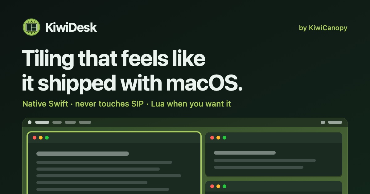
KiwiDesk is a tiling window manager for macOS that puts your open windows in order for you instead of leaving that job to you. Open a window and it slots neatly into place beside the others — tidy, edge to edge, with no gaps you did not ask for. It is built for people who work on a Mac all day and want their screen to stay calm and organized without manual dragging, resizing, or setup rituals. Every window finds its place in one of seven layouts, apps can be opened with a shortcut, and mouse users get a Space Bar they can drag windows onto. It is free to use, and its source is public on GitHub. The problem KiwiDesk addresses is familiar to anyone who works on a Mac: window management is manual. Without a tool like this, you drag a window to one side, pull its edge until it fits, then do the same for the next one — and when you open one more, you start over. As the creator puts it, tiling managers were always a nerd's toy, and the goal here was to make them intuitive for everyone so that it should just work. The stated ambition is a window manager that works with you, rather than one you have to tell how to work. KiwiDesk exists to remove that repeated tidying, so that every window is visible and nothing stays buried while you focus on actual work. At the core of KiwiDesk is automatic tiling. Instead of you positioning each window by hand, each window slides into a tidy spot automatically, so every window stays visible and nothing gets buried. Windows size themselves to fit, which means no dragging window edges. There are seven layouts to choose from, and a scrolling layout is shown in action in the product video. Automatic arrangement also continues as you move around: a window you move somewhere else arranges itself when it gets there, so there is no rebuilding your layout by hand. If you do want to change the arrangement, a tap of a key nudges the layout; otherwise it simply stays neat while you work. Keyboard control is central to how KiwiDesk behaves. You can give an app its own key, and its window comes to you — including a window you had minimized. That makes switching contexts a single keystroke rather than a hunt through a crowded desktop. The same idea runs through the basic workflow: you work as you always do, opening apps, browsing and writing, and the windows arrange themselves around you. When you want a different arrangement, a tap of a key nudges the layout; when you do not, KiwiDesk stays out of the way. The product describes this as staying in the flow. Mouse users are treated as first-class, which is unusual for a tiling window manager. KiwiDesk provides Space Bar and App Bar overlays that let you navigate visually without memorizing hotkeys. The Space Bar is something you can drag windows onto, so a mouse-driven user can place and move windows directly instead of relying on keyboard commands. The App Bar gives a visual way to reach applications. Together these overlays mean the product is not only for people who are comfortable with shortcuts — it also works for anyone who prefers to point and drag. KiwiDesk works alongside your native macOS Desktops. Each Desktop keeps its own windows, and each can bring its own setup: you bind a profile to each macOS Desktop and it loads the moment you swipe there, with its own spaces, layouts, colors and shortcuts. That makes it possible to have, for example, one arrangement for focused writing and a different one for development, each restoring itself automatically when you swipe over. KiwiDesk also offers a sticky or pinned window that follows you everywhere — the product's own example being your music or your notes, always there. A pinned window that follows you, and one profile per macOS Desktop, are both demonstrated in the product video. The app is designed to feel native to macOS. Settings live in a native Settings app, and no config file is needed — everything is set through the interface rather than by editing text. It is built for macOS with SwiftUI settings, smooth spring animations, and zero config files required. That combination matters because it lowers the barrier for people who are not command-line or dotfile users: you install it, open the settings, and configure layouts, shortcuts and profiles visually. The result is described as a tool that feels like it shipped with the operating system rather than something bolted on. The stated workflow is deliberately short: three steps to a calmer screen. First, open your windows — work like you always do, opening apps, browsing and writing, with nothing new to learn. Second, they arrange themselves: each window slides into a tidy spot automatically, so every window is visible and nothing is buried. Third, stay in the flow: a tap of a key nudges the layout when you want it, and otherwise it stays neat while you focus. There are no setup rituals and no manuals; the product's claim is simply that it starts helping. The benefits follow from that. You stop dragging window edges because windows size themselves to fit. You stop rebuilding layouts by hand, because a window you move somewhere else arranges itself when it arrives. You reach any app's window with a single key, even if it was minimized. Your macOS Desktops keep their own windows and can each bring their own profile. Sticky windows keep important things such as music or notes visible everywhere. And because it feels native, with SwiftUI settings, smooth spring animations and no config files, it fits into an existing Mac workflow instead of asking you to adopt a new one. Concrete scenarios described in the content include tidying five messy windows in one step, using the scrolling layout, dragging a window onto the Space Bar, pinning a window that follows you, and running one profile per macOS Desktop. In day-to-day terms that covers a desk in a hurry: opening a batch of apps and having them immediately tile edge to edge; arranging a scrolling strip of windows for material you are referencing; pulling a window across to the Space Bar with the mouse; keeping a music player or notes window always visible through a sticky window; and letting each macOS Desktop load its own layout, spaces, colors and shortcuts the moment you swipe to it. KiwiDesk is aimed at Mac users who want calmer, tidier screens — from people new to tiling window managers, for whom the product is recommended as a starting point, to experienced users who want something flexible enough to replace more opinionated window managers. It runs on desktop macOS only, requires macOS 14 or later on Apple silicon, and is signed and notarized. You can download it directly, or install it with Homebrew — the same signed build either way — and it keeps itself up to date from there. It is free to use, the source is public on GitHub, and there is an option to support development on Ko-fi. KiwiDesk's core promise is simple: tiling that feels like it shipped with macOS. It takes the repetitive work of arranging, resizing and rebuilding window layouts on a Mac and turns it into something automatic and calm, while keeping keyboard control, first-class mouse overlays, per-Desktop profiles and sticky windows for the people who want them. Everything is configured in a native Settings app with no config files, it is free and open source, and it is designed to just work.
Eclatira is a platform for powering applications with conversational voice and video AI. It lets developers build conversational agents with native voice, camera, and screen sharing, and then connect those agents to their own APIs, MCPs, and more than 3,000 apps. The product is described as a conversational video agent that plugs into any stack, giving developers native voice-to-voice, live vision, and full-stack execution across custom APIs, MCPs, and a large library of connected apps. Its stated goal is to help teams ship autonomous multimodal video agents quickly, with agents that are fast enough to barge in and sharp enough to see what you show them. The primary audience is developers and product teams who want to add real-time conversational video intelligence to their own software. Teams can start building through the web app, book a demo, or create agents, upload documents, define tools, and start calls through a versioned REST API. Most conversational agents have been built as text-first systems, with voice treated as an add-on layer. Eclatira takes a different starting point: voice and video are native to the session, and audio and video stream through the same bidirectional pipeline from the start. Another common obstacle is integration. Connecting an agent to a company's own systems usually means writing custom integration code for every service. Eclatira states that developers can connect agents to APIs, MCPs, and 3,000+ apps without writing custom integration code. The company's own FAQ frames the questions teams ask before adopting this kind of tool, including how Eclatira differs from a chatbot that also does voice, how the web widget compares with telephony, how fast a real conversation feels in practice, how long it takes to get an agent live, whether code is required to connect your own APIs, how recorded audio and video are handled, and whether video costs more than voice. The video engine is built around live visual input processed in the same real-time stream as voice. When a webcam is pointed at the agent, it perceives the live video stream continuously and tracks what changes in the frame while the conversation keeps going, so visual awareness does not interrupt the dialogue. Screen sharing works the same way as camera input: the agent watches what is on screen and can guide someone through a page, a form, or a piece of software step by step. The agent can also read what is in frame. Point the camera at a printed page, a screen, or a label and it reads the text through OCR, then acts on what it has just read. Beyond text, the agent identifies physical objects, products, and packaging in frame with high accuracy, which the product positions as useful for guided troubleshooting or visual verification. Video is processed at up to 30 frames per second against the same sub-800ms latency budget as voice, so visual understanding keeps pace with the conversation. On the voice side, Eclatira uses native voice-to-voice processing, which it describes as the reason an agent responds at conversational speed. The site separates this from a chatbot that also does voice, framing native voice-to-voice as a different starting point. Voice and video run through one pipeline: audio and video stream through the same bidirectional session, so the agent can talk about what it is seeing in the same breath. The core capabilities list separates the video engine, voice engine, telephony, agent builder, knowledge and tools, web widget, and platform and API, indicating that agents can be reached both through a web widget embedded in an application and through telephony. Agents can be assembled in two ways. In the agent builder, you describe the job in plain language, then refine the prompt, voice, and tools until the agent is ready to ship. This makes the builder the place to shape what the agent knows and how it behaves before it goes live. The platform also exposes a versioned REST API, where developers can create agents, upload documents, define tools, and start calls programmatically, which suits teams that want agent creation and call handling to live inside their own systems. Knowledge and tools are listed as a core capability alongside the web widget, suggesting that agents can be grounded in uploaded material and given tools to act with. Integrations extend that reach: agents connect to custom APIs, MCPs, and more than 3,000 apps without custom integration code, and public documentation is available for the API. The underlying approach is a single bidirectional session that carries audio and video together in real time. Live camera and screen input are processed in the same stream as voice, part of one session from the start, so the agent's understanding of what it sees and its spoken response are handled together rather than as separate processes joined after the fact. Latency is managed as a shared budget: video runs at up to 30 frames per second under the same sub-800ms target that voice uses. Agents are created either conversationally in the builder or programmatically through the versioned REST API, and are then connected to external systems, tools, and documents so they can execute rather than only converse. For users, the benefit of native voice-to-voice is responsiveness at conversational speed, which is the difference between a natural exchange and a slow one. Real-time vision means the agent can see through a camera or a shared screen while it talks, so support, guidance, and verification happen inside the same conversation instead of across separate steps. Continuous frame tracking keeps the agent aware of changes while the conversation continues. OCR lets it respond to printed pages, screens, and labels it is shown; object recognition lets it identify products and packaging, which the product links to guided troubleshooting and visual verification. Processing video at up to 30 frames per second within the same sub-800ms latency budget as voice means visual understanding keeps pace with speech. Connecting to APIs, MCPs, and 3,000+ apps without writing custom integration code reduces the work required to make an agent useful. Several concrete scenarios follow from the features described. A user can point a webcam at the agent and have it perceive the live stream, which suits situations where someone needs to show something rather than describe it. When a user shares their screen, the agent can guide them through a page, a form, or a piece of software step by step, which fits onboarding, walkthroughs, and support. If someone holds a printed page, a screen, or a label to the camera, the agent reads the text through OCR and acts on it. Object recognition supports guided troubleshooting and visual verification of physical products and packaging. Agents can be deployed through a web widget inside an application or through telephony, and they can be connected to custom APIs, MCPs, and 3,000+ apps so that a conversation can trigger real work across a stack. Eclatira is aimed at developers and teams building conversational agents into their own applications, including those who want to ship autonomous multimodal video agents quickly. The integrations named in the content are custom APIs, MCPs, and 3,000+ apps, with connections described as requiring no custom integration code. Agents can be created in the builder or through a versioned REST API that supports creating agents, uploading documents, defining tools, and starting calls. Delivery channels mentioned are the web widget and telephony. The site offers a free start to building and an option to book a demo. The site also notes that Google Analytics is used and that analytics cookies are only set if a visitor accepts, with a link to the privacy policy. Eclatira's core promise is a conversational agent that both hears and sees in real time and can act across a company's existing stack. By making voice and video native to a single bidirectional session, adding OCR and object recognition on live frames, holding to a sub-800ms latency budget, and connecting to APIs, MCPs, and 3,000+ apps without custom integration code, it gives developers a way to build multimodal agents fast enough to keep a real conversation going.
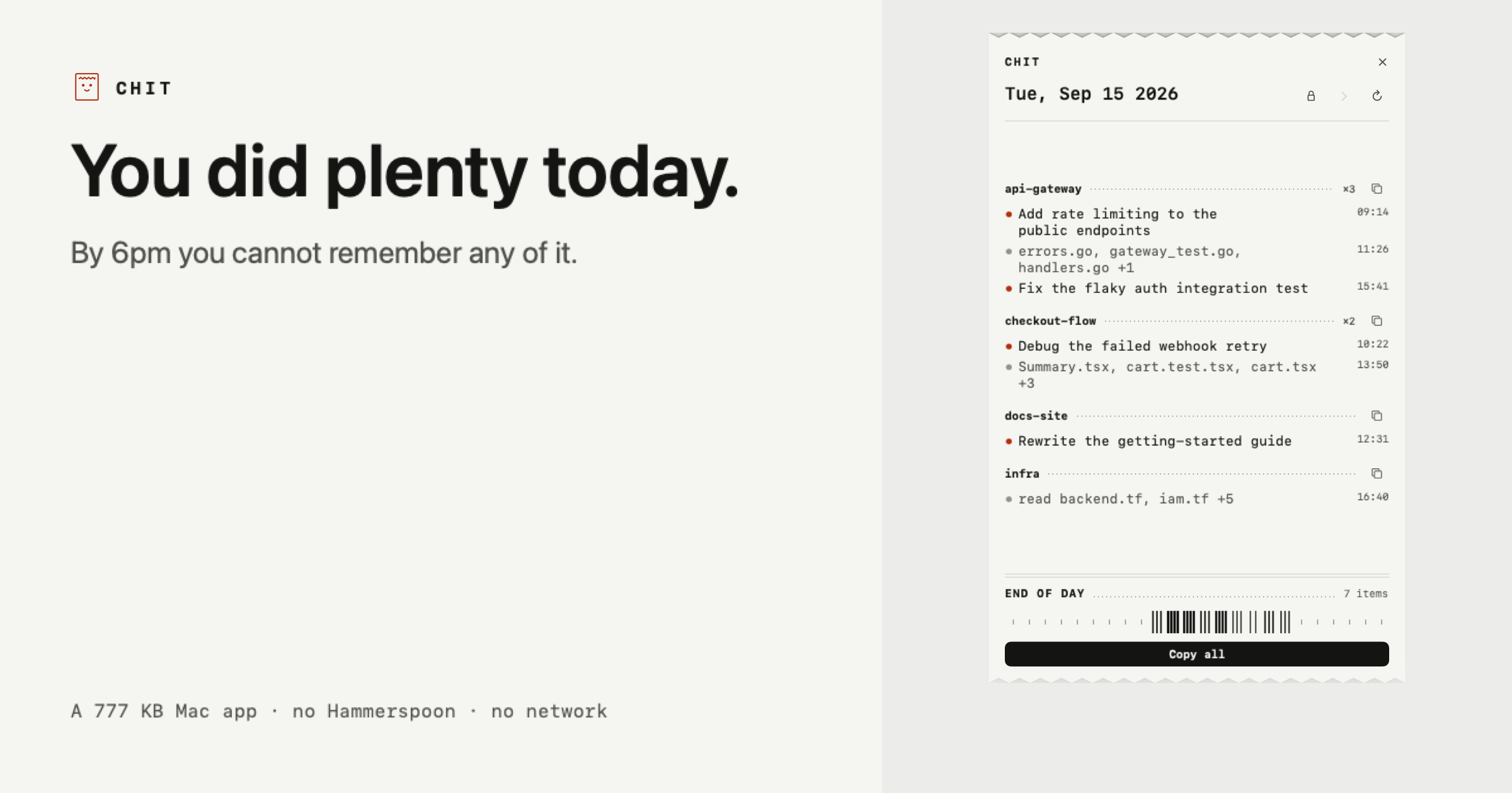
Chit is a small Mac application that reads the Claude Code transcripts already sitting on your own disk and prints your day back as a receipt — a compact, plain-text summary of what you actually did, grouped by project and ready to paste. It was made for developers and other Claude Code users who finish a working day with plenty of activity behind them but no reliable memory of it. The receipt is the app: Chit prints itself once a day, and how long that receipt is depends on how much you did. Nothing needs to be installed first — you double click the app and today is already on screen. You did plenty today. The problem is that by 6pm you cannot remember any of it. The day's work is spread across many sessions, several repositories, and a transcript history that reads like chat logs rather than like work. Chit exists to convert that raw history into something that reads as a day of engineering: which projects you touched, what was done in each, and which files changed. That matters most at the moments when you have to account for your time — a standup in the morning, a timesheet at the end of the week, or a review of a day you have already forgotten. Rather than asking you to reconstruct the day from memory, Chit reads what Claude Code already wrote to disk. The core of the receipt is its grouping. Every session is bucketed under its repository, busiest first, so the day reads as work rather than as a pile of chat logs. Agent worktrees fold back into their parent project instead of appearing as separate, unrecognisable entries — a detail that keeps parallel agent work from fragmenting your summary into strangers. Under each project the receipt lists the tasks that were worked on and the files that changed, with an explicit sample showing entries such as a rate-limiting task followed by a list of touched files. Because the ordering is by activity, the busiest project naturally appears first. Chit's output is built to be pasted, not read twice. One click copies the whole day; another copies a single project on its own. Both are already phrased the way a task sheet or a standup wants them, so there is no reformatting step between the receipt and the place you need it. For destinations that render Markdown, there is a Markdown version as well. The sample receipt shown on the site demonstrates the shape of it: a date header, followed by project names such as api-gateway, checkout-flow and docs-site, each with its bulleted tasks and touched files underneath. The receipt is not limited to today. You can step back through the week when you need to account for a day you have already forgotten, and a full scan of a 2.7 GB transcript folder takes about a second. That speed is what makes browsing backwards practical rather than a chore. Chit is also a CLI, which means the same material can be produced without the window at all: chit --today, --date=, --from= --to= and --markdown are the documented flags. The CLI output can be piped straight into whatever eats your timesheets, so a summary can flow into an existing tool instead of being copied by hand. Privacy is the part of the design Chit spends the most words on, and the approach is unusually simple. Chit opens the files Claude Code already writes to ~/.claude/projects on your own disk. Nothing leaves the machine, and there is no network code in the binary at all — the site counts it as zero network calls, ever. The lines in a receipt come from the titles Claude Code generates for sessions, or, where Claude Code has not named a session, from the names of the files you touched; Chit names the line after those files. Your prompts never appear. What you typed is used only to decide whether a session counted as work, and is never stored or shown. Two more protections follow from that. Lines contain file names, not paths — a line says audit.js, never a path that reveals your client directories, because a path would say who you are and who you work for. And whole projects can be hidden, keeping client, NDA or job-hunt work off the receipt entirely; hiding removes that project's lines, though the site is honest that it cannot hide a sentence you typed about that work inside a different project, and is not sold as if it could. Chit is read only: it never writes to ~/.claude, so nothing it does can affect a session. The app itself is 777 KB, requires zero things to install first, and takes a single double click. One practical caveat is stated plainly on the site: Chit is not notarised yet, so a browser download gets flagged once. The terminal one-liner installs with no warning at all, and the SHA-256 is published next to it. The benefit of all of this is a daily artefact you did not have to write. Instead of reconstructing yesterday from memory, you get the day back in a form that already matches how standups, task sheets and timesheets want to receive it, produced from data that was already on your disk, without an account and without anything leaving your machine. The scenarios Chit is described against are specific. The first is the standup: you open the receipt in the morning, copy the day, and paste it into a task sheet or standup thread already phrased for the occasion. The second is timesheets — the CLI's date flags let you produce a ranged summary and pipe it into whatever system eats your timesheets. The third is accounting for a day you have already forgotten, stepping back through the week until you find it. The fourth is keeping sensitive work quiet: hiding whole projects keeps client, NDA or job-hunt work off the receipt. And because a busy day produces a longer receipt than a quiet morning, the output scales with what you actually did. Chit is aimed at people who use Claude Code heavily enough that their own history has become unreadable: developers running multiple sessions and repositories, and anyone who has to report what they did. Pricing is split in two. The free tier is free forever, not a trial, and covers the half used every morning: today's receipt in full, copying the day or any project, plain text and Markdown, hiding projects, and the CLI. Chit Pro is $12 once, not a subscription, and adds every past day, week and month statements, a dashboard, and a key tied to your Mac that works offline forever. The app is distributed as a zip you drag to Applications, or via a curl one-liner, and it is a Mac app at 777 KB with no account required. Taken together, Chit is a deliberately small, local tool with a narrow job: read the Claude Code transcripts already on your disk, print the day back as a receipt grouped by project, and make it paste-ready. It asks for no account, makes no network calls, never shows your prompts, and keeps file names rather than paths. For developers who need to account for their time, that is the whole value: a printed receipt of your day, produced from your own machine.
Kaiku is an agent-native task tracker and wiki built for teams whose work is increasingly done by AI agents. In Kaiku, agents work in the tracker and the wiki the way the rest of the team does. You can hand an agent an issue, or call it in a comment, connect your own agents over MCP, and see every run on the issue it worked on. The product's core rule is simple: an agent proposes, a person approves. Tools written against the API most companies already run connect too, so the software you already use does not have to be replaced to bring agents into the way your team plans and records work. The problem Kaiku addresses is that agentic work has arrived inside ordinary team workflows, but the tools those teams use were not built for it. Agents are usually bolted on as plugins, and their connection to existing trackers and wikis runs through a bridge that lags a version behind the API it imitates. Kaiku puts the compatibility on the wire instead: the MCP servers your agents already use for the incumbent tracker and its wiki work against Kaiku as they are. The second problem is cost visibility. When automation files issues, answers questions and edits pages, the bill arrives after the fact. Kaiku records every agent run against the issue it worked on — tokens by kind, machine time, who asked — so you find out what the automation actually cost while you can still do something about it. Agents are the point of Kaiku, not a plugin. The product speaks MCP two ways. First, through the MCP servers your agents already have configured for the tracker and the wiki your company runs today; those work unchanged because the compatibility lives on the wire rather than in a bridge that lags a version behind. Second, Kaiku ships an MCP server of its own. Both are HTTP with a bearer token: a workspace, an address, and four lines of config. Your workspace answers on its own address and issues its own tokens from Settings, and a read-only token cannot reach the MCP endpoint at all. The built-in server exposes issues and their children, comments and the threads they hang in, wiki pages, attachments by path, project fields, and questions put to one person and waiting on an answer. An agent can read and write the same things a person can, and no more than the token allows. Calling an agent in Kaiku works like calling a colleague. You call it in a comment, by name, in the thread where the question already is. It reads the issue, answers in the same thread, and says what it read to get there. It never decides: a proposal is recorded as a question addressed to you, with no default answer, so the issue keeps who chose and what they chose — and silence chooses nothing. An agent is a role of your workspace, not an account, with no password, no token and no access of its own. It runs as the person who called it, with the permissions that person has at that moment, and it is clamped to the issue's project — a question about one project never ships the other nine to a model. Its tools are reads only, and the comment it answers with is written by Kaiku, not by the model. Every answer carries the issues and pages its tools actually returned, so the reasoning can be checked against its sources, and every call is a row: who called which role, on which issue, what came of it and what it cost. The wiki beside the tasks speaks the same protocol. Every project carries exactly one space, keyed like the project. You write Markdown, while the wire carries the storage format the incumbent corporate wiki uses, so tools built for it read Kaiku without being told. Pages go out as Word documents, and the words inside an attached diagram are searchable, so a drawing stops being a dead end. Issues, comments and wiki pages are also translated automatically, on demand, with a language picker that searches by what each language calls itself. Because the wiki is governed by the same access rules and the same MCP server as the tracker, agents can read and write it under exactly the same permissions a person has. Some teams keep clients rather than a backlog, and Kaiku covers that with a mini-CRM. Turn on the client book in a project and it reads as one: a row per client, the columns your business actually runs on, and the work for each client right under its row. Nothing leaves the tracker to get there — the board, search and your agents keep seeing the same issues. A client is an issue of its own type, so it comes with comments, files, history and watchers, and the same API and MCP as everything else. Projects write down the columns they need, of six kinds: a list with colours, a country, a number, a date, a person, a line of text. A value that does not fit its column is refused on the spot, never quietly dropped. The name, the owner and every custom column change right in the table, using the same write the card makes, so history, notifications and agents all see it. The whole book exports as one .xlsx with your columns in your order, where a number stays a number and a date stays a date. Beyond agents, the wiki and the client book, Kaiku ships the ordinary things a tracker owes you and a few it usually does not. There are Kanban and scrum boards, dragging between columns, and sprints that start and close; a board bigger than a page says so rather than quietly showing you a prefix. Custom fields are not only for clients: any project can define them, search by them, colour its board cards by a list's value, and mark a card with the field that matters. Several GitLab repositories can attach to a project, because a tracker project rarely lives in one, and a repository that did not answer says so instead of pretending there is nothing there. Numbers stay honest because stock and flow are kept apart — what is open now never quietly takes the date range that created-per-day takes — and archived issues are still counted, because a shelf is not a delete. Archiving clears a board without losing anything, by hand or on a rule the project sets, counted from when the task became done rather than when it was made. You can sign in without a password using passkeys or Google sign-in, or a password if you prefer, and you cannot remove your last way in. Notifications cover mentions, watchers and reactions on comments, with a digest that respects what you asked for; every timestamp keeps its exact value behind the friendly one. The data stays yours. One request gives you the whole project as a zip: structured JSON, readable Markdown and every attachment. It keeps working after a subscription lapses, on the principle that a service which locks your data behind a payment is a service nobody should pick. If your workspace does stop paying, it becomes read-only: nothing is deleted, everything is still readable, export keeps working, and that state is kept for 12 months with a warning well before anything is removed. Bringing existing work in is a first-class path too. A company admin imports a project from the cloud version of a popular task manager, and issues keep their keys while their comments, files, custom fields, parents and links come with them. A check runs first and names what will not move — change history, sprints, logged time — before anything is written. The unique approach running through all of this is that agents are treated as members of the team rather than as an external integration. They are roles in your workspace, called by name in the place the conversation already lives, constrained by the permissions of the person who called them, and answered with citations to what they read. Everything they do is a recorded run attached to an issue, with tokens by kind, machine time and who asked. Because the tracker and the wiki both answer on the wire formats the incumbent tools use, the MCP servers people already run keep working, and nothing has to be installed or forked to make that true. Concrete use cases come straight from the product. A repertory theatre runs a season as project work: a dozen productions share one board, each opening night has thirty pieces of work in front of it, and the calendar shows when each of them ran and what each is waiting on — drawing a bar only between days that were actually recorded, never from a start somebody guessed. A company admin migrates a project from the cloud version of a popular task manager and keeps issue keys, comments, files, custom fields, parents and links. A team that keeps clients turns on the client book and manages each client's work under its row without leaving the tracker. A developer calls an agent by name in a comment on an issue, gets an answer in the same thread with the sources it read, and approves or rejects the proposal it made. And finance can watch a week of automation costs on the issues where the runs happened. Kaiku is aimed at teams whose work is increasingly done by AI agents and who already run a tracker and a corporate wiki, as well as people who use agents such as Claude Code and Cursor and want a tracker they can point those tools at. Integrations centre on MCP over HTTP with a bearer token, the REST API of the tracker most companies already run, the equivalent wiki format, and GitLab repositories. Workspaces live on their own subdomain, yourcompany.kaiku.tech, so project keys and issue keys never collide across companies. Pricing starts with a 30-day trial: up to 2 people, 1 project, 1 GB of attachments, every feature, no card and no wallet to start. Personal is $19.99 per month for one seat, up to 100 projects, 20,000 issues and wiki pages and 10 GB of attachments. Team is $7 per person per month with AI included or your own key, $5.25 per person per month when paid for a year, plus $20 per month per extra 20,000 issues and pages and $10 per month per extra 100 GB of attachments, per workspace. A Team plan with your own AI key is $6 per person per month and runs agents, the assistant and translation on your company's own Anthropic or DeepSeek key. AI Pro on Team adds $12.99 per seat per month. Payment is in USDT or USDC today, with Visa and Mastercard card payments coming soon, and self-hosting is available by request. Kaiku's primary value is that it lets agents join the team without leaving the systems the team already uses: an agent-native tracker and wiki that speak the API and MCP the incumbent tools speak, record what every run cost on the issue it worked on, and never let a model decide on its own. Start with a month — two people, one project, everything switched on — and take your data with you if it does not fit.
Once UI 2.0 is an open-source design system for building polished React products with less repetitive code. The website describes it as an open-source design system for indie creators built with Next.js and Supabase, and says you can ship fully functional apps with copy-paste React code covering components, blocks, layouts and pages. Once UI brands itself as "the agentic design system," and its Product Hunt tagline states that it builds consistent React apps for developers and AI agents. Its core purpose is to provide one shared system — foundations, components and design tokens — so that layouts can be composed from readable primitives and the result stays consistent as a product grows. The problem it addresses is repetition and visual drift in growing React codebases. According to the product description, Once UI helps teams build polished React products "with less repetitive code" and keeps "the result consistent as your product grows" by using a shared system of components and design tokens. The homepage expresses the same idea in a single line: "Any look. One system. Roll the die. The whole page changes. The code doesn't." In other words, the visual identity can be swapped completely while the underlying code stays untouched, because appearance is driven by the system rather than hard-coded into each screen. Version 2.0 extends this logic to AI coding agents: the release notes say the new version "gives both you and your coding agent a clearer way to work," which matters because agent-generated interface code tends to drift unless the agent has explicit rules and a catalog of approved components to draw from. The most visually distinctive feature is the "look" system. The homepage presents a twenty-sided die; rolling it changes the entire page, and a deck counter shows which of the twenty looks you have collected, with unrolled entries marked "Not rolled yet." The default is look number 20, described as "Natural 20: The default. You rolled the whole system." Each look specifies a complete visual configuration, shown on the site as neutral gray, brand emerald, accent orange, border playful, solid contrast · flat, surface filled, with heading, body and label fonts all set to Geist. Every look also has its own URL, such as once-ui.com/?face=20, so a specific appearance can be linked directly. Because the look changes the whole page while the code does not, the same React implementation can be restyled by switching configuration rather than rewriting components. Once UI ships as copy-paste React code rather than a locked black box. The meta description says it lets you "ship fully functional apps with copy-paste React code: components, blocks, layouts and pages," and the product description adds that you can "compose layouts with readable primitives." Those two statements describe the practical workflow: you assemble a screen from components and larger blocks, arrange them with primitives that stay readable in the source, and rely on layouts and page-level compositions that already follow the system's conventions. A shared set of design tokens carries the visual decisions, and those tokens underpin the look system demonstrated on the homepage. The product description also highlights "foundations and predictable APIs," which it says make the output "easier for you to understand." The intended outcome is a codebase where a developer can read a layout and know where every spacing, color and typographic value comes from. Version 2.0 is explicitly designed for AI coding agents as well as people. The product description states that its "component catalog, compact rules, and task guides help agents use the system correctly." Each of those three pieces serves a different purpose. The component catalog gives an agent an inventory of approved building blocks to choose from, so it does not have to invent new UI. The compact rules give the agent a short, enforceable set of constraints that fit inside a working context. The task guides walk the agent through common jobs step by step. On the other side of the same coin, the description notes that the "foundations and predictable APIs make the output easier for you to understand," so a human reviewing agent-generated code can still follow what was done and why. This is what the "agentic design system" label refers to: a system with enough structure that both a person and a coding agent can produce work that matches. Once UI is built with Next.js and Supabase, according to the website's meta description, and it is distributed as open-source software. The site supports that framing with a public GitHub organization, public documentation, a roadmap, a changelog and a handbook. The methodology is also visible in the way the homepage is organized as a game: twenty numbered faces, a die to roll, a deck that tracks collection progress, and a direct URL for each face. That structure is a demonstration of the system, not just a marketing device, because it shows that one React implementation can present twenty fully different visual identities by drawing on shared tokens. Because the project also publishes Figma assets and pre-built products such as Magic Portfolio, Magic Docs, Once UI Starter and Once UI Figma, the same system can be applied across design and code without branching into separate, drifting definitions. For developers, the stated benefit is less repetitive code and a result that stays consistent as the product grows. Because layouts are composed from readable primitives and the appearance is controlled by tokens and looks, changing the visual direction does not require editing every component. For teams working with AI agents, the stated benefit is that agents can use the system correctly, guided by a component catalog, compact rules and task guides, instead of producing one-off UI. The description also says the foundations and predictable APIs make agent output easier for the developer to understand, which reduces review effort. The open-source license and the free products listed on the site — Magic Portfolio, Magic Docs, Once UI Starter and Once UI Figma — lower the cost of trying the system. The site's showcase lists products built with Once UI, which gives concrete use cases. Aveiro is a creator platform; Frametic is described as "motion for the web"; IQON is a monitoring app; Hoshina is a property claim platform; La Femme Kosmetik is a beauty brand; and one entry is explicitly a developer portfolio, belonging to Divyanshu Dhruv. There is also Dopler Store, a swag store. Together these examples cover marketing sites, monitoring and business applications, portfolio pages, small online stores, and creator or content platforms, all built on the same design system. Other products in the Once UI family point to further uses: Once UI Core, Once UI Blocks and Orbit Core for building interfaces, Magic Portfolio and Magic Docs as ready-made templates, and Once UI Figma for design work. The companion newsletter, the Design Engineers Club, is described as having 5,000 readers every week, a Discord that answers, and a GitHub that ships in public. Once UI is aimed at indie creators and developers who build React products, especially those working with AI coding agents. The meta description names indie creators directly, and the product description speaks to developers building polished React products. The technology stack stated in the content is Next.js and Supabase, with React components as the delivery format. The project is open source, and its Product Hunt topics include Open Source, Developer Tools, Artificial Intelligence and GitHub. The website lists certain products under a "Free" heading — Magic Portfolio, Magic Docs, Once UI Starter and Once UI Figma — while a separate Pricing page is linked in the navigation. The project also states that it is supported by Claude for open source and Sentry for open source, and that it is a product by Dopler. In short, Once UI 2.0 is an open-source, Next.js-and-Supabase design system for React that pairs component, block, layout and page code you can copy into your app with a token-driven look system spanning twenty distinct visual identities. Its pitch is that the look can change while the code does not, and that the same structure makes the system usable by both developers and AI coding agents through a component catalog, compact rules and task guides. For indie creators and React teams, it offers consistency without repetition.
Jango is a macOS app for testing the parts of your application that need more than one person. Rather than coordinating colleagues or paid testers, Jango gives your app a cast of AI participants. Each cast member has its own account, its own goal and its own isolated browser, so it signs in to your app as a distinct user and interacts with the other participants in real time. You point Jango at your development URL, decide who shows up, and watch the scenario play out. You can direct the cast, join in as yourself, or take control of any participant's screen. When the run ends, Jango leaves a report of actions, errors and screenshots. It is aimed at developers building social feeds, marketplaces, sandbox order books and collaborative workflows. Multi-user features are hard to test alone. The interactions that make a product interesting — two accounts trading on an order book, a group chat where messages arrive from several people, a team app where one user invites another and a third updates a shared task — all require other people to be present at the same time, using separate accounts, in the same app. That coordination is slow and unreliable. Testers have to be scheduled, briefed and kept in sync, and by the time the scenario is reproduced tomorrow the context has to be rebuilt from scratch. Jango targets exactly that gap: test apps with people, without the wait. The product's own framing is that you build the interactions that need other people, and Jango exists to exercise them. Setting up a scenario in Jango starts with the app itself. You add your development URL and your test accounts, and each participant receives its own isolated browser. From there you assign roles and goals: a buyer places a test order, a seller lists an item, a teammate updates a task. Because every participant acts through a separate browser session, the app sees several independent users rather than several tabs inside one signed-in session. In the illustrative order book example on the site, Rin acts as a buyer and selects Buy, enters three units at $100 and submits a limit order; Theo acts as a seller, offers two units at $99 and checks the resulting fill; Morgan acts as a market participant, places another test order and reviews the updated book. Each of those steps runs from a separate account inside the same shared application. Once a run is underway, Jango is built to be watched and steered rather than left alone. You can use your app alongside the participants, inspecting their screens as they go. You can pause when something breaks. You can direct participants with instructions — the site's CLI example shows a direction such as asking Maya to invite Alex to the group — or take manual control of any user's screen. Cast members do more than chat: each operates your web app through its own browser, navigating, clicking controls, filling forms, selecting options and uploading supplied images. What a participant can do depends on the controls Jango can observe in your app, and goals are used to exercise posts, profiles, shared tasks, marketplace listings or a sandbox order book. Jango's runs are designed to leave something useful behind. The app keeps an app memory built on three kinds of context. Known identities capture roles, relationships and encrypted login state, so the cast can be brought back with the accounts and relationships it already had. Observed app controls are reusable hints backed by an execution history, giving the cast a navigation hint grounded in an actual action rather than an assumption. Run evidence covers activity, observable checks and comparisons — evidence that an expected message appeared, for example. Together these let you save a repeatable situation instead of rebuilding context the next day. Pro plans also add multi-user checks and saved checkpoints. Architecturally, Jango splits work between your machine and your account. Browsers run locally on your computer, and Node.js and Chromium are bundled, so no separate Node or Playwright installation is required. Your account keeps projects, evidence and browser checkpoints in the cloud, and sign-in credentials use your operating system's credential protection. Browser destinations are restricted to your configured app origins. For intelligence, you can connect your own AI key — described as bring your own key — or buy managed AI credits. Providers named in the content are OpenAI, Anthropic and Vercel AI Gateway. Relevant page text, goals and participant memories are sent to the AI provider you select. Jango runs on macOS for both Apple silicon and Intel, ships as version 1.1.1, checks for updates automatically and installs them when you restart or quit. The practical benefit is that a multi-user scenario becomes something you can run on demand, alone, rather than something you have to schedule. You get a group of participants that sign in with separate accounts and act at the same time, a live view you can interrupt the moment something looks wrong, and evidence afterwards — actions, errors and screenshots — that documents what happened. Because casts, identities and observed controls are saved, the same situation can be repeated on your next change. Jango is explicit that its AI participants are not real people: they act through real browser sessions to help you exercise interactions and explore scenarios, and they do not replace research with real users. The site lists several concrete workflows. Social app testing exercises social app interactions with AI participants — invitations, conversations, community roles and shared activity — alongside your own test account. Chat app testing covers messaging and group chat flows without coordinating a group of testers, with AI participants directed in separate browsers while you join the conversation yourself. Collaboration testing explores team invitations, shared tasks and role-based workflows in collaborative web apps without gathering a testing team. Order books and marketplaces exercise sandbox order books and marketplace workflows with separate AI participants that navigate pages, fill forms and submit test orders. There is also a guide for the solo developer, describing a practical workflow for testing social and collaborative apps alone: separate accounts, purposeful scenarios, AI participants and checks across browsers. Jango is aimed at developers — particularly solo developers and small teams — testing real multi-user flows in apps they control. It fits where you build: the dashboard, a terminal launch, or a coding assistant given access through MCP, with a workspace API and portable casts keeping the cast and its memory together. The CLI example starts a cast with node ./jango-cli.mjs start --live --ai byok, and directions can be sent with node ./jango-cli.mjs direct . Pricing starts free: $0 with three participants per session, one project, your own AI key and managed AI credits at cost plus 20%. Pro is $9 per month at a founding price and includes twelve participants per session, unlimited projects, multi-user checks and saved checkpoints, and managed AI credits at cost plus 10%. Enterprise is custom, with participant limits set with you, invoiced billing, negotiated managed AI rates and direct support. Managed AI credits are prepaid and can be bought on any plan, while bringing your own key is available on every plan. Supported today are separate browser sessions, saved casts and memory, uploads, live views and manual control, plus CLI and coding-assistant integrations. Canvas-only apps, popup sign-in flows and CAPTCHA may need a different integration. Jango's value proposition is straightforward: it lets one developer run the multi-user parts of an application with a cast of AI participants that behave like separate signed-in users, watch and steer them live, and keep the memory and evidence afterwards. If a feature only reveals itself when more than one person is using the app, Jango is built to put those people there without the wait.
Squints is a free Chrome extension that puts design tools on top of any live web page, built for design engineers. It bundles a set of utilities that let you look closely at a page that is actually running in the browser: measure spacing, drag out guides, overlay a column grid, pick colours in any format, see the font that actually rendered, and slow down or scrub any animation. Rather than working inside a static design file, Squints operates on the real, live page, so the things you examine are the things users see. The extension is free, requires no account, and does no tracking. You add it to Chrome and the tools are available over the pages you visit, without a separate design canvas or an export step in between. The product exists because design is moving into code. Decisions that used to be settled in a design file, such as spacing, type, colour and motion, now get made in the browser, where the tools for looking closely never followed. A designer or design engineer reviewing a built page can see the result, but measuring the gap between two elements, checking which font actually rendered, or slowing down an animation to inspect it is awkward without the right tooling. Squints closes that gap by bringing Figma's measuring tools and more to any live web page. The result is that the same kind of close inspection that happens in a design canvas can happen on the production page itself. Two of the core capabilities are inspection and measurement. With Squints you can inspect anything on the page and read its box, along with the gap to the next one. That means selecting an element and seeing its boundaries and the distance between it and a neighbouring element, rather than estimating by eye. Alongside inspection, Squints provides rulers and guides that you drag out just like in Figma, and they snap. Snapping matters because it turns a rough drag into an exact alignment reference; you pull a guide to the edge of an element and it locks onto the right position, giving you a reliable line to measure against. Together these tools make spacing decisions visible and precise on a live page. Squints also lays a column grid over the real page, and the grid is remembered per site. That means once you set up the column structure for a given site, Squints keeps it for that site, so repeat visits do not require setting the grid up again. Overlaying a grid on the live page lets you judge whether content lines up with the intended columns as it actually renders. On top of that, Squints lets you draw on the page, using arrows, boxes and notes, where it matters. This turns the extension into a lightweight annotation layer, so you can mark up a specific spot on a rendering with a pointer, an outline or a written note instead of describing its location in words. Colour and type are handled directly on the live page as well. Squints lets you pick any colour, showing it in every format, plus the token behind it. Picking a colour from a rendered page means you capture the value that is actually being displayed, and getting the token behind it connects that value back to the design system it came from. For type, Squints identifies any font, the one that really rendered, with metrics. This matters because what a page specifies and what a browser renders are not always the same thing; a fallback may be in use without being obvious. Squints reports the font that actually rendered and includes its metrics, so typography can be checked against what users truly see. Motion and capture round out the toolset. Squints slows motion down, running every animation at a tenth of its speed. Animations often move too quickly to judge by eye, so slowing them to a tenth of their speed makes it possible to watch a transition play out and see what it does. Squints can also scrub any animation, as the product description notes, alongside slowing it down. The extension can also capture the result: a screenshot or a recording, with or without the marks you have made. Capturing a screenshot with marks included produces an annotated visual you can share, while capturing without marks gives a clean view of the page. A recording captures motion over time. These outputs make it easy to document what you found and pass it along. Overall, Squints works by layering design tooling on top of live web pages rather than inside a separate design file. It is delivered as a Chrome extension, so it runs in the browser next to the page you are examining. The tools are applied to the real rendered output, which is the same output users encounter. It is free, needs no account, and does no tracking. That combination keeps the workflow lightweight: there is nothing to sign up for and nothing being collected, so the extension can be used as a quick inspection layer whenever a page needs a closer look. The tools echo Figma's measuring approach, but they are pointed at the live web. The benefit for users is that close inspection becomes possible wherever the work actually lives. Instead of estimating spacing, you read the box and the gap. Instead of guessing at a colour, you pick it in every format and see the token behind it. Instead of wondering which font rendered, you identify it with metrics. Instead of trying to catch a fast animation by eye, you slow it down to a tenth of its speed. Guides that snap give exact alignment references, an overlaid column grid is remembered per site, and annotations plus screenshots or recordings let you document findings. The result is a tighter loop between looking at a live page and making a decision about it. Use cases follow from those capabilities. A design engineer reviewing a built page can measure the spacing between elements and check it against the intended values with rulers and guides that snap. Someone auditing a site's typography can identify the font that actually rendered and inspect its metrics. A designer checking colour can pick any colour on the page, see it in every format, and find the token behind it. When a layout needs verification against a grid, a column grid can be overlaid on the real page and remembered for that site. Animations can be slowed to a tenth of their speed to inspect motion, and the whole result can be captured as a screenshot or a recording, with or without marks, to share. Squints is described as a free Chrome extension for design engineers. It is intended for people who work where design meets code and who need to examine live pages closely. The extension is free, requires no account, and does no tracking, so there is no pricing tier, signup, or data collection to consider. Because it installs in Chrome and operates over web pages, it fits into an existing browser workflow rather than adding a separate application. The Product Hunt listing categorises it under design tools, productivity and developer tools, which matches the mix of design inspection and engineering-facing utility that the extension provides. In short, Squints brings design tools to the live web. It puts inspection, rulers and snapping guides, a remembered column grid, drawing and annotation, colour picking with tokens, font identification with metrics, slowed-down motion, and screenshot or recording capture on top of any live page. For design engineers, that means the close looking that once happened only in a design file can now happen in the browser, free and without an account.
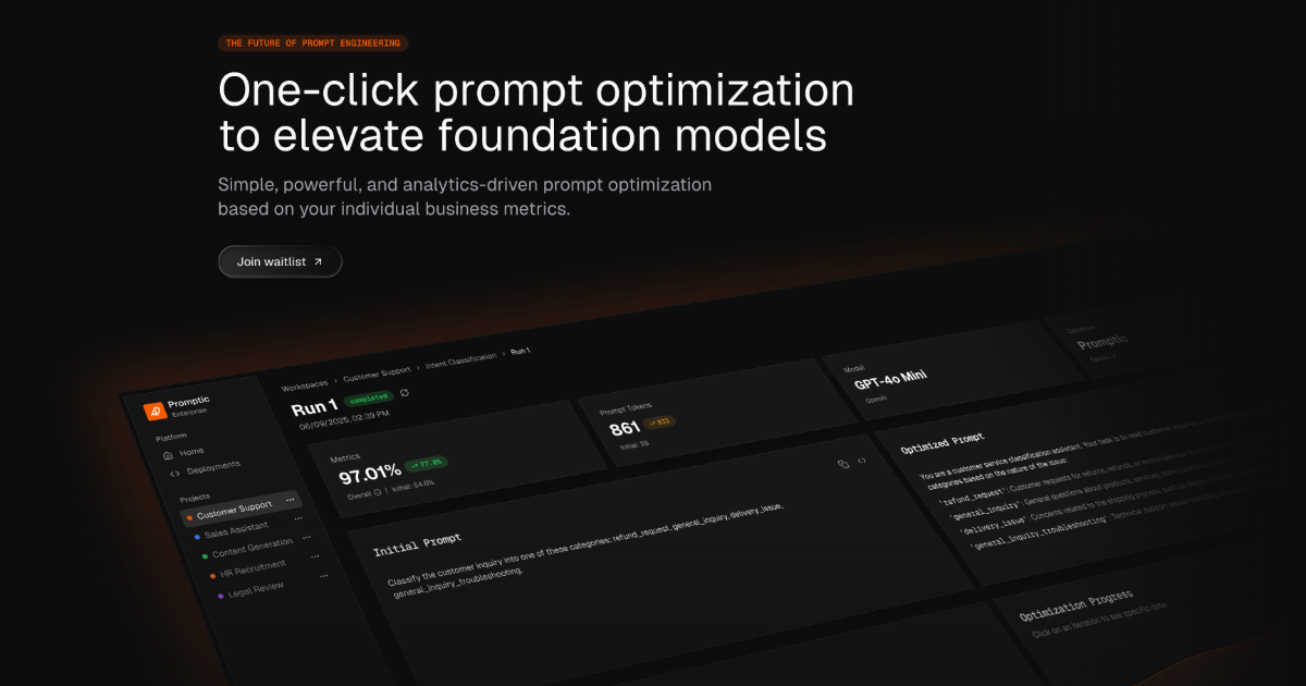
Promptic is an optimization platform for GenAI applications, built around a single promise: better quality at lower cost. According to its own description, it benchmarks models, tunes prompts and agents, and optimizes tool use against your own data and business metrics. The product is aimed at the people who actually have to decide what a generative AI application ships with — which foundation model, which prompt, which agent setup, which tools — and it exists so those decisions rest on measured evidence rather than intuition. Promptic presents itself as simple, powerful, and analytics-driven, with one-click prompt optimization and foundation model optimization as its headline capabilities. The problem Promptic addresses is the gap between how GenAI applications are configured and how they are judged in production. Modern applications built on large language models involve a long chain of choices: which model to call, how the prompt is worded, how an agent is structured, and how tools are invoked. Each of those choices affects both the quality of the output and the cost of producing it, and the space of possible combinations is far larger than any team can explore by hand. The product description states the consequence directly: without a disciplined way to compare candidates, you ship the configuration that sounded right instead of the one that wins. Promptic's stated mission is to replace that guesswork with analytics-driven optimization tied to the individual business metrics a team cares about, so quality and cost are evaluated together rather than traded off blindly. The first capability Promptic describes is model benchmarking. Rather than relying on generic leaderboards or vendor claims, the platform benchmarks models against your own data and business metrics. That matters because the model that performs best on a public benchmark is frequently not the model that performs best on the specific tasks, tone, domain vocabulary, and edge cases of a given application. By running the comparison on the organization's own inputs and scoring the results against the metrics it already tracks, Promptic lets teams see how candidate foundation models behave on the work that actually matters to them. The outcome is a defensible basis for choosing a model — or for confirming that an existing choice is still the right one — instead of an opinion formed from a handful of manual tests. The second capability is prompt and agent tuning. Promptic describes tuning prompts and agents as core to the platform, and its messaging leads with one-click prompt optimization to elevate LLMs. Prompt engineering is iterative by nature: small changes in wording, structure, or examples can shift output quality noticeably, and agents add another layer of complexity on top because their behaviour depends on instructions, intermediate steps, and the sequence of actions they take. Promptic treats these as things to be optimized systematically rather than edited by feel. The "one click" framing signals that the platform is intended to lower the barrier to running an optimization, so that teams can generate and evaluate improved configurations without hand-writing and hand-testing every variation. Because agents are named alongside prompts, the same approach is extended beyond a single instruction string to the broader agent definition. Promptic also covers tool use. In GenAI systems that call external tools, the model's effectiveness depends on how tools are described, when they are selected, and how their results are fed back into the workflow. The platform states that it optimizes tool use against your own data and business metrics, which places tool configuration in the same evidence-based loop as model choice and prompt wording. Running through all of this is the scoring mechanism: every candidate is scored on the quality and cost you actually care about. Quality and cost are presented as the two dimensions that matter, and because candidates are scored on both, a team can see the trade-offs between them rather than optimizing one in isolation. The result the description promises is that you ship the configuration that wins, not the one that merely sounded plausible. Promptic's overall approach is analytics-driven optimization anchored to individual business metrics, and it is designed to run wherever a team already works. The description names three surfaces: a dashboard UI, your CI, and your coding agent. The dashboard gives a graphical place to run and review optimizations, which suits teams that want to inspect results, compare candidates, and share findings. Running in CI places optimization inside the development pipeline, so configurations can be evaluated as part of the same process that builds and tests the software, before changes reach users. Running from a coding agent keeps the work inside the environment where the developer is already writing code, so an optimization can be triggered without switching context. That flexibility is the distinguishing element of the stated methodology: the same optimization capability is delivered through different surfaces so it can fit the workflow a team prefers, whether that is an interactive session in a browser, an automated check in a pipeline, or an action taken directly from an AI coding environment. The benefits Promptic states follow from that methodology. Teams get better quality at lower cost, because candidates are evaluated on both dimensions and the winning configuration is the one that performs best on the metrics that matter. Decisions become evidence-based: rather than debating which prompt or model feels better, a team can point to scores produced against its own data and business metrics. The one-click framing reduces the effort required to explore alternatives, which makes it practical to revisit model and prompt choices as models are updated or requirements change. And because optimization can run in the dashboard, in CI, or from a coding agent, it can be folded into existing habits rather than requiring a separate process. The overarching benefit described is confidence: shipping the configuration that wins instead of the one that sounded right. Several concrete scenarios follow from the capabilities described. A team building a new GenAI feature can benchmark multiple foundation models against its own data before committing to one, rather than guessing based on reputation or a public leaderboard. An application already in production can have its prompts tuned through one-click optimization to lift quality without changing the underlying model. Teams working with agents can tune the agent definition — the instructions and behaviour that shape its multi-step work — using the same optimization loop. Projects that depend on external tools can optimize how those tools are used so the model calls them more effectively. Organizations with a delivery pipeline can run optimizations in CI, treating a configuration as something to be evaluated automatically as part of the build, so a change that degrades quality or raises cost is visible before it ships. Developers who work inside a coding agent can trigger optimization from that environment, keeping the whole task in one place. In each case, the candidate configurations that result are scored on quality and cost, and the configuration that wins is the one put into production. Promptic is aimed at teams and developers building generative AI applications — the people responsible for choosing models, writing and refining prompts, assembling agents, and wiring up tool calls. Its topics on Product Hunt include SaaS, Developer Tools, and Artificial Intelligence, which aligns with that audience: it is a tool for people who build software with AI rather than an end-user application. The product is described as running in a dashboard UI, in your CI, and in your coding agent, so it reaches both interactive and automated development workflows. It is positioned as an optimization platform rather than a model provider, sitting alongside whatever foundation models and infrastructure a team already uses. No pricing or plan details, technology stack, or specific third-party integrations are stated in the material available, so those aspects are not described here. In short, Promptic is a one-click, analytics-driven optimization platform for GenAI applications. It benchmarks models, tunes prompts and agents, and optimizes tool use against a team's own data and business metrics, scoring every candidate on the quality and cost that actually matter. The value proposition is straightforward: replace configuration guesswork with measured results and ship the configuration that wins.
Wand is a voice-first tool designed for builders who think faster than they type. It allows users to speak naturally, shaping their thinking into work, authorizing a build, and reviewing the result in one quiet, generative environment. The product aims to turn spoken thoughts into software, eliminating the need to stop and translate ideas into written prompts. By doing so, Wand introduces what it calls the post-keyboard era, where the keyboard is no longer the bottleneck in software creation. The problem Wand addresses is the friction caused by traditional input methods. The keyboard is becoming the bottleneck for builders who have ideas flowing faster than they can type. Translating thoughts into prompts or code requires stopping the creative process, which slows down innovation. Wand solves this by letting users think out loud instead of typing, allowing them to ramble, react, and even change their mind mid-sentence while the system keeps up. This matters because it removes the translation step between idea and implementation, making software creation more fluid and immediate. A core capability of Wand is its ability to capture natural speech. Users can speak freely, without needing to structure their thoughts into precise prompts. The system is designed to keep up with rambling, reactions, and mid-sentence changes of mind. This means builders can think out loud, exploring ideas verbally without worrying about formulating the perfect written instruction. The feature is useful because it mirrors the way people naturally think—non-linearly and dynamically—rather than forcing them into a rigid typing format. Another key feature is the transformation of spoken thoughts into work. Wand shapes your thinking into work, turning your thoughts into software. This is done within a generative environment, implying that the system uses generative technology to create software artifacts from voice input. The process is described as shaping thinking into work, suggesting a refinement from raw ideas to structured output. This is useful because it allows builders to go from concept to tangible software without the intermediate step of manually writing code or detailed specifications. Wand also includes an authorization step and a review process. After speaking, users authorize a build, which suggests a checkpoint where the user approves the generated output before it is finalized. Then they review it in the same quiet environment. This feature gives users control over the generative process, ensuring that the software produced aligns with their intent. The quiet environment implies a focused, distraction-free workspace where the entire cycle—speak, shape, authorize, review—happens seamlessly. This is useful for maintaining quality and intentionality in the software creation process. Overall, Wand works by integrating voice input with generative software creation in a single environment. Its unique approach is voice-first: instead of typing prompts, users speak naturally. The system is designed to handle the messy, nonlinear nature of human thought, capturing ideas as they evolve. It then converts those ideas into software, allowing the user to authorize and review the result. This methodology aims to make software building as fast as thought itself, ushering in the post-keyboard era. The benefits for users include the ability to build software at the speed of thought. By removing the keyboard bottleneck, builders can iterate faster, capture fleeting ideas, and maintain creative flow. They can ramble and react without losing momentum, and change their mind mid-sentence knowing the system will adapt. The quiet, generative environment provides a focused space for creation, reducing distractions. Ultimately, Wand enables a more natural and efficient way to turn ideas into software. Use cases for Wand include any scenario where a builder wants to quickly prototype or develop software ideas. For example, a developer might speak a feature concept aloud, refine it mid-sentence, authorize the build, and review the generated code—all without typing. Product thinkers could brainstorm aloud, capturing and shaping ideas into functional software. It is particularly suited for builders who think faster than they type and want to maintain a high velocity of ideation and implementation, moving from spoken thought to authorized build and review in a single quiet session. The target users for Wand are builders—specifically those who create software and find the keyboard a bottleneck. This includes developers, engineers, and product creators who want to move from thought to software more directly. No specific integrations, tech stack, or pricing details are mentioned in the available content. The product is accessed via a web environment, as indicated by its website and the "Get started" call to action. In summary, Wand is a voice-first generative environment that lets builders speak naturally to shape their thinking into software. By eliminating the need to type prompts, it removes the keyboard bottleneck and enables software creation at the speed of thought. With features like natural speech capture, mid-sentence changes, build authorization, and review, Wand provides a fluid, quiet space for turning ideas into work. It represents a step into the post-keyboard era, where thinking out loud is the new way to build.