Category Focus/categories/design
Design AI Tools
Discover and compare the best design AI tools and software. Browse 145+ curated tools with reviews and rankings.
Projects tracked
145
Sort mode
RECENT
Page
1
Discover and compare the best design AI tools and software. Browse 145+ curated tools with reviews and rankings.
Projects tracked
145
Sort mode
RECENT
Page
1
Narrative is an AI-first video editor built around a simple idea: bring your footage, say what you want made, and cut it together with an editor that does the work with you. Rather than assembling cuts by hand, you upload clips, describe the edit you want in plain words, and keep refining the result through chat. Narrative brings video editing, custom motion graphics and reference-video style matching into one interface. It builds a finished draft on a timeline you can still open and change, so the output is not a locked black box but a real project you can adjust. It is designed for people who already have footage and a clear idea of the outcome, but who do not want to learn Premiere or After Effects to get there. From podcast clips to launch videos, the first step is the same: say what you want. The problem Narrative addresses is the gap between having footage and having a finished cut. Editing traditionally means learning complex software, understanding timelines and motion graphics, and spending hours scrubbing through material to find the good bits. One producer notes that every episode used to cost an afternoon of finding the good bits. A media lead describes the difficulty of finding every goal in a ninety minute match, including the one the camera nearly missed. A product marketing team says their unboxing demos went from a freelancer and a week to a sentence and ten minutes. Narrative targets exactly that gap: the time, cost and specialised skill that sit between raw footage and a usable edit, whether the material is a two hour shoot, a wedding, a podcast or a match recording. The core of the product is editing by talking. You ask in ordinary language, and the agent does the work. An example from the site is a request to make a 15 second reel of the best rides, with a title at the start and music under it. The agent then reads the transcript, edits the clips and reports back what it did, explaining that four rides were placed on the strip with the tightest one first, the title running from 0:00 to 0:03 and the music bed sitting under everything. Anything you would say to an editor, you can say to this one — it works from the words, not a menu. The site lists prompts such as cutting to the beat, making it feel like a trailer, putting every goal in order, removing the ums, going vertical with captions, starting on the best line, tightening to thirty seconds, warming it up a little, and putting the title back at the end. Everything lives in the same editor as the conversation: the transcript, captions, versions, the frame and the models behind it. The editing surface is the editor itself, not a picture of it — you can press play, scrub the strip and mute a track. Tracks and elements shown in the interface include graphics, clips, dialogue and music, along with elements such as a title and a location card, with individual clips listed by timecode and duration. You can add music, sound effects and transitions, and Narrative also supports custom motion graphics and reference-video style matching, so you can take inspiration from reference videos. Because the assistant reads the transcript while cutting, requests such as removing filler words or placing captions are grounded in what was actually said in the footage. Every turn is a version. The version history in the interface shows a numbered list of states, with the current one marked and older entries available to restore — for example v12 as the current turn, v11 with edited styles, v10 where a clip was trimmed, and v9 where the frame was set to 9:16. Each entry carries a restore action, so you can step back to any of them or put the project back to how a turn left it. A completed turn also reports what it used, such as the number of tools and credits consumed. For teams, this matters: one testimonial notes that with every version kept, nobody on the staff can break the cut. You can choose the speed, or the brains. Narrative offers three model tiers: Fast, for quick cuts and small changes; Balanced, for most edits most of the time; and Max, for long footage and hard briefs. The frame control handles aspect ratio, starting at 16:9 and switching to others on request. The options shown are 16:9 (original), 9:16 described as both speakers stacked, 1:1 for feed and 4:5 for portrait feed. The 9:16 example is instructive: start in 16:9 and ask for 9:16, and both speakers stay in the shot, stacked. That means social-ready vertical versions can be produced from the same source project rather than being re-cut from scratch in another tool. Overall, Narrative's approach is to treat the conversation and the timeline as one workspace rather than bolting a chat box onto a traditional editor. You upload your footage, describe the edit, and the agent reads the material — including the transcript — makes the cut, and tells you what it did. Every instruction becomes a version you can inspect or restore, and each turn reports the tools and credits it used. You decide how much horsepower to apply by choosing Fast, Balanced or Max, and you control the output shape through the frame settings. Narrative handles rendering and storage, so you are not managing exports, disk space or a render queue yourself. The result keeps a real, open timeline at the centre instead of a one-shot generated file. The stated benefits follow from that model. Edits arrive faster: a three minute highlight from two hours of wedding footage was on the timeline before a coffee was cold, and a producer can ask for the five best moments as verticals with captions and then open the timeline to check the work. Work that previously required a freelancer and a week can become a sentence and ten minutes. Because the output is a real editor rather than a fixed render, changes stay possible — when legal wants a frame changed, the frame is changed. Version history protects the cut from accidental damage, and Narrative's own launch video was made entirely in Narrative. Concrete scenarios named on the site include wedding films, podcasts, match highlights and product demos. A wedding filmmaker asked for a three minute highlight with the vows in the middle from two hours of footage. A podcast producer asks for the five best moments as verticals with captions. A football club's media lead asks for every goal in a ninety minute match. A product marketer produces unboxing demos. Broader examples include a rough cut, a supercut, or a vertical reel from a two hour shoot, plus podcast clips and launch videos. The audience is filmmakers, producers, media leads, product marketers and teams who cut regularly. Plans run from Free at $0/month with 3 AI prompts, the whole editor and your own footage, through Plus at $20/month with 2,000 AI credits, 10 projects, 100 GB of footage, 4K renders without watermark, every model tier including Max and version history kept for a year, and Pro at $40/month with 4,000 AI credits, 30 projects and 500 GB of footage, to Studio at $100/month for teams cutting every day with 10,000 AI credits, unlimited projects, unmetered renders with priority in the queue, 1 TB of footage and priority support. Paid plans include a 3-day trial and can be cancelled any time, and there is an iOS app in addition to the web editor. Narrative's value proposition is straightforward: describe the edit you want in plain words, and get a finished draft on a timeline you can still open and change. It compresses the distance between raw footage and a usable cut while keeping the edit genuinely editable, with versions, model tiers and frame controls under your hand.
Pixolm is an AI image generation and editing workspace for creators and small teams. Generate from text or reference images, then refine results with prompts and optional masks. An AI creative agent and dedicated workflows support icons, hand-drawn illustrations and ecommerce visuals. Features vary by model and mode. New users receive 20 one-time welcome credits; paid plans start at $9.90 per month.
Image to ASCII is a free, browser-based converter that turns a picture into a composition of characters. Users drop, paste, or choose a JPG, PNG, WebP, or GIF image — or load a built-in sample such as the neon jellyfish — and the tool renders it as text art in a live preview. From there they refine the output and either copy it as plain text or Markdown, or export it as TXT, PNG, SVG, HTML, or ANSI. It is made for developers, designers, and creators who need text-based artwork for README files, Discord servers, blog covers, terminals, and posters, and it works without a signup. ASCII art has always been a practical way to put imagery into places that only accept text: source files, README files, terminal screens, forums, and chat code blocks. The traditional route is a command-line utility, a script, or a lot of manual retyping, and the result often falls apart the moment it lands somewhere with a different font or line wrapping. Online converters solve part of that, but many require uploading a private image or creating an account first. This tool addresses both problems: the conversion happens inside the browser so the file never leaves the device, and the export options are matched to the destination, so the artwork keeps its shape whether it is pasted into a code block or shared as an image. The conversion runs locally. As the site puts it, images are processed locally and never uploaded — the image is read by the browser and converted with Canvas, so the file stays on the device. Supported inputs are JPG, PNG, WebP, and GIF, provided the browser can decode them; a GIF conversion uses the frame the browser provides, which means the output is a still result rather than an animation. Users can upload a file, paste an image, or start from a sample and replace it later. Because nothing is transmitted, the tool suits portraits, logos, and other images that should not leave a personal machine. Width and character set are the two controls that decide how much detail the artwork carries. The ASCII width can be set from very compact output — 56 columns for a Discord mascot — up to 220 columns for detailed studies. Fewer columns produce bolder characters; more columns produce finer detail. Character ramps determine the texture of the result: Detailed uses a smooth photo ramp, Dense uses @%#*+=-:. , Blocks uses Unicode symbols, Simple uses #*+=-. , and Minimal uses @. . According to the FAQ, making art more detailed means increasing the ASCII width, choosing the Dense character set, and raising contrast slightly, since detailed photos often need more width than simple icons. Advanced tuning gives control over light, texture, and background: tonal balance, brightness, contrast, sharpen, saturation, background cleanup, and dither, plus an invert toggle. The interface shows starting values such as tonal balance 1.25, brightness 0, contrast 8, sharpen 18, saturation 110, and background cleanup 99%, with dither available as a separate switch. Tonal balance is described as a way to recover midtones without clipping the extremes. These controls sit close to the preview so every change is visible immediately in the live canvas, which can be viewed as paper or as characters, expanded, and compared against the original image. Presets cover two kinds of starting points. Visual style presets — Auto, Neon, Pixel, Gallery, Fine Art, and Portrait — set a look, while destination presets — Logo, README, Terminal, Social, and Poster — are tuned for where the artwork will end up. The site also publishes practical recipes: Portrait uses a detailed ramp with dither on, mild sharpen, and medium contrast; Logo uses the Blocks style at a smaller width with high contrast and dither off; README uses a simple ramp around 80 columns followed by Copy README or Copy Markdown; Terminal uses 80 columns with clean light backgrounds and exports ANSI or TXT; Social uses 56 columns for chat code blocks or PNG export when spacing may collapse; and Poster uses a wider 200-column output exported as PNG, SVG, or HTML. Presets are starting points, not platform limits. Color is handled separately from structure. Color output uses sampled image colors, and color is preserved in PNG, SVG, HTML, and ANSI exports, while TXT, Markdown, README, and comment exports remain plain so they stay valid inside code blocks. The plain text formats keep editable characters; the image formats preserve the visual appearance, which matters when a destination font would distort the letters. The site explains why colored ASCII does not work in TXT: text files store plain characters, not per-character colors, so PNG, SVG, or HTML should be used when the colored preview needs to travel with the artwork. Exports and copy actions are grouped so the common path is one click: Copy Plain, Download TXT, Download PNG, Copy Markdown, Copy README, Copy Comment, Copy ANSI, Copy Share Caption, Download SVG, Download HTML, and Download ANSI. A typical workflow is three steps — upload, paste, or try a sample; choose a preset and fine-tune width, style, dither, sharpen, and color; then copy plain or Markdown ASCII or download TXT, PNG, SVG, or HTML. A before/after comparison slider makes it easy to check the original against the characters, and a gallery of example studies (Chrome muse, Silk in motion, Into the light, and Electric deep) can be loaded with their settings so users can see how each result was produced. Under the hood, the converter reads the brightness and detail in a picture and maps them to text characters, so light, shadow, and form become a graphic text landscape. It compensates for tall text cells when sampling the image so the result is not stretched, which is why changing the column width changes the level of detail rather than the character proportions. Because spacing is what keeps ASCII art readable, the tool advises using a code block to preserve spaces or exporting PNG when the destination changes the font, and it recommends keeping the result in a monospace font with line breaks intact. For READMEs it suggests starting around 70 to 90 columns with the README preset so the art fits code blocks on laptops and mobile screens. Three purpose-built destinations show how settings and export choices line up. For blogs and editorial work, a glass flower is rendered at 200 columns with the Detailed ramp and color, then exported as PNG or SVG so the character texture and colors survive, while the headline stays in the blog editor so it remains readable and searchable. For GitHub, a geometric fox becomes an 80-column Simple monochrome mark whose clean outline stays recognizable at small size, copied with Copy README for a fenced text block while the project name and links stay outside the artwork. For Discord, a ghost mascot is rendered at 56 columns in the Dense style and copied as Markdown so spacing holds in a code block, or exported as PNG when the message would wrap or clip. Beyond those, the tool lists code comment artwork, terminal welcome screens, forum text art, profile images, posters, and landing accents. Image to ASCII is aimed at developers, designers, and creators who publish in text-first environments, and it is free to use with no signup. It runs as a web application with a mobile-friendly workbench, so upload, tuning, copy, and export actions stay reachable on small screens. The workbench includes single-click samples, the before/after comparison, a character-oriented preview, and links to dedicated guides for blog ASCII covers, GitHub READMEs, and Discord messages, so users can follow a documented path instead of guessing at settings. The takeaway is that Image to ASCII turns an ordinary photo, logo, or illustration into text art without giving up control or privacy. Conversion happens locally in the browser, the controls beside the live preview make every setting's effect visible, presets and guides cover the destinations people actually publish to, and the export formats — TXT, PNG, SVG, HTML, and ANSI — let the same artwork travel either as editable characters or as a faithful colored image.
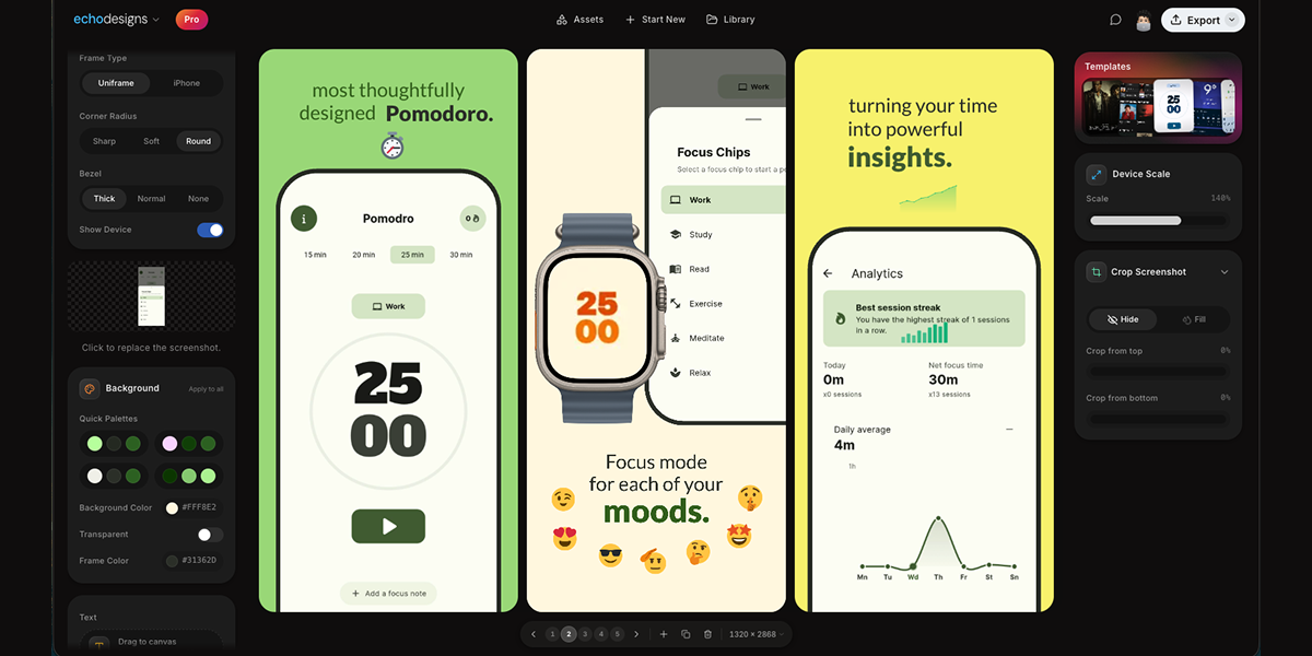
appdesigns is a free, in-browser editor for making App Store and Google Play screenshots. It is aimed at people who need to create app listing visuals, including app developers, designers, and marketers. The product's stated purpose is to help users design amazing app screenshots completely free. Users can drop in their screens, frame them in device mockups, add headlines, backgrounds and stickers, and export at the exact sizes App Store Connect asks for. The website emphasizes that no account is needed, there is no watermark, and exports are unlimited. The editor is accessed through appdesigns.click and is described as needing a laptop-sized window. The Product Hunt tagline says Design amazing appstore screenshots for free. The problem context is stated directly: many screenshot tools are free to start but then impose limits. appdesigns positions itself as truly free, not free to start. It highlights unlimited exports, no watermark, and no account required. This matters for app developers and teams preparing store listings because screenshots are a required part of presenting an app on the App Store and Google Play. The product removes sign-up friction and export restrictions, while keeping the creation process inside the browser. The metadata description says Make App Store and Google Play screenshots in your browser. Truly free, not free to start: unlimited exports, no watermark, no account required. The website also says support is appreciated but never required, reinforcing that the tool does not require payment to use its stated core capabilities. Device framing is a core part of the editor. The Device section lists Mobile, iPad, Mac, and Watch. Frame Type includes Uniframe and iPhone. Available device options include iPhone Duo, marked New; iPhone 18 Pro, marked New; iPhone 18 Pro Max, marked New; iPhone 17 Pro Max; and three more. Users can choose Portrait or Landscape orientation. There is a Show Device toggle, which lets users decide whether the device frame is visible. The product description also mentions framing screens in the latest iPhone, iPad or Mac. These options help users present screenshots in the context of real devices and match the type of app being shown. The Device section provides Mobile, iPad, Mac, and Watch options, while the Frame Type section offers Uniframe and iPhone choices. Uploading and customizing the screenshot content happens on the canvas. Users upload a screenshot, and the interface includes a Background section with Apply to all, Background Color, and Transparent. The background color example shown is #FF512F, and Transparent is an available choice. Text can be added directly to the canvas; users can click or drag to place it, or press T to place text. The Text section includes an Add text control and instructions: Click or drag to the canvas. Press T to place. The canvas displays slides numbered 1, 2, and 3, along with a canvas size of 1242 × 2688. These controls support adding headlines and visual treatments to app screens before export. Templates and transformation tools help shape the overall screenshot set. The website displays a Templates section with template artwork that users can browse. The Product Hunt description states users can start from a community template. Scale & Tilt controls let users adjust device presentation; the interface shows Scale at 135% and Tilt at 0°. The interface shows Scale 135% and Tilt 0° as example values, with the ability to adjust scale and tilt. The product description says users can design the whole set side by side, tilt and scale devices, or start from a community template. This combination supports creating a coordinated group of screenshots rather than editing each image in isolation. The overall workflow is explained in three steps: 1 Upload your app screenshots, 2 Choose a device frame, 3 Customise and export. This straightforward approach is presented as the main method for using the editor. Users begin with their own app screens, select a frame from the available device options, then customise with backgrounds, text, templates, scale, and tilt before exporting. The editor runs in the browser and the website notes that the editor needs a laptop-sized window, with a prompt to copy the link for your laptop. This indicates the tool is used in a desktop or laptop browser environment. Exporting is aimed at the exact sizes App Store Connect asks for, and the free offer includes unlimited exports, no watermark, and no account needed to start. Benefits and outcomes stated or directly implied by the content include creating app screenshots for free and without an account. The product removes the need to sign up before starting, and it does not add a watermark to exports, according to the website and metadata. Unlimited exports mean users can produce as many screenshot files as their listing requires. The in-browser editor avoids a separate desktop installation. The three-step workflow and community templates provide a guided path for users who may not be professional designers. The product also supports every device, every size, and no account needed, as stated on the website. Concrete use cases include preparing App Store and Google Play listing screenshots. A developer can upload app screens, frame them in iPhone, iPad, Mac, or Watch device mockups, add headlines and backgrounds, and export at required sizes. A designer or marketer can create a consistent set of screenshots side by side, using templates and background colour changes applied to all. A user who wants a device mockup without signing up can open the editor in a laptop browser, upload a screenshot, choose a frame such as iPhone 18 Pro or iPad, add text, and export. The editor also shows slides numbered 1, 2, and 3, which supports working with multiple screens in one session. The target users are app developers, designers, marketers, and teams who need store listing visuals. The product is designed for users who want a free, browser-based screenshot editor with no account required, no watermark, and unlimited exports. It supports Mobile, iPad, Mac, and Watch device frames and references exact export sizes for App Store Connect. Because the website states the editor needs a laptop-sized window, it is intended for use on a laptop or desktop browser rather than on a mobile phone. The website mentions support is appreciated, never required, but does not present it as a mandatory part of using the free editor. No pricing tiers, paid plans, or subscription details are stated; the pricing model is free. In summary, appdesigns is a free in-browser tool for making App Store and Google Play screenshots. It combines device frames, background controls, text, community templates, and scale and tilt adjustments with a simple upload, frame, customise, and export workflow. Its primary value proposition is stated clearly: amazing app screenshots for free, with no account, no watermark, and unlimited exports.
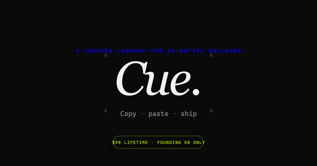
Cue is an Awwwards-tier UI component library for anyone building to stand out. It gathers best-in-class components from across the internet and curates them by hand, offering bold hero sections, smooth interactions, unique layouts and thoughtful micro-animations that help teams ship websites that do not just work but stand out. Cue is made not only for AI builders but also for designers, developers, agencies, solo makers and product teams who refuse to ship generic-looking work. It describes itself simply as the taste layer on top of the tools people already use, and today every component ships with an AI prompt so users can recreate what they see inside their own projects. The starting point for Cue is a familiar frustration: most component libraries, template packs and AI-generated interfaces look interchangeable, and shipping something distinctive usually means hours of reverse-engineering interactions spotted on award-winning sites. Cue approaches that problem from the opposite direction. Rather than generating components to fill a grid, the library is assembled from hand-picked references, sourced from an Awwwards Site of the Day, a Behance-featured interaction, or a production output the founder considered best-of-class. The editorial section describes the collection as the best web interactions from Awwwards, CollectUI and X, delivered together with the code and prompt needed to recreate them in your own project. The stated bar is taste, not volume: if a user finds a better reference for the same component, the founder replaces the existing item, so the catalogue keeps improving instead of merely growing. The library itself is organised around the building blocks of a high-end marketing site. Cue lists bold hero sections, smooth interactions, unique layouts and micro-animations, and the site exposes tags for sections and interactions alongside filters for new versus old entries. At the time of writing the library advertises 75+ components with daily drops, so the collection is presented as a growing, frequently refreshed catalogue rather than a fixed download. A dedicated Editorial stream highlights a new drop each day. An email signup lets visitors be notified when new components ship, described as no spam and unsubscribe anytime, and the founder states that every drop is hand-picked personally. What makes Cue unusual among reference galleries is that every component ships with an AI prompt. Those prompts are designed to be dropped straight into Bolt, v0, Cursor, Framer AI, ChatGPT or Claude, so instead of studying a screenshot and rebuilding an animation by hand, a user can hand the prompt to the AI tool they already work in and adapt the result to their own project. The free tier of Cue allows visitors to browse the whole library and copy two AI prompts every 24 hours, which lets people test the workflow before committing. Because the prompt travels with the component reference, the interaction and the implementation guidance stay together. Beyond prompts, Cue states that React source code and an MCP server are actively rolling out. The MCP server is described as giving native access from Cursor, Claude Desktop, or any MCP-aware AI tool, which means an assistant can reach the component library directly rather than relying on copy and paste. React source code targets the developers who want the underlying implementation rather than only a description. Together these additions move Cue from a browsable gallery toward a resource that plugs into the toolchain of AI-assisted development. Cue's positioning is deliberately narrow. It does not host projects, deploy code, or run an AI model of its own; it is the taste layer sitting on top of the tools people already use. It also states plainly what it is not: not a template pack, not a subscription, not a course, not an AI wrapper, and not a marketplace. Curation is done by founder Alok, a founder-designer who hand-picks every drop and describes the work as building the taste layer for AI components. Because access is offered as a one-time lifetime payment rather than a recurring fee, the emphasis stays on singular, vetted references instead of a constantly billed content feed. The promised outcome is straightforward: build less and create more. Teams that struggle to produce distinctive interfaces get a shortcut to the interactions and layouts that define award-winning sites, without spending days dissecting how they were built. Designers gain a curated reference library that reflects a single, consistent point of view rather than an unfiltered dump of community uploads. Developers get prompts and, as they roll out, React source and MCP access, which shortens the distance between seeing an interaction and shipping it. AI builders get a way to raise the visual quality of what their assistants generate. For solo makers and agencies, the appeal is the same: differentiate visually while keeping the existing toolchain. Concrete uses follow from the components on offer. A designer putting together a portfolio can browse hero sections and unique layouts for a starting point rather than a blank canvas. A developer building a landing page in React can copy a prompt, paste it into Cursor or v0, and adapt a micro-animation that would otherwise take hours to recreate. An agency can use Cue as a reference source when pitching or producing client work that needs to look handcrafted. A solo maker launching a product can pull in an interaction that lifts the site above a default template. Teams working inside Claude Desktop or another MCP-aware client can eventually reach the library natively. Community activity is part of the workflow too: a Discord invitation lets members pick the next drop, and the founder is directly reachable for questions or for hire. Cue is aimed at designers, developers, agencies, solo makers and product teams, as well as AI builders, who refuse to ship generic-looking work. Pricing is structured as a free tier plus one-time lifetime access. Free browsing includes the full library with two AI-prompt copies per 24 hours. Cue+ Founding Lifetime is USD $99 as a one-time payment, capped at the first 50 members. Cue+ Lifetime at the standard rate is USD $249 one-time after the founding tier sells out. Promotional pricing has been offered at $79 lifetime, and the site also mentions custom pricing where you pay only for the components you pick. Technically, Cue centres on AI prompts for Bolt, v0, Cursor, Framer AI, ChatGPT and Claude, with React source code and an MCP server rolling out. The takeaway is that Cue sells taste rather than volume. By hand-picking Awwwards-tier components and pairing each one with an AI prompt, and soon React source code and MCP access, it gives designers, developers and AI builders a faster route to interfaces that stand out, while staying a layer on top of the tools they already use.
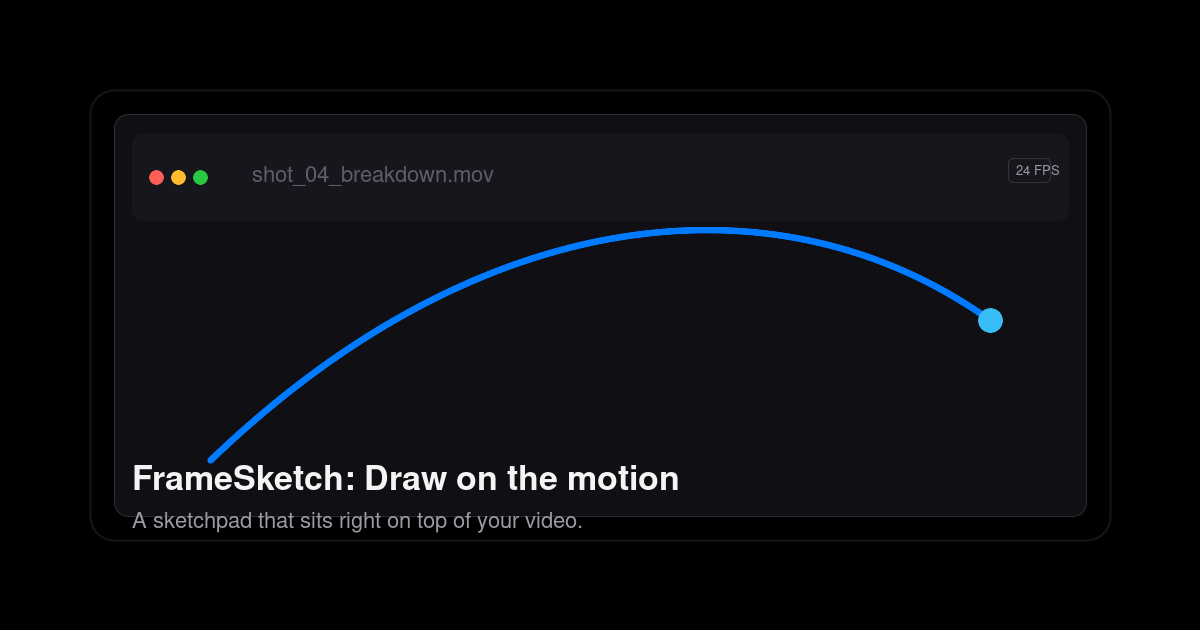
FrameSketch is a video annotation tool that lets you sketch right on top of your footage. It is built for animators, VFX artists, and motion designers who need to mark up arcs, poses, and breakdowns on moving images instead of describing them in words. You step through frames, draw over the canvas, and keep your lines exactly where you left them, then hand the result to whoever needs to see the shot. The site states the intent plainly: no uploads, no lag, just your lines exactly where you left them. FrameSketch runs in the browser at app.framesketch.xyz and is free to use. The problem the product addresses is the friction of reviewing and annotating motion. The site describes the alternative as animation-suite bloat: heavy software where you open a file, fight plugins, and juggle exports before you can get back to the shot. It also promises there is no export roulette and no timeline lag, which are the usual complaints when scrubbing footage and drawing over it in a general-purpose tool. The other half of the problem is privacy and waiting. Cloud-based annotation means uploading footage before anyone can mark it up; FrameSketch instead keeps everything on your machine, so your footage never leaves your device and cloud sync, when enabled, only carries annotations. For studios handling unreleased client work, that distinction matters. The drawing tools are organised around frame accuracy. Lines land on the exact frame, and you can step forward, step back, or scrub while the canvas never drifts from the video, so a mark you place on a frame stays on that frame. Onion skin lets you peek at the frames before and after and tune the ghosting until it feels right, which is how animators check spacing, timing, and the read of a pose. Strokes stay put: each line is fixed the moment you lift the pen, so your marks stay exactly as drawn, frame after frame, without re-tracing as you move through the timeline. The brush setup is described as four pens and one palette, and the tool strip lists pressure-sensitive input. The page also shows a scrubber running from frame 0000 to frame 0144 as an example of stepping through a section of footage. The studio adds the tools a shot review normally needs, built in rather than bolted on. A frame-by-frame timeline lets you walk the footage frame by frame, mark a stretch of it, and play just that range on a loop, which is useful when a single cycle or transition needs repeated scrutiny. Layers let you stack strokes, shapes, and notes on real layers, then reorder them, hide them, and dial in each layer's opacity, which keeps a busy annotation from turning into one inseparable mess. Notes and comments appear as sticky notes and comment markers pinned right on the frame; you can move, resize, recolor, and edit them at any time, so feedback stays attached to the exact moment it refers to. Alignment and navigation tools help you place marks precisely. Grid, rulers, and guides offer rectangular or isometric grids drawn as dots or lines, and you can drag guides out of the rulers to line your marks up where you need them. Pan and zoom let you zoom into the detail and move around the shot while your marks stay exactly where you left them. Scenes and backgrounds support one project with many scenes, and every scene sits on a solid background layer, so you can hide or dim the video whenever you want to see your own drawn lines without the footage competing for attention. The welcome screen rounds this out with recent projects one click away, described as an escape from project browser rabbit holes. Underneath, FrameSketch takes a local-first approach. It runs entirely on your machine; cloud sync is optional and, when switched on, only carries annotations rather than media, and you can turn it off so everything stays local. Projects are saved as a single small .fsk file that holds every stroke; the site says a whole project is a few hundred kilobytes, small enough to email, stash, or version. Because the file is that light, sharing a review does not mean exporting video or uploading anything: you send the .fsk, the other person opens it, and they can keep going. The app reads video files straight from your machine and re-encodes nothing. The file picker only lists what your platform can really play: MP4 with H.264 in an MP4 container is recommended and plays on every platform, browser and desktop; MOV is a QuickTime container whose H.264 content plays everywhere; M4V shares the same H.264 core as MP4; and WebM uses the open VP8/VP9 codec, playing on Windows, Linux, and Chromium, though on macOS MP4 or MOV is advised. Anything else can be converted once to H.264 MP4 and it will play anywhere. The product is described as working in the browser with web and PWA support, and desktop apps for Windows and Linux are coming soon. The practical benefits follow from those choices. Privacy is the headline: your footage never uploads, so confidential or unreleased material stays on your own device while you still get optional sync for annotations. Speed is the second: drawing at 60fps and a frame-accurate canvas that never drifts means marking up a shot feels immediate rather than waiting on a round trip to a server. Small project files make collaboration cheap, since emailing a few hundred kilobytes and versioning it like any other small asset is far easier than moving video around. And because the tool deliberately avoids suite-level complexity, time to first mark is short; the site claims your first arc takes about ten seconds. Concrete workflows the tool is built around include animating arcs and poses over reference footage: load a shot, step to a frame, and draw the arc, breakdown, or pose directly on the picture. Shot review is another: pin sticky notes and comment markers to specific frames, then send the project to a colleague or director who can open it and add to it. Timing and spacing checks lean on onion skin, letting you compare neighbouring frames with adjustable ghosting to judge how a movement reads. Aligning marks to a layout uses the grids and rulers, whether rectangular or isometric. Privacy-sensitive work benefits from the local-first model, since client footage never needs to be uploaded. And because a project travels as one .fsk file, remote collaboration is as simple as emailing an attachment and continuing where the other person left off. FrameSketch is aimed at animators, VFX artists, and motion designers, the people who think about motion frame by frame, and its marketing addresses animators directly. It is available as a web app and installable as a PWA at app.framesketch.xyz, with desktop apps for Windows and Linux listed as coming soon. Pricing is free to use, and the site reiterates that your footage never leaves your device. No plugins or additional software are needed for the core workflow, and the tool opens straight from the browser ready for you to draw. FrameSketch's value proposition is narrow and deliberate: annotate video the way animators actually think, frame by frame, on top of the footage, without uploading anything. Drop in a local file, draw arcs, breakdowns, and notes with tools like onion skin and frame-accurate stepping, share a tiny .fsk file with collaborators, and keep your footage private the entire time. It is a free, browser-based video annotation tool for animators, VFX artists, and motion designers who want to mark up motion quickly and get back to the shot.
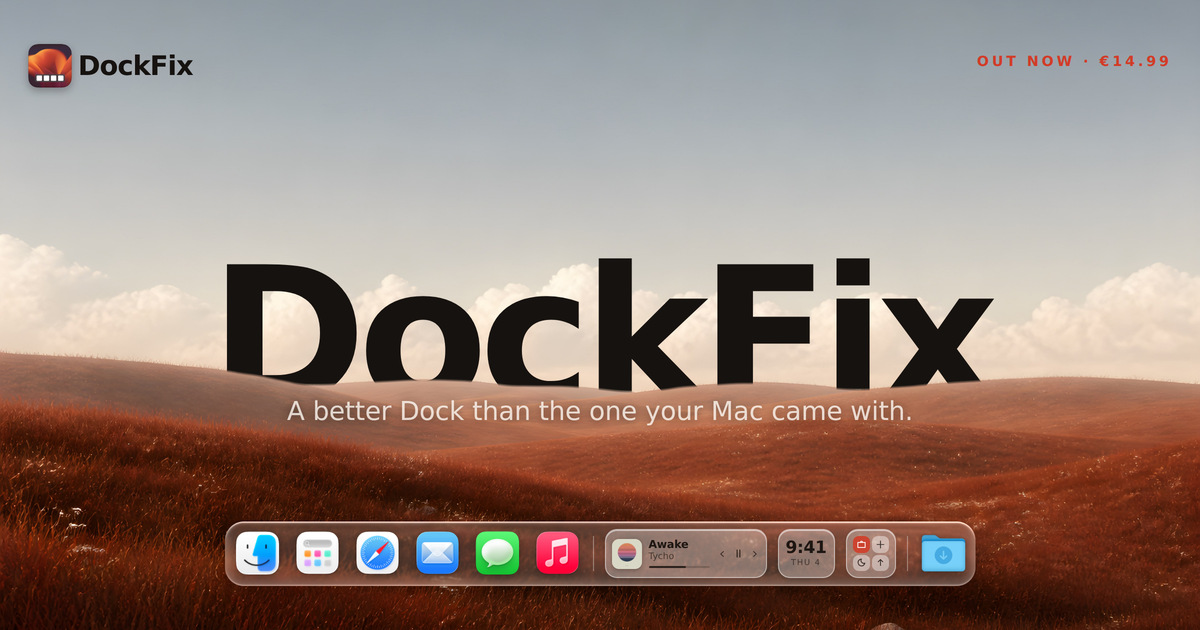
The macOS Dock does very little, and you cannot personalise any of it. DockFix replaces it with a dock you control completely, adding colours, opacity, size, position, animations, custom app icons, folders, website shortcuts, presets, a file shelf, widgets and window previews. It is built for macOS users who want their Dock to feel personal while still looking and behaving like it came with the Mac, and it runs on macOS 14 or later on both Apple silicon and Intel machines. DockFix exists for one reason, as founder Gustav Lübker of AppVerge puts it: the Dock that comes with your Mac is not yours. Apple designed it to be fast and reliable and then closed it, so you cannot personalise its colour, its icons, its animations, or much of what sits inside it. DockFix was built to hand all of that back to the user. The hard part, according to the founder, is that a dock you have made your own is only worth having if it still feels like part of macOS — the magnification has to carry the right weight, a window has to fold toward the corner it came from, and an icon has to appear the instant the app does. Miss any of that and people feel it straight away, even when they could not tell you what is wrong. Customisation is the core of the product. Colours, opacity, size, position, animations and icons can all be configured to your likings, so the dock can match a wallpaper, a workflow or a mood. DockFix also supports folders, website shortcuts and presets, meaning items can be grouped, a site can be pinned to the dock, and a complete configuration can be saved and reapplied. Community presets take this further: a theme can be applied instantly with one click, and the site points to a Community Docks gallery at dockfix.app/discover where users share the setups they have built. Custom app icons let you apply your own artwork to any app on the system, including the native apps macOS will not otherwise let you touch. That means Finder, Launchpad, Safari, Mail and the rest can be redrawn to match a theme rather than being locked to Apple's originals. For anyone who cares about visual consistency across the desktop, this removes the last element that Apple's closed Dock design left unchangeable, and it works app by app rather than as an all-or-nothing switch. Widgets place useful information and quick controls directly in the dock itself. The site names media playback, the clock and shortcuts as examples, so a now-playing panel, a time display and quick actions can live in the same strip as your apps and folders, available wherever you are. Because they sit in the dock rather than in a separate window or the menu bar, they stay within reach without adding another place to look, and they are described as useful information and quick controls in one place. Window previews are billed as the most requested feature. Hovering over an app shows its open windows live, and you can jump straight to the one you want instead of cycling through them one by one. That turns the dock into a way of navigating open work rather than only launching it. The rebuild also delivered a completely new interface, designed from the ground up to be modern and intuitive, alongside a new engine. DockFix's custom dock is built to look and animate exactly like the system dock straight out of the box, with the same magnification and true liquid glass, so customisation does not come at the cost of the feel people expect from macOS. The current release is a ground-up rebuild rather than an update layered on the old app. Every part of DockFix was rebuilt: a new engine, a new interface, and a dock that looks and behaves like it came with your Mac, with every bit of customisation that existed before still present and a great deal more added. The founder notes that the team stopped adding to what they had and rebuilt the app from nothing, with no line of the old code left in place, because a rewrite is not something you can do halfway. The result is a dock that moves like Apple's and then does what Apple's will not, without any of it feeling bolted on. Performance is treated as a feature rather than an afterthought: the new version uses under one percent CPU on average, and it runs on both Apple silicon and Intel Macs running macOS 14 or later. DockFix requires no special permissions and never asks you to disable System Integrity Protection. While it runs it hides the system Dock and restores it when you quit, so nothing on the system is changed permanently. On privacy, the site states plainly that there is no tracking and no usage collection of any kind; the only data stored is your email address, kept to manage your licence and answer support requests. The outcome for users is a dock that feels personal without feeling foreign — Apple's speed and polish, but configured however you like, with the features Apple never added. Because DockFix keeps the same magnification and liquid glass appearance as the system dock, switching is not jarring; because it stays under one percent CPU on average, it is not something you have to worry about leaving running. Existing owners get the rebuilt version free, with the licence carrying over automatically and nothing to move or reactivate, so upgrading carries no risk, no extra cost and no configuration work. In practice, DockFix suits a range of everyday workflows. A user who wants a dock that matches a wallpaper or a desktop theme can set colours, opacity, size and position, then apply a community preset in one click rather than rebuilding the look by hand. Someone working with many open windows can hover over an app, see those windows live and jump straight to the one they need. Anyone who keeps media playing can leave playback controls and the clock in the dock itself. Users who dislike Apple's default icons can apply their own artwork to the native apps macOS usually locks down, and people who keep files or links close at hand can use the file shelf, folders and website shortcuts. Students get 30% off, and anyone with an older licence simply updates to the new version at no cost. DockFix is aimed at macOS users on macOS 14 or later, on Apple silicon and Intel machines, who want to personalise the Dock beyond what Apple allows. It is a paid desktop app priced at €14.99, paid once and used forever, with no subscription. Every purchase comes with a seven-day free trial with every feature unlocked and no card required, and settings carry over if you buy during or after the trial. There is a 30% discount for enrolled students. Support is available through the support page and a Discord server, where the site says most questions are answered within a day, and a lost licence key can be recovered from inside the app. The new version is free for anyone who already owns DockFix. Taken together, DockFix is a macOS Dock replacement built around one idea: the dock that ships with your Mac is not yours, and it should be. By rebuilding the app from nothing — new engine, new interface — AppVerge delivered a dock that looks and animates like Apple's, keeps the magnification and liquid glass feel intact, and then adds everything Apple's Dock will not do: window previews, widgets, custom icons, folders, presets and the file shelf. For €14.99 once, with a free seven-day trial and a free upgrade for existing owners, it offers a fully customisable dock that stays light, safe and private.
GLYPH Immersive is a free browser-based tool for drawing modular grid letterforms and shapes. You paint rounded-pixel forms onto an adjustable grid and control spacing, corners, and edges directly, then export your work for free. It is built for anyone who wants to construct letters and geometric artwork from elementary parts — type designers, graphic designers, letterers, artists, and students. No signup is required; the whole tool runs in the browser. It also includes a beta type tool for turning painted characters into a basic OTF font, and a reference system for placing a photo behind or inside your grid. GLYPH Immersive sits at the end of a long history of grids. Long before the digital pixel — earlier even than the concept of design — humans used math to create precise guides for art, architecture, and the page. Weaving, tiling, and writing were the foundation for humankind's earliest grids: Andean weavers encoded modular symbols across bands of textiles, Ibn Muqla proportioned Arabic script using rhombic dots, kolam artists built patterns across fields of points, and Hangul assembled circles, squares, and lines into 1:1 blocks. Later, Bauhaus stripped design to those same elementary parts, with Anni Albers crediting Andean weavers as her teachers. The early digital age relied on this foundation, using pixels to create efficient symbols on tiny screens, and that era's constraints and possibilities inspired New Alphabet by Wim Crouwel, Reticuláreas by Gego, Lance Wyman's Huichol-inspired Mexico 68, and Waldemar Cordeiro's computer art. GLYPH Immersive presents itself as a simple space that balances possibility with constraint, encouraging experimentation, play, and reflection about the systems we inherit, no matter how basic they may seem. At the center of GLYPH Immersive is a grid you paint on. You click or drag to paint cells, and Shift+click fills a line between two cells, which makes it fast to lay down a straight run of pixels. Joints follow a three-step cycle: the first click fills and joins a cell, the second click removes joints, and the third click resets the cell. Because the letterforms are drawn as rounded pixels rather than freeform curves, the results stay modular and systematic. A Detail control and an Invert option sit at the top of the interface for refining how the artwork reads, and a Clear board action wipes the surface when you want to start fresh. The control menu adjusts the artwork while the guide menu controls the artboard, keeping the drawing separate from its underlying structure. The guide menu controls the artboard. You can set Width, Height, and Spacing, add guides, and define a typographic layout with a font name, columns, gutter, rows, and gutter. Guide display options cover Grid, Dots, and Vertex modes, and a GuideView entry opens the Settings & Guide panel. Navigation is deliberately lightweight: scroll or two-finger drag to pan, pinch or use the Zoom slider to zoom, and drag to move or use corners to scale. A percentage readout tracks zoom, and a Preview Type option lets you check type output before exporting. Corners and Edges controls shape how letterforms and shapes are finished, which matters when you are working with rounded pixels instead of hard squares. When a design is finished, GLYPH Immersive exports it as SVG, PNG, JPG, ASCII MAP, or TYPE. The TYPE export is only available when Create type is on. The GLYPH Type Tool is described as a simple way to create your own font: each labeled green box is one character, covering A–Z, digits, and punctuation. You adjust the guides to change width, height, and spacing, then paint within the boxes to create each letter. When you are happy with your glyphs, you download TYPE to export a basic OTF you can install and try. The type tool is marked beta in the interface, and the workflow stays inside the same grid you use for everything else, so letterforms, spacing decisions, and the grid they sit on are all visible at once. GLYPH Immersive also supports working from existing imagery. You insert a photo, place it, and then choose Save as reference for a soft overlay behind your grid or Save as dots to convert it into editable grid art. Color in the guide menu cycles fill and background modes, so you can flip between painting the form and painting the ground. Wander plays a calm loop of designs, which makes the tool usable as a passive display as well as an editor. A Sound setting and a Language setting, which includes EN and ES, appear in the guide menu. The project is an open source resource by Kate Ander, with questions, ideas, and bugs directed to a dedicated email address, and an optional newsletter for occasional notes on GLYPH and new work. GLYPH Immersive's approach is deliberately reductive. Everything is built from elementary parts arranged on an adjustable grid, and the tool keeps possibility and constraint in balance rather than offering unlimited freeform control. The site notes that technology has continued to present new possibilities while at times numbing life's necessary friction — the constraints and discomfort that produce great art and ideas — and positions GLYPH as a simple counterweight to that. It runs in the browser with no signup, so nothing stands between an idea and the canvas, and the full workflow, from painting a first cell to exporting an OTF, an SVG, or an ASCII map, happens in one place. By naming the weaving, calligraphy, kolam, Hangul, and Bauhaus traditions that its grid logic descends from, it also treats the interface itself as a way of reflecting on inherited systems. The benefits follow directly from that design. Because export is free and no account is needed, you can move from experiment to finished file without friction — an SVG or PNG for further design work in another program, a JPG for quick sharing, an ASCII MAP for text-based environments, or a basic OTF font you can install and try out. Adjustable width, height, and spacing give you consistent control over rhythm across a whole set of letterforms, and separate corners and edges controls let you vary the finish without redrawing anything. The three-step joint cycle and line-fill shortcut make drawing fast enough to stay playful, which supports the experimentation and reflection the tool is built around. Concrete uses follow the tool's structure. A type designer or letterer can draw a modular alphabet cell by cell, tuning spacing and corners until the set reads consistently, then turn it into a basic OTF with Create type. An illustrator can place a photo, save it as dots, and repaint it as grid art, or keep it as a soft reference underneath while drawing. A student or teacher exploring grid systems can use the guide menu to change columns, gutters, and rows and see how proportion affects a form. Wander turns the board into a calm loop of designs, and exports cover SVG, PNG, JPG, and ASCII MAP for whatever the finished piece is headed toward. GLYPH Immersive is aimed at designers, type designers, letterers, artists, and students — anyone working with modular letterforms, symbols, or grid-based composition, from first experiments to finished artwork. It is free, runs in the browser, and requires no signup, so there is no cost or account barrier to trying it. The site presents it as an open source resource by Kate Ander, with copyright noted as 2026, contact by email for questions, ideas, and bugs, and an optional newsletter for occasional updates about GLYPH and new work. Beyond the browser itself, no specific frameworks, integrations, or third-party services are named in the content. Taken together, GLYPH Immersive is a free, no-signup workspace for building letters and shapes from rounded pixels on an adjustable grid, with fine control over spacing, corners, and edges. It pairs a fast paint-style drawing surface with a beta type tool that exports an installable OTF and a range of image and ASCII exports, making it equally useful for quick experiments and finished modular lettering work.
Design Studio by Monday Merch is a browser-based canvas that lets anyone design custom merchandise directly onto the product they are ordering. It brings together more than 1,000 products—from Premium T-Shirts, Premium Polos, hoodies and caps to drinkware like the Sleek Bottle and Dopper Original, tote bags, mugs, pens and jackets—inside a single design environment. Instead of designing artwork in one tool and then guessing how it will look on a finished item, you place your logo, artwork or text straight onto the product, viewing it from every angle in 2D, with selected products also available in 3D. The tool is meant for anyone who needs to produce branded or custom merch, including teams, businesses and individuals, and it is free to use with no design skills needed. Traditionally, creating branded merchandise is a fragmented, error-prone process. A designer might prepare artwork in a separate graphics program, then hand it off to a printer, only to discover that the placement, size or format does not match the product's printing requirements. Colour choices, print areas and production rules often live outside the design tool, which means a design can look right on screen but fail in production. Design Studio addresses this by keeping the design and the production requirements in the same place, so what you create is grounded in the realities of the product you are ordering. It aims to reduce the back-and-forth between design and production and to make merch design accessible to people who are not professional designers. The backbone of Design Studio is its catalogue of product templates. The platform offers over 1,000 products, organised so that you can browse and start from a template. Featured examples include the Premium T-Shirt, Premium Polo, Unstructured 6 Panel Cap, Structured 5 Panel Cap, Vintage Low Profile Cap, Dad Cap, Classic Hoodie, Premium Hoodie, Classic Sweatshirt, Fleece Zipper Jacket, Columbia Men's Full Zip Fleece Jacket, Heavyweight Oversized T-Shirt, Lightweight T-Shirt, Classic T-Shirt and Premium Women's T-Shirt, alongside drinkware such as the Sleek Bottle (500 ml), the Dopper Original (450 ml) and the Ceramic Glazed Mug, plus the Stainless Camp Mug, Dual Color Shopper Tote and Contemporary Pen. Each template can be opened directly with a "Design Now" action, so you can begin placing your artwork onto a realistic product view. Products are grouped into categories such as Apparel, Bags, Drinkware, Office, Packaging, Stickers & Print, Tech and Events, making it easier to find the right blank item for a given project. Beyond product templates, Design Studio also provides a library of print templates for paper-based and printed items. These include Christmas cards such as the Merry & Mint Xmas Card and Santa Xmas Card, thank-you cards, invitation cards like the Wax Seal Invitation Card, event materials such as the Running Event Flyer, posters such as the Good Vibes Poster, the Office Values Poster and the Mental Health Awareness Poster, menu cards such as the Alcohol Menu Card, and guides like the Recipe How To Guide Flyer. Print templates make it possible to design a broader range of collateral—everything from cards and flyers to posters—inside the same environment you use to design physical merchandise, so a single brand look can be applied across apparel, drinkware and printed materials. Design Studio includes several features that streamline the design process. You can add your brand hub with a click, which lets you create designs instantly using your own brand assets, so you do not have to rebuild your logo or colours from scratch each time. You design straight on the product, with every angle available in 2D and selected products also available in 3D, which helps you understand how the finished item will look from different viewpoints. The price is shown while you design, so you can see the cost implications of your choices as you make them. Printing rules and requirements are baked into the tool, meaning the designs you create are set up to be ready for production. And you can easily share and collaborate, which supports team workflows around a design. The core approach of Design Studio is to collapse the gap between designing and producing. Rather than treating design as an abstract exercise, it treats the product as the canvas. You choose a product template, then place your logo, artwork or text straight onto the product you are ordering. Because printing rules and requirements are built in, the tool guides your design toward something that can actually be manufactured, reducing the risk of a design that looks good but cannot be printed. The combination of a large product catalogue, brand hub assets, multi-angle viewing, live pricing and sharing tools means the entire journey—from idea to a production-ready design—happens in one browser-based workspace. For users, these capabilities translate into practical benefits. Because no design skills are needed and the tool is free to use, designing custom merch becomes accessible to people without a design background. Seeing the price while you design gives you immediate feedback on budget, helping you make informed choices about products and design details. The built-in printing rules and requirements reduce the chance of production errors, and the ability to design straight onto the product gives a realistic preview rather than a guess. Sharing and collaboration features make it easier to work with teammates or stakeholders, and the option to add a brand hub with a click speeds up the creation of on-brand designs. Design Studio supports a range of concrete scenarios. A company can design branded apparel and drinkware for its team, using product templates like the Premium T-Shirt, Classic Hoodie or Ceramic Glazed Mug and applying its brand hub assets. An individual or small business can create custom merch for sale, starting from a template and placing artwork directly onto a chosen product. A team can prepare printed materials such as Christmas cards, thank-you cards, invitation cards, flyers or posters using the print templates. Event organisers can design event-related items, given the Events category and templates like the Running Event Flyer. Because designs can be shared and collaborated on, multiple stakeholders can review and refine a design before it goes to production. Design Studio is designed for anyone who needs to create custom merchandise or printed materials without deep design expertise. Its categories—Apparel, Bags, Drinkware, Office, Packaging, Stickers & Print, Tech and Events—suggest users ranging from businesses and teams producing branded goods to individuals creating personal or resale items. The tool is free to use, and it runs in the browser. The website also presents country and language options, indicating availability across regions with multiple languages. The exact tech stack and third-party integrations are not specified in the available content. In summary, Design Studio by Monday Merch turns the browser into a merch design workspace where over 1,000 products serve as the canvas. By letting you design straight onto the product, add your brand hub with a click, see the price as you work, and rely on built-in printing rules, it aims to make every design ready for production while remaining free and accessible to non-designers. With product templates, print templates, multi-angle 2D and 3D viewing, and easy sharing and collaboration, it positions itself as "Figma, but for creating real products."
sizeless is an AI-powered documentation platform for civil engineering that turns a smartphone video of an open trench into the deliverables utilities and contractors are legally required to produce: a 3D model, CAD/BIM plans, and the quantities they bill from. It is built for network operators and construction teams working on civil engineering, district heating, and house connections who need precise 3D twins of open trenches and house connections delivered directly for GIS and CAD. The platform pairs a guided iPhone Pro capture app called SiteScan with processing that generates high-resolution 3D reconstructions, industry-standard as-built plans, and GIS-ready digital twins, so that a single scan produces every output a team already works with. The problem sizeless addresses is the gap between how fast underground infrastructure is built and how slowly it is documented. Producing compliant as-built documentation has traditionally taken months and required a surveyor, which means trenches must either stay open or be revisited, crews wait for separate surveying appointments, and the final record is assembled from manual sketches that end up in disconnected data silos. Because documentation lags behind construction, billing and cash flow slow down, and construction errors can go unnoticed until they are buried under backfill. sizeless moves documentation into the moment of excavation: the existing project team films the open trench themselves, and the required outputs are generated from that single capture, in hours rather than months. The workflow begins with trench capture. Using a standardized capture process on an iPhone Pro directly at the excavation, the existing project team records the open trench. No special hardware is required and no extra appointments have to be scheduled, which means documentation starts while the trench is still open rather than in a later, separate surveying visit. Because capture is carried out by the people already on site, the process does not depend on specialists being available, and technicians can document house connections independently via smartphone. The same guided approach is used by the SiteScan iPhone app to capture properties, trenches, and technical rooms in minutes. From that captured video, algorithms developed at ETH Zurich generate a high-resolution 3D point cloud of the open trench that is centimeter-accurate. The point cloud is the objective basis for earthwork volumes, dimensions, and audit trails, giving teams a measurable 3D reconstruction of the scanned space instead of a hand-drawn approximation. The reconstruction is interactive, so users can rotate and zoom through it to inspect the captured geometry. This continuous 3D evidence also covers third-party utilities and house entries, and it works without GPS in basement areas, which keeps documentation complete in places where positioning signals are unavailable. The capture then converts into a 2D CAD as-built plan in DWG/DXF, the industry-standard format for revision documentation. In these plans, couplings and pipes are quickly identified and measurement extraction is simplified, so the as-built record can be handed to the processes and tools that already consume CAD drawings. Alongside the 2D plan, sizeless produces a 3D model and digital twin of the pipe route including house entries, with seamless integration into GIS systems for future-proof planning and maintenance. Together these outputs mean one capture yields a 3D point cloud, 2D CAD, and BIM/GIS deliverables ready to drop into existing tools. sizeless describes its approach as a four-step AI-powered workflow. Step one is trench capture at the excavation by the existing project team. Step two is the generation of a centimeter-accurate 3D point cloud using algorithms developed at ETH Zurich. Step three is the production of 2D CAD as-built plans in DWG/DXF for revision documentation. Step four is the 3D model and GIS output that represents the pipe route as a digital twin, including house entries. The differentiating idea is that no surveyor and no special hardware are needed: the documentation is filmed by the crew themselves and turned into compliant deliverables from a single scan, which is why sizeless can produce documentation in hours where the traditional route takes months. The benefits follow directly from that workflow. Trenches can be backfilled immediately after the video, with no waiting for separate surveying appointments, and complete documentation is available weeks earlier, which enables faster billing and cash flow. Documentation is described as quality-assured and audit-proof, because the continuous 3D evidence eliminates manual sketches and data silos and allows construction errors to be identified before backfilling. Process autonomy is another stated outcome: technicians document house connections independently with a smartphone, and existing internal or external teams can handle a higher project volume through more efficient workflows, without specialists. The headline references include 72-hour documentation, DWG/DXF outputs, instant backfill, iPhone Pro capture, GIS-ready data, and higher throughput. Concrete use cases include documenting open trenches for civil engineering and district heating projects, capturing house connections and house entries, documenting third-party utilities encountered in the trench, and scanning properties and technical rooms with the SiteScan iPhone app. Because the outputs include as-built plans and quantities, the documentation also feeds revision documentation and the measurement quantities that contractors bill from. For network operators, the resulting digital twin of the pipe route integrates into GIS systems to support future planning and maintenance of underground infrastructure. The primary audience is network operators, utilities, and contractors active in civil engineering, district heating, and house connections, along with the existing field teams and technicians who carry out the work on site. Documentation is available through the web platform at sizeless.co, where users can book a demo, request an in-person demo, or see the workflow in action, and through SiteScan, the sizeless iPhone app available on the App Store. sizeless was founded by engineers from ETH Zurich and UC Berkeley and is backed by Y Combinator, ETH Zurich, UC Berkeley, Cambridge, and MIT. In summary, sizeless replaces months of surveying and manual sketching with an AI-powered, video-first documentation workflow for underground infrastructure. A single smartphone scan of an open trench becomes a centimeter-accurate 3D point cloud, DWG/DXF as-built plans, and a GIS-ready digital twin of the pipe route, giving utilities and contractors audit-proof documentation, faster backfill, faster billing, and greater process autonomy without special hardware or specialist surveyors.