Category Focus/categories/analytics
Analytics AI Tools
Discover and compare the best analytics AI tools and software. Browse 115+ curated tools with reviews and rankings.
Projects tracked
115
Sort mode
RECENT
Page
3
Discover and compare the best analytics AI tools and software. Browse 115+ curated tools with reviews and rankings.
Projects tracked
115
Sort mode
RECENT
Page
3
Hookest is a searchable swipe file of viral video hooks — the opening seconds of short-form videos that make people stop scrolling. It gathers hooks from TikTok, Instagram Reels and YouTube Shorts and attaches real performance data to every clip, so creators, social media marketers and brands can study what has already worked instead of guessing. Users browse a library of hooks by keyword, caption or creator, filter by category, save the ones they want to study, and can connect that collection to Claude, ChatGPT or Gemini through MCP for deeper analysis. The site presents itself as a place to find 1000+ creative hook videos and trending hooks across the platforms where short-form video actually lives. Short-form video is decided in its opening seconds. Hookest's own FAQ defines a viral hook as the first 1–5 seconds of a video, or the opening line of a caption, designed to stop the scroll and grab attention instantly, and notes that hooks go viral when they trigger curiosity, emotion or controversy within the first three seconds. That is a very small window carrying a very large consequence, and the information creators need to fill it has traditionally been scattered across separate feeds, platforms and accounts. Raw view counts are a poor guide on their own: a high number tells you a video was seen, not whether its opening kept the promise it made. Add the fact that TikTok, Reels and Shorts each respond to different hook styles, and that trend hooks can shift within days, and the case for a structured, searchable record of proven hooks — with performance context attached — becomes clear. The centre of the product is the hook library. Users can search by keyword, caption or creator, or filter by one of 14 categories, and can sort results by newest to surface the trending hooks added today or by views to see what is already proven. Every hook in the library carries real performance numbers, so the decision about which opening to study is based on data rather than impression. The collection is organised around niches, with categories including Health, Food, Cars, Fashion, Beauty, Electronics, Technology, Business, Sports, Travel, Education, Music and Finance, and individual hooks are named for the visual device they use — Water Tank Splash, Saw To Supercar, Cream Splash, Mega Ramp Launch and Slow Motion Impact are examples from the library. Because the library is updated daily, it is meant to be a constantly refreshed source of hook ideas for Reels, Shorts and TikTok rather than a static archive. Saving a hook turns the library into a personal collection to review when planning content, and Hookest explicitly looks past raw view counts when it evaluates one. It asks whether the hook keeps its promise: the curiosity gap it opens, how relevant it is to its audience, and the direction it sets for the rest of the video. From there, users can connect Hookest to Claude, ChatGPT or Gemini through an MCP server and ask the assistant to break down any hook for them. The practical effect is that a saved hook stops being a bookmarked clip and becomes study material — why the opening worked, what it assumes about the viewer, and how the rest of the video pays off the promise the opening made. Two listening tools sit on top of the library. Competitor Listening lets a user add any Instagram competitor and receive a notification as soon as one of their posts starts going viral, so the format can be examined while it is still warm. Trend Radar delivers the week's new hooks to the inbox every Monday, limited to the categories the user chooses. Alongside these, Hookest publishes a weekly roundup of the viral hook videos gaining the fastest engagement across TikTok and Instagram, refreshed weekly precisely because trend hooks can shift within days, so users can spot a format before it peaks and adapt it into their own content early. The library also treats platforms separately rather than as one undifferentiated pool: TikTok hooks are described as leaning on fast cuts, sound-triggered openers and a first second that makes no sense until you keep watching; Instagram Reels hooks are described as caption-driven, with bold on-screen text and clean visual reveals where brands do particularly well; and YouTube Shorts hooks work best when they promise a specific result or reveal, so viewers stay for the payoff. Hookest's approach is to track the opening seconds of viral short-form videos and make them searchable, rather than serving a general feed of popular clips. Three ideas run through the product. The first is context: every hook is stored with performance data and judged on whether it kept its promise, not just on how many views it collected. The second is platform specificity: the same opening can stop the scroll on TikTok and fall flat on Reels or Shorts, so each platform is tracked separately and shown in terms of what its audience responds to in the first three seconds. The third is recency: the library, the weekly trending list and the Monday Trend Radar digest all assume that formats move fast. The site reports 2026 trend data drawn from 100 viral hooks tracked across niches, pointing to text-overlay hooks, transitional hook edits and niche-specific pain points such as relationships, money and fitness outperforming generic openers. For a user, the payoff is a shorter path from wondering what to post to a decision grounded in evidence. Instead of scrolling a feed and trying to remember what caught the eye, a creator can pull up proven openings in their own niche, see the numbers behind them, save the ones worth studying and understand why they worked. The FAQ suggests a workable method: pick a proven formula or clip, adapt it to your niche rather than copying it word for word, and test two or three variations. Competitor Listening and Trend Radar shorten the distance between a format appearing and the user noticing it, which matters when a trend can turn into yesterday's news within days. Hookest also reminds users that most transitional hook clips and hook video download templates are free to download and reuse, while advising them to check each clip's usage terms and avoid reposting someone else's original footage without modifying it into their own edit. In practice, Hookest fits several workflows. A creator planning next week's content opens the library, filters to their niche, sorts by views, saves a handful of hooks and adapts one into their own style. A marketer adds a competitor to Competitor Listening and waits for the notification that a post is taking off, then studies the opening while it is still building. Someone watching trends turns on Trend Radar to get the week's new hooks by email every Monday and checks the weekly trending roundup for formats gaining engagement fastest. A user who wants a deeper read saves a hook and asks Claude, ChatGPT or Gemini to break it down through MCP. And because each platform is tracked separately, users comparing TikTok against Reels or Shorts can see how the same idea is executed differently and build the version for where it will actually be watched. Hookest is aimed at creators, social media marketers, brands and content teams who publish on TikTok, Instagram Reels and YouTube Shorts, and who would rather plan around proven formats than post blind. Its most notable integration is the MCP server, which connects the saved hook collection to Claude, ChatGPT or Gemini. The product runs on the web, and the site exposes an English interface with alternate locales listed for Turkish, German, French and Spanish. Its categories let users work inside a specific niche — Health, Food, Cars, Fashion, Beauty, Electronics, Technology, Business, Sports, Travel, Education, Music or Finance — while platform separation supports teams comparing hook styles across networks. No pricing details are stated on the site beyond the note that most transitional hook clips and download templates are free to reuse, subject to each clip's usage terms. Taken together, Hookest treats the first few seconds of a short-form video as the thing worth studying, and it gives users the tools to study them properly. A searchable library of hooks with real performance data answers what is working; the evaluation model and MCP analysis answer why; Competitor Listening and Trend Radar answer what to watch next; and platform-specific tracking answers where a hook will land. For anyone whose growth depends on stopping the scroll on TikTok, Instagram Reels or YouTube Shorts, that combination turns a vague instinct about hooks into a repeatable, evidence-based part of content planning.
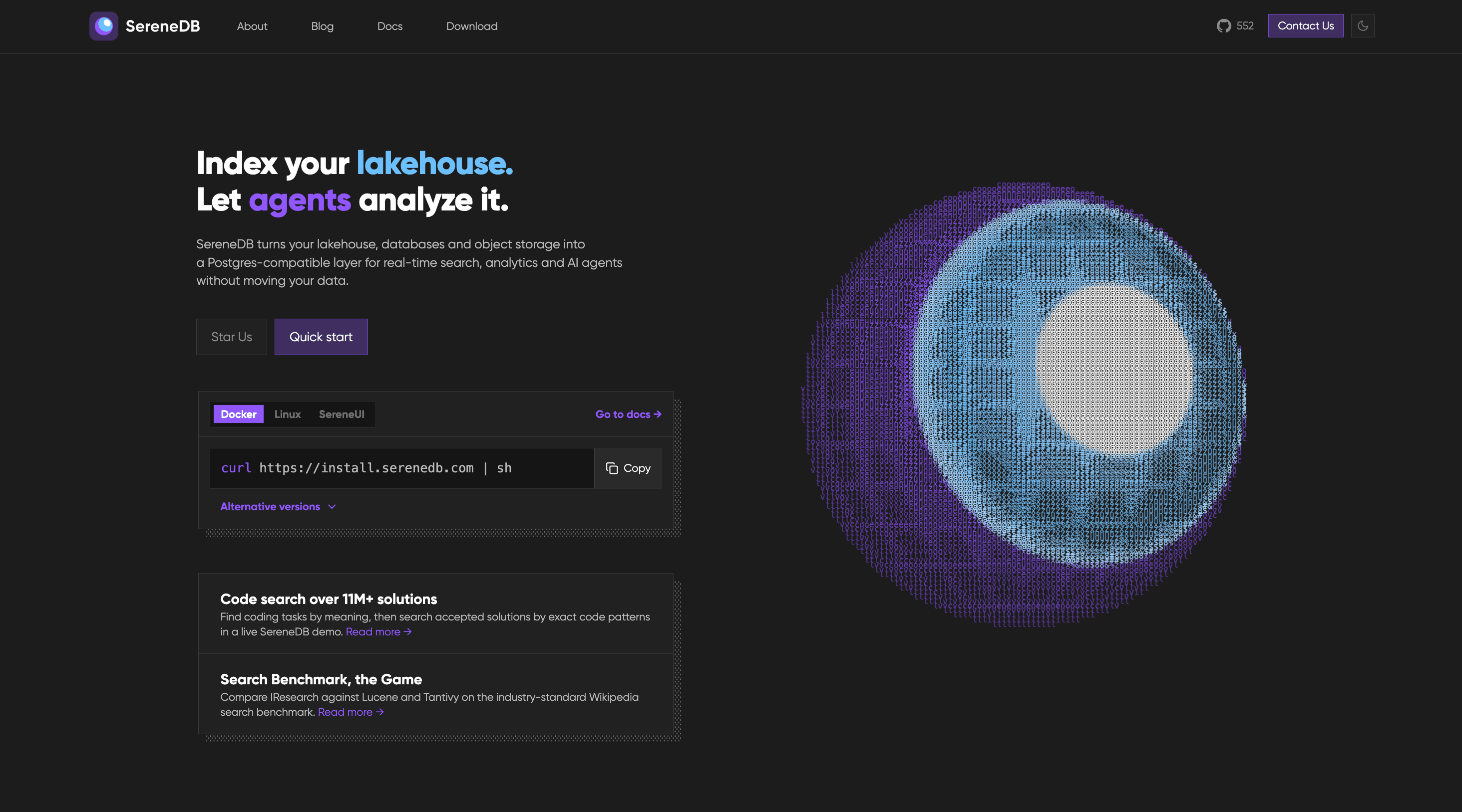
SereneDB is an open-source database that combines ultra-fast full-text search with fast analytics in a single engine. Its website describes it as a real-time search analytics database with full-text, vector and hybrid search, SQL execution, and a PostgreSQL-compatible frontend. The project presents itself as the result of twelve years of development, and it is aimed at teams that need search and analytics over the same data instead of operating separate systems for each. SereneDB also describes itself as Agentic AI ready, placing AI agent workloads, retrieval-augmented generation, and documentation search alongside classic search and analytical queries. The problem SereneDB targets is a familiar one for engineering teams: search and analytics usually live in different systems, which means data has to be duplicated and kept in sync through ETL pipelines. SereneDB is both Postgres- and Elastic-compatible, so teams can keep their SQL, their drivers and their Elastic clients while dropping the second system and the ETL between them. The website captures this positioning with the phrase that your data stays where it is, emphasising that data can be queried in place rather than copied into yet another store. For organisations whose data keeps growing, that means fewer moving parts to operate, one set of compatibility guarantees to rely on, and no dedicated pipeline whose only job is to move the same records from one engine to another. On the search side, SereneDB provides full-text search with BM25 ranking over tables and files, so relevance-scored keyword search runs directly against relational data and file content rather than through a separate search cluster. Vector search is supported through ANN indexes that sit beside relational data, which means embeddings and structured records can be queried from the same system instead of being split between a vector store and a relational database. Hybrid search combines BM25 and vector scores in one query, which matters because lexical retrieval and semantic retrieval often disagree: keyword matching is precise but literal, while vector similarity captures meaning but can drift, and merging both scores in a single query lets a user get the benefits of each without reconciling two result sets by hand. SereneDB also describes Postgres search, letting users keep their existing drivers and their SQL while adding search capabilities on top. For analytics and data work, SereneDB offers real-time analytics that aggregate fresh data without a nightly job, so dashboards and reports can reflect current data rather than a batch that ran the previous evening. It is described as an OLAP database that performs columnar scans over billions of rows, which is the query pattern needed for large-scale aggregation. Search over a data lake lets users index object storage in place, and zero-ETL search lets queries run against remote sources where they live rather than migrating the data first. Together these capabilities mean the same engine can answer a relevance-ranked search request and a heavy analytical aggregation, including over data that was never copied into the database. For AI and agent workloads, SereneDB is presented as a database for AI agents, offering agent-ready SQL over every source it can reach. It is also positioned as a RAG database, acting as the retrieval layer for grounded answers in retrieval-augmented generation workflows, so that generated responses can be anchored in data the system actually stores and can query. A related use case is documentation search: searching over documentation and knowledge bases, which the project demonstrates on its own documentation through Serene Docs Search. The website references a LangChain integration on its blog, connecting the database to common AI application frameworks. Under the hood, SereneDB unifies search and analytics with a columnar engine, vectorized SQL execution, and hybrid storage behind a PostgreSQL-compatible frontend. That combination is what allows full-text, vector and hybrid search to coexist with SQL and analytical query patterns in one system rather than being stitched together from separate products. Benchmarks published by the project compare SereneDB against Elasticsearch, ClickHouse and PostgreSQL search extensions. The vendor states that SereneDB outperforms those alternatives and that it indexed one billion logs in under eight minutes using roughly ten times less disk. The methodology, the raw results and the source code are public, and the project is released under the Apache 2.0 licence, which means the performance claims can be inspected rather than taken on faith. The practical benefit for users is consolidation. Teams keep familiar SQL, drivers and Elastic clients while removing a second system and the ETL that connected it, so there is less infrastructure to run and less data movement to monitor. Search relevance, vector similarity and analytical aggregation no longer require three separate stacks, and the same data can serve keyword search, semantic search, dashboards and AI retrieval. Because data can stay where it is, in object storage or remote sources, teams can index and query in place instead of migrating data into a new silo. Real-time aggregation removes the dependency on nightly batch jobs, so answers reflect what is happening now, and the reported disk efficiency of the published indexing benchmark reduces the storage footprint that large log volumes otherwise demand. The website groups concrete use cases into three areas. Search covers full-text BM25 ranking over tables and files, vector search with ANN indexes beside relational data, hybrid search that merges BM25 and vector scores in one query, and Postgres search that preserves existing drivers and SQL. Analytics and data covers real-time analytics over fresh data without a nightly job, OLAP columnar scans over billions of rows, search over a data lake by indexing object storage in place, and zero-ETL search against remote sources. AI and agents covers using SereneDB as a database for AI agents with agent-ready SQL over every source, as a RAG retrieval layer for grounded answers, and as a documentation search engine over docs and knowledge bases. Published benchmark work includes 92 search and analytics queries over 100M, 1B and 10B OpenTelemetry logs on a single instance, along with comparisons against the Lucene world, namely Elasticsearch, OpenSearch and CrateDB, at 100M and 1B logs. SereneDB is built for developers, data teams and platform engineers who need search and analytics together. It is distributed as open source under Apache 2.0 and is listed on Product Hunt under the topics Open Source, Developer Tools, GitHub and Database. Installation options include Docker and Linux, along with a one-line shell installer, and SereneUI is referenced as a companion user interface. Compatibility is central to the product: a PostgreSQL-compatible frontend, support for existing Postgres drivers and SQL, and Elastic-compatible clients. A LangChain integration is referenced for AI workflows, and OpenTelemetry logs are the data set used in published benchmarks. The code is hosted on GitHub. Beyond the open-source licence, no pricing or plan details are described in the provided content. SereneDB's core promise is straightforward: ultra-fast full-text search and fast analytics in one open-source, PostgreSQL-compatible engine, so teams can keep their SQL, drivers and Elastic clients while removing a second system and the ETL between them. With a columnar engine, vectorized SQL execution, hybrid storage, BM25 full-text search, vector and hybrid search, in-place indexing of object storage and remote sources, and agent-ready SQL for RAG and AI workflows, it targets the consolidation of search, analytics and AI retrieval onto a single database.
Anomalo Analyst is a team of AI agents that monitor your data around the clock and give you insights on anything that is happening in the data and why it matters. It is designed for anyone who needs to stay current on what is shifting, breaking, or trending in their data without writing SQL queries, waiting on a dashboard refresh, or filing a ticket with the data team. Users connect a data warehouse or data lake, and Anomalo Analyst begins monitoring the tables they care about, delivering a continuous feed of trends, anomalies, and shifts. The product's promise is simple and direct: you just show up informed. The underlying problem Anomalo Analyst addresses is that data is complex, and being insightful should not be. Data changes every day, and in most organizations the responsibility for explaining those changes falls on a data team that is already stretched thin. Business users who need an answer typically have to write a query, wait for a dashboard, or open a ticket, which means they often only learn about an important change after someone else asks about it. Most AI tools put the burden on the user to go find the insight. Anomalo Analyst inverts that: it finds the insight for you, proactively, and delivers it before you know to ask. The first stage of how Anomalo Analyst works is detection. Statistical modeling, not LLMs, scans every table for meaningful changes. The examples given in the product documentation include new values that appeared, trends that reversed, and drift that occurred, among others. Rather than treating every fluctuation equally, Anomalo Analyst ranks every change with a magnitude score. That ranked, prioritized list of real changes is what the AI agent works from, which is why the output is not a raw alert but a considered finding. Using statistical modeling to scan the tables matters because it keeps detection grounded in the data itself, focusing attention on changes that are meaningful rather than simply noisy. Once changes have been ranked, an AI agent investigates them. It digs into historical context and writes an analyst-grade report revealing what happened, what the data shows, and why it matters. This is the step that turns a statistical signal into something a person can actually act on: the agent explains not only that a number moved, but the context around it. The result is described as a polished insight rather than a raw alert. The report format is deliberate, modeled on the kind of write-up a human analyst would produce, so that recipients can read it, understand it, and share it without needing to interpret a chart or run their own query. A dedicated verification agent then reads every report line by line and checks each claim against the data before it reaches the user. If a statement is not supported by the data, it gets caught and corrected rather than published. This verification step helps distinguish real business changes from broken data, and it exists specifically to catch hallucinations before they reach you. Delivery is proactive as well: Anomalo Analyst publishes an Insights Feed and a Digest to your homepage and your inbox, a news feed of everything meaningful that changed in your data, delivered without prompting. Because the digest is personalized and arrives automatically, users do not need to log in and check a tool every morning. Anomalo Analyst is designed to get smarter the more you use it. Users can give feedback when an insight was useful, or tell the product that they look at their data differently, and Anomalo Analyst saves that to memory, making every insight and conversation sharper over time. Getting started is also lightweight. You connect Anomalo Analyst to your warehouse and describe what you work on; the product finds the right tables and starts monitoring. If you have found something your manager or team should see, you can share any insight or analyst conversation with a link, and recipients can view it immediately after signing in with no warehouse access needed. The overall approach is a pipeline of specialized AI agents rather than a single chatbot. First, connect your data platform and select the tables you care about. Second, Anomalo Analyst analyses and profiles your tables automatically, then asks you a few quick questions to personalize your insights. Third, the Analyst learns from your data's history and watches your tables every day for meaningful changes, producing a continuous feed of trends, anomalies, and shifts delivered without queries or dashboards. Fourth, you can dive deeper into any change with follow-up questions and analyses in natural language. From signup to a first insight takes minutes, and the workflow continues as an ongoing monitoring relationship with your data rather than a one-off search. The benefits described are about knowing first and answering first. Instead of wondering what happened, users receive a personalized digest of what actually changed — the trends, anomalies, and shifts that matter to their work — so they can be the most insightful person on their team without logging in. Because insights are verified against the data, users spend less time chasing questionable numbers and more time acting on genuine business changes. Because follow-up questions happen in natural language, users do not need SQL skills to investigate a finding, and they do not need to file a ticket. And because insights can be shared by link, a single person's investigation can inform a manager or an entire team. Concrete use cases described in the content include connecting a data warehouse such as Snowflake, Databricks, or BigQuery and receiving insights about what is shifting, breaking, or trending in that data. A business user who notices an insight in the feed can ask a follow-up question in plain language rather than filing a ticket. A data team can rely on the detection and verification steps to distinguish a real business change from broken data before it is escalated. Someone preparing for a morning review can read the personalized digest instead of logging into a dashboard. And anyone who uncovers something important can share the insight or the analyst conversation with a colleague by link. Anomalo Analyst is aimed at people who need to stay informed about their data: the website describes its audience as data teams, and the product is trusted by data teams at companies including Aritzia, Atlassian, Block, Buzz, Discover, Equifax, Evidation, Faire, Fandom, HomeToGo, Lebara, and Notion. It is equally useful for business users who do not write SQL and do not want to wait on the data team. The monitored data platforms named in the content are Snowflake, Databricks, and BigQuery, connected as a data warehouse or data lake. The product is available on the web, with insights delivered to a homepage and an inbox, and a "Start for Free" call to action points to a signup at analyst.anomalo.com. The takeaway is straightforward: your data changes every day, and Anomalo Analyst makes sure you know about it. By combining statistical change detection, agent-written analyst reports, and independent verification, it turns constant data movement into a proactive feed of insights that arrive on your homepage and in your inbox. Follow-up questions in plain language replace queries and tickets, sharing replaces screenshots, and feedback makes the next insight sharper than the last. For teams who want to understand what is happening in their data before anyone thinks to ask, Anomalo Analyst is built to deliver just that.
Jevtown is a social network where people write and 10,000 AI personas read. You post a text, a listing, a product or a headline, and within seconds the town reacts: most scroll past, some like, repost, block, write to the seller or buy. The English-speaking town is described as having 10,002 residents, and the site also shows a saved example labelled "the Ukrainian residents", so posts are read by computed residents rather than by real people. Nothing about the product requires an account — the site states there is no sign-in — so a writer can move from typing a post to seeing reactions without creating a profile, connecting an account or publishing anything anywhere. The product positions itself as a way to find out how an audience responds to a piece of writing before that writing is released. Writing for an audience is usually a blind exercise. A headline, a second-hand listing or a product description goes live, and only afterwards does the writer learn whether people stopped, scrolled past, doubted it or bought — by which point the first impression has already been spent. Jevtown's stated purpose is to move that feedback loop in front of publication. The Product Hunt description puts the cost of finding out in concrete terms: a weak text dies for half a cent, so a failed test is cheap and private, while a text that earns approval reaches everyone in 14 seconds. For sellers in particular, the difference between a listing that reads as trustworthy and one that reads as a scam is often a matter of wording, and the site demonstrates that directly by showing one iPhone listing written two ways. The town is not a flat audience. A post starts with a small cohort — the description says the 600 residents it should matter to see it first. Only if more readers were glad than annoyed does it reach the next 1,500, and from there it can go on to the full town. That staged distribution is the core mechanic: the feed acts as a filter that must be earned, so a text that fails to please its first cohort stops there, while a text that lands keeps travelling. The site's own feed of sample runs shows the outcomes of that process as wave sizes — posts display 600, 2,100, 5,100, 10,001 and 10,002 people reached, with the largest waves attached to posts that collected far more glad reactions than sorry ones. The Product Hunt description summarises the fastest outcome: a good text reaches everyone in 14 seconds. Every run returns a breakdown that goes well beyond a like count. Jevtown reports who stopped, liked, reposted or blocked a post, sorted by interest, job, age, city and budget. Individual residents are shown with their first name and initial, age, job and city — for example a repost attributed to "Zoe, 20 · student, New York" or a purchase attributed to "Iryna, 37 · copywriter, Dnipro" — next to the action they took. The reaction vocabulary used across the site includes scrolled past, stopped, glad, reposted, sorry, wrote to the seller, smelled a scam, bought it and clicked, with headlines reported using stopped and clicked rather than glad and sorry. Because the numbers can be watched as they develop, the site offers a Replay control, and the public feed offers Latest and Travelled furthest views alongside a running total shown as 148 texts seen 260,005 times. For listings and products the feedback is qualitative as well as numeric. Jevtown surfaces the questions buyers would ask a listing first, and it separates out the residents who took commercial action. In the demonstration listing, 2,100 personas saw the post, 142 wrote to the seller and 6 smelled a scam, and the listing went into a second wave and reached 2,100 personas. A writer also chooses the visibility of a submission — to the public feed or by link only — and a post's text is capped at 2,000 characters, which keeps submissions the length of a real social post, a listing description or a headline. The same sample record shows how one iPhone listing was written two ways, the first version offering details and payment on inspection and the second demanding advance payment only, which makes the trust cost of wording visible in the reactions rather than in hindsight. Products can additionally be tested against price. The price ladder lets a writer enter several prices — the interface shows a set in ₴, $, € and £, allows naming a few and accepts another price — and everyone who stops at the product is asked for the highest of those prices they would pay. The result is a demand curve: how many buyers each price gets and which one earns the most. This is a distinct form of testing from the copy question above, because it tests the offer rather than the sentence, and it gives a product writer a way to compare price points using reactions from the same residents who read the post. The overall approach is simulation rather than publishing. Instead of putting a text in front of a real audience and waiting, Jevtown computes a fixed population of AI residents with their own interests, jobs, ages, cities and budgets, lets them read in waves, and reports their behaviour as a feed would. That design produces the two things the product leads with: a fast, cheap answer to whether a piece of writing works, and a demographic map of who it works for. The English-speaking town is given as 10,002 residents, a saved example is labelled "the Ukrainian residents", and persona cities shown on the site include Lviv, Dnipro, Zhytomyr, New York and Boston, with prices accepted in hryvnia, dollars, euros and pounds. Whether the submission is a text, a listing, a product or a headline, the reading, the wave logic and the reporting stay the same. The practical benefit is that a writer can see the shape of a reaction before it costs anything real. The Product Hunt description frames the value in terms of price and speed: a weak text dies for half a cent, and a good one reaches everyone in 14 seconds. Alongside that, the product answers questions a writer would otherwise have to guess at — who stopped rather than scrolled past, whether buyers would write to the seller, which residents were glad and which were sorry, which questions a listing invites first, and how demand shifts as a product's price changes. Because no sign-in is required, there is no setup cost to getting that answer, and because posts can be kept to a link, the test can stay private. Use cases are illustrated directly by the site's own feed. A seller testing a second-hand iPhone listing can compare a "details, pay on inspection" version against an "advance payment only" version and read how many personas wrote to the seller and how many smelled a scam. A marketer can post a headline and see how many residents stopped and how many clicked. A builder can post a product with a price ladder and see how many buyers each price attracts and which price earns the most. And any writer can post a plain text — the feed shows runs ranging from one-line posts to opinions, announcements and memes — and watch which wave it reaches, from 600 residents up to the full town. The product is aimed at people who write to be read: sellers and marketplace listers, marketers testing headlines and copy, builders describing products and price points, and writers posting text to a feed. Product Hunt lists Jevtown under Writing, Marketing and Artificial Intelligence, and the site's feed mixes English and Ukrainian content, with the English-speaking town singled out at 10,002 residents. The product's own pitch repeats the same core mechanics — computed residents, staged waves, reaction breakdowns, the questions buyers would ask first, and a demand curve over a price ladder — rather than any additional modules. Jevtown's core promise is simple to state and repeated throughout the site: publish a text, a listing, a product or a headline, and find out who in a town of 10,000 computed residents stopped, was glad, reposted, was sorry, wrote to the seller or bought, in seconds and without signing in. A weak text dies for half a cent; a good one reaches everyone in 14 seconds.
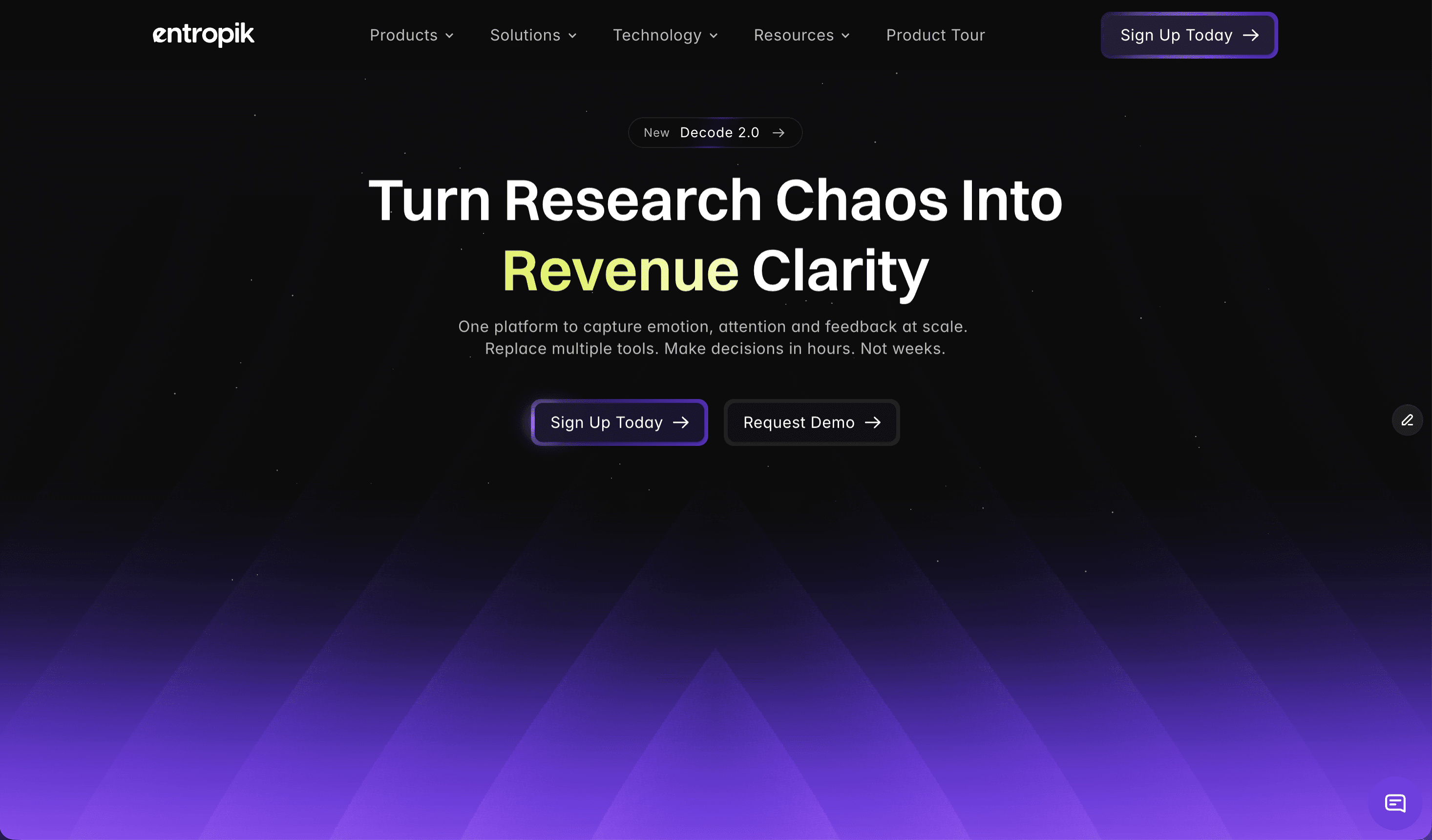
AI Creative Insights by Decode is a predictive creative testing platform built by Entropik, the team behind Decode. It allows teams to upload any ad, banner, out-of-home (OOH) unit, or video creative and predict how people will respond before the media budget goes live. Using Neuro AI, the platform predicts attention, emotion, and conversion impact, helping teams see which creative wins before they commit spend. Its stated promise is direct: predict creative winners before you spend. The platform is aimed at the people who build, test, and approve creative work, including marketing teams, advertising teams, research teams, product teams, and UX/design teams, all of whom need evidence rather than opinion when deciding which asset to launch. The problem the product addresses is spelled out on the site as a set of broken practices. Creative evaluation today is subjective and inconsistent, slow and difficult to scale, and it leads to inefficient media spend, limited insight depth, and difficulty comparing one creative against another. Decode counters each of those gaps directly: AI-led predictive creative evaluation replaces subjective judgement, instant AI-powered analysis replaces slow manual processes at scale, creatives are optimized before launch instead of after, creative performance scoring adds depth where insight was thin, and benchmarking against category norms makes comparison possible. The argument is that creatives should not be a gamble, and that data should lead the decision. Predictive Attention AI is the first of the four headline capabilities. It compares creatives and predicts attention, recall, and resonance before launch, so teams can test variations, forecast performance, benchmark against a category, and get second-by-second clarity on how an asset behaves. The purpose is to choose the version that drives maximum impact rather than the version that simply looks best in a review meeting. Because predictions are generated before media goes live, the decision point moves earlier in the process, when changes are still cheap and fast to make. Emotion Simulation is the second capability and focuses on how people actually feel while watching a creative. The platform visualizes emotional highs and lows second by second and uncovers what triggers engagement or drop-offs at specific moments. Teams can measure emotional response, track emotion flow, check brand safety, and connect emotion to intent. This matters because two creatives can hold attention equally yet produce very different feelings, and those feelings are what shape whether an audience stays engaged, remembers the brand, or acts. By mapping emotion across the timeline of an asset, teams can pinpoint exactly which seconds help or hurt the story. Visual Hierarchy Heatmaps are the third capability. They show where people look first and what catches or loses attention, allowing teams to optimize layouts, storytelling, and branding with evidence instead of assumptions. The stated outcomes include seeing where people look, ensuring message visibility, removing distractions, and comparing layouts against one another. For designers and creative directors, this turns subjective layout debates into concrete questions about which element earns the first fixation and which elements compete with the message. Prescriptive AI Suggestions complete the core set. Rather than only reporting scores, the platform provides actionable recommendations that tell teams exactly how to improve performance, explaining what to change, why it matters, and what impact it will drive. Teams can use these suggestions to get improvement recommendations, understand why performance changes, prioritize high impact changes, and build clearer briefs. This converts diagnostic data into a to-do list for the creative team, which is what makes the workflow from insight to revised asset practical. Synthetic Audience extends evaluation to specific groups of people. Teams build reusable synthetic audiences and apply them across every AI Creative Insights evaluation, then compare predictions persona by persona before spending on media. The page illustrates audience options such as Gen Z Shopper, Urban Professional, Family Buyer, and Value Buyer, each returning a predicted score along with attention, clarity, and CTA focus ratings. Scores are banded as strong fit (75+), moderate fit (55–74), or weak fit (below 55), giving an at-a-glance signal for whether a creative suits a given audience. Beneath these capabilities sits the intelligence layer. The site names Facial Expression Analysis, Eye Gaze Tracking, and Voice Emotion Analysis as the underlying technologies, describing the ability to capture real behavior and emotion, synthesize answers in minutes, and guide decisions with audit-ready proof. Deeper creative intelligence is organized into three groups. Attention Metrics track where users look first, how long they stay, and the journey their eyes follow, covering first fixation, attention duration, and visual path and retention. Engagement and Comprehension measures emotional impact, message clarity, and how well a creative drives brand recall and purchase intent, through emotion mapping, message clarity assessment, and brand recall and purchase intent measurement. Comparative Intelligence benchmarks performance against competitors, audiences, and past campaigns using industry and competitor benchmarking, channel and demographic comparisons, and historical trends and performance insights. The workflow is described as running from upload to uplift. Teams drop in assets of any format, let the AI analyze them, make the recommended fixes, and validate results, launching only high performers. Reviewing a creative in the dashboard surfaces metrics such as Attention, Clarity, and Time to Discover, alongside sub-metrics for title and visual elements, so a reviewer can see both an overall verdict and the specific components driving it. Entropik reports measurable uplift for brands using Decode: 95% predictive attention accuracy, 32% testing cost reduction, 4X faster research timelines, and 40% CTR improvement. The platform is described as being used by more than 150 forward-thinking brands, and the page notes that Entropik helps top companies understand what customers truly feel, do, and expect at scale. Testimonials on the site describe data-driven design decisions, uncovering emotional responses to packaging through facial coding, precise behavioral insight from eye-tracking and AOI metrics, pack design changes made from platform recommendations, and supportive onboarding from the team. The site names several concrete use cases. AD Testing is positioned as testing ads before they go live to maximize performance with AI. Banner Testing focuses on making every banner ad impossible to ignore. OOH Testing aims to maximize out-of-home advertising impact. Creative Testing is described as transforming creative development with AI-powered testing. AI Creative Recommendations lets AI guide creative excellence by generating improvement guidance for teams. Published success stories include a global fast-food brand that reduced media research timelines by 4X, a global beverage company that used AI moderator-led qualitative research for ready-to-drink beverage experience optimization, and a UK-based financial institution that optimized its digital onboarding experience using Decode by Entropik. Industries listed for Entropik's solutions include CPG, technology and software, healthcare and pharma, financial services, and retail and e-commerce, with dedicated offerings for research, marketing, product, and UX/design teams. Pricing is not published on this page. Visitors are invited to try AI Creative Insights, request a demo, or sign up today, and a demo request form collects name, business email, contact number, LinkedIn URL, and company on the stated basis that Entropik will store and process personal data under its privacy policy. The overall takeaway is straightforward: AI Creative Insights by Decode replaces subjective, slow, and hard-to-scale creative judgment with fast, consistent, AI-led prediction of attention, emotion, and conversion impact. By combining predictive attention scoring, second-by-second emotion simulation, visual hierarchy heatmaps, prescriptive suggestions, and persona-level synthetic audiences, it lets teams decide which ad wins before the media budget goes live.
Embedful is a tool for building multi-tenant embedded dashboards that display personalized analytics to individual customers from a shared application database. It is aimed at SaaS teams that want to give their customers useful, customer-facing analytics without taking on an analytics infrastructure project. In practice, the product lets a team connect an existing data source, configure one dashboard, and securely embed personalized views for every customer directly inside their own product, website, or client portal, with the embedded view scoped to each customer's own data at render time. The problem Embedful addresses is a familiar one for product teams: showing customers their own data usually means either building and maintaining an analytics platform yourself or leaving customers without insights. Full analytics platforms are built for teams that need cloud deployment, data modeling, APIs, SDKs, and release management, which is a heavy footprint when the actual job is secure customer dashboards. Embedful positions itself as the shorter path to customer-facing analytics by keeping implementation focused on four steps — connect data, build the view, map each account, and embed it. The stated goal is to ship the dashboard, not an analytics platform. The first step is connecting existing data. Embedful's Query Builder lets you add a connection to an existing application database by entering credentials, with passwords encrypted at rest and connections that can be secured with SSL. Supported data sources include PostgreSQL, MySQL, and Firebase, as well as Google Analytics, spreadsheet files, and APIs and custom data sources. Because Embedful works from data you already have, there is no extra deployment to manage, and teams avoid standing up separate analytics storage purely to power customer dashboards. Once data is connected, a visual builder lets you select tables, choose columns, and apply dynamic filtering without writing SQL. Charts, tables, and counters can be combined into a single shareable dashboard view. These views are reusable across every customer, can be set to update automatically, and use responsive layouts. The stated benefit is that there is no charting UI to engineer: Embedful supplies the dashboard interface and rendering rather than expecting a team to build a bespoke front-end analytics stack alongside its existing product. The third stage is Paste, Map, and Publish. When building a Customer Dashboard, you select which database column identifies the customer, and that mapping enforces data separation so each customer sees only their own data. Before embedding, the dashboard can be previewed with real customer data, so the experience can be checked against actual accounts rather than samples. Embedful also generates backend code for creating secure, short-lived tokens for each viewer, and access is granted at the account level. A single dashboard configuration then serves all customers, with the embedded view dynamically scoped to each customer's data at render time. Embedful describes itself as right-sized by design. Instead of deploying an analytics platform in your own cloud environment, you configure a hosted dashboard layer that Embedful operates. The product highlights three principles: hosted for you, so there is no analytics infrastructure to operate; one build for every account, so mapping each customer's account ID to the right data turns a single dashboard into a secure, personalized view per account; and a lightweight embed, so dashboards can be added without a front-end analytics build. The embed is dropped into your SaaS app, website, or customer portal, and Embedful handles the dashboard UI and rendering. The outcome for SaaS teams is fewer moving parts: one dashboard to maintain, with updates to a single experience keeping every customer view in sync; no analytics services to deploy because Embedful hosts the dashboard layer; and useful insights placed in every customer's hands, described as supporting effectively unlimited customer viewers. Because data separation is enforced through the customer-identifying column, each account sees only its own data while the team maintains just one configuration. Concrete uses include embedding personalized dashboards inside a SaaS product's analytics area, adding a dashboard to a website, or delivering one through a client portal with secure, account-level access. Embedful also states that you can add a hosted dashboard to the tools you already use, listing Carrd, CMSMS, Coda, Drupal, Framer, Lovable, Notion, Obsidian, WordPress, Wix, and Xtensio, without rebuilding your product around an analytics SDK. Live dashboard examples are available for Lovable, Notion, Framer, and Xtensio. The primary audience is SaaS teams that need customer-facing analytics rather than an internal business intelligence platform, and builders working in website and no-code environments such as those listed above. The relevant tech surfaces are the product's own web application, the hosted dashboard layer, and the backend code Embedful generates for issuing secure, short-lived viewer tokens. On data sources, the site names PostgreSQL, MySQL, Firebase, Google Analytics, spreadsheet files, and APIs and custom data sources. The website invites visitors to start building free, and offers a how-it-works walkthrough plus a newsletter for updates on new dashboard features, integrations, and templates. Embedful's core value proposition is straightforward: it shortens the path from existing data to secure, personalized, customer-facing dashboards. By hosting the dashboard layer, enforcing per-customer data separation, and providing a ready-made embed, it lets SaaS teams deliver embedded analytics in minutes instead of taking on the deployment, data modeling, API, SDK, and release-management overhead of a full analytics platform.
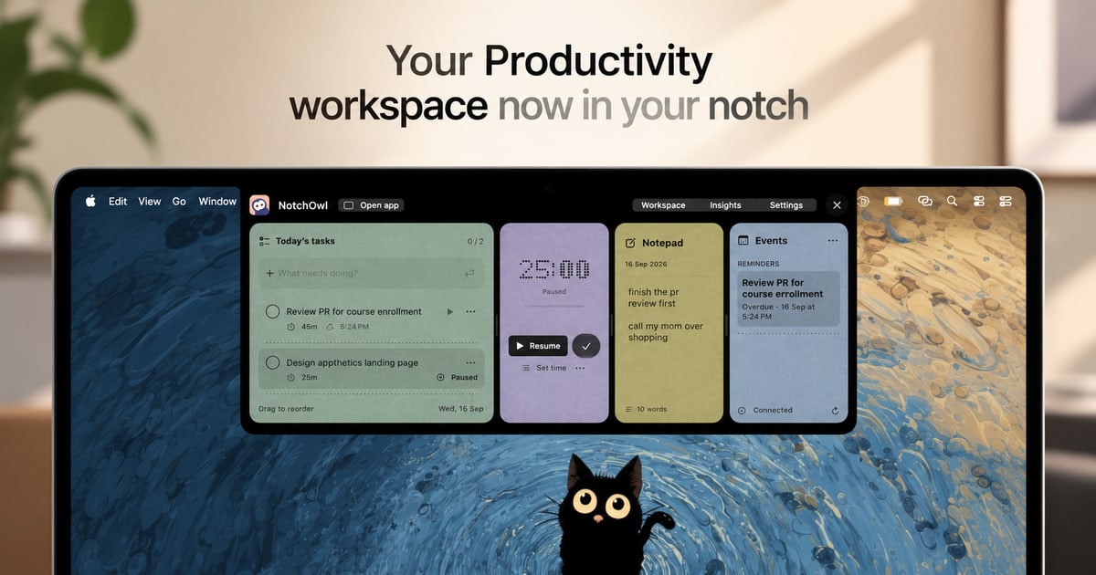
NotchOwl is a Mac productivity workspace that turns the notch at the top of your screen into a place to work. It brings together tasks, a focus timer, quick notes, calendar events, and productivity insights so that everything you need to stay on track sits one hover away. Instead of moving between windows and separate apps, you open NotchOwl in the notch, add a task, start a focus session, jot down a note, or check today's upcoming events, then close it and get back to work. It is built for Mac users who want their next task and their captured ideas to stay close to whatever they are doing, and its tagline captures the idea simply: keep your day a notch closer. Most productivity tools live in their own window or browser tab, which means using them requires leaving the thing you are actually working on. NotchOwl is built around the opposite idea: less switching, more doing. The product's website frames the benefit directly, describing a workspace where everything you need to stay on track is available without switching windows. The problem it addresses is twofold. First, tasks and timers are easy to lose sight of when they sit in another app, so the work you planned gets interrupted by the mechanics of managing it. Second, a busy week can be hard to remember, making it difficult to see what you actually finished and where your attention went. By keeping the workspace in the notch and its timer visible while you work, NotchOwl keeps your intentions in view rather than filed away. The focus timer is the core of the task workflow. You pick a task and give it a time limit, or you let a stopwatch run when you do not need a deadline. The timer stays visible in the notch while you work, so you can see the remaining time without opening anything. You can pause, resume, or add five minutes when you need a little longer, which makes the timer flexible enough for work that does not end exactly on schedule. Two details matter for accuracy: timers pause when your Mac sleeps, and Insights counts only active focus time. The result is a timer that reflects the time you actually spent focusing rather than wall-clock time that includes every interruption. The daily notepad is where thoughts get captured before they disappear. You can jot down an idea, a link, or something to follow up on, and the notepad saves as you type. When a line becomes something to do, you place the cursor on that line and press Command–Return to turn it into a task. That single shortcut closes the gap between capturing a thought and acting on it, so notes do not pile up as an unprocessed list. Because the notepad lives in the same workspace as your tasks and timer, the moment you write something actionable you can convert it without leaving the notch. Insights is the reflection layer. A busy week can be hard to remember, so Insights brings together completed tasks, active focus time, and daily activity in one place. That lets you see what you finished and where your attention went, turning a scattered set of sessions into a readable record of the work you put in. Because active focus time is counted separately, timers pause when your Mac sleeps, so the picture Insights shows is about deliberate work rather than time spent with the app open. Calendar events are available in the same notch workspace, and connecting Calendar is optional. The notch workspace shows today's upcoming events from the calendars you already have added to Apple Calendar on your Mac. NotchOwl is explicit about how this works: macOS calls the permission Full Access, but NotchOwl only reads events and never creates, edits, or deletes them. That means you can check what is coming up next without opening a calendar app, while your calendar data stays under the control of Apple Calendar on your Mac. Getting into the workspace is deliberately quick. You hover over your Mac's notch or press Option–N to open NotchOwl, then add a task, start a focus session, jot down a note, or check today's upcoming events. When you are ready to work, you close it, and your running timer stays visible in the notch. You do not need a Mac with a notch to use it: on displays without a notch, NotchOwl opens at the top center of the screen, below the menu bar, and you can also open a full dashboard. Your tasks, notes, and timers work locally and your planner data stays on your Mac, and you can export your planner data as a JSON backup. The stated outcomes are practical. Keeping the workspace one hover away means less switching and more doing, because checking your next task no longer means leaving the app you are working in. Because the timer stays visible in the notch, your commitment to a task stays in front of you, and the ability to pause, resume, or add five minutes keeps that commitment realistic. The notepad means ideas and follow-ups are captured as they happen rather than lost. Insights answers the question of what you actually got done, and the calendar view keeps the next appointment in view. Together these pieces support the product's closing invitation: make room for what matters. Several concrete workflows follow from the features described. During a focused piece of work, you can pick a task and give it a time limit, or run a stopwatch if the work has no clear deadline, and watch the countdown in the notch until you pause, resume, or add five minutes. Mid-task, you can hover the notch and jot an idea or a link into the daily notepad without switching windows, saving it as you type. If a line you wrote is something to do, Command–Return turns it into a task immediately. Before a meeting, you can open the workspace and check today's upcoming events from Apple Calendar. At the end of a busy week, you can open Insights to review completed tasks, active focus time, and daily activity. And if you need a broader view, you can open the full dashboard. NotchOwl also keeps working when you are offline: after license activation, tasks, notes, and timers work locally, and an internet connection is needed only for activation, deactivation, and update checks. NotchOwl is for Mac users. The current download requires macOS 14 or later and is built for Apple silicon Macs, and a notch is not required since the workspace also opens at the top center of the screen on displays without one, with a full dashboard option as well. It is a paid product sold as a one-time purchase rather than a subscription: the lifetime license is $4.9 USD and covers all NotchOwl features, lifetime updates, and activation on up to 3 Macs, with a 14-day money-back guarantee. The installer is free to download, but a paid license is required to use the app; after checkout the license key arrives in the Dodo Payments email and is entered in the Mac app. There is no recurring payment, and you can move the license to another Mac by choosing Deactivate this Mac in the License section of Settings, after which you can use the key on the new Mac, subject to the 3-Mac limit and an internet connection for deactivation. NotchOwl's value proposition is narrow and clear: instead of another window to manage, it puts tasks, a focus timer, quick notes, calendar events, and insights in the Mac's notch, one hover or Option–N away. For Mac users who want their next task and captured ideas to stay close, without switching windows, it offers a small, local, one-time-purchase workspace for the work in front of them.
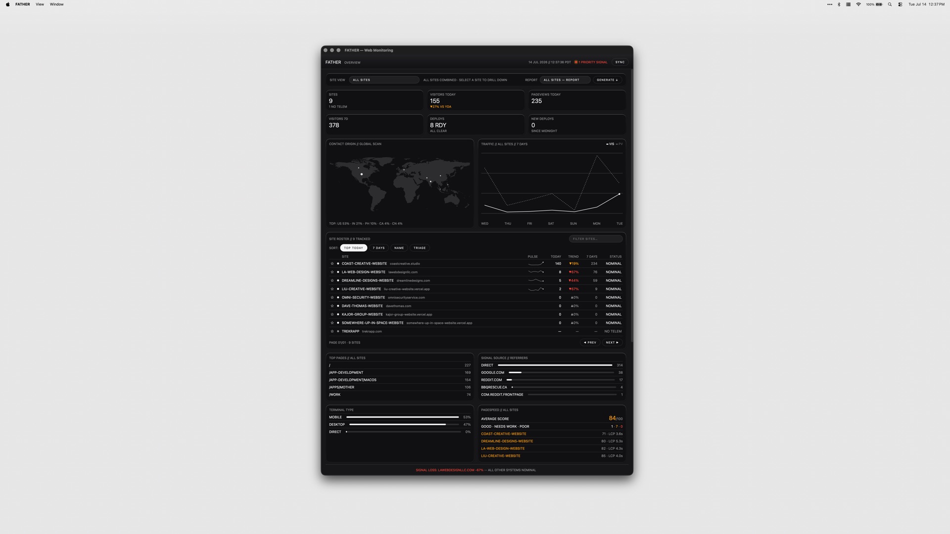
FATHER is a macOS application that serves as a mission-control dashboard for websites and deployments, built specifically for teams shipping on Vercel. Its stated purpose is simple: it watches the fleet so you do not have to, and it makes sure you know that a site is down before your clients do. The app is aimed at people who are responsible for more than one live site — studios, agencies and developers running client projects — and who need a single screen that answers the question of what is healthy, what is broken and what is about to expire. Connect your Vercel account and the dashboard fills itself: deployments, uptime and speed metrics appear live. The underlying problem is fragmentation. A team shipping on Vercel typically has to visit the Vercel dashboard for deploys, a search console for clicks and rankings, a separate source for page-speed scores, and yet another place to check whether an SSL certificate or a domain is about to lapse. GitHub checks live somewhere else again, and a failed build can sit unnoticed for hours if nobody happens to be looking at a browser tab. FATHER pulls those signals into one native macOS window, and — more importantly — into the menu bar, so monitoring stops being something you have to remember to do and becomes something that comes to you. FATHER is built on Vercel. Deploy tracking and the speed and uptime metrics all come from the Vercel API, so the integration is not a bolt-on but the foundation of the app. You connect your account token and your projects appear automatically; there is no manual inventory to maintain and nothing to keep in sync. Projects that are hosted somewhere other than Vercel can still be added manually so they get basic status checks, which means the dashboard can serve as a single view even for a mixed hosting estate. Because the app relies directly on the Vercel API, the numbers it shows come from the same place your deployments do. The core view is the fleet at a glance: the status, uptime and response of every site on one screen. Rather than opening projects one at a time, you get a single list you can scan in seconds to see which sites are responding, which are slow and which are down, so the morning check on a portfolio of client work takes moments instead of a tour through several dashboards. Deploy tracking is the second pillar. FATHER lets you watch builds progress and catch failures the moment they land, live from Vercel, so a broken deploy does not have to wait for a client email or a casual check-in to be discovered. Two features make sure that information actually reaches you. Menu-bar status shows an F in the macOS menu bar: it displays a dot while builds are running and turns red when something needs your attention, so the health of the fleet is legible at a glance from wherever you are on the Mac. Alerts go further — notifications fire even when the dashboard is closed, so a failed build or a site going down will find you rather than waiting to be found. Together they turn the app into something closer to a pager for your web estate than a traditional dashboard you have to remember to visit. Beyond deployments and uptime, FATHER covers the surrounding signals that usually live in separate tools. Traffic, PageSpeed scores, Search Console data and Bing data all appear in the dashboard, with clicks, rankings and indexing visible without leaving the app. SSL certificates and domain renewals get a countdown, so expirations stop being a nasty surprise, and failing GitHub checks get flagged alongside everything else. The result is a dashboard that answers both the operational question of whether a site is up and the marketing question of whether it is performing. The app's approach is deliberately local and deliberately simple. Tokens stay on your Mac rather than being shipped to a hosted service, and the product is sold as a one-time purchase instead of a subscription. It is a native macOS application — universal, so it runs on both Apple Silicon and Intel Macs — and it is menu-bar-first rather than browser-first. Every app in the studio's suite ships with the same set of themes, so the dashboard can be themed to taste like the rest of the collection. For the user, the benefit is timing. Knowing that a site is down before your clients do changes the conversation entirely: it turns a defensive, apologetic call into a proactive fix. Catching a failing deploy the moment it lands shortens the window in which a broken build is live. A countdown on SSL and domain renewals removes a class of avoidable outages, and having traffic, PageSpeed and search data in the same window reduces the number of tabs and logins needed to answer routine questions. All of it runs from the menu bar, so the information arrives without anyone having to go looking for it. Typical use looks like an agency or studio with a portfolio of client sites on Vercel: the dashboard becomes the first thing checked in the morning and the thing that taps you on the shoulder when a build fails overnight. Freelance developers use it to keep an eye on their own and their clients' projects without logging into the Vercel dashboard repeatedly. Teams with mixed hosting add their non-Vercel sites manually so the fleet view stays complete. Marketers and SEO-minded owners watch clicks, rankings and indexing alongside speed scores, and anyone responsible for renewals relies on the SSL and domain countdowns. FATHER is made for teams shipping on Vercel — studios, agencies and independent developers managing client work. The integrations named in the product material are Vercel, Google Search Console, Bing and GitHub, with PageSpeed scores surfaced in the dashboard. It is a macOS app that runs on Apple Silicon and Intel Macs. Pricing is a one-time $7.99 for FATHER alone, or $22.99 for the full Suite of all four apps from the same studio. In short, FATHER is a macOS mission-control dashboard that turns a scattered set of monitoring chores — deploys, uptime, speed, search visibility, renewals and checks — into a single live view with menu-bar alerts attached. Its value proposition is early warning: you find out first, act first, and keep your clients out of the loop only because there is nothing for them to worry about.
Anthropologic is a zero distance consumer research platform that reads the whole internet through its Human Context Protocol to uncover consumer, category and cultural truths. It is built for people who need consumer understanding that is both fast and deep: research, innovation, marketing and foresight teams who cannot wait weeks for fieldwork but also cannot act on shallow social listening. The platform covers 239 markets and more than 100 languages, and it organises its capabilities into nine workflows, each aimed at a different type of question — what is moving in a category, what people think and feel, how segments behave online, what futures are probable, how creative performs, how a brand is read across social, search and LLMs, and where a brand can stand within a market's cultural codes. The promise is straightforward: research, innovation and foresight answers in minutes. Traditional research is deep but slow. Social listening is fast but shallow. LLMs are fluent but culturally blind. That is how Anthropologic frames the state of consumer insight, and it is the gap the platform exists to close. Deep research — surveys, ethnographic work, segmentation studies — produces trustworthy understanding, but it arrives on a timeline that rarely matches the pace at which categories move. Social listening moves at the speed of the feed but tends to capture volume and sentiment rather than meaning, leaving researchers to guess at the cultural logic underneath. Large language models can generate convincing text about consumers, yet by the platform's own description they lack cultural grounding, so their fluency masks a blindness to the codes that actually govern a market. Anthropologic positions itself between these three approaches: fast like listening, interpretive like research, and grounded in cultural context rather than surface fluency. For teams making decisions about products, positioning and communication, that combination matters because the cost of being slow is measured in missed trends, and the cost of being shallow is measured in misread consumers. The first group of workflows answers the question of what is happening. Trends shows what is moving in a category, pairing social proof with search patterns so that a signal is visible both in conversation and in demand. The live trend examples shown on the site make the shape of the output concrete: a search volume for alcohol-free club nights in the UK, a multiple showing how many scents now sit in a wardrobe where a single signature perfume once did, the number of US stores stocking overnight oats, or a search rate for Filipiniana bridal looks. Discourse goes a layer deeper and covers what people think, say and feel, mapping the positions, tensions and narratives inside a conversation rather than stopping at sentiment. Digital Segmentation takes the behavioural record and turns it into psychographic segments based on online behaviours, so teams can see not only that a category is moving but which kinds of people are moving it and with what mindset. Once a team knows what is happening, the next group of workflows helps it look forward and test. Foresight Simulator uncovers probable future scenarios reshaping a category, giving innovation and strategy teams a structured way to consider what comes next instead of relying on a single forecast. Synthetic Survey simulates consumer responses at scale using cultural ontologies, which allows researchers to explore how different audiences would respond without running a full field study for every hypothesis. Creative Evaluation scores a video ad for cultural strength across grounded signals, endorser and pillars, turning creative judgement into something that can be assessed against cultural evidence rather than taste alone. Together these workflows cover the middle of the research process: the stage where teams need to stress-test ideas, creative and scenarios before committing budget to production or media. Interpretation comes next. Ask an Anthropologist interprets an insight using cultural codes, giving teams a way to ask what a signal actually means rather than only what it says. Brand Performance shows how a brand performs across Social, Search and LLM, extending brand tracking into the place where many consumers now form impressions — the answers language models give. Cultural Semiotics reads a space in a market: the codes that govern it, the tensions between them, and where a brand can stand, which is directly useful for positioning work. The site also lists Innovation as coming soon, described as identifying opportunity spaces through convergence modelling and developing novel concepts, alongside a Research Thinking section where longer-form perspectives are published, with example essays such as 'Death of the Sugar High', 'Future of Fashion is Value', 'Medicalized Mouth', 'Beyond Classrooms' Four Walls' and 'Redesigned: Future of Aging'. The overall approach is what Anthropologic calls the Human Context Protocol: the platform reads the whole internet, rather than a single social network or a survey panel, and interprets what it finds through cultural context instead of raw keyword matching. Nine workflows sit on top of that reading, each packaged as a launchable tool with a defined question and a defined output, so a researcher does not have to assemble a methodology from scratch. Coverage is broad by design — 239 markets and 100+ languages — which means the same method can be applied across geographies and language communities rather than only in the markets where a team happens to have local researchers. The workflows range from descriptive (Trends, Discourse, Digital Segmentation) through projective (Foresight Simulator, Synthetic Survey, Creative Evaluation) to interpretive (Ask an Anthropologist, Cultural Semiotics) and diagnostic (Brand Performance). The through-line is that every output is meant to be grounded in something observable — social proof, search patterns, online behaviours, cultural codes or ontologies — rather than in a model's unaided opinion. The stated benefit is speed without sacrificing depth: research, innovation and foresight answers in minutes. For a category team, that means trend questions can be answered while a campaign or product decision is still open, rather than in a retrospective deck delivered after the moment has passed. For innovation teams, probable future scenarios and simulated consumer responses reduce the cost of exploring many hypotheses before narrowing to the few worth real investment. For brand and marketing teams, scoring creative for cultural strength and tracking performance across social, search and LLM gives a more complete picture of how a brand is actually being read. And because the platform works across 239 markets and 100+ languages, the same questions can be asked consistently in many places at once, which is difficult to do with traditional fieldwork and easy to get wrong with a culturally ungrounded model. The result is fewer decisions made on instinct alone and fewer insights that arrive too late to use. Concrete scenarios follow from the workflow list. A beauty or fashion brand tracking a new behaviour — the site's own examples include Gen Z fragrance, secondhand shopping, slow fashion and beauty after GLP-1 — would use Trends to see whether the movement shows up in both conversation and search, then Discourse to understand the narratives around it, and Digital Segmentation to identify which psychographic groups are driving it. A creative team preparing a video ad would run it through Creative Evaluation to score its cultural strength against grounded signals, endorser and pillars before committing media spend. A strategy team planning ahead would use Foresight Simulator to unpack probable future scenarios in a category and Synthetic Survey to test how consumers might respond. A brand lead would use Brand Performance to compare how the brand reads across Social, Search and LLM, and Cultural Semiotics to understand the codes and tensions in a market and where the brand can credibly stand. A researcher holding an ambiguous insight would use Ask an Anthropologist to interpret it through cultural codes. The Research Thinking section shows how those outputs are turned into published perspective pieces across topics such as fashion, education, wellness, entertainment and sportswear. Anthropologic is aimed at research, innovation and foresight functions — the product description names research, innovation and foresight answers explicitly — as well as the marketing and brand teams that consume that work. The scope is global by default: 239 markets and 100+ languages, covering categories visible in the platform's own examples, such as beauty, fashion, travel, fitness, food and drink, entertainment, education, wellness, pets and motherhood. No pricing or plan details appear on the page, and no specific third-party integrations are listed; the data domains the product describes are Social, Search and LLM, plus the platform's own cultural ontologies and semiotic codes. The product is delivered on the web at anthropologic.quilt.ai, and its Product Hunt listing categorises it under Marketing, Artificial Intelligence, and Data & Analytics. Anthropologic's core proposition is zero distance: closing the gap between a consumer signal and the decision it should inform. By combining a Human Context Protocol that reads the whole internet with nine purpose-built workflows spanning 239 markets and 100+ languages, it offers research depth at listening speed — trends with social proof and search patterns, discourse with tensions and narratives, psychographic segmentation, foresight scenarios, creative scoring, synthetic surveys, cultural interpretation, brand performance across social, search and LLM, and semiotic reading of a market. The takeaway is that cultural context, not fluency alone, is what makes consumer insight usable.
tiun. is the AI-native backend for builders, positioned as one system for authentication, payments, a customer database, and analytics. According to the website, tiun gives AI and SaaS companies the backend they need to ship, scale, and grow their business in one unified platform. Rather than assembling a stack of separate services, teams get a single place where user accounts, billing, transactions, and product usage data live together. The product describes itself as the backend powering the AI engineering era, built from an ecosystem of services that are designed to work together from the start. Its stated goal is to remove webhook logic and business logic that developers would otherwise have to write and maintain themselves, so a builder can launch a paid product the same day they start building. The problem tiun addresses is the hidden complexity created by single-purpose tools. When authentication, payments, customer data, and analytics each come from a different provider, teams end up juggling multiple accounts, scattered data, and costs that compound as they scale. Keeping those separate systems in sync requires maintaining business logic purely for the sake of consistency, and that maintenance burden grows alongside the business. The website notes that this fragmentation also makes the insights a company needs harder to reach, because the information required to understand customers, usage, and revenue sits in disconnected places. tiun's answer is an ecosystem of services designed to work together from the start, so there is no webhook logic and no business logic to handle just to keep tools aligned. The way to adopt tiun is described as installing its skills, connecting its MCP endpoint, and letting an AI agent do the hard work. The site provides a single command — npx skills add https://mcp.tiun.business — and links to documentation at docs.tiun.io. This integration path is highlighted by customers on the page: one founding member at Braintonic comments that it worked so well there was no backend, no webhooks, and no custom logic, while a founder describes integrating it for a side project as working like a charm and an absolute no brainer for future solo builders and founders. The significance of this approach is that it shifts setup work away from manual backend engineering and toward an agent-driven installation flow, which lowers the barrier for builders who want working infrastructure without writing and maintaining the usual glue code. tiun's authentication section aims to provide everything needed for user authentication. Sign up, login, and logout are ready to use out of the box, and the platform describes them as simple and secure. Beyond those basics, tiun supplies a User Button and User Profile, giving users a dropdown menu where they can access their account and manage their profile and security settings. Multifactor authentication is included, with SMS passcodes, email, and social SSO listed as supported methods. For a builder, this means the account layer that normally requires careful implementation — credential handling, profile management, and stronger sign-in options — is available as pre-built functionality rather than something to design from scratch. Payments are handled without the need to write payment code or wrangle webhooks. With tiun, builders can create products and billing plans and accept one-time payments, subscriptions, and usage-based billing from day one. Pre-built checkout components can be dropped in as an overlay, so users never leave the page during the purchase flow. tiun also acts as the Merchant of Record: it processes payments, pays out monthly, and includes tax compliance and chargebacks. The site states that this model brings better fees and more functionality, and its example pricing shows transaction fees of 2.9% + $0.30, for a total of roughly 3.4% + $0.30 on international transactions. The third part of the system is a customer database where every user, transaction, and session is stored in one place, with no syncing between tools. User management keeps customers' subscription status up to date and stored alongside their user data, removing the need to build or maintain complex synchronization logic. Advanced event and session tracking logs every login, purchase, and product interaction at profile level, so teams can understand how users move through the product. The same area covers transactional emails for key user actions such as confirmations, password resets, and purchases, invoice history that lets customers view and download receipts and invoices from their profile, and plan management so users can upgrade, downgrade, or cancel directly without a support ticket. Data APIs expose one queryable API built on a consistent model that stays in sync and is ready to plug into an existing stack. Analytics is presented as one system your entire team can work with, so the full picture is finally visible and actionable. All data lives in one place, letting business, engineering, product, and marketing see who is signing up, who is paying, how they use the product, where they get value, and how to price it. Because authentication, billing, and product events share the same underlying model, these questions can be answered from a single source instead of being stitched together across separate tools. The site illustrates the value with a case study: Res Publica reported a 21% increase in paying users and grew its user base by 21% in the last 12 months after introducing usage-based billing with tiun, as described by CEO Martin Stedler. Overall, tiun's approach is to treat authentication, payments, the customer database, and analytics as one connected system rather than four independent products. The website frames this as an ecosystem of services designed to work together from the start, which is why there is no webhook logic and no business logic to handle simply to keep systems in sync. Integration follows an AI-native path: install the skills, connect the MCP endpoint, and let an agent carry out the setup, with the command npx skills add https://mcp.tiun.business and documentation available for reference. Installation is described as one command, and the promise is that a builder can launch a paid product the same day they start building. The benefits follow directly from that consolidation. Teams avoid multiple accounts and scattered data, and they avoid the compounding costs that come with maintaining several single-purpose tools as they scale. Because subscription status, session activity, and transactions all sit with the user record, there is no synchronization logic to build or maintain. Customers can manage their own plans, invoices, and profiles, which reduces the need for support tickets. And because business, engineering, product, and marketing all read from the same data, the insights needed to understand signups, payments, usage, and pricing are reachable rather than buried in disconnected systems. tiun is aimed at AI and SaaS companies and the builders behind them, including solo founders and developers who want to launch a paid product quickly; commenters on the site describe using it for side projects. Typical scenarios reflect the product's shape: adding sign-up, login, and multifactor authentication to a new application; accepting one-time payments, subscriptions, or usage-based billing from day one; offering checkout as an overlay so users stay on the page; giving customers self-service control over plans, receipts, and invoices; and asking who is signing up, who is paying, and how to price the product from a single place. tiun can be tried for free, pricing details are published on its pricing page, and the platform is used through the web as well as its MCP and data APIs. tiun's core value proposition is consolidation: one system that supplies the authentication, payments, customer database, and AI analytics an AI or SaaS business needs, installed with one command and connected through MCP so an agent can do the heavy lifting. By removing webhook and synchronization logic and keeping every user, transaction, and session in one place, tiun promises to help builders ship, scale, and grow from a single backend — and start charging on day one.