Category Focus/categories/productivity
Productivity AI Tools
Discover and compare the best productivity AI tools and software. Browse 864+ curated tools with reviews and rankings.
Projects tracked
864
Sort mode
RECENT
Page
18
Discover and compare the best productivity AI tools and software. Browse 864+ curated tools with reviews and rankings.
Projects tracked
864
Sort mode
RECENT
Page
18
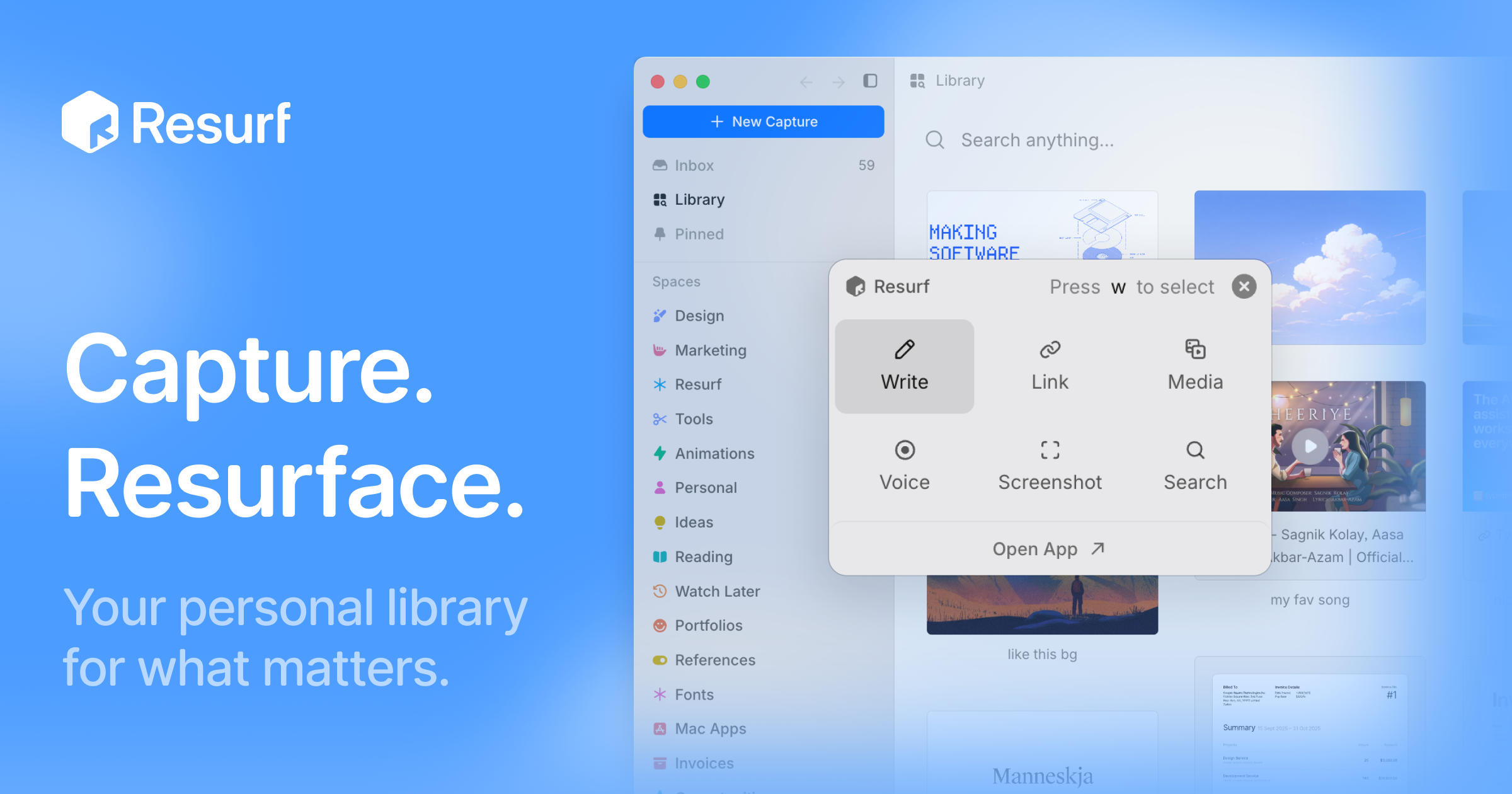
Resurf is a personal context library — one place to keep the things you like, care about, and work on. It saves notes, links, images, PDFs, and documents into a fully local library, so the material you collect stays in one searchable spot instead of being scattered across browsers, folders, and apps. The app is built for Mac, iPhone, and iPad, and it is written entirely in native Swift. Its stated purpose is twofold: capture what you find, and then find it again — or hand that accumulated context to AI when you need a model to work with your own material. There is no Resurf account required, the app works offline, and sync through your own private iCloud is optional. The problem Resurf addresses is fragmentation. The things a person wants to remember arrive in wildly different formats and from wildly different places: an article on Substack, a PDF of a paper, a screenshot, a tweet, a GitHub repository, a YouTube video, a code snippet, a voice note recorded in the middle of a walk. Each of those lands wherever the app that produced it decides to put it. Later, when the thought returns — 'I read something about typography,' 'there was a paper worth revisiting' — there is no single place to look. Resurf's answer is the inbox model: save now, organize later. The library is meant to get more useful every time you save, because a growing personal collection becomes more valuable as long as it remains findable. A second, newer problem motivates the AI side of the product: AI tools are only as good as the context you give them, and most people have no structured way to hand over what they have saved. Capture is designed to stay out of the way. Quick Capture, bound to ⌘⇧C, lets you save something without switching context — the point being that a capture tool fails if it interrupts whatever you were doing. Content can come from any app: Resurf captures from Mac, Chrome, and iPhone into the same library, and a Chrome extension is available from the Chrome Web Store for browser-based saving. The library accepts a wide range of formats — articles, PDFs, images, audio, video, code, tweets, GitHub, YouTube, and notes — and every format renders natively, meaning you view the saved item as it was rather than as a degraded copy. Once something is saved, Resurf leans on an inbox-first approach: you do not have to decide where a capture belongs at the moment you make it. Organization happens later, through Spaces and Tags that let you group material around projects, research, and ideas — the page shows examples such as Research and Writing spaces and tags like #ml, #philosophy, and #ideas. A Visual Library complements that structure by letting you browse what you saved the way you remember it, which suits image-heavy or reference-heavy collections where a thumbnail is easier to recognize than a filename. Instant Search, triggered with ⌘K, finds notes, links, PDFs, images, and files quickly across the library — the page illustrates it with an example of searching typography notes across 24 captures from the last six months. Resurf also covers the moment after capture, when you have something to say about what you saved. Highlight & Annotate keeps your thoughts beside the source, so commentary lives with the material rather than in a separate document — useful when a highlighted passage only makes sense in relation to your note about it. Voice Memos capture thoughts before they disappear, which matters for ideas that arrive away from a keyboard. The Notes surface provides a rich-text editor with a formatting toolbar and highlights, and the product describes five surfaces — Library, Inbox, View, Notes, and Assistant — as the five places you will actually spend your time in the app. AI in Resurf is opt-in across the board, and the product is explicit about that. AI Summaries help you revisit articles, links, and PDFs faster by producing a short summary of the saved item. Bring Your Own AI lets you supply your own AI key rather than relying on a bundled service, and on Mac you can hand off saved context to AI agents through MCP or the CLI — a documented connection path in the guides. Ask Your Library lets you ask questions across the context you have saved; the page illustrates this with a query such as 'What did I save about typography?' answered against a reading list. Because the library lives locally, the material used for these questions is your own collection rather than a shared index. How the product works is defined by its architecture. Resurf is written entirely in native Swift for Mac, iPhone, and iPad, so the same library runs natively across all three rather than being wrapped in a cross-platform shell. Your library lives on-device — the page names the location ~/Library/Resurf — which is what makes the 'fully local' and 'private by default' claims concrete: data stays on your Mac, the app works offline, and no account is required. Sync is optional and runs through your own private iCloud rather than a Resurf-operated service. The Chrome extension and the MCP/CLI connection on Mac are the two extensions beyond the core Apple-platform apps: the first brings browser captures into the library, the second takes the library out to AI agents. The benefits follow from those choices. Because everything lands in one library with instant search, the answer to 'where did I put that?' is a single search rather than a tour of multiple apps. Because capture is bound to a keyboard shortcut and does not require switching context, saving feels lightweight enough to actually do. Because storage is local and sync is optional and private, the library can hold personal reading, screenshots, and voice memos without being uploaded to a third-party service. And because the library is exposed to AI through your own key, MCP, or the CLI, the collection becomes an input rather than a dead archive. The app is also free to try and, per the page, free on iPhone and iPad, with a separate license purchase for Mac. Concrete uses appear throughout the product's own examples. A reader saves a Substack article tagged #reading so it can be found later, and highlights passages while annotating them. A designer or writer keeps typography references and design notes in a space, browsing them visually — the page shows a query about typography answered from saved captures. A researcher stores papers such as a PDF of 'Attention is all you need,' marking it as worth revisiting. Someone away from a desk records a voice memo about a headline's typography. A developer saves GitHub repositories, code, and YouTube videos alongside everything else. Once the library has grown, the same collection can be queried directly — 'What did I save about typography?' — or handed off to an AI agent on Mac through MCP or the CLI. Resurf is aimed at people who collect: designers gathering visual references, writers and researchers assembling sources, developers saving code and repositories, and anyone who already runs a personal knowledge practice or wants to. Availability reflects that audience. The app runs on Mac (Apple Silicon and Intel) with macOS 14.3 or later, and is free on iPhone and iPad; the Mac app can be downloaded free to try or licensed through a purchase. A Chrome extension is available for browser capture, and a guide covers connecting agents over MCP or the CLI on Mac. The library itself is stored locally at ~/Library/Resurf, with optional private iCloud sync and no Resurf account required. The takeaway is that Resurf treats your saved material as an asset with two uses: a private library you actually revisit, and a context source you can hand to AI. It is fully local by default, native across Mac, iPhone, and iPad, built around quick capture and instant search, and organized through inboxes, spaces, tags, and a visual library. Its AI capabilities — summaries, asking your library, and agent handoff through MCP or the CLI — are opt-in and can run on your own key. For anyone whose best ideas and references are currently spread across browsers, folders, and screenshots, Resurf's proposition is a single, private, searchable place to put them.
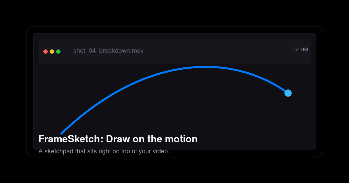
FrameSketch is a video annotation tool that lets you sketch right on top of your footage. It is built for animators, VFX artists, and motion designers who need to mark up arcs, poses, and breakdowns on moving images instead of describing them in words. You step through frames, draw over the canvas, and keep your lines exactly where you left them, then hand the result to whoever needs to see the shot. The site states the intent plainly: no uploads, no lag, just your lines exactly where you left them. FrameSketch runs in the browser at app.framesketch.xyz and is free to use. The problem the product addresses is the friction of reviewing and annotating motion. The site describes the alternative as animation-suite bloat: heavy software where you open a file, fight plugins, and juggle exports before you can get back to the shot. It also promises there is no export roulette and no timeline lag, which are the usual complaints when scrubbing footage and drawing over it in a general-purpose tool. The other half of the problem is privacy and waiting. Cloud-based annotation means uploading footage before anyone can mark it up; FrameSketch instead keeps everything on your machine, so your footage never leaves your device and cloud sync, when enabled, only carries annotations. For studios handling unreleased client work, that distinction matters. The drawing tools are organised around frame accuracy. Lines land on the exact frame, and you can step forward, step back, or scrub while the canvas never drifts from the video, so a mark you place on a frame stays on that frame. Onion skin lets you peek at the frames before and after and tune the ghosting until it feels right, which is how animators check spacing, timing, and the read of a pose. Strokes stay put: each line is fixed the moment you lift the pen, so your marks stay exactly as drawn, frame after frame, without re-tracing as you move through the timeline. The brush setup is described as four pens and one palette, and the tool strip lists pressure-sensitive input. The page also shows a scrubber running from frame 0000 to frame 0144 as an example of stepping through a section of footage. The studio adds the tools a shot review normally needs, built in rather than bolted on. A frame-by-frame timeline lets you walk the footage frame by frame, mark a stretch of it, and play just that range on a loop, which is useful when a single cycle or transition needs repeated scrutiny. Layers let you stack strokes, shapes, and notes on real layers, then reorder them, hide them, and dial in each layer's opacity, which keeps a busy annotation from turning into one inseparable mess. Notes and comments appear as sticky notes and comment markers pinned right on the frame; you can move, resize, recolor, and edit them at any time, so feedback stays attached to the exact moment it refers to. Alignment and navigation tools help you place marks precisely. Grid, rulers, and guides offer rectangular or isometric grids drawn as dots or lines, and you can drag guides out of the rulers to line your marks up where you need them. Pan and zoom let you zoom into the detail and move around the shot while your marks stay exactly where you left them. Scenes and backgrounds support one project with many scenes, and every scene sits on a solid background layer, so you can hide or dim the video whenever you want to see your own drawn lines without the footage competing for attention. The welcome screen rounds this out with recent projects one click away, described as an escape from project browser rabbit holes. Underneath, FrameSketch takes a local-first approach. It runs entirely on your machine; cloud sync is optional and, when switched on, only carries annotations rather than media, and you can turn it off so everything stays local. Projects are saved as a single small .fsk file that holds every stroke; the site says a whole project is a few hundred kilobytes, small enough to email, stash, or version. Because the file is that light, sharing a review does not mean exporting video or uploading anything: you send the .fsk, the other person opens it, and they can keep going. The app reads video files straight from your machine and re-encodes nothing. The file picker only lists what your platform can really play: MP4 with H.264 in an MP4 container is recommended and plays on every platform, browser and desktop; MOV is a QuickTime container whose H.264 content plays everywhere; M4V shares the same H.264 core as MP4; and WebM uses the open VP8/VP9 codec, playing on Windows, Linux, and Chromium, though on macOS MP4 or MOV is advised. Anything else can be converted once to H.264 MP4 and it will play anywhere. The product is described as working in the browser with web and PWA support, and desktop apps for Windows and Linux are coming soon. The practical benefits follow from those choices. Privacy is the headline: your footage never uploads, so confidential or unreleased material stays on your own device while you still get optional sync for annotations. Speed is the second: drawing at 60fps and a frame-accurate canvas that never drifts means marking up a shot feels immediate rather than waiting on a round trip to a server. Small project files make collaboration cheap, since emailing a few hundred kilobytes and versioning it like any other small asset is far easier than moving video around. And because the tool deliberately avoids suite-level complexity, time to first mark is short; the site claims your first arc takes about ten seconds. Concrete workflows the tool is built around include animating arcs and poses over reference footage: load a shot, step to a frame, and draw the arc, breakdown, or pose directly on the picture. Shot review is another: pin sticky notes and comment markers to specific frames, then send the project to a colleague or director who can open it and add to it. Timing and spacing checks lean on onion skin, letting you compare neighbouring frames with adjustable ghosting to judge how a movement reads. Aligning marks to a layout uses the grids and rulers, whether rectangular or isometric. Privacy-sensitive work benefits from the local-first model, since client footage never needs to be uploaded. And because a project travels as one .fsk file, remote collaboration is as simple as emailing an attachment and continuing where the other person left off. FrameSketch is aimed at animators, VFX artists, and motion designers, the people who think about motion frame by frame, and its marketing addresses animators directly. It is available as a web app and installable as a PWA at app.framesketch.xyz, with desktop apps for Windows and Linux listed as coming soon. Pricing is free to use, and the site reiterates that your footage never leaves your device. No plugins or additional software are needed for the core workflow, and the tool opens straight from the browser ready for you to draw. FrameSketch's value proposition is narrow and deliberate: annotate video the way animators actually think, frame by frame, on top of the footage, without uploading anything. Drop in a local file, draw arcs, breakdowns, and notes with tools like onion skin and frame-accurate stepping, share a tiny .fsk file with collaborators, and keep your footage private the entire time. It is a free, browser-based video annotation tool for animators, VFX artists, and motion designers who want to mark up motion quickly and get back to the shot.
Captain Kill Switch is a free utility for macOS, Windows, and Linux that lives as a quiet menu-bar or system-tray button. Its purpose is simple and focused: close every running app the instant you need a clean slate. It is for anyone who wants to reset their desktop without manually quitting applications one by one—whether before a presentation, a screen-share, a game, or just to clear their head. The product runs 100% locally, requires no account, and is described as private and cross-platform. It is built to do one thing extremely well, with no bloat, no dashboards, and no upsell. Instead of a complex interface, it offers one calm, decisive click. Modern desktops get cluttered. Multiple apps, windows, and background processes accumulate, and closing them manually takes time and attention. The traditional methods—Alt-Tab, Cmd-Q, clicking each dock icon—can be slow and distracting, especially when you are about to present, share your screen, or start a game. Captain Kill Switch addresses this by replacing the multi-step cleanup with a single action. Instead of hunting through open windows, you click one button or press one hotkey, and every open application closes. The product is designed for the moment you need a fresh start immediately, not after a slow shutdown routine. It solves the problem of chaos on the desktop by making the reset instantaneous. The core feature is instant, one-click reset. When you click the menu-bar icon, every open application closes in milliseconds. This is positioned as perfect before a presentation, a screen-share, a game, or simply to clear your head. A second key feature is the global hotkey. You can bind a keyboard shortcut and fire it from anywhere, so you do not need to find the menu bar first. The website calls this your panic button, always one keystroke away. To set it, you open the menu-bar icon, go to Preferences, then Shortcut, and press the key combination you want. The recommendation is to pick something deliberate so you never trigger it by accident. Together, these two features mean the cleanup action is always accessible and takes only a moment. Captain Kill Switch lives in your menu bar or system tray. It is a discreet tray icon, nothing more. The product uses minimal memory, creates no dock clutter, and has no background CPU usage. You can forget it is there until you need it. It also requires zero configuration. You install it, and it just works. There is no setup wizard, no permissions maze, and no manual. The entire interface is a quiet tray icon and a single button. This minimalist approach keeps the utility out of your way while still being immediately available. It is designed to do one thing extremely well without adding bloat, dashboards, or upsells. The app includes smart detection that closes your applications while leaving critical system processes untouched. This protects what matters, so your Mac or PC stays stable rather than becoming stranded. It also is truly cross-platform, offering the same calm, single-button experience on macOS, Windows, and Linux. You learn it once and can use it on every machine you own. This consistency means the product fits into mixed-device environments without requiring different habits or relearning. The cross-platform nature is a core selling point: the same button, the same behavior, across all supported operating systems. The workflow is described in three steps. Step one is install and forget: download for your OS and open it once. Captain Kill Switch tucks itself into your menu bar or system tray automatically. Step two is hit the button: when you need a fresh start, click the tray icon or press your global hotkey. One action is the whole interface. Step three is clean slate: every app closes at once, leaving you a quiet, empty desktop ready for whatever is next. You can repeat the process whenever the chaos returns. This methodology relies on a single-purpose utility that waits in the background and acts only when triggered. There is no complex configuration or ongoing management. The benefits are speed, simplicity, and stability. You get a clean desktop almost instantly, without the Alt-Tab or Cmd-Q marathon. Because each app is asked to quit properly first, your next launch is clean with no crash-recovery prompts—though anything still open a couple of seconds later is force-closed, unsaved work included, so you should save what matters before firing. The app stays private: it runs 100% locally, never phones home, requires no account, and has no ads. Anonymous usage statistics and crash reports help improve the product, but events carry only a random install ID, never your name or information about the apps, files, or windows on your machine. Nothing is sold or shared. On macOS, builds are signed with an Apple Developer ID and notarised by Apple, so the app opens with a normal double-click and no security warnings. On Windows, SmartScreen may show a warning because the app has not been widely downloaded yet; you can click More info, then Run anyway. The app is tiny and runs locally. Several concrete scenarios are highlighted. Before a presentation, one click removes every open app so your audience sees a clean desktop. Before a screen-share, the same action prevents distracting windows from appearing. Before a game, it clears the desktop so you can start fresh. When you simply need to clear your head, it creates a quiet, empty workspace in milliseconds. It is also useful whenever the chaos returns and you need to repeat the reset, or when you are moving from one task to another and want a clean slate. The product is ready whenever you are, and installs in under a minute. You can forget about it until the moment you need it most. Captain Kill Switch is for users of macOS, Windows, and Linux who want a fast, private, one-button way to close all apps. It is available as a free download for all three platforms. On Windows 10/11, the latest version is v0.4.4, with an EXE installer recommended, plus an MSI installer, winget, and Scoop options. On macOS 10.15+, the same version offers a DMG package recommended, a PKG installer, and Homebrew formulas for the app and CLI. On Linux (Ubuntu, Debian, Arch), there is a DEB package recommended, an APT repository, and a terminal CLI install script. The latest release v0.4.4 covers macOS, Windows, and Linux and was released August 28, 2026. Pricing is free forever, with no account and no ads. Uninstalling is straightforward: quit it from the menu bar, then drag the app to the Trash on macOS, uninstall from Apps & Features on Windows, or remove the package on Linux. It leaves nothing lingering behind. In short, Captain Kill Switch is a focused, free, cross-platform utility that puts one button between you and a clean slate. It closes every running app on demand, protects critical system processes, respects your privacy, and stays out of your way until the moment you need it most. If you value a calm, decisive reset without dashboards, upsells, or manual app quitting, this product is designed exactly for that purpose.
LinkFlick is a macOS menu bar app that switches your Magic Mouse, Magic Keyboard, and Magic Trackpad between any Macs on your local network. Its purpose is simple: hand off Apple's Magic peripherals from one Mac to another in a single gesture, with no cables, no dongles, no iCloud, and no re-pairing. You install LinkFlick on each Mac you want to move devices between, and it waits quietly in the menu bar until you need it. The app is built for people who work across more than one Mac — a laptop and a desktop, a personal machine and a work machine — and who want their keyboard, mouse, and trackpad to follow them to whichever screen they are working on rather than staying stuck on the Mac that last claimed them. The problem LinkFlick addresses is the friction of shared Apple peripherals. Magic devices can only talk to one Mac at a time, so anyone moving between machines has to go through the Bluetooth pairing process again and again: unpair here, discover there, confirm, and repeat on the way back. The launch notes describe exactly this frustration — re-pairing a Magic Keyboard and Magic Mouse every time the maker moved between a personal MacBook and a work MacBook. Because those two machines used different Apple IDs, Universal Control was never going to be an option. LinkFlick takes a different route: it works at the Bluetooth and local network level instead of depending on Apple's ecosystem features, so it does not care which Apple ID is signed in, whether the Macs belong to the same person, or how the two machines are configured. The goal is to remove the digging through menus that makes peripheral sharing painful. Switching is deliberately minimal. LinkFlick lives in your menu bar and presents your Macs as a cluster of trusted peers that are instantly available for a switch. A single click — or a customizable hotkey, or a spoken command to Siri to flick devices — moves the keyboard, mouse, and trackpad to the other Mac in one gesture. There are no cables and no dongles involved; it is a hand-off of your controls between machines. Because the control is explicit and lives in the menu bar rather than following the cursor across screens, you do not have to worry about your pointer drifting off the edge of the screen by accident. As the site puts it, everything is there and you simply continue exactly where you left off. LinkFlick's key technical idea is that it moves the physical hardware, not just the cursor. Instead of bridging an input stream across the network, it re-pairs the peripherals at the Bluetooth layer, so the destination Mac sees a real Magic device — a genuine Magic Keyboard, Magic Mouse, or Magic Trackpad — rather than a forwarded or emulated input signal. The site describes this as native by design, with no iCloud dependency, no network relays, and no limits. LinkFlick supports 1st and 2nd generation Magic hardware, covering keyboard, mouse, and trackpad. The app intentionally supports Apple's Magic peripherals only, and the FAQ explains why: these devices enter Bluetooth discovery mode automatically after unpairing, which allows LinkFlick to perform a silent re-pair on the other Mac without PIN codes or confirmation dialogs. The site explicitly notes that third-party devices from Logitech, Razer, and similar brands are not currently supported. Because LinkFlick operates at the Bluetooth and local network level, it has no dependency on iCloud or Apple ID. You can move a Magic Mouse between a personal MacBook and a work Mac Studio signed into different accounts without any configuration. Macs are discovered automatically: LinkFlick uses Bonjour to find your Macs on the local subnet, with no cloud servers involved, and both Wi-Fi and Ethernet work as long as all Macs are on the same network. The app also keeps an eye on your peripherals. It displays battery levels, and the launch post notes that it nags you before your Magic Mouse battery dies. Alongside that, LinkFlick senses power and display status: the moment you connect power or a display, it wakes up, checks where your devices need to be, and offers a gentle nudge that your Magic Keyboard, Mouse, and Trackpad are still on another Mac. Putting it together, LinkFlick forms a cluster of trusted Macs. You install the app on every Mac you want to transfer devices between; it runs as a lightweight menu bar extra that uses almost no resources when idle. When you switch, the app hands off each device silently in the background — no pairing screens, no interruption — typically in 5 to 15 seconds, depending on how quickly macOS processes the Bluetooth pairing request internally. Before any of that, it needs two permissions: Bluetooth access to re-pair devices, and Local Network access to discover other Macs via Bonjour. It does not require administrator privileges, does not read keyboard input, and keeps all communication within your home or office network — nothing is sent to the cloud. If the destination Mac is off or asleep, your devices simply stay connected to the current Mac, and the other machine reappears in the Flick List as soon as it wakes and LinkFlick reconnects. The outcome is continuity. Your workflow follows you between machines: you open your editor on the other Mac, pick up your mouse, and carry on right where you left off, without touching a Bluetooth settings pane. Devices arrive waiting rather than requiring you to go find them. Switching happens in the background while you are already turning to face the other screen, and if a transfer cannot happen because the target Mac is unavailable, nothing breaks — your devices stay where they are and the opportunity to move them returns on its own. With no cloud, no account, and no admin rights required, the setup is also private and lightweight by construction: your input devices and your data never leave the local network that your Macs already share. Concrete scenarios are easy to picture. A developer plugs their MacBook into a desk setup with an external display; the moment power and display connect, LinkFlick notices and offers to bring the Magic Keyboard, Mouse, and Trackpad back from the desktop Mac. Someone who splits their day between a personal MacBook and a work Mac with a different Apple ID uses a hotkey or a Siri command to flick devices over and back as meetings and tasks demand. A home user with a laptop and a desktop moves their Magic Mouse and Keyboard between the two without re-pairing either time. Power users with a full multi-Mac setup — up to five Macs on the Pro plan — keep one set of peripherals useful across every machine on the same network. LinkFlick is aimed at Mac users who own more than one Mac and at least one Magic peripheral: people working across laptop and desktop, individuals bridging personal and work machines, and power users running a full multi-Mac arrangement. The app requires macOS 14 Sonoma or later, and all Macs must be on the same local network. Pricing is a one-time purchase with no subscriptions: the Personal plan costs $14.99 and covers up to 3 Macs, described as perfect for working between a laptop and a desktop at home, while the Pro plan costs $19.99 and covers up to 5 Macs for power users and full multi-Mac setups. Both plans include auto device discovery, instant switching, battery level display, trusted peers, free updates, and no cloud or account requirement. A 14-day free trial is available with no credit card required; on the trial you can connect up to 3 Macs — your local Mac plus 2 trusted peers. LinkFlick's core value proposition is straightforward: stop re-pairing your Magic Keyboard, Mouse, and Trackpad every time you change Macs. By moving devices at the Bluetooth layer, discovering Macs over Bonjour on the local network, and keeping the whole experience inside a menu bar app with a hotkey or a Siri command, it turns a tedious pairing ritual into a one-click hand-off — no iCloud, no Apple ID dependency, no cloud servers, and no admin privileges, just your Magic devices following you between the Macs you already trust.
Work Life Panda is a task manager and calendar that live together in one calm app, available on iPhone, iPad, Android and the web. Instead of asking you to rebuild your life inside a new tool, it starts with the life you already have: you connect the calendar you already use and your week is simply there, then you capture everything else in a sentence. Every task and every event carries its own chat, its own files, its own people and its own tracked history, so the plan and the conversation about it stay in the same place. It is built for personal and family life as well as for teams and small businesses, and it is designed to be a single connected workspace rather than one more app in the stack. Most task apps start empty and ask you to rebuild your life inside them. Your week, meanwhile, lives in a calendar, your to-dos live in a list, and your plans live in a group chat - three separate places that rarely agree with each other. Work Life Panda's stated position is that this scattering is the problem: the product asks you to stop scattering your life across separate tools. By connecting the calendar you already use rather than importing a copy of it, the app arrives already full of the week you have. Invitations that sit in your email become events on their own, so nothing has to be forwarded, copied or retyped. The result is meant to be one calm place for everything you have to do and everywhere you have to be. Calendar connectivity is the foundation. Work Life Panda supports Google, Apple iCloud and Microsoft Outlook calendars, all syncing both ways, plus Fastmail and Zoho, and it can follow any calendar that is published as a link. The stated approach is that the calendar remains yours rather than becoming a copy: change something in either place and both stay right. Because your to-dos and your whole schedule sit together, planning happens against the real week you actually have. The product also connects to email: a booking that lands in your inbox becomes an event on your calendar, and connecting an iCloud or Outlook mailbox turns the invitations already sitting there into events on their own, with no forwarding and no copying. Gmail support is described as waiting on Google's security review. Panda AI handles the busy steps. It turns a sentence or your voice into a task, smoothing the parts of capture and structuring that usually slow people down. Crucially, it runs on your device rather than in the cloud, so nothing goes to the cloud, and it works with no internet connection. That design choice is presented as a privacy and control feature: the AI that turns a sentence into a task runs on your device, so your data stays with you. Capture is meant to be fast enough to keep up with a passing thought, and the structure the AI produces keeps that thought connected to the rest of your life instead of leaving it loose in a notes app. The stated goal is that you keep control while safe local AI automates the busy steps, moving faster without handing your life to an opaque cloud. A chat on everything is the second core idea. Every task and every event carries its own chat, files, people and tracked history, so the conversation lives on the thing it is about. You can discuss and decide on the item itself, assign it, hand it off and see what moved. Sharing one with your partner, your family or your team means nobody has to ask where it was decided. You can also connect a calendar into a shared space so everyone sees it. In teams and shared contexts this replaces the familiar pattern of a plan living in one tool while the discussion about it lives in a noisy chat thread - the plan and the conversation stay together. Work Life Panda organizes life into shared spaces. You pick the shape that fits - a home for personal and family life, or one for the teams, groups and small businesses you plan with; the app is described as the same calm place either way. Within that, the product manages people, roles, kids and rewards from the same core workflow, covering shared responsibilities, family routines and reward systems. Birthdays, anniversaries and other important dates are kept in one place so the personal moments that matter do not slip through the cracks. Notes stay connected too: ideas, lists, meeting notes or family context can be captured without losing the connection to what needs doing. Together these make the product, in its own words, more than a task app - one evolving operating layer for life. The same source of truth follows you across phone, tablet and desktop, so your life does not split just because your devices change. On iPhone and iPad you capture, plan, collaborate and stay on top of life from the device already in your hand; Android keeps the same connected workflow with the same shared model, collaboration and AI-assisted experience; and the web app is there when you want a larger workspace for planning, reviewing and coordinating. The app can be downloaded from the App Store and Google Play, or opened in your browser. Because the AI runs on-device and the app works offline, using it across devices does not mean depending on a connection. The stated benefit is calm and continuity: everything you have to do and everywhere you have to be in one place, with nothing to import and nothing to retype. Because the calendar is connected rather than copied, there is no duplicate to maintain and no drift between two schedules. Because every task and event has its own chat, decisions are recorded where the work is, and no one has to reconstruct where something was decided. Because the AI is local, privacy is preserved and capture still works without a connection. And because the app opens on the life you already have rather than an empty list, that value is available from the first moment instead of after a long setup. Work Life Panda describes itself in terms of real scenarios. For personal and family life, that means chores, kids, plans, reminders, notes and birthdays captured in a sentence and kept in one private place on every device you already own, with no shared wall tablet required. For teams and business, it covers trips, clubs, shared houses, side projects and small teams, giving a plan a real home where tasks, events, files and the conversation about them live together instead of being scattered across a chat thread and three tools. A concrete flow the product illustrates is a booking landing in your inbox and the event landing on your calendar, alongside a weekly calendar with an event imported from email shown next to the day's task list. Shared spaces let a partner, family or team discuss, decide, assign and hand off on the item itself. Work Life Panda is free to use - completely free during early access, including every Pro feature - and the company states that early members always get its best pricing later. It works on iPhone, iPad, Android and the web, with downloads from the App Store and Google Play and a browser app for a larger workspace. Calendar integrations explicitly named are Google, Apple iCloud and Microsoft Outlook, all syncing both ways, plus Fastmail and Zoho, with support for any calendar published as a link; iCloud and Outlook mailboxes can be connected so invitations become events automatically, while Gmail is waiting on Google's security review. The audience is described as two broad groups: personal and family life, and teams, groups and small businesses. Early access members can tell the team what they want directly from the app, and the roadmap includes smarter capture and more ways to share. Work Life Panda's primary value proposition is simple: every task, every calendar and every conversation in one calm place, with private on-device AI smoothing the busy parts. It does not ask you to start from an empty list - it starts with the life you already have, keeps your existing calendar connected rather than copied, and puts a chat, files, people and tracked history on every task and event so decisions stay with the things they are about. Free during early access, available across iOS, Android and the web, and private by design because its AI runs on your device, it positions itself as one evolving operating layer for the way you live and work.
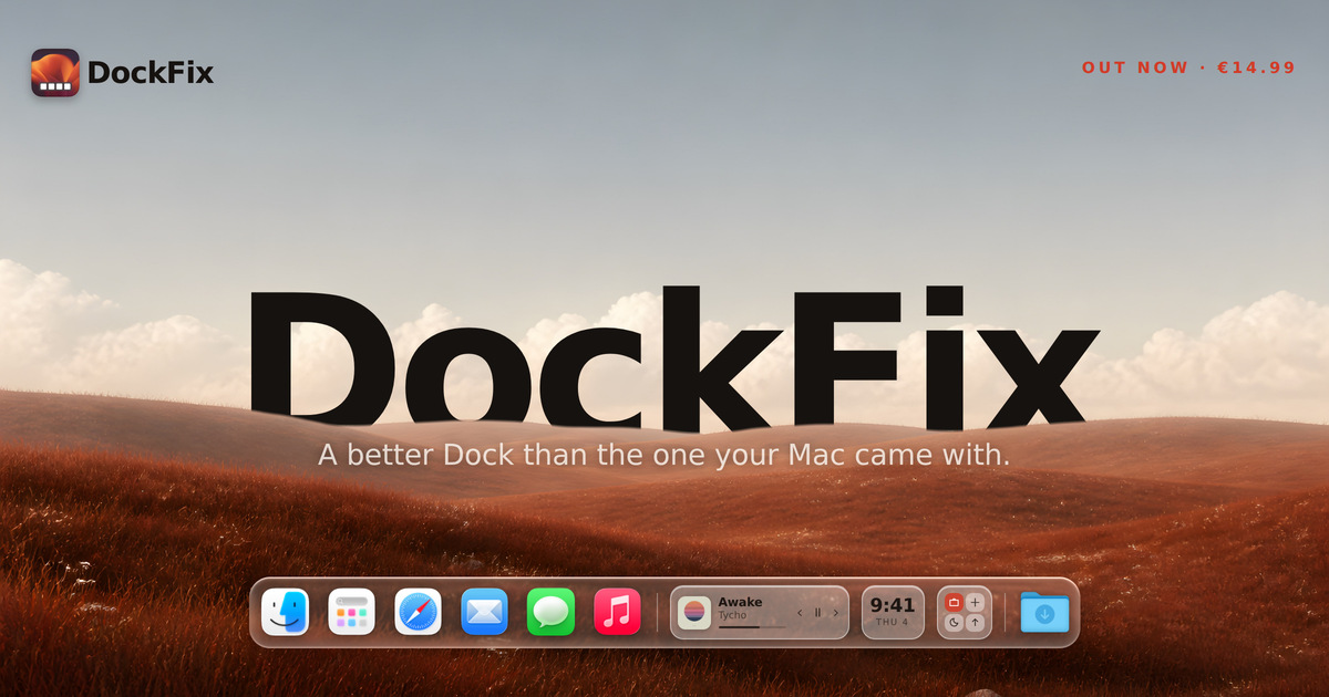
The macOS Dock does very little, and you cannot personalise any of it. DockFix replaces it with a dock you control completely, adding colours, opacity, size, position, animations, custom app icons, folders, website shortcuts, presets, a file shelf, widgets and window previews. It is built for macOS users who want their Dock to feel personal while still looking and behaving like it came with the Mac, and it runs on macOS 14 or later on both Apple silicon and Intel machines. DockFix exists for one reason, as founder Gustav Lübker of AppVerge puts it: the Dock that comes with your Mac is not yours. Apple designed it to be fast and reliable and then closed it, so you cannot personalise its colour, its icons, its animations, or much of what sits inside it. DockFix was built to hand all of that back to the user. The hard part, according to the founder, is that a dock you have made your own is only worth having if it still feels like part of macOS — the magnification has to carry the right weight, a window has to fold toward the corner it came from, and an icon has to appear the instant the app does. Miss any of that and people feel it straight away, even when they could not tell you what is wrong. Customisation is the core of the product. Colours, opacity, size, position, animations and icons can all be configured to your likings, so the dock can match a wallpaper, a workflow or a mood. DockFix also supports folders, website shortcuts and presets, meaning items can be grouped, a site can be pinned to the dock, and a complete configuration can be saved and reapplied. Community presets take this further: a theme can be applied instantly with one click, and the site points to a Community Docks gallery at dockfix.app/discover where users share the setups they have built. Custom app icons let you apply your own artwork to any app on the system, including the native apps macOS will not otherwise let you touch. That means Finder, Launchpad, Safari, Mail and the rest can be redrawn to match a theme rather than being locked to Apple's originals. For anyone who cares about visual consistency across the desktop, this removes the last element that Apple's closed Dock design left unchangeable, and it works app by app rather than as an all-or-nothing switch. Widgets place useful information and quick controls directly in the dock itself. The site names media playback, the clock and shortcuts as examples, so a now-playing panel, a time display and quick actions can live in the same strip as your apps and folders, available wherever you are. Because they sit in the dock rather than in a separate window or the menu bar, they stay within reach without adding another place to look, and they are described as useful information and quick controls in one place. Window previews are billed as the most requested feature. Hovering over an app shows its open windows live, and you can jump straight to the one you want instead of cycling through them one by one. That turns the dock into a way of navigating open work rather than only launching it. The rebuild also delivered a completely new interface, designed from the ground up to be modern and intuitive, alongside a new engine. DockFix's custom dock is built to look and animate exactly like the system dock straight out of the box, with the same magnification and true liquid glass, so customisation does not come at the cost of the feel people expect from macOS. The current release is a ground-up rebuild rather than an update layered on the old app. Every part of DockFix was rebuilt: a new engine, a new interface, and a dock that looks and behaves like it came with your Mac, with every bit of customisation that existed before still present and a great deal more added. The founder notes that the team stopped adding to what they had and rebuilt the app from nothing, with no line of the old code left in place, because a rewrite is not something you can do halfway. The result is a dock that moves like Apple's and then does what Apple's will not, without any of it feeling bolted on. Performance is treated as a feature rather than an afterthought: the new version uses under one percent CPU on average, and it runs on both Apple silicon and Intel Macs running macOS 14 or later. DockFix requires no special permissions and never asks you to disable System Integrity Protection. While it runs it hides the system Dock and restores it when you quit, so nothing on the system is changed permanently. On privacy, the site states plainly that there is no tracking and no usage collection of any kind; the only data stored is your email address, kept to manage your licence and answer support requests. The outcome for users is a dock that feels personal without feeling foreign — Apple's speed and polish, but configured however you like, with the features Apple never added. Because DockFix keeps the same magnification and liquid glass appearance as the system dock, switching is not jarring; because it stays under one percent CPU on average, it is not something you have to worry about leaving running. Existing owners get the rebuilt version free, with the licence carrying over automatically and nothing to move or reactivate, so upgrading carries no risk, no extra cost and no configuration work. In practice, DockFix suits a range of everyday workflows. A user who wants a dock that matches a wallpaper or a desktop theme can set colours, opacity, size and position, then apply a community preset in one click rather than rebuilding the look by hand. Someone working with many open windows can hover over an app, see those windows live and jump straight to the one they need. Anyone who keeps media playing can leave playback controls and the clock in the dock itself. Users who dislike Apple's default icons can apply their own artwork to the native apps macOS usually locks down, and people who keep files or links close at hand can use the file shelf, folders and website shortcuts. Students get 30% off, and anyone with an older licence simply updates to the new version at no cost. DockFix is aimed at macOS users on macOS 14 or later, on Apple silicon and Intel machines, who want to personalise the Dock beyond what Apple allows. It is a paid desktop app priced at €14.99, paid once and used forever, with no subscription. Every purchase comes with a seven-day free trial with every feature unlocked and no card required, and settings carry over if you buy during or after the trial. There is a 30% discount for enrolled students. Support is available through the support page and a Discord server, where the site says most questions are answered within a day, and a lost licence key can be recovered from inside the app. The new version is free for anyone who already owns DockFix. Taken together, DockFix is a macOS Dock replacement built around one idea: the dock that ships with your Mac is not yours, and it should be. By rebuilding the app from nothing — new engine, new interface — AppVerge delivered a dock that looks and animates like Apple's, keeps the magnification and liquid glass feel intact, and then adds everything Apple's Dock will not do: window previews, widgets, custom icons, folders, presets and the file shelf. For €14.99 once, with a free seven-day trial and a free upgrade for existing owners, it offers a fully customisable dock that stays light, safe and private.
TIM PG is a privacy guard utility that wraps intelligent data protection and security around the everyday use of artificial intelligence. It is built for people and teams who want to take advantage of large language models and other AI tools without handing over sensitive information, and it does this by automatically masking personal data from the clipboard before that data is pasted anywhere. Alongside clipboard protection, TIM PG anonymizes documents such as PDF and Office files, and uses Smart Bubble technology to protect individual text segments locally on a PC. The product is presented as a strictly offline, 100 percent AI-free Windows utility, so protection happens on the machine itself rather than in a cloud service. AI assistants have become part of ordinary working life, and the fastest way to use them is to paste text straight into the prompt. The trouble is that the text people paste often contains personal data — the kind of sensitive detail that was never meant to leave the organization or the user's own machine. Once such content reaches a cloud-based model, it is difficult to know where it goes or who may see it. TIM PG addresses this specific moment of risk: the copy-and-paste step that happens between a user's own documents and an external AI tool. Rather than asking people to change their habits or stop using AI, it intervenes at the clipboard itself, before the sensitive data has a chance to leave the local machine. The core of TIM PG is automatic masking of personal data from the clipboard. Before a user pastes anything into an LLM, the utility masks the sensitive data inside the clipboard content, so what reaches the AI tool is a version of the text without that personal data. Once the AI produces its answer, TIM PG restores the sensitive data back into the AI's response. That round trip matters because it means the AI's output stays usable: the user still sees their own real data in the final answer, even though the model itself never received it. Both the masking and the restoration are performed locally on the PC, so the protection step does not become another place where data can leak. Beyond the clipboard, TIM PG offers document anonymization for PDF and Office files. This extends the same principle from a single copy-and-paste action to complete documents, which are typically the source of the most detailed content in a business workflow. A user who needs to work with a PDF or an Office document alongside an AI tool can anonymize that document first, so the content that travels onward carries no personal data. Because document anonymization is part of the same local utility, it keeps the whole process inside the user's existing environment rather than requiring a separate hosted service or an upload to a third party. It is the same idea as clipboard masking, applied at document scale. TIM PG also introduces Smart Bubble technology for protecting text segments. Rather than relying on a single blanket rule for everything, Smart Bubble is designed to protect text segments locally on the user's PC. For people who work with mixed material — where some parts of a document need shielding and others do not — this offers a way to apply protection at the level of individual segments instead of treating the entire piece of content as one block. Like the rest of the product, Smart Bubble operates on the local machine, so protected segments are never exposed to an external service as part of the protection process. The overall approach of TIM PG is deliberately local. It is described as a strictly offline, 100 percent AI-free Windows utility, which means it neither relies on a cloud connection nor uses AI of its own to do its work. Masking, document anonymization and the restoration of sensitive data all take place on the user's PC. This design choice is what separates the product from privacy add-ons that route content through a hosted service: there is no server in the middle, so nothing about the user's data is transmitted as part of the protection step. The utility sits between the user's clipboard or documents and the AI tool they want to use, and it does its work in that gap. The promised outcome is straightforward: no cloud, no leaked data — just secure local data privacy for everyday workflows. Users can keep using the AI tools they have already chosen while reducing the exposure of personal data. Because the masking is automatic, the protection does not depend on the user remembering to redact text by hand, and because the restoration is seamless, the final AI answer still contains the real details that make it useful. The result is that privacy stops being a trade-off against productivity: a user can copy, paste, prompt and read the response much as they normally would, with an extra layer of protection working locally in the background on their Windows machine. TIM PG is designed for the everyday scenarios in which text moves from private material into an AI tool. The most direct example is pasting clipboard content into an LLM, where TIM PG masks the personal data on the way in and restores it on the way out. A second scenario is working with PDF and Office documents that need to be anonymized before they are used with AI assistance. A third is the handling of individual text segments that require local protection through Smart Bubble technology. In each case the workflow ends the same way: the user gets the benefit of AI processing while the sensitive data stays on their own PC. TIM PG is a Windows utility, so it fits naturally into Windows-based business environments. It is presented on a website that also describes TIM, a next-generation business platform, and TIM TL, smart helper tools for daily business processes, alongside a statement that the team brings decades of development and IT security background to guarantee business stability. That positioning suggests the product is aimed at business operations and utilities users who need practical, secure tooling rather than experimental AI features. The site states that intelligent data protection and security are the goal for the safe use of artificial intelligence, and it offers a demo as well as a way to request a consultation. No pricing or plan information is stated in the available content. TIM PG's value proposition is narrow, clear and practical: it protects sensitive data at the exact moment it would otherwise be exposed — when it is pasted into an AI tool. By masking personal data from the clipboard, anonymizing PDF and Office documents, restoring protected data into the AI's response and using Smart Bubble technology to protect text segments locally, it lets people keep working with AI without sending their private information to the cloud. Strictly offline and 100 percent AI-free, TIM PG is local data privacy built for workflows that depend on AI.
Spaces is a desktop app that gives a team one shared space per project, where the people on the team and their AI agents work together. Instead of each person holding a private AI chat history, a space keeps the project's chats, files, and routines in one place, so Monday's decision is still there on Thursday for everyone. It is built for teams that already use AI assistants every day and want that work to be shared rather than scattered across separate laptops and browser tabs. Spaces runs as a desktop application on Apple silicon Macs and Windows PCs, and a single person can start with it free before inviting anyone else. The problem the product sets out to solve is described on its own site as five people with five private chat histories. Everyone on a team has their own AI thread, and none of them can see each other's. The project's context ends up spread across browser tabs on separate machines, so every new question begins by re-explaining the job to the assistant. Each individual gets faster, but the team as a whole does not. A shared space is the product's answer to that gap: one project, one conversation, with chats and files living in the space rather than in somebody's personal thread. Getting started follows three explicit steps. First you download Spaces; it is free, needs no account, and installs like any other desktop app. Next you connect your AI by pasting the ChatGPT, Claude, or Gemini key you already have — one provider is enough to begin with. Then you open a space by naming the project and putting a specialist to work, and from that moment the space starts holding the context. Because each person's agents, API keys, and connected accounts stay on their own computer, the account you connect is not moved into someone else's cloud. The shared space is the core of the product. Chats and files live in the space itself, not in one person's thread, so a Product Launch space can show a press list for launch week, waitlist copy, and a battery claims comparison beside a launch brief, all visible to everyone in the space. The example space is managed by a Launch Lead and also includes a Copywriter and a Researcher. Because the space holds the history, nobody has to reconstruct what was decided or re-feed the same background into a fresh chat. Rather than one general assistant, a space can hold specialists. The site frames this as hiring agents, not one assistant: a researcher, a copywriter, a launch lead, each keeping its own notes so anyone in the space can put them to work. Each specialist gets its own instructions, memory, and tools, so it can research, draft, work through an inbox, or run a report. Agents have skills and tools attached, and the studio view lets you pick an agent to chat with or add someone new to the space. Routines are the part of Spaces that keeps working when nobody is watching. They are described as things that run on a schedule — check-ins, follow-ups, and reminders. In the product demo there are three routines in the Product Launch space: a launch morning brief that runs daily at 9:00 AM, a Friday recap that runs at 4:00 PM, and a paused waitlist follow-up. The stated behaviour is that the space does the standing work and pings someone only when it needs a decision, which means routine output does not depend on a person remembering to ask. Spaces takes the position that teams should use the models they already pay for. You connect ChatGPT, Claude, or Gemini, or run a model on the computer itself — Ollama is shown running locally — and the keys stay on that person's computer. Providers can be switched per agent at any time, and more than one provider can be brought in. The stated benefit is that you are buying the space, not another subscription for tokens: Spaces is not a reseller of AI, it is the app those models work in. Agents can also use the real web through a built-in browser. Research, clicking through, and staying signed in all happen inside the app, so the agent sees the page the user sees. The site illustrates this with a supplier specification page for a solar backpack being checked against claims held in the space's files — a 65W peak panel, a 20,000 mAh pack, and a weatherproof shell — along with the instruction not to claim that the pack charges a laptop in an hour. Having the browser inside the app keeps the agent's view and the team's files in the same workspace. Spaces separates what stays local from what the cloud carries. Each person's agents, API keys, and connected accounts stay on their own computer and never go to the cloud. The cloud carries the space, the chats, the files, and the routines, and nothing else, and shared-space content is encrypted at rest with a per-space key held in Google Cloud KMS; only members of the space receive it. A space begins as yours, and when you invite someone it becomes a shared space you both work in — the same chats, the same files, the same routines, with their agents alongside yours. The outcomes stated on the site follow from that structure. Context stops being personal: the project's history, decisions, and files belong to the space and remain available to everyone in it. Standing work continues without anyone prompting it, because routines run on a schedule. Each person keeps control of their own keys and accounts, so joining a shared space does not mean handing a colleague access to a personal AI account. And because the team is not buying tokens from Spaces, adding a seat does not add an AI subscription — the models are the ones the team already pays for. Concrete scenarios appear throughout the site. A product launch team keeps a press list for launch week, drafts waitlist copy, and compares battery claims against a launch brief with a researcher, all inside one space. The same space runs a morning brief at 9:00 AM and a Friday recap at 4:00 PM, and it can follow up on a waitlist when someone switches that routine on. Agents use the built-in browser to check supplier specification pages against internal claims. A solo user can run unlimited spaces on their own machine with specialists, routines, and playbooks, and only moves to a shared cloud space when other people need to work in it. Pricing is stated clearly. The desktop app is free on your own computer with no account, and includes unlimited local spaces, specialists, routines, and playbooks, plus your own AI keys. Spaces Cloud is listed at $10.99 a year per person, described on the pricing panel as $0.92 a month, and the FAQ gives $1.49 a month or $10.99 a year per person; it adds cloud-hosted spaces with shared chats, files, and routines, plus the ability to invite anyone who has a seat. A team of five is $55 a year. Everyone who works in a shared space needs their own seat because each person runs their own agents, and anyone who works alone stays free. Enterprise is a conversation rather than a checkout, and puts Spaces inside your own cloud so the data never leaves it, with help setting the whole thing up. The desktop app runs on Apple silicon Macs and Windows PCs. The takeaway Spaces promotes is that AI work on a team should live in a place the team can see. One space per project holds the chats, files, and routines; specialists take on defined roles; routines keep the standing work moving; and the models doing the work are the ones you already pay for. Start free on your own computer, connect a key, and invite the team when you are ready.
Formesign is a tool for collecting legally binding eSignatures inside Google Forms. It adds signature fields to the forms you have already built, so the people who fill in your form can sign it directly instead of printing, signing and scanning a document. When a form is submitted, Formesign converts the responses into signed PDF files, saves an audit-ready copy to Google Drive, and syncs the submission to Google Sheets. Signed forms can also be emailed to respondents and collaborators for record-keeping. Formesign is built for compliance-focused businesses and organisations that need signatures as a normal part of a data-collection workflow, and it is used across healthcare, HR, education, events, real estate and construction. Its purpose is simple: keep the Google Forms workflow an organisation already relies on, and add a signature step to it that stands up as legally enforceable. Google Forms is great at collecting data from users, but it does not have a built-in option to collect signatures. That gap matters whenever a form is not just information gathering but an agreement: a consent form, an acknowledgement, a rental agreement or an approval request. Organisations in these situations often fall back on printing forms, asking people to sign by hand, and then scanning and storing the paper themselves, or they turn to dedicated eSignature platforms that charge far more than the workflow justifies. A customer quoted on the Formesign site describes the industry-standard signature provider as "TOO expensive" for their HIPAA-compliant Google Forms signature needs. Formesign addresses exactly that problem: it keeps the Google Forms workflow the organisation already uses, while adding a signature collection step that meets electronic signature regulations, so organisations that care about compliance do not have to leave the tools they know or pay enterprise eSignature prices. Formesign ensures that signatures collected through Google Forms are legally enforceable, meeting electronic signature regulations, so a signed Google Form can be relied on as a record of agreement rather than a loose acknowledgement. Alongside a single signer, Formesign supports collecting multiple signatures, so a document can require additional parties such as a witness or a guardian to sign as well. This lets organisations ensure that all necessary parties sign the document before the form submission is complete, rather than chasing missing signatures after the fact. For compliance-focused teams, the practical result is that the signature step is built into the same submission that captures the rest of the data, so the signed record and the submitted answers stay tied together. Google Drive integration is central to how Formesign handles documents. It automatically converts form responses into signed PDF files and syncs them to a Google Drive folder when the user submits the form, which gives the organisation a stored, audit-ready copy of every signed document without manual exports or filing. Email delivery complements this: Formesign sends customised emails with the signed PDF files to respondents and collaborators for seamless communication and record-keeping. A respondent can therefore keep their own copy of what they signed, while internal collaborators receive the same document inside the workflow that collected the signature, removing the need to forward attachments or reconcile separate copies by hand. Responses also sync automatically to Google Sheets, providing a familiar interface for organising and analysing the data that accompanies each signature, so the answers people submit alongside the signature remain usable for reporting and follow-up. The signing experience itself is designed to be seamless: users can easily sign forms on any device, including mobiles and tablets, for a convenient, secure and accessible signing experience. One customer highlights the ability to update a form without needing to regenerate the link, which means corrections can be made to a live form without invalidating links that have already been distributed to signers — particularly useful for teams that send consent, registration or application links out widely. The overall approach is to keep the form the organisation already has and add to it, rather than replace it. You add signature fields to your existing Google Form and continue to publish and share it as usual. When someone submits the form, Formesign generates a signed PDF from that submission, stores the file in Drive, emails it out to the relevant parties, and records the response in Sheets. Because the whole flow runs through Google Forms, Google Drive and Google Sheets, the process stays inside the tools the team already uses, and the signature becomes part of the submission itself rather than a separate document-handling exercise. There is also a library of blank, ready-made signature forms on the site, so teams can start from a template rather than building a signature form from scratch. The benefits follow directly from that design: legally enforceable signatures without leaving Google Forms, signed PDFs generated and filed automatically, email copies in the hands of respondents and collaborators, and response data arriving in Sheets ready to organise and analyse. The site emphasises a secure, accessible signing experience across devices, and it highlights customers moving from paper-based processes to a modern digital workflow — one customer describes their company as having moved "from the stone age to modern age" through the ability to use the feature. Another customer, working with HIPAA-compliant Google Forms, notes that they needed a way to collect signatures and that Formesign worked perfectly, and that the company worked with them to evolve the product so that a PDF copy of the form could be provided after signing. With more than 500 organisations trusting Formesign, the product is positioned for teams that need signature collection at volume and at a lower cost than dedicated eSignature platforms. The site also presents a range of ready-made signature forms, which show the kinds of concrete workflows Formesign supports: an employee handbook acknowledgement form for HR, a HIPAA privacy notice acknowledgement form for healthcare, photo release forms and catering agreements for events, a tattoo consent form for legal compliance, a rental agreement form for real estate, an equipment rental agreement and a vendor application form for business, a school application form for education, a contest entry form for events, a reference request for HR, an IT service request for IT, and a purchase request approval form for finance. Each of these is a scenario where a signature is required alongside the data a Google Form already collects, and where the signed PDF then needs to be retained and circulated to the right people. Formesign is aimed at compliance-focused businesses and organisations working in healthcare, HR, education, events, real estate, finance, IT, construction and legal-compliance contexts — the site notes that its customers span from healthcare to construction, and that more than 500 organisations trust it. It is used by organisations working with HIPAA-compliant Google Forms, and by small teams that describe themselves as not tech savvy and who use it to create registration links for clients. Because Formesign operates as an add-on to Google Forms, the integrations it relies on are Google Drive for document storage and signed PDFs, Google Sheets for response data, and email for delivering signed PDFs to respondents and collaborators. In short, Formesign adds the missing signature step to Google Forms: legally binding eSignatures, multiple signers when a witness or guardian must also sign, signed PDFs generated and saved to Drive, customised emails to respondents and collaborators, and responses synced to Sheets — all inside the Google tools a team is already using. For organisations that need signature collection to be compliant, simple and affordable, it turns an ordinary Google Form into a source of signed, audit-ready documents.
ChatHop is a browser-based tool that moves your AI conversation from one assistant to another mid-thought, with the context included. Instead of starting over on a different AI service, you take the conversation you were already having and carry it into a fresh chat on the assistant you choose. ChatHop is aimed at people who work inside AI chat interfaces every day and want the freedom to switch without losing the thread. It is not a new place to chat; it is a way to move the chats you already have. Its purpose is a single idea: your conversation should be able to travel with you, so you never have to re-explain what you were doing, what you asked, or what you already got back. The problem ChatHop addresses is the wall. You ask something and get a bad answer. You hit a rate limit. You want a second opinion on the response you just received. Any of these moments can stop a session dead, and the usual workaround — opening another AI, copying fragments of the old conversation, and retyping your instructions — costs time and breaks the flow of thought. It arrives at the worst possible moment, right when the work is going well. Re-explaining context is not only tedious; it can change the result, because the new assistant never sees the full exchange that led to your question. ChatHop treats the conversation itself as the thing worth moving, so the work you have already done stays intact. The site sums the promise up in one line: your conversation, carried over, no re-explaining. The core capability is a one-click transfer of conversation context into a fresh chat on the AI you pick. When you run into a bad answer, a rate limit, or a need for a second opinion, you trigger a hop rather than start from scratch. ChatHop asks you to choose why you are moving the conversation and then to choose your destination, and it carries the conversation into the new chat. Answering that first question turns a vague urge to escape a stuck conversation into a deliberate choice about where the work should go next. The result lands in the destination composer, ready for you to review and continue. Auto-send is optional and off by default, so nothing sends without you — you keep control of what leaves your hands and when it does. ChatHop also copies the complete conversation to your clipboard in plain text or Markdown. This is the 'take it with you' half of the product: when you need the conversation somewhere other than another AI chat, you can paste it into a document, an email, a notes app, a code editor, Slack, another AI, or anywhere else you choose. The format choice matters for practical reasons, since plain text drops cleanly into almost any destination while Markdown preserves structure in the tools that read it. Because the copy is a full conversation rather than a single reply, it captures the back-and-forth that gives the exchange its meaning. ChatHop's framing is that you decide where it goes — the copy is an export you control, not an automatic sync. Privacy is presented as a design principle rather than an afterthought. ChatHop reads conversation context only when you initiate a transfer or a copy action, meaning it acts on your instruction instead of scanning continuously in the background. Conversation text is never sent to ChatHop's billing service, which keeps the content of your chats out of the payment path. Your chats are not used for advertising, profiling, or chat analytics, and ChatHop states that it does not sell conversation data. The design intent is that the tool holds your text only long enough to do the job you asked for. Taken together, these commitments mean the product's access to your conversations is bounded by the specific action you take. The workflow is deliberately three steps. First, open your conversation and work where you already work, because ChatHop supports the major AI chat services you use every day. Second, click and pick: choose why you are moving the conversation, then choose your destination, and ChatHop carries the conversation into the new chat. Third, review, send, and flow on — the conversation is placed in the destination composer for your review, and if you have enabled Auto-send, ChatHop can send it automatically, though it never does so without your say-so. Each step hands a decision back to you before the next one begins. Putting the review step in the middle keeps the human decision point inside the process rather than bolted on at the end. The stated benefit is speed and continuity. The site puts it as seconds from stuck to shipping — that is a hop. Instead of losing a session to a rate limit or a weak answer, you keep the thread alive somewhere new, with the previous exchange in hand. Because context travels with the conversation, you do not pay the re-explaining tax. Because nothing auto-sends by default, you do not trade that convenience for loss of control. For anyone working through a long problem in stages, that continuity is the difference between a session that survives the interruption and one that quietly dies. The product is positioned around a simple expectation: switching assistants should feel like continuing, not restarting. Concrete scenarios follow directly from the page. You get a bad answer and want to see whether a different assistant handles the same prompt history better. You hit a rate limit mid-task and need to keep working rather than wait. You want a second opinion on a response you already received, with the original exchange in front of the new assistant. Or you need the conversation outside an AI chat altogether — pasted into a document, an email, a notes app, a code editor, Slack, or anywhere else you choose, in plain text or Markdown. Each case is the same underlying move: take what exists and put it somewhere it can continue. ChatHop is built for people who treat AI chat interfaces as a working environment rather than a novelty, and who would rather carry a conversation forward than rebuild it. It is distributed as a browser tool; its Product Hunt listing places it under Chrome Extensions, Productivity, and Artificial Intelligence. It supports the major AI chat services you use every day, without naming individual providers on the page. Pricing starts free: 20 free uses every month, with no signup, no password, and no card required to start. That free tier reads as a way to learn the habit rather than a hard wall. There is no ChatHop account or password. If you upgrade, Stripe securely handles checkout and subscription management, and ChatHop never sees your full card details. ChatHop's value proposition is portable conversation. It takes the moment you hit a wall — a bad answer, a rate limit, a need for a second opinion — and turns it into one click that carries your context into a fresh chat on the AI you choose, or copies the whole exchange to your clipboard as plain text or Markdown. With 20 free uses a month, no signup to begin, review-before-send by default, and a privacy stance built around acting only when you do, ChatHop is a focused utility for a specific and recurring friction: your chat should be yours to move.