Category Focus/categories/design
Design AI Tools
Discover and compare the best design AI tools and software. Browse 177+ curated tools with reviews and rankings.
Projects tracked
177
Sort mode
RECENT
Page
3
Discover and compare the best design AI tools and software. Browse 177+ curated tools with reviews and rankings.
Projects tracked
177
Sort mode
RECENT
Page
3
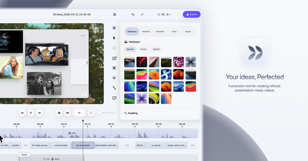
Dina is a screen recorder built exclusively for macOS that turns raw screen captures into polished, presentation-ready videos. It records your screen, audio, camera, cursor, and keystrokes in one take, then refines the result — with motion, zoom, and clarity handled for you — so every recording feels ready to present. The tool is made for people who need to explain something on screen clearly and beautifully, from product demos and tutorials to courses and social media videos. Dina's stated goal is to make every video worth watching, so what your audience sees is as clear as what you imagined. Screen recordings are the fastest way to show rather than tell, but the result rarely matches what the creator pictured. Key interactions get lost when the viewer cannot tell where to look, and motion can feel less intentional than intended. Dina's approach is to handle the refinement automatically: it records your screen and refines it automatically, and according to the product, demos and tutorials made with it feel clearer, more engaging, and effortless to watch because automatic zoom keeps the audience focused on what matters. Dina also positions itself as an alternative to tools such as Screen Studio, Loom, and Tella, standing apart by adding cinematic zoom, smooth animations, and AI-powered features to recordings so they feel polished without manual editing. Capture everything that matters, all in one take. Dina records screen, audio, camera, cursor, and keystrokes together, and you can capture your screen, a window, or a selected area with camera, mic, and system audio in high quality from the same recording panel. Scheduled Recording lets you set a time and let Dina handle the rest, so a recording can start without you being there, while Pause Recording lets you pause and resume whenever you need to so you can record at your own pace. Because capture happens in one place in one take, there is no need to assemble separate tracks afterwards. Automatic zoom is at the heart of the experience. Dina automatically zooms into key interactions, helping your audience stay focused without distraction, and you can switch to precise manual zoom control when you want to highlight something specific. Smooth, intentional zoom animations guide the audience through every important detail. A new dimension of depth comes from subtle 3D camera movement added to your recording, so scenes feel more cinematic and alive. You set the perspective with presets that range from a gentle angle to a dynamic top-down shot, then fine-tune camera position, distance, roll, and depth blur so each move feels exactly right. Cursor movement is gently refined so motion feels steady and intentional, and cursor size, variant, and highlight effects can be customized to match your brand. Keyframes provide smooth, natural transitions that highlight important moments and guide the viewer's attention. Complete layouts bring titles, slides, images, and video together into cohesive scenes that feel balanced, intentional, and ready to present. Mask Layout hides sensitive information with flexible, multi-region masking exactly where you need it. Slide Layout adds slides directly into your recording and gives you control over their color, timing, and animation so they feel like part of the video rather than an overlay. Text Layout adds text with solid or gradient fills and refined animations timed to appear and exit naturally as the recording progresses. Annotations guide attention exactly where it matters: arrows, highlights, shapes, and callouts are added directly into the video. Callouts provide contextual notes with customizable text, colors, and timing, Highlights draw the viewer's eye to key moments, and Shapes & Arrows frame, point, and guide with precision. Background and spacing can be adjusted to frame content clearly and consistently. Dina is built for presence, recording your webcam, microphone, and captions together so your message comes through naturally without extra setup. The webcam can be adjusted for size, shape, roundness, and position to place your camera exactly where it belongs in the frame. Voiceovers can be recorded directly in the timeline, so narration can be added, edited, and refined without breaking your flow. Editable captions generate transcripts automatically and let you fine-tune words, timing, and phrasing so captions read clearly and accurately. AI transcript editing turns speech into edits: your recording appears as text, so you can edit your video by editing the transcript while AI removes fillers and silence automatically. AI voiceovers turn text into natural-sounding narration instantly, generating voiceovers from text using efficient on-device models. Dina puts control at your fingertips so you can customize shortcuts and edit your video with speed and precision without slowing down. Visual keyboard overlays show every key as it is pressed so your audience can follow along, and the shortcut display itself can be customized to match your brand and improve clarity. Output is studio-quality and ready instantly, with 4K output, multiple formats, and fast rendering. Native resolution exports preserve the original resolution without quality loss, which is useful for high-quality demos and tutorials. Shareable video links let anyone watch, review, and collaborate on a recording without needing an account, and Layer Export lets you export videos in layers to preserve quality and flexibility for professional editing workflows. Dina also handles iPhone recordings. Beautiful iOS Recordings capture your iPhone in original resolution and enhance it with smooth motion and refined presentation, designed to make every recording look polished. A range of iPhone variants and device mockups let you present your recordings inside device mockups. Easy iOS device recording works by connecting your iPhone with a USB cable or by choosing the iPhone mirroring window, and then starting the recording. Under the hood, Dina is designed exclusively for macOS, using modern Apple technologies to deliver native performance. The interface is crafted with SwiftUI for fluid animations, precise interactions, and a clean macOS-native experience. Metal taps directly into the GPU to power smooth motion, real-time visual effects, and high-quality video processing. On-device Core ML models run intelligent features, from transcript generation to voice synthesis, with full privacy and zero cloud latency. Dina runs natively on Macs powered by Apple Silicon and requires macOS Sequoia or later; there is no Windows version, and the app is built exclusively for macOS to take full advantage of Apple Silicon and Metal. Privacy is a core part of the product. All recordings are saved locally on your Mac, Dina works completely offline, and it does not require any account or cloud connection, so your data stays on your device, private and secure. The AI features, including transcript generation and voice synthesis, run on-device via Core ML, so nothing needs to leave the machine. The practical outcome is a fast, private workflow where polished videos are produced without manual editing, without subscriptions, and without depending on an internet connection. Typical uses include product demo videos that show a feature in action, video tutorials and courses that walk through a process step by step, and social media video content intended for quick sharing. Mask Layout is useful when a recording contains sensitive information that should not be shown, and Scheduled Recording helps capture sessions that happen at a fixed time without the creator being present. Layer Export serves professional editing workflows where further work happens in another editor, while shareable links support review and collaboration, since anyone can watch, review, and collaborate on a video without an account. Dina is trusted by professionals at companies including FloraAI, Sketch, Windsurf, and Typeform. It is distributed as a Mac licence: a native macOS app sold as a one-time purchase rather than a subscription. The licence costs $58 per device and includes lifetime updates, with an option to choose one device or three devices. Buyers get a lifetime license, free updates forever, files saved locally, full offline operation, and all features unlocked. Dina also maintains a Slack community for new features and tips, and an X/Twitter account for release updates. In short, Dina is a native macOS screen recorder that makes recordings look intentional without manual editing. It captures screen, audio, camera, cursor, and keystrokes in one take, then applies automatic zoom, 3D camera motion, smooth cursor movement, layouts, annotations, captions, and transcript-based AI editing to produce studio-quality video. For Mac users who need demos, tutorials, courses, or social videos that look polished and stay private, Dina combines speed, cinematic presentation, and one-time pricing in a single offline app.
Peas & Pans is meal planning software for nutrition coaches, dietitians and personal trainers who build plans for clients. It is designed so that a coach imports recipes, arranges them into a client's week against that client's calorie and macro targets, and then sends the finished plan out under the coach's own brand. The client receives a private page and a PDF in the coach's colours, with the coach's logo and business name, and Peas & Pans never appears on it. The product runs in a browser, is sold on a single plan at USD 29 per month with unlimited clients, and begins with a 7 day free trial that does not require a card. The problem the product addresses is stated plainly in its own words: you became a coach to help people eat better, not to retype recipes, add up macros in a spreadsheet and fix a PDF at 11 pm. The work behind a single client plan fragments across files — a macros spreadsheet with hand-written totals, a document named "Meal plan v3 FINAL (2).docx" last edited at 23:04, a screenshot of a recipe saved from Instagram, a message at 21:47 asking for the plan to be sent again because the PDF cannot be found, and a follow-up question about whether Thursday is fine without dairy. Peas & Pans takes that administrative part away so the coach keeps the part that needs them: deciding what each client should eat. Recipe import is the front of the workflow. A coach pastes a link, snaps a photo of a cookbook page, uploads a PDF, or types the recipe in as text. The product fetches the page, reads the recipe and matches it, so a link to something like a lemon chicken traybake arrives with its nutrition already worked out. Every ingredient is matched to USDA FoodData Central, which means the numbers are ones a coach can stand behind, and any line the system is not certain about is flagged for the coach to check and resolve themselves. An imported recipe shows its serving count, time, calories, protein, carbs and fat, along with how many lines are waiting for review — for example, two lines to check on one import, and every line matched on another. The product ships with a starter library of 450 recipes covering breakfasts, lunches, dinners and snacks, every one of them with ingredients matched to USDA data and already checked. Coaches can put them into a plan exactly as they are, or save a copy and make it their own. The library can be browsed by meal, by diet, and by what to leave out, and each recipe shows calories, protein, carbs and fat per serving, a method, and a macro ring. Behind the recipes sits a foods database of nearly 14,000 foods from USDA FoodData Central, each with its household measures. A coach can look a food up, check it per 100 g, per portion or by their own amount, view macros, fibre, sodium and more, and add it straight to a plan or use it inside a recipe. Building the week is the middle of the workflow. Recipes are dragged into each day, or every empty slot in the week can be filled in one press, and calories and macros add up as the coach goes, measured against the targets set for that particular client. Days show a running total against the target — for instance 1,567 of 1,850 kcal, 283 kcal under, with protein, carbs and fat tracked the same way. A meal can be swapped for one that matches its calories and protein in the same slot, a single day can be copied, and a whole plan can be copied and handed to the next client. Grocery lists are built from the week, grouped by aisle, and can be ticked off on the client's phone. Sharing is the final step, and it is where the branding matters. Each client gets a private page and a print-ready PDF in one click, carrying the coach's logo, colour and business name. There is no app to install and no login for the client — the private link simply opens in any browser. Six templates control the look of both the page and the PDF: Clean, which is airy with fine lines; Warm, with soft tinted cards; Editorial, with cookbook serif titles and days as chapters; Slate, with a dark header panel and strong rules; Notebook, with day cards on a cream sheet and dotted rules; and Statement, with a big title, a heavy rule in the brand colour, and large numbers. The coach's colours are applied within whichever layout they choose. The overall approach follows a simple three-step product tour — Import, Build, Share. Import brings a recipe in from a link, photo, PDF or text and resolves its nutrition against USDA FoodData Central, flagging anything uncertain. Build arranges those recipes into a client's week with live day totals against that client's targets. Share publishes the week as a branded page and PDF. Around those three steps sit the details that keep a practice running: an invite link that lets a client answer a few questions and land in the coach's client list ready for a plan, and calories and macros suggested from those intake answers, over which the coach always has the last word. A number of smaller conveniences are included as well. One search box finds any client, plan, recipe or food, and can be opened from any screen with ⌘K or Ctrl K. Help is available from every screen, either to read an answer or to send a question. A new account comes with a sample client and a week already in the coach's brand, so the coach can see what a client sees before building anything real. Data ownership is explicit: settings export every client, recipe and plan, plus the plan PDFs, at any time, and that export remains available if a subscription ends. The outcome for the coach is time returned and work they can stand behind. Plans that were assembled from spreadsheets and retyped recipes become a drag-and-drop week whose totals update automatically, and the PDF that used to be rebuilt late at night is replaced by a one-click export already in the coach's branding. Because every ingredient is matched to USDA data and anything uncertain is flagged, the nutrition a coach sends out is checked rather than estimated. Because clients get a private link with no login, there is no app for them to install or account for them to forget. And because the pages and PDFs carry the coach's logo, colour and name only, the software disappears behind the practice. Typical use looks like a coach importing a batch of recipes from links and cookbook photos, checking the flagged lines, then dragging meals into a named client's week — for example, a plan for a client on 1,850 kcal and 152 g protein a day, running 14 to 20 September, with each day measured against those targets. Another scenario is swapping Thursday's dinner for a dairy-free option after a client asks, using swaps that fit the same calories and protein in the same slot. A third is reusing a proven week: copying a day to fill a week, or copying a whole plan to hand to the next client. A fourth is sending the finished plan as a private page and a print-ready PDF, with a grocery list grouped by aisle that the client ticks off on their phone. Peas & Pans is aimed at nutrition coaches, dietitians and personal trainers who plan for clients, and it is priced as a single plan: USD 29 per month with unlimited clients, every feature included, and no per-client fees. It starts with 7 days free and no card required. When the trial ends, the account becomes read-only until the coach subscribes, and nothing is deleted. On cancellation the subscription runs to the end of the paid period, after which the account is read-only and everything can still be exported. Refunds are offered within 14 days of a charge. The value proposition is straightforward: Peas & Pans handles the retyping, the macro arithmetic and the late-night PDF, and leaves the coach the decision of what each client should eat. It does that with USDA-matched nutrition, a checked recipe library, a week builder that keeps the numbers current, and branded client pages and PDFs that carry the coach's name rather than the software's.
Once UI 2.0 is an open-source design system for building polished React products with less repetitive code. The website describes it as an open-source design system for indie creators built with Next.js and Supabase, and says you can ship fully functional apps with copy-paste React code covering components, blocks, layouts and pages. Once UI brands itself as "the agentic design system," and its Product Hunt tagline states that it builds consistent React apps for developers and AI agents. Its core purpose is to provide one shared system — foundations, components and design tokens — so that layouts can be composed from readable primitives and the result stays consistent as a product grows. The problem it addresses is repetition and visual drift in growing React codebases. According to the product description, Once UI helps teams build polished React products "with less repetitive code" and keeps "the result consistent as your product grows" by using a shared system of components and design tokens. The homepage expresses the same idea in a single line: "Any look. One system. Roll the die. The whole page changes. The code doesn't." In other words, the visual identity can be swapped completely while the underlying code stays untouched, because appearance is driven by the system rather than hard-coded into each screen. Version 2.0 extends this logic to AI coding agents: the release notes say the new version "gives both you and your coding agent a clearer way to work," which matters because agent-generated interface code tends to drift unless the agent has explicit rules and a catalog of approved components to draw from. The most visually distinctive feature is the "look" system. The homepage presents a twenty-sided die; rolling it changes the entire page, and a deck counter shows which of the twenty looks you have collected, with unrolled entries marked "Not rolled yet." The default is look number 20, described as "Natural 20: The default. You rolled the whole system." Each look specifies a complete visual configuration, shown on the site as neutral gray, brand emerald, accent orange, border playful, solid contrast · flat, surface filled, with heading, body and label fonts all set to Geist. Every look also has its own URL, such as once-ui.com/?face=20, so a specific appearance can be linked directly. Because the look changes the whole page while the code does not, the same React implementation can be restyled by switching configuration rather than rewriting components. Once UI ships as copy-paste React code rather than a locked black box. The meta description says it lets you "ship fully functional apps with copy-paste React code: components, blocks, layouts and pages," and the product description adds that you can "compose layouts with readable primitives." Those two statements describe the practical workflow: you assemble a screen from components and larger blocks, arrange them with primitives that stay readable in the source, and rely on layouts and page-level compositions that already follow the system's conventions. A shared set of design tokens carries the visual decisions, and those tokens underpin the look system demonstrated on the homepage. The product description also highlights "foundations and predictable APIs," which it says make the output "easier for you to understand." The intended outcome is a codebase where a developer can read a layout and know where every spacing, color and typographic value comes from. Version 2.0 is explicitly designed for AI coding agents as well as people. The product description states that its "component catalog, compact rules, and task guides help agents use the system correctly." Each of those three pieces serves a different purpose. The component catalog gives an agent an inventory of approved building blocks to choose from, so it does not have to invent new UI. The compact rules give the agent a short, enforceable set of constraints that fit inside a working context. The task guides walk the agent through common jobs step by step. On the other side of the same coin, the description notes that the "foundations and predictable APIs make the output easier for you to understand," so a human reviewing agent-generated code can still follow what was done and why. This is what the "agentic design system" label refers to: a system with enough structure that both a person and a coding agent can produce work that matches. Once UI is built with Next.js and Supabase, according to the website's meta description, and it is distributed as open-source software. The site supports that framing with a public GitHub organization, public documentation, a roadmap, a changelog and a handbook. The methodology is also visible in the way the homepage is organized as a game: twenty numbered faces, a die to roll, a deck that tracks collection progress, and a direct URL for each face. That structure is a demonstration of the system, not just a marketing device, because it shows that one React implementation can present twenty fully different visual identities by drawing on shared tokens. Because the project also publishes Figma assets and pre-built products such as Magic Portfolio, Magic Docs, Once UI Starter and Once UI Figma, the same system can be applied across design and code without branching into separate, drifting definitions. For developers, the stated benefit is less repetitive code and a result that stays consistent as the product grows. Because layouts are composed from readable primitives and the appearance is controlled by tokens and looks, changing the visual direction does not require editing every component. For teams working with AI agents, the stated benefit is that agents can use the system correctly, guided by a component catalog, compact rules and task guides, instead of producing one-off UI. The description also says the foundations and predictable APIs make agent output easier for the developer to understand, which reduces review effort. The open-source license and the free products listed on the site — Magic Portfolio, Magic Docs, Once UI Starter and Once UI Figma — lower the cost of trying the system. The site's showcase lists products built with Once UI, which gives concrete use cases. Aveiro is a creator platform; Frametic is described as "motion for the web"; IQON is a monitoring app; Hoshina is a property claim platform; La Femme Kosmetik is a beauty brand; and one entry is explicitly a developer portfolio, belonging to Divyanshu Dhruv. There is also Dopler Store, a swag store. Together these examples cover marketing sites, monitoring and business applications, portfolio pages, small online stores, and creator or content platforms, all built on the same design system. Other products in the Once UI family point to further uses: Once UI Core, Once UI Blocks and Orbit Core for building interfaces, Magic Portfolio and Magic Docs as ready-made templates, and Once UI Figma for design work. The companion newsletter, the Design Engineers Club, is described as having 5,000 readers every week, a Discord that answers, and a GitHub that ships in public. Once UI is aimed at indie creators and developers who build React products, especially those working with AI coding agents. The meta description names indie creators directly, and the product description speaks to developers building polished React products. The technology stack stated in the content is Next.js and Supabase, with React components as the delivery format. The project is open source, and its Product Hunt topics include Open Source, Developer Tools, Artificial Intelligence and GitHub. The website lists certain products under a "Free" heading — Magic Portfolio, Magic Docs, Once UI Starter and Once UI Figma — while a separate Pricing page is linked in the navigation. The project also states that it is supported by Claude for open source and Sentry for open source, and that it is a product by Dopler. In short, Once UI 2.0 is an open-source, Next.js-and-Supabase design system for React that pairs component, block, layout and page code you can copy into your app with a token-driven look system spanning twenty distinct visual identities. Its pitch is that the look can change while the code does not, and that the same structure makes the system usable by both developers and AI coding agents through a component catalog, compact rules and task guides. For indie creators and React teams, it offers consistency without repetition.
Squints is a free Chrome extension that puts design tools on top of any live web page, built for design engineers. It bundles a set of utilities that let you look closely at a page that is actually running in the browser: measure spacing, drag out guides, overlay a column grid, pick colours in any format, see the font that actually rendered, and slow down or scrub any animation. Rather than working inside a static design file, Squints operates on the real, live page, so the things you examine are the things users see. The extension is free, requires no account, and does no tracking. You add it to Chrome and the tools are available over the pages you visit, without a separate design canvas or an export step in between. The product exists because design is moving into code. Decisions that used to be settled in a design file, such as spacing, type, colour and motion, now get made in the browser, where the tools for looking closely never followed. A designer or design engineer reviewing a built page can see the result, but measuring the gap between two elements, checking which font actually rendered, or slowing down an animation to inspect it is awkward without the right tooling. Squints closes that gap by bringing Figma's measuring tools and more to any live web page. The result is that the same kind of close inspection that happens in a design canvas can happen on the production page itself. Two of the core capabilities are inspection and measurement. With Squints you can inspect anything on the page and read its box, along with the gap to the next one. That means selecting an element and seeing its boundaries and the distance between it and a neighbouring element, rather than estimating by eye. Alongside inspection, Squints provides rulers and guides that you drag out just like in Figma, and they snap. Snapping matters because it turns a rough drag into an exact alignment reference; you pull a guide to the edge of an element and it locks onto the right position, giving you a reliable line to measure against. Together these tools make spacing decisions visible and precise on a live page. Squints also lays a column grid over the real page, and the grid is remembered per site. That means once you set up the column structure for a given site, Squints keeps it for that site, so repeat visits do not require setting the grid up again. Overlaying a grid on the live page lets you judge whether content lines up with the intended columns as it actually renders. On top of that, Squints lets you draw on the page, using arrows, boxes and notes, where it matters. This turns the extension into a lightweight annotation layer, so you can mark up a specific spot on a rendering with a pointer, an outline or a written note instead of describing its location in words. Colour and type are handled directly on the live page as well. Squints lets you pick any colour, showing it in every format, plus the token behind it. Picking a colour from a rendered page means you capture the value that is actually being displayed, and getting the token behind it connects that value back to the design system it came from. For type, Squints identifies any font, the one that really rendered, with metrics. This matters because what a page specifies and what a browser renders are not always the same thing; a fallback may be in use without being obvious. Squints reports the font that actually rendered and includes its metrics, so typography can be checked against what users truly see. Motion and capture round out the toolset. Squints slows motion down, running every animation at a tenth of its speed. Animations often move too quickly to judge by eye, so slowing them to a tenth of their speed makes it possible to watch a transition play out and see what it does. Squints can also scrub any animation, as the product description notes, alongside slowing it down. The extension can also capture the result: a screenshot or a recording, with or without the marks you have made. Capturing a screenshot with marks included produces an annotated visual you can share, while capturing without marks gives a clean view of the page. A recording captures motion over time. These outputs make it easy to document what you found and pass it along. Overall, Squints works by layering design tooling on top of live web pages rather than inside a separate design file. It is delivered as a Chrome extension, so it runs in the browser next to the page you are examining. The tools are applied to the real rendered output, which is the same output users encounter. It is free, needs no account, and does no tracking. That combination keeps the workflow lightweight: there is nothing to sign up for and nothing being collected, so the extension can be used as a quick inspection layer whenever a page needs a closer look. The tools echo Figma's measuring approach, but they are pointed at the live web. The benefit for users is that close inspection becomes possible wherever the work actually lives. Instead of estimating spacing, you read the box and the gap. Instead of guessing at a colour, you pick it in every format and see the token behind it. Instead of wondering which font rendered, you identify it with metrics. Instead of trying to catch a fast animation by eye, you slow it down to a tenth of its speed. Guides that snap give exact alignment references, an overlaid column grid is remembered per site, and annotations plus screenshots or recordings let you document findings. The result is a tighter loop between looking at a live page and making a decision about it. Use cases follow from those capabilities. A design engineer reviewing a built page can measure the spacing between elements and check it against the intended values with rulers and guides that snap. Someone auditing a site's typography can identify the font that actually rendered and inspect its metrics. A designer checking colour can pick any colour on the page, see it in every format, and find the token behind it. When a layout needs verification against a grid, a column grid can be overlaid on the real page and remembered for that site. Animations can be slowed to a tenth of their speed to inspect motion, and the whole result can be captured as a screenshot or a recording, with or without marks, to share. Squints is described as a free Chrome extension for design engineers. It is intended for people who work where design meets code and who need to examine live pages closely. The extension is free, requires no account, and does no tracking, so there is no pricing tier, signup, or data collection to consider. Because it installs in Chrome and operates over web pages, it fits into an existing browser workflow rather than adding a separate application. The Product Hunt listing categorises it under design tools, productivity and developer tools, which matches the mix of design inspection and engineering-facing utility that the extension provides. In short, Squints brings design tools to the live web. It puts inspection, rulers and snapping guides, a remembered column grid, drawing and annotation, colour picking with tokens, font identification with metrics, slowed-down motion, and screenshot or recording capture on top of any live page. For design engineers, that means the close looking that once happened only in a design file can now happen in the browser, free and without an account.
Designeer is a curated platform that brings the best of the internet together for designers, developers, and builders. According to its own description, it helps people discover interface craft, component libraries, design systems, AI tools, inspiration, and people worth learning from, all in one place. The site is organised into numbered sections: Design Galleries, Interface Design, and Reading. Each section is a hand-picked list of external resources, from design showcase sites and prototyping canvases to books, essays and tutorials. The Product Hunt listing frames the same idea as "Explore the Best of the Internet for Builders," with a tagline of "Bringing the best of the internet together" and a four-step promise: Discover. Learn. Build. Showcase. The value of a platform like Designeer comes from how dispersed the material it collects normally is. Design inspiration lives on award sites, personal galleries, mobile flow archives and visual moodboarding platforms. Tooling lives on the sites of individual products. Learning material lives in books, course platforms, engineering blogs and pattern libraries. Keeping track of all of it is a manual exercise. Designeer's approach is to curate rather than generate: it selects resources and presents each one with a short, one-line description so a visitor can judge relevance before clicking through. The result is a single index covering galleries, canvases, tokens, tutorials and AI tooling, which is exactly what the phrase "bringing the best of the internet together" describes. The platform places itself in the middle of a workflow it names in four words — Discover, Learn, Build, Showcase — and serves each of those stages from the same list. The largest section is Design Galleries, described on the site as covering "design galleries, interface patterns, and web inspiration." It contains dozens of listings. Some are broad awards and community platforms, such as Awwwards for exceptional digital web craft, Dribbble's global community for sharing design concepts, Behance's Adobe showcase for creative portfolios, and Pinterest's visual discovery engine for creative ideas. Others are tightly focused galleries: 60fps collects recordings of interfaces that move well, Minimal Gallery showcases minimal and restrained websites, Sombra and Dark Mode Design celebrate dark-mode interfaces, Hover States showcases innovative interactive web design, and wwwtf.site gathers quirky and experimental interactive web corners. Several listings target specific page elements — Supahero curates website hero sections, navbar.design and navbar.gallery focus on navigation bar patterns, footer.design collects creative website footers, cta.gallery curates call-to-action buttons and banners, and Sections.wtf presents a real-world website section and hero gallery. Product and mobile references are covered too: Mobbin offers real mobile and web product flows, UX Archive holds a historical archive of mobile onboarding flows, Screenlane is a searchable gallery of interface screens, Pttrns is a directory of mobile UI patterns, and Appinspo curates mobile application design. For marketing pages there are Land-book, Lapa Ninja, Landingfolio, Saaspo, SaaSFrame, SaaS Landing Page, Best SaaS Web Designs and Landdding. The section also reaches into motion and imagery with Motionimo's library of motion design clips, Imageory's galleries pairing images with prompts, Backgrounds Supply's handcrafted website backgrounds and Venust Backgrounds' free AI-generated backgrounds. The Interface Design section is introduced as covering "interface design canvases, tokens, and layout systems." It lists end-to-end design platforms alongside narrower references. Figma is described as a collaborative interface design and prototyping platform; Framer as a visual canvas for designing and publishing websites; Penpot as an open-source web design platform supporting SVG; and Spline as browser-based 3D design software with physics. make.design is an AI generator that turns prompts into polished designs, and design.dev is an AI-assisted design token and system editor. Around those tools sit craft-focused references: Interface Craft publishes articles exploring modern digital interface craftsmanship, UI Labs is a laboratory deconstructing animated UI components, UIWTF showcases experimental web interface patterns, Lab01 presents refined UI experiments from a studio, and UI Playbook is a guide to common UI component states. The third section, Reading, is described as "essential books, design engineering essays, and craft tutorials." It mixes foundational books with ongoing publications and courses. Refactoring UI is listed as a practical design guide for building interfaces, and Practical Typography as an essential book covering typographic rules and layout; Design Books is a directory of essential design literature by discipline. For web standards and performance there is web.dev, and Inclusive Components is a pattern library teaching accessible component design. Interactive learning appears through Josh Comeau's tutorials breaking down CSS mechanics, Learn UI's video course on practical user interface design, Animations.dev's course on creating web animations that feel right, SVG Guide's guide to SVG markup and animations, and Learn Kernels' interactive guide to GPU kernel programming. Design system practice is supported by the Design System Checklist and by userinterface.wiki, a knowledge base documenting interface guidelines and rules. On the AI side, UI Skills teaches techniques for designing with AI, AI for UI teaches AI workflows for interfaces, and The Shape of AI is a pattern library highlighting AI interface design. Editorial and community sources include Smashing Magazine, Codrops, Muzli, UX Collective, Designer News, Web Designer Depot, Designmodo, Abduzeedo, Boxes and Arrows, Interfaces, Making Software, Visual Rambling, Design Spells, Good UI, Laws of UX, Degreeless Design, UI Land's interviews with design engineers, 99designs Discover and Inspiration Grid. Designeer works as a browsable index rather than a hosted toolset. The homepage is divided into numbered sections — 01 Design Galleries, 02 Interface Design and 03 Reading — and each entry within a section is a card with a favicon, the resource name and a one-sentence description. Selecting a card sends the visitor out to the original resource through a tagged outbound link, so Designeer itself stays a directory. Search is exposed at the top of the page and is bound to the CtrlK shortcut, while the Explore view is bound to CtrlE, giving keyboard-first users a fast way to filter the collection. A sponsored placement sits above the listings; currently the slot features Loops, described as marketing and transactional email for SaaS, from onboarding to product launches. Because every entry is hand-picked and summarised, the platform's stated benefit is that designers, developers and builders can find interface craft, component libraries, design systems, AI tools and inspiration in one place instead of across dozens of bookmarks. The one-line descriptions carry much of the value: a visitor can tell whether a resource is an archive of onboarding flows, a gallery of hero sections, a course on animation or an AI design tool without leaving the page. Coverage extends across the whole workflow the site names — Discover, Learn, Build and Showcase — so the same index serves someone gathering inspiration, someone choosing a design canvas, someone studying typography, and someone looking for people worth learning from. Concrete workflows follow the three sections. A designer starting a landing page can browse the landing-page and hero galleries — Lapa Ninja, Landingfolio, Land-book, Saaspo, SaaSFrame, Supahero — and then check navbar.design, footer.design or cta.gallery for the specific components they need to build. A team reviewing onboarding can study Mobbin's real product flows or UX Archive's historical archive of mobile onboarding flows. Someone choosing tooling can compare Figma, Framer, Penpot, Spline, make.design and design.dev in the Interface Design section. A developer building skills can work through Reading entries such as Animations.dev, SVG Guide or Josh Comeau's CSS tutorials. A design engineer looking for peers and portfolios can use Wall of Portfolios, Folios Gallery, desengs.com, designeng.tools, designengineer.tools and bestdesignsonx, while someone following AI build tooling can look for AI tools, coding agents and MCP servers referenced in the platform's own description. The platform names its audience directly: designers, developers, and builders. The Product Hunt listing tags it with the topics Design Tools, Developer Tools, Artificial Intelligence and Vercel Day. The website is localised in English, uses Designeer as application name, author, creator and publisher, and exposes Open Graph and Twitter card imagery plus rich search metadata for sharing. A sponsorship slot indicates commercial placement on the homepage, currently occupied by Loops. No pricing tiers, subscription plans or account requirements are described in the available content, apart from a Log in control shown in the interface. In short, Designeer is a curation layer for the design and build internet. Rather than offering its own editor, it collects galleries, interface design canvases, design systems, AI tooling, books, essays and tutorials, describes each one in a sentence, and lets visitors jump straight to the source. For designers, developers and builders who want to discover interface craft and people worth learning from without maintaining a sprawling bookmark folder, the platform's promise is simple: the best of the internet, brought together in one place.
LockLines is a macOS app for designing plain-text lock screen messages that fit the small message area macOS gives you. The app is built around a simple idea: the text that appears on a locked Mac should be readable before someone ever reaches the desktop. LockLines lets you write that message, preview how it will actually appear, and copy a finished, paste-ready result into macOS Lock Screen settings. It follows the same workflow shown in its screenshots — visible text, scroll text, preview, copy — and it is aimed at anyone who needs the lock screen to carry context: owner notes, contact information, asset labels, test machines, shared Macs, or any other message that needs to be understood by whoever is looking at the locked screen. The problem LockLines addresses is that the message area on a macOS lock screen is small, and it is easy to write something that does not fit or does not read well once it is in place. A message can end up cut off, with the important part hidden where nobody sees it. LockLines grew out of experiments with an OnyX lock screen option, which led its developer to try multiline messages, aligned text, and scroll-down owner details, and eventually to build a dedicated app for the job. The result is a tool that treats the lock screen message as a design problem: what appears first, what appears after scrolling, and how the whole thing reads at a glance before someone types a password. The first part of the workflow is the visible message — the text people see before they scroll. In LockLines you shape that first-screen message directly, writing a short prompt, a return instruction, or an owner contact teaser that fits the limited space macOS provides. The editor pairs your text with a lock screen preview, so you can see the first-screen message in context instead of guessing how it will look. The visible message editor screenshot shows a first-screen message with repeated-character border controls, which means you can decorate the plain text with borders built from repeated characters so the message stands out inside the small area. That decoration matters because plain text offers no bold, color, or font size — repeated characters are one of the few ways to create visual structure that survives the transfer to the lock screen. Below the first-screen message, LockLines lets you add scroll-down details. These are the longer pieces of text that appear after someone scrolls through the lock screen message: a fuller owner note, pickup instructions, an asset label, or test-machine details. Keeping this content in a separate scroll area means the initial message can stay short and readable while still carrying richer information for anyone who scrolls. The scroll text editor is shown alongside a lock screen preview as well, and the screenshots describe scrollable message details with styled plain-text boxes, so longer text can still be organized and visually separated using nothing more than plain characters. This separation between the first screen and the scrollable area is what allows both a quick-glance prompt and a detailed note to coexist in one message. A central capability is the ability to preview both states. LockLines separates the first visible message from the scrollable details and then shows each of them inside a lock screen preview, so you can switch between visible and scroll previews and understand the layout before copying anything. Because the output is plain text, what you see in the preview is what will end up on the lock screen — there is no rich formatting layer that might not survive the transfer. Decoration is handled the same way, through repeated characters and styled plain-text boxes, which keeps the message compatible with the plain-text field macOS expects. The app also includes an intro screen with an app explanation: an intro walkthrough explaining the plain-text lock screen workflow, so a new user can see the intended process before writing anything. The overall approach is a four-step workflow: write the first screen message, add scroll-down details, preview both states, and copy for System Settings. LockLines does not attempt to manage your system settings for you; instead, it produces the final plain-text message and hands it to you ready to paste. You copy the complete message and paste it into macOS Lock Screen settings yourself. That deliberate, transparent handoff keeps the tool predictable and keeps you in control of what actually gets applied to the machine, which suits users who prefer native utilities that do one job cleanly rather than tools that reach deeper into the operating system than necessary. The benefit is that a locked Mac stops being anonymous. A good lock screen message can turn a found device, a shared asset, or a test machine into something understandable. Instead of an unexplained login window, the person standing in front of the Mac sees a return prompt, an owner contact, or an asset label, and can act on it immediately. For anyone who manages machines, the payoff is fewer unanswered questions and less time spent identifying hardware, because the context travels with the device and is visible before anyone reaches the desktop. The scroll-down area adds a second layer: the short visible line can point to more detail that is available for those who need it, without cluttering the first screen. LockLines is useful anywhere a locked Mac needs context. It is used for lost Mac return instructions, so a found device can guide its way back to its owner. It is used for owner contact notes and for school and office asset labels on shared hardware. It fits conference or demo machines that pass through many hands and need a visible label. It suits repair intake or lab devices that should be identifiable while they sit on a bench. And it supports scroll-down prompts for longer messages, where the short visible line points to more detail that appears after scrolling. In each of these scenarios the app serves the same purpose: making the machine explain itself to whoever is standing in front of it. LockLines is available as a download on the Mac App Store, and the website also offers a support contact route for users who need help. It is made by Ihor July, a cybersecurity expert and reverse engineer focused on secure, privacy-respecting macOS tools; the same developer also builds Parall, DockLock Lite, App Trust Preview, and App Archiver for Mac users who care about predictable native utilities. The developer has written about the origin of the app in My Mac Apps Story, Part 5, describing how an OnyX lock screen option led to experiments with multiline messages, aligned text, and scroll-down owner details, and eventually to LockLines. The target audience is therefore Mac users and Mac administrators who want simple, native, privacy-respecting utilities that solve one specific problem well. LockLines exists to solve one specific, practical problem: making a macOS lock screen message fit and read well in a small space. By separating the visible message from the scroll-down details, previewing both states inside a lock screen preview, and copying a finished plain-text message ready for System Settings, it turns message design into a short, predictable workflow. For owner notes, contact information, asset labels, test machines, and shared Macs, that workflow is what makes the difference between a message nobody reads and one that is understood at a glance.
IconsDB is a web-based search engine for open source icons, logos, file type graphics, flags and emoji. It is designed for designers and developers who need to find the right visual asset quickly without guessing exact icon names. The platform provides instant, semantic search across more than 200,000 icons from 83 icon sets, including popular libraries such as Lucide, Heroicons, Tabler, Phosphor, Material Symbols and Font Awesome. Users can describe what they are looking for in plain language—for example 'sad robot' or 'money leaving'—and IconsDB returns matching results from across its collected libraries. Once an icon is found, it can be copied as SVG, React, Vue or CSS for immediate use in a project. Traditionally, finding an icon has required knowing its exact name or browsing through multiple separate icon libraries one by one. A developer who needs a specific concept might search for the wrong term, open several GitHub repositories, or waste time scrolling through thousands of icons. IconsDB addresses this by aggregating many open source sets into a single searchable catalog and by using an AI-powered semantic approach rather than relying on exact keyword matches. Instead of remembering that a particular icon is called 'face-grin-beam-sweat' or 'hand-holding-dollar', a user can describe the idea behind the icon and let the search engine interpret the intent. The core of IconsDB is its semantic search. The product tagline describes it as 'AI powered search across 200K+ free icons', and the website explains that users can 'stop guessing icon names' by describing what they need. Examples given include 'sad robot' and 'money leaving', which are natural-language descriptions rather than library-specific icon names. Search results can be sorted by relevance, name or icon set, and filters are available to narrow the results. The interface supports compact, grid and large view modes, letting users choose how much detail they want to see as they browse. There is also a 'Browse by name' section with direct links to common concepts such as home, search, settings, user, heart, star, bell, calendar, shopping cart, trash, arrow right, check, menu, download, lock and camera. IconsDB currently indexes 83 icon sets containing a total of 215,457 icons. The collection is organized into several areas. The main icon sets include Lucide (1,925 icons), HeroIcons (1,288), Tabler Icons (6,232), Phosphor (9,161), Remix Icon (3,229), Material Symbols (16,347), Bootstrap Icons (2,084), IonIcons (2,361), Iconoir (1,682), Carbon (2,763), Fluent UI System Icons (20,239), Radix Icons (342), Octicons (944), Akar Icons (458), css.gg (704), Teenyicons (1,200), Material Design Icons (7,638), Solar (8,425), Majesticons (1,045), Font Awesome 6 Solid (1,407), Font Awesome 6 Regular (164), MingCute Icon (3,336), Huge Icons (6,091), Material Line Icons (1,233), Unicons (1,215), Unicons Monochrome (298), Unicons Solid (190), Eva Icons (490), Feather Icons (286), BoxIcons v2 (1,609), BoxIcons v2 Solid (665), Mage Icons (1,042), Pixelarticons (1,306), Framework7 Icons (1,253), Jam Icons (940), Line Awesome (1,544), Humbleicons (287), WeUI Icon (162), Google Material Icons (10,956), Material Symbols Light (15,988), Font Awesome Solid (2,000), Font Awesome Regular (272), IconPark Outline (2,658), IconPark Solid (1,970), IconPark TwoTone (1,947), IconPark (2,658), Myna UI Icons (2,658), TDesign Icons (2,364), Ant Design Icons (848), Prime Icons (313), Element Plus (293), Flowbite Icons (804), Codicons (658), Lucide Lab (373), Fluent UI System Color Icons (890), Health Icons (2,709) and Keyline Icons (8,000). A separate section is dedicated to logos, file types and flags. This includes Simple Icons (3,733), Font Awesome 6 Brands (495), Boxicons Brands (299), SVG Logos (2,165), Devicon (1,053), Skill Icons (396), VSCode Icons (1,595), Catppuccin Icons (659), Flag Icons (530), Circle Flags (718), Flagpack (255), Font Awesome Brands (608), Material Icon Theme (1,175), CoreUI Brands (829), Web3 Icons (1,863), Web3 Icons Branded (4,164) and LobeHub AI Icons (948). The emoji section covers Twitter Emoji (4,169), Noto Emoji (3,818), Fluent Emoji Flat (3,180), Fluent Emoji High Contrast (1,595), OpenMoji (4,579), Fluent Emoji (3,032), Emoji One Colored (1,834), Streamline Emojis (787) and Firefox OS Emoji (1,034). IconsDB works by collecting icons from many open source sets into one searchable index and then applying semantic search so that users can query by intent. This differs from traditional icon search, which typically requires exact names or manual browsing within a single library. The platform also offers an MCP (Model Context Protocol) integration for coding agents. Through this, tools such as Claude Code, Cursor and Codex can search icons by intent directly from within the coding environment. The site also provides a licenses page that explains what attribution each icon set requires, helping users understand the terms attached to MIT, Apache-2.0, CC-BY-4.0, CC0-1.0, ISC and other licenses represented in the collection. The main benefit for users is speed and convenience. By removing the need to guess icon names, IconsDB reduces the time spent hunting through separate libraries and documentation. Designers and developers can describe a concept and receive relevant results from across 83 sets in one place. The ability to copy icons as SVG, React, Vue or CSS means the found asset can move directly into code without manual conversion. The MCP integration extends these benefits to AI coding agents, so icon discovery can happen inside tools like Claude Code, Cursor and Codex rather than in a separate browser tab. For teams that need to respect open source licenses, the dedicated licenses page provides clarity on attribution requirements. Typical use cases include a developer who needs an icon for a specific concept and does not know its name—they describe it in plain language and pick from the results. A front-end developer building a React or Vue interface can copy the chosen icon as a component and paste it into the project. A designer working on a page that lists technologies or brands can browse the logos, file types and flags section and find assets from Simple Icons, SVG Logos, Devicon or similar libraries. Product teams can use the emoji sets to find emoji imagery for interfaces, docs or marketing. Coding agent users can connect via MCP and have Claude Code, Cursor or Codex search icons by intent while working. Before publishing, users can check the licenses page to confirm what attribution is needed for a particular set. IconsDB is aimed at designers and developers, including front-end engineers who work with React, Vue, SVG or CSS. It also serves anyone using AI coding agents such as Claude Code, Cursor or Codex, since the MCP integration lets those tools search icons by intent. The product is web-based and focuses on open source icon sets. It is free to use, with the icons themselves coming from open source libraries that carry their own licenses, such as MIT, Apache-2.0, CC-BY-4.0, CC0-1.0 and ISC. The website includes sponsored placements from Prequel and GenMotion and an option to advertise, but the core icon search is presented as a free resource for finding 200,000+ icons, logos and emoji. In short, IconsDB is a centralized, AI-powered search tool for open source icons, logos and emoji. It combines 83 icon sets and more than 200,000 assets into one semantic search experience, supports copying as SVG, React, Vue or CSS, and offers an MCP integration for coding agents like Claude Code, Cursor and Codex. For designers and developers who want to stop guessing icon names and start finding the right visual asset by description, it provides a faster path from concept to code.
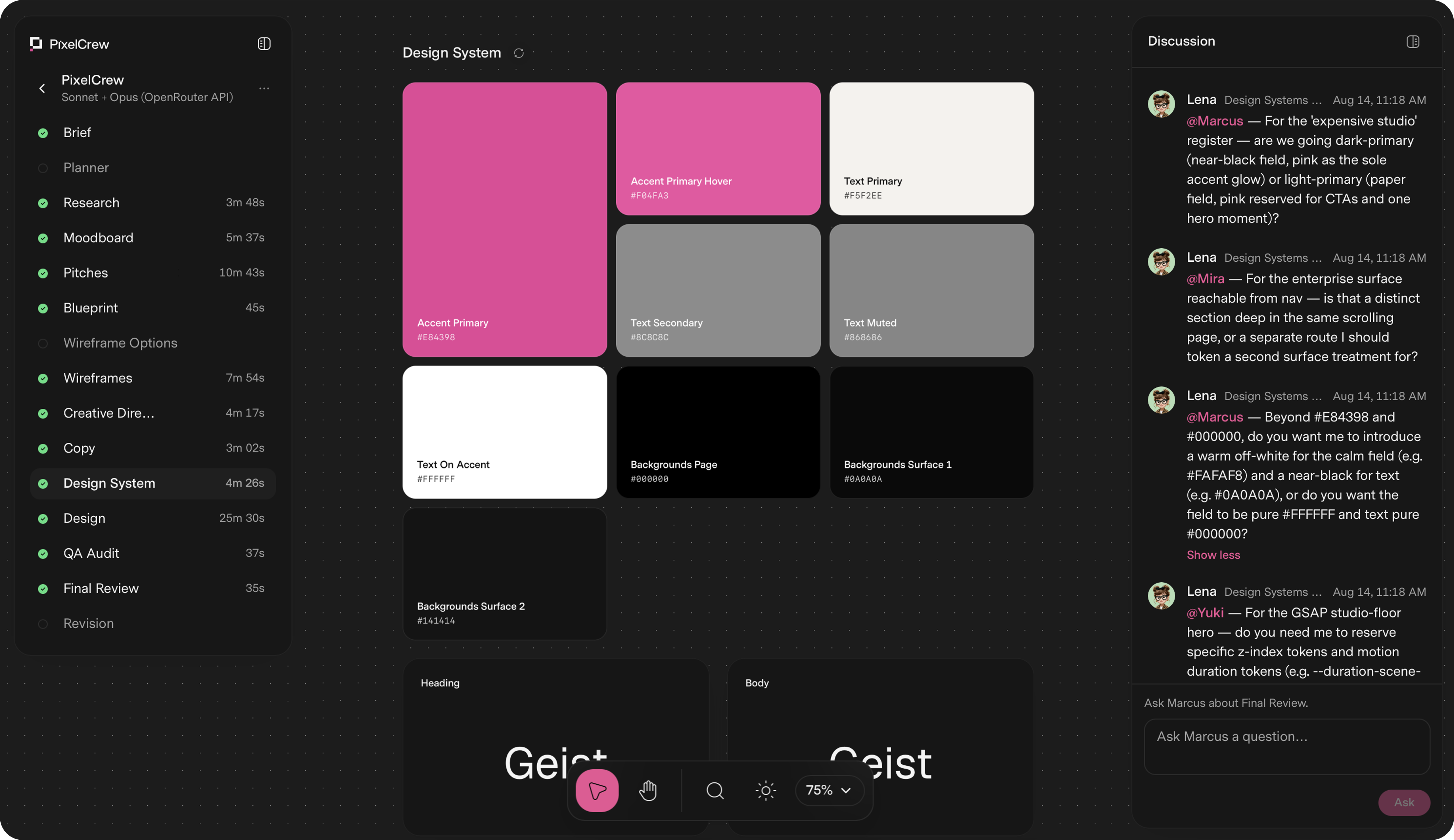
PixelCrew is a web-based platform that turns a written design brief into production-ready design output using a crew of specialized AI agents. It is designed for designers, developers, small teams, startups, and enterprises that need to ship landing pages, product dashboards, design systems, or pitch decks without waiting weeks for a traditional design cycle. Instead of relying on a single AI model to generate generic output, PixelCrew coordinates multiple agents with defined roles and handoffs to produce structured, shippable deliverables such as production-ready HTML, Tailwind CSS, wireframes, copy, and a complete design system. Users submit a free-text brief describing their intent, and the agents read that brief to infer requirements, audience, and direction. Traditional design workflows require coordination between researchers, art directors, UX designers, copywriters, and QA reviewers. This process can take weeks, especially for small teams or founders without a full design department. PixelCrew addresses this by compressing the workflow into a single brief-driven sequence. The problem it solves is the gap between having an idea and having production-quality design assets that can actually be shipped or handed to a developer. Rather than filling out templates, users describe what they need in free text, and the agents execute structured discovery, creative direction, wireframing, copywriting, design system assembly, and QA review. The result is bespoke design output produced in 25–45 minutes on average. The core of PixelCrew is its crew of specialized agents. Elena, the Researcher for Strategy, runs first. She reads the brief and executes structured discovery: audience personas, competitive analysis, jobs-to-be-done mapping, and an information architecture recommendation. She hands Marcus a validated research foundation, not assumptions, with outputs including a research document, personas, and an IA spec. Marcus, the Director for Art Direction, runs second. He takes Elena's research and makes creative decisions: visual direction, brand language, and layout approach. He writes three distinct visual pitches, selects the strongest, and produces a full creative brief with palette, typography, layout direction, and section-by-section composition guidance, including a moodboard. Mira, the Designer for UX Architecture, runs third. She takes Marcus's creative brief and builds the blueprint: wireframes, user flows, information architecture, and a section-by-section spec. Her outputs include wireframes, a UX flow file, and a navigation spec. The build crew then turns this into production HTML. PixelCrew produces a range of production-ready outputs. After the agent crew runs, users receive production-ready HTML and Tailwind, a complete design system, and documentation. Specific deliverables include a landing page HTML file, a design system JSON file, and docs. The crew also writes the copy and assembles the design system, including tokens, type scale, color, and components. Design happens inside the system, not around it. Every screen goes through a QA audit and a final review pass. Issues get flagged, revised, and rechecked before anything reaches the user. Outputs from the process include research-brief.md, personas, IA spec, CREATIVE_BRIEF.md, moodboard, three pitches, wireframes.html, ux-flow.json, nav-spec, copy.md, tokens, components, qa-report.md, revisions, landing-page.html, design-system.json, and docs. This means users get everything their engineering team needs to ship, or hand to any developer. PixelCrew is free while in alpha, and it uses a bring-your-own-key model for AI model access. Users connect their own API key from OpenRouter, which is the recommended path, or from Anthropic or Google Gemini. The agents run on that key, and users pay model costs directly to the provider. There is no subscription, no markup, and no card on file. A typical brief costs a few dollars in model usage. Users can set their own spend limit. This approach gives flexibility to run the crew on whichever models they prefer. Pro and Enterprise plans are coming. Pro will offer hosted keys with zero setup, no API key required, model costs included in one bill, priority processing queue, brief history and versioning, and team seats. Enterprise is custom and for teams that ship at scale, with custom agent configuration, your design system baked in, SSO and security review, and invoice billing. The unique approach of PixelCrew is sequential, context-aware agent coordination. Each agent runs in order and passes structured outputs to the next: Elena passes research-brief-output.md to Marcus, Marcus passes CREATIVE_BRIEF.md to Mira, and Mira passes wireframes.html to the build crew. This mimics the way a real team works, with each specialist building on the previous agent's work rather than starting from scratch. Users provide context through their brief, and the agents coordinate to produce the final deliverable. While the crew runs, users can watch the agents discuss decisions. The process is broken into clear steps: submit your brief, Elena maps the research, Marcus sets creative direction, Mira builds the wireframe, copy and design system take shape, QA audit and final review, and finally the user receives production output. The benefits of PixelCrew are speed, structure, and production quality. Average delivery is 25–45 minutes, compared to weeks for a traditional design cycle. Users receive production-quality output they can ship or hand to a developer. The design system ensures consistency across screens and components, and the QA audit catches issues before delivery. Because the agents work sequentially with context, the output is coherent and tailored to the brief rather than generic. The bring-your-own-key model means users have control over model choice and costs, with no subscription or markup. Overall, PixelCrew turns a written brief into a complete set of design assets, reducing the time and coordination required to go from idea to shippable design. PixelCrew has been used for demonstration projects produced from written briefs. These include After Dark, a neighborhood coffee shop website that feels like the room: dark, warm, and unhurried, with menu, hours, and atmosphere shipped as production HTML. Modena Coupé is a luxury automotive landing page in an editorial register, with full-bleed photography, serif display type, performance stats, and a request-information flow. MicroProject is a working task manager UI for small teams, with list views, project sidebar, shared lists, overdue states, a light theme, and a complete component set. Geisha Porto is a coffee roastery and jazz listening lounge in Porto, with a product catalog including harvest data, a vinyl audio archive, and a rooftop terrace section in a Swiss editorial layout. Other briefs can be for landing pages, product dashboards, design systems, or pitch decks. PixelCrew is for designers, developers, small teams, startups, and enterprises that ship at scale. It is especially useful for founders and teams without a full design department, as well as engineering teams that need shippable HTML and Tailwind. Integrations include bring-your-own-key support for OpenRouter, Anthropic, and Google Gemini. The product runs on the web at app.pixelcrew.ai. Pricing: free during alpha with a full agent crew, unlimited briefs, HTML and Tailwind output, and landing pages, dashboards, and design systems supported. Model usage is billed by the key provider, not by PixelCrew. Pro is coming soon with hosted keys, model costs included, priority processing, brief history and versioning, and team seats. Enterprise is custom with custom agent configuration, your design system baked in, SSO and security review, and invoice billing. PixelCrew's primary value proposition is turning a written design brief into production-ready design through a coordinated crew of specialized AI agents. It delivers bespoke, shippable design in minutes instead of weeks, with the flexibility to run on the models you choose via your own API key. By mimicking a real design team's sequential workflow, PixelCrew produces coherent, production-quality HTML, Tailwind, wireframes, copy, and a complete design system that engineering teams can ship or hand to any developer.
WZRD is an AI-native workspace built for teams and creators who work with documents, slides, forms and sheets. Its purpose is to generate these everyday business artifacts with AI and then turn them into something users can actually engage with rather than simply read. According to the website, WZRD can generate slides, forms, sheets and docs, and its Product Hunt listing describes it as a workspace for "AI-native documents, slides, forms and sheets that talk back." The product positions itself around the idea that the output of a document should stay conversational and responsive, so the slides, sheets, forms and documents you create become interactive experiences that respond to the people using them. Traditional documents, slides, spreadsheets and forms are static. A presentation is presented at an audience, a spreadsheet is read, and a form is filled in silently. WZRD's core premise, expressed in its tagline "Slides that talk back," is that these formats can be given a voice and made conversational. The website invites users to "Give your slides a voice that walks people through the story," and the Product Hunt description says the goal is to "turn it into an AI experience users can engage with." Instead of leaving the audience to interpret the material alone, WZRD aims to make the artifact itself responsive: forms that collect answers by speaking or typing, sheets that explain numbers out loud, and slides that walk people through the story. This addresses the gap between creating content and having that content communicate on its own. On the creation side, WZRD offers an AI presentation generator that produces presentations in minutes. The website lists "Slides — AI presentations in minutes," and the launch messaging focuses heavily on slides that talk back, giving presentations a voice that walks an audience through the story. Alongside slides, WZRD includes Docs, described as "AI-crafted smart documents." These are documents generated or enhanced by AI so that they can engage every user, per the Product Hunt description: "Documents engage every user." The result is a document that is not a fixed block of text but a piece of content designed to be interacted with. Both slides and docs are generated within the same workspace, allowing teams to move between formats without leaving WZRD. WZRD also generates Forms and Sheets. Forms are presented as "smart form flows," and the Product Hunt description notes that forms "collect answers by speaking or typing." That means a respondent is not limited to typing into input boxes; they can speak their answers, and WZRD handles the collection of that information as part of the flow. Sheets are described as "smart sheets with structured generation," and the Product Hunt description says that sheets "explain numbers out loud." This turns a spreadsheet from a grid that must be interpreted into something that can verbally walk a user through the figures. Both formats are generated by AI and are described with the word "smart," indicating that structure and intelligence are added to the output rather than the user building everything manually. A key part of the WZRD workflow is the starting point. The interface asks, "What are we building today?" and offers two paths: drop a file to start, or click to browse documents. Supported file types are listed as XLS, CSV, PPT, PDF and DOCS, so users can bring existing spreadsheets, presentations, PDFs and documents into the workspace. Alternatively, users can "Generate with AI" from a prompt. This dual approach means WZRD can work with material a team already has or create new material from scratch. The website also references a "Tap to talk" interaction, and the site description mentions the ability to "talk to your business with AI voice agents." Together with the conversational output of slides, sheets, forms and docs, this shows that voice and conversation are central to the WZRD experience rather than an add-on. WZRD positions itself as an AI workspace rather than a single-purpose tool. The site describes it as "the AI workspace" that lets you "Generate slides, docs, sheets and forms, and talk to your business with AI voice agents." The overall methodology, based on the content provided, is: start with an existing file or a prompt, let AI generate the artifact, and then deliver it as a conversational, responsive experience. The Product Hunt listing summarizes this as: "Upload existing work or create from a prompt, then turn it into an AI experience users can engage with." The output "stays conversational and responsive," which is the distinguishing characteristic WZRD repeats across its messaging. In practice, this means the generated slides, forms, sheets and documents are not static deliverables—they are meant to be experienced, listened to, or spoken with. The stated benefit is engagement. Where static documents are passively consumed, WZRD's formats "talk back," which the content frames as a way to make users engage with the material. Forms keep respondents involved because they can answer by speaking or typing. Sheets communicate numerical results out loud, reducing the need for readers to decode rows and columns themselves. Slides deliver the narrative in a voice. Documents are designed to "engage every user." For teams and creators, the promise is less time spent building static artifacts from scratch—AI presentations are generated "in minutes"—and a more interactive final product that holds attention and communicates its content directly. The content suggests several concrete scenarios. A team can drop an existing XLS or CSV file into WZRD and get a smart sheet with structured generation that can explain its numbers out loud. A marketer or founder can bring a PPT or PDF and have WZRD turn it into an AI presentation whose slides walk an audience through the story with a voice. Someone needing feedback or data can generate a form whose smart flow collects answers by speaking or typing. Teams working with documents can upload a DOC and have WZRD produce an AI-crafted smart document that engages every user. And because WZRD describes AI voice agents, a business can use voice interaction to talk to its own data and content. All of these start from the same simple entry point: "What are we building today?" WZRD is aimed at "teams and creators working with documents, slides, forms and sheets," according to its Product Hunt description. The website's initial prompt—"What are we building today?"—and the option to drop a file or browse documents suggest a workspace intended for knowledge work and content production. The Product Hunt topics for WZRD are Productivity, No-Code and Design, which align with its positioning as an AI workspace for generating business formats. No specific integrations, pricing tiers, or technology stack are mentioned in the provided content, so those details cannot be confirmed; the described interfaces are the website at wzrd.to and the Product Hunt launch page. WZRD's core value proposition is simple and repeated throughout its messaging: it is the AI workspace that generates slides, docs, sheets and forms—and makes them talk back. Rather than producing static files, WZRD turns them into conversational AI experiences. Teams can start from an existing file or a prompt, generate in minutes, and end up with responsive content that engages the people who use it.
Flicka is a screen recorder that runs entirely inside a Chrome extension and produces launch-ready product demos from a browser tab. It is built for a Mac or a PC — as the site notes, phones cannot share their screen — and its stated purpose is to let you press record and have Flicka do the cinematography. You capture a take, and it arrives already zoomed and backdropped, then you aim it on the canvas rather than in a panel. Flicka is made for people who need to show software on screen and want the result to look deliberate without learning a video editor. The problem Flicka addresses is the gap between a raw screen capture and a demo that is actually worth shipping. A plain recording of a screen is flat: clicks happen away from the viewer's attention, small interface details are hard to read, and the footage usually needs to be pushed through an editor before it can be published. Existing workflows often add either an install or a server round-trip — upload the take, wait, download the result. Flicka takes the opposite approach. Capture, editing and encoding all run on your computer, nothing is uploaded, and the product's own words sum the promise up as "It records, frames and zooms the take without asking me anything." For teams that publish demos, tutorials, bug reports or marketing clips regularly, that removes both the editing effort and the question of where the footage lives. The entry point is a popup that the site describes as one sentence long, with the highlighted words acting as the controls: record this tab with my mic and auto-zoom. From that single popup you can choose this tab, the whole screen, one window, part of this tab, or just my camera, with options for the microphone, the tab's audio and a webcam bubble. Recordings have no time limit and begin with a countdown from three. A keyboard shortcut, Alt+Shift+R, starts a take from any page, and holding it grabs a still instead of a video. The same shortcut set continues inside the library, where R records, S takes a screenshot, Z adds a zoom, C cuts and Tab opens the panel. While a take is running, Flicka places a single bar on the page. Everything you can draw with lives under the word "Mark up": a pen, a highlighter, an arrow, a box, an oval, text, an eraser, blur, cursor effects, click effects and a spotlight, with a clear action to wipe the marks. The page bar presents six targets at rest, and everything about the take sits under the timer. This means you can mark up the page live as you record, blurring something sensitive before it is ever captured, rather than fixing it afterwards in an editor. The recording card repeats the same sentence back to you, keeping the interface consistent between the popup and everything that follows. The editor is where the auto-zoom promise is delivered. Your click clusters arrive as eased zoom blocks on the timeline before you touch anything — the site shows "3 clicks caught · zooms follow in the editor" — so a take can land with its zooms already cut. Five lanes share one time axis: zoom, draw, cuts, clicks and audio. Auto-zoom lays the first cut, and you re-aim a zoom by dragging the frame directly on the canvas instead of nudging numbers in a panel. Zoom blocks can be automatic or yours, with values such as 1.4× and 1.5× showing on the timeline, and the interface states an ease curve of 700 milliseconds with separate ease in and ease out. Around the picture, framing controls cover padding, corner radius, shadow, 3D tilt and mockups, with browser, macOS or no frame, plus gradient and solid backdrops. Beyond recording, Flicka includes an annotator and a template system. The annotator accepts any image, not just your own captures: drop or paste a picture and it opens with fifteen tools, numbered steps and redaction bars that actually redact. Layers can be cleared, arrows have adjustable weight, and exports go out as PNG at 1×, 2× or 3×, up to 2880×1800 — one example on the site is a 1440×900 image at six layers exported as PNG @2×. Templates turn code, posts and testimonials into generated plates rather than captures: a code snippet plate is generated from fields such as filename, language and theme, then passes through the same backdrop, framing and export as a capture. Tweet and testimonial cards follow the same route. Export is handled on your device. The extension offers presets including YouTube at 1920×1080, X at 1280×720, TikTok at 1080×1920, Instagram at 1080×1080, the original source size, and GIF at 960×540, with formats of MP4, WebM and GIF and quality settings of High, Medium and Low. MP4 is produced through WebCodecs where H.264 is available; when the browser cannot encode H.264, Flicka falls back to WebM through MediaRecorder, and there is a dependency-free GIF encoder as well. Rendering happens in the background while you keep editing, and the finished file is saved to your downloads. Underneath, one compositor drives two outputs: the same canvas pipeline draws both the preview you scrub and the frames the exporter encodes, so what you aim is what you ship. Among the browser APIs Flicka names are getDisplayMedia for the stream, canvas for the composite and WebCodecs for the file. The outcomes Flicka claims follow from that architecture. Takes arrive zoomed and backdropped, so the first pass already looks intentional, and you re-aim zooms by dragging on the canvas rather than editing by hand. Because capture, compositing and encoding all run on browser APIs inside the extension, work offline once the tab has loaded and require no install, nothing leaves your computer. Projects and media blobs are written to the extension's own storage, so your library is waiting when you come back, no account is needed to record, and there is nothing to delete from a server. Word-by-word captions, when used, are also made on your device. Priya Anand, Head of Product at Northwind, states in a testimonial that Flicka is "The only screen recorder I've stopped editing by hand." Concrete uses on the site include onboarding walkthroughs, pricing pages and bug reproductions — a library view shows a 47-second "Onboarding walkthrough" with four zooms, a pricing page marked as annotated, and a 1:12 "Bug repro — filter drawer" with two zooms. The annotator is used to redact before shipping, with the example caption "Blur this before you ship it". Templates cover code snippets, posts and testimonials for social and documentation work. Export presets map to the destinations people publish to: YouTube, TikTok, Instagram, X and GIF. The accompanying guides cover recording your screen on a Mac with audio, adding smooth auto-zoom to a screen recording, annotating and blurring screenshots online, and recording your screen on Windows 10 and 11. Flicka is intended for desktop browser users on Mac or Windows. Pricing starts free forever: the whole studio on your device, unlimited recording length, auto-zoom and manual zoom blocks, the full fifteen-tool annotator, the code snippet template, twelve gradient backdrops and solid colours, 1080p WebM and GIF export, up to ten projects, and a small Flicka mark on exports. Pro is $30 a year, or $5 a month with cancel any time, and adds MP4 and 4K export with no watermark, the webcam layer, click sounds, cuts and 3D tilt, word-by-word captions made on your device, all 42 gradients with custom colours and image and pattern backdrops, all device frames, tweet and testimonial templates, and unlimited projects. A Pro lifetime licence is $80 once, with every Pro feature and every future update, working in any browser while projects stay where they were made. Prices are in USD before local tax, payments are by Paddle, and there is a 14-day money-back guarantee. Share links and cloud extras are listed as planned. Projects can be exported as a .flicka.zip, and the site states it uses Google Analytics to count visits, with no ads and no tracking across sites. Flicka's core proposition is that a polished product demo should not require a separate editing session, an upload or an account. Press record, let the clicks become zooms, aim the framing on the canvas, and export an MP4, WebM or GIF from the same machine that captured it — all from one Chrome extension on Mac or Windows.