Category Focus/categories/image
Image AI Tools
Discover and compare the best image AI tools and software. Browse 54+ curated tools with reviews and rankings.
Projects tracked
54
Sort mode
RECENT
Page
1
Discover and compare the best image AI tools and software. Browse 54+ curated tools with reviews and rankings.
Projects tracked
54
Sort mode
RECENT
Page
1
Redlamp is a native, open-source RAW photo editor for Apple Silicon Macs, built from scratch in Swift and Metal. According to its website, it keeps "Lightroom's workflow" — the panels, slider names, ranges and keyboard shortcuts photographers already know — while rebuilding everything underneath as a native, GPU-first application. It describes itself as an editor, not a catalog: it opens folders of photos and keeps your edits in small sidecar files right next to them, and it never touches your originals. It runs on macOS 26, is currently at pre-alpha version 0.2.6, and the site states that the Mac editor comes first, with iPad and iPhone to follow from the same platform-neutral engine. The website explains the motivation behind the project directly: Lightroom defined how millions of photographers edit, but it is described as "a cross-platform application that doesn't feel at home on a Mac," and one that is tied to a subscription and a cloud. Redlamp's name comes from the darkroom safelight — "the one light you can work by without fogging the paper" — a way of saying you can see and shape your photo freely while the original is never harmed. Redlamp is licensed MPL-2.0, described as compatible with the App Store, and the site says its algorithms are implemented clean-room from published papers. It is free, with no subscription, and support is offered through Ko-fi. The Develop module is presented as "Lightroom's workflow, at home on the Mac." The site says the layout, panel order, slider names, ranges and defaults, and single-key shortcuts all carry over, so there is nothing to relearn, while everything underneath is rebuilt as a native, GPU-first app. Panels listed include Basic, Tone Curve, Color Mixer, Color Grading, Detail and Effects. The site states that Lightroom Classic's shortcuts are implemented as 83 actions on 87 key bindings, that you can find an adjustment (⌘F) by name or by the words people use, and that before and after is available in three layouts, cached so edits never re-render it. Sliders can be clicked to jump, dragged to adjust, Shift-dragged for fine control and double-clicked to reset; clicking the value lets you type one in or drag to scrub. Double-clicking a panel title resets it, and Option-clicking a header turns on Solo Mode. The histogram shows clipping indicators and you can drag across it to adjust Blacks, Shadows, Exposure, Highlights or Whites. The command palette is a central part of the workflow described on the site. ⌘K opens one search for every action, every Develop slider and every picker, and choosing a slider or a picker does not close the palette — it turns into that control, over the photo. ⌘F searches the sliders alone. Pressing Enter on a slider shrinks the palette to a slider bar over the photo; the arrow keys step the value, Shift moves ten times as far and Option moves finer, up and down move to the next slider, and a run of presses counts as one history step. Moving through a picker previews each choice on the photo, Enter applies it, and Esc goes back one level. You can also type a value directly, such as "exposure 0.7" or "temp 5600k", or type something like "x+0.3" in the slider bar. A hint bar always shows the keys that work right now. Responsiveness is framed as a core design principle. The site states that rendering and UI are strictly separated, so the UI never waits on the engine, the disk or the GPU. One fused Metal kernel applies every adjustment, frames arrive as IOSurfaces without a copy, and rendering never waits on the main thread. The site reports interactive renders at Fit in 0.6 to 3 ms on Apple Silicon, a full 26 MP frame at 1:1 in about 13 ms, a full-resolution export render in 45 ms, and opening a raw file in 70–250 ms, all measured on an Apple M1 Ultra with a Release build. Latest-wins scheduling collapses a burst of slider events to the newest, and a full mip pyramid means every zoom level samples the right resolution. Masking is described as "part of the architecture, not an afterthought." Every edit is a layer with its own adjustments plus a mask built from components that add, subtract and intersect, each of which can be inverted. Components include linear and radial gradients drawn directly on the photo, a brush with A and B brushes and Erase, Size, Feather, Flow, Density and Auto Mask plus pen pressure, and Luminance Range and Color Range selections that follow the photo's global edit. AI masks cover Subject, Background, People (including parts such as face skin, eyebrows, eye sclera, iris, lips, teeth and hair) and Sky using Apple Vision's built-in models, with nothing to download. Objects can be selected by hovering to preview and then clicking, dragging a box or brushing, using Segment Anything 2.1; Depth Range comes from a photo's own depth map or an estimated depth map; and Landscape masks cover water, vegetation, mountains, architecture, ground and snow. Mask presets such as Blue Sky, Brighten Subject, Darken Background, Smooth Skin, Whiten Teeth and Pop Eyes compute their masks for each photo. The site says masks are evaluated per pixel inside the same GPU kernel, so up to 16 of them cost well under a millisecond extra at Fit, and that every model runs on the Mac, with photos never uploaded. Colour handling is described as "serious colour science, scene-referred from the start." The pipeline is linear and scene-referred, with a camera white-balance model using Robertson's method and the camera's matrix. The Color Mixer works in OKLCh so hues move the way the eye expects, and some looks are measured against cameras' own renderings — the site notes that Standard v3 sits within ΔE 3.26 of the camera's Provia. Other colour tools include 3-way and individual colour-grading wheels with Blending and Balance, which also tint B&W images for split-toning, and parametric and point tone curves. Treatment switches between Colour and B&W, and Base Looks come with an Amount slider from 0 to 200 plus a browser that renders every look on the photo; six built-in looks and 15 film-style looks built on 3D look tables are listed. In the Detail panel, noise reduction is described as knowing your camera's noise. It scales to each photo's own noise, read from the DNG NoiseProfile tag, otherwise from the camera's calibrated profile at its ISO, otherwise measured from the raw data when the file opens. Luminance and Color controls are provided with Lightroom's controls, and luminance keeps fine texture through wavelet shrinkage and a non-local-means pass in exports. Sharpening is noise-aware: detail is measured on a denoised copy and applied to the untouched image, so grain passes through instead of being sharpened, and Detail moves from an unsharp mask towards Richardson–Lucy deconvolution. Texture, Clarity and Dehaze work globally and inside masks, and highlight reconstruction rebuilds clipped photosites. Recipes bring presets, profiles and LUTs into one open format. One format holds presets, profiles (a recipe's Base Look) and LUTs, and the site says you can type in a Fujifilm-style camera recipe card exactly as it is written. There are 39 bundled recipes in eight groups with hover to preview, import and export of .redrecipe, .cube, .3dl and HaldCLUT files, camera controls for Dynamic Range, Color Chrome and white-balance shift, and a Recipe Lab that checks every look across a 40-image set. Lightroom develop presets (.xmp) can also be imported, with a report of what came across exactly, approximately or not at all. Redlamp uses its own RAW pipeline. LibRaw only unpacks the file; black levels, white balance, demosaicing and colour all happen in Redlamp, on the GPU. The site lists Menon demosaic for Bayer sensors, Markesteijn's X-Trans demosaic, hot-pixel repair before demosaicing, row and column banding correction measured in the sensor's masked margins, and DNG gain maps applied before demosaicing. It states support for Sony ARW, Canon CR3, Nikon NEF, Fujifilm RAF, Apple ProRAW and Pixel DNG, plus JPEG, HEIC, TIFF and PNG. Edits are saved to a small sidecar next to each photo, and the original stays exactly as you shot it. Focus stacking is a separate Stack workspace. Redlamp spots a focus bracket in your folder and offers to merge it with a merge banner. Frames are stacked as demosaiced camera RGB before any edit, so every Develop slider still works on the result, and you can retouch from any frame. Stacks are detected for you, with Auto, Smooth and Detail strategies and a depth map, and the site reports that 25 Canon CR3 frames merge in about 8 seconds. A command-line tool, redlamp stack, does the same from the terminal. The workspace follows a Lightroom-style layout: Navigator, Folders, Recipes, Snapshots and History on the left, the photo with a filmstrip below in the centre, and the histogram, tool strip and Develop panels on the right. Folders are remembered by bookmark, shown as a tree with the number of photos in each, and nothing on disk is moved or changed — the filmstrip follows the disk by itself. The site says Redlamp is built to stay fast with any number of photos: a folder lists without reading a single sidecar, thumbnails decode in parallel on every core, memory is kept within a 128 MB budget and cached on disk in one file per folder, and the filmstrip is built so 50,000 photos cost what a screenful does. The benefits described are practical: photographers keep a workflow they already know, with the same panel layout, slider names and ranges and keyboard shortcuts, while gaining a native, GPU-first app where every slider lands within a frame and the UI never waits on the engine. Because edits are stored in sidecar files next to photos rather than in a catalog or the cloud, the described outcome is that you can see and shape your photo freely and the original is never harmed. On-device AI and optional downloadable models mean photos are never uploaded. Concrete scenarios where the product is used, as shown on the site, include editing RAW files from cameras such as a Sony α7R V, Nikon Z 6, Fujifilm X-T3 X-Trans, Canon EOS R6 and iPhone 12 Pro ProRAW; applying masks such as a linear gradient to darken and cool a sky while a feathered radial gradient warms trees; splitting tones with the colour-grading wheels; working at 1:1 with the Detail panel on a Canon EOS R6 CR3; applying camera-style recipes to Fujifilm raw files; and merging a focus bracket of 25 Canon CR3 frames into a single developing result. Redlamp is aimed at photographers who edit RAW files on a Mac and want the Lightroom workflow without a subscription or a cloud, and at users on Apple Silicon running macOS 26 — the site notes it is a pre-alpha release. It is free, with no subscription, and supported via Ko-fi, so it can also be downloaded and built from source under MPL-2.0. The technology stack listed is Swift and Metal, with an AppKit-based workspace, Apple Vision models and Core ML conversions running locally, all on one platform-neutral engine that the site says will also power iPad and iPhone versions. In short, Redlamp's stated proposition is Lightroom's workflow made native to the Mac: a from-scratch Swift and Metal RAW editor with a familiar Develop module, architecture-level masking, serious scene-referred colour, its own GPU-first RAW pipeline, and no subscription, no cloud and no changes to your originals.
AI Room Makeover helps you preview changes in a photo of your real room before buying furniture, painting or remodeling. Upload a room photo, describe the change, and optionally add product or material reference images. Generate a visual preview of new furniture, wall colors, flooring or a room style while keeping the original space as close to the source photo as possible. A free tier is available, with optional one-time credit packs.
Scumble is a free, open-source desktop editor built specifically for AI inpainting. Rather than moving between a masking tool, a generation workflow and a separate image editor, you select part of a picture, say what belongs there, and the result arrives as its own colour-matched layer. It is made for people who inpaint regularly — retouchers, photographers and AI image makers who already work with models such as FLUX 3, GPT Image or Nano Banana and want one place to run and refine those edits. Scumble works with your own ComfyUI instance or your own API keys, so generation stays on infrastructure you already control instead of a subscription service you do not. The project began as a weekend build. Its maker describes doing a lot of inpainting and repeating the same dance every time: build a mask here, run a workflow there, pull everything back into an image editor, fix the edges, and repeat. That loop is the problem Scumble addresses. Each step is individually reasonable, but together they force constant context switching, and the final blending work — matching an AI-generated patch to the lighting and colour of the surrounding photograph — is exactly the part that general-purpose tools handle clumsily. Scumble's answer is to make the inpainting result a first-class layer inside the editor, so the fiddly part of the process happens where you can see it. Selection is deliberately flexible. You can paint a mask by hand, point at an object in the picture, or simply type what it is, letting the editor work out where the selection should be. Whichever route you take, every result comes back as its own layer that is colour-matched to its surroundings, and the original image is never touched. That last detail matters: because the edit lives on a separate layer, an almost-right generation does not overwrite your base photograph. You keep the pixels you started with, and the AI output sits on top as something you can judge, adjust and combine rather than something that permanently replaces your file. Scumble does not lock you into one provider. It runs against your own ComfyUI setup — local, remote or Comfy Cloud — or against your own API keys for a range of models, including FLUX 3, FLUX.2, GPT Image, Nano Banana, Seedream, Qwen and Ideogram. The API path is handled with a privacy detail worth noting: only the area around your selection leaves your machine, and the answer comes back at full resolution. In practice that means you are not uploading the whole photograph to a third-party service just to change one region of it. Because it is your own ComfyUI or your own keys, you pay the model providers directly, and Scumble takes no cut. Prompting goes beyond a single text box. Boxes in the prompt let you draw where things should go and describe each box individually — a capability the maker lists for FLUX 3 Image and Ideogram 4 — so a single generation can place several described objects into specified regions of the frame. Reference images can be addressed by name inside the prompt as well, allowing instructions such as 'put their cup from @img1 on the sill'. Together these two features let you compose edits with a level of spatial and referential control that a plain inpainting prompt cannot express, while still keeping the workflow inside the same editor window rather than spread across multiple applications. Under the hood, Scumble can be driven not only by a person but by an agent. It ships an MCP server with 105 tools, which means Claude Code or any other MCP client can operate the editor directly. Combined with the layer-based output model, that is Scumble's defining approach: inpainting is treated as a normal editing operation that produces a discrete, colour-matched layer, rather than a one-shot generation you have to redo when it is not quite right. The editor also includes 46 film looks that apply as layers, along with retouch tools, so a generated patch can be graded and blended in the same environment it was created in, without exporting to a different application just to finish it. The practical benefit is time. As the maker puts it, colour-matched layers were possible in Photoshop or ComfyUI before, but in a much more cumbersome way; having it directly as a feature in the layer saves a great deal of that time. Commenters on the launch made the same point from the other direction, noting that the layer-based approach makes AI edits feel more like ordinary photo editing instead of forcing a full regeneration of the image. PSD export extends that logic further: if an AI edit is almost right, you can finish it in another editor rather than generating again. Scumble also keeps accounts out of the equation — no account, no telemetry, and API keys stored in the system's credential store. Scumble fits workflows where a photograph needs a targeted change rather than a wholesale reimagining. A retoucher can paint a mask, replace an object and blend the result via a colour-matched layer and one of the 46 film looks before exporting a PSD. A masked region can be regenerated through an API with only the area around the selection leaving the machine, which suits work on images that should not be uploaded in full. Teams building something like virtual try-on, where garment print and texture must stay clean at mask edges, can keep the AI output on its own layer. And with the MCP server, a developer can let an MCP client such as Claude Code drive the editor programmatically. Scumble is aimed at anyone who inpaints often enough to want a dedicated tool: photographers, retouchers and AI image makers already comfortable with ComfyUI or with provider API keys. Integration is broad on the model side — ComfyUI (local, remote or Comfy Cloud) and keys for FLUX 3, FLUX.2, GPT Image, Nano Banana, Seedream, Qwen and Ideogram and more — while output supports PSD, ORA and TIFF export and pictures of 15,000 pixels and more. On pricing it is free and open source under GPL-3.0. Availability is honest about its stage: version 0.1.x and moving fast, with Windows first — a Microsoft Store listing signed by Microsoft, a GitHub installer and a portable zip — Linux builds coming out of CI, Mac planned, and not every API provider tested live. Scumble's value proposition is narrow and clear: it is a free, open-source desktop editor that treats AI inpainting as a layer-based editing task, running on your own ComfyUI or your own API keys. By returning every generation as a colour-matched layer, keeping the original untouched, sending only the selected area when going through an API, and supporting PSD, ORA and TIFF export, it removes the mask-run-edit-fix loop that makes inpainting tedious. Add a 105-tool MCP server and it becomes something an agent can drive too. For anyone who inpaints regularly, it is an attempt to make the process feel like ordinary photo editing.
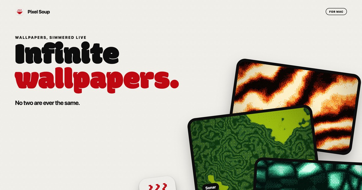
Pixel Soup is a Mac app that generates dithered wallpapers on your own GPU. Each wallpaper is made from a shape, a palette, a dither style and a seed, and it can sit still as your desktop picture or keep drifting gently behind your icons at a speed you choose. The app is for Mac users who want a desktop that looks distinctive without hunting for images elsewhere: Pixel Soup makes the wallpaper for you, in the style of dithering, and no two results are ever the same. A small handle sits on the edge of your screen, and clicking it opens the editor, so there is no Dock icon and no window in the way. You pick a shape, a palette and a dither, press Apply, and it becomes your desktop. The thinking behind Pixel Soup is abundance plus ownership. Because every wallpaper is a shape, a palette, a dither and a seed, there are over a hundred thousand combinations before you touch a single dial, and every one of them keeps moving. Instead of a fixed library of static images that everyone else also has, the app can serve a fresh wallpaper every hour or every day if you like being surprised, and if you preferred the last one, Previous brings it back. Ownership is part of the pitch too: the app is a one-time purchase rather than a subscription, it requires no account, it makes no analytics calls, and nothing about you leaves your Mac. The core of the app is its shape set. Pixel Soup ships with twelve shape tiles in the editor, among them Flow, Mesh, Plasma, Ripple, Aurora, Cells, Topo, Whorl, Sonar, Mosh and Weave, with a page on the site showing them all. A shape provides the underlying structure that the generator animates and dithers, so the same palette and the same dither choice will look entirely different depending on which shape is selected. Because a wallpaper is defined by shape, palette, dither and seed together, the number of possible results exceeds a hundred thousand before you adjust any sliders. If you cannot decide, a one-button shuffle produces a random new wallpaper, and you can keep shuffling until something stops you, then keep that one. The Fresh Bowl option serves a new wallpaper every hour or every day, for people who like being surprised. Dithering is the visual signature of Pixel Soup, and the app provides ten dither styles: Smooth, Poster, Bayer 4, Bayer 8, Noise, Halftone, Lines, Diamond, ASCII and Benday dots. The site links to a reference page showing what each one looks like, which matters because dither styles change the character of an image dramatically, from clean gradients to hard-edged dot patterns reminiscent of print. Beyond picking a style, you set the pixel size the dither is applied at and how many colours the image is allowed to use. Those two dials control how coarse or how refined the result looks, so the same shape can read as a subtle gradient or as a chunky retro pattern. The dither layer is what turns a generated gradient into something that looks like it was printed rather than rendered. Colour is handled through palettes. Pixel Soup includes twelve palettes, and you can build your own from up to five colours. If you would rather pull a palette out of something you already like, you can point the app at a photo and it will extract a palette for you. Photos also work as source material in their own right: drop in an image and Pixel Soup dithers that instead of a generated shape, applying the same dither styles, pixel size and colour controls to your own picture. The site dedicates a page to turning a photo into a dithered wallpaper, so this is a first-class workflow rather than an afterthought. Combined with palette extraction, it means you can produce a dithered version of a photograph that matches a colour scheme you have already chosen, or use colours from that photograph on generated shapes elsewhere. Every wallpaper can be still or moving. Freeze any single frame as your desktop picture, or let it keep drifting behind your icons at a speed you choose. When you want to take a result elsewhere, you can export it as a PNG for this display, at 6K, at iPhone size, or as a 2048 square, and exported PNGs are yours to use anywhere, including commercially. Multi-display setups are supported: every display gets the wallpaper at its own resolution, and plugging a display in or out sorts itself out. Answers on the site address battery life directly: an animated wallpaper is drawn by the GPU at a low frame rate, pauses when windows cover the desktop, and slows down again in Low Power Mode, while a still wallpaper costs nothing once it is set. Pixel Soup runs entirely on your Mac. It is sandboxed, requires no account, includes no analytics, and nothing about you leaves your machine. The editor lives behind a small handle on the edge of your screen, so the app stays out of the way with no Dock icon and no window competing with your work. The workflow is deliberately short: pick a shape, a palette and a dither, press Apply, and the wallpaper is your desktop. Generation happens live on the GPU rather than being downloaded, which is how the app can offer so many variations from a single install. The download is a notarized DMG that updates itself, and the full app is free to try for three days with no account and no card. What you get out of Pixel Soup is a desktop that never looks like anyone else's, produced on your own machine in seconds. Because the app generates rather than downloads, there is no library to browse and no account to create; you shuffle until something stops you and apply it. Stills carry no ongoing cost, so freezing a frame is an option that costs nothing once it is set, and the animated mode is built to be polite about power by lowering its frame rate and pausing when the desktop is covered. Exporting PNGs means a result you like is not trapped inside the app and can be used anywhere, including commercially. And the purchase model is a single payment with updates included, not a subscription. Concrete use cases come straight out of the app's own workflows. If you want a new look without deciding anything, hit the shuffle button for a random wallpaper, or turn on Fresh Bowl and let a new one arrive every hour or every day, using Previous to go back if you liked the last one better. If you have a photograph you love, drop it into Pixel Soup and dither it, optionally pulling a palette from it first so a generated shape elsewhere on your desktop matches. If you work across several monitors, each display receives the wallpaper at its own resolution and plugging a display in or out sorts itself out. If you make things, export a 6K, iPhone or 2048 square PNG and use it in other places. And if you simply want a moving desktop, choose a speed and let it drift. Pixel Soup is for Mac users running macOS 14 Sonoma or later, on either Apple silicon or Intel; the app is a universal, notarized build. Pricing is a one-time payment: $4.99 during launch week, then $9.99, and the licence is good for up to 3 of your Macs. The download from the site is the full app, free for three days with no account and no card; if you want to keep it after that, you buy a licence, sold through Dodo Payments, who handle your receipt and any tax. A Mac App Store version is coming soon and will be the same app at the same price, without the trial. Refunds are available within 14 days, no questions asked. Taken together, Pixel Soup is a small Mac utility with a narrow and clearly stated promise: your Mac makes its own dithered wallpapers, still or gently moving, and no two are ever the same. It does that on your own GPU, keeps everything on your machine, stays out of the way behind a handle on the edge of the screen, and asks for a single payment rather than a subscription. The free three-day trial means you can find out whether your desktop looks better dithered before you decide.
What to Order is a decision helper for restaurant diners. Its purpose is stated simply: find food you will love on any restaurant menu. Rather than asking people to read a long list of dishes and choose, it reverses the process — you say what you are in the mood for, and the dishes that fit float up from the menu. The product covers several well-known US chains, including The Cheesecake Factory, Olive Garden, IHOP and Chipotle, and it also works with any menu a diner photographs. It is offered for free and is aimed at anyone who has ever stared at a menu without being able to decide. The problem the product addresses is menu paralysis. As the product's own description puts it: ever sat down at The Cheesecake Factory and been handed the menu? 331 items. You flip through it, get nowhere, and order the same thing as last time. That is a familiar pattern in large chain restaurants, where the sheer number of dishes makes comparison impractical and pushes diners toward a habitual order. What to Order treats that as a search problem rather than a browsing problem. Instead of expecting a diner to scan and weigh hundreds of items, it takes a plain-language description of what the diner wants and checks every dish on the menu against it. The core feature is mood and constraint-based searching. A diner tells the product what they are in the mood for, and it checks every dish on the menu on their behalf. Short, everyday prompts work: the product notes that Spicy works, and so does a combined request such as Spicy vegetarian. That combination handling matters, because real diners rarely have a single requirement — they may want something spicy and meat-free, or light and high in protein. The product also supports occasion-level requests: asking for a Thanksgiving dinner for 2 returns a whole order, pumpkin cheesecake included, according to the description. In other words, the output is not just a list of matching dishes but, in some cases, a complete suggested order. A second feature group is prepared menu coverage for popular US chains. The product states that it has 7 US chains so far, naming The Cheesecake Factory, Olive Garden, IHOP and Chipotle among them. The menus represented in the product's content span the full range of a large chain menu: appetizers and small plates, soups and salads, flatbread pizzas, burgers and sandwiches, pastas, steaks, seafood and chicken dishes, tacos, sides, SkinnyLicious lighter options, a kids menu, brunch and breakfast plates, cheesecakes and other desserts, milkshakes and smoothies, coffees, cocktails, zero-proof drinks and lemonades. Having that menu data already prepared means a diner does not have to type dish names or paste a menu in — the dishes are already there to be filtered. The third feature group is menu capture by photograph. If a diner is eating somewhere that is not among the supported chains, they can snap a photo of the menu, and the product will work with it. The description states plainly: eating somewhere else? Snap a photo of the menu. This extends the product beyond its built-in chain coverage to essentially any restaurant, from a local cafe to a place with a paper menu. Together with the pre-loaded chain menus, the photo option means the diner's own situation is covered in most cases, whether the restaurant is a large national brand or a one-off spot. Overall, the product works the other way around from a normal menu. A conventional menu is organized by the restaurant — appetizers here, entrées there, desserts at the back — and the diner has to translate their own appetite into that structure. What to Order inverts that relationship. The diner's intent comes first, expressed in ordinary language, and the menu is treated as a set of dishes to be checked against that intent. The result is presented as dishes that float up from the menu, so the matching items are surfaced rather than buried among hundreds of others. The same mechanism handles a simple craving, a dietary restriction, or a full meal request for a group. The benefits follow from that reversal. Diners spend less time scanning and comparing a long menu, and more of the decision is made for them. Someone with a dietary requirement such as vegetarian does not have to read every dish description to find the options that qualify; someone who wants something spicy gets the spicy dishes surfaced directly. Occasion-based requests produce a complete order rather than a single dish, which helps when the diner is ordering for more than one person or planning a whole meal. And because the product is free, there is no cost barrier to trying it the next time a menu feels too long to read. The prompts shown on the product's site suggest the kinds of situations it is used for: I need to lose weight, something spicy, I am vegetarian, hangover cure, my picky 6 year old, high protein after the gym, chocolate, obviously, and light lunch before a meeting. Each maps to a real dining moment. A diner on a diet wants lighter options surfaced. A vegetarian wants dishes that qualify without reading every line. A parent with a picky six-year-old wants something the child will actually eat. Someone coming from the gym wants high-protein dishes. Someone heading into a meeting wants a light lunch. And someone who simply wants chocolate — as the prompt puts it, chocolate, obviously — wants the dessert list reduced to the right answer. The product is for restaurant diners generally, and it is especially useful for people eating at large chain restaurants where the menu runs to hundreds of items. Families ordering for children, diners with dietary restrictions, people with fitness or weight goals, and groups assembling a full order are all addressed by the prompts the product presents. It is a web product, reached at whattoorder.app, and it is free. The supported chain lists named in the product's materials are The Cheesecake Factory, Olive Garden, IHOP and Chipotle, with the product stating it has 7 US chains so far, and any other menu can be used by photographing it. In short, What to Order is about starting from the diner rather than the menu. Instead of reading 331 items at The Cheesecake Factory and defaulting to the usual order, a diner says what they are in the mood for and the dishes that fit float up. With prepared menus for several US chains, a photo option for everywhere else, and no charge to use it, the product targets the everyday problem of not knowing what to order — and answers it in the diner's own words.
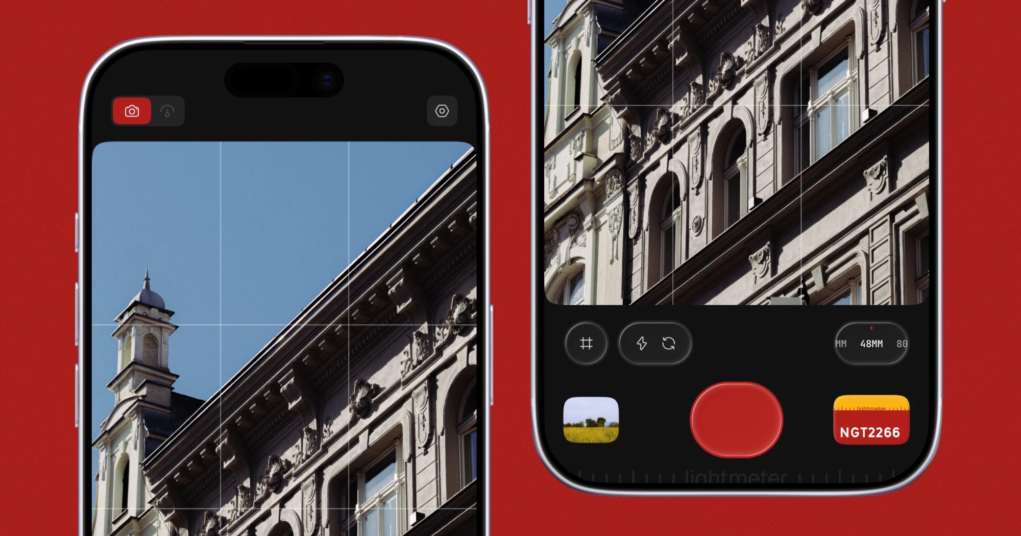
Lightmeter is an iOS app that describes itself as a pocket film camera designed for everyday moments. It fills two roles at once: it is a real light meter when you carry film, and it is a film camera when you do not. The app captures natural and raw photos with authentic film looks, and it is built for people who want the character of film in their everyday pictures without having a film camera in hand for every moment. Its film looks are built on true RAW capture, so grain, halation and color behave like film rather than a filter sitting on top of a flat photo. Lightmeter is distributed for iOS through the App Store, and the website includes a QR code that links directly to the App Store listing. The product is published by Aakash Goel and shares updates through the handle @lightmeterx. The problem Lightmeter addresses comes from the divided habits of film photographers. When you are carrying film, you need a dependable way to read the light before you expose a frame. When you are not carrying film, you still want photographs that look like film rather than clinical, heavily processed phone images. Lightmeter takes a clear position against the common mobile approach: it states that it uses zero-AI processing and no HDR. Instead of generating or guessing detail, it works from true RAW capture and applies film looks whose grain, halation and color are designed to behave the way film behaves. The result is aimed at photographers who care about analog character, natural color and authentic grain, and who want one iPhone app that covers both sides of that habit: metering light for film, and shooting with film character when they are not carrying a film camera. The first role Lightmeter describes for itself is metering. The app is described as a real light meter when you carry film, which positions it as a companion for analog shooting rather than purely a photo filter app. The site's own keyword list frames it as a light meter app, an iPhone light meter and a reflected light meter, and it also references an exposure calculator and the sunny 16 approach that film photographers know well. That vocabulary places Lightmeter in the world of exposure decisions made before a shot: the app is meant to be with you when you are thinking about light for a film camera rather than only when you are composing a phone photo. Having metering and shooting in the same app means you do not need to install a separate meter tool for analog work and a separate camera app for everything else. The second role is the film camera itself, delivered through a library of film looks inspired by real film stocks and artists. The website names twelve looks: NGT2266, Ink E6, Classic 64, Cine 50, Dusk, Daybreak, Bloom, Ember, Retro 400, Mono X400, Mono 3200 and Mono P400. The naming gives away the range: the Mono looks point at black-and-white film behavior, while the remaining looks span color emulsions and distinct moods such as Dusk, Daybreak, Bloom and Ember. Because these looks are applied to true RAW capture, the grain, halation and color in each one are designed to behave like film itself rather than a filter laid over a flat photo. A black-and-white facade, an iced coffee on a cafe table, a barista under pendant lights, glaciers between Himalayan ridges, a breaking wave and a cyclist passing flowering trees are among the everyday and travel subjects shown shot on Lightmeter, which underlines that the app is aimed at ordinary moments rather than studio production. Processing is where Lightmeter draws its sharpest line. The product states that it applies zero-AI processing and no HDR, delivering natural colors and authentic grains. The website makes the difference visible with a side-by-side comparison labeled Shot on lightmeter against Raw, no lightmeter, using the same dawn hill path scene. That comparison exists to show what the film look adds over an ungraded frame straight off the sensor. By refusing AI processing and HDR, the app avoids the synthetic look that comes from invented detail and aggressive tone mapping, and instead relies on RAW data plus film modelling for grain, halation and color. For photographers who want images that read as natural and film-like, this is the core promise: the look is baked into how the photo is captured and developed, not bolted on afterwards. Privacy is treated as a feature in its own right. Lightmeter states that it is private by design, with no signup required. The app has no tracking, no ads, and collects no data, and the site adds that nothing leaves your phone. That combination matters for a camera app, because photos are personal. There is no account to create before you can shoot, no advertising profile built from your behavior, and no upload of your images to a server for processing. The website repeats the phrase private by design alongside the App Store download prompt, making it one of the two headline ideas of the product page alongside the film look itself. Taken together, the approach is deliberately narrow and technical. Lightmeter does not try to reconstruct a scene with AI or lift shadows with HDR. It captures true RAW and builds film looks on top of that capture, so grain, halation and color are modelled rather than simulated as a single flat filter. It pairs that with a light meter mode for people who carry actual film, and it removes the usual account, tracking and server round trips from the equation. The method, in the product's own terms, is zero-AI, no HDR, true RAW, authentic grain, real film-inspired looks, and a private app with no signup. The benefits follow directly from those choices. Photographers get natural colors and authentic grain rather than the processed look that AI and HDR pipelines tend to produce. They get film looks that are inspired by real film stocks and artists, so the range covers color and monochrome moods in a single app. They get one tool that serves both analog habits: a light meter when film is in the bag, and a film camera when it is not. And they get that without creating an account, without advertising, without tracking, and with the assurance that nothing leaves their phone. For people who shoot everyday moments but still want the feel of film, that combination removes both the gear requirement and the privacy trade-off. The use cases are defined by the two modes the app describes. Carrying film and needing to read light for an exposure is the metering case. Walking around without a film camera and wanting film character in the pictures is the shooting case, and the site's collage of ordinary scenes shows what that looks like in practice: architecture, cafe tables, a barista at work, landscapes from the air, a wave, a cyclist. Black-and-white work is covered by the Mono X400, Mono 3200 and Mono P400 looks, while color moods are covered by looks such as Dusk, Daybreak, Bloom, Ember, Cine 50 and Classic 64. The Shot on lightmeter versus Raw, no lightmeter comparison gives a fourth scenario for anyone deciding whether a given photo benefits from the film look or should stay as a straight RAW frame off the sensor. Lightmeter is an iOS product. It is offered as a download for iOS through the App Store, linked from the website with a QR code, and it is categorized on Product Hunt under iOS, Photography, and Photo & Video. The site is published by Aakash Goel, and the app's public handle is @lightmeterx. The website's keyword set places the product in film photography and analog photography territory, referencing terms such as film camera app, film simulation for iPhone, exposure calculator, 35mm, sunny 16 and reflected light meter. No pricing or plan details are stated on the page, and no account or signup is required to use the app. Lightmeter's primary value proposition is straightforward: it is a pocket film camera in your phone that also serves as a real light meter for the film you actually carry. With true RAW capture, zero-AI processing, no HDR, film looks inspired by real film stocks and artists, authentic grain, natural colors, and a private-by-design app that asks for no signup and keeps everything on your device, it targets photographers who want the character of film in everyday pictures without the processing artifacts and privacy costs of typical mobile camera apps.
BiBimba is a Mac clipboard manager that keeps clipboard history, screenshots, and the text inside copied images in one searchable place. It is aimed at Mac users who copy and screenshot constantly and then need to find something again later without remembering where it came from. Instead of relying on memory, you type a few words, choose the item you need, and paste it straight back into the app you were using. Beyond history, BiBimba reads text inside screenshots with OCR and, on compatible Macs, runs on-device AI that can translate, summarize, or rewrite selected text. The entire experience is designed to be driven from the keyboard. The problem BiBimba addresses is simple and familiar to anyone who works on a Mac all day. The system clipboard only holds the last thing you copied, so everything before that is gone the moment you copy something new. Screenshots add a second layer of friction: an image can contain a receipt total, an error message, or a table of values, yet that text is locked inside a picture and cannot be searched or reused. The result is a lot of hunting — scrolling through folders, opening old screenshots, or copying the same information twice. BiBimba's answer, as its tagline puts it, is clipboard history that can read your screenshots, so copied text and screenshots become searchable together rather than living in separate silos. Search is the core of the product. With ⌃⇧C you open your history, then type a few words to search Mac clipboard history, screenshots, text inside images, and snippets all at once. You move through the results with ⌃N and ⌃P, choose an item, and paste it back into the app you were using. Because OCR results are indexed alongside ordinary copied text, the interface can even label matching items by type — the site shows an example query such as "invoice" returning a result group marked "@ocr · 6 items." For quick reuse without opening the full window, ⌃⇧V lets you pick an item and paste it directly, and the paste menu offers a plain paste with ↩ alongside text actions with ⌃K. The design goal is stated plainly on the site: you do not need to remember where something was saved; you search, choose, and use it. OCR is what separates BiBimba from a conventional clipboard history tool. BiBimba automatically reads the text in screenshots and copied images with OCR, so a screenshot stops being a dead-end image and becomes searchable, copyable text. You can copy the specific text you need rather than retyping it, and if BiBimba detects a table in an image, it can turn that detected table into Markdown, JSON, or HTML. The site illustrates this with a receipt screenshot reading "Receipt total ¥12,400" — the kind of detail that is easy to capture in a screenshot and painful to recover later. Dedicated shortcuts support the workflow: ⌃⇧S takes a screenshot and ⌃⇧O runs screen OCR, and the history view explicitly points out that you can search text inside screenshots and copy the part you need. Once text is in front of you, BiBimba can act on it. Selected text can be translated, summarized, or rewritten, and the site lists the built-in actions with their keyboard shortcuts: Translate (⌃T), Summarize (⌃S), Business email (⌃M), Bullet list (⌃L), and Format a table (⌃R). There is also a Saved actions entry on ⌃K, so the instructions you use often can be run from the keyboard rather than retyped. These operations run from the keyboard, which means you never have to leave the app you are working in or break your flow to open another tool. The site notes that summaries, rewrites, and some other features require a supported setup with Apple Intelligence enabled, so the AI actions depend on the capabilities of the Mac you are using. Snippets give you a small library of reusable text — the site shows a saved snippet reading "Thanks for reaching out." — which you can reach with ⌃⇧B and find through the same search you use for clipboard and screenshot content. Privacy is handled by keeping everything local. Clipboard and screenshot history is stored on your Mac, not in the cloud. You choose how many items to keep and for how long, older items are removed automatically, and you can delete anything you no longer need at any time. The site also states there are no ads and no clipboard or feature-usage analytics, so what you copy and screenshot stays on your machine. BiBimba's overall approach is keyboard-first and local-first. Everything is reached through a small set of shortcuts rather than menus or browser tabs: ⌃⇧C to open history, ⌃⇧V to pick and paste, ⌃⇧B for snippets, ⌃⇧S for a screenshot, ⌃⇧O for screen OCR, and ⌃K for text actions. Copying, screenshots, and OCR output all feed the same searchable history, and the AI text actions run on-device on compatible Macs instead of sending your content to a remote service. When an action produces a result — a translation, a summary, a rewrite, or a table converted to Markdown, JSON, or HTML — you paste the result straight back into the app you were using. The workflow loops cleanly: capture, search, transform, paste. The benefit is time and recall. Because clipboard history and screenshot text are searchable together, something you copied an hour or a week ago is still findable by typing a few words, which removes the need to remember where it was saved or to copy it again. Extracting text from an image saves retyping and makes screenshots of receipts, error messages, and tables usable as data rather than as pictures. Converting a detected table into Markdown, JSON, or HTML means an image can flow straight into documentation or code. Running translate, summarize, and rewrite actions from the keyboard keeps you inside your current app, and keeping history on your Mac with automatic cleanup and no usage analytics keeps the whole thing low-maintenance and private. Concrete scenarios follow directly from how the product is described. A shopper screenshots a receipt and later searches for the total instead of scrolling through photos. A developer captures an error message in a screenshot, finds it again with OCR search, and copies just the part needed. A support or sales person keeps snippets like "Thanks for reaching out." ready for quick replies. Someone preparing documentation finds a table in a screenshot, extracts it, and outputs Markdown, JSON, or HTML. A user reading something in another language selects the text, runs Translate with ⌃T, and pastes the result where they need it. And anyone drafting correspondence can select text and run Business email (⌃M), Bullet list (⌃L), or Format a table (⌃R) without leaving the app they are working in. BiBimba runs on Apple silicon Macs with macOS 26 or later; summaries, rewrites, and some other features require a supported setup with Apple Intelligence enabled, and the site notes it cannot run on non-Apple-silicon devices. The interface is available in ten languages: Japanese, English, Simplified and Traditional Chinese, Korean, Spanish, French, German, Portuguese, and Arabic. Pricing is a one-time US$9 purchase covering 3 active Macs, with all 1.x updates included; buying again with the same email adds 3 more Macs. A 7-day free trial is available inside the app via ⌃T, with no email, card, or automatic billing required. Installation is a DMG download from the site, moving BiBimba to the Applications folder, with distribution through Apple notarization. Refunds can be requested through Link Support from the purchase receipt; requests made within 60 days of purchase are responded to based on the circumstances, without affecting local consumer rights. The takeaway is that BiBimba turns the clipboard from a one-slot memory into a searchable, local archive that also understands the text hidden inside images. For anyone who copies and screenshots constantly on a Mac, it offers a keyboard-driven way to find anything again, extract text with OCR, and translate, summarize, or rewrite it with on-device AI before pasting the result straight back into the work at hand.
Pixolm is an AI image generation and editing workspace for creators and small teams. Generate from text or reference images, then refine results with prompts and optional masks. An AI creative agent and dedicated workflows support icons, hand-drawn illustrations and ecommerce visuals. Features vary by model and mode. New users receive 20 one-time welcome credits; paid plans start at $9.90 per month.
Image to ASCII is a free, browser-based converter that turns a picture into a composition of characters. Users drop, paste, or choose a JPG, PNG, WebP, or GIF image — or load a built-in sample such as the neon jellyfish — and the tool renders it as text art in a live preview. From there they refine the output and either copy it as plain text or Markdown, or export it as TXT, PNG, SVG, HTML, or ANSI. It is made for developers, designers, and creators who need text-based artwork for README files, Discord servers, blog covers, terminals, and posters, and it works without a signup. ASCII art has always been a practical way to put imagery into places that only accept text: source files, README files, terminal screens, forums, and chat code blocks. The traditional route is a command-line utility, a script, or a lot of manual retyping, and the result often falls apart the moment it lands somewhere with a different font or line wrapping. Online converters solve part of that, but many require uploading a private image or creating an account first. This tool addresses both problems: the conversion happens inside the browser so the file never leaves the device, and the export options are matched to the destination, so the artwork keeps its shape whether it is pasted into a code block or shared as an image. The conversion runs locally. As the site puts it, images are processed locally and never uploaded — the image is read by the browser and converted with Canvas, so the file stays on the device. Supported inputs are JPG, PNG, WebP, and GIF, provided the browser can decode them; a GIF conversion uses the frame the browser provides, which means the output is a still result rather than an animation. Users can upload a file, paste an image, or start from a sample and replace it later. Because nothing is transmitted, the tool suits portraits, logos, and other images that should not leave a personal machine. Width and character set are the two controls that decide how much detail the artwork carries. The ASCII width can be set from very compact output — 56 columns for a Discord mascot — up to 220 columns for detailed studies. Fewer columns produce bolder characters; more columns produce finer detail. Character ramps determine the texture of the result: Detailed uses a smooth photo ramp, Dense uses @%#*+=-:. , Blocks uses Unicode symbols, Simple uses #*+=-. , and Minimal uses @. . According to the FAQ, making art more detailed means increasing the ASCII width, choosing the Dense character set, and raising contrast slightly, since detailed photos often need more width than simple icons. Advanced tuning gives control over light, texture, and background: tonal balance, brightness, contrast, sharpen, saturation, background cleanup, and dither, plus an invert toggle. The interface shows starting values such as tonal balance 1.25, brightness 0, contrast 8, sharpen 18, saturation 110, and background cleanup 99%, with dither available as a separate switch. Tonal balance is described as a way to recover midtones without clipping the extremes. These controls sit close to the preview so every change is visible immediately in the live canvas, which can be viewed as paper or as characters, expanded, and compared against the original image. Presets cover two kinds of starting points. Visual style presets — Auto, Neon, Pixel, Gallery, Fine Art, and Portrait — set a look, while destination presets — Logo, README, Terminal, Social, and Poster — are tuned for where the artwork will end up. The site also publishes practical recipes: Portrait uses a detailed ramp with dither on, mild sharpen, and medium contrast; Logo uses the Blocks style at a smaller width with high contrast and dither off; README uses a simple ramp around 80 columns followed by Copy README or Copy Markdown; Terminal uses 80 columns with clean light backgrounds and exports ANSI or TXT; Social uses 56 columns for chat code blocks or PNG export when spacing may collapse; and Poster uses a wider 200-column output exported as PNG, SVG, or HTML. Presets are starting points, not platform limits. Color is handled separately from structure. Color output uses sampled image colors, and color is preserved in PNG, SVG, HTML, and ANSI exports, while TXT, Markdown, README, and comment exports remain plain so they stay valid inside code blocks. The plain text formats keep editable characters; the image formats preserve the visual appearance, which matters when a destination font would distort the letters. The site explains why colored ASCII does not work in TXT: text files store plain characters, not per-character colors, so PNG, SVG, or HTML should be used when the colored preview needs to travel with the artwork. Exports and copy actions are grouped so the common path is one click: Copy Plain, Download TXT, Download PNG, Copy Markdown, Copy README, Copy Comment, Copy ANSI, Copy Share Caption, Download SVG, Download HTML, and Download ANSI. A typical workflow is three steps — upload, paste, or try a sample; choose a preset and fine-tune width, style, dither, sharpen, and color; then copy plain or Markdown ASCII or download TXT, PNG, SVG, or HTML. A before/after comparison slider makes it easy to check the original against the characters, and a gallery of example studies (Chrome muse, Silk in motion, Into the light, and Electric deep) can be loaded with their settings so users can see how each result was produced. Under the hood, the converter reads the brightness and detail in a picture and maps them to text characters, so light, shadow, and form become a graphic text landscape. It compensates for tall text cells when sampling the image so the result is not stretched, which is why changing the column width changes the level of detail rather than the character proportions. Because spacing is what keeps ASCII art readable, the tool advises using a code block to preserve spaces or exporting PNG when the destination changes the font, and it recommends keeping the result in a monospace font with line breaks intact. For READMEs it suggests starting around 70 to 90 columns with the README preset so the art fits code blocks on laptops and mobile screens. Three purpose-built destinations show how settings and export choices line up. For blogs and editorial work, a glass flower is rendered at 200 columns with the Detailed ramp and color, then exported as PNG or SVG so the character texture and colors survive, while the headline stays in the blog editor so it remains readable and searchable. For GitHub, a geometric fox becomes an 80-column Simple monochrome mark whose clean outline stays recognizable at small size, copied with Copy README for a fenced text block while the project name and links stay outside the artwork. For Discord, a ghost mascot is rendered at 56 columns in the Dense style and copied as Markdown so spacing holds in a code block, or exported as PNG when the message would wrap or clip. Beyond those, the tool lists code comment artwork, terminal welcome screens, forum text art, profile images, posters, and landing accents. Image to ASCII is aimed at developers, designers, and creators who publish in text-first environments, and it is free to use with no signup. It runs as a web application with a mobile-friendly workbench, so upload, tuning, copy, and export actions stay reachable on small screens. The workbench includes single-click samples, the before/after comparison, a character-oriented preview, and links to dedicated guides for blog ASCII covers, GitHub READMEs, and Discord messages, so users can follow a documented path instead of guessing at settings. The takeaway is that Image to ASCII turns an ordinary photo, logo, or illustration into text art without giving up control or privacy. Conversion happens locally in the browser, the controls beside the live preview make every setting's effect visible, presets and guides cover the destinations people actually publish to, and the export formats — TXT, PNG, SVG, HTML, and ANSI — let the same artwork travel either as editable characters or as a faithful colored image.
Vibe Eyes is a macOS menu bar app that puts your pet in your menu bar. You drop in a photo of your own pet, and the app turns that pet into a tiny animated avatar that lives at the top of your screen. Eleven pets also ship built in for free, so you can try the experience immediately without uploading anything. The app is aimed at people who spend long days at a desk, staring at a screen, and miss the animal they share their home with. Instead of taking over your screen with a window, Vibe Eyes stays in the menu bar, where it becomes a small, permanent presence you catch sight of while you work. The idea comes directly from the maker's own routine. Working from home, with a dog sleeping two rooms away all day, he kept missing him while staring at a screen. The solution was to put the dog on the screen, in the menu bar, in a spot he already looked at a hundred times a day. That is the entire premise of the product: take the pet you miss, and place them somewhere you naturally glance during the workday. Because the menu bar is always visible and always in the corner of your eye, it becomes a low-effort way to keep a pet present without adding another app to manage or another window to switch to. The core workflow is simple. You supply a photo of your pet, and the app generates a small animated head from it that appears in the menu bar. Making your own pet is a one-time $14.99 unlock, and it requires you to connect your own AI key. There is no subscription attached to that unlock. Because the maker does not run a backend, your photo is sent to the AI provider you connect and nowhere else. That structure puts the user in control of both the generation step and the image data: you choose which provider handles the photo, and the developer's servers are never part of the path. Once the avatar is up, it behaves like a tiny companion. Its eyes follow your cursor as you move around the screen. It blinks on its own. It winks when you click. And when you have been idle for a while, it glances up at you. These four behaviours are the entire interaction model: there is nothing to configure and no window to open. The design leans on small, ambient signals rather than notifications or badges, so the pet reacts to what you are already doing at the machine rather than demanding attention. The result is a character that feels alive in the corner of the menu bar without interrupting the task in front of you. The hardest part of building it was not producing a cute head from a photo. It was the blink. A generated head has its eyes wherever the model decided to place them, which means the app has to measure the real eyeballs in the image and bake a closed-lid frame that matches them. When that frame is even slightly off, the result becomes uncanny: white crescents show through the lid, or the fur changes colour around the eye. According to the maker, most of the last few months of development went into that single frame, because a pet that blinks wrong stops looking like your pet. That attention to one detail is what separates the avatar from a generic animated sticker. Beyond custom pets, Vibe Eyes comes with eleven pets built in, free. Those built-in animals let you use the app straight away, with no photo, no AI key and no purchase. If you want your own pet in the menu bar, the custom path is a one-time $14.99 unlock plus your own AI key. There is no subscription and no backend. That combination gives the app a straightforward pricing shape: a free tier with eleven ready-made pets, and a single paid unlock for personalising the avatar with a photo of your own animal, paid once rather than monthly. The app is deliberately lightweight in how it occupies your Mac. There is no window, no dock icon, and no permissions to grant. Vibe Eyes lives only in the menu bar, which is the same place the avatar itself appears, so there is nothing else to manage or dismiss. Privacy is handled by omission: the maker does not run a backend, so your photo goes to the provider you connect and nowhere else. For anyone cautious about uploading pictures of their pet, that architecture is the point: you control the AI key, you control the provider, and the developer's server never receives the image. The outcome the app aims for is small but real. The maker's own description of the experience is that you catch yourself glancing up and smiling. It is not a productivity tool and it is not trying to change how you work; it adds a tiny, personal detail to an environment you stare at for hours. For people who work from home with a pet asleep in another room, or who simply like having a familiar face nearby, that detail changes the texture of a long desk session. The value is emotional and ambient rather than functional, and the app is honest about that scope. Typical use looks like this: you are working from home, your dog or cat is asleep two rooms away, and you are at the desk for hours. Vibe Eyes puts that pet in your menu bar so they are in view whenever you glance up. Another common path is dropping in a photo to turn your own pet into a custom animated avatar rather than picking one of the eleven built-in animals. Others start with the built-in pets simply to try the app, then move to a personalised version later. And, as the Product Hunt launch thread shows, people also enjoy deciding which pet they would put in their menu bar and sharing photos of them with other users. Vibe Eyes is a macOS app distributed through an App Store listing linked from its Product Hunt page. It is tagged on Product Hunt under Mac, Pets and Menu Bar Apps, and filed in the avatar generators category. At launch it gathered 86 votes, 5 comments and 78 followers, with commenters praising the attention paid to the blink, asking whether a Windows version is planned, and requesting additional pets such as a shiba inu. Those questions and requests appear in the launch discussion rather than as a formal roadmap, so capabilities beyond what is described here should not be assumed. In short, Vibe Eyes takes a photo of your pet, or one of eleven built-in animals, and turns it into a tiny animated avatar that lives in your macOS menu bar, following your cursor, blinking, winking when you click and glancing up when you have been away. It is free at the built-in tier, with a one-time $14.99 unlock plus your own AI key for a custom pet, and no subscription or backend behind it. The promise is modest and specific: a pet you miss, placed somewhere you already look a hundred times a day.