Category Focus/categories/productivity
Productivity AI Tools
Discover and compare the best productivity AI tools and software. Browse 859+ curated tools with reviews and rankings.
Projects tracked
859
Sort mode
RECENT
Page
12
Discover and compare the best productivity AI tools and software. Browse 859+ curated tools with reviews and rankings.
Projects tracked
859
Sort mode
RECENT
Page
12
DEV·TV is a retro television interface for following developer news. It takes the sources developers already check out of habit — GitHub, Hacker News, DEV, Hugging Face, plus Releases, AI Papers, Latest Papers, CVE, HN Video and AI Video — and turns them into 10 live channels that play on their own, like TV. It is made for developers and dev teams who want to glance at what is rising in their field, catch one story, and get back to coding instead of opening a dozen tabs. Everything runs on one always-on screen with an ON AIR indicator, a running clock, numbered channels and a built-in reader for the story currently playing. Most developers check the same sources every day as a habit: GitHub for rising repositories, Hacker News for discussion, DEV for posts, Hugging Face for models and demos, plus release notes, papers and security advisories. Those checks are fragmented across tabs and feeds, and they are easy to skip when you are deep in work — which means a team can miss a release, a vulnerability or a story that everyone else is talking about. DEV·TV frames this habitual checking as television: content plays on its own in a fixed, glanceable screen, so catching up takes seconds rather than a dedicated browsing session. The Product Hunt listing frames the value simply: glance, catch one story, get back to coding. The product is organised around 10 channels: GITHUB, HACKER NEWS, DEV, HUGGING FACE, RELEASES, AI PAPERS, LATEST PAPERS, CVE, HN VIDEO and AI VIDEO. Each channel is numbered from 01 to 10 and listed in the channel panel, where individual channels can be switched ON or OFF. Channels surface different kinds of items — for example, GitHub shows a RISING REPOSITORY with its star count and creation time, and the ticker at the bottom of the screen labels upcoming items by source, such as GH for GitHub, HN for Hacker News, DEV, HF for Hugging Face, REL for releases, NEW for new papers, CVE for advisories, VID for HN Video and AIV for AI Video. Because every channel is a different feed, the viewer can move between code, community, research and security without leaving the TV. Playback is deliberately simple. WATCH/STOP only plays or freezes the current channel, and channels never change on their own — the viewer stays in control of what is on screen. The channel lineup shows the current item under NOW, along with NEXT and LATER items, and a scrolling ticker repeats the upcoming queue. On the keyboard, the left and right arrow keys or the number keys change channel, while the space bar or the WATCH/STOP control plays or freezes the current channel; pressing escape closes a story. On touch devices the same actions map to taps: tap a channel to switch, tap a story to read, and use the gear icon for channel settings. The interface also shows a 1× speed indicator, a power control, a fullscreen button and an on-screen clock. When a story is playing, clicking it opens it inside DEV·TV using the built-in reader — a link marked "Open original source" is available for reading the item at its origin. This keeps the reading experience on the same screen rather than sending you off to another tab. The TV also produces commercial breaks: fake dev ads appear roughly every five minutes, labelled with the disclaimer "this is not a real advertisement". When a channel has nothing to show, the screen displays a NO SIGNAL state rather than an empty feed. A gear icon opens channel settings, and the channel panel lists each channel with its own ON switch alongside a commercial breaks control that notes the fake dev ads run about every 5 minutes. Together these details give the experience the rhythm of broadcast television without pretending to be a real broadcast. Under the hood, DEV·TV is deliberately minimal: one HTML file, with no backend, no login and no build step. It uses real source data and a built-in reader, and it explicitly does not generate AI summaries — the content you see is the source content itself. That approach means the product can be dropped onto any screen or hosted as a static page, and the listing notes it can be starred on GitHub and is MIT-licensed. The channel model is the core idea: instead of a dashboard of widgets or an infinite feed, the sources become television channels with a lineup, numbers and a play state, which makes the habit of checking developer sources feel like watching TV rather than working through a reading list. The practical benefit is a low-effort way to stay current. Because channels play on their own and the current item is always visible under NOW, a developer can look up, catch one story, and return to code without leaving their editor context for long. The Product Hunt description points to a second benefit for groups: leave DEV·TV on an office screen or on a remote team's always-on tab and it becomes shared context — everyone sees what is rising, and anyone can point and ask "did you see this?". That turns private feed checking into a common reference point, which is useful for releases, papers and CVEs where timing matters. Free, MIT-licensed access also means teams can adopt it without procurement or cost. Concrete uses follow from that design. An office can run DEV·TV fullscreen on a shared screen, letting the channels cycle through GitHub, Hacker News and other feeds so the room has a passive stream of what is happening. A remote team can keep it open in an always-on browser tab, giving distributed colleagues the same shared context and a reason to point at a story together. An individual developer can watch a single channel — for example the CVE channel for advisories, the RELEASES channel for new versions, or AI VIDEO and HN VIDEO for talks and clips — and freeze it with WATCH/STOP until they are done. And because there is a built-in reader, someone who spots an interesting story can read it inside the TV and then optionally open the original source. DEV·TV is aimed at developers, and more specifically at dev teams that want ambient awareness of the ecosystem: office teams with a spare screen, remote teams with a shared tab, and individuals who follow GitHub, Hacker News, DEV, Hugging Face, releases, papers and CVEs. It is tagged on Product Hunt under Open Source, TV, Developer Tools and GitHub. The technology footprint is intentionally tiny — one HTML file, no backend, no login and no build step — and the product is free and MIT-licensed, so there are no paid tiers or plan details to consider. Channels are configurable through channel settings, where each source can be switched on or off. DEV·TV's core proposition is simple: take the developer sources you already check out of habit and turn them into 10 live TV channels you can glance at. Real source data, a built-in reader, no AI summaries, no backend, no login, no build step — free and MIT-licensed. Whether it runs on a wall screen or a shared browser tab, it turns routine feed checking into something closer to watching television, and into shared context for a team.
Flan helps couples and young professionals see their financial future, not just past spending. Visual projection-first budgeting, shared goals, and life-event planning. Available on iOS and the web, coming soon to Android.
ChoreDivider is an iPhone app that splits housework by what it actually costs each of you, rather than by whose turn someone thinks it is. Instead of asking once how hard a chore is and applying that answer to everyone, it asks each household member, in private, how draining a particular task feels to them. The app then balances time and effort across a 14-day window and attaches a reason to every assignment, so the split is not just asserted but explained. It is free to start, syncs over iCloud, and is built for people who share a home — couples, families and flatshares alike. The problem ChoreDivider addresses is one that shared households recognise immediately: whoever does more knows it, and whoever does less does not notice. Shared to-do lists only record what got ticked off, never how draining the work felt, so what remains is a feeling of unfairness that no checklist can settle. Two people can complete the same number of tasks while one of them carries far more of the cost in effort and drain, and a checklist has no way to register that difference. The app quotes the complaint that echoes through shared homes — "I feel like I always end up with the exhausting half" — and describes it as the argument every shared household has had. ChoreDivider exists to surface that hidden cost and act on it. The central mechanism is a private rating. Each person says what drains them by scoring a task from 1 to 10, answering the question "How draining is this for you?", where 1 means you barely notice it and 10 means it wipes you out. The app is explicit that it is not asking how important a task is; it is asking how much it costs you personally. Your number stays sealed until everyone has rated, so nobody anchors anybody else and neither person can simply copy the other's answer. The website illustrates this with a bathroom deep clean listed at 35 minutes, weekly, shown as a private rating at task 2 of 3, where the first person's number sits sealed until the other person rates the same task. Only once everyone has rated do the numbers open and feed the split. Once the ratings are in, ChoreDivider deals out the chores. The app balances time and effort across 14 days, dealing each day so that minutes stay even over that window and nobody gets the chore they dread. Where a conventional chore app asks how hard a chore is, once, for everyone, ChoreDivider asks each of you privately how draining it is for you, and the split then follows those answers. The Split screen presents the outcome in minutes per person rather than in an abstract score, showing who gets what alongside the reason why. The emphasis throughout is on real minutes and real effort, which is why the product deliberately avoids points entirely. Transparency is attached to every individual assignment. Each chore says why it landed with the person who received it, summarised on the site as "See why — every task explains how it got there." Fairness therefore is not delivered as a black box: the explanation travels with the task rather than living in a settings screen or a manual. That detail is what allows a split to be discussed rather than merely felt, because the person receiving a chore can see the basis on which it arrived with them, and the person who might otherwise keep score in their head has something concrete to point at instead. The Today screen shows what is on you today and the last 14 days in a single ring. That ring covers the whole household — as pictured, a ring for three people alongside today's chores — so the recent balance of effort is visible at a glance rather than reconstructed from memory. The website says three screens do most of the work. Today answers what is on you today and shows the last 14 days in one ring. Rate is where you enter your number from 1 to 10, sealed until everyone has rated. Split shows who gets what, in minutes, and the reason why. Work that is not part of the recurring chore cycle lives in Projects. These are one-off projects rather than repeating chores: each person ranks the items, and the lists merge into one shared order instead of one person's list winning. This matters because a household's outstanding work is not only the repeating round of cleaning and tidying — there are irregular jobs that still need deciding, such as a deep clean or a larger shared undertaking. Ranking them together prevents the situation where whoever wrote their list first effectively sets the agenda for everyone else. ChoreDivider syncs between phones automatically over iCloud. It also works offline and catches up when you are back online, so the app stays usable without a connection and reconciles afterwards. The product also scales past a couple: flatshares and families work the same way, with everyone rating and everyone getting a share that matches what drains them. Deliberately, there is no points system and no leaderboard — the app's framing is that households should stop keeping score in their heads, and it declines to replace that mental scorekeeping with a scoreboard. The benefits described are direct consequences of how the product works. Ratings stay sealed until everyone has rated, so neither person can copy the other and the numbers reflect genuine individual experience. The daily deal keeps minutes even over 14 days, so no one quietly ends up doing more, and the balancing logic avoids handing anyone the chore they dread. Because every assignment explains how it got there, the fairness of a split is visible rather than implied, and the feeling of unfairness that a shared checklist cannot settle is addressed with the actual cost of the work rather than with a tick count. The closing message of the site — "Stop keeping score in your head" — captures the outcome the app is aiming for. Use cases follow the shape of shared living. A couple using ChoreDivider each rate tasks such as a weekly 35-minute bathroom deep clean in private, wait for the other's number to be sealed in, and then receive a split dealt out in minutes across 14 days with a stated reason for each task. A flatshare with three people rates the same way, with the Today ring reflecting all three people and today's chores. A family household works identically, with everyone rating and everyone receiving a share that matches what drains them. One-off jobs, rather than repeating chores, go into Projects, where each person ranks the items and the lists merge into a single shared order. Anywhere that a household has argued about who ends up with the exhausting half, the app provides the minutes and the reasoning behind each assignment. ChoreDivider is made for iPhone and is free to start, available through the App Store. Syncing between phones happens automatically over iCloud, and the app continues to function offline, catching up when a connection returns. It supports households of more than two people — flatshares and families use the same model as a couple — and it is designed around private, individual ratings rather than a shared, single estimate of difficulty. There are no points and no leaderboard, and the interface is organised around three screens: Today, Rate and Split, with Projects available for non-recurring work. ChoreDivider's core value proposition is that housework should be divided by what it actually costs each person, and that the result should be explainable. By collecting sealed, private 1-to-10 ratings of how draining each task feels, balancing minutes over 14 days, avoiding the chores people dread, and stating why every task landed where it did, it replaces the feeling of unfairness with a split that can be seen and understood.
LockLines is a macOS app for designing plain-text lock screen messages that fit the small message area macOS gives you. The app is built around a simple idea: the text that appears on a locked Mac should be readable before someone ever reaches the desktop. LockLines lets you write that message, preview how it will actually appear, and copy a finished, paste-ready result into macOS Lock Screen settings. It follows the same workflow shown in its screenshots — visible text, scroll text, preview, copy — and it is aimed at anyone who needs the lock screen to carry context: owner notes, contact information, asset labels, test machines, shared Macs, or any other message that needs to be understood by whoever is looking at the locked screen. The problem LockLines addresses is that the message area on a macOS lock screen is small, and it is easy to write something that does not fit or does not read well once it is in place. A message can end up cut off, with the important part hidden where nobody sees it. LockLines grew out of experiments with an OnyX lock screen option, which led its developer to try multiline messages, aligned text, and scroll-down owner details, and eventually to build a dedicated app for the job. The result is a tool that treats the lock screen message as a design problem: what appears first, what appears after scrolling, and how the whole thing reads at a glance before someone types a password. The first part of the workflow is the visible message — the text people see before they scroll. In LockLines you shape that first-screen message directly, writing a short prompt, a return instruction, or an owner contact teaser that fits the limited space macOS provides. The editor pairs your text with a lock screen preview, so you can see the first-screen message in context instead of guessing how it will look. The visible message editor screenshot shows a first-screen message with repeated-character border controls, which means you can decorate the plain text with borders built from repeated characters so the message stands out inside the small area. That decoration matters because plain text offers no bold, color, or font size — repeated characters are one of the few ways to create visual structure that survives the transfer to the lock screen. Below the first-screen message, LockLines lets you add scroll-down details. These are the longer pieces of text that appear after someone scrolls through the lock screen message: a fuller owner note, pickup instructions, an asset label, or test-machine details. Keeping this content in a separate scroll area means the initial message can stay short and readable while still carrying richer information for anyone who scrolls. The scroll text editor is shown alongside a lock screen preview as well, and the screenshots describe scrollable message details with styled plain-text boxes, so longer text can still be organized and visually separated using nothing more than plain characters. This separation between the first screen and the scrollable area is what allows both a quick-glance prompt and a detailed note to coexist in one message. A central capability is the ability to preview both states. LockLines separates the first visible message from the scrollable details and then shows each of them inside a lock screen preview, so you can switch between visible and scroll previews and understand the layout before copying anything. Because the output is plain text, what you see in the preview is what will end up on the lock screen — there is no rich formatting layer that might not survive the transfer. Decoration is handled the same way, through repeated characters and styled plain-text boxes, which keeps the message compatible with the plain-text field macOS expects. The app also includes an intro screen with an app explanation: an intro walkthrough explaining the plain-text lock screen workflow, so a new user can see the intended process before writing anything. The overall approach is a four-step workflow: write the first screen message, add scroll-down details, preview both states, and copy for System Settings. LockLines does not attempt to manage your system settings for you; instead, it produces the final plain-text message and hands it to you ready to paste. You copy the complete message and paste it into macOS Lock Screen settings yourself. That deliberate, transparent handoff keeps the tool predictable and keeps you in control of what actually gets applied to the machine, which suits users who prefer native utilities that do one job cleanly rather than tools that reach deeper into the operating system than necessary. The benefit is that a locked Mac stops being anonymous. A good lock screen message can turn a found device, a shared asset, or a test machine into something understandable. Instead of an unexplained login window, the person standing in front of the Mac sees a return prompt, an owner contact, or an asset label, and can act on it immediately. For anyone who manages machines, the payoff is fewer unanswered questions and less time spent identifying hardware, because the context travels with the device and is visible before anyone reaches the desktop. The scroll-down area adds a second layer: the short visible line can point to more detail that is available for those who need it, without cluttering the first screen. LockLines is useful anywhere a locked Mac needs context. It is used for lost Mac return instructions, so a found device can guide its way back to its owner. It is used for owner contact notes and for school and office asset labels on shared hardware. It fits conference or demo machines that pass through many hands and need a visible label. It suits repair intake or lab devices that should be identifiable while they sit on a bench. And it supports scroll-down prompts for longer messages, where the short visible line points to more detail that appears after scrolling. In each of these scenarios the app serves the same purpose: making the machine explain itself to whoever is standing in front of it. LockLines is available as a download on the Mac App Store, and the website also offers a support contact route for users who need help. It is made by Ihor July, a cybersecurity expert and reverse engineer focused on secure, privacy-respecting macOS tools; the same developer also builds Parall, DockLock Lite, App Trust Preview, and App Archiver for Mac users who care about predictable native utilities. The developer has written about the origin of the app in My Mac Apps Story, Part 5, describing how an OnyX lock screen option led to experiments with multiline messages, aligned text, and scroll-down owner details, and eventually to LockLines. The target audience is therefore Mac users and Mac administrators who want simple, native, privacy-respecting utilities that solve one specific problem well. LockLines exists to solve one specific, practical problem: making a macOS lock screen message fit and read well in a small space. By separating the visible message from the scroll-down details, previewing both states inside a lock screen preview, and copying a finished plain-text message ready for System Settings, it turns message design into a short, predictable workflow. For owner notes, contact information, asset labels, test machines, and shared Macs, that workflow is what makes the difference between a message nobody reads and one that is understood at a glance.
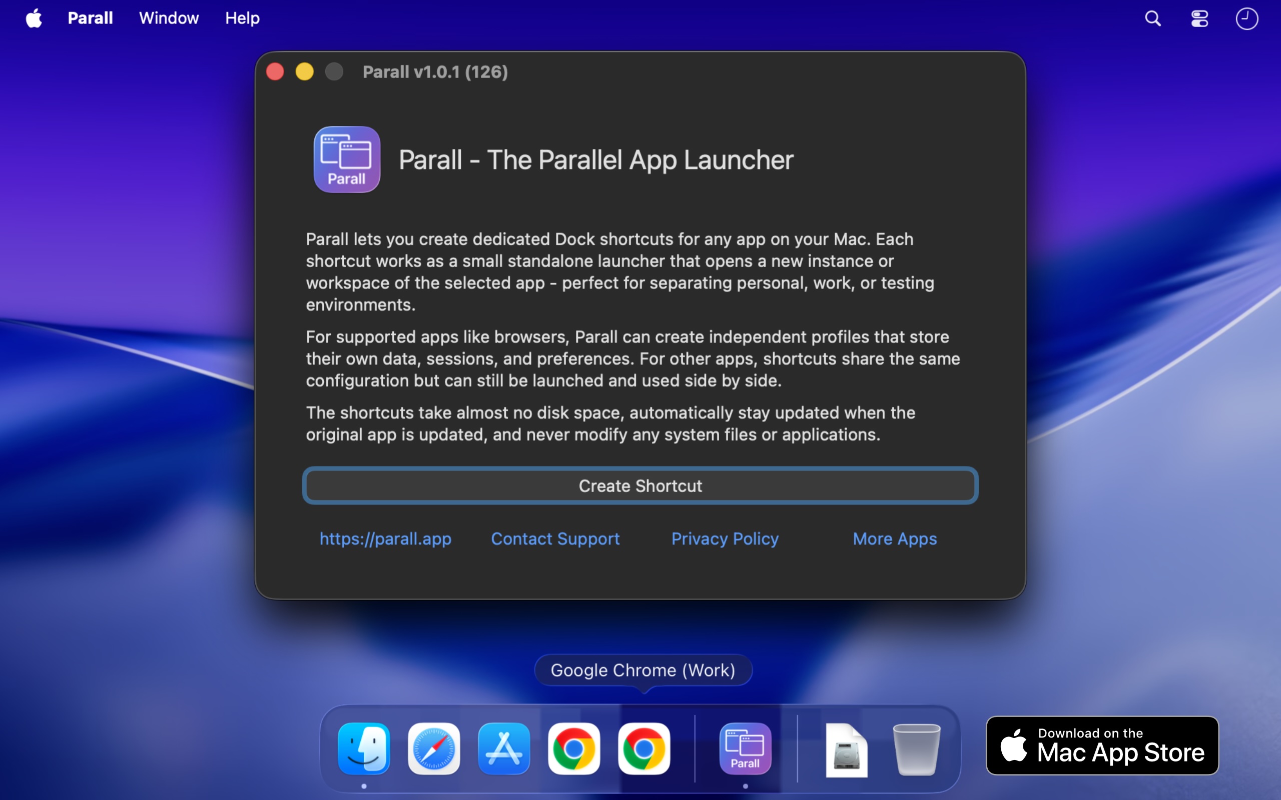
Parall is a native macOS application that lets you run multiple independent instances of the same supported app on your Mac, each with its own name and Dock icon. Where the target app supports it, those instances can also use separate accounts, profiles, and data. Beyond running app instances, Parall turns any website URL into a Web App Shortcut, and can also launch files, folders, and command-line tools as shortcuts. It is built for Mac users who need genuine separation between accounts, brands, clients, or working contexts without logging out and back in every time. Parall does all of this through lightweight shortcuts that keep the original app untouched. The problem Parall addresses is a long-standing limitation in macOS. macOS gives a regular app one usable running identity, so launching it again cannot reliably produce a separate instance with its own Dock icon and Spaces behavior. App data is stored wherever the app decides, which means accounts, profiles, and working data often cannot be moved to an external drive, cloud storage, or an easy to access folder. And to use more than one account, users usually have to log out and log back in every time. Parall was built by Ihor July, a cybersecurity expert and reverse engineer, who dealt with these macOS limitations for more than a decade, built scripted app bundles for himself as a workaround, and then realized there was no easy, polished way for regular users to run truly independent app instances. Parall's central capability is running supported apps as separate instances. Instead of being limited to one running copy, you can run multiple supported app instances side by side. Where the target app allows it, each instance can be given its own data folder, account set, profile, or storage location, so the accounts and settings stay apart. Each instance can also appear with its own Dock identity, pinned with its own name and icon, so macOS treats it like a distinct app. Parall automatically detects supported Electron, Eclipse, Chrome, Firefox, and ToDesktop based apps and separates their data even when the target app is sandboxed. Examples listed as supported include Slack, Notion, VS Code, Cursor, OBS, Dropbox, and Philips Hue Sync. Parall can turn any website URL into a Web App Shortcut with its own Dock identity and custom storage path. These shortcuts run on native WebKit, without Electron or a bundled Chrome engine, and can have their own data paths where the website supports separate storage. MS Teams and WhatsApp web apps are supported with notifications, unread badges, and an optional menu bar background mode. Parall also creates file and folder shortcuts that open in their default app, and command shortcuts that run command-line tools from the Dock with custom arguments and environment variables. The site describes three shortcut types: Web App Shortcut mode, command shortcut mode, and file and folder shortcuts. Parall gives each shortcut a recognizable presence in the Dock and menu bar. You can set custom app names and icons, draw labels on top of shortcut icons, and extract icons from any app or file for use in custom shortcuts. Appearance can be overridden per shortcut with Follow System, Light, or Dark mode regardless of the macOS system setting. Dock effects and animations can be applied per shortcut, and there is experimental control of Dock icon visibility. For supported Chrome based browsers you can control full screen menu bar behavior, and optional menu bar icons can be added for any shortcut while the target app is running, with menu bar icon appearance customizable by scale, grayscale, and template mask. For users who need exact per-shortcut behavior, Parall exposes advanced launch configuration. You can set custom data paths for Web App Shortcuts, set separate data folders for supported apps, define custom environment variables per shortcut, and override HOME for compatible apps that have a containerized structure. Command-line arguments can be passed to command shortcuts, and advanced Info.plist parameter overrides are available for each shortcut for experienced users. These controls let a shortcut reproduce the precise launch environment an app needs. Parall's approach is described as original macOS engineering built from research rather than a recipe. The app behavior it depends on is undocumented, so Parall's compatibility profiles come from observing how each target app launches, stores data, handles separate processes, and interacts with the Dock, the same reverse-engineering work that makes shortcuts function correctly when opened through Spotlight, Raycast, and Alfred. A script can sometimes start another process, but Parall solves the harder problem of giving supported instances their own usable identity, Dock behavior, and, where the target app allows it, separate data, accounts, profiles, and settings while keeping them connected to the original app. Parall shortcuts are small macOS launcher app bundles that directly execute the installed target app's binary and do not contain a copy of the target app. Parall never edits or freezes the target app. Every shortcut continues to launch the original installed app, preserving its code signature and allowing its built-in updater to keep working; after an update, all shortcuts use the new version when restarted. Parall does not use private APIs, inject or patch code, or modify macOS or the original app. The shortcut bundles are not sandboxed by design because they must launch the original application directly without additional layers. Parall also works locally with no automatic telemetry, no background daemons, no Electron runtime, and no bundled Chrome engine, and it does not modify system files or app data. The practical benefit is that Mac users can keep multiple accounts signed in and work in parallel instead of logging in and out. Reviewers describe keeping each Vivaldi or Chrome window scoped to a specific brand with the brand's icon in the Dock, running multiple Claude instances side by side, managing Cursor IDE accounts with different logins and extensions, running company and personal versions of apps, and running separate OBS instances with separate data. One reviewer notes it replaced an hour or two of reconfiguration after each Mac update. Others emphasize the time saved navigating between open browser profiles and the value of not needing fast user switching. Parall is listed on the Mac App Store with Family Sharing support. Use cases documented on the site and in reviews include browser profiles, developer environments, creative tools, multi-client work, and app setups that need real separation. Specifically: separate browser profiles each with their own Dock icon; multiple Claude and Claude Code desktop instances for personal and work accounts; multiple Cursor IDE accounts with separate logins and extensions; multiple Emacs instances with different command-line arguments, environment variables, custom icons, and app names; separate OBS instances with independent data; and separate Philips Hue Sync instances with different LED assignments for different displays. Parall also notes limited iOS and iPadOS app shortcuts, without data separation or a dedicated Dock icon. Parall is aimed at Mac users who juggle multiple accounts across the same apps, including people working under multiple brands, freelancers and part-time workers using one computer, developers, and creative professionals. It is a native macOS app that works from macOS 10.11 through macOS 27 Golden Gate, and the site maintains a compatibility table with 124 compatibility records. Parall is distributed through the Mac App Store with Family Sharing, and pricing is not stated on the website; one reviewer describes it as the best $9.99 spent on an app. Buyers who need a specific app tested are advised to check compatibility or contact support before purchasing. Parall's core promise is simple: run each Mac app instance separately, with its own identity, its own Dock presence, and, where the app allows it, its own data. By building shortcuts that launch the original signed app rather than modifying or copying it, Parall adds the multi-instance control macOS does not provide, while keeping the work local, private, and updateable.
Harness Manager is a native Mac app for managing an AI coding stack in one place. Described as the App Store and control center for AI coding harnesses on Mac, it lets you discover, install, and update tools such as Claude Code, Codex, OpenCode, and Pi, automatically detects what is already installed, manages MCP servers and AI skills, checks versions and paths, and diagnoses broken installations or configuration issues. It is built for developers and anyone working with multiple AI coding tools who wants their tools, connections, and updates together where they can see them. The app gathers an entire AI coding stack into one workspace, with the stated goal of less setup to manage and more space to build. Harness Manager is free and open source. The problem it addresses is familiar to anyone working with modern AI coding tools. Each new harness, MCP server, or skill arrives with its own install path, its own version, and its own update mechanism, and keeping track of them spreads across terminals, bookmarks, and a growing pile of browser tabs. Harness Manager targets that sprawl directly. Instead of checking each tool separately, you get a single view of what is installed, what is running, and what needs an update. The product's own framing is explicit: your tools, connections, and updates, together, where you can see them. The site also positions it as a way to keep up with the ecosystem without keeping twenty tabs open, and as a way to get your stack sorted and get back to building. Discovery is the first job Harness Manager takes on. The Discover screen lets you browse harnesses, MCPs, and skills by popularity, moving from well-known tools like Claude Code and Codex to options you have not tried yet. The app presents tools with logos and install options, so adding the next piece of a workflow does not require hunting down a separate download page. Harness Manager works in the other direction as well: it finds supported tools and configuration already present on your Mac, so your existing stack appears in one view rather than needing to be re-entered. Tools shown in this context include Claude Code, Codex, Gemini CLI, Cursor, OpenCode, Warp, Antigravity, Antigravity IDE, T3 Code, Conductor, Superset, Paseo, cmux, Orca, Herdr, and Emdash. Update handling is deliberately conservative. The app shows what needs an update, lets you see installed versions, and lets you compare available updates. Before anything runs, you can review the command and decide when it runs. The phrase used on the site is "Your updates. Your call." — the point being that you decide when an update runs rather than having changes applied silently. Reviewing the command first gives you a chance to understand what will happen to your environment before anything changes. The same workspace surface shows what is installed and what is running, so update decisions can be made with a view of the current state of the stack. Beyond tools and updates, Harness Manager surfaces the rest of your setup in plain sight. It shows provider configuration, described on the site as local configuration signals; MCP servers, described as your tools' connections; skills, described as reusable instructions; and processes, showing what is running and where. Placing these details alongside the tools that use them means you can see how a connection or a skill relates to a particular harness instead of inspecting configuration files one at a time. The app also checks versions and paths and can diagnose broken installations or configuration issues, which is useful when a tool that used to work stops behaving as expected. Harness Manager also includes benchmarks and rankings for comparing models. The app presents 31 ranked collections and seven comparison metrics, with data by Modelgrep. Collections are grouped into themes. General covers Smartest, Coding, Agents, Fastest, Low latency, Cheapest, and Free. Development covers Design, UI components, Full-stack apps, Mobile apps, Tool calling, and Long-context reasoning. Reasoning and knowledge covers Reasoning, Math, Science, Writing, Instruction following, RAG, and SQL and analysis. Deployment covers Local, Open-source, Small and fast, Long context, Vision, and Uncensored. Creative and specialist covers Data visualization, SVG, Game development, 3D, and Roleplay. Individual metrics include intelligence, coding, agentic performance, design, speed, latency, and context. The site notes that rankings are a starting point and that results depend on your task. The Harness Briefing is a built-in news surface that goes beyond a changelog. It collects new harnesses, useful ideas, and the story behind releases, drawing on publisher news, community finds, and official releases. Named sources on the site include OpenAI, Google Developers, Simon Willison, Hacker News, and project releases. Every story links to its source, so the original material is always one step away, and articles can be read inside the app. For developers trying to follow a fast-moving ecosystem, this replaces the habit of monitoring many separate feeds and tabs with a single, sourced feed inside the same app that manages the tools being discussed. Getting started follows three steps. First, download, drag, and open: you move Harness Manager to Applications and open your workspace, with no build tools required. Second, see your existing stack: the app finds supported tools and configuration already on your Mac and shows them together in one view. Third, make your next move: review an update, discover a skill, or compare models for your next project. That sequence reflects the product's overall approach — begin from what you already have, make the current state visible, then act from that shared picture rather than from guesswork or scattered notes. It is a native Mac application, which is central to how it inspects local tools, configuration, and processes. The stated benefit is a stack that stays sorted. By concentrating discovery, installation, updates, configuration visibility, diagnostics, and model comparison in one native workspace, Harness Manager reduces the number of places a developer has to look and the amount of manual bookkeeping involved in maintaining a set of AI coding tools. Automatic detection means less time reconstructing what is already installed. Review-before-run updates mean changes to your environment remain under your control. Diagnostics for broken installations or configuration issues mean problems can be identified from inside the same app. And built-in model rankings and news mean evaluating new options does not require leaving the tool that manages your current ones. Concrete scenarios follow from these capabilities. A developer who has accumulated several coding harnesses can open the workspace to see everything installed alongside provider configuration, MCP servers, skills, and running processes in a single view. Someone preparing a new project can browse the Discover screen by popularity to find a harness, MCP, or skill and install it without leaving the app. A user who notices an available update can review the exact command before allowing it to run. When a tool stops working, versions, paths, and diagnostics can help identify a broken installation or configuration issue. Anyone weighing a model switch can compare options across the ranked collections — for example coding, agents, or tool calling — before committing. And a developer who wants to keep up with releases can read sourced stories from the Harness Briefing inside the app. Harness Manager targets Mac users who work with AI coding tools: developers, and anyone maintaining a collection of harnesses, MCP servers, and skills. It requires macOS 14 or later and runs on both Apple silicon and Intel. The site lists it as free to use, inspect, and make your own, licensed under Apache 2.0, with the project available on GitHub. It is distributed as a download for Mac rather than as a web service. The build is described as an early preview and is noted as not yet notarized, so macOS may require approval in Privacy & Security on first launch. No paid tier or pricing plan is mentioned; the product is presented as free and open source. In short, Harness Manager is a free, open-source Mac app that treats an AI coding stack as something to be managed rather than endured. It brings discovery, installation, updates, configuration and process visibility, diagnostics, model rankings, and ecosystem news into one native workspace built around what is already on your machine. The value proposition it states is simple: your stack, sorted, and back to building.
AutonomyAI is described as the OS for building in production, built around Fei Studio. Its stated purpose is turning product managers and product designers into product builders. Rather than writing a specification and waiting for engineering to pick it up, product and design teams can describe a change, have it built against the real codebase, get a rendered and validated result, and hand engineers one click of approval. AutonomyAI frames this as Autonomous Product Delivery: product and design build it, engineers approve it, and the whole loop runs as one system. The site states that AutonomyAI is trusted by 170+ product teams. The problem AutonomyAI sets out to solve is that writing code got 10x faster, but shipping stayed the same speed. Every change still goes through engineering, so a PM can spec a feature in an afternoon and then watch it wait in the backlog for a quarter. AI coding tools make engineers faster, but because only engineers can ship, the backlog keeps growing anyway. Meanwhile, app builders produce demos that cannot touch a real codebase, so the work either gets redone from scratch or dies. AutonomyAI positions the fix as a second lane to production: a path where the people who spec the work are also the people who ship it, on the real codebase, with engineering still holding the approval. Codebase ingestion is the foundation of that approach. Fei Studio plugs into your repository and models how your engineers write code, covering components, standards, design system, APIs, hooks and architecture, so every task is built the way your team would build it rather than from a generic AI template. The website states that your real stack is understood in under two minutes. You connect your git provider with no manual config, and CSS, API, SSO and DB connections are all ingested. Ingestion is self-updating as your codebase evolves, which matters because it means the system's understanding of your product does not go stale after the first setup. Task Execution takes raw product ideas and turns them into production-ready product updates. Fei Studio accepts any input, including prompts, PRDs, screenshots, tickets and Figma, and turns those inputs into codebase-aligned variants and testable implementation options before generating production-ready output. Ideas are broken into structured plans based on your infrastructure, and those plans are translated into real system changes and pull requests. The site notes that each task involves 36+ orchestrated steps with transparent output, so the work is not a black box even though the workflow itself is autonomous. Production Grade output is what makes the handoff workable. Every task produces production-ready code, a clean PR and full specs, all built to match your codebase, so engineering can review and merge. The generated code is production quality and written to your standards, the pull requests are clean and ready for engineering review, and full specs plus change history are provided for complete context. In the described workflow, Fei writes the change, renders it and validates it within minutes, then opens a PR that an engineer approves with one click. That is the entire path, compared with a coding agent that hands the work back into the engineering queue. The loop now also starts before the ticket exists. Discover Mode researches your analytics, tickets, customer calls and code to find what to build, and it can either answer a question you ask or suggest the next improvement on its own. After something ships, Fei Studio measures the result and proposes the next build. The site states that every merge makes the system smarter, so the delivery loop compounds over time rather than resetting with each task. This is the end-to-end sequence AutonomyAI describes as Discover, plan, build, ship, repeat. Fei Studio also works inside other AI agents through a new MCP Server. Claude Code, Cursor or any MCP client can connect to it, so wherever a team already works, Fei Studio's delivery layer is one connection away. The site draws a direct comparison with coding agents: both start from the same point, but a coding agent hands the work back to engineering, while Fei Studio hands engineers one click. A published comparison table contrasts Fei Studio with Cursor/Copilot, Lovable and Claude Code across creating prototypes, enhancing existing screens, live preview of changes, a friendly UI for non-technical people, matching your product's look and feel, reusing existing components, production-ready code for review, handling branches, commits and PRs, output per task, and an Agent Knowledge Hub. Fei Studio is listed as supporting each of these, with your product's look and feel auto-ingested. The stated outcomes include a faster path from an idea to a merged change, engineering time protected from environment setup, code review and fixing, and a shorter feedback loop when a build misses what the PM actually meant. AutonomyAI reports that its own product team has opened 50+ PRs against its production codebase while writing zero code, with an engineer approving every merge. That first-party example is presented as proof that the model works on a real codebase. The documented use cases run across the product lifecycle. Teams can validate product ideas, improve existing features, turn support feedback into product changes, create stakeholder demos, accelerate feature delivery, build enterprise customizations, refactor legacy interfaces, prototype with real code, explore UX improvements, align with a design system, and redesign elements. Role-specific pages address PMs with "Ship features, not just specs," designers with "Design in the real product," and engineers with "Stop rebuilding from scratch." AutonomyAI speaks to product managers, product designers and engineering teams, positioning PMs and designers as the primary builders and engineers as the approvers. Enterprise offerings, compliance and security documentation, a knowledge base and comparison resources are available on the site. A Playground sign-up is offered at studio.autonomyai.io, alongside a "Book a Demo" flow. Pricing is described as per task, contrasted in the comparison table with per-seat plus usage, per-credit usage-based and subscription or per-token models. The takeaway is that AutonomyAI's Autonomous Product Delivery closes the gap between how fast code can be written and how fast product actually ships. By ingesting your real codebase, executing structured plans into production-ready code, opening clean PRs for engineering approval, and using Discover Mode to keep proposing what to build next, it gives product and design a second lane to production without removing engineers from the final decision.
CtrlOps is a local-first desktop application for managing Linux servers with AI. It brings an AI-assisted terminal, real-time infrastructure monitoring, SSH access, security auditing, access management, a visual file manager, log search, backups, and single-click deployments together into one screen. It is built for the people who run Linux servers — developers, DevOps engineers, technical teams, and non-terminal people such as designers or solo founders — and its purpose is to give complete visibility across a whole fleet of servers from a single application, without installing an agent on those servers. The problem CtrlOps was built to solve comes from the founders' own experience running an IT service company. They were designers and product people at heart, but every client they worked with had their own server. To check anything — even something as simple as finding out why a server is slow by checking memory and CPU — someone had to open a terminal, remember the right IP, find the right credentials, and log in. Separately. Every single time. For every single client. Servers were a black box, and they had a minimum of seven to ten projects and more than forty servers running every month. There was no unified view and no quick way to know what was happening across the infrastructure without pulling in the one person on the team who knew how to navigate it all; everything ran through him, and if he was unavailable, the team was blind. CtrlOps answers the question they kept asking: why does managing Linux servers have to feel like this, why is there no tool that gives full visibility across all your servers in one place, that feels intuitive enough for a non-terminal person to use, and that does not make you dependent on a single engineer to keep everything running. They built it first for themselves, then made it for everyone. The AI terminal is the centrepiece of the product. Instead of memorising commands, you describe what you need in plain English — for example, clearing disk space on prod-web — and CtrlOps works out the command for you. Crucially, it keeps a human in the loop: you review and approve every command before it runs, and the app makes clear exactly which server you are on before anything executes. Web search, MCP servers, and one-click saved scripts are built in, so questions can be researched and repeat fixes can be stored and run again with a single click. Reviewers describe this preview and approval step as the whole game when AI touches live infrastructure, because nothing changes on a production server until a person has seen the exact command. Security auditing and access management address the question of who can actually reach your servers. CtrlOps runs 25 security audits over SSH and gives you a hardening score, a PDF audit report, and fix commands for every issue found — each one waiting for your approval before it runs. Access management scans your whole fleet to show who can log in where and who has sudo. When someone leaves the team, you can revoke access across every server at once and assign any level of roles and access without touching the terminal. Every log file is found and searchable without SSH, so you do not need to know where a log lives in order to read it. Day-to-day server work is covered by the rest of the toolkit. Multi-server management keeps your whole fleet in one app, letting you switch between servers by alias instead of remembering IP addresses. The visual file manager lets you upload, download and unzip files in one click, which removes the need for a separate SFTP client and separate logins just to edit a single config file. Real-time infrastructure monitoring shows live CPU, memory, disk and network data for every server, and the product is described as offering backups that prove they ran. Single-click deployment takes a GitHub repository, environment variables and a domain through one form and puts the app live, with PM2, Nginx and SSL handled for you, so there are no scripts to write and no CI/CD pipeline to set up. The approach behind all of this is deliberately architectural. CtrlOps speaks SSH directly to your fleet — there is no service in between, no cloud bridge to breach and no vendor to lock you in. It runs entirely on your machine: SSH keys, server IPs and credentials never touch a cloud, there is no telemetry, and sensitive data is stored only on your device. It requires only your SSH key, never your AWS IAM, GCP service account or Azure credentials, and it needs no agent installed on the servers themselves. Connections are made over SSH using ED25519 keys on port 22 directly to your machines. This local-first design is the reason the product can state that your credentials never leave your machine while still managing an entire fleet. The outcomes reported by users follow from that design. Teams describe doing in ten minutes what used to take an hour, and deployments that no longer cause stress because the flow is simply pasting the repository, filling in environment variables, toggling SSL and finishing. Offboarding becomes a quick check that can be performed by whoever needs it — including an HR team member who reported checking SSH management herself and flagging access in two minutes instead of going back and forth with the technical team. Users report catching issues before they became outages, onboarding a developer in minutes, and no longer depending on one person who is the only one who knows how the infrastructure is wired. CtrlOps is described as trusted by more than 700 engineers in more than 160 countries and is rated 4.8 out of 5 on G2. Concrete use cases described in the content include deploying a GitHub repository to a server without writing scripts or setting up CI/CD; checking why a server is slow by looking at live CPU, memory and disk; finding a misconfigured Nginx configuration and checking the service status through the AI terminal; clearing disk space on a production server with an approved command; editing a configuration file directly through the file manager rather than a separate SFTP client; searching logs across a fleet without SSH; auditing servers against 25 security checks and generating a PDF report for review; revoking a departing employee's access across every server at once; running a saved script or playbook of common fixes with one click; onboarding a new developer quickly; and, for solo builders and designers who do not know DevOps or Linux commands, asking the AI terminal in plain English what to do and following the steps to take a finished website live by themselves. The product is aimed at developers and DevOps engineers, IT service companies running many client servers, teams that need a unified view across a fleet, solo founders wearing the DevOps hat, and non-terminal users such as designers and no-code builders who are otherwise blocked at deployment. CtrlOps connects to any server over SSH, and the content names AWS, Google Cloud, Azure, DigitalOcean and any VPS as environments it manages, along with GitHub repositories for deployments. It is available as a desktop app for macOS, with separate Apple Silicon (M1, M2, M3, M4, M5) and Intel x64 (Core i5, i7, i9) builds, for Windows through the Microsoft Store, and for Linux. Pricing is free to start, with a one month free trial that requires no credit card, and a lifetime subscription is referenced by users. The takeaway is that CtrlOps brings everything needed to manage servers into one local desktop application: an AI terminal that asks before it acts, security hardening you can measure and report on, access control you can audit and revoke, monitoring, file management, backups, log search and one-click deployment — all speaking SSH directly to your fleet while your credentials stay on your machine.
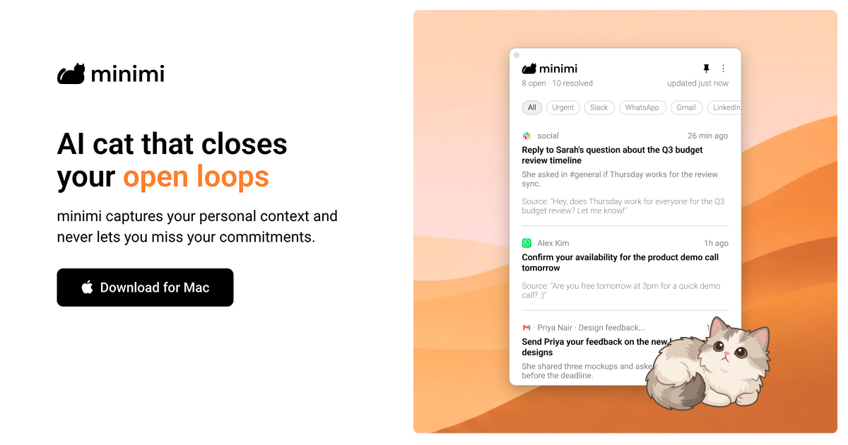
minimi is a Mac application from Shram Intelligence that its makers describe as an AI cat that closes your open loops. It captures your personal context as you work and never lets you miss your commitments. Rather than being another destination you have to visit, minimi is positioned as personal intelligence that comes to you: it runs on your Mac, reads your digital activity through the operating system's accessibility infrastructure, and uses what it learns to find the things that still need your attention. The stated ambition is a world where, before you have said a word, AI already understands you and frees you from the work of managing your own life, so you can spend that time actually living it. The product is aimed at anyone who is tired of re-explaining themselves to AI and of manually tracking what they promised to do. The problem minimi addresses is the fragmentation of personal context. The commitments you make are scattered across WhatsApp messages, Gmail threads, calendar entries and the other applications you use throughout a laptop day, and nothing keeps track of them as a coherent whole. The site notes that if you context-switch frequently, minimi can be a life-saver because it never misses what should be on your plate. People quoted on the page describe the value of contextual clarity over memory-based decisioning, of no longer paying separately for meeting transcription, and of not having to re-explain their whole situation in every AI conversation. minimi's answer is to capture context passively and continuously instead of waiting for you to log it yourself. The first half of the product is finding your open loops. minimi captures your personal context and, from that context, identifies your high-value action items. Because the detection is based on the work you actually did rather than on a to-do list you maintain by hand, the items it surfaces are tied to real commitments you already made somewhere in your apps. The site describes this as a discovery step that works like magic: instead of you remembering to write something down, minimi notices that a loop is still open and brings it forward. For anyone who ends the day unsure what they still owe someone, this step is what converts scattered activity into a visible, actionable picture of outstanding work. The second half is closing those loops automatically. minimi traces your decisions and resolves closed loops without manual effort. In other words, once it knows what you decided and what has been handled, it can consider the loop finished on its own rather than asking you to mark it complete. This matters because the maintenance overhead of a task system is usually what causes people to abandon it: the more manual upkeep required, the faster the system dies. By pairing automatic detection with automatic resolution, minimi aims to keep your picture of outstanding work accurate without asking you to do bookkeeping, and the whole flow is summarised on the site as 'Works like magic' in two steps. minimi also states that it supports all apps and works right out of the box without the need for any integrations. The page lists WhatsApp, Gmail, Calendar and 'and more' as the kinds of surfaces it covers. This approach removes the connector-by-connector setup that most context tools require, and it means you do not have to decide in advance which of your tools are worth connecting. Users commenting on the site highlight the same idea from a different angle, noting that minimi eliminates the need for integrations and MCPs across hundreds of tools while still capturing laptop work context. Practically, that means you download the app, and the context capture begins without configuration work. Privacy and ownership of memory are treated as first-class features under the heading 'Own your memory'. Your memory is stored on your Mac, and the company states that none of your data is stored on their servers. There is no cloud database, and the FAQ adds that they do not retain your data or train on it. minimi also clarifies that it does not take screenshots of your screen; instead it reads what is on your screen via Apple's accessibility infrastructure on your Mac. The comparison the site draws is with a brain that relies on senses to create and store memories: minimi does the equivalent for your digital activity on your Mac, but keeps the resulting memory local and under your control. Structurally, minimi is organised around two components. Memory MCP captures your personal context so you never explain yourself to AI again, and Open loops Inbox uses that personal context so you never miss your commitments. The FAQ describes minimi MCP as a digital pendrive that you can use to plug all your memories into any AI, including LLMs such as Claude, ChatGPT and Gemini, as well as harnesses such as OpenClaw and Hermes. The product is presented through characters: Cotton captures your personal context, Melody uses that context and never lets you miss your commitments, and the company says more cats are coming. This character framing is how the two capabilities are made memorable and distinct. The benefits described are straightforward. You stop being the person who has to remember and reconcile everything, because minimi finds the open loops and resolves them automatically. You avoid the setup tax of integrations. You keep your context private on your own machine. And you can context-switch like a pro, because the system tracks what should be on your plate rather than depending on your recollection. The site summarises the onboarding experience as 'No setup needed. Just download and begin.' and frames the outcome as staying on top of your work. Concrete scenarios are visible in the material around the product. One video walkthrough is titled 'minimi: Your Meeting Notetaker', and a user quoted on the page says they stopped paying for meeting transcription and that minimi also captures offline discussions and makes notes with accuracy. Another video is titled 'minimi: The Ultimate Company Brain', pointing at team knowledge use. Several commenters describe everyday workflows: feeding captured context into Claude, ChatGPT or Cursor through the MCP so the assistant already knows the situation, and using the memory to reconstruct what was actually done the previous day. The most repeated scenario is the context-switching knowledge worker who moves between messaging, email and calendar all day and needs one reliable place that knows what is still owed. minimi is a Mac download, so the desktop platform is the core surface. It is described as trusted by people at a set of companies shown as logos on the site, and it launched on Product Hunt where it gathered 303 upvotes and 45 comments under the topics Productivity, User Experience and Artificial Intelligence. On the AI side, the explicitly named connections are Claude, ChatGPT, Gemini, and harnesses such as OpenClaw and Hermes, all reached through minimi MCP. No pricing plans, tiers or subscription details are stated in the provided content, and the only commercial signal is a user note that minimi already had paying customers globally shortly after launch. Taken together, minimi 2.0 is best understood as a personal context layer for your Mac rather than a single-purpose app. It watches your digital activity through accessibility infrastructure, builds a private memory that stays on your device, uses that memory to find and close your open loops automatically, and exposes the same memory through MCP so any AI you already use can start from an understanding of you instead of a blank slate. Its primary value proposition is simple and consistently repeated across the site: capture your personal context and never let you miss your commitments.
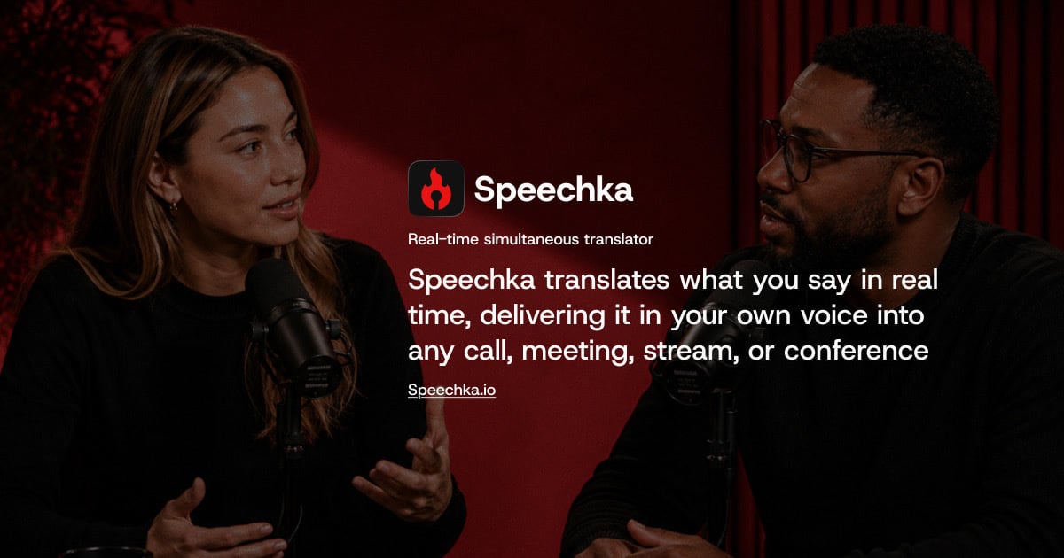
Speechka is a real-time voice translation app that lets you speak naturally in one language while others hear you in theirs. According to its website, Speechka translates what you say in real time and delivers it in your own voice into any call, meeting, stream, or conference. Rather than relying on captions, subtitles, or transcripts, it delivers translated speech as audio, spoken in your Personal voice. The product is aimed at anyone who communicates across languages live: people in online meetings, sales and client calls, livestreams, presentations, conferences, keynotes, workshops, classrooms, and international events. Speechka runs as a desktop application for macOS and Windows, and a limited version of the experience can be tried directly in the browser for free. The problem Speechka addresses is the friction that language barriers create in live conversation. Traditional solutions such as subtitles or transcripts shift attention away from the speaker, and less immediate approaches can turn a conversation into a series of delayed voice messages. Speechka's website frames the goal simply: once translation becomes part of the conversation, language stops getting in the way. It positions itself as built for conversations, not subtitles, translating live speech with natural timing so that conversations stay fluid. The site also notes that participants should not have to follow subtitles, repeat themselves, or rely on separate streams and dubbed recordings. At its core, Speechka provides real-time voice translation. You speak in your language while others hear you in theirs, and the company describes this as low-latency voice translation built for meetings, calls, conferences, and live conversations. Speechka listens, translates, and delivers every sentence in sequence, which the site says keeps conversations smooth, natural, and easy to follow. A related capability is ordered playback: every translated sentence is delivered in the correct order, which keeps multilingual conversations clear even when multiple people are speaking. The site also states that Speechka automatically handles pauses, sentence boundaries, and playback timing, so translated speech follows the rhythm of a real conversation rather than sounding fragmented. Together these mechanisms are meant to make translation feel like part of the exchange instead of an interruption layered on top of it. Personal voice is one of Speechka's most distinctive features. Instead of generic AI narration, translated speech preserves your identity and speaking style, so you keep your own voice, accent, and identity across every supported language. Setting it up involves recording a short voice sample—the interface allows recording up to 10 seconds of your voice, and offers a sample text you can read. After recording, you can listen to the sample and re-record it if needed, and you can remove or replace your voice at any time. Speechka states that every translation is spoken using your Personal voice, preserving your identity, speaking style, and natural accent across supported languages. The voice sample has its own language setting, and by creating a personal voice and using translation you agree to the Terms & Conditions and confirm that you have permission to use that voice. Speechka's context-aware translation is designed to understand complete ideas rather than individual words. By recognizing context, sentence structure, tone, and intent, the company says translated speech sounds natural instead of robotic or fragmented. Users can also choose between two quality modes. Faster is optimized for the lowest possible latency, making it suitable for fast-paced conversations, while High quality prioritizes the most natural voice generation and translation quality, which the site recommends for presentations, meetings, podcasts, and professional communication. Two listening modes are described in the FAQ: Listen Mode plays translated speech only for you through your headphones or speakers, while Broadcast Mode sends translated speech directly to other participants through your microphone, so they hear the translation while you continue speaking naturally. Getting started follows a simple three-step flow. First, you choose your languages—Speechka translates both ways between 44 languages. Second, you create your voice, which will be used for translation. Third, you start translation and can listen to the result in real time. The browser experience follows the same three steps and lets you hear how Speechka translates you before downloading anything, but free browser translation time is limited to 5 free minutes; after that, the site prompts you to download Speechka and complete your account to keep translating in real time. On desktop, Speechka integrates with the tools already in use, which the company describes as a seamless fit with existing communication tools. Because it works with virtually any application that accepts microphone input, the translation can flow into the same channels people already use. The stated benefits center on keeping conversations moving and preserving the speaker's identity. In online meetings, Speechka translates your voice in real time so everyone hears you in their own language, with no subtitles to follow and no need to repeat yourself. For presenters, the promise is to speak once and reach every room: present in your own language while Speechka delivers your voice to multilingual audiences in real time without interrupting the flow of the presentation. For streamers, Speechka translates your voice live for viewers around the world, so you can grow your audience without creating separate streams, subtitles, or dubbed recordings—every viewer hears the same content, naturally translated and spoken in your own voice. Speechka's site names several concrete scenarios. In online meetings, it covers daily stand-ups, client calls, and remote workshops where everyone can hear you in their own language. For conferences and events, it is described as perfect for conferences, keynotes, workshops, classrooms, and international events where clear communication matters more than language. Livestreamers use it to go live for a global audience on Twitch, YouTube, Kick, TikTok, or their own platform, and the site notes it suits livestreaming software as well. For professional communication, the High quality mode is recommended for presentations, meetings, podcasts, and professional communication, and the Pro subscription is described as designed for those who communicate across languages regularly, including sales calls and customer calls. Speechka works with virtually any application that accepts microphone input. The site explicitly lists Zoom, Google Meet, Microsoft Teams, Discord, Slack, OBS, Webex, browser-based meetings, and livestreaming software, and displays logos for Zoom, Google Meet, Microsoft Teams, Slack, Discord, and Webex. It is available as a desktop app for macOS and Windows (the site offers download links for Mac and Windows), and the browser experience is offered as a way to try real-time voice translation before downloading. Pricing is structured around credits. There is a 7-day free trial with 10 credits and no feature limitations, described as enough to experience real-time voice translation in real meetings, calls, presentations, or livestreams. The Pro subscription costs $19.99 per month and includes 180 credits every month. Additional credits can be purchased without changing the subscription: 60 credits for $9.99, 180 credits for $24.99, and 360 credits for $39.99. Questions and privacy requests can be sent to support@speechka.io. Speechka's core proposition is straightforward: speak naturally in your own language and be heard in someone else's, in your own voice. By combining real-time translation, ordered playback, context-aware processing, and Personal voice with support for 44 languages and compatibility with the communication tools people already use, it turns language from a barrier into something that simply becomes part of the conversation. For teams, presenters, and streamers who work across languages every day, that is the value Speechka sets out to deliver.