Category Focus/categories/developer-tools
Developer Tools AI Tools
Discover and compare the best developer tools AI tools and software. Browse 471+ curated tools with reviews and rankings.
Projects tracked
471
Sort mode
RECENT
Page
1
Discover and compare the best developer tools AI tools and software. Browse 471+ curated tools with reviews and rankings.
Projects tracked
471
Sort mode
RECENT
Page
1
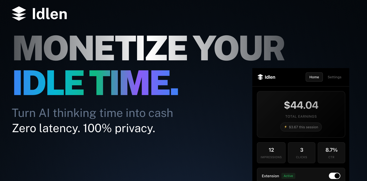
Idlen is an advertising network built around the idle time that appears while AI models are thinking. Its promise is short and direct: AI thinks, you earn. The product puts native developer-tool ads in three places — the IDE, the browser, and the chat app you shipped. Developers install the Idlen extension for VS Code, Cursor, or Chrome and see a native ad during the moments their AI assistant is processing a request, keeping 70% of the revenue. Advertisers use the same network to reach developers inside the tools they already use every day, targeted by the stack they actually work with, including React, Python, and AWS. AI app builders add three lines of code with npm i @idlen/chat-sdk to monetize their own chat products, and ads remain optional there: no key, no ads. Developers spend a large part of their day waiting on AI. A prompt is sent, the model thinks, and the editor sits idle for a few seconds at a time. Idlen takes that observation literally: the wait is an ad slot. Instead of treating AI processing time as dead time, the network fills it with a native, relevant sponsor message — the demo shows a sponsored slot carrying Neon, described as serverless Postgres for modern apps. The reasoning behind the product is that the waiting is unavoidable: developers are already using Claude, ChatGPT, Cursor, and other AI tools, and they change nothing about their workflow. Idlen simply adds an ad during processing and pays the developer a share. At the same time, developer-tool companies struggle to reach this audience precisely, and AI app builders who ship chat products have usage but often no monetization. Idlen answers all three sides with one network and three doors. The earning side of Idlen is built for individual developers first. The extension is described as earning €20-100 per month passively, without lifting a finger, and earnings go directly to the developer's account. Payouts are flexible: Stripe, PayPal, or a 10% bonus taken as credits. Idlen also supports teams through a shared earnings pool, so an entire group can collect the income generated by its members. An earnings calculator on the site lets developers model the result using their coding hours per day and a target subscription — ChatGPT Plus, Claude Pro, or v0 Premium — showing, for example, that four hours per day yields 150% coverage, making ChatGPT Plus free with surplus pocket money. The site notes these figures are based on average developer activity and ad inventory fill rates. Onboarding is presented as taking under two minutes. Privacy is treated as a core feature rather than a footnote. Idlen states plainly that your code stays on your machine, and the privacy process is spelled out in three steps. First, no code access: the extension never reads, stores, or transmits your source code. Second, local analysis only: package.json is analyzed on your machine to determine ad relevance, and nothing leaves the device. Third, the ad request itself is anonymous — the illustrative code shows dependencies read locally, keywords matched from those dependencies, and then an anonymous fetch for an ad. The company also describes the extension code as transparent and auditable and available for security review. For developers, that means the monetization does not come at the cost of handing over a codebase or prompts; Idlen states that it does not read your prompts. Idlen is designed to stay out of the way. Its zero-latency claim rests on timing: ads load during AI processing only, so they occupy time the developer is already waiting rather than adding delay to normal editing. It works everywhere in practice — VS Code, Chrome, and all the AI tools the developer already uses, with support listed for Claude, ChatGPT, V0, Bolt, Lovable, Cursor, Windsurf, and Replit, plus downloads for VS Code, Cursor, Open VSX, Chrome, and Firefox. On the advertising side, the network claims to avoid spam and clickbait, promising only curated developer tools, organized into categories such as Cloud & Hosting for deploying, scaling, and monitoring apps; Databases for modern databases; APIs & Services covering payment, email, and SMS; and Dev Tools for boosting productivity. The core workflow is deliberately small. Step one: install the extension — add Idlen to VS Code or Chrome in one click, and it works with all your AI tools. Step two: use AI as usual — keep coding with Claude, ChatGPT, Cursor, or any other AI tool, with no workflow changes. Step three: earn passively — relevant dev tool ads appear during wait time and earnings go directly to your account. The site summarizes the whole journey as starting to earn in under 2 minutes. The demo interaction reinforces it: a user sends a message such as "Add proper error handling and improve the loading state," and the assistant thinks for three seconds; during that window a sponsored Idlen slot appears in the chat, and the panel reports earning tokens while you wait. Advertisers enter through a different door: they buy the slot and appear in the IDE and browser, targeted by the stack the developer actually uses. Publishers enter through a third door: they paste a message in the sandbox to preview which ad would serve, then run npm i @idlen/chat-sdk, three lines of code, and keep 70%. The benefits differ by side but share one shape — value extracted from time that was previously wasted. For developers, the outcome is passive income on top of work they were already doing, with no change to workflow, zero tracking, and no exposure of code or prompts. Reported earnings of €20-100 per month can offset or fully cover an AI subscription, and the calculator turns that into a concrete target: pick your hours and your subscription and see the coverage percentage. Flexible payouts and a team pool make the income usable for individuals and groups alike. For advertisers, the benefit is placement inside the tools where developers spend their day, targeted by real stack signals rather than guesswork, with a welcome offer that doubles the first deposit: pay €200 and get €400 this week. For AI app builders, the benefit is monetization of an existing chat product with a very small integration surface — three lines — while keeping 70% and retaining the option to show no ads at all. A few concrete workflows illustrate where Idlen is used. A developer using Cursor or VS Code spends a few seconds waiting for code generation; the Idlen extension fills that moment with a native, stack-relevant sponsor message and credits the earnings. A developer working in the browser with ChatGPT or Claude gets the same treatment through the Chrome or Firefox extension. An advertising team that sells a serverless database or a hosting platform buys slots and appears while developers are actively coding, matched against the technologies visible in that project. An AI app builder who shipped a chat product installs @idlen/chat-sdk, previews a message in the sandbox to see which ad would serve, and switches on monetization without managing keys. A team adopts the extension together and pools its earnings through the shared team pool. And a prospective advertiser tests the waters with the €200-to-€400 welcome offer before committing further spend. Idlen is explicitly built for every side of the ecosystem it touches. The first group is AI users — developers who want passive income while using their favorite AI tools. The second is advertisers selling developer tools who want to appear in the IDE and browser, targeted by the stack developers actually use. The third is AI app builders and publishers who want to monetize an AI product with three lines of code. Integrations and downloads cover VS Code, Cursor, Open VSX, Chrome, and Firefox, with the network listed as working alongside Claude, ChatGPT, V0, Bolt, Lovable, Cursor, Windsurf, and Replit. Installing Idlen is free for developers, who keep 70% of earnings; the paid side of the marketplace is advertising, where the entry offer is €200 matched with €200 for €400 to spend this week. The site also highlights privacy first, zero latency, and cancel anytime as standing commitments. Idlen's core proposition can be stated in one line: the seconds you spend waiting for AI are already being spent, so the network turns them into income for developers, distribution for developer-tool advertisers, and revenue for AI app builders. One network, three doors — install the extension, buy the slot, or try the sandbox.
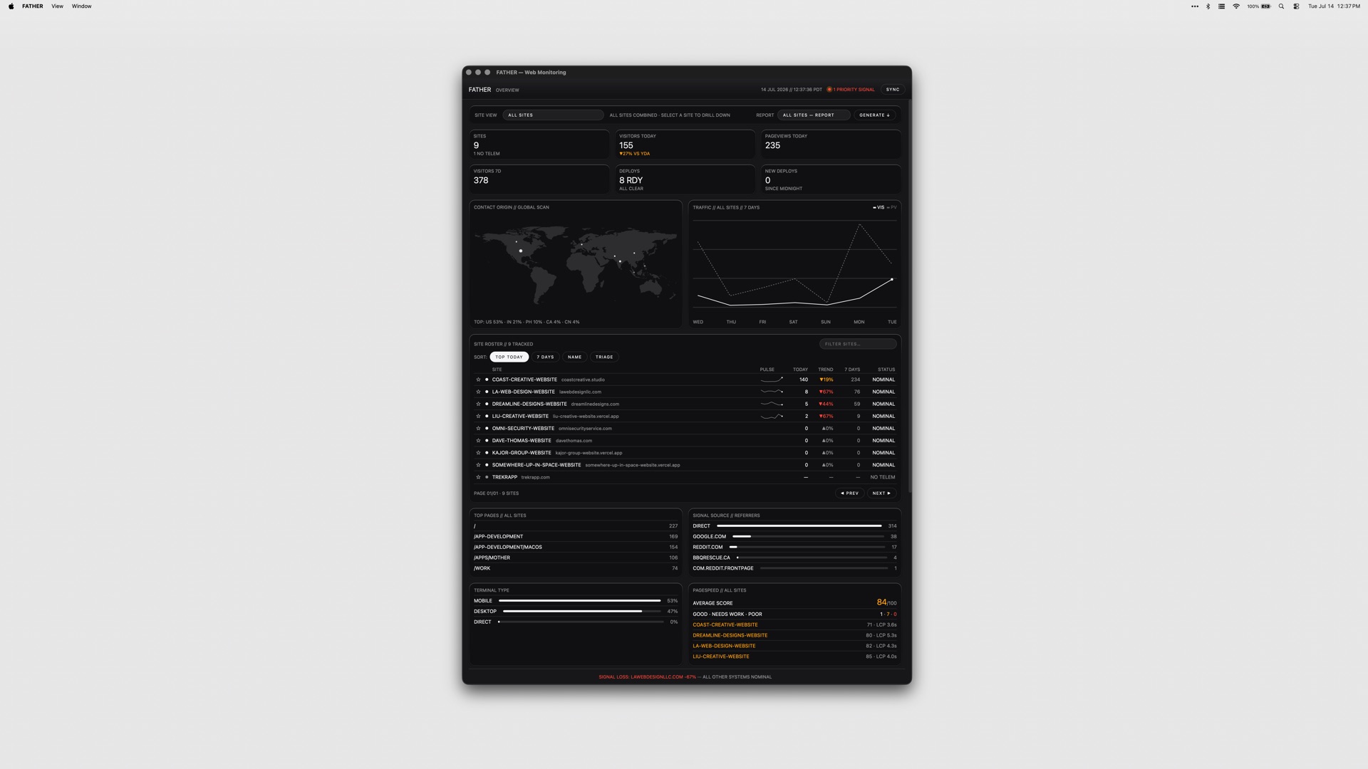
FATHER is a macOS application that serves as a mission-control dashboard for websites and deployments, built specifically for teams shipping on Vercel. Its stated purpose is simple: it watches the fleet so you do not have to, and it makes sure you know that a site is down before your clients do. The app is aimed at people who are responsible for more than one live site — studios, agencies and developers running client projects — and who need a single screen that answers the question of what is healthy, what is broken and what is about to expire. Connect your Vercel account and the dashboard fills itself: deployments, uptime and speed metrics appear live. The underlying problem is fragmentation. A team shipping on Vercel typically has to visit the Vercel dashboard for deploys, a search console for clicks and rankings, a separate source for page-speed scores, and yet another place to check whether an SSL certificate or a domain is about to lapse. GitHub checks live somewhere else again, and a failed build can sit unnoticed for hours if nobody happens to be looking at a browser tab. FATHER pulls those signals into one native macOS window, and — more importantly — into the menu bar, so monitoring stops being something you have to remember to do and becomes something that comes to you. FATHER is built on Vercel. Deploy tracking and the speed and uptime metrics all come from the Vercel API, so the integration is not a bolt-on but the foundation of the app. You connect your account token and your projects appear automatically; there is no manual inventory to maintain and nothing to keep in sync. Projects that are hosted somewhere other than Vercel can still be added manually so they get basic status checks, which means the dashboard can serve as a single view even for a mixed hosting estate. Because the app relies directly on the Vercel API, the numbers it shows come from the same place your deployments do. The core view is the fleet at a glance: the status, uptime and response of every site on one screen. Rather than opening projects one at a time, you get a single list you can scan in seconds to see which sites are responding, which are slow and which are down, so the morning check on a portfolio of client work takes moments instead of a tour through several dashboards. Deploy tracking is the second pillar. FATHER lets you watch builds progress and catch failures the moment they land, live from Vercel, so a broken deploy does not have to wait for a client email or a casual check-in to be discovered. Two features make sure that information actually reaches you. Menu-bar status shows an F in the macOS menu bar: it displays a dot while builds are running and turns red when something needs your attention, so the health of the fleet is legible at a glance from wherever you are on the Mac. Alerts go further — notifications fire even when the dashboard is closed, so a failed build or a site going down will find you rather than waiting to be found. Together they turn the app into something closer to a pager for your web estate than a traditional dashboard you have to remember to visit. Beyond deployments and uptime, FATHER covers the surrounding signals that usually live in separate tools. Traffic, PageSpeed scores, Search Console data and Bing data all appear in the dashboard, with clicks, rankings and indexing visible without leaving the app. SSL certificates and domain renewals get a countdown, so expirations stop being a nasty surprise, and failing GitHub checks get flagged alongside everything else. The result is a dashboard that answers both the operational question of whether a site is up and the marketing question of whether it is performing. The app's approach is deliberately local and deliberately simple. Tokens stay on your Mac rather than being shipped to a hosted service, and the product is sold as a one-time purchase instead of a subscription. It is a native macOS application — universal, so it runs on both Apple Silicon and Intel Macs — and it is menu-bar-first rather than browser-first. Every app in the studio's suite ships with the same set of themes, so the dashboard can be themed to taste like the rest of the collection. For the user, the benefit is timing. Knowing that a site is down before your clients do changes the conversation entirely: it turns a defensive, apologetic call into a proactive fix. Catching a failing deploy the moment it lands shortens the window in which a broken build is live. A countdown on SSL and domain renewals removes a class of avoidable outages, and having traffic, PageSpeed and search data in the same window reduces the number of tabs and logins needed to answer routine questions. All of it runs from the menu bar, so the information arrives without anyone having to go looking for it. Typical use looks like an agency or studio with a portfolio of client sites on Vercel: the dashboard becomes the first thing checked in the morning and the thing that taps you on the shoulder when a build fails overnight. Freelance developers use it to keep an eye on their own and their clients' projects without logging into the Vercel dashboard repeatedly. Teams with mixed hosting add their non-Vercel sites manually so the fleet view stays complete. Marketers and SEO-minded owners watch clicks, rankings and indexing alongside speed scores, and anyone responsible for renewals relies on the SSL and domain countdowns. FATHER is made for teams shipping on Vercel — studios, agencies and independent developers managing client work. The integrations named in the product material are Vercel, Google Search Console, Bing and GitHub, with PageSpeed scores surfaced in the dashboard. It is a macOS app that runs on Apple Silicon and Intel Macs. Pricing is a one-time $7.99 for FATHER alone, or $22.99 for the full Suite of all four apps from the same studio. In short, FATHER is a macOS mission-control dashboard that turns a scattered set of monitoring chores — deploys, uptime, speed, search visibility, renewals and checks — into a single live view with menu-bar alerts attached. Its value proposition is early warning: you find out first, act first, and keep your clients out of the loop only because there is nothing for them to worry about.
tiun. is the AI-native backend for builders, positioned as one system for authentication, payments, a customer database, and analytics. According to the website, tiun gives AI and SaaS companies the backend they need to ship, scale, and grow their business in one unified platform. Rather than assembling a stack of separate services, teams get a single place where user accounts, billing, transactions, and product usage data live together. The product describes itself as the backend powering the AI engineering era, built from an ecosystem of services that are designed to work together from the start. Its stated goal is to remove webhook logic and business logic that developers would otherwise have to write and maintain themselves, so a builder can launch a paid product the same day they start building. The problem tiun addresses is the hidden complexity created by single-purpose tools. When authentication, payments, customer data, and analytics each come from a different provider, teams end up juggling multiple accounts, scattered data, and costs that compound as they scale. Keeping those separate systems in sync requires maintaining business logic purely for the sake of consistency, and that maintenance burden grows alongside the business. The website notes that this fragmentation also makes the insights a company needs harder to reach, because the information required to understand customers, usage, and revenue sits in disconnected places. tiun's answer is an ecosystem of services designed to work together from the start, so there is no webhook logic and no business logic to handle just to keep tools aligned. The way to adopt tiun is described as installing its skills, connecting its MCP endpoint, and letting an AI agent do the hard work. The site provides a single command — npx skills add https://mcp.tiun.business — and links to documentation at docs.tiun.io. This integration path is highlighted by customers on the page: one founding member at Braintonic comments that it worked so well there was no backend, no webhooks, and no custom logic, while a founder describes integrating it for a side project as working like a charm and an absolute no brainer for future solo builders and founders. The significance of this approach is that it shifts setup work away from manual backend engineering and toward an agent-driven installation flow, which lowers the barrier for builders who want working infrastructure without writing and maintaining the usual glue code. tiun's authentication section aims to provide everything needed for user authentication. Sign up, login, and logout are ready to use out of the box, and the platform describes them as simple and secure. Beyond those basics, tiun supplies a User Button and User Profile, giving users a dropdown menu where they can access their account and manage their profile and security settings. Multifactor authentication is included, with SMS passcodes, email, and social SSO listed as supported methods. For a builder, this means the account layer that normally requires careful implementation — credential handling, profile management, and stronger sign-in options — is available as pre-built functionality rather than something to design from scratch. Payments are handled without the need to write payment code or wrangle webhooks. With tiun, builders can create products and billing plans and accept one-time payments, subscriptions, and usage-based billing from day one. Pre-built checkout components can be dropped in as an overlay, so users never leave the page during the purchase flow. tiun also acts as the Merchant of Record: it processes payments, pays out monthly, and includes tax compliance and chargebacks. The site states that this model brings better fees and more functionality, and its example pricing shows transaction fees of 2.9% + $0.30, for a total of roughly 3.4% + $0.30 on international transactions. The third part of the system is a customer database where every user, transaction, and session is stored in one place, with no syncing between tools. User management keeps customers' subscription status up to date and stored alongside their user data, removing the need to build or maintain complex synchronization logic. Advanced event and session tracking logs every login, purchase, and product interaction at profile level, so teams can understand how users move through the product. The same area covers transactional emails for key user actions such as confirmations, password resets, and purchases, invoice history that lets customers view and download receipts and invoices from their profile, and plan management so users can upgrade, downgrade, or cancel directly without a support ticket. Data APIs expose one queryable API built on a consistent model that stays in sync and is ready to plug into an existing stack. Analytics is presented as one system your entire team can work with, so the full picture is finally visible and actionable. All data lives in one place, letting business, engineering, product, and marketing see who is signing up, who is paying, how they use the product, where they get value, and how to price it. Because authentication, billing, and product events share the same underlying model, these questions can be answered from a single source instead of being stitched together across separate tools. The site illustrates the value with a case study: Res Publica reported a 21% increase in paying users and grew its user base by 21% in the last 12 months after introducing usage-based billing with tiun, as described by CEO Martin Stedler. Overall, tiun's approach is to treat authentication, payments, the customer database, and analytics as one connected system rather than four independent products. The website frames this as an ecosystem of services designed to work together from the start, which is why there is no webhook logic and no business logic to handle simply to keep systems in sync. Integration follows an AI-native path: install the skills, connect the MCP endpoint, and let an agent carry out the setup, with the command npx skills add https://mcp.tiun.business and documentation available for reference. Installation is described as one command, and the promise is that a builder can launch a paid product the same day they start building. The benefits follow directly from that consolidation. Teams avoid multiple accounts and scattered data, and they avoid the compounding costs that come with maintaining several single-purpose tools as they scale. Because subscription status, session activity, and transactions all sit with the user record, there is no synchronization logic to build or maintain. Customers can manage their own plans, invoices, and profiles, which reduces the need for support tickets. And because business, engineering, product, and marketing all read from the same data, the insights needed to understand signups, payments, usage, and pricing are reachable rather than buried in disconnected systems. tiun is aimed at AI and SaaS companies and the builders behind them, including solo founders and developers who want to launch a paid product quickly; commenters on the site describe using it for side projects. Typical scenarios reflect the product's shape: adding sign-up, login, and multifactor authentication to a new application; accepting one-time payments, subscriptions, or usage-based billing from day one; offering checkout as an overlay so users stay on the page; giving customers self-service control over plans, receipts, and invoices; and asking who is signing up, who is paying, and how to price the product from a single place. tiun can be tried for free, pricing details are published on its pricing page, and the platform is used through the web as well as its MCP and data APIs. tiun's core value proposition is consolidation: one system that supplies the authentication, payments, customer database, and AI analytics an AI or SaaS business needs, installed with one command and connected through MCP so an agent can do the heavy lifting. By removing webhook and synchronization logic and keeping every user, transaction, and session in one place, tiun promises to help builders ship, scale, and grow from a single backend — and start charging on day one.
Product Launch Checklist is a free list for people launching software, from the moment the product works to the first month after launch. It covers SaaS, mobile apps, AI tools, browser extensions, open source projects and developer tools. Every item says why it matters and says when you can skip it. Pick what you are launching and the list gets shorter, not longer: billing and trials come in for SaaS, store review and privacy labels for apps. Your ticks are remembered in the browser, and the whole thing is readable without an account, an email or a payment. It is also built for AI agents: the checklist is available as Markdown, through a no-auth MCP server and as an agent skill.
Image to ASCII is a free, browser-based converter that turns a picture into a composition of characters. Users drop, paste, or choose a JPG, PNG, WebP, or GIF image — or load a built-in sample such as the neon jellyfish — and the tool renders it as text art in a live preview. From there they refine the output and either copy it as plain text or Markdown, or export it as TXT, PNG, SVG, HTML, or ANSI. It is made for developers, designers, and creators who need text-based artwork for README files, Discord servers, blog covers, terminals, and posters, and it works without a signup. ASCII art has always been a practical way to put imagery into places that only accept text: source files, README files, terminal screens, forums, and chat code blocks. The traditional route is a command-line utility, a script, or a lot of manual retyping, and the result often falls apart the moment it lands somewhere with a different font or line wrapping. Online converters solve part of that, but many require uploading a private image or creating an account first. This tool addresses both problems: the conversion happens inside the browser so the file never leaves the device, and the export options are matched to the destination, so the artwork keeps its shape whether it is pasted into a code block or shared as an image. The conversion runs locally. As the site puts it, images are processed locally and never uploaded — the image is read by the browser and converted with Canvas, so the file stays on the device. Supported inputs are JPG, PNG, WebP, and GIF, provided the browser can decode them; a GIF conversion uses the frame the browser provides, which means the output is a still result rather than an animation. Users can upload a file, paste an image, or start from a sample and replace it later. Because nothing is transmitted, the tool suits portraits, logos, and other images that should not leave a personal machine. Width and character set are the two controls that decide how much detail the artwork carries. The ASCII width can be set from very compact output — 56 columns for a Discord mascot — up to 220 columns for detailed studies. Fewer columns produce bolder characters; more columns produce finer detail. Character ramps determine the texture of the result: Detailed uses a smooth photo ramp, Dense uses @%#*+=-:. , Blocks uses Unicode symbols, Simple uses #*+=-. , and Minimal uses @. . According to the FAQ, making art more detailed means increasing the ASCII width, choosing the Dense character set, and raising contrast slightly, since detailed photos often need more width than simple icons. Advanced tuning gives control over light, texture, and background: tonal balance, brightness, contrast, sharpen, saturation, background cleanup, and dither, plus an invert toggle. The interface shows starting values such as tonal balance 1.25, brightness 0, contrast 8, sharpen 18, saturation 110, and background cleanup 99%, with dither available as a separate switch. Tonal balance is described as a way to recover midtones without clipping the extremes. These controls sit close to the preview so every change is visible immediately in the live canvas, which can be viewed as paper or as characters, expanded, and compared against the original image. Presets cover two kinds of starting points. Visual style presets — Auto, Neon, Pixel, Gallery, Fine Art, and Portrait — set a look, while destination presets — Logo, README, Terminal, Social, and Poster — are tuned for where the artwork will end up. The site also publishes practical recipes: Portrait uses a detailed ramp with dither on, mild sharpen, and medium contrast; Logo uses the Blocks style at a smaller width with high contrast and dither off; README uses a simple ramp around 80 columns followed by Copy README or Copy Markdown; Terminal uses 80 columns with clean light backgrounds and exports ANSI or TXT; Social uses 56 columns for chat code blocks or PNG export when spacing may collapse; and Poster uses a wider 200-column output exported as PNG, SVG, or HTML. Presets are starting points, not platform limits. Color is handled separately from structure. Color output uses sampled image colors, and color is preserved in PNG, SVG, HTML, and ANSI exports, while TXT, Markdown, README, and comment exports remain plain so they stay valid inside code blocks. The plain text formats keep editable characters; the image formats preserve the visual appearance, which matters when a destination font would distort the letters. The site explains why colored ASCII does not work in TXT: text files store plain characters, not per-character colors, so PNG, SVG, or HTML should be used when the colored preview needs to travel with the artwork. Exports and copy actions are grouped so the common path is one click: Copy Plain, Download TXT, Download PNG, Copy Markdown, Copy README, Copy Comment, Copy ANSI, Copy Share Caption, Download SVG, Download HTML, and Download ANSI. A typical workflow is three steps — upload, paste, or try a sample; choose a preset and fine-tune width, style, dither, sharpen, and color; then copy plain or Markdown ASCII or download TXT, PNG, SVG, or HTML. A before/after comparison slider makes it easy to check the original against the characters, and a gallery of example studies (Chrome muse, Silk in motion, Into the light, and Electric deep) can be loaded with their settings so users can see how each result was produced. Under the hood, the converter reads the brightness and detail in a picture and maps them to text characters, so light, shadow, and form become a graphic text landscape. It compensates for tall text cells when sampling the image so the result is not stretched, which is why changing the column width changes the level of detail rather than the character proportions. Because spacing is what keeps ASCII art readable, the tool advises using a code block to preserve spaces or exporting PNG when the destination changes the font, and it recommends keeping the result in a monospace font with line breaks intact. For READMEs it suggests starting around 70 to 90 columns with the README preset so the art fits code blocks on laptops and mobile screens. Three purpose-built destinations show how settings and export choices line up. For blogs and editorial work, a glass flower is rendered at 200 columns with the Detailed ramp and color, then exported as PNG or SVG so the character texture and colors survive, while the headline stays in the blog editor so it remains readable and searchable. For GitHub, a geometric fox becomes an 80-column Simple monochrome mark whose clean outline stays recognizable at small size, copied with Copy README for a fenced text block while the project name and links stay outside the artwork. For Discord, a ghost mascot is rendered at 56 columns in the Dense style and copied as Markdown so spacing holds in a code block, or exported as PNG when the message would wrap or clip. Beyond those, the tool lists code comment artwork, terminal welcome screens, forum text art, profile images, posters, and landing accents. Image to ASCII is aimed at developers, designers, and creators who publish in text-first environments, and it is free to use with no signup. It runs as a web application with a mobile-friendly workbench, so upload, tuning, copy, and export actions stay reachable on small screens. The workbench includes single-click samples, the before/after comparison, a character-oriented preview, and links to dedicated guides for blog ASCII covers, GitHub READMEs, and Discord messages, so users can follow a documented path instead of guessing at settings. The takeaway is that Image to ASCII turns an ordinary photo, logo, or illustration into text art without giving up control or privacy. Conversion happens locally in the browser, the controls beside the live preview make every setting's effect visible, presets and guides cover the destinations people actually publish to, and the export formats — TXT, PNG, SVG, HTML, and ANSI — let the same artwork travel either as editable characters or as a faithful colored image.
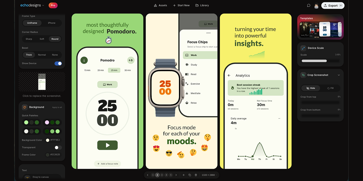
appdesigns is a free, in-browser editor for making App Store and Google Play screenshots. It is aimed at people who need to create app listing visuals, including app developers, designers, and marketers. The product's stated purpose is to help users design amazing app screenshots completely free. Users can drop in their screens, frame them in device mockups, add headlines, backgrounds and stickers, and export at the exact sizes App Store Connect asks for. The website emphasizes that no account is needed, there is no watermark, and exports are unlimited. The editor is accessed through appdesigns.click and is described as needing a laptop-sized window. The Product Hunt tagline says Design amazing appstore screenshots for free. The problem context is stated directly: many screenshot tools are free to start but then impose limits. appdesigns positions itself as truly free, not free to start. It highlights unlimited exports, no watermark, and no account required. This matters for app developers and teams preparing store listings because screenshots are a required part of presenting an app on the App Store and Google Play. The product removes sign-up friction and export restrictions, while keeping the creation process inside the browser. The metadata description says Make App Store and Google Play screenshots in your browser. Truly free, not free to start: unlimited exports, no watermark, no account required. The website also says support is appreciated but never required, reinforcing that the tool does not require payment to use its stated core capabilities. Device framing is a core part of the editor. The Device section lists Mobile, iPad, Mac, and Watch. Frame Type includes Uniframe and iPhone. Available device options include iPhone Duo, marked New; iPhone 18 Pro, marked New; iPhone 18 Pro Max, marked New; iPhone 17 Pro Max; and three more. Users can choose Portrait or Landscape orientation. There is a Show Device toggle, which lets users decide whether the device frame is visible. The product description also mentions framing screens in the latest iPhone, iPad or Mac. These options help users present screenshots in the context of real devices and match the type of app being shown. The Device section provides Mobile, iPad, Mac, and Watch options, while the Frame Type section offers Uniframe and iPhone choices. Uploading and customizing the screenshot content happens on the canvas. Users upload a screenshot, and the interface includes a Background section with Apply to all, Background Color, and Transparent. The background color example shown is #FF512F, and Transparent is an available choice. Text can be added directly to the canvas; users can click or drag to place it, or press T to place text. The Text section includes an Add text control and instructions: Click or drag to the canvas. Press T to place. The canvas displays slides numbered 1, 2, and 3, along with a canvas size of 1242 × 2688. These controls support adding headlines and visual treatments to app screens before export. Templates and transformation tools help shape the overall screenshot set. The website displays a Templates section with template artwork that users can browse. The Product Hunt description states users can start from a community template. Scale & Tilt controls let users adjust device presentation; the interface shows Scale at 135% and Tilt at 0°. The interface shows Scale 135% and Tilt 0° as example values, with the ability to adjust scale and tilt. The product description says users can design the whole set side by side, tilt and scale devices, or start from a community template. This combination supports creating a coordinated group of screenshots rather than editing each image in isolation. The overall workflow is explained in three steps: 1 Upload your app screenshots, 2 Choose a device frame, 3 Customise and export. This straightforward approach is presented as the main method for using the editor. Users begin with their own app screens, select a frame from the available device options, then customise with backgrounds, text, templates, scale, and tilt before exporting. The editor runs in the browser and the website notes that the editor needs a laptop-sized window, with a prompt to copy the link for your laptop. This indicates the tool is used in a desktop or laptop browser environment. Exporting is aimed at the exact sizes App Store Connect asks for, and the free offer includes unlimited exports, no watermark, and no account needed to start. Benefits and outcomes stated or directly implied by the content include creating app screenshots for free and without an account. The product removes the need to sign up before starting, and it does not add a watermark to exports, according to the website and metadata. Unlimited exports mean users can produce as many screenshot files as their listing requires. The in-browser editor avoids a separate desktop installation. The three-step workflow and community templates provide a guided path for users who may not be professional designers. The product also supports every device, every size, and no account needed, as stated on the website. Concrete use cases include preparing App Store and Google Play listing screenshots. A developer can upload app screens, frame them in iPhone, iPad, Mac, or Watch device mockups, add headlines and backgrounds, and export at required sizes. A designer or marketer can create a consistent set of screenshots side by side, using templates and background colour changes applied to all. A user who wants a device mockup without signing up can open the editor in a laptop browser, upload a screenshot, choose a frame such as iPhone 18 Pro or iPad, add text, and export. The editor also shows slides numbered 1, 2, and 3, which supports working with multiple screens in one session. The target users are app developers, designers, marketers, and teams who need store listing visuals. The product is designed for users who want a free, browser-based screenshot editor with no account required, no watermark, and unlimited exports. It supports Mobile, iPad, Mac, and Watch device frames and references exact export sizes for App Store Connect. Because the website states the editor needs a laptop-sized window, it is intended for use on a laptop or desktop browser rather than on a mobile phone. The website mentions support is appreciated, never required, but does not present it as a mandatory part of using the free editor. No pricing tiers, paid plans, or subscription details are stated; the pricing model is free. In summary, appdesigns is a free in-browser tool for making App Store and Google Play screenshots. It combines device frames, background controls, text, community templates, and scale and tilt adjustments with a simple upload, frame, customise, and export workflow. Its primary value proposition is stated clearly: amazing app screenshots for free, with no account, no watermark, and unlimited exports.
OzBrain is a hosted knowledge base that acts as a shared brain every AI agent you use can read and write. Instead of each assistant keeping its own private memory, OzBrain provides one structured source of truth that sits underneath Claude, ChatGPT, Cursor, Claude Code and other connected agents. It is built for people and teams who already use several AI tools every day and want the work they have already done to be available the next time any agent starts a task. The company describes it as your Dropbox for agent knowledge: a place where structured articles with links, provenance and freshness live behind the connector menu that Claude and ChatGPT already show you. Today, context lives in your chats and your teammate's context lives in theirs, and the two never meet. People share a doc, drop a message and paste the same things over and over again. Meanwhile copies of the same plan sit in Drive, on laptops, in Downloads, in email, and no one is sure which version is current. Platform memory does not solve this either: as the site puts it, that memory is a few preferences and a thin summary of past chats. OzBrain's answer is to hold the work itself — your projects, decisions, research and the thinking you have already done — so an agent starts with what the task needs instead of whatever fits in a profile. The centrepiece is a single shared brain. Point everyone at one OzBrain and your agents and their agents read and write to the same place, so what one person works out, everyone's agents already have. The site illustrates this with a team view: a company brain holding company vision, rules and skills, engineering plans, customers, research and the roadmap, with individual people connected through Claude, Cursor, Codex and Claude Code. Because the knowledge sits outside any single chat product, it is not owned by whichever assistant happened to be used first. Sharing on brains you own is included in every plan, including the free one. OzBrain breaks your knowledge into nested pieces so that an agent pulls the exact slice it needs — the email body, not the whole launch plan. The site shows a launch plan at 11,842 tokens and 47.3 KB nesting into launch campaigns at 1,486 tokens and 5.9 KB, which in turn nests into launch email at 218 tokens and 0.87 KB. The argument is straightforward: the less an agent has to load, the faster and cheaper it answers, and the less it invents from context it never needed. Alongside this, OzBrain keeps the latest version out front. Instead of copies of the same plan scattered across Drive, laptops, Downloads and email, every agent decides from the current version rather than an old copy. When newer thinking lands, OzBrain goes back through your knowledge on its own, marks the old notes as replaced and points to the latest. You never have to hunt down every place an old decision lived, and no agent answers from a version you have moved past. The site gives the example of a website launch plan being updated when the company acquired a new domain, with related company details marked as updated to ozbrain.com. Every change is also on the record: which agent made it, what changed and the reasoning. Changes are proposed before they land, so several agents can work at once without writing over each other, and a recent-changes table shows the time, agent, article and reason for each edit. Privacy and ownership are handled explicitly. Your brain is encrypted at rest and sealed to your account, so nothing leaks between tenants. The site states that it never trains on your data and never sells it, describing OzBrain as a sovereign place for your data. Export is available at any time — everything as markdown, including after you cancel — on the principle that your knowledge should not be locked in anywhere, including OzBrain. Deleting your account removes your content: delete means deleted. The company also notes that it runs OzBrain on OzBrain, with its own data sitting next to yours, because it wanted the safest and easiest tool for itself as well as for users. Getting started does not require any coding. You add OzBrain from the connector menu in Claude or ChatGPT, sign in and approve it; there is nothing to install. Connect guides exist for Claude and ChatGPT, and the same brain can be reached from Claude Code, Cursor, OpenClaw, Hermes Agent, Gemini Spark where Google makes it available (US, Spark eligibility) and any client that supports connectors. Because it is one URL, anything that speaks the protocol can hold the same brain. Rather than being a memory API that developers code against, OzBrain is described as a brain you connect — structured articles with links, provenance and freshness, and one source of truth rather than a separate memory in each product. The stated outcomes for users are practical. Agents make fewer mistakes because they pull only the slice of knowledge a task needs. Answers are faster and cheaper because less context has to be loaded. Nobody has to maintain or "work" the brain, since replaced notes are marked automatically and the current version stays out front. Teams stop pasting the same context into several separate chats, and a brand-new chat can know what everyone has already worked on. Because everything is exportable as markdown, users keep an exit route and can move their knowledge to whichever tools serve them best. Concrete scenarios appear throughout the site. In one, a team connects individual agents through Claude, Cursor, Codex and Claude Code so the whole team's agents work together on the same knowledge — company vision, rules and skills, engineering plans, customers, research and roadmap — instead of each person's context living in a separate chat. In another, a website launch plan is updated when the company acquires a new domain, and OzBrain marks related articles, such as company details, as updated so no agent answers from the old domain. The changelog example shows several agents, including Claude, making coordinated changes to articles such as a website launch plan, an MCP setup guide and a surfaces page with a stated reason for each edit. A further scenario is a new chat starting with what a team has already worked on rather than from a blank slate. OzBrain is aimed at individuals and teams whose work already runs through multiple AI agents, from a single person's venture and personal knowledge to an organisation where agents run the operation from one brain. Supported integrations include Claude and ChatGPT through their native connector flows, plus Claude Code, Cursor, OpenClaw, Hermes Agent, Gemini Spark where Google makes it available (US, Spark eligibility) and any client that supports connectors. Pricing starts with Free at $0 forever, with up to 50 articles, sharing on brains you own, unlimited brains, reads, writes and connections, write-time size discipline and markdown export anytime. Pro is $20 per month with up to 500 articles, described as room for one venture plus personal knowledge. Max is $99 per month with up to 5,000 articles, for when agents run the operation from one brain. Enterprise sits above the Max ceiling with org-owned shared brains and per-seat pricing designed with you. Every plan includes unlimited reads and writes, and free plans mean you can start without a credit card. The takeaway is that OzBrain turns scattered, agent-specific context into one shared, encrypted and exportable brain that every agent and teammate can read and write. It keeps the current version out front, prunes replaced notes automatically, records who changed what and why, and lets you walk away with everything in markdown whenever you choose.
Web Search Agents by Nimble are self-learning agents that become experts at your specific research task. They are web crawling and research agents built for a specific domain — company enrichment, regulations research, and other focused use cases — and they crawl the web with surgical accuracy. Instead of returning generic results, the agents self-learn your use case to go deeper into the sources that matter most to you, giving your AI deeper and more relevant web context. The product is aimed at agent builders and teams that need expert-level web search for their AI agents, delivering higher accuracy at a fraction of the token cost. You can start by giving your AI the Nimble agent onboarding link, start building for free, or book a demo with the team. Web search is usually judged on generic benchmarks that do not resemble the queries a real agent builder faces. Nimble evaluates web search by domain instead, because that lets agent builders judge solutions against queries that resemble their own rather than generic benchmarks. Nimble argues that specialized intelligence needs a specialized web search, and invites teams whose domain is not listed to contact the company to see how Web Search Agents adapt to their use case. A second problem is cost: retrieving web context typically means redundant searches and parsing raw pages with an LLM, which consumes tokens. Nimble positions Web Search Agents as a way to retrieve exactly what is needed — with no redundant searches and no parsing of raw pages with an LLM — so teams get expert-level web search for their AI agents with higher accuracy at a fraction of the token cost. Web Search Agents are built to execute hyper-specific research workflows, crawling the web with surgical accuracy for the task at hand. They can also build and enrich web datasets: you define your schema and the agents return consistent results on every run, which makes it practical to assemble structured web data without manual cleanup. A monitoring capability, currently in beta, lets you continuously track any data point on any webpage in real time, so changes on the web surface as they happen. Together these three capabilities — hyper-specific research, schema-driven dataset building, and continuous monitoring — cover the common shapes of web data work an agent needs to perform, from answering a single research question to maintaining a dataset that stays current. Three capabilities underpin how the agents adapt to your use case and self-improve. First, compounding domain knowledge: the agents accumulate web context over time to master your domain, so their understanding of relevant sources grows with use. Second, deep web access for your sources: the agents combine web search with domain crawling to reach subpages that other tools cannot access, which matters when the useful information sits deeper than a top-level page. Third, full control over search methodology: the agents retrieve data within the scope and guardrails defined by your search plan, so you decide what is in bounds. Nimble summarizes this as agents that adapt to your use case and self-improve, rather than behaving the same way for every customer and every query. Governance is part of the design. Web Search Agents operate with full governance and control through auditable Search Plans that show exactly what was searched, where, and why — so you can inspect the path the agent took rather than trusting an opaque set of results. Accuracy compounds over time through a Proprietary Index and Memory that gets smarter with every query, meaning the agents retain and reuse what they have learned. The same retrieval discipline addresses cost: by retrieving exactly what is needed, the system avoids redundant searches and avoids the expense of parsing raw pages with an LLM. These three elements — auditable Search Plans, compounding memory, and precise retrieval — are the core promises Nimble makes for expert-level web search delivered to AI agents. The overall approach is that the agents self-learn your use case. Rather than being configured once and left static, Web Search Agents learn from the searches they run, building a memory and a Proprietary Index that improve the relevance of later results. They combine two access paths — web search and domain crawling — to reach both broad results and the deeper subpages that other tools cannot access. Each retrieval stays inside the scope and guardrails you define for the search plan, and every search is recorded so you can audit what was searched, where, and why. Nimble describes this as specialized intelligence for a specialized web search, and documents an onboarding path so your AI agent can be pointed at the product and begin building. The stated benefits concentrate on accuracy and cost. Nimble says Web Search Agents deliver expert-level web search for your AI agents with higher accuracy at a fraction of the token cost. Because retrieval returns exactly what is needed, there are no redundant searches and no need to parse raw pages with an LLM — two of the main sources of token spend in agentic web research. Accuracy compounds over time as the Proprietary Index and Memory get smarter with every query, so results improve rather than plateau. Control and trust are the other stated outcomes: auditable Search Plans show exactly what was searched, where, and why, and the agents work within the scope and guardrails you set, which makes it easier for teams to explain how a result was produced. Nimble publishes cookbook examples of what teams can build. Company research and due diligence can be run from a single prompt at audit grade. Teams can research case laws and regulations, enrich dependencies with health indicators, and find assortment gaps on the digital shelf. Retail and brand teams can find where products are sold to enforce MAP compliance, and go-to-market teams can discover businesses that match an ideal customer profile. Finance workflows include tracking analyst earnings predictions against actuals, and recruiting workflows include building a dataset of job candidates. Nimble also names the domains it evaluates and adapts to: market analysis, real estate, social media monitoring, travel and hospitality, company research, finance, product intelligence, and GTM. In those benchmarks, contestants independently completed 96 tasks per domain — covering reports, enrichment, and discovery — with each result graded fact-by-fact by an independent AI judge against a gold standard built without any contestant's input. Web Search Agents are aimed at agent builders and teams that need their AI agents to research the web reliably. Nimble says it is trusted by organizations including Databricks, Qudo and Uber under a "Trusted By" heading, and its site also displays a broader logo wall featuring brands such as Microsoft, Coca-Cola, L'Oréal, LG, TripAdvisor, Semrush and Browserbase. Native integrations are offered including Anthropic, GPT, LangChain and Vercel, and the product is documented as a Nimble SDK with an agent onboarding page you can give to your AI to get started. Security and compliance features include zero data retention, flexible PII masking, audit logs, data encryption in transit, and no training, alongside CCPA, GDPR and SOC 2 badges. Nimble invites teams to start building for free, try the product now, or book a demo to discuss use cases and see how Nimble delivers higher accuracy at a fraction of the token cost. For teams building AI agents that need reliable web context, Web Search Agents by Nimble offer a self-learning approach: agents that adapt to your domain, crawl the web with surgical accuracy, build and enrich datasets against your schema, and monitor pages for change. Auditable Search Plans provide governance, while a Proprietary Index and Memory compound accuracy over time and precise retrieval reduces token cost. The result is deeper, more relevant web context for your AI, evaluated by domain against queries that resemble your own rather than generic benchmarks.
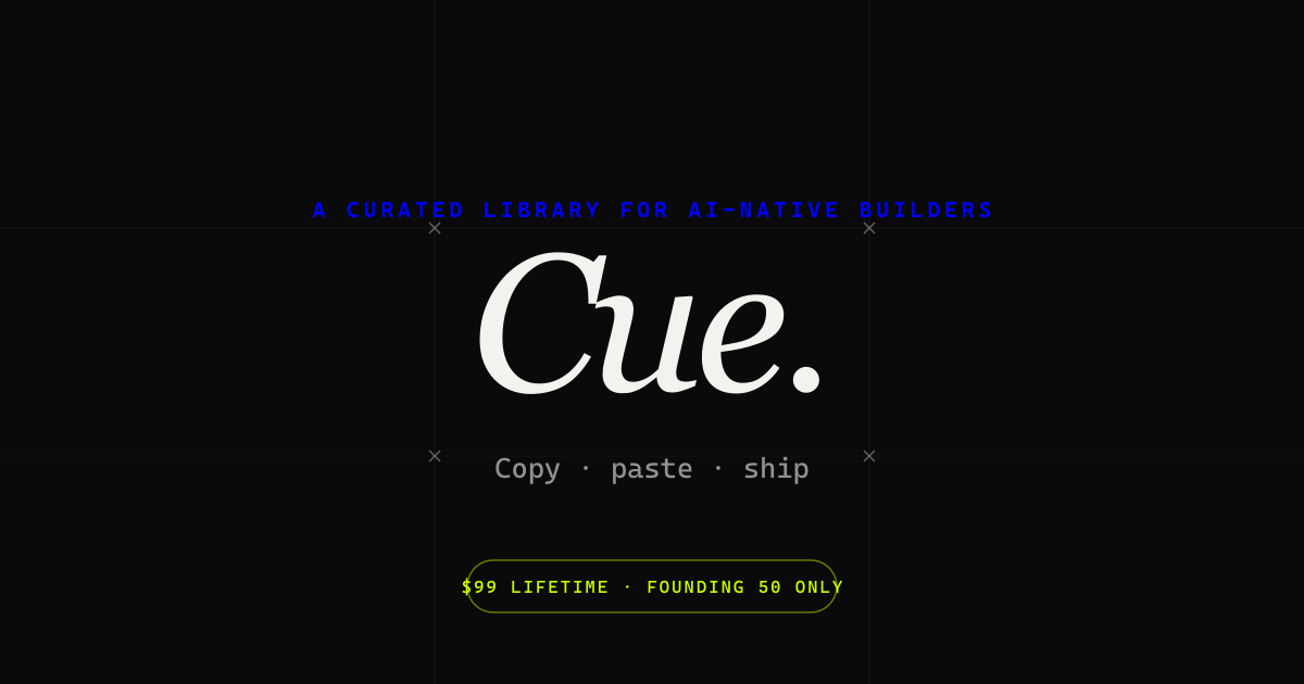
Cue is an Awwwards-tier UI component library for anyone building to stand out. It gathers best-in-class components from across the internet and curates them by hand, offering bold hero sections, smooth interactions, unique layouts and thoughtful micro-animations that help teams ship websites that do not just work but stand out. Cue is made not only for AI builders but also for designers, developers, agencies, solo makers and product teams who refuse to ship generic-looking work. It describes itself simply as the taste layer on top of the tools people already use, and today every component ships with an AI prompt so users can recreate what they see inside their own projects. The starting point for Cue is a familiar frustration: most component libraries, template packs and AI-generated interfaces look interchangeable, and shipping something distinctive usually means hours of reverse-engineering interactions spotted on award-winning sites. Cue approaches that problem from the opposite direction. Rather than generating components to fill a grid, the library is assembled from hand-picked references, sourced from an Awwwards Site of the Day, a Behance-featured interaction, or a production output the founder considered best-of-class. The editorial section describes the collection as the best web interactions from Awwwards, CollectUI and X, delivered together with the code and prompt needed to recreate them in your own project. The stated bar is taste, not volume: if a user finds a better reference for the same component, the founder replaces the existing item, so the catalogue keeps improving instead of merely growing. The library itself is organised around the building blocks of a high-end marketing site. Cue lists bold hero sections, smooth interactions, unique layouts and micro-animations, and the site exposes tags for sections and interactions alongside filters for new versus old entries. At the time of writing the library advertises 75+ components with daily drops, so the collection is presented as a growing, frequently refreshed catalogue rather than a fixed download. A dedicated Editorial stream highlights a new drop each day. An email signup lets visitors be notified when new components ship, described as no spam and unsubscribe anytime, and the founder states that every drop is hand-picked personally. What makes Cue unusual among reference galleries is that every component ships with an AI prompt. Those prompts are designed to be dropped straight into Bolt, v0, Cursor, Framer AI, ChatGPT or Claude, so instead of studying a screenshot and rebuilding an animation by hand, a user can hand the prompt to the AI tool they already work in and adapt the result to their own project. The free tier of Cue allows visitors to browse the whole library and copy two AI prompts every 24 hours, which lets people test the workflow before committing. Because the prompt travels with the component reference, the interaction and the implementation guidance stay together. Beyond prompts, Cue states that React source code and an MCP server are actively rolling out. The MCP server is described as giving native access from Cursor, Claude Desktop, or any MCP-aware AI tool, which means an assistant can reach the component library directly rather than relying on copy and paste. React source code targets the developers who want the underlying implementation rather than only a description. Together these additions move Cue from a browsable gallery toward a resource that plugs into the toolchain of AI-assisted development. Cue's positioning is deliberately narrow. It does not host projects, deploy code, or run an AI model of its own; it is the taste layer sitting on top of the tools people already use. It also states plainly what it is not: not a template pack, not a subscription, not a course, not an AI wrapper, and not a marketplace. Curation is done by founder Alok, a founder-designer who hand-picks every drop and describes the work as building the taste layer for AI components. Because access is offered as a one-time lifetime payment rather than a recurring fee, the emphasis stays on singular, vetted references instead of a constantly billed content feed. The promised outcome is straightforward: build less and create more. Teams that struggle to produce distinctive interfaces get a shortcut to the interactions and layouts that define award-winning sites, without spending days dissecting how they were built. Designers gain a curated reference library that reflects a single, consistent point of view rather than an unfiltered dump of community uploads. Developers get prompts and, as they roll out, React source and MCP access, which shortens the distance between seeing an interaction and shipping it. AI builders get a way to raise the visual quality of what their assistants generate. For solo makers and agencies, the appeal is the same: differentiate visually while keeping the existing toolchain. Concrete uses follow from the components on offer. A designer putting together a portfolio can browse hero sections and unique layouts for a starting point rather than a blank canvas. A developer building a landing page in React can copy a prompt, paste it into Cursor or v0, and adapt a micro-animation that would otherwise take hours to recreate. An agency can use Cue as a reference source when pitching or producing client work that needs to look handcrafted. A solo maker launching a product can pull in an interaction that lifts the site above a default template. Teams working inside Claude Desktop or another MCP-aware client can eventually reach the library natively. Community activity is part of the workflow too: a Discord invitation lets members pick the next drop, and the founder is directly reachable for questions or for hire. Cue is aimed at designers, developers, agencies, solo makers and product teams, as well as AI builders, who refuse to ship generic-looking work. Pricing is structured as a free tier plus one-time lifetime access. Free browsing includes the full library with two AI-prompt copies per 24 hours. Cue+ Founding Lifetime is USD $99 as a one-time payment, capped at the first 50 members. Cue+ Lifetime at the standard rate is USD $249 one-time after the founding tier sells out. Promotional pricing has been offered at $79 lifetime, and the site also mentions custom pricing where you pay only for the components you pick. Technically, Cue centres on AI prompts for Bolt, v0, Cursor, Framer AI, ChatGPT and Claude, with React source code and an MCP server rolling out. The takeaway is that Cue sells taste rather than volume. By hand-picking Awwwards-tier components and pairing each one with an AI prompt, and soon React source code and MCP access, it gives designers, developers and AI builders a faster route to interfaces that stand out, while staying a layer on top of the tools they already use.
Spaces is a desktop app that gives a team one shared space per project, where the people on the team and their AI agents work together. Instead of each person holding a private AI chat history, a space keeps the project's chats, files, and routines in one place, so Monday's decision is still there on Thursday for everyone. It is built for teams that already use AI assistants every day and want that work to be shared rather than scattered across separate laptops and browser tabs. Spaces runs as a desktop application on Apple silicon Macs and Windows PCs, and a single person can start with it free before inviting anyone else. The problem the product sets out to solve is described on its own site as five people with five private chat histories. Everyone on a team has their own AI thread, and none of them can see each other's. The project's context ends up spread across browser tabs on separate machines, so every new question begins by re-explaining the job to the assistant. Each individual gets faster, but the team as a whole does not. A shared space is the product's answer to that gap: one project, one conversation, with chats and files living in the space rather than in somebody's personal thread. Getting started follows three explicit steps. First you download Spaces; it is free, needs no account, and installs like any other desktop app. Next you connect your AI by pasting the ChatGPT, Claude, or Gemini key you already have — one provider is enough to begin with. Then you open a space by naming the project and putting a specialist to work, and from that moment the space starts holding the context. Because each person's agents, API keys, and connected accounts stay on their own computer, the account you connect is not moved into someone else's cloud. The shared space is the core of the product. Chats and files live in the space itself, not in one person's thread, so a Product Launch space can show a press list for launch week, waitlist copy, and a battery claims comparison beside a launch brief, all visible to everyone in the space. The example space is managed by a Launch Lead and also includes a Copywriter and a Researcher. Because the space holds the history, nobody has to reconstruct what was decided or re-feed the same background into a fresh chat. Rather than one general assistant, a space can hold specialists. The site frames this as hiring agents, not one assistant: a researcher, a copywriter, a launch lead, each keeping its own notes so anyone in the space can put them to work. Each specialist gets its own instructions, memory, and tools, so it can research, draft, work through an inbox, or run a report. Agents have skills and tools attached, and the studio view lets you pick an agent to chat with or add someone new to the space. Routines are the part of Spaces that keeps working when nobody is watching. They are described as things that run on a schedule — check-ins, follow-ups, and reminders. In the product demo there are three routines in the Product Launch space: a launch morning brief that runs daily at 9:00 AM, a Friday recap that runs at 4:00 PM, and a paused waitlist follow-up. The stated behaviour is that the space does the standing work and pings someone only when it needs a decision, which means routine output does not depend on a person remembering to ask. Spaces takes the position that teams should use the models they already pay for. You connect ChatGPT, Claude, or Gemini, or run a model on the computer itself — Ollama is shown running locally — and the keys stay on that person's computer. Providers can be switched per agent at any time, and more than one provider can be brought in. The stated benefit is that you are buying the space, not another subscription for tokens: Spaces is not a reseller of AI, it is the app those models work in. Agents can also use the real web through a built-in browser. Research, clicking through, and staying signed in all happen inside the app, so the agent sees the page the user sees. The site illustrates this with a supplier specification page for a solar backpack being checked against claims held in the space's files — a 65W peak panel, a 20,000 mAh pack, and a weatherproof shell — along with the instruction not to claim that the pack charges a laptop in an hour. Having the browser inside the app keeps the agent's view and the team's files in the same workspace. Spaces separates what stays local from what the cloud carries. Each person's agents, API keys, and connected accounts stay on their own computer and never go to the cloud. The cloud carries the space, the chats, the files, and the routines, and nothing else, and shared-space content is encrypted at rest with a per-space key held in Google Cloud KMS; only members of the space receive it. A space begins as yours, and when you invite someone it becomes a shared space you both work in — the same chats, the same files, the same routines, with their agents alongside yours. The outcomes stated on the site follow from that structure. Context stops being personal: the project's history, decisions, and files belong to the space and remain available to everyone in it. Standing work continues without anyone prompting it, because routines run on a schedule. Each person keeps control of their own keys and accounts, so joining a shared space does not mean handing a colleague access to a personal AI account. And because the team is not buying tokens from Spaces, adding a seat does not add an AI subscription — the models are the ones the team already pays for. Concrete scenarios appear throughout the site. A product launch team keeps a press list for launch week, drafts waitlist copy, and compares battery claims against a launch brief with a researcher, all inside one space. The same space runs a morning brief at 9:00 AM and a Friday recap at 4:00 PM, and it can follow up on a waitlist when someone switches that routine on. Agents use the built-in browser to check supplier specification pages against internal claims. A solo user can run unlimited spaces on their own machine with specialists, routines, and playbooks, and only moves to a shared cloud space when other people need to work in it. Pricing is stated clearly. The desktop app is free on your own computer with no account, and includes unlimited local spaces, specialists, routines, and playbooks, plus your own AI keys. Spaces Cloud is listed at $10.99 a year per person, described on the pricing panel as $0.92 a month, and the FAQ gives $1.49 a month or $10.99 a year per person; it adds cloud-hosted spaces with shared chats, files, and routines, plus the ability to invite anyone who has a seat. A team of five is $55 a year. Everyone who works in a shared space needs their own seat because each person runs their own agents, and anyone who works alone stays free. Enterprise is a conversation rather than a checkout, and puts Spaces inside your own cloud so the data never leaves it, with help setting the whole thing up. The desktop app runs on Apple silicon Macs and Windows PCs. The takeaway Spaces promotes is that AI work on a team should live in a place the team can see. One space per project holds the chats, files, and routines; specialists take on defined roles; routines keep the standing work moving; and the models doing the work are the ones you already pay for. Start free on your own computer, connect a key, and invite the team when you are ready.


.jpg)